
电影数据.png
import pandas as pd
reviews = pd.read_csv('fandango_scores.csv')
cols = ['FILM', 'RT_user_norm', 'Metacritic_user_nom', 'IMDB_norm', 'Fandango_Ratingvalue', 'Fandango_Stars']
norm_reviews = reviews[cols]
print(norm_reviews[:1])
import matplotlib.pyplot as plt
from numpy import arange
num_cols = ['RT_user_norm', 'Metacritic_user_nom', 'IMDB_norm', 'Fandango_Ratingvalue', 'Fandango_Stars']
#高度
bar_heights = norm_reviews.ix[0, num_cols].values
#print bar_heights
#条形间隔
bar_positions = arange(5) + 0.75
#print bar_positions
fig, ax = plt.subplots()
#0.5是每个条形的宽度
ax.bar(bar_positions, bar_heights, 0.5)
plt.show()

条形图1.png
###加上主标题,横纵坐标标题
num_cols = ['RT_user_norm', 'Metacritic_user_nom', 'IMDB_norm', 'Fandango_Ratingvalue', 'Fandango_Stars']
bar_heights = norm_reviews.ix[0, num_cols].values
bar_positions = arange(5) + 0.75
tick_positions = range(1,6)
fig, ax = plt.subplots()

ax.bar(bar_positions, bar_heights, 0.5)
ax.set_xticks(tick_positions)
ax.set_xticklabels(num_cols, rotation=45)

ax.set_xlabel('Rating Source')
ax.set_ylabel('Average Rating')
ax.set_title('Average User Rating For Avengers: Age of Ultron (2015)')
plt.show()
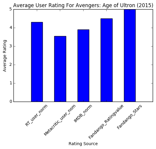
条形图2.png
import matplotlib.pyplot as plt
from numpy import arange
num_cols = ['RT_user_norm', 'Metacritic_user_nom', 'IMDB_norm', 'Fandango_Ratingvalue', 'Fandango_Stars']

bar_widths = norm_reviews.ix[0, num_cols].values
bar_positions = arange(5) + 0.75
tick_positions = range(1,6)
fig, ax = plt.subplots()
ax.barh(bar_positions, bar_widths, 0.5)

ax.set_yticks(tick_positions)
ax.set_yticklabels(num_cols)
ax.set_ylabel('Rating Source')
ax.set_xlabel('Average Rating')
ax.set_title('Average User Rating For Avengers: Age of Ultron (2015)')
plt.show()

条形图3.png
##散点图
fig, ax = plt.subplots()
ax.scatter(norm_reviews['Fandango_Ratingvalue'], norm_reviews['RT_user_norm'])
ax.set_xlabel('Fandango')
ax.set_ylabel('Rotten Tomatoes')
plt.show()

散点图1.png
#交换x轴y轴
fig = plt.figure(figsize=(5,10))
ax1 = fig.add_subplot(2,1,1)
ax2 = fig.add_subplot(2,1,2)
ax1.scatter(norm_reviews['Fandango_Ratingvalue'], norm_reviews['RT_user_norm'])
ax1.set_xlabel('Fandango')
ax1.set_ylabel('Rotten Tomatoes')
ax2.scatter(norm_reviews['RT_user_norm'], norm_reviews['Fandango_Ratingvalue'])
ax2.set_xlabel('Rotten Tomatoes')
ax2.set_ylabel('Fandango')
plt.show()

散点图2.png
import pandas as pd
import matplotlib.pyplot as plt
reviews = pd.read_csv('fandango_scores.csv')
cols = ['FILM', 'RT_user_norm', 'Metacritic_user_nom', 'IMDB_norm', 'Fandango_Ratingvalue']
norm_reviews = reviews[cols]
print(norm_reviews[:5])
fandango_distribution = norm_reviews['Fandango_Ratingvalue'].value_counts()
fandango_distribution = fandango_distribution.sort_index()

imdb_distribution = norm_reviews['IMDB_norm'].value_counts()
imdb_distribution = imdb_distribution.sort_index()

print(fandango_distribution)
print(imdb_distribution)
#柱形图
fig, ax = plt.subplots()
#bins默认为10
ax.hist(norm_reviews['Fandango_Ratingvalue'])
#调整bins=20,柱状图变为20条
#ax.hist(norm_reviews['Fandango_Ratingvalue'],bins=20)
#调整range(4,5),显示区间[4,5]之间的柱状图
#ax.hist(norm_reviews['Fandango_Ratingvalue'], range=(4, 5),bins=20)
plt.show()

柱形图1.png

柱形图2.png

柱形图3.png
fig = plt.figure(figsize=(5,20))
ax1 = fig.add_subplot(4,1,1)
ax2 = fig.add_subplot(4,1,2)
ax3 = fig.add_subplot(4,1,3)
ax4 = fig.add_subplot(4,1,4)
ax1.hist(norm_reviews['Fandango_Ratingvalue'], bins=20, range=(0, 5))
ax1.set_title('Distribution of Fandango Ratings')
#设置y轴区间
ax1.set_ylim(0, 50)

ax2.hist(norm_reviews['RT_user_norm'], 20, range=(0, 5))
ax2.set_title('Distribution of Rotten Tomatoes Ratings')
ax2.set_ylim(0, 50)

ax3.hist(norm_reviews['Metacritic_user_nom'], 20, range=(0, 5))
ax3.set_title('Distribution of Metacritic Ratings')
ax3.set_ylim(0, 50)

ax4.hist(norm_reviews['IMDB_norm'], 20, range=(0, 5))
ax4.set_title('Distribution of IMDB Ratings')
ax4.set_ylim(0, 50)

plt.show()
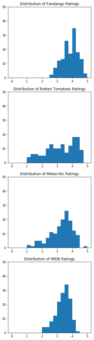
柱状图子图.png
import matplotlib.pyplot as plt
from matplotlib import cm
import numpy as np

label = ['a','b','c','d','e','f']
x = sorted([1234,221,765,124,2312,890])

idx = np.arange(len(x))
color = cm.jet(np.array(x)/max(x))
#用barh函数绘制横条形图
plt.barh(idx, x, color=color)
plt.yticks(idx+0.4,label)
plt.grid(axis='x')

plt.xlabel('Revenues Earned')
plt.ylabel('Salespeople')
plt.title('Top 12 Salespeople(2012)\n(in USD)')

plt.show()

横条形图.png
#盒图,观察数据分布
fig, ax = plt.subplots()
ax.boxplot(norm_reviews['RT_user_norm'])
ax.set_xticklabels(['Rotten Tomatoes'])
ax.set_ylim(0, 5)
plt.show()
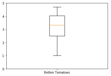
盒图1.png
#多个盒图
num_cols = ['RT_user_norm', 'Metacritic_user_nom', 'IMDB_norm', 'Fandango_Ratingvalue']
fig, ax = plt.subplots()
ax.boxplot(norm_reviews[num_cols].values)
ax.set_xticklabels(num_cols, rotation=90)
ax.set_ylim(0,5)
plt.show()
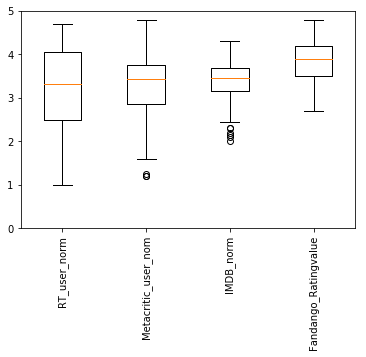
盒图2.png
import numpy as np
import matplotlib.pyplot as plt
import matplotlib.mlab as mlab
np.random.seed(0) #随机种子点设置
mu = 100     #正态分布参数mu和sigma
sigma = 15
x = mu+sigma*np.random.randn(437) #随机生成x列
num_bins = 50   #柱子的个数
#-----------绘图--------------
fig,ax = plt.subplots()
#-------绘制直方图---------
n,bins,patches = ax.hist(x, num_bins, normed=1, facecolor='red', histtype='barstacked')
#--------normpdf()求取概率分布曲线------
y = mlab.normpdf(bins, mu, sigma)
ax.plot(bins, y, '--')#将概率曲线显示在图上
ax.set_xlabel('Smarts') #设置x轴的label
ax.set_ylabel('Probability density')    #设置Y轴的label
ax.set_title(r'Histogram of IQ: $\mu=100$,$\sigma=15$')  #设置图片标题
fig.tight_layout()  #让图的位置更好的匹配窗口
plt.show()

叠加图
3D图
3D散点图
import matplotlib.pyplot as plt
from mpl_toolkits.mplot3d import Axes3D
import numpy as np

xs = np.random.randint(30,40,100)
ys = np.random.randint(20,30,100)
zs = np.random.randint(10,20,100)
xs2 = np.random.randint(50,60,100)
ys2 = np.random.randint(30,40,100)
zs2 = np.random.randint(50,70,100)
xs3 = np.random.randint(10,30,100)
ys3 = np.random.randint(40,50,100)
zs3 = np.random.randint(40,50,100)

fig = plt.figure()
ax = Axes3D(fig)
ax.scatter(xs, ys, zs)
ax.scatter(xs2, ys2, zs2, c='r', marker='^')
ax.scatter(xs3, ys3, zs3, c='g', marker='*')
ax.set_xlabel('X label')
ax.set_ylabel('Y label')
ax.set_zlabel('Z label')
plt.show()
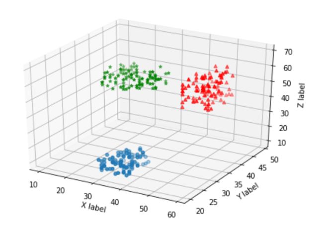
3D散点图
3D直方图
import matplotlib.pyplot as plt
import numpy as  np
from mpl_toolkits.mplot3d import Axes3D

x = np.arange(8)
y = np.random.randint(0,10,8)

y2 = y + np.random.randint(0,3,8)
y3 = y2 + np.random.randint(0,3,8)
y4 = y3 + np.random.randint(0,3,8)
y5 = y4 + np.random.randint(0,3,8)

clr = ['red', 'green', 'blue', 'black'] * 2

fig = plt.figure()
ax = Axes3D(fig)
ax.bar(x, y, 0,zdir='y', color=clr)
ax.bar(x, y2, 10,zdir='y', color=clr)
ax.bar(x, y3, 20,zdir='y', color=clr)
ax.bar(x, y4, 30,zdir='y', color=clr)
ax.bar(x, y5, 40,zdir='y', color=clr)

ax.set_xlabel('X axis')
ax.set_ylabel('Y axis')
ax.set_zlabel('Z axis')

ax.view_init(elev=40)
plt.show()
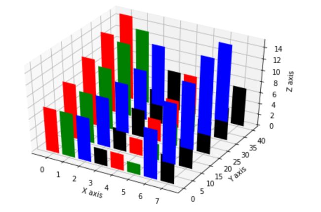
3D柱状图
细节调整
1970年美国来各个学科男女比例

数据.png
import pandas as pd
import matplotlib.pyplot as plt

women_degrees = pd.read_csv('percent-bachelors-degrees-women-usa.csv')
plt.plot(women_degrees['Year'], women_degrees['Biology'])
plt.show()
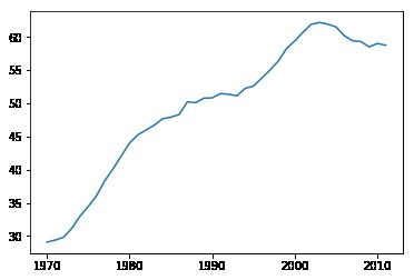
1.png
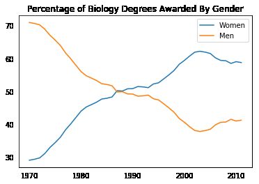
#100-women_degrees means men
plt.plot(women_degrees['Year'], women_degrees['Biology'], c='blue', label='Women')
plt.plot(women_degrees['Year'], 100-women_degrees['Biology'], c='green', label='Men')
plt.legend(loc='upper right')
plt.title('Percentage of Biology Degrees Awarded By Gender')
plt.show()

2.png
fig, ax = plt.subplots()
# Add your code here.
fig, ax = plt.subplots()
ax.plot(women_degrees['Year'], women_degrees['Biology'], label='Women')
ax.plot(women_degrees['Year'], 100-women_degrees['Biology'], label='Men')

#去掉边框坐标上的小齿
ax.tick_params(bottom="off", top="off", left="off", right="off")
ax.set_title('Percentage of Biology Degrees Awarded By Gender')
ax.legend(loc="upper right")

plt.show()

3.png
4.png
fig, ax = plt.subplots()
ax.plot(women_degrees['Year'], women_degrees['Biology'], c='blue', label='Women')
ax.plot(women_degrees['Year'], 100-women_degrees['Biology'], c='green', label='Men')
ax.tick_params(bottom="off", top="off", left="off", right="off")

for key,spine in ax.spines.items():
    #消去边框
    spine.set_visible(False)
# End solution code.
ax.legend(loc='upper right')
plt.show()

5.png
major_cats = ['Biology', 'Computer Science', 'Engineering', 'Math and Statistics']
fig = plt.figure(figsize=(12, 12))
for sp in range(0,4):
ax = fig.add_subplot(2,2,sp+1)
ax.plot(women_degrees['Year'], women_degrees[major_cats[sp]], c='blue', label='Women')
ax.plot(women_degrees['Year'], 100-women_degrees[major_cats[sp]], c='green', label='Men')
# Add your code here.
# Calling pyplot.legend() here will add the legend to the last subplot that was created.
plt.legend(loc='upper right')
plt.show()
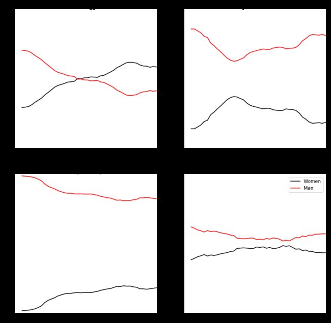
major_cats = ['Biology', 'Computer Science', 'Engineering', 'Math and Statistics']
fig = plt.figure(figsize=(12, 12))
for sp in range(0,4):
ax = fig.add_subplot(2,2,sp+1)
ax.plot(women_degrees['Year'], women_degrees[major_cats[sp]], c='blue', label='Women')
ax.plot(women_degrees['Year'], 100-women_degrees[major_cats[sp]], c='green', label='Men')
for key,spine in ax.spines.items():
spine.set_visible(False)
ax.set_xlim(1968, 2011)
ax.set_ylim(0,100)
ax.set_title(major_cats[sp])
ax.tick_params(bottom="off", top="off", left="off", right="off")
# Calling pyplot.legend() here will add the legend to the last subplot that was created.
plt.legend(loc='upper right')
plt.show()

6.png

7.png
#Color
import pandas as pd
import matplotlib.pyplot as plt

women_degrees = pd.read_csv('percent-bachelors-degrees-women-usa.csv')
major_cats = ['Biology', 'Computer Science', 'Engineering', 'Math and Statistics']

#通过改变RGB通道来调整线的颜色
cb_dark_blue = (0/255, 107/255, 164/255)
cb_orange = (255/255, 128/255, 14/255)

fig = plt.figure(figsize=(12, 12))

for sp in range(0,4):
    ax = fig.add_subplot(2,2,sp+1)
    # The color for each line is assigned here.
    ax.plot(women_degrees['Year'], women_degrees[major_cats[sp]], c=cb_dark_blue, label='Women')
    ax.plot(women_degrees['Year'], 100-women_degrees[major_cats[sp]], c=cb_orange, label='Men')
    for key,spine in ax.spines.items():
        spine.set_visible(False)
    ax.set_xlim(1968, 2011)
    ax.set_ylim(0,100)
    ax.set_title(major_cats[sp])
    ax.tick_params(bottom="off", top="off", left="off", right="off")

plt.legend(loc='upper right')
plt.show()
颜色.png
#Setting Line Width
cb_dark_blue = (0/255, 107/255, 164/255)
cb_orange = (255/255, 128/255, 14/255)
#调整图的大小
fig = plt.figure(figsize=(12, 12))

for sp in range(0,4):
    ax = fig.add_subplot(2,2,sp+1)
    # Set the line width when specifying how each line should look.
#linewidth调整线粗细
    ax.plot(women_degrees['Year'], women_degrees[major_cats[sp]], c=cb_dark_blue, label='Women', linewidth=10)
    ax.plot(women_degrees['Year'], 100-women_degrees[major_cats[sp]], c=cb_orange, label='Men', linewidth=10)
    for key,spine in ax.spines.items():
        spine.set_visible(False)
    ax.set_xlim(1968, 2011)
    ax.set_ylim(0,100)
    ax.set_title(major_cats[sp])
    ax.tick_params(bottom="off", top="off", left="off", right="off")

plt.legend(loc='upper right')
plt.show()

线粗细.png
stem_cats = ['Engineering', 'Computer Science', 'Psychology', 'Biology', 'Physical Sciences', 'Math and Statistics']
fig = plt.figure(figsize=(18, 3))

for sp in range(0,6):
    ax = fig.add_subplot(1,6,sp+1)
    ax.plot(women_degrees['Year'], women_degrees[stem_cats[sp]], c=cb_dark_blue, label='Women', linewidth=3)
    ax.plot(women_degrees['Year'], 100-women_degrees[stem_cats[sp]], c=cb_orange, label='Men', linewidth=3)
    for key,spine in ax.spines.items():
        spine.set_visible(False)
    ax.set_xlim(1968, 2011)
    ax.set_ylim(0,100)
    ax.set_title(stem_cats[sp])
    ax.tick_params(bottom="off", top="off", left="off", right="off")

plt.legend(loc='upper right')
plt.show()
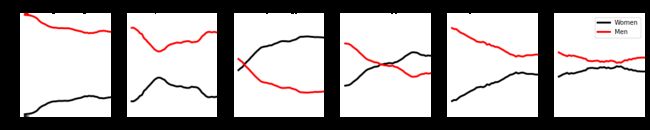
并排排列.png
fig = plt.figure(figsize=(18, 3))

for sp in range(0,6):
    ax = fig.add_subplot(1,6,sp+1)
    ax.plot(women_degrees['Year'], women_degrees[stem_cats[sp]], c=cb_dark_blue, label='Women', linewidth=3)
    ax.plot(women_degrees['Year'], 100-women_degrees[stem_cats[sp]], c=cb_orange, label='Men', linewidth=3)
    for key,spine in ax.spines.items():
        spine.set_visible(False)
    ax.set_xlim(1968, 2011)
    ax.set_ylim(0,100)
    ax.set_title(stem_cats[sp])
    ax.tick_params(bottom="off", top="off", left="off", right="off")
plt.legend(loc='upper right')
plt.show()
fig = plt.figure(figsize=(18, 3))

for sp in range(0,6):
    ax = fig.add_subplot(1,6,sp+1)
    ax.plot(women_degrees['Year'], women_degrees[stem_cats[sp]], c=cb_dark_blue, label='Women', linewidth=3)
    ax.plot(women_degrees['Year'], 100-women_degrees[stem_cats[sp]], c=cb_orange, label='Men', linewidth=3)
    for key,spine in ax.spines.items():
        spine.set_visible(False)
    ax.set_xlim(1968, 2011)
    ax.set_ylim(0,100)
    ax.set_title(stem_cats[sp])
    ax.tick_params(bottom="off", top="off", left="off", right="off")

#在线上加字
    if sp == 0:
        ax.text(2005, 87, 'Men')
        ax.text(2002, 8, 'Women')
    elif sp == 5:
        ax.text(2005, 62, 'Men')
        ax.text(2001, 35, 'Women')
plt.show()
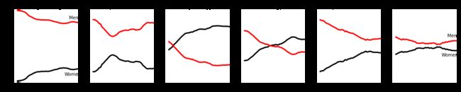
在线上加字.png