Scorecard Modelling – Banking Case Study Example
标签(空格分隔): Scorecard
(Part 1) Data Visualization
Art and Science of Data Visualization
Data visualization, as mentioned earlier, is both art and science. I personally prefer to have a long look at the data, plotting them in various ways before jumping into rigorous mathematical modeling. You might have noticed my penchant for art while going through my artwork presented in all the posts on this blog. The saying – a picture is worth thousand words – holds true during data analysis as well. Models in analytics can go horribly wrong if you have not spent enough time on the data exploratory phase – which is all about data visualization to me. Let me present a case study example to explain the aspects of data visualization during the exploratory phase.
Banking Case Study Example – Risk Management
Assume you are the chief risk officer (CRO) for CyndiCat bank that has disbursed 60816 auto loans in the quarter between April–June 2012. Today, about a year and a quarter since the loans disbursal, you know that the loans have seasoned or bad loansare tagged to a greater certainty. You have noticed a bad rate of around 2.5% or 1524 bad loans out of total 60816 disbursed loans.
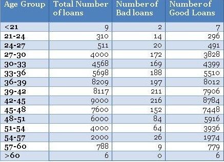
Before you jump to multivariate analysis and credit scoring, you want to analyze the bad rate across several individual variables. You have a hunch based on your experience that borrower’s age at the time of loan disbursal is a key distinguishing factor for bad rates. Therefore, you have divided the loans based on the age of the borrowers and created a table something like the one below.
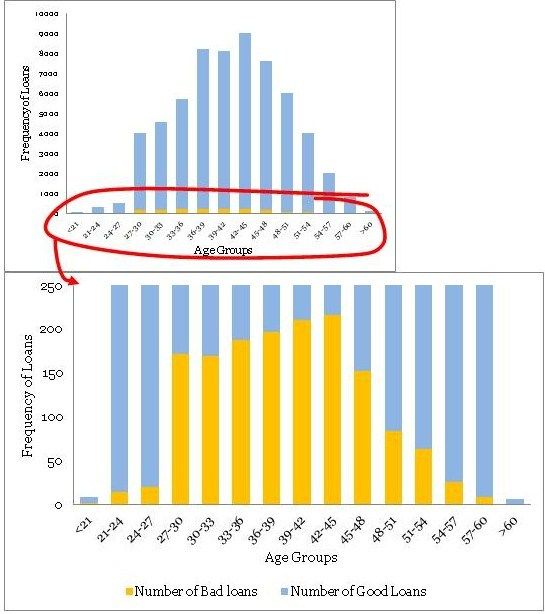
Using the above table, you have created a histogram and zoomed into the area of interest (close to the bad loans) as shown in the plots below.
You must have noticed the following
• The distribution of loans across age groups is a reasonably smooth normally distributed curve, without too many outliers. Age often display this kind of pattern for most products. However, do not expect similar smooth curves for other commonly found variables in a business scenario. Often, you may have to resolve to variable transformation to make the distributions smooth.
• The maximum bad loans are in the age bucket 42 to 45 years. This certainly does not mean the risk is also the highest in this bucket, however, once I have heard someone drawing a similar conclusion in a quarterly business review meeting –a silly mistake. Note, the maximum loans are also in the bucket 42 to 45 years. Absolute numbers do not provide enough information hence we need to create a normalized plot.
• The data is really thin on the fringe buckets (i.e. <21 and >60 years groups)with only 9 and 6 data points – be careful when dealing with such thin data. Sound business knowledge to modify these fringe buckets is extremely helpful while a model development. For instance, you know that for age above 60 for loans could be highly risky, but in this data, we do not have enough evidence for the same since we do not have enough data to validate our hypothesis. We should supplement a right risk weight in such situation – however, be very careful while doing so.
Normalized Plot
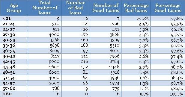
The normalized plot is easy to construct. The idea is to scale each age group to 100% and overlay bad and good percentage of records on top. We could extend the table shown above to get the values for the normalized plot as shown below.
Now, once you have the table ready you could create a normalized plot quite easily, as shown below (again we have zoomed into the plot to get a clear view of bad rates).
These plots are completely different from the original frequency count plot and presenting the information in a completely different light. The following are the things one could conclude from the plots.
• There is a definite trend in terms of the bad rates and the age groups. As the borrowers are getting older, they are less likely to default on their loans. That is a good insight.
• Again, the fringes (i.e. <21 and >60 years groups) have thin data, this information cannot be obtained from the normalized plot. Hence, you need to have the frequency plot handy to treat thin data differently. A handy rule of thumb is to have at least 10 records of both (good & bad) cases before taking the information seriously – otherwise, it is not statistically significant.
I must conclude by saying that, data visualization is the beginning of modeling process and not the destination. However, it is a good & creative beginning.
(Part 2) Data Visualization
The Case Study Example Continues…
You also believe that income of the applicants should have some sort of relationship with the bad rates. You are feeling confident about your understanding of the tools you have used last time around i.e. histogram and normalized histogram (overlaid with good / bad borrowers). You immediately start by plotting an equal interval histogram and observe the following:
Ouch! This is nothing like the smooth bell curve histogram you have observed for the age groups. Even the normalized histogram, shown below, is completely uninformative.
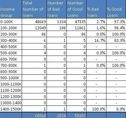
So, what is going on here? Income, unlike age, has a few extreme outliers – almost invisible in the histogram. There is a High-Net worth-Individual (HNI) with $1.47 million annual salary and few other outliers in the middle. Incidentally, this loan to the HNI customer has gone bad – quite unfortunate for the Bank. Have a look at the distribution table – almost 99.8% population is in the first two income buckets.
Here, as an analyst, you need to take a call whether you want to include these extreme cases, with thin data, in your model or create an income boundary for which the model is applicable for the majority of the customers. In my opinion, the latter option is a prudent choice. Going further with your exploratory analysis and data visualization, you have decided to zoom into the regions with a predominant number of data points i.e. first two buckets and re-plotted the histogram. The following is what you observed
* Correction: Read X axis as Income Groups (not Age Groups)
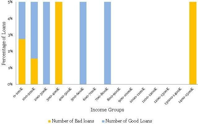
This time, the histogram is reasonably smooth and hence does not require transformation. Presented below is the normalized histogram for the above histogram.
The following conclusions can be drawn from the above
• There is a definite trend in terms of the bad rates and the income groups. As the borrowers are earning a higher salary, they are less likely to default on their loans. This seems like a good insight.
• For the Last bucket i.e. >150 K, the risk jumps up – a break in the trend. This is attributed to the thin data in this bucket – not just in terms of data count but this data is alsospread across a very large interval 150 to 1500 K.
Now you have two variables that are possible governing bad rates for the borrowers – age and income. However, your further analysis of income with age shows that there is a high correlation between the two variables – 0.76 to be precise. You cannot use them both in the model because it will be problematic because of multicollinearity. The correlation between age and income makes sense. Since income is a function of years of experience for a professional, this further depends on upon her age. Hence, you have decided to drop income from the model. The leaves us with a question, is there a way of bringing income back in our multivariate model?
Financial Ratios
When corporate analysts try to analyze financials of a company they often work with several financial ratios. Working with ratios has a definite advantage over working with plain vanilla variables. Combined variables often convey much higher information. Seasoned analysts understand this really well. Moreover, variables creation is a creative exercise that requires sound domain knowledge. For credit analysis, the ratio of the sum of obligations to income is highly informative since this provides an insight about percentage disposable income for the borrower.
Let us try to understand this with an example. Susan has an annual income of 100 thousand dollars. She has a home loan with an annual obligation (EMI) of 40 thousand dollars and a car loan with 10 thousand dollars. Hence, she is spending 10+40 thousand dollars on paying the EMIs out of her income of 100 thousand dollars. Her Fixed Obligation to Income Ratio (FOIR) in this case is equal to 50/100 = 50%. She is left with just 50% of her income to run her other expenses.
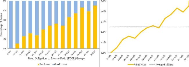
The following is the normalized histogram plot for FOIR.
Clearly, there is a directly proportional relationship between FOIR and bad rate. Additionally, FOIR has little correlation with age, just 0.18. Now, you have another variable FOIR , along with age, for your multivariate model. Congratulations! Like, Sherlock Holmes, you are building your case evidence by evidence – a process in science.
(Part 3) Logistic Regression – Banking Case Study Example
Case Study Example – Banking
In our last two articles part 1 & Part 2, you were playing the role of the Chief Risk Officer (CRO) for CyndiCat bank. The bank had disbursed 60816 auto loans in the quarter between April–June 2012. Additionally, you had noticed around 2.5% of bad rate. You did some exploratory data analysis (EDA) using tools of data visualization and found a relationship between age (Part 1) & FOIR (Part 2) with bad rates. Now, you want to create a simple logistic regression model with just age as the variable. If you recall, you have observed the following normalized histogram for age overlaid with bad rates.
We shall use this plot for creating the coarse classes to run a simple logistic regression. However, the idea over here is to learn the nuances of logistic regression. Hence, let us first go through some basic concepts in logistic regression.
Logistic regression
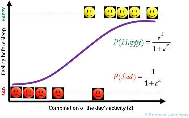
In a previous article (Logistic Regression), we have discussed some of the aspects of logistic regression. Let me reuse a picture from the same article. I would recommend that you read that article, as it would be helpful while understanding some of the concepts mentioned here.
Logistic Regression
In our case z is a function of age, we will define the probability of bad loan as the following.
You must have noticed the impact of Euler’s constant on logistic regression. The probability of loan or P(Bad Loan) becomes 0 at Z= –∞ and 1 at Z = +∞. This keeps the bounds of probability within 0 and 1 on either side at infinity.
Additionally, we know that probability of good loan is one minus probability of bad loan hence:
If you have ever indulged in betting of any sorts, the bets are placed in terms of odds. Mathematically, odds are defined as the probability of winning divided by the probability of losing. If we calculate the odds for our problem, we will get the following equation.
Here we have the Euler’s constant stand out in all its majesty.
Coarse Classing
Now, let create coarse classes from the data-set we have seen in the first article of this series for age groups. Coarse classes are formed by combining the groups that have similar bad rates while maintaining the overall trend for bad rates. We have done the same thing for age groups as shown below.
We will use the above four coarse classes to run our logistic regression algorithm. As discussed in the earlier article the algorithm tries to optimize Z. In our case, Z is a linear combination of age groups i.e Z = G1+G2+G3+Constant. You must have noticed that we have not used G4 in this equation.This is because the constant will absorb the information for G4. This is similar to using dummy variables in linear regression. If you want to learn more about this, you could post your questions on this blog and we can discuss it further.
Logistic Regression
Now, we are all set to generate our final logistic regression through a statistical program for the following equation.
You could either use a commercial software (SAS, SPSS or Minitab) or an open source software (R) for this purpose. They will all generate a table similar to the one shown below:
Logistic Regression Results (Age Groups and Bad Rates)
| Predictor | Coefficient | Std. Er | Z | P | Odds Ratio |
|---|---|---|---|---|---|
| Constant | -4.232**** | 0.074456**** | -56.84**** | 0**** | |
| G1 | 1.123 | 0.103026 | 10.9 | 0 | 3.07 |
| G2 | 0.909 | 0.0919 | 9.89 | 0 | 2.48 |
| G3 | 0.508 | 0.082846 | 6.14 | 0 | 1.66 |
Let us quickly decipher this table and understand how the coefficients are estimated here. Let us look at the last column in this table i.e. Odds Ratio. How did the software arrive at the value of 3.07 for G1? The odds (bad loans/good loans) for G1 are 206/4615 = 4.46% (refer to aboveTable 1 – Coarse Class). Additionally, odds for G4 (the baseline group) are 183/12605 =1.45%. The odds ratio is the ratio of these two numbers 4.46%/1.45% = 3.07. Now, take the natural log of 3.07 i.e. ln(3.07) = 1.123 – this is our c for G1. Similarly, you could find the coefficient for G2 and G3 as well. Try it with your calculator!
These coefficients are the β values to our original equation and hence the equation will look like the following
Remember, G1,G2 and G3 can only take values of either 0 or 1. Additionally, since they are mutually exclusive when either of them is 1 the remaining will automatically become 0. If you make G1 = 1 the equation will take the following form.
Similarly, we could find the estimated value of bad rate for G1
This is precisely the value we have observed. Hence, the logistic regression is doing a good job for estimation of bad rate. Great! We have just created our first model.
(Part 4) Information Value (IV) and Weight of Evidence (WOE) – A Case Study from Banking
This is a continuation of our banking case study for scorecards development. In this part, we will discuss information value (IV) and weight of evidence. These concepts are useful for variable selection while developing credit scorecards. We will also learn how to use weight of evidence (WOE) in logistic regression modeling. The following are the links where you can find the previous three parts (Part 1), (Part 2) & (Part 3).
Experts in Expensive Suits
A couple of weeks ago I was watching this show called ‘Brain Games’ on the National Geographic Channel. In one of the segments, they had a comedian dressed up as a television news reporter. He had a whole television camera crew along with him. He was informing the people coming out of a mall in California that Texas has decided to form an independent country, not part of the United States. Additionally, while on camera he was asking for their opinion on the matter. After the initial amusement, people took him seriously and started giving their serious viewpoints. This is the phenomenon psychologists describe as ‘expert fallacy’ or obeying authority, no matter how irrational the authorities seem. Later after learning the truth, the people on this show agreed that they believed this comedian because he was in an expensive suit with a TV crew. Nate Silver in his book The Signal and The Noise described a similar phenomenon. He analyzed the forecasts made by the panel of experts on the TV program The McLaughlin Group. The forecasts turned out to be true only in 50% cases; you could have forecasted the same by tossing a coin. We do take experts in expensive suits seriously, don’t we? These are not a few-off examples. Men in suits or uniforms come in all different forms – from army generals to security personnel in malls. We take them all very seriously.
We have just discovered that rather than accept an expert’s opinion, it would be better to look at the value of the information and make decisions oneself. Let us continue with the theme and try to explore how to assign the value to information using information value and weight of evidence. Then we will create a simple logistic regression model using WOE (weight of evidence). However, before that let us recapture the case study we are working on.
Case Study Continues ..
This is a continuation of our case study on CyndiCat bank. The bank had disbursed 60816 auto loans with around 2.5% of the bad rate in the quarter between April–June 2012. We did some exploratory data analysis (EDA) using tools of data visualization in the first two parts Part 1 & Part 2. In the previous article, we have developed a simple logistic regression model with just age as the variable Part 3. This time, we will continue from where we left in the previous article and use weight of evidence (WOE) for age to develop a new model. Additionally, we will also explore the predictive power of the variable (age) through information value.
Information Value (IV)and Weight of Evidence (WOE)
Information value is a very useful concept for variable selection during model building. The roots of information value, I think, are in information theory proposed by Claude Shannon. The reason for my belief is the similarity information value has with a widely used concept of entropy ininformation theory. Chi Square value, an extensively used measure in statistics, is a good replacement for IV (information value). However, IV is a popular and widely used measure in the industry. The reason for this is some very convenient rules of thumb for variables selection associated with IV – these are reallyhandy as you will discover later in this article. The formula for information value is shown below.
What distribution good/bad mean will soon be clear when we will calculate IV for our case study. This is probably an opportune moment to define Weight of Evidence (WOE), which is the log component in information value.
Hence, IV can further be written as the following.
If you examine both information value and weight of evidence carefully then you will notice that both these values will break down when either the distribution good or bad goes to zero. A mathematician will hate it. The assumption, a fair one, is that this will never happen while a scorecard development because of the reasonable sample size. A word of caution, if you are developing non-standardized scorecards with smaller sample size use IV carefully.
Back to the Case Study
In the previous article, we have created coarse classes for the variable age in our case study. Now, let us calculate both information value and weight of evidence for these coarse classes.
Let us examine this table. Here, distribution of loans is the ratio of loans for a coarse class to total loans. For the group 21-30, this is 4821/60801 = 0.079. Similarly, distribution bad (DB) = 206/1522 = .135 and distribution good = 4615/59279 (DG) = 0.078. Additionally, DG-DB = 0.078 – 0.135 = – 0.057. Further, WOE = ln(0.078/0.135) = -0.553.
Download the attached Excel to understand this calculation : Information Value (IV) and Weight of Evidence (WOE)
Finally, component of IV for this group is (-0.057)*(-0.553) = 0.0318.Similarly, calculate the IV components for all the other coarse classes. Adding these components will produce the IV value of 0.1093 (last column of the table). Now the question is how to interpret this value of IV? The answer is the rule of thumb described below.
| Information Value | Predictive Power |
|---|---|
| < 0.02 | useless for prediction |
| 0.02 to 0.1 | Weak predictor |
| 0.1 to 0.3 | Mediumpredictor |
| 0.3 to 0.5 | Strongpredictor |
| >0.5 | Suspicious or too good to be true |
Typically, variables with medium and strong predictive powers are selected for model development. However, some school of thoughts would advocate just the variables with medium IVs for a broad-based model development. Notice, the information value for age is 0.1093 hence it is barely falling in the medium predictors' range.
Logistic Regression with Weight of Evidence (WOE)
Finally, let us create a logistic regression model with weight of evidence of the coarse classes as the value for the independent variable age. The following are the results generated through a statistical software.
Logistic Regression Results (Age Groups and Bad Rates)
| Predictor | Coefficient | Std. Er | Z | P | Odds Ratio |
|---|---|---|---|---|---|
| Constant | -3.66223 | 0.0263162 | -139.16 | 0 | |
| WOE_Age | -1 | 0.0796900 | -12.55 | 0 | 0.37 |
If we estimate the value of bad rate for the age group 21-30 using the above information.
This is precisely the value we have obtained the last time (See the previous part) and is consistent with the bad rate for the group.
(Part 5) Reject Inference & Scorecards – Banking Case
This is a continuation of the banking case study for the creation of application risk scorecards that we have discussed in some previous articles. You can find the other parts of the series at the following links (Part 1), (Part 2), (Part 3), (Part 4), and (Part 6).
Reject Inference is a topic that separates credit scoring from the other classification problems such as marketing propensity models for cross / upselling, etc. As you will discover later, reject inference is about patching information gaps that exist during the development of application scorecards. Let us try to gain a more holistic perspective about patching information gaps through the way human beings have evolved.
Power of Context
As promised earlier, let me present a couple of illustrations to emphasize the power of context. In the first of these illustrations (shown adjacent), try to compare the length of two yellow lines and decide which one is longer. In this case, you will most probably identify the top yellow line as longer than the bottom yellow line. In this illusion, your brain will supersede the information received through your eyes based on the context or surrounding patterns around the yellow lines. As you might appreciate our three-dimensional world will rarely, or most probably never, offer a pattern similar to the optical illusion of illustration 1. Hence, for most practical purposes our brain has made the right decision though may seem ridiculous in this case.
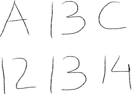
Now, let us have a look at the second illustration as shown adjacent. Notice B and 13 in the middle of the top and the bottom sequences, they are identical. You read the top sequence ABC and the bottom sequence 12,13,14. This is phenomenal, what your brain has just done in a split second is something most text mining and artificial intelligence algorithms try to do painstakingly. I must point out, CAPTCHA is a proof that most of these algorithms fail to capture what nature has equipped us with – the ability to join missing links.
Our brain tries to fill the gap in our information using the available information. This is precisely what we try to do while using reject inference for credit scoring.
Reject Inference
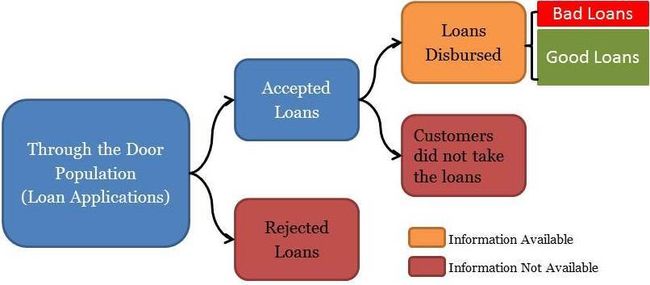
Let us try to understand the dynamics of the loan application process before establishing the necessity for reject inference. The ‘through-the-door’ loan applications are assessed by underwriters to establish the creditworthiness of the applicants. The underwriters will either accept or reject the applications based on the credentials of the applicants. Moreover, the customers with accepted applications will either avail the loans or not. This is shown in the schematic below:
As you could see in the above schematic, we have information aboutjust the disbursed loans to tag them as good or bad based on their performance. However, to create holistic scorecards for the entire through-the-door population we need to infer the behavior of the rejected loans. This process of supplementing information is called reject inference and is essential for developing holistic scorecards. The following segments cover a few commonly used ways to perform reject inference. I must also point out that the following methods are not perfect despite being extensively used in the industry.
Use Credit Bureaus
This method involves using information from credit bureaus to fill the gaps. If other lenders have disbursed loans to your rejected applicants then it makes sense to tag the rejected customers good or bad based on their performance with the other lenders. Although this method is possibly the best way to infer rejects with concrete information, it has the following challenges
- It unlikely that all the rejected loans have got a loan with some other lenders around the development period of the scorecard
- Difference in collection process and reporting among lenders could influence dubious tagging for customers’ performance
In most cases using credit bureausinformation alone won’t be sufficient enough to tag the entire through-the-door population. That is why we need analytical methods for reject inference as discussed in the next segment.
Augmentation through Parceling
Augmentation in different forms is the most commonly used methodology for reject inference. Now as shown in the above schematic we have fairly concrete tagging of good and bad loans for all the disbursed loans. We can easily run a classification algorithm like logistic regression (follow this link[Part 3], neural nets or decision tree to create a Known-Good-Bad (KGB) model. The same KGB model is used to score the rejected loans. Once the scoring is completed the analyst could create a table similar to the one shown below:
| Score Range | Disbursed % Bad | **Disbursed % Good ** | **Total Rejected Applications ** | **Rejects Inferred Bad ** | **Rejects Inferred Good ** |
|---|---|---|---|---|---|
| 0–231 | 27.0% | 73.0% | 1,838 | 496 | 1342 |
| 232–241 | 22.0% | 78.0% | 2,295 | 505 | 1790 |
| 242–251 | 17.0% | 83.0% | 3,162 | 538 | 2624 |
| 252–261 | 15.0% | 85.0% | 3,659 | 549 | 3110 |
| 262–271 | 9.0% | 91.0% | 3,298 | 297 | 3001 |
| 272–281 | 7.0% | 93.0% | 3,893 | 273 | 3620 |
| 282–291 | 4.0% | 96.0% | 2,627 | 105 | 2522 |
| 292–301 | 1.5% | 98.5% | 2,612 | 39 | 2573 |
| 302–311 | 0.7% | 99.3% | 2,441 | 17 | 2424 |
| 312+ | 0.3% | 99.7% | 1,580 | 5 | 1575 |
As you may notice in the above table, we have divided rejected applications into the same proportion of good / bad as in the disbursed loans for the score range. For instance, the score range of 232-241 has 22% bad loans. We have divided 2295 rejected applicants in this bucket into 505 (this is 22% of 2295) bad loans and 1790 good loans. We will randomly choose 505 rejected applications in the score range of 232-241 and assign them as bad loans (the remaining loans in this bucket will be assigned as good). Now we will create a holistic scorecard by re-running the classification algorithm i.e. logistic regression on the entire through-the-door population.
I hope you have noticed that we have used the principles of power-of-context discussed above by using score ranges as the criteria for augmentation.
Fuzzy Augmentation
A fuzzy augmentation is an extended form of parceling, here rather than randomly assigning loans as good and bad we will create multiple copies of rejected loans in the proportion of good / bad % in the score range. For instance, 22 copies of a single rejected loan inthe score range of 232-241 will be tagged as bad and 78 copies as good. The process will be repeated for all the rejected loans. This is similar to the workings of fuzzy logic. Fuzzy augmentation is believed to be a superior method for reject inference to produce holistic scorecards.
(Part 6) Population Stability Index (PSI) – Banking Case
This is a continuation of the banking case study for the creation of application risk scorecards we have discussed in some previous articles. You could find the previous parts of the series at the following links (Part 1), (Part 2), (Part 3) and (Part 4).
In this article, we will discuss the Population Stability Index (PSI), an important metric to identify a shift in population for retail credit scorecards. Before we delve deeper into the calculation of the population stability index (PSI) and its utility, let’s try to understand the overall purpose of the PSI and similar indexes by connecting a few dots between..
Dictators and Credit Crisis
What is similar between Napoleon’s and then Hitler’s attempts to invade Russia and financial crisis of 2007-08?
Napoleon tried to invade Russia in 1812 and Hitler repeated Napoleon’s misdeeds in 1941 – both invasions ended with severe defeats for the armies of the dictators. The armies of both Napoleon and Hitler were far superior to the Russians. It was the conditions in which the battles were fought that resulted in these defeats. Russian winters are often held responsible for the fate of these armies. In reality, it was the ill-preparedness and bad judgment of both Napoleon’s and Hitler’s men that caused them the humiliating defeats. They were very well trained men but they were trained in benevolent conditions of France and Germany. This time, the battle was in completely different and extreme conditions, and they could not cope with it.
The failure of credit risk models during the financial crisis 0f 2007-08 could be related to the fate of both the French and German armies. The models were built and trained in a benevolent economic environment and were ill-prepared to deal with extreme economic conditions at the time. Additionally, there were series of bad judgments by the executives at the financial firms that resulted in total economic collapse.
The moral of the above stories is that one has to keep a close tab on a change in conditions in the currently prevalent environment and training environment. The Basel III accord has paid a significant attention towards monitoring portfolio on a regular basis for a good reason. The population stability index (PSI) is one such index that helps risk managers in performing this task for retail credit scorecards.
Population Stability Index (PSI) – Our Banking Case Continues
You are the chief-risk-officer at CyndiCat bank. It’s been a couple of years since your team, in your supervision, has built the auto-loans credit scorecard. Since then the overall risk assessment process for the bank has improved significantly. Though being a prudent risk manager you have asked your team to regularly compare the population for which the scorecard was built and the existing through-the-door population (applicants for auto loans). A good place to start this comparison is by checking how two populations are distributed across the risk bands created through the scorecard. The following is a representation for the latest quarterly comparison your team has performed against the benchmark sample. Here Actual %’ is the population distribution for the latest quarter and ‘Expected %’ is the population distribution for the validation sample (a.k.a. benchmark sample).
Comparing two populations visually is a good place to start. The current population seems to have shifted towards the right side of the graph. To a small extent, this is expected since scorecards often influence the through-the-door population as the market starts reacting to the approval strategies of the bank. However, the question we need to ask is whether this a major shift in the population? Essentially, you are comparing two different distributions and could use any goodness-of-fit measure such as Chi-square test. However, the population stability index is an industry-accepted metric that presents some convenient rules of thumb for the same. The population stability index (PSI) formula is displayed below (refer to ‘Credit Risk Scorecards’ by Naeem Siddiqui)
Again like the weight of evidence and the information value, PSI seems to have it’s root in information theory. Let’s calculate the population stability index (PSI) for our population (we have already seen a histogram for this above).
| Score bands | Actual % | Expected % | Ac-Ex | ln(Ac/Ex) | Index |
|---|---|---|---|---|---|
| < 251 | 5% | 8% | -3% | -0.47 | 0.014 |
| 251–290 | 6% | 9% | -3% | -0.41 | 0.012 |
| 291–320 | 6% | 10% | -4% | -0.51 | 0.020 |
| 321–350 | 8% | 13% | -5% | -0.49 | 0.024 |
| 351–380 | 10% | 12% | -2% | -0.18 | 0.004 |
| 381–410 | 12% | 11% | 1% | 0.09 | 0.001 |
| 411–440 | 14% | 10% | 4% | 0.34 | 0.013 |
| 441–470 | 14% | 9% | 5% | 0.44 | 0.022 |
| 471–520 | 13% | 9% | 4% | 0.37 | 0.015 |
| 520 < | 9% | 8% | 1% | 0.12 | 0.001 |
| (PSI)= | 0.1269 |
The last column in the above table is what we care for. Let us consider the score band 251-290 and calculate the index value for this row.
The final value for the PSI i.e. 0.13 is the sum of all the values of the last column. Now the question is how to interpret this value? The rule of thumb for the PSI is displayed below
| PSI Value | Inference | Action |
|---|---|---|
| Less than 0.1 | Insignificant change | No action required |
| 0.1 – 0.25 | Some minor change | Check other scorecard monitoring metrics |
| Greater than 0.25 | Major shift in population | Need to delve deeper |
The value of 0.13 falls in the second bucket which indicates a minor shift in population from the validation or benchmark sample. These are handy rules to have. However, one must ask, how is this population shift going to make any difference in the scorecard? Actually, it may or may not make any difference. Each score band of a scorecard has an associated bad rate or probability of customers not paying off their loans. For instance, score band 251-290 in our scorecard has a bad rate of 10% or one customer out of the population of 10 in this score band won’t service his/her loan. The population stability index simply indicates changes in the population of loan applicants. However, this may or may not result in deterioration in performance of the scorecard to predict risk. Nevertheless, the PSI indicates changes in the environment which need to be further investigated through analyzing the change in macroeconomic conditions and overall lending policies of the bank.
