引入需要的库:
import matplotlib.pyplot as plt
import numpy as np
import pandas as pd
from numpy.random import randn
code1:
fig=plt.figure(2)
ax1=fig.add_subplot(2,2,1)                                         #为2*2的图像  ax1为第1个图像
ax2=fig.add_subplot(2,2,2)                                         #为2*2的图像  ax1为第2个图像
ax3=fig.add_subplot(2,2,3)                                         #为2*2的图像  ax1为第3个图像
plt.plot(randn(50).cumsum(),'k--')                                 #随机生成50个数;‘k--’表示线性选项,用于告诉matplotlib绘制黑色虚线图,并绘绘制在最后一个格子里
ax1.hist(randn(100),bins=20,color='k',alpha=0.4)                   #bins 表示分为20个箱子, color为设置fill的颜色 k为黑色,b为蓝色,r为红色,alpha=0.3设置透明度
ax2.scatter(np.arange(30),np.arange(30)+3*randn(30),color='r')     #散点图,默认颜色为深蓝 ,(其他颜色: k为黑色,b为蓝色,r为红色 )
plt.show()
图形显示1:
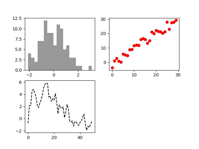
Figure_2.png
code2:
fig,axes=plt.subplots(2,2,sharex=False,sharey=False)
                                                   #sharex=False,sharey=False每个子图都会有x,y刻度 若True则会尽量共用刻度
for i in range(2):
    for j in range(2):
         axes[i,j].hist(randn(500),bins=50,color='k',alpha=0.5)
plt.subplots_adjust(wspace=0.2,hspace=0.2)         #控制子图之间的间距的  wspace左右  hspace为上下
plt.savefig("case2.png", dpi=100)                  #保存子图,dpi为设置图片的像素
plt.show()
图形显示2:
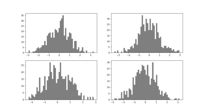
Figure_1.png
code3:
x=np.arange(10)
y=randn(10)*10
print(x)
print(y)
fig=plt.figure()
ax=fig.add_subplot(1,1,1)            #为2*2的图像  ax1为第一个图像
ax.plot(x,y,'go--',label='Default')  #设置线型虚线,0为折线上加散点 颜色为绿色 green  或者ax.plot(x,y,linestyle='--',color='g',marker='o')效果一样marker为加点;k为黑色 g为绿色
ax.plot(x,y,'k-',drawstyle='steps-post',label='steps-post')
                                     #drawstyle为设置连接散点的插值方式
plt.xlim([-1,11])                    #设置x的范围
plt.legend(loc=2)                    #设置图例的位置
plt.savefig("case3.png", dpi=100)
plt.show()
图形显示3:
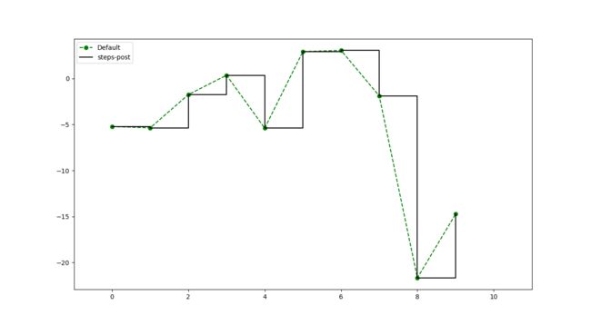
Figure_1.png
code4:
fig=plt.figure()
ax=fig.add_subplot(1,1,1)
ax.plot(np.arange(1000),randn(1000).cumsum(),'b',label='one')
                                                 #x为np.arange(1000),y为randn(1000).cumsum()
ax.plot(np.arange(1000),randn(1000).cumsum(),'r-',label='two')
ax.plot(randn(1000).cumsum(),'k',label='three')
ticks=ax.set_xticks([0,250,500,750,1000])        #设置刻度
labels=ax.set_xticklabels(['one','two','three','four','five'],rotation=30,fontsize='small')
                                                 #设置刻度标签
ax.legend(loc='best')
ax.set_title('My first matplotlib plot')
ax.set_xlabel('stages')
ax.text(416,22,'this is my freestyle',family='monospace',fontsize=20)
                                                 #在图像上添加注释
plt.savefig("case4.png", dpi=100)
plt.show()
图形显示4:
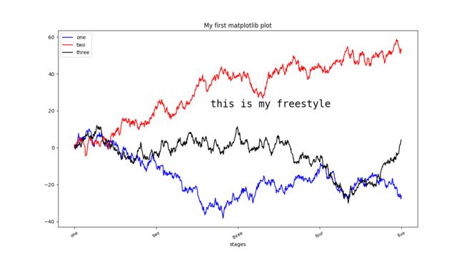
Figure_1.png
参考资料:
matplotlib官网:(http://matplotlib.org/gallery.html)