Typographical Concepts
This chapter defines some important typographical concepts relevant to the text system. Many of the terms representing these concepts are reflected in text system APIs. If you’re familiar with typography, you can skip this chapter.
本章定义了与文本系统相关的一些重要的排版概念。 这些概念的许多术语都反映在文本系统API中。 如果您熟悉排版,可以跳过本章。
Characters and Glyphs(字符和字形)
A character is the smallest unit of written language that carries meaning. Characters can correspond to a particular sound in the spoken form of the language, as do the letters of the roman alphabet; they can represent entire words, such as Chinese ideographs; or they can represent independent concepts, such as mathematical symbols. In every case, however, a character is an abstract concept.
一个字符是有一定含义的书面语言的最小单位。 字符可以指某种语言的发音,如拉丁字母;它可以代表整个词,如中国表意文字; 或者它也可以表示独立的概念,例如数学符号。 无论在何种情况下,字符都是一个抽象的概念。
Although characters must be represented in a display area by a recognizable shape, they are not identical to that shape. That is, a character can be drawn in various forms and remain the same character. For example, an “uppercase A” character can be drawn with a different size or a different stroke thickness, it can lean or be vertical, and it can have certain optional variations in form, such as serifs. Any one of these various concrete forms of a character is called a glyph. Figure 2-1 shows different glyphs that all represent the character “uppercase A.”
虽然字符必须通过可识别的形状在显示区域中表示,但它们的形状不同。 也就是说,可以以各种形式来绘制同一个字符。 例如,可以使用不同大小或不同行程厚度绘制“大写A”字符,它可以倾斜或垂直,并且可以在形式上具有某些可选的变体,例如衬线。 字符的这些各种具体形式中的任何一个称为字形。 图2-1显示了所有表示字符“大写A”的不同字形。
Characters and glyphs do not have a one-to-one correspondence. In some cases a character may be represented by multiple glyphs, such as an “é” which may be an “e” glyph combined with an acute accent glyph “´”. In other cases, a single glyph may represent multiple characters, as in the case of a ligature, or joined letter. Figure 2-2 shows individual characters and the single-glyph ligature often used when they are adjacent.
字符和字形不是一一对应的。在某些情况下,字符可以由多个字形表示,例如“é”,其可以是与紧急口音字形“”“组合的”e“字形。另一种情况,单个字形可以表示多个字符,如在连字或加入字母的情况下。图2-2显示了单个字符和相邻时经常使用的单字形连字。
A ligature is an example of a contextual form in which the glyph used to represent a character changes depending on the characters next to it. Other contextual forms include alternate glyphs for characters beginning or ending a word.
连字是根据上下文内容形成的,其中用于表示字符的字形根据其旁边的字符而改变。其他上下文形式包括用于开始或结束单词的字符的替代字形。
Computers store characters as numbers mapped by encoding tables to their corresponding characters. The encoding scheme native to iOS and OS X conforms to the Unicode standard. Unicode provides a standard methodology for assigning a unique number for every character in every modern written language in the world, independent of the platform, program, and programming language being used. This universal standard solves a longstanding problem of different computer systems using hundreds of conflicting encoding schemes. It also provides information specifying how to handle bidirectional text and contextual forms; how to form words and break lines; how to sort text in different languages; and how to format numbers, dates, times, and other elements appropriate to different languages.
计算机将字符存储为编码表来映射字符到其相应的数字。 iOS和OS X原生的编码方案符合Unicode标准。 Unicode提供了一种标准方法,用于为世界上每种现代书写语言中的每个字符分配唯一的编号,而与所使用的平台,程序和编程语言无关。这个通用标准解决了使用数百种冲突编码方案的不同计算机系统的长期存在的问题。它还提供了指定如何处理双向文本和上下文形式的信息;如何形成单词和断字;如何对不同语言的文本进行排序?以及如何格式化适合不同语言的数字,日期,时间和其他元素。
Glyphs are also represented by numeric codes called glyph codes. The glyphs used to depict characters are selected by the layout manager during composition and layout processing. The layout manager determines which glyphs to use and where to place them in the display, or view. The layout manager caches the glyph codes in use and provides methods to convert between characters and glyphs and between characters and view coordinates.
字形符号也被称为字形编码。在组合和布局处理过程中,布局管理器选择用于描述字符的符号。布局管理器确定要使用哪些符号,以及将它们放置在显示或视图中的位置。布局管理器会缓存使用的符号代码,并提供在字符和符号之间以及字符和视图坐标之间转换的方法。
Typefaces(Font-Family) and Fonts(字体系列和字体)
A typeface is a set of visually related shapes for some or all of the characters in a written language. For example, Times is a typeface, designed by Stanley Morrison in 1931 for The Times newspaper of London. All of the letter forms in Times are related in appearance, having consistent proportions between stems (vertical strokes) and counters (rounded shapes in letter bodies) and other elements. When laid out in blocks of text, the shapes in a typeface work together to enhance readability.
字体是用于书面语言中的一些或所有字符的视觉相关形状的集合。例如,“Times”是一本字体,由斯坦利·莫里森(Stanley Morrison)于1931年为伦敦“泰晤士报”报纸设计。Times中的所有字母形式与外观相关,茎(垂直笔画)和计数器(字体中的圆形)和其他元素之间的比例一致。当以文本的方式布置时,字体中的形状一起工作以增强可读性。
A typestyle, or simply style, is a distinguishing visual characteristic of a typeface. For example, roman typestyle is characterized by upright letters having serifs and stems thicker than horizontal lines. In italic typestyle, the letters slant to the right and are rounded, similar to cursive or handwritten letter shapes. A typeface usually has several associated typestyles.
一种字样,或是一种简单的风格,是字体的独特视觉特征。例如,罗马类型的特征是直立字母具有比水平线更粗的衬线和茎。斜体字型,字母向右倾斜,圆形,类似于草书或手写字母形状。字体系列通常有几个相关的字体。
A font is a series of glyphs depicting the characters in a consistent size, typeface, and typestyle. A font is intended for use in a specific display environment. Fonts contain glyphs for all the contextual forms, such as ligatures, as well as the normal character forms.
一个字体是一系列字形,描述了一致的大小,字体和方式的字符。字体用于特定的显示环境。字体包含所有上下文形式的字形,例如连字符,以及正常字符形式。
A font family is a group of fonts that share a typeface but differ in typestyle. So, for example, Times is the name of a font family (as well as the name of its typeface). Times roman and Times Italic are the names of two individual fonts belonging to the Times family. Figure 2-3 shows several of the fonts in the Times font family.
字体系列是一组共享字体但字体不同的字体。所以,例如,Times是一个字体系列的名称(以及它的字体名称)。Times roman和Times Italic是“Times family”字体系列中两个不同的字体。图2-3显示了Times字体系列中的几种字体。
Styles, also called traits, include variations such as bold, italic, condensed, expanded, narrow, small caps, poster fonts, and fixed pitch. The text system includes objects called font descriptors, which provide font-matching capability, so that you can partially describe a font by creating a font descriptor with, for example, just a family name or weight, and you can then find all the fonts on the system that match the given trait.
风格,也称为特质,包括粗体,斜体,浓缩,扩展,窄,小帽,海报字体和固定音高等变体。文本系统包括称为字体描述符的对象,它们提供字体匹配功能,以便您可以通过创建一个字体描述符来部分描述字体,例如只根据family name或weight,就可以在系统上查找所有匹配特征的字符。
Text Layout(文本布局)
Text layout is the process of arranging glyphs on a display device, in an area called a text view, which represents an area similar to a page in traditional typesetting. The order in which glyphs are laid out relative to each other is called text direction. In English and other languages derived from Latin, glyphs are placed side by side to form words that are separated by spaces. Words are laid out in lines beginning at the top left of the text view proceeding from left to right until the text reaches the right side of the view. Text then begins a new line at the left side of the view under the beginning of the previous line, and layout proceeds in the same manner to the bottom of the text view.
文本布局是在显示设备上排列字形的过程,这个显示设备和传统排版中的页面类似, 被称为TextView。 字形相对于页面的布置顺序称为文本方向。 以英文和其他语言派生自拉丁语,字形并排放置形成由空格分开的单词。 单词以从左到右的文本视图的左上角开始,直到文本视图的右侧。 然后,文本在上一行开始处的视图左侧开始一行,布局以相同的方式进行到文本视图的底部。
In other languages, glyph layout can be quite different. For example, some languages lay out glyphs from right to left or vertically instead of horizontally. It is common, especially in technical writing, to mix languages with differing text direction, such as English and Hebrew, in the same line. Some writing systems even alternate layout direction in every other line (an arrangement called boustrophedonic writing). Some languages do not group glyphs into words separated by spaces. Moreover, some apps call for arbitrary arrangements of glyphs; for example, in a graphic design context, a layout may require glyphs to be arranged on a nonlinear path.
在其他语言中,字形布局可能会有很大的不同。例如,一些语言从右到左或垂直而不是水平地布置字形。在同一行中,特别是在技术写作中,将语言与不同的文本方向(如英语和希伯来语)混合是很常见的。一些书写系统甚至是每隔一行一个布局方向(一种叫做布氏写作)。某些语言不会将字形分成空格分开的单词。此外,一些应用程序需要任意安排字形;例如,在图形设计上下文中,布局可能需要将字形布置在非线性路径上。
To create lines from a string of glyphs, the layout engine must perform line breaking by finding a point at which to end one line and begin the next. In the text system, you can specify line breaking at either word or glyph boundaries. In roman text, a word broken between glyphs requires insertion of a hyphen glyph at the breakpoint.
要从字符串创建行,布局引擎必须通过找到结束一行并开始下一个行的点来执行换行。 在文本系统中,您可以在任一个字或字形边界上指定换行符。 在罗马文本中,字形之间的字词需要在断点处插入连字符号。
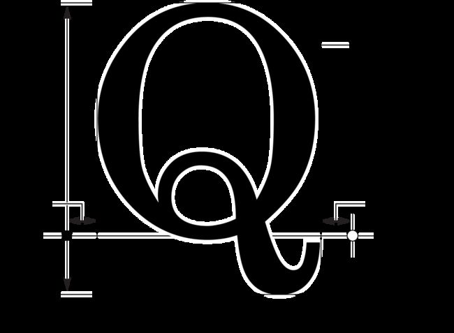
The layout manager lays out glyphs along an invisible line called the baseline. In roman text, the baseline is horizontal, and the bottom edge of most of the glyphs rest on it. Some glyphs extend below the baseline, including those for characters like “g” that have descenders, or “tails,” and large rounded characters like “O” that must extend slightly below the baseline to compensate for optical effects. Other writing systems place glyphs below or centered on the baseline. Every glyph includes an origin point that the layout manager uses to align it properly with the baseline.
布局管理器沿着一条称为基线的不可见线排列字形。 在罗马文本中,基线是水平的,大多数字形的底边依赖于它。 一些字形延伸到基线以下,包括具有下降字符的“g”或“尾”等字符,以及像“O”这样的大圆角字符必须稍微低于基线,以补偿光学效果。 其他书写系统将字形放在基线的下方或居中。 每个字形包括布局管理器用于将其正确与基准对齐的原点。
Glyph designers provide a set of measurements with a font, called metrics, which describe the spacing around each glyph in the font. The layout manager uses these metrics to determining glyph placement. In horizontal text, the glyph has a metric called the advance width, which measures the distance along the baseline to the origin point of the next glyph. Typically there is some space between the origin point and the left side of the glyph, which is called the left-side bearing. There may also be space between the right side of the glyph and the point described by the advance width, which is called the right-side bearing. The vertical dimension of the glyph is provided by two metrics called the ascent and the descent. The ascent is the distance from the origin (on the baseline) to the top of the tallest glyphs in the font. The descent, which is the distance below the baseline to the bottom of the font’s deepest descender. The rectangle enclosing the visible parts of the glyph is called the bounding rectangle or bounding box. Figure 2-4 illustrates these metrics.
字形设计师提供了一组称为度量的字体的测量,它们描述字体中每个字形周围的间距。布局管理器使用这些度量来确定字形位置。在水平文本中,字形具有称为提前宽度的度量,该度量测量沿着基线到下一个字形的原点的距离。通常,在字形的原点和左侧之间有一些空间,称为左侧轴承。在字形的右侧和由前进宽度描述的点之间也可能存在空格,称为右侧轴承。字形的垂直维度由称为上升和下降的两个指标提供。上升是从原点(基线)到字体中最高字形顶部的距离。下降,这是距离基线到字体最深的下降的底部的距离。封闭字形可见部分的矩形称为边界矩形或边界框。图2-4说明了这些指标。
By default, in horizontal text, typesetters place glyphs side-by-side using the advance width, resulting in a standard interglyph space. However, in some combinations, text is made more readable by kerning, which is shrinking or stretching the space between two glyphs. A very common example of kerning occurs between an uppercase W and uppercase A, as shown in Figure 2-5. Type designers include kerning information in the metrics for a font. The text system provides methods to turn kerning off, use the default settings provided with the font, or tighten or loosen the kerning throughout a selection of text.
默认情况下,在水平文本中,排版器使用前进宽度并排放置字形,被称作标准的间隔空间。 然而,在某些组合中,通过字距调整使文本变得更加易读,字距缩小或缩小两个字形之间的空间。 字母间距的一个很常见的例子是在大写字母W和大写字母A之间发生,如图2-5所示。 类型设计师包括字体指标中的字距信息。 文本系统提供关闭字距的方法,使用字体提供的默认设置,或在整个文本选择中收紧或松开字距。
Type systems usually measure font metrics in units called points, which measure exactly 72 per inch in most computer typesetting systems. Adding the distance of the ascent and the descent of a font provides the font’s point size.
类型系统通常以单位称为单位测量字体度量,在大多数计算机排版系统中,这些单位的测量精确为每英寸72。 添加上升和下降字体的距离可以提供字体的点大小。
Space added during typesetting between lines of type is called leading, after the slugs of lead used for that purpose in traditional metal-type page layout. The total amount of ascent plus descent plus leading provides a font’s line height. (Leading is sometimes also called linegap. It is often specified as a ratio of a font’s point size over the line height at which a block of text is set, such as 14/16.5.)
在排版之间添加的空间类型称为引导,在传统金属类页面布局中用于此目的的铅笔。上升加下降加前导的总量提供字体的行高。 (引导有时也称为线间隙,通常被指定为字体的点大小与设置文本块的行高度的比例,例如14 / 16.5)。
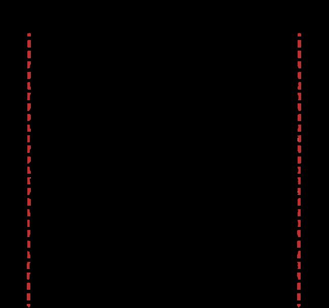
Although the preceding typographic concepts of type design may be somewhat esoteric, most people who have created documents on a computer or typewriter are familiar with the elements of text layout on a page. For example, the margins are the areas of white space between the edges of the page and the text area where the layout engine places glyphs. Alignment describes the way text lines are placed relative to the margins. For example, horizontal text can be aligned right, left, or centered, as shown in Figure 2-6.
虽然上述类型设计的排版概念可能有些深奥,但大多数在计算机或打字机上创建文档的人都熟悉页面上文本布局的元素。例如,边距是页面边缘与布局引擎放置字形的文本区域之间的空白区域。对齐方式描述文本行相对于边距放置的方式。例如,水平文本可以右对齐,左对齐或居中对齐,如图2-6所示。
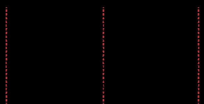
Lines of text can also be justified; for horizontal text the lines are aligned on both right and left margin by varying interword and interglyph spacing, as shown in Figure 2-7. The system performs alignment and justification, if requested, after the text stream has been broken into lines and hyphens added and other glyph substitutions made.
文本行也可以是正当的;对于水平文本,线条通过改变左右边距和间距间隔来对齐左右边距,如图2-7所示。在文本流被分解成行和连字符之后,如果需要,系统执行对齐和对齐,并进行其他字形替换。


