今天在Medium看到一篇用研方法的介绍—— 卡诺模型(The Kano Analysis)。用以分析一个产品功能是否能使用户满意,这种方法的优点是能得出一个实实在在的数据结论,帮助决策。计算方式也挺简单的,问卷操作也比较容易简单,成本很低。我本人特别喜欢这种能快速验证的低成本方法,能在有限的时间与人力资源条件下,也能快速得出可靠的数据参考与清晰的结论。正如我上一篇文章介绍的方法一样,能大大提高沟通效率,减少无谓的争吵。本方法对功能的五种划分也蛮有意思,让我想起锤子科技,锤子的手机就是特别注重软件上的Delightful Features而忽略其他硬件上的Required Features。这就恰恰解释了为何锤子销量与认知度不成正比。
原文我就不全翻了,我只把关键的内容翻下,由于Medium需要梯子,所以我在征得作者同意的情况下把原文粘贴在此。有梯子的同学请点此传送。
受行为科学家赫兹伯格的双因素理论的启发,东京理工大学教授狩野纪昭(Noriaki Kano)和他的同事Fumio Takahashi于1979年10月发表了《质量的保健因素和激励因素》(Motivator and Hygiene Factor in Quality)一文。
该方法把产品功能划分为以下五种:
Desired Features 期望功能
当提供此功能,用户满意度会提升,当不提供此功能,用户满意度会降低;
Required Features 必备功能
当优化此功能,用户满意度不会提升,当不提供此功能,用户满意度会大幅降低;
Delightful Features 魅力功能
用户意想不到的,如果不提供此功能,用户满意度不会降低,但当提供此功能,用户满意度会有很大提升;
Indifferent Features 无差异功能
无论提供或不提供此功能,用户满意度都不会有改变,用户根本不在意;
Anti-feature Features 反向功能
用户根本都没有此功能,提供后用户满意度反而会下降。
方法采用问卷提问的方式收集数据,最后通过数据整合得出一个功能的两个系数:满意系数 Satisfaction Coefficient 与 不满意系数 Dissatisfaction Coefficient。如果满意系数高于不满意系数,该功能值得做。
以下是原文内容 Let's Go:
The Kano Analysis
A Better Way Discover What Users Really Want From Your Product
by Brian O'Neill
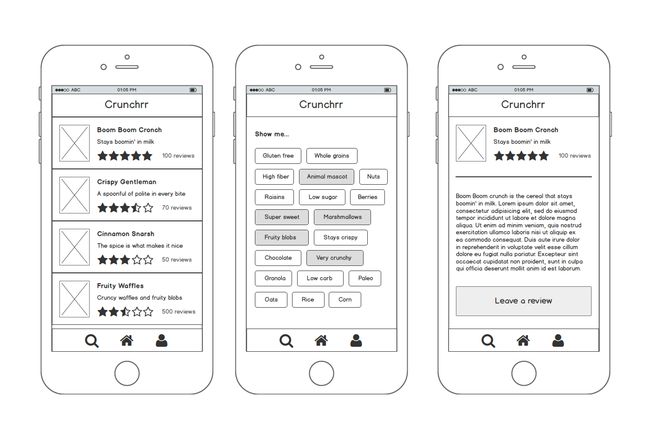
You’re on the design team for Crunchrr, a new app that helps users discover cereals they’ll love. Users can:
- Create a profile and connect with others
- Discover cereals based on their preferences
- Rate and review cereals
Crunchrr is in the hands of some early adopters who are loving its core features. Things are going great. That is, until the requests start rolling in.
Annelise from marketing says: “Crunchrr needs a map view so users can see where each cereal is made. People are really interested in where their food comes from nowadays, so this is really a must! Besides, every app has a map view.” Kevin from sales was at a meeting with a potential advertiser who asks: “Where’s the chatbot? You can’tnothave a chatbot. Conversational UI is the future!”
One of your early adopters pings you to suggest: “There should be a button so I can email the cereal maker to request a gluten-free version.” Another one says: “Maybe there could be something like Shazam for cereal. That way, if I’m in a restaurant I can take a picture of what the person at the next table is eating and it’ll show me what that cereal is.”
The next thing you know, your backlog is a gaggle of suggestions, requests, and demands. It seems that everyone has brilliant idea that justhasto go into the next release.
This can’t be avoided. Everyone has an opinion and given the opportunity, they’ll express it. And people easily fall into a “more is better” mentality. More features equals a better product, and the more of each feature, the better.
The obvious problem is that you can’t deliver on every request. Not only that, but all ideas aren’t created equal, and users are often at a loss as to how to articulate what they really want and need. On the other hand, internal stakeholders tend to view features in the narrow context of their own interests. How do you stop the madness?
“The most important thing that a team can do to help their design is to say no to almost any idea for a feature”
— Jared Spool
You need a way to predict user satisfaction that lets you prioritize feature releases and even re-evaluate existing features. And you need hard data to support your decisions about what goes into Crunchrr and when. That’s where theKano Modelcomes in.
The Kano Model
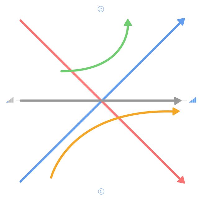
In 1984 professor Noriaki Kano presented a model that predicts how satisfied people will be with a product based on its features. Since then, the Kano Model has become a standard design tool because of how effectively it can make typically invisible ideas about quality visible. The core principle of the model is that satisfaction can be plotted along five distinct curves.[1]
Curve 1: Desired Features
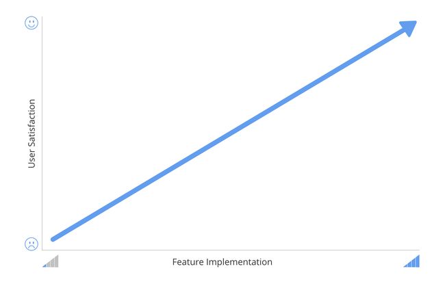
Remember when I said more isn’t always better? Well,sometimesit is it is. More storage space or battery life is better. Faster download speeds? Better. These are all examples of where the user will usually express greater satisfaction in direct proportion to how much of the feature they get.
With desired features, satisfaction is directly proportional to feature implementation
In the case of Crunchrr, desired features could be:
- Speed and responsiveness
- Number of users to connect with
- Suggestions based on stated preferences and past browsing behavior
- Options for quickly zeroing in on a kind of cereal (sorting, filtering, etc.)
- Size of cereal selection
Curve 2: Required Features
Required features are the ones users expect and take for granted.
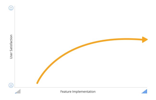
Users are dissatisfied when a required feature is not present and satisfied when it is. But that satisfaction levels off after a certain point. This makes sense when you think about it. If a wheel doesn’t roll, it will cause dissatisfaction. If it does roll, it will cause satisfaction. But it’s hard to get anyone excited about a wheel that rollsreally, reallywell. In the case of Crunchrr, as with most other apps, this could mean things like:
- Reliable uptime
- Search
- Ability to create a profile
- Easy log in/out
Curve 3: Delightful Features
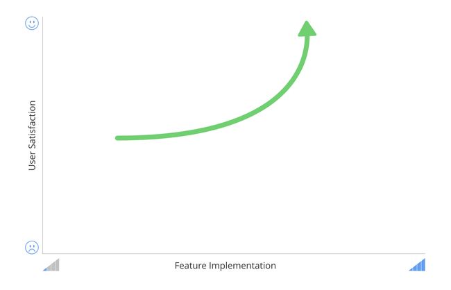
Delightful features are the ones that make an app fun to use and give it a personality. They’re the features you love, but don’t expect. It could be as simple as when the login form appears to shake its head when you enter the wrong credentials. Or it could be the tone of the writing or a fun mascot character or some unique interaction.
As you can see from the graph, users express increased satisfaction with delightful features. But there’s no dissatisfaction when they’re not present. Also, as with required features, there’s a limit to just how delighted a user can be. After a certain point, there are diminishing returns.
Annelise’s map view is probably an example of a delighter because it’s little more than eye candy, and it certainly isn’t solving any of the currently defined business needs for Crunchrr.
Delightful features are an important part of the user experience, and shouldn’t be ignored. Butthey come with a shelf life, in part because they’re so easily imitated. For a while, the swiping interaction was a big part of Tinder’s unique identity. Now, Tinder is justone of many appswhere users can swipe left or right. In other words, over time, delightful features go on to become desired or even required features.
Curve 4: Indifferent Features
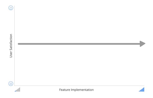
These are features the user simply doesn’t care about either way. Whether they’re implemented fully or not at all, they won’t change users’ opinions about the app, or change how they use it.
Curve 5: Anti-features
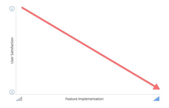
Anti-features are the features that users actively dislike. (Remember Clippy?) And the more these features are implemented, the greater the dissatisfaction. Anti-features are like the mirror opposite of desired features.
Putting it All Together
Looking at all of these features together not only provides a clear pictorial representation of how features will be perceived, but also helps you figure out strategic direction.
Desired Features:Resources should be invested heavily in these features, because they are key to user adoption and retention, as well as competitive advantage
Required Features:Resources should be invested heavily in these features, but only until basic needs have been met.
Delightful Features:It’s fine to invest resources here, but not at the expense of desired and required features. However, delightful features are often key differentiators that can build loyalty and buzz.
Indifferent Features and Anti-features:Resources should be invested only in identifying these so as not to waste cycles on building and implementing them.
By now I hope you’re sold on the Kano Model. Then the next question is: How do you find out which features belong to each category? That’s where the Kano Analysis comes in.
The Kano Analysis
To find out which features belong where, we need to ask our users. But remember, users are not usually great at identifying or expressing what they really want and need. The Kano Analysis accounts for this by asking questions in pairs: afunctional questionfollowed by adysfunctional question. Let’s go back to Annelise’s suggestion of a map view for Crunchrr. We could ask a question pair about this feature like this:
If Crunchrr let you see on a map where a brand of cereal is made, how would you feel?
If Crunchrr did not let you see on a map where a brand of cereal is made, how would you feel?
For both functional and dysfunctional questions, users must choose one of the following answers:
- I like it that way
- I expect it that way
- I am neutral about it
- I can live with it that way
- I dislike it that way
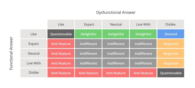
You would prepare an entire questionnaire in this style for each of the features in your backlog. Each user’s answers can then be analyzed by plotting its outcome in the following table.
It should be clear that if a user likes it when the feature is present and dislikes it when it’s not, then that is a desired feature. The designation ofquestionablehappens when the answers apparently contradict each other. (This is often the result of the user not understanding the question.)
Great. We’re almost done. The final piece is to aggregate all of the survey responses to find the overall results for each feature. (Alternatively, you could break this down even further and aggregate responses based on personas.)
Coefficients
After you’ve aggregated all of the responses, you’ll calculate the satisfaction and dissatisfaction coefficients. The satisfaction coefficient is a number between 0 and 1: the closer to 1, the stronger the influence on satisfaction. The dissatisfaction coefficient is a number between 0 and -1: the closer the closer to -1, the stronger the influence on dissatisfaction. We calculate the coefficients with these formulas:
Let’s say that the aggregated responses for the map view breaks down like this:
Desired: 5%
Required: 12%
Delightful: 4%
Indifferent: 23%
Anti-feature: 31%
Questionable: 25%
That would give you these results:
Satisfaction: (4 + 5) / (4 + 5 + 12 + 23) =0.2045
Dissatisfaction: (5 + 12) / (4 + 5 + 12 + 23) * (-1) = -0.3864
As you can see, the map view feature is having a significantly stronger influence on dissatisfaction than on satisfaction. This clearly indicates that we should leave it out of Crunchrr. Sorry, Annelise! (Actually, if you saw these results in the real world, you wouldn’t even need to calculate the coefficients. Seeing 31% anti-feature and 25% questionable is enough to tell you not to include this feature. I used these exaggerated figures to highlight the differences produced in the coefficients.)
Other times, the coefficients will show little difference in influence. Cases like those will require a judgement call or re-testing.
In Closing
A Kano Analysis is cheap and easy to perform and provides clear vision into what users actually want and expect from your product. It also provides hard data, which breaks everyone out of the trap of biased or shortsighted thinking. There’s no need to argue and debate with internal stakeholders about which features are in or out. The numbers don’t lie!
Brian O’Neill @brianeoneill is a designer in the San Francisco Bay Area, currently at NVIDIA.
[1]These curves go by many different names, depending on the source. I picked these names arbitrarily. In the end, it doesn’t matter what they’re called.
