用python统计数据并画出图表分析数据
这里使用的数据是某地区影响发生火灾的因素以及火灾情况。
总体思想是创建一个类,在类里面创建处理数据的函数。
import pandas as pd
import matplotlib.pyplot as plt
import numpy as np
from sklearn.cluster import KMeans #引入sklearn模块里的机器学习算法Kmeans
class fireArea():
def detectDate(self,filePath):
'''
探索数据
:param filePath:
:return:
'''
df = pd.read_csv(filePath)
describe = df.describe(include='all')
print(describe.T)
df.to_excel('data/forestfires.xls')
pass
def cleanData(self, filePath):
'''
:param filePath:
:return:
'''
df = pd.read_csv(filePath)
df.to_excel('data/cleaned.xls')
pass
def chooseData(self, filePath):
'''
拿出自己需要的数据
:param filePath:
:return:
'''
df = pd.read_excel(filePath)
df = df[['FFMC', 'DMC', 'DC', 'ISI', 'temp', 'RH', 'wind', 'area']]
df.to_excel('data/coredata.xls')
pass
def standardData(self, filePath):
'''
一般标准化的方式:(原数据-平均值)/标准差
:param filrPath:
:return:
'''
df = pd.read_excel(filePath)
df = (df - np.mean(df, axis=0))/np.std(df, axis=0)
df[['FFMC', 'DMC', 'DC', 'ISI', 'temp', 'RH', 'wind', 'area']].to_excel('data/stdcoredata.xls')
pass
def classifyData(self,filePath, k=8):
df = pd.read_excel(filePath)
kmeans = KMeans(k)
kmeans.fit(df[['FFMC', 'DMC', 'DC', 'ISI', 'temp', 'RH', 'wind', 'area']])
print(kmeans.cluster_centers_)
print(kmeans.labels_)
df['label'] = kmeans.labels_
# df.to_excel('data/air_result.xls')
coreData = pd.DataFrame(kmeans.cluster_centers_)
# coreData.to_excel('data/air_core.xls')
coreData = np.array(kmeans.cluster_centers_)
#
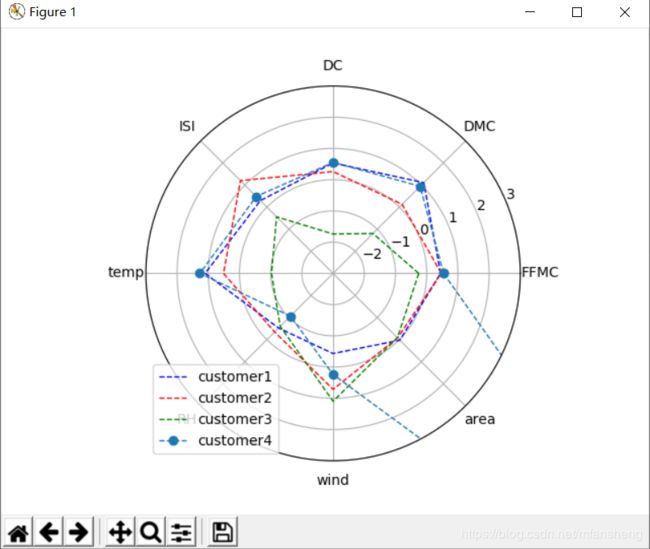
#绘制雷达图
#1.组织数据
#构造x轴值
xdata = np.linspace(0, 2*np.pi, k, endpoint=False)
xdata = np.concatenate((xdata, [xdata[0]]))
ydata1 = np.concatenate((coreData[0], [coreData[0][0]]))
ydata2= np.concatenate((coreData[1], [coreData[1][0]]))
ydata3 = np.concatenate((coreData[2], [coreData[2][0]]))
ydata4= np.concatenate((coreData[3], [coreData[3][0]]))
fig = plt.figure()
ax = fig.add_subplot(111, polar=True)
ax.plot(xdata, ydata1, 'b--', linewidth=1, label='customer1')
ax.plot(xdata, ydata2, 'r--', linewidth=1, label='customer2')
ax.plot(xdata, ydata3, 'g--', linewidth=1, label='customer3')
ax.plot(xdata, ydata4, 'o--', linewidth=1, label='customer4')
ax.set_thetagrids(xdata * 180 / np.pi, ['FFMC', 'DMC', 'DC', 'ISI', 'temp', 'RH', 'wind', 'area'])
ax.set_rlim(-3, 3)
plt.legend(loc='best')
plt.show()
print(xdata)
pass
pass
if __name__ == '__main__':
ad = fireArea()
# ad.detectDate('data/forestfires.csv')
#ad.cleanData('data/forestfires.csv')
# ad.chooseData('data/cleaned.xls')
#ad.standardData('data/coredata.xls')
ad.classifyData('data/stdcoredata.xls', k=8)
pass运行结果为:
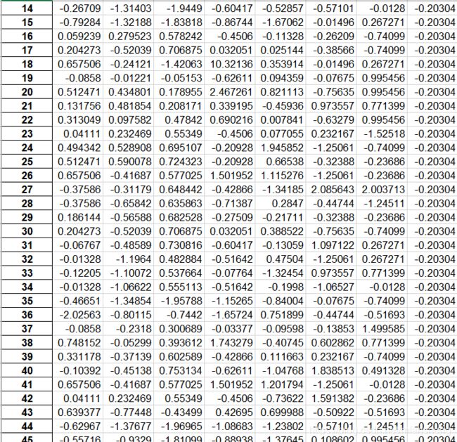
有一个数据发现它越界了,是因为有一天森林烧毁的面积非常大,这种数据还是有用的数据,不能删除。
下面是处理数据的情况(这个方法适合处理所有类型数据,只需要把相应的元素名变一下,代码稍作改动就好了):
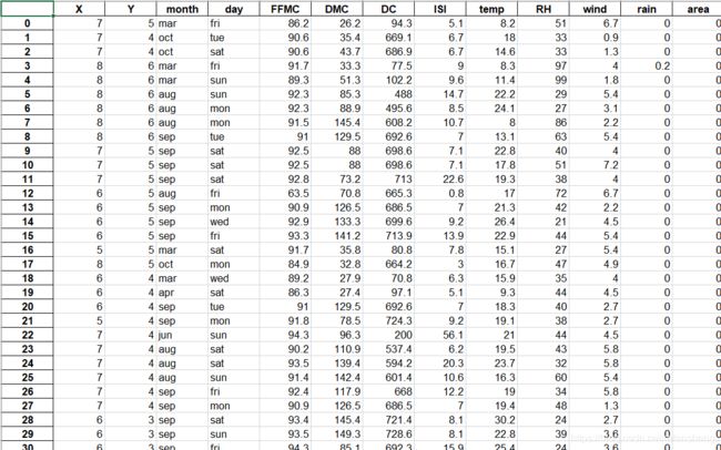
1.原始数据(数据有很多条,这里只是截取一小部分)
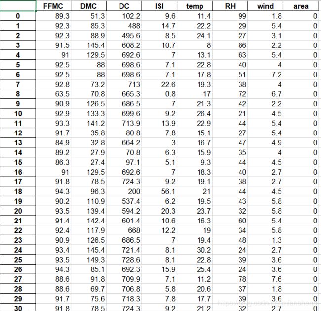
2.处理好的数据(去除不要的数据)
3.把需要的数据标准化,方便分类
4.画图