echarts自定义鼠标悬浮显示效果
最近在做报表系统,用到了大量的图表显示效果,下面总结一下我使用过程中遇到的问题及解决办法。本教程主要讲解了:鼠标悬浮时自定义显示效果、Y轴显示金额柱状图上面显示百分比、修改X、Y轴坐标颜色、两个Y轴实现水平线一致。(我描述的可能不好,请看图来理解)
点击进入echarts官方网址demo将下面的代码直接复制粘贴即可
1.鼠标悬浮时自定义显示效果、修改X、Y轴坐标颜色
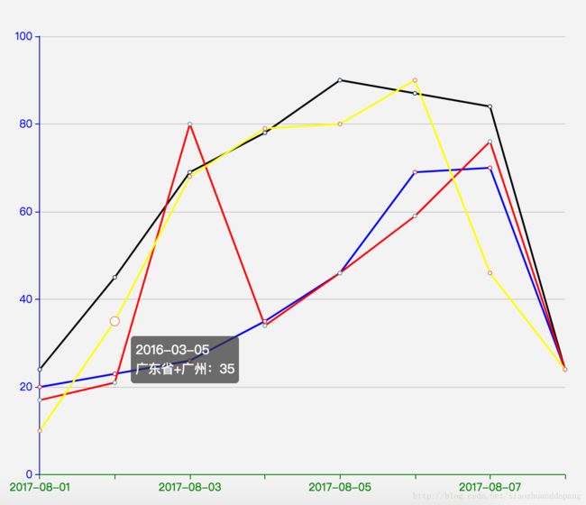
var brokenName = ['广东省+深圳','广东省+潮州','广东省+福建','广东省+广州'];
var brokenData = [[20,23,26,35,46,69,70,24],[24,45,69,78,90,87,84,24],[17,21,80,34,46,59,76,24],[10,35,68,79,80,90,46,24]];

var dataArr = ["2016-03-04", "2016-03-05","2016-03-06","2016-03-07","2016-03-08","2016-03-09","2016-03-10","2016-03-11"];

option = {
     tooltip: {
        formatter: function(params, ticket, callback) {
            return dataArr[params.dataIndex] + "
" +
            params.seriesName + ":" + params.value;
        }
    },
    grid: {
        left: '3%',
        right: '4%',
        bottom: '3%',
        containLabel: true
    },
    xAxis: {
        type: 'category',
        boundaryGap: false,
        axisLabel: {
            show: true,
            textStyle: {
                color: 'green'
            }
        },
        axisLine:{
            show:true,
            lineStyle:{
                color:'green'
            }
        },
        data: ['2017-08-01','','2017-08-03','','2017-08-05','','2017-08-07','']
    },
    yAxis: [{
        type: 'value',
        axisLabel:{
            show: true,
            textStyle: {
                color: 'blue'
            }
        },
        axisLine:{
            show:true,
            lineStyle:{
                color:'blue'
            }
        }
    }],
    series:[{
            name:brokenName[0],
            type:'line',
            lineStyle:{
                normal:{
                    width:2,
                    color:'blue'
                }
            },
            data:brokenData[0]
    },{
            name:brokenName[1],
            type:'line',
            lineStyle:{
                normal:{
                    width:2,
                    color:'black'
                }
            },
            data:brokenData[1]

    },{
            name:brokenName[2],
            type:'line',
            lineStyle:{
                normal:{
                    width:2,
                    color:'red'
                }
            },
            data:brokenData[2]

    },{
            name:brokenName[3],
            type:'line',
            lineStyle:{
                normal:{
                    width:2,
                    color:'yellow'
                }
            },
            data:brokenData[3]
    }]
};
2.Y轴显示金额柱状图上面显示百分比

var dataset = {
    "直连": [9, 8, 7, 8, 4],
    "间连": [3, 4, 6, 2, 6]
};
var key = ['2016/06/01','2016/06/03','2016/06/05','2016/06/07','2016/06/09'];
var dataNum = {};
for (var x in dataset["直连"]) {
    dataNum[key[x]] =dataset["直连"][x]+dataset["间连"][x];
}
option = {
    title : {
        subtext:'万\n元',
    },
    tooltip : {
        trigger: 'axis',
        axisPointer : {            // 坐标轴指示器,坐标轴触发有效
            type : 'none'        // 默认为直线,可选为:'line' | 'shadow'
        }
    },
    legend: {
        x:'center',
        y: 'bottom',
        data:['直连','间连']
    },
    grid: {
        right: '4%',
        bottom: '8%',
        containLabel: true
    },
    xAxis : [
        {
            type : 'category',
            data : ['2016/06/01','2016/06/03','2016/06/05','2016/06/07','2016/06/09']
        }
    ],
    yAxis : [
        {
            type : 'value'
        }
    ],
    series : [
        {
            name:'直连',
            type:'bar',
            barWidth : 40,
            stack: '搜索引擎',
            label: {
                normal: {
                    show: true,
                    position: 'inside',
                    formatter: function(params) {
                        return Math.round(params.value/dataNum[params.name]*1000)/10+"%";
                    },
                    textStyle:{color:'black'}
                }
            },
            data:[9, 8,7,8,4]
        },
        {
            name:'间连',
            type:'bar',
            stack: '搜索引擎',
            label: {
                normal: {
                    show: true,
                    position: 'inside',
                    formatter: function(params) {
                        return Math.round(params.value/dataNum[params.name]*1000)/10+"%";
                    },
                    textStyle:{color:'black'}
                }
            },
            data:[3, 4, 6, 2, 6]
        }
    ],
    color:['green','red']
};
3.Y轴坐标颜色、两个Y轴实现水平线一致
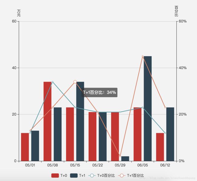
option = {
     tooltip: {
        formatter: function(params, ticket, callback) {
            var showContent = params.seriesName + ":" + params.value;
            if (params.seriesIndex > 1) {
                return showContent + "%";
            }
            return showContent;
        }
    },
        legend: {
            x:'center',
            y: 'bottom',
            data:['T+0','T+1',"T+0百分比",'T+1百分比']
        },
        xAxis: [
            {
                type: 'category',
                data: ['05/01','05/08','05/15','05/22','05/29','06/05','06/12'],
                axisPointer: {
                    type: 'none'
                }
            }
        ],
        yAxis: [
            {
                type: 'value',
                name: '万\n元',
                min: 0,
                max: 60,
                interval: 20,
            },
            {
                type: 'value',
                name: '百\n分\n比',
                min: 0,
                max: 60,
                interval: 20,
                axisLabel: {
                    formatter: '{value}%'
                }
            }
        ],
        series: [
            {
                name:'T+0',
                type:'bar',
                yAxisIndex: 0,
                data:[12,34,23,21,21,23,12]
            },
            {
                name:'T+1',
                type:'bar',
                yAxisIndex: 0,
                data:[13,23,34,21,2,45,23]
            },
            {
                name:'T+0百分比',
                type:'line',
                yAxisIndex: 1,
                data:[12,34,23,21,21,23,12]
            },
            {
                name:'T+1百分比',
                type:'line',
                yAxisIndex: 1,
                data:[13,23,34,21,2,45,23]
            }
        ]
    };