弦图(Echarts)
弦图
弦图主要用来表示一组节点之间的联系关系,包括外部节点和内部连接节点的边。其中,边的宽度表示对应边的权重,即弦。并且弦是带有方向的,所以在绘制弦图我们一般是以一个环形来布局。
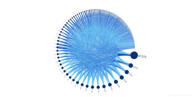
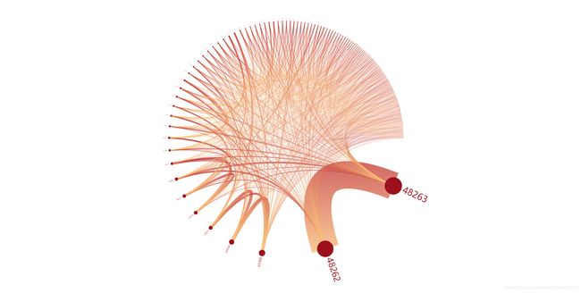
本篇博客以港口间的海运贸易数据为例,下图为最后的渲染效果:
数据格式
1、港口数据集合,包括了港口代号和港口贸易频次:
var ports = [
	{name:"48263",value:1717},  //港口索引+港口贸易频次
	{name:"48262",value:1625},
	{name:"43388",value:626},
	... ...
]
2、货流数据集合,包括OD港口代码以及对应的货流贸易频次:
var links = [
	{source:"48263",target:"48262",value:544},  //O点港口索引,D点港口索引,货流贸易频次
	{source:"48262",target:"48263",value:543},
	{source:"43420",target:"43388",value:70},
	... ...
]
设置样式
通过数组循环,依据频次来设置节点的符号大小、弦的宽度:
ports.forEach(function (node) {
    node.symbolSize = node.value /20;
    node.label = {
         normal: {
              show: node.symbolSize > 2,
              fontSize :30*node.value/1630
         }
    };
});
function weight(link) {
    if(link.value=="undefined"){
        return 1;
    }else{
        return link.value/4
    }
}

links.forEach(function (link) {
    link.lineStyle={
        normal:{
            width:weight(link),
            opacity:0.5
        }
    };
});
设置option
option = {
    animationDurationUpdate: 1500,
    animationEasingUpdate: 'quinticInOut',
    series : [
        {
            name: '货流',
            type: 'graph',
            layout: 'circular',
            circular: {
                rotateLabel: true
            },
            data: ports,
            links: links,
            roam: true,
            label: {
                normal: {
                    position: 'right',
                    formatter: '{b}'
                }
            },
            itemStyle:{
                normal: {
                    color:'#0f3475'
                }
            },
            lineStyle: {
                normal: {
                    color: {
                        type: 'linear',
                        x: 0,
                        y: 0,
                        x2: 0,
                        y2: 1,
                        colorStops: [{
                            offset: 0, color: '#1551c2'
                        }, {
                            offset: 1, color: '#7be0ff'
                        }],
                        globalCoord: false
                    },
                    curveness: 0.3,
                    opacity:0.2
                }
            }
        }
    ]
};
当然,自定义样式不仅仅修改颜色和大小,大家可以根据官方配置文档试试其他样式的设置!