06_ 行销(Marketing)客户分析:了解客户的行为
行销(Marketing)客户分析:了解客户的行为
- Load the packages
- Load the packages
- Analytics on Engaged Customers
- Customer Segmentation by CLV & Months Since Policy Inception
客户分析是一个通过分析客户行为数据来了解和了解客户行为的过程。它的范围从简单的数据分析和可视化到更高级的客户细分和预测分析。然后,可以将通过客户分析获得的信息和见解用于制定营销策略,优化销售渠道以及制定其他关键业务决策。客户分析的重要性正在上升。由于对许多企业而言,访问客户数据变得更加容易,并且由于客户现在可以更轻松地访问其他竞争对手提供的类似产品和内容的数据和信息,因此对于许多企业而言,能够理解和预测其潜在客户至关重要购买或查看。您对客户的了解越深,您对竞争对手的竞争能力就越强。常见的客户分析有以下几个:
- 销售渠道分析
通过分析销售渠道数据,我们可以监视和跟踪客户的生命周期,从而获得有用的信息例如他们通过哪个营销渠道注册,他们登录系统的频率,他们浏览和购买的产品类型或下降的方式。
- 客户细分
客户细分通过识别相似客户的子组,我们可以更好地了解目标人群。例如,低参与度客户的营销策略应与高参与度客户的营销策略应该不同。通过按参与度有效地细分客户群,我们可以更深入地了解不同客户群的行为以及对不同营销策略的反应。这可以进一步帮助更好地定位特定的客户子群体。
- 预测分析
借助客户数据,我们可以更深入地了解客户的哪些属性和特征与我们需要的结果高度相关。例如,如果想提高响应速度和参与度,则可以分析数据以识别那些可以提高响应速度和参与度的客户特征。然后,您可以建立预测模型,以预测客户对我们的营销信息做出响应的可能性。使用预测分析的另一个示例可以用于营销渠道优化。借助从客户分析中获得的见解,我们可以构建预测模型来优化营销渠道。客户将对不同的营销渠道做出不同的反应。例如,年轻一代使用智能手机的人数要比其他人群更多,则更有可能通过智能手机应对营销。另一方面,更多的高级人群更有可能对电视或报纸广告等传统媒体上的营销做出更好的反应。使用客户分析,我们可以确定客户的某些属性与不同营销渠道的绩效之间的关联。
在这篇文章里,我们将讨论如何使用客户分析来监视和跟踪不同的营销策略,以及了解一些细分和分析客户群以获取见解和有用信息的方法。我们的数据集也来自于Kaggle的 WA_Fn-UseC_-Marketing-Customer-Value-Analysis.csv
# This Python 3 environment comes with many helpful analytics libraries installed
# It is defined by the kaggle/python Docker image: https://github.com/kaggle/docker-python
# For example, here's several helpful packages to load

import numpy as np # linear algebra
import pandas as pd # data processing, CSV file I/O (e.g. pd.read_csv)

# Input data files are available in the read-only "../input/" directory
# For example, running this (by clicking run or pressing Shift+Enter) will list all files under the input directory

import os
for dirname, _, filenames in os.walk('/kaggle/input'):
    for filename in filenames:
        print(os.path.join(dirname, filename))

# You can write up to 5GB to the current directory (/kaggle/working/) that gets preserved as output when you create a version using "Save & Run All"
# You can also write temporary files to /kaggle/temp/, but they won't be saved outside of the current session
/kaggle/input/ibm-watson-marketing-customer-value-data/WA_Fn-UseC_-Marketing-Customer-Value-Analysis.csv
Load the packages
import matplotlib.pyplot as plt
import pandas as pd
%matplotlib inline
Load the packages
df = pd.read_csv('../input/ibm-watson-marketing-customer-value-data/WA_Fn-UseC_-Marketing-Customer-Value-Analysis.csv')
df.head(3)
| Customer | State | Customer Lifetime Value | Response | Coverage | Education | Effective To Date | EmploymentStatus | Gender | Income | ... | Months Since Policy Inception | Number of Open Complaints | Number of Policies | Policy Type | Policy | Renew Offer Type | Sales Channel | Total Claim Amount | Vehicle Class | Vehicle Size | |
|---|---|---|---|---|---|---|---|---|---|---|---|---|---|---|---|---|---|---|---|---|---|
| 0 | BU79786 | Washington | 2763.519279 | No | Basic | Bachelor | 2/24/11 | Employed | F | 56274 | ... | 5 | 0 | 1 | Corporate Auto | Corporate L3 | Offer1 | Agent | 384.811147 | Two-Door Car | Medsize |
| 1 | QZ44356 | Arizona | 6979.535903 | No | Extended | Bachelor | 1/31/11 | Unemployed | F | 0 | ... | 42 | 0 | 8 | Personal Auto | Personal L3 | Offer3 | Agent | 1131.464935 | Four-Door Car | Medsize |
| 2 | AI49188 | Nevada | 12887.431650 | No | Premium | Bachelor | 2/19/11 | Employed | F | 48767 | ... | 38 | 0 | 2 | Personal Auto | Personal L3 | Offer1 | Agent | 566.472247 | Two-Door Car | Medsize |
3 rows ?? 24 columns
Analytics on Engaged Customers
Overall Engagement Rate
df.groupby('Response').count()['Customer']
Response
No     7826
Yes    1308
Name: Customer, dtype: int64
ax = df.groupby('Response').count()['Customer'].plot(
    kind='bar',
    color='skyblue',
    grid=True,
    figsize=(10, 7),
    title='Marketing Engagment'
)

ax.set_xlabel('Engaged')
ax.set_ylabel('Count')

plt.show()
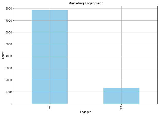
df.groupby('Response').count()['Customer']/df.shape[0]
Response
No     0.856799
Yes    0.143201
Name: Customer, dtype: float64
From these results, we can see that only about 14% of the customers responded to the marketing calls.
Engagement Rates by Offer Type
by_offer_type_df = df.loc[
    df['Response'] == 'Yes'
].groupby([
    'Renew Offer Type'
]).count()['Customer']/df.groupby('Renew Offer Type').count()['Customer']

by_offer_type_df
Renew Offer Type
Offer1    0.158316
Offer2    0.233766
Offer3    0.020950
Offer4         NaN
Name: Customer, dtype: float64
ax = (by_offer_type_df*100.0).plot(
    kind='bar',
    figsize=(7, 7),
    color='skyblue',
    grid=True
)

ax.set_ylabel('Engagement Rate (%)')

plt.show()
As you can easily notice from this plot, Offer2 had the highest engagement rate among the customers.
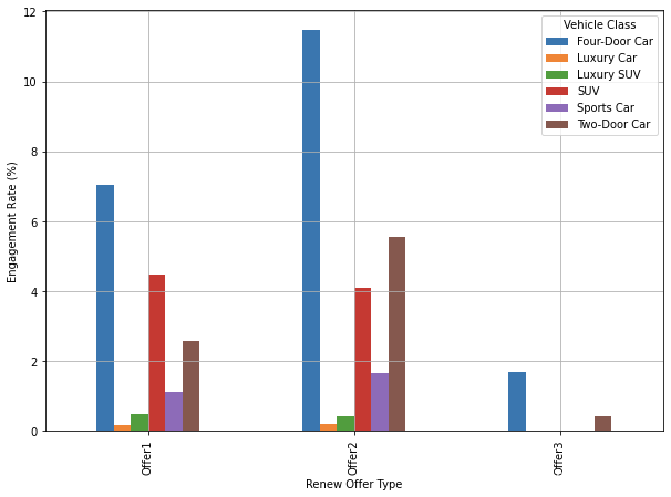
Offer Type & Vehicle Class
by_offer_type_df = df.loc[
    df['Response'] == 'Yes'
].groupby([
    'Renew Offer Type', 'Vehicle Class'
]).count()['Customer']/df.groupby('Renew Offer Type').count()['Customer']

by_offer_type_df
Renew Offer Type  Vehicle Class
Offer1            Four-Door Car    0.070362
                  Luxury Car       0.001599
                  Luxury SUV       0.004797
                  SUV              0.044776
                  Sports Car       0.011194
                  Two-Door Car     0.025586
Offer2            Four-Door Car    0.114833
                  Luxury Car       0.002051
                  Luxury SUV       0.004101
                  SUV              0.041012
                  Sports Car       0.016405
                  Two-Door Car     0.055366
Offer3            Four-Door Car    0.016760
                  Two-Door Car     0.004190
Name: Customer, dtype: float64
by_offer_type_df = by_offer_type_df.unstack().fillna(0)
by_offer_type_df
| Vehicle Class | Four-Door Car | Luxury Car | Luxury SUV | SUV | Sports Car | Two-Door Car |
|---|---|---|---|---|---|---|
| Renew Offer Type | ||||||
| Offer1 | 0.070362 | 0.001599 | 0.004797 | 0.044776 | 0.011194 | 0.025586 |
| Offer2 | 0.114833 | 0.002051 | 0.004101 | 0.041012 | 0.016405 | 0.055366 |
| Offer3 | 0.016760 | 0.000000 | 0.000000 | 0.000000 | 0.000000 | 0.004190 |
ax = (by_offer_type_df*100.0).plot(
    kind='bar',
    figsize=(10, 7),
    grid=True
)

ax.set_ylabel('Engagement Rate (%)')

plt.show()
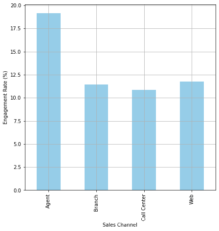
Engagement Rates by Sales Channel
by_sales_channel_df = df.loc[
    df['Response'] == 'Yes'
].groupby([
    'Sales Channel'
]).count()['Customer']/df.groupby('Sales Channel').count()['Customer']

by_sales_channel_df
Sales Channel
Agent          0.191544
Branch         0.114531
Call Center    0.108782
Web            0.117736
Name: Customer, dtype: float64
ax = (by_sales_channel_df*100.0).plot(
    kind='bar',
    figsize=(7, 7),
    color='skyblue',
    grid=True
)

ax.set_ylabel('Engagement Rate (%)')

plt.show()
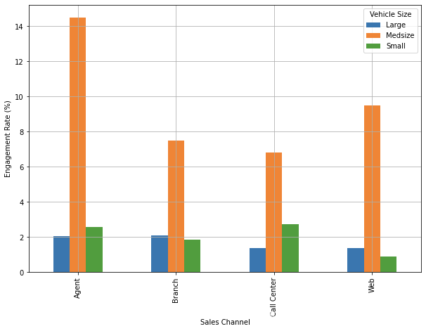
Sales Channel & Vehicle Size
by_sales_channel_df = df.loc[
    df['Response'] == 'Yes'
].groupby([
    'Sales Channel', 'Vehicle Size'
]).count()['Customer']/df.groupby('Sales Channel').count()['Customer']

by_sales_channel_df
Sales Channel  Vehicle Size
Agent          Large           0.020708
               Medsize         0.144953
               Small           0.025884
Branch         Large           0.021036
               Medsize         0.074795
               Small           0.018699
Call Center    Large           0.013598
               Medsize         0.067989
               Small           0.027195
Web            Large           0.013585
               Medsize         0.095094
               Small           0.009057
Name: Customer, dtype: float64
by_sales_channel_df = by_sales_channel_df.unstack().fillna(0)
by_sales_channel_df
| Vehicle Size | Large | Medsize | Small |
|---|---|---|---|
| Sales Channel | |||
| Agent | 0.020708 | 0.144953 | 0.025884 |
| Branch | 0.021036 | 0.074795 | 0.018699 |
| Call Center | 0.013598 | 0.067989 | 0.027195 |
| Web | 0.013585 | 0.095094 | 0.009057 |
ax = (by_sales_channel_df*100.0).plot(
    kind='bar',
    figsize=(10, 7),
    grid=True
)

ax.set_ylabel('Engagement Rate (%)')

plt.show()
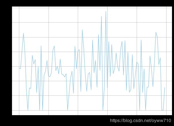
Engagement Rates by Months Since Policy Inception
by_months_since_inception_df = df.loc[
    df['Response'] == 'Yes'
].groupby(
    by='Months Since Policy Inception'
)['Response'].count() / df.groupby(
    by='Months Since Policy Inception'
)['Response'].count() * 100.0

by_months_since_inception_df.fillna(0)
Months Since Policy Inception
0     14.457831
1     14.117647
2     20.224719
3     26.315789
4     19.780220
        ...
95    15.584416
96    17.910448
97     0.000000
98     0.000000
99     7.692308
Name: Response, Length: 100, dtype: float64
ax = by_months_since_inception_df.fillna(0).plot(
    figsize=(10, 7),
    title='Engagement Rates by Months Since Inception',
    grid=True,
    color='skyblue'
)

ax.set_xlabel('Months Since Policy Inception')
ax.set_ylabel('Engagement Rate (%)')

plt.show()
Customer Segmentation by CLV & Months Since Policy Inception
df['Customer Lifetime Value'].describe()
count     9134.000000
mean      8004.940475
std       6870.967608
min       1898.007675
25%       3994.251794
50%       5780.182197
75%       8962.167041
max      83325.381190
Name: Customer Lifetime Value, dtype: float64
df['CLV Segment'] = df['Customer Lifetime Value'].apply(
    lambda x: 'High' if x > df['Customer Lifetime Value'].median() else 'Low'
)
df['Months Since Policy Inception'].describe()
count    9134.000000
mean       48.064594
std        27.905991
min         0.000000
25%        24.000000
50%        48.000000
75%        71.000000
max        99.000000
Name: Months Since Policy Inception, dtype: float64
df['Policy Age Segment'] = df['Months Since Policy Inception'].apply(
    lambda x: 'High' if x > df['Months Since Policy Inception'].median() else 'Low'
)
ax = df.loc[
    (df['CLV Segment'] == 'High') & (df['Policy Age Segment'] == 'High')
].plot.scatter(
    x='Months Since Policy Inception',
    y='Customer Lifetime Value',
    logy=True,
    color='red'
)

df.loc[
    (df['CLV Segment'] == 'Low') & (df['Policy Age Segment'] == 'High')
].plot.scatter(
    ax=ax,
    x='Months Since Policy Inception',
    y='Customer Lifetime Value',
    logy=True,
    color='blue'
)

df.loc[
    (df['CLV Segment'] == 'High') & (df['Policy Age Segment'] == 'Low')
].plot.scatter(
    ax=ax,
    x='Months Since Policy Inception',
    y='Customer Lifetime Value',
    logy=True,
    color='orange'
)

df.loc[
    (df['CLV Segment'] == 'Low') & (df['Policy Age Segment'] == 'Low')
].plot.scatter(
    ax=ax,
    x='Months Since Policy Inception',
    y='Customer Lifetime Value',
    logy=True,
    color='green',
    grid=True,
    figsize=(10, 7)
)

ax.set_ylabel('CLV (in log scale)')
ax.set_xlabel('Months Since Policy Inception')

ax.set_title('Segments by CLV and Policy Age')

plt.show()
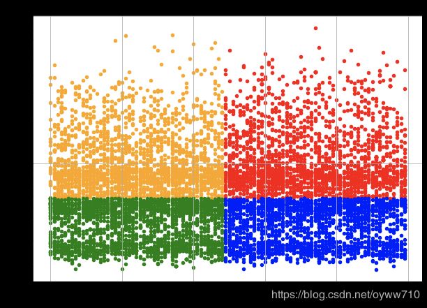
As you can see from this scatter plot, the data points in red represent those customers in the High CLV and High Policy Age segment. Those in orange represent the High CLV and Low Policy Age group, those in blue represent the Low CLV and High Policy Age group, and lastly, those in green represent the Low CLV and Low Policy Age group.
engagment_rates_by_segment_df = df.loc[
    df['Response'] == 'Yes'
].groupby(
    ['CLV Segment', 'Policy Age Segment']
).count()['Customer']/df.groupby(
    ['CLV Segment', 'Policy Age Segment']
).count()['Customer']

engagment_rates_by_segment_df
CLV Segment  Policy Age Segment
High         High                  0.138728
             Low                   0.132067
Low          High                  0.162450
             Low                   0.139957
Name: Customer, dtype: float64
ax = (engagment_rates_by_segment_df.unstack()*100.0).plot(
    kind='bar',
    figsize=(10, 7),
    grid=True
)

ax.set_ylabel('Engagement Rate (%)')
ax.set_title('Engagement Rates by Customer Segments')

plt.show()
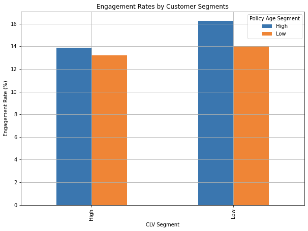
High Policy Age Segment has higher engagement than the Low Policy Age Segment. This suggests that those customers who have been insured by this company longer respond better. It is also noticeable that the High Policy Age and Low CLV segment has the highest engagement rate among the four segments.