微信小程序自定义组件,模态框详细案例,自定义事件,组件传值
最近一直在学习微信小程序,小程序自带的组件有限,自己开发一些组件应用与项目,下面是一个自定义模态框的案例
1.第一步,这个应该比较简单了,创建一个组件,新建文件夹命名为components,在components文件夹中创建文件(文件类型为component)
(1)新建文件夹命名为components
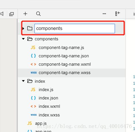
(2)在components文件夹中创建文件(文件类型为component)
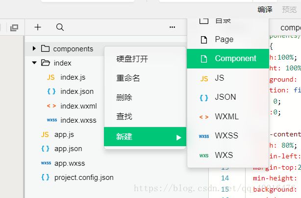
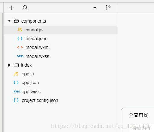
(3)命名为modal,会生成以下目录
2.准备工作已经做好,下面直接上代码
modal.wxml文件:
        {{modalTitle}}


         {{modalMsg}}


        取消
        确定
由于个人写代码的习惯,习惯初始化一些公共样式:app.wxss
page{
  font-size: 28rpx;
}
view,text,image,button,input,label,radio,picker,picker-view,slider,form,checkbox,swiper,button{
  box-sizing: border-box;
  font-family: "微软雅黑",Helvetica,Arial,sans-serif;
}
modal.wxss文件
/* components/modal.wxss */
.modal{
  width:100%;
  height: 100%;
  background: rgba(0,0,0,0.5);
  position: fixed;
  top: 0;
  left:0;
}
.modal-content{
  width: 80%;
  margin-left: 10%;
  margin-top:200rpx;
  min-height: 300rpx;
  background: #fff;
  position: relative;
}
.modal-top{
  padding: 20rpx;
  background: #f2f2f2;
}
.modal-body{
   padding:20rpx;
}
.modal-footer{
  padding: 20rpx;
  border-top: 1px solid #f2f2f2;
   position: absolute;
  bottom: 0;
  left:0;
  width: 100%;
  display: flex;
  justify-content: flex-end;
}
.cancle{
  width: 100rpx;height: 50rpx;
  line-height: 50rpx;
  border: 1px solid #f2f2f2;
  text-align: center;
  margin-right: 20rpx;
  border-radius: 6rpx;
}
.sure{
  width: 100rpx;height: 50rpx;
  line-height: 50rpx;
  text-align: center;
  border-radius: 6rpx;
  background: #f2f2f2;
}
// components/modal.js
Component({
/**
* 组件的属性列表
*/
properties: {
modalHidden:{
type:Boolean,
value:true
},
modalMsg: {
type: String,
value: ' ',
},
modalTitle: {
type: String,
value: ' ',
}
},
/**
* 组件的初始数据
*/
data: {
},
/**
* 组件的方法列表
*/
methods: {
//隐藏弹框
hideModal() {
this.setData({
isShow: !this.data.isShow
})
},
//展示弹框
showModal() {
this.setData({
isShow: !this.data.isShow
})
},
_cancelEvent() {
//触发取消回调
this.triggerEvent("cancelEvent")
},
_confirmEvent() {
//触发成功回调
this.triggerEvent("confirmEvent");
}
}
})
3.组件已经建立好,下面就是调用了
(1)在调用页面index.json文件中加入以下代码,声明调用哪个组件,即提供每个自定义组件的标签名和对应的自定义组件文件路径:
{
  "usingComponents": {
    "modal": "/components/modal"
  }
}
(2)index.wxml文件
(3)index.js
const app = getApp()
Page({
data: {
},
onReady: function () {
//获得modal组件
this.modal= this.selectComponent("#modal");
},
showDialog() {
this.modal.showModal();
},
_cancelEvent() {
console.log('你点击了取消');
this.modal.hideModal();
},
//确认事件
_confirmEvent() {
console.log('你点击了确定');
this.modal.hideModal();
}
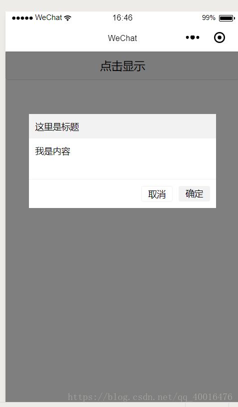
})一个简单的自定义组件已经做好了
初学小程序,如有错误请指出