数据分析入门--数据科学框架的搭建--04数据的统计性初探
本文基于kaggle入门项目Titanic金牌获得者的Kernel翻译而来,并对其代码进行注解
原文链接https://www.kaggle.com/ldfreeman3/a-data-science-framework-to-achieve-99-accuracy
现在,我们清理好数据。将应用描述性统计与图形统计探索我们的数据与总结我们的变量。在这个阶段,你将对特征进行分类并确定它们与目标变量之间的关系。
#Discrete Variable Correlation by Survival using
#group by aka pivot table: https://pandas.pydata.org/pandas-docs/stable/generated/pandas.DataFrame.groupby.html
for x in data1_x:
    if data1[x].dtype != 'float64' :
        print('Survival Correlation by:', x)
        print(data1[[x, Target[0]]].groupby(x, as_index=False).mean())
        print('-'*10, '\n')


#using crosstabs: https://pandas.pydata.org/pandas-docs/stable/generated/pandas.crosstab.html
print(pd.crosstab(data1['Title'],data1[Target[0]]))
结果为:
Survival Correlation by: Sex
      Sex  Survived
0  female  0.742038
1    male  0.188908
----------

Survival Correlation by: Pclass
   Pclass  Survived
0       1  0.629630
1       2  0.472826
2       3  0.242363
----------

Survival Correlation by: Embarked
  Embarked  Survived
0        C  0.553571
1        Q  0.389610
2        S  0.339009
----------

Survival Correlation by: Title
    Title  Survived
0  Master  0.575000
1    Misc  0.444444
2    Miss  0.697802
3      Mr  0.156673
4     Mrs  0.792000
----------

Survival Correlation by: SibSp
   SibSp  Survived
0      0  0.345395
1      1  0.535885
2      2  0.464286
3      3  0.250000
4      4  0.166667
5      5  0.000000
6      8  0.000000
----------

Survival Correlation by: Parch
   Parch  Survived
0      0  0.343658
1      1  0.550847
2      2  0.500000
3      3  0.600000
4      4  0.000000
5      5  0.200000
6      6  0.000000
----------

Survival Correlation by: FamilySize
   FamilySize  Survived
0           1  0.303538
1           2  0.552795
2           3  0.578431
3           4  0.724138
4           5  0.200000
5           6  0.136364
6           7  0.333333
7           8  0.000000
8          11  0.000000
----------

Survival Correlation by: IsAlone
   IsAlone  Survived
0        0  0.505650
1        1  0.303538
----------

Survived    0    1
Title
Master     17   23
Misc       15   12
Miss       55  127
Mr        436   81
Mrs        26   99
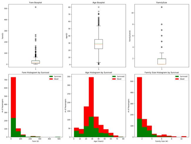
1.探索各个标签的不同特征值的生存结果对比
import matplotlib.pyplot as plt

plt.figure(figsize = [16,12])

plt.subplot(231)
plt.boxplot(x = data1['Fare'],showmeans = True,meanline = True)
plt.title('Fare Boxplot')
plt.ylabel('Fare($)')

plt.subplot(232)
plt.boxplot(x = data1['Age'], showmeans = True, meanline = True)
plt.title('Age Boxplot')
plt.ylabel('Age($)')

plt.subplot(233)
plt.boxplot(x = data1['FamilySize'],showmeans = True, meanline = True)
plt.title('FamilySize')
plt.ylabel('FamilySize($)')

plt.subplot(234)
plt.hist(x = [data1[data1['Survived']==1]['Fare'],data1[data1['Survived']==0]['Fare']],stacked=True, color=['g','r'],label=['Survives','Dead'])
plt.title('Fare Histogram by Survival')
plt.xlabel('Fare ($)')
plt.ylabel('# of Passengers')
plt.legend()

plt.subplot(235)
plt.hist(x = [data1[data1['Survived']==1]['Age'], data1[data1['Survived']==0]['Age']],
         stacked=True, color = ['g','r'],label = ['Survived','Dead'])
plt.title('Age Histogram by Survival')
plt.xlabel('Age (Years)')
plt.ylabel('# of Passengers')
plt.legend()

plt.subplot(236)
plt.hist(x = [data1[data1['Survived']==1]['FamilySize'], data1[data1['Survived']==0]['FamilySize']],
         stacked=True, color = ['g','r'],label = ['Survived','Dead'])
plt.title('Family Size Histogram by Survival')
plt.xlabel('Family Size (#)')
plt.ylabel('# of Passengers')
plt.legend()

plt.show()
import seaborn as sns

fig, saxis = plt.subplots(2, 3,figsize=(16,12))

sns.barplot(x='Embarked',y='Survived',data = data1,ax=saxis[0,0])
sns.barplot(x='Pclass',y='Survived',order=[1,2,3],data=data1,ax=saxis[0,1])
sns.barplot(x = 'IsAlone', y = 'Survived', order=[1,0], data=data1, ax = saxis[0,2])

sns.pointplot(x = 'FareBin', y = 'Survived',  data=data1, ax = saxis[1,0])
sns.pointplot(x = 'AgeBin', y = 'Survived',  data=data1, ax = saxis[1,1])
sns.pointplot(x = 'FamilySize', y = 'Survived', data=data1, ax = saxis[1,2])
plt.show() 
#graph distribution of qualitative data: Pclass
#we know class mattered in survival, now let's compare class and a 2nd feature
fig, (axis1,axis2,axis3) = plt.subplots(1,3,figsize=(14,12))

sns.boxplot(x = 'Pclass', y = 'Fare', hue = 'Survived', data = data1, ax = axis1)
axis1.set_title('Pclass vs Fare Survival Comparison')

sns.violinplot(x = 'Pclass', y = 'Age', hue = 'Survived', data = data1, split = True, ax = axis2)
axis2.set_title('Pclass vs Age Survival Comparison')

sns.boxplot(x = 'Pclass', y ='FamilySize', hue = 'Survived', data = data1, ax = axis3)
axis3.set_title('Pclass vs Family Size Survival Comparison')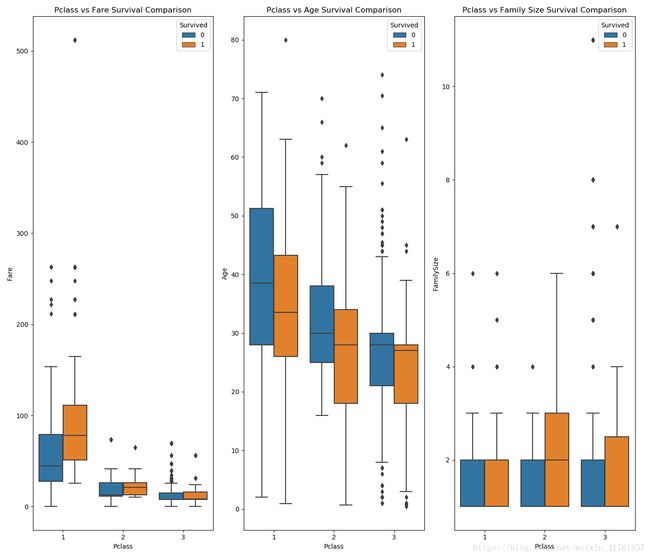
由图可看出:1)船舱等级越高,票价越贵。2)船舱等级高的人的年龄相对较大。 3)船舱等级越高,家庭出游人数越少。死亡比例与船舱等级关系不大。
#graph distribution of qualitative data: Sex
#we know sex mattered in survival, now let's compare sex and a 2nd feature
fig, qaxis = plt.subplots(1,3,figsize=(14,12))

sns.barplot(x = 'Sex', y = 'Survived', hue = 'Embarked', data=data1, ax = qaxis[0])
axis1.set_title('Sex vs Embarked Survival Comparison')

sns.barplot(x = 'Sex', y = 'Survived', hue = 'Pclass', data=data1, ax  = qaxis[1])
axis1.set_title('Sex vs Pclass Survival Comparison')

sns.barplot(x = 'Sex', y = 'Survived', hue = 'IsAlone', data=data1, ax  = qaxis[2])
axis1.set_title('Sex vs IsAlone Survival Comparison')
由图可知由图可知,有图
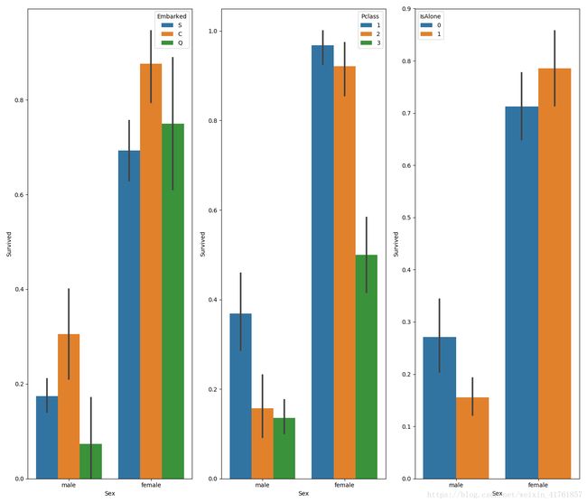
由图可知,女性的存活比例大于男性,且C甲板、独自出行的女士存活率较高。
由图可知,女性的存活比例大于男性,且C甲板、独自出行的女士存活率较高。
#more side-by-side comparisons
fig, (maxis1, maxis2) = plt.subplots(1, 2,figsize=(14,12))

#how does family size factor with sex & survival compare
sns.pointplot(x="FamilySize", y="Survived", hue="Sex", data=data1,
              palette={"male": "blue", "female": "pink"},
              markers=["*", "o"], linestyles=["-", "--"], ax = maxis1)

#how does class factor with sex & survival compare
sns.pointplot(x="Pclass", y="Survived", hue="Sex", data=data1,
              palette={"male": "blue", "female": "pink"},
              markers=["*", "o"], linestyles=["-", "--"], ax = maxis2)
Out[15]: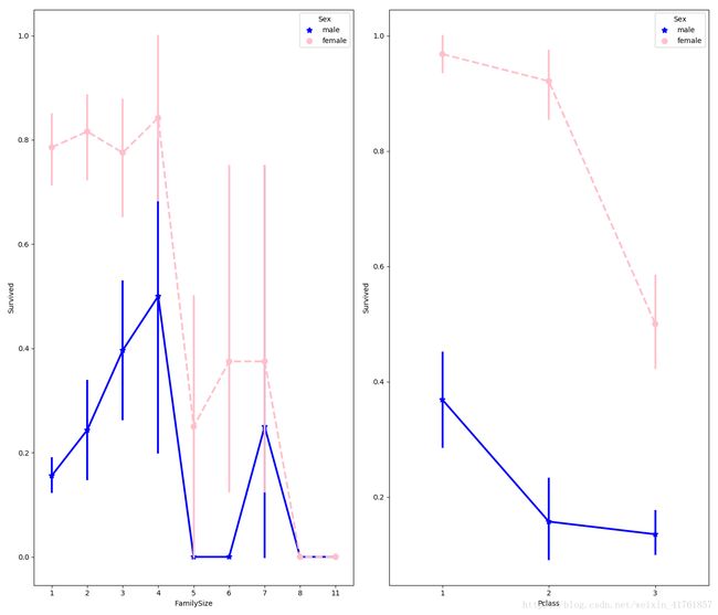
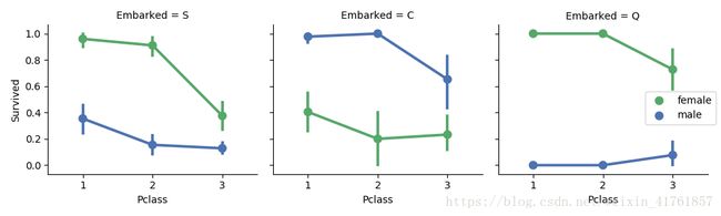
#how does embark port factor with class, sex, and survival compare
#facetgrid: https://seaborn.pydata.org/generated/seaborn.FacetGrid.html
e = sns.FacetGrid(data1, col = 'Embarked')
e.map(sns.pointplot, 'Pclass', 'Survived', 'Sex', ci=95.0, palette = 'deep')
e.add_legend()
FacetGrid:
https://blog.csdn.net/weixin_41761857/article/details/80688586