python常用数据作图--matplotlib用法(相关设置及常用图)
目录
- 1.pyplot的plot( )函数
- 1.1 函数参数
- 1.2 函数应用
- 2. 常用figures,axes(多图形、坐标系)
- 2.1 创建fig,axes
- 2.2 基本绘图2D设置
- 1) plot()默认是线
- 2) 关键字参数绘图
- 3) 区间上下限
- 4) 设置边框线
- 5) 设置图例
- 6) 设置备注
- 7) 区间分段
- 8) 布局
- 9) 轴相关
- 2.3 绘制基本图形
- 散点图
- 条形图
- 直方图
- 饼图
- 箱形图
- 气泡图
- 等高线图
- 3D图
matplotlib.pyplot是一个有命令风格的函数集合,看起来和MATLAB相似。每一个pyplot函数都使一副图像做出些许改变,例如创建一幅图,在图中创建一个绘图区域,在绘图区域中添加一条线等等。在matplotlib.pyplot中,各种状态通过函数调用保存起来,以便于可以随时跟踪像当前图像和绘图区域这样的东西。== 绘图函数是直接作用于当前axes(matplotlib中的专有名词,图形中组成部分,不是数学中的坐标系)。 ==
1.pyplot的plot( )函数
1.1 函数参数
==plt.plot(x,y,format_string,**kwargs) ==
x:x轴数据,列表或数组,可选
y:y轴数据,列表或数组
format_string:控制曲线的格式字符串,可选
**kwargs:第二组或更多,(x,y,format_string)
注:当绘制多条曲线时,各条曲线的x不能省略
例子:
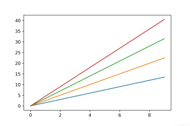
import matplotlib.pyplot as plt
import numpy as np

a = np.arange(10)
plt.plot(a,a*1.5,a,a*2.5,a,a*3.5,a,a*4.5)
plt.show()
format_string:控制曲线的格式字符串,可选,由颜色字符、风格字符和标记字符组成。
| 颜色字符 | 说明 | 颜色字符 | 说明 |
|---|---|---|---|
| ‘b’ | 蓝色 | ‘m’ | 洋红色 |
| ‘g’ | 绿色 | ‘y’ | 黄色 |
| ‘r’ | 红色 | ‘k’ | 黑色 |
| ‘c’ | 青绿色 cyan | ‘w’ | 白色 |
| ‘#008000’ | RGB某颜色 | ‘0.8’ | 灰度值字符串 |
| 风格字符 | 说明 |
|---|---|
| ‘-‘ | 实线 |
| ‘–’ | 破折线 |
| ‘-.’ | 点划线 |
| ‘:’ | 虚线 |
| ’ ’ ’ ‘ | 无线条 |
| 标记字符 | 说明 | 标记字符 | 说明 |
|---|---|---|---|
| ‘.’ | 点标记 | ‘1’ | 下花三角标记 |
| ‘,’ | 像素标记(极小点) | ‘2’ | 上花三角标记 |
| ‘o’ | 实心圈标记 | ‘3’ | 左花三角标记 |
| ‘v’ | 倒三角标记 | ‘4’ | 右花三角标记 |
| ‘^’ | 上三角标记 | ’s’ | 实心方形标记 |
| ‘>’ | 右三角标记 | ‘p’ | 实心五角标记 |
| ‘<’ | 左三角标记 | ‘*’ | 星形标记 |
| ‘h’ | 竖六边形标记 | ‘x’ | x标记 |
| ‘H’ | 横六边形标记 | ‘D’ | 菱形标记 |
| ‘+’ | 十字标记 | ‘d’ | 瘦菱形标记 |
| ‘ | ’ | 垂直线标记 |
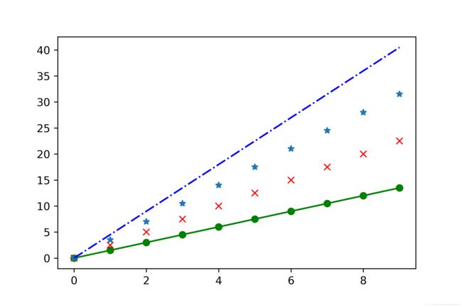
import matplotlib.pyplot as plt
import numpy as np

a = np.arange(10)
plt.plot(a,a*1.5,'go-',a,a*2.5,'rx',a,a*3.5,'*',a,a*4.5,'b-.')
plt.show()
plt.plot(x,y,format_string,**kwargs)
**kwargs:第二组或更多,(x,y,format_string)
color:控制颜色,color=’green’
linestyle:线条风格,linestyle=’dashed’
marker:标记风格,marker = ‘o’
markerfacecolor:标记颜色,markerfacecolor = ‘blue’
markersize:标记尺寸,markersize = ‘20’
1.2 函数应用
1)一个参数y
    import matplotlib.pyplot as plt
    plt.plot([1,2,3,4])
    plt.ylabel('some numbers')
    plt.show()

X和Y轴为什么是0-3和1-4?
这里我们只是为plot()命令提供 了一个list或者是array,matplotlib就会假设这个序列是Y轴上的取值,并且会自动生成X轴上的值。因为python中的范围是从0开始的,因此X轴就是从0开始,长度与Y的长度相同,也就是[0,1,2,3]。
2)plot()是一个灵活的命令,它的参数可以是任意数量,比如
plt.plot([1, 2, 3, 4], [1, 4, 9, 16])
这表示的是==(x,y)对==,(1,1)(2,4)(3,9)(4,16)。这里有第三个可选参数,它是字符串格式的,表示颜色和线的类型。该字符串格式中的字母和符号来自于MATLAB,它是颜色字符串和线的类型字符串的组合。默认情况下,该字符串参数是’b-‘,表示蓝色的实线。
举一个使用红色圆圈绘制上述点集的例子:
    import matplotlib.pyplot as plt
    plt.plot([1,2,3,4], [1,4,9,16], 'ro')
    plt.axis([0, 6, 0, 20])
    plt.show()
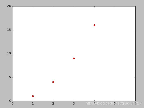
可以查看plot()的文档(https://matplotlib.org/api/pyplot_api.html#matplotlib.pyplot.plot),那里有完整的关于线的类型的说明。axis()命令(https://matplotlib.org/api/pyplot_api.html#matplotlib.pyplot.axis)可以方便的获取和设置XY轴的一些属性。
如果matplotlib仅限于使用上面那种list,那么它将显得毫无用处。通常,我们都是使用numpy数组,实际上,所有的序列都将被在内部被转化成numpy数字。下面的例子是使用一个命令用几种不同风格的线绘制一个数组:
    import numpy as np
    import matplotlib.pyplot as plt

    # 0到5之间每隔0.2取一个数
    t = np.arange(0., 5., 0.2)

    # 红色的破折号,蓝色的方块,绿色的三角形
    plt.plot(t, t, 'r--', t, t**2, 'bs', t, t**3, 'g^')
    plt.show()

控制线的属性
线有许多属性可以设置:线宽、线的形状,平滑等等。这里有一些设置线属性的方法:
- 使用关键字参数
plt.plot(x,y,linewidth=2.0)
- 对线对象(Line2D)使用set_方法,plot()会返回一个线对象的列表,比如line1, line2 = plot(x1, y1,
x2, y2)。下面的代码我们将假设我们只有一条线,即返回的线对象列表的长度为1。
line, = plt.plot(x, y, '-')
line.set_antialiased(False) # 关闭平滑
- 使用setp()命令。
下面的例子使用的是MATLAB风格的命令去设置一个线的列表的多个属性。setp()可以作用于一个列表对象或者是一个单一的对象。你可以使用python风格的关键字参数或者是MATLAB风格的string/value对为参数:
lines = plt.plot(x1, y1, x2, y2)

# 使用关键字
plt.setp(lines, color='r', linewidth=2.0)

# 或者是MATLAB风格的string/value对
plt.setp(lines, 'color', 'r', 'linewidth', 2.0)
2. 常用figures,axes(多图形、坐标系)
MATLAB和pyplot都有当前图形(figure)和当前坐标系(axes)的概念。所有的绘图命令都是应用于当前坐标系的。gca()和gcf()(get current axes/figures)分别获取当前axes和figures的对象。通常,你不用担心这些,因为他们都在幕后被保存了,下面是一个例子,创建了两个子绘图区域(subplot):
import numpy as np
import matplotlib.pyplot as plt

def f(t):
    return np.exp(-t) * np.cos(2*np.pi*t)

t1 = np.arange(0.0, 5.0, 0.1)
t2 = np.arange(0.0, 5.0, 0.02)

plt.figure("2subplot")
plt.subplot(211)
plt.plot(t1, f(t1), 'bo', t2, f(t2), 'k')

plt.subplot(212)
plt.plot(t2, np.cos(2*np.pi*t2), 'r--')
plt.show()

figure()命令在这儿可以不写,因为figure(1)将会被默认执行,同样,subplot(111)也是默认被执行的。subplot()中的参数分别指定了numrows、numcols、fignum,其中fignum的取值范围为1到numrows*numcols,分别表示的是将绘图区域划分为numrows行和numcols列个子绘图区域,fignum为当前子图的编号。编号是从1开始,一行一行由左向右编号的。其实subplot中的参数【111】本应写作【1,1,1】,但是如果这三个参数都小于10(其实就是第三个参数小于10)就可以省略逗号。你可以创建任意数量的子图(subplots)和坐标系(axes)。如果你想手动放置一个axes,也就是它不再是一个矩形方格,你就可以使用命令axes(),它可以让坐标系位于任何位置,axes([left,bottom,width,height]),其中所有的值都是0到1(axes([0.3,0.4,0.2,0.3])表示的是该坐标系位于figure的(0.3,0.4)处,其宽度和长度分别为figure横坐标和纵坐标总长的0.2和0.3)。subplot和axes的区别就在于axes大小和位置更加随意。
可以创建多个figure,通过调用figure(),其参数为figure的编号。当然每个figure可以包含多个subplot或者是多个axes。
2.1 创建fig,axes
一起创建
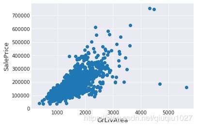
fig, ax = plt.subplots()
ax.scatter(x = train['GrLivArea'], y = train['SalePrice'])
plt.ylabel('SalePrice', fontsize=13)
plt.xlabel('GrLivArea', fontsize=13)
plt.show()
 单独创建
单独创建
import matplotlib.pyplot as plt
fig = plt.figure()
ax = fig.add_subplot(111)
ax.set(xlim=[0.5, 4.5], ylim=[-2, 8], title='An Example Axes',
       ylabel='Y-Axis', xlabel='X-Axis')
plt.show()

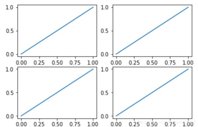
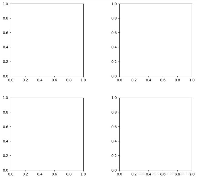
对于上面的fig.add_subplot(111)就是添加Axes的,意为在画板的第1行第1列的第一个位置生成一个Axes对象来准备作画。也可以通过fig.add_subplot(2, 2, 1)的方式生成Axes,前面两个参数确定了面板的划分,例如 2, 2会将整个面板划分成 2 * 2 的方格,第三个参数取值范围是 [1, 2*2] 表示第几个Axes。如:
plt.figure()
plt.subplot(2,2,1)#建立一个两行两列的画布,第一个
plt.plot([0,1],[0,1])
plt.subplot(2,2,2)#第二个
plt.plot([0,1],[0,1])
plt.subplot(2,2,3)#第三个
plt.plot([0,1],[0,1])
plt.subplot(2,2,4)#第四个
plt.plot([0,1],[0,1])
plt.show()
plt.figure()
plt.subplot(2,1,1)#建立一个两行两列的画布,第一个
plt.plot([0,1],[0,1])
plt.subplot(2,3,4)#第二个
plt.plot([0,1],[0,1])
plt.subplot(2,3,5)#第三个
plt.plot([0,1],[0,1])
plt.subplot(2,3,6)#第四个
plt.plot([0,1],[0,1])
plt.show()

动态图
from matplotlib import animation#动态图所需要的包
fig,ax = plt.subplots()#子图像
x = np.arange(0,2*np.pi,0.01)
line, = ax.plot(x,np.sin(x))

def animate(i):
    line.set_ydata(np.sin(x+i/10))#用来改变的y对应的值
    return line,
def init():
    line.set_ydata(np.sin(x))#动态图初始图像
    return line,

ani = animation.FuncAnimation(fig=fig,func=animate,init_func=init,interval=20)#动态作图的方法,func动态图函数,init_func初始化函数,interval指图像改变的时间间隔
plt.show()

注:若想看动态效果请在ipython中使用
2.2 基本绘图2D设置
1) plot()默认是线
plot()函数画出一系列的点,并且用线将它们连接起来。看下例子:
x = np.linspace(0, np.pi)
y_sin = np.sin(x)
y_cos = np.cos(x)

ax1.plot(x, y_sin)
ax2.plot(x, y_sin, 'go--', linewidth=2, markersize=12)
ax3.plot(x, y_cos, color='red', marker='+', linestyle='dashed')
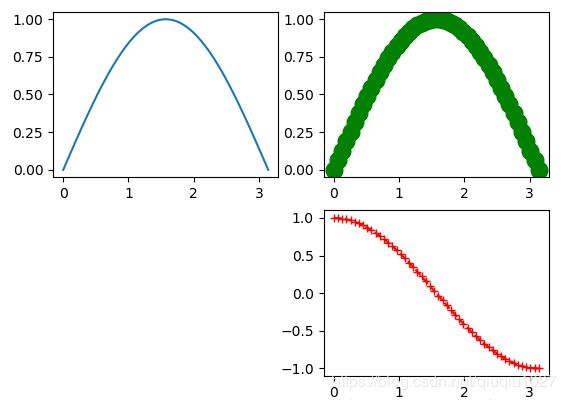
在上面的三个Axes上作画。plot,前面两个参数为x轴、y轴数据。ax2的第三个参数是 MATLAB风格的绘图,对应ax3上的颜色,marker,线型。
2) 关键字参数绘图
可以通过关键字参数的方式绘图,如下例:
x = np.linspace(0, 10, 200)
data_obj = {'x': x,
            'y1': 2 * x + 1,
            'y2': 3 * x + 1.2,
            'mean': 0.5 * x * np.cos(2*x) + 2.5 * x + 1.1}

fig, ax = plt.subplots()

#填充两条线之间的颜色
ax.fill_between('x', 'y1', 'y2', color='yellow', data=data_obj)

# Plot the "centerline" with `plot`
ax.plot('x', 'mean', color='black', data=data_obj)

plt.show()
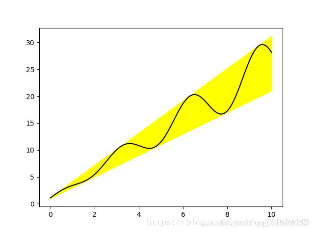
发现上面的作图,在数据部分只传入了字符串,这些字符串对一个这 data_obj 中的关键字,当以这种方式作画时,将会在传入给 data 中寻找对应关键字的数据来绘图。
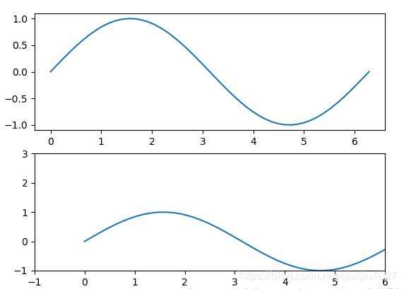
3) 区间上下限
ax.set_xlim([xmin, xmax]) #设置X轴的区间
ax.set_ylim([ymin, ymax]) #Y轴区间
ax.axis([xmin, xmax, ymin, ymax]) #X、Y轴区间
ax.set_ylim(bottom=-10) #Y轴下限
ax.set_xlim(right=25) #X轴上限
x = np.linspace(0, 2*np.pi)
y = np.sin(x)
fig, (ax1, ax2) = plt.subplots(2)
ax1.plot(x, y)
ax2.plot(x, y)
ax2.set_xlim([-1, 6])
ax2.set_ylim([-1, 3])
plt.show()
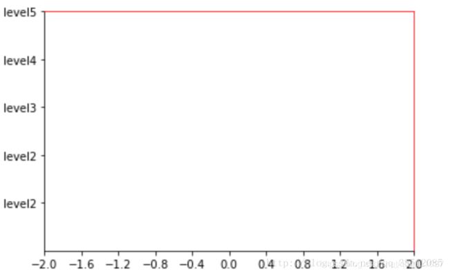
4) 设置边框线
plt.gca #获取当前的坐标轴
spines['right'].set_color('red’) #右边框为红色
# 分别把x轴与y轴的刻度设置为bottom与left
xaxis.set_ticks_position('bottom')
yaxis.set_ticks_position('left’)
# 分别v把bottom和left类型设置为data,交点为(0,0)
spines['bottom'].set_position(('data',0))
spines['left'].set_position(('data',0))

#例:
ax = plt.gca()
ax.spines['right'].set_color(‘red')
ax.spines['top'].set_color(‘red’)
5) 设置图例
fig, ax = plt.subplots()
ax.plot([1, 2, 3, 4], [10, 20, 25, 30], label='Philadelphia')
ax.plot([1, 2, 3, 4], [30, 23, 13, 4], label='Boston')
ax.scatter([1, 2, 3, 4], [20, 10, 30, 15], label='Point')
ax.set(ylabel='Temperature (deg C)', xlabel='Time', title='A tale of two cities')
ax.legend()
plt.show()

在绘图时传入 label 参数,并最后调用ax.legend()显示图例说明,对于 legend 还是传入参数,plt.legend(loc='xxxt’)。
控制图例说明显示的位置:
| Location String | Location Code |
|---|---|
| ‘best’ | 0 |
| ‘upper right’ | 1 |
| ‘upper left’ | 2 |
| ‘lower left’ | 3 |
| ‘lower right’ | 4 |
| ‘right’ | 5 |
| ‘center left’ | 6 |
| ‘center right’ | 7 |
| ‘lower center’ | 8 |
| ‘upper center’ | 9 |
| ‘center’ | 10 |
l1, = plt.plot(x,y1,color='red',linewidth=1.0,linestyle='—') #设置两条线为l1,l2    注:应该在后面加上,
l2, = plt.plot(x,y2,color="blue",linewidth=5.0,linestyle="-")
plt.legend(handles=[l1,l2],labels=['test1','test2'],loc='best’) #将l1,l2绘制于一张图中,其中名字分别是l1,l2,位置自动取在最佳位置

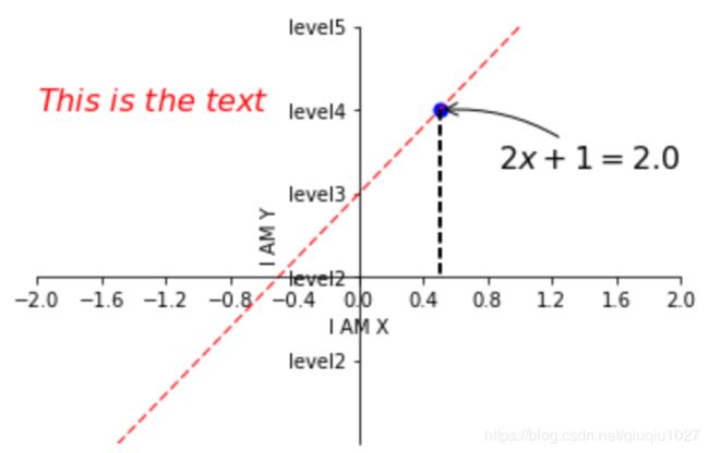
6) 设置备注
x0 = 0.5
y0 = 2*x0 + 1
# 画点
plt.scatter(x0,y0,s=50,color='blue')
# 画虚线
plt.plot([x0,x0],[y0,0],'k--',lw=2)#[x0,x0],[y0,0]代表x0,y0点作虚线交于x0,0  k--代表颜色的虚线,lw代表宽度
plt.annotate(r'$2x+1=%s$' % y0,xy=(x0,y0),xytext=(+30,-30),textcoords='offset points',fontsize=16,arrowprops=dict(arrowstyle='->',connectionstyle='arc3,rad=.2'))
#xy=(x0,y0)指在x0,y0点,xytext=(+30,-30)指在点向右移动30,向下移动30,textcoords='offset points'指以点为起点
#arrowprops=dict(arrowstyle='->',connectionstyle='arc3,rad=.2')指弧度曲线,  .2指弧度
plt.text(-2,2,r'$This\ is\ the\ text$',fontsize=16,color='red’) #-2,2指从-2,2开始写
7) 区间分段
data = [('apples', 2), ('oranges', 3), ('peaches', 1)]
fruit, value = zip(*data)

fig, (ax1, ax2) = plt.subplots(2)
x = np.arange(len(fruit))
ax1.bar(x, value, align='center', color='gray')
ax2.bar(x, value, align='center', color='gray')

ax2.set(xticks=x, xticklabels=fruit)

#ax.tick_params(axis='y', direction='inout', length=10) #修改 ticks 的方向以及长度
plt.show()

上面不仅修改了X轴的区间段,并且修改了显示的信息为文本。
8) 布局
fig, axes = plt.subplots(2, 2, figsize=(9, 9))
fig.subplots_adjust(wspace=0.5, hspace=0.3,
                    left=0.125, right=0.9,
                    top=0.9,    bottom=0.1)

#fig.tight_layout() #自动调整布局,使标题之间不重叠
plt.show()
通过fig.subplots_adjust()我们修改了子图水平之间的间隔wspace=0.5,垂直方向上的间距hspace=0.3,左边距left=0.125 等等,这里数值都是百分比的。以 [0, 1] 为区间,选择left、right、bottom、top 注意 top 和 right 是 0.9 表示上、右边距为百分之10。不确定如果调整的时候,fig.tight_layout()是一个很好的选择。之前说到了内边距,内边距是子图的,也就是 Axes 对象,所以这样使用 ax.margins(x=0.1, y=0.1),当值传入一个值时,表示同时修改水平和垂直方向的内边距。
观察上面的四个子图,可以发现他们的X、Y的区间是一致的,而且这样显示并不美观,所以可以调整使他们使用一样的X、Y轴:
fig, (ax1, ax2) = plt.subplots(1, 2, sharex=True, sharey=True)
ax1.plot([1, 2, 3, 4], [1, 2, 3, 4])
ax2.plot([3, 4, 5, 6], [6, 5, 4, 3])
plt.show()

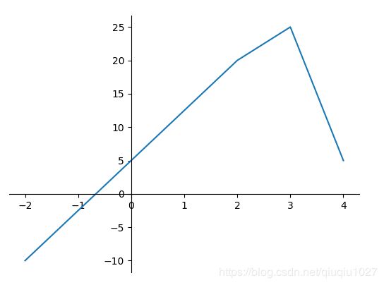
9) 轴相关
改变边界的位置,去掉四周的边框:
fig, ax = plt.subplots()
ax.plot([-2, 2, 3, 4], [-10, 20, 25, 5])
ax.spines['top'].set_visible(False)     #顶边界不可见
ax.xaxis.set_ticks_position('bottom')  # ticks 的位置为下方,分上下的。
ax.spines['right'].set_visible(False)   #右边界不可见
ax.yaxis.set_ticks_position('left')

# "outward"
# 移动左、下边界离 Axes 10 个距离
#ax.spines['bottom'].set_position(('outward', 10))
#ax.spines['left'].set_position(('outward', 10))

# "data"
# 移动左、下边界到 (0, 0) 处相交
ax.spines['bottom'].set_position(('data', 0))
ax.spines['left'].set_position(('data', 0))

# "axes"
# 移动边界,按 Axes 的百分比位置
#ax.spines['bottom'].set_position(('axes', 0.75))
#ax.spines['left'].set_position(('axes', 0.3))

plt.show()
2.3 绘制基本图形
散点图
x = np.random.normal(0,1,500)
y = np.random.normal(0,1,500)
plt.scatter(x,y,s=50,color='blue',alpha=0.5) #s指点大小,alpha指透明度
plt.show()

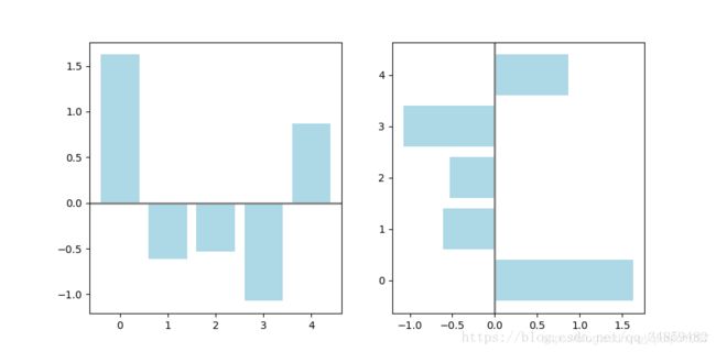
条形图
np.random.seed(1)
x = np.arange(5)
y = np.random.randn(5)

fig, axes = plt.subplots(ncols=2, figsize=plt.figaspect(1./2))

vert_bars = axes[0].bar(x, y, color='lightblue', align='center')
horiz_bars = axes[1].barh(x, y, color='lightblue', align='center')
#在水平或者垂直方向上画线
axes[0].axhline(0, color='gray', linewidth=2)
axes[1].axvline(0, color='gray', linewidth=2)
plt.show()
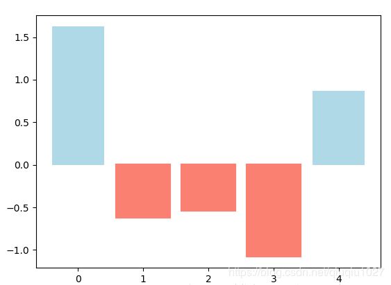
条形图还返回了一个Artists 数组,对应着每个条形,例如上图 Artists 数组的大小为5,我们可以通过这些 Artists 对条形图的样式进行更改,如下例:
fig, ax = plt.subplots()
vert_bars = ax.bar(x, y, color='lightblue', align='center')

# We could have also done this with two separate calls to `ax.bar` and numpy boolean indexing.
for bar, height in zip(vert_bars, y):
    if height < 0:
        bar.set(edgecolor='darkred', color='salmon', linewidth=3)

plt.show()
直方图
np.random.seed(19680801)

n_bins = 10
x = np.random.randn(1000, 3)

fig, axes = plt.subplots(nrows=2, ncols=2)
ax0, ax1, ax2, ax3 = axes.flatten()

colors = ['red', 'tan', 'lime']
ax0.hist(x, n_bins, density=True, histtype='bar', color=colors, label=colors)
ax0.legend(prop={'size': 10})
ax0.set_title('bars with legend')

ax1.hist(x, n_bins, density=True, histtype='barstacked')
ax1.set_title('stacked bar')

ax2.hist(x,  histtype='barstacked', rwidth=0.9)

ax3.hist(x[:, 0], rwidth=0.9)
ax3.set_title('different sample sizes')

fig.tight_layout()
plt.show()
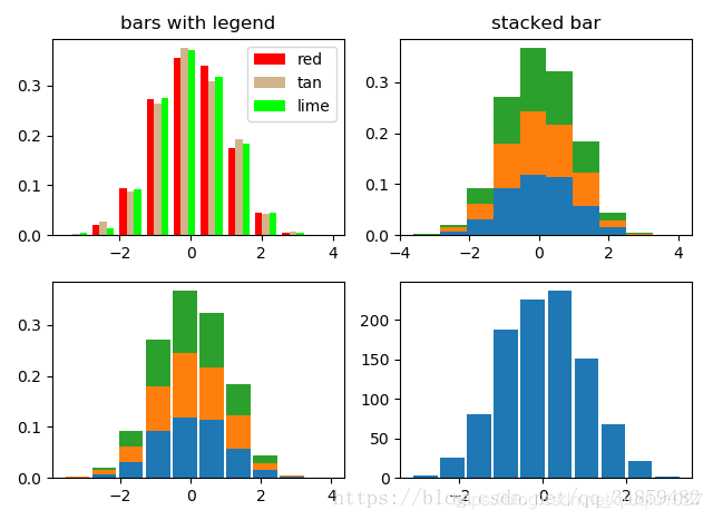
参数中density控制Y轴是概率还是数量,与返回的第一个的变量对应。histtype控制着直方图的样式,默认是 ‘bar’,对于多个条形时就相邻的方式呈现如子图1, ‘barstacked’ 就是叠在一起,如子图2、3。 rwidth 控制着宽度,这样可以空出一些间隙,比较图2、3. 图4是只有一条数据时。
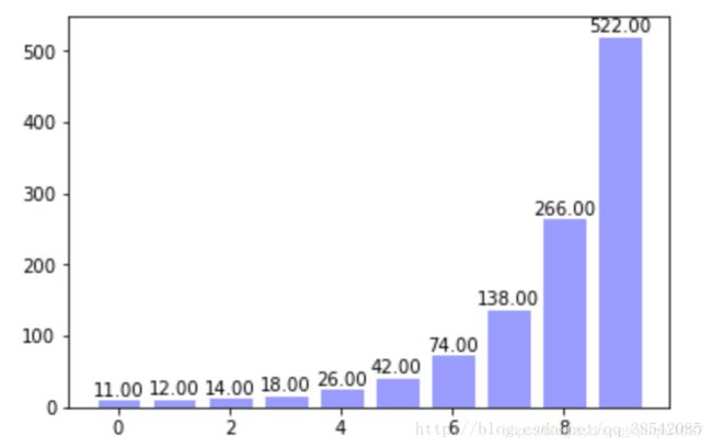
或者直接用plt.bar()
x = np.arange(10)
y = 2**x + 10
plt.bar(x,y,facecolor='#9999ff',edgecolor='white')#柱颜色,柱边框颜色
for x,y in zip(x,y):#zip指把x,y结合为一个整体,一次可以读取一个x和一个y
    plt.text(x,y,'%.2f' % y,ha='center',va='bottom')#指字体在中间和柱最顶的顶部
plt.show()
饼图
labels = 'Frogs', 'Hogs', 'Dogs', 'Logs'
sizes = [15, 30, 45, 10]
explode = (0, 0.1, 0, 0)  # only "explode" the 2nd slice (i.e. 'Hogs')

fig1, (ax1, ax2) = plt.subplots(2)
ax1.pie(sizes, labels=labels, autopct='%1.1f%%', shadow=True)
ax1.axis('equal')
ax2.pie(sizes, autopct='%1.2f%%', shadow=True, startangle=90, explode=explode,
    pctdistance=1.12)
ax2.axis('equal')
ax2.legend(labels=labels, loc='upper right')

plt.show()
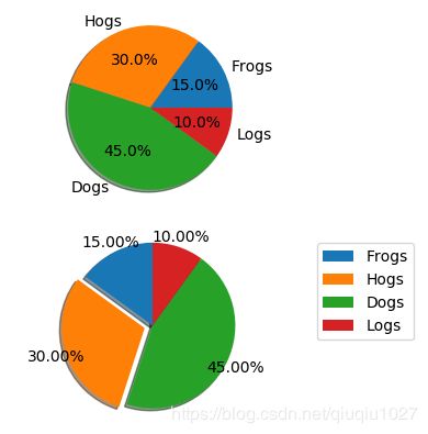
饼图自动根据数据的百分比画饼.。labels是各个块的标签,如子图一。autopct=%1.1f%%表示格式化百分比精确输出,explode,突出某些块,不同的值突出的效果不一样。pctdistance=1.12百分比距离圆心的距离,默认是0.6.
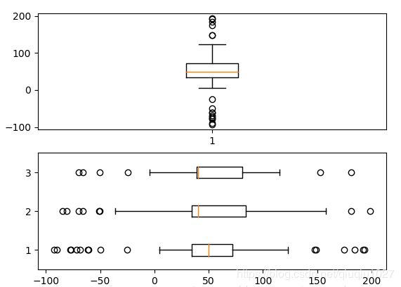
箱形图
为了专注于如何画图,省去数据的处理部分。 data 的 shape 为 (n, ), data2 的 shape 为 (n, 3)。
fig, (ax1, ax2) = plt.subplots(2)
ax1.boxplot(data)
ax2.boxplot(data2, vert=False) #控制方向
气泡图
散点图的一种,加入了第三个值 s 可以理解成普通散点,画的是二维,泡泡图体现了Z的大小,如下:
np.random.seed(19680801)


N = 50
x = np.random.rand(N)
y = np.random.rand(N)
colors = np.random.rand(N)
area = (30 * np.random.rand(N))**2  # 0 to 15 point radii

plt.scatter(x, y, s=area, c=colors, alpha=0.5)
plt.show()

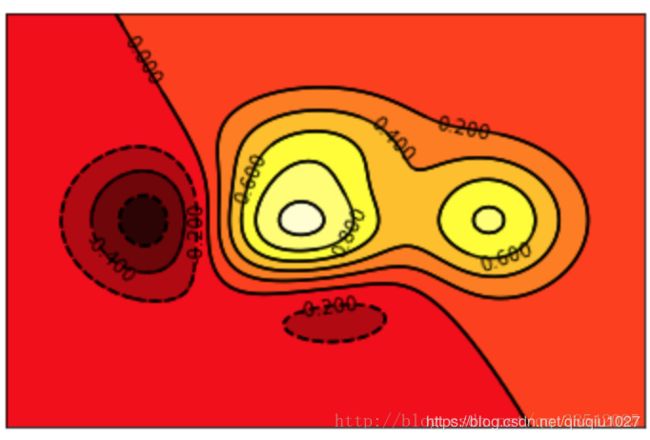
等高线图
fig, (ax1, ax2) = plt.subplots(2)
x = np.arange(-5, 5, 0.1)
y = np.arange(-5, 5, 0.1)
xx, yy = np.meshgrid(x, y, sparse=True)
z = np.sin(xx**2 + yy**2) / (xx**2 + yy**2)
ax1.contourf(x, y, z)
ax2.contour(x, y, z)

上面画了两个一样的轮廓图,contourf会填充轮廓线之间的颜色。数据x, y, z通常是具有相同 shape 的二维矩阵。x, y 可以为一维向量,但是必需有 z.shape = (y.n, x.n) ,这里 y.n 和 x.n 分别表示x、y的长度。Z通常表示的是距离X-Y平面的距离,传入X、Y则是控制了绘制等高线的范围。
def f(x,y):
    #用来生成高度
    return (1-x/2+x**5+y**3)*np.exp(-x**2-y**2)

x = np.linspace(-3,3,100)
y = np.linspace(-3,3,100)

X,Y = np.meshgrid(x,y)#将x,y指传入网格中
plt.contourf(X,Y,f(X,Y),8,alpha=0.75,cmap=plt.cm.hot)#8指图中的8+1根线,绘制等温线,其中cmap指颜色

C = plt.contour(X,Y,f(X,Y),8,colors='black',linewidth=.5)#colors指等高线颜色
plt.clabel(C,inline=True,fontsize=10)#inline=True指字体在等高线中

plt.xticks(())
plt.yticks(())
plt.show()
3D图
from mpl_toolkits.mplot3d import Axes3D#动态图所需要的包
fig = plt.figure()
ax = Axes3D(fig)

x = np.arange(-4,4,0.25)#0.25指-4至4间隔为0.25
y = np.arange(-4,4,0.25)
X,Y = np.meshgrid(x,y)#x,y放入网格
R = np.sqrt(X**2 + Y**2)
Z = np.sin(R)

ax.plot_surface(X,Y,Z,rstride=1,cstride=1,cmap=plt.get_cmap('rainbow'))#rstride=1指x方向和y方向的色块大小
ax.contourf(X,Y,Z,zdir='z',offset=-2,cmap='rainbow')#zdir指映射到z方向,-2代表映射到了z=-2
ax.set_zlim(-2,-2)

plt.show()
