matlab bar的用法简介
http://openwetware.org/wiki/McClean:_Making_Nice_Bar_Plots
McClean: Making Nice Bar Plots
Contents[hide]
|
Summary
This explains the basics of making pretty bar plots in Matlab. The Matlab "bar" command is used, along with some nice scripts discovered on the Matlab file exchange.
Example
Suppose you have some experimental data from two strains (Strain 1 and Strain 2) under four different experiment conditions (Condition A,B,C,D). The means and standard deviations of your measurement of interest look like:
Strain1_Mean=[0.5137    3.2830    1.5887    5.9188];
Strain2_Mean=[0.4042    2.9884    0.5709    2.7766];
Strain1_std=[1.1393    2.8108    2.2203    3.5233];
Strain2_std=[0.8762    2.8478    0.9878    2.2197];
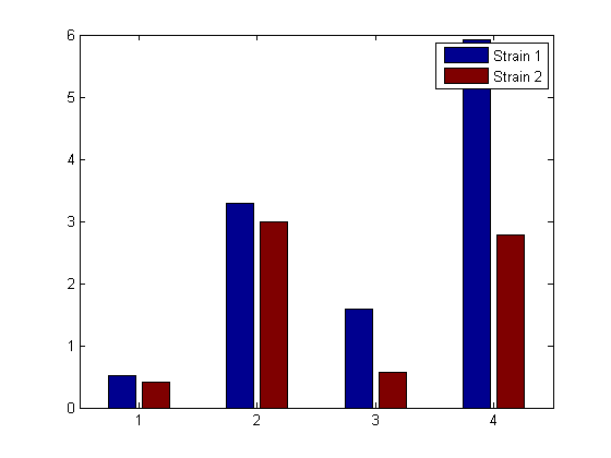
Use Matlab's bar command to plot this data (without error bars) as a bar chart:
bar([1 2 3 4],[Strain1_Mean' Strain2_Mean'])
legend('Strain 1','Strain 2')
pause; close all;
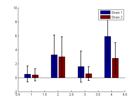
This looks ok, but we would really like some error bars, so we use a handy function (barwitherr) from the Matlab file exchange:
h=figure; hold;
barwitherr([Strain1_std' Strain2_std'], [1 2 3 4],[Strain1_Mean' Strain2_Mean'])
legend('Strain 1','Strain 2')
pause; close all;
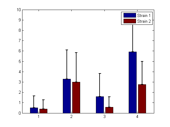
This is ok, but we'd rather only have one-sided error bars. To do this, use a 4x2x2 matrix for the errors: cat(3,zeros(4,2),[Strain1_std' Strain2_std'])
The function barwitherr uses the first matrix zeros(4,2) as the lower error, and the second matrix [Strain1_std' Strain2_std'] for the upper errors:
barwitherr(cat(3,zeros(4,2),[Strain1_std' Strain2_std']), [1 2 3 4],[Strain1_Mean' Strain2_Mean'])
legend('Strain 1','Strain 2')
pause; close all;
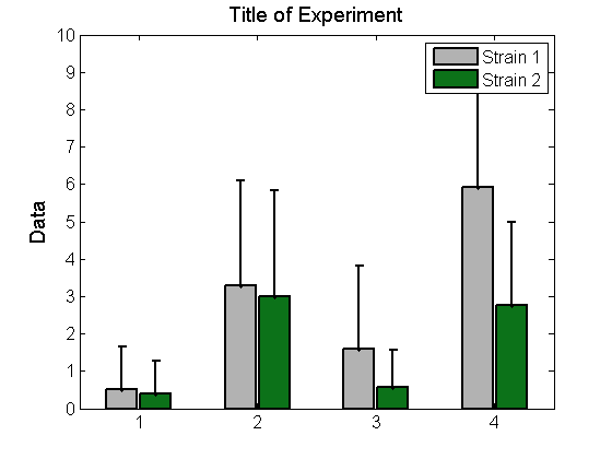
Don't like the colors? You can change them by modifying the colormap:
barmap=[0.7 0.7 0.7; 0.05 .45 0.1]; %[0.7 0.7 0.7] is grey, [ 0.05 .45 0.1] is green
colormap(barmap);
ylabel('Data','FontSize',14)
title('Title of Experiment','FontSize',14)
pause;
It isn't very useful to have our experimental conditions labelled 1,2,3,4. To change the x-ticks to labels:
set(ax, 'XTick',[1 2 3 4],'XTickLabel',{'A','B','C','D' });
pause;
Maybe we would like more information in our x-tick labels. But if the labels are too long, they will overlap. To get around this, rotate the x-tick labels using the function xticklabel_rotate from the Matlab file exchange (see references below):
set(ax, 'FontSize',12,'XTick',[1 2 3 4],'XTickLabel',{'Condition A','Condition B','Condition C','Condition D' });
xticklabel_rotate([1 2 3 4],45,{'Condition A','Condition B','Condition C','Condition D' })
pause
If you are going to use this figure in a presentation or paper you can save it in various forms (including as a file for adobe illustrator). Recall that h is our figure handle:
saveas(h, 'ExampleBar.fig','fig')
saveas(h, 'ExampleBar.png','png')
saveas(h, 'ExampleBar.ai','ai')
close all;
Code
You can copy and paste the code below into a Matlab m-file to run all of the examples shown above. You will also need the two functions listed in the references below, available from the Matlab file exchange at Matlab Central.
close all;

%Suppose you have the following data for two different strains across 4
%different experimental conditions (Conditions A,B,C,D, from left to right)
Strain1_Mean=[0.5137    3.2830    1.5887    5.9188];
Strain2_Mean=[0.4042    2.9884    0.5709    2.7766];
Strain1_std=[1.1393    2.8108    2.2203    3.5233];
Strain2_std=[0.8762    2.8478    0.9878    2.2197];


%Plot this data as a bar chart
bar([1 2 3 4],[Strain1_Mean' Strain2_Mean'])
legend('Strain 1','Strain 2')
pause; close all;

%This looks ok, but we would really like some error bars, so we use a handy
%function from the file exchange:
h=figure; hold;
barwitherr([Strain1_std' Strain2_std'], [1 2 3 4],[Strain1_Mean' Strain2_Mean'])
legend('Strain 1','Strain 2')
pause; close all;

%This is ok, but we'd rather only have one-sided error bars.  To do this,
%you will send barwitherr zeros for the lower error and keep the upper
%error as is by sending in the matrix cat(3,zeros(4,2),[Strain1_std'
%Strain2_std']) for the error
barwitherr(cat(3,zeros(4,2),[Strain1_std' Strain2_std']), [1 2 3 4],[Strain1_Mean' Strain2_Mean'])
legend('Strain 1','Strain 2')
pause; close all;

%Now let's use better colors by changing the color map and set the bar
%widths, line widths, axis fonts etc to something prettier
barwitherr(cat(3,zeros(4,2),[Strain1_std' Strain2_std']), [1 2 3 4],[Strain1_Mean' Strain2_Mean'],'LineWidth',2,'BarWidth',0.9)
legend('Strain 1','Strain 2')
%set the axis properties
ax=gca;
set(ax, 'FontSize',12)


%Don't like the colors? You can change them by modifying the colormap:
barmap=[0.7 0.7 0.7; 0.05 .45 0.1]; %[0.7 0.7 0.7] is grey, [ 0.05 .45 0.1] is a green
colormap(barmap);
ylabel('Data','FontSize',14)
title('Title of Experiment','FontSize',14)
pause;

%It isn't very useful to have our experimental conditions labelled 1,2,3,4
%so can we change these to words? Yes:
set(ax, 'XTick',[1 2 3 4],'XTickLabel',{'A','B','C','D' });
pause;
%But this isn't perfect, maybe we want more information on the axis.  To
%have actual labels rotate them using the handy xticklabel_rotate function:
%set(ax, 'FontSize',12,'XTick',[1 2 3 4],'XTickLabel',{'Condition A','Condition B','Condition C','Condition D' });
xticklabel_rotate([1 2 3 4],45,{'Condition A','Condition B','Condition C','Condition D' })
pause

%If you are going to use this figure in a presentation or paper you can
%save it in various forms (including as a file for adobe illustrator):

%Recall that h is our figure handle:
 saveas(h, 'ExampleBar.fig','fig')
 saveas(h, 'ExampleBar.png','png')
 saveas(h, 'ExampleBar.ai','ai')

 close all;
Notes
Please feel free to post comments, questions, or improvements to this protocol. Happy to have your input!
- Megan N McClean 17:27, 11 June 2012 (EDT): There are probably more elegant ways of doing this, but this solution has worked well for me so far. Please feel free to update and add information as you figure out better ways of doing this.
References
Function xticklabel_rotate: xticklabel_rotate
Function barwitherr: barwitherr
Contact
- Megan N McClean 14:01, 11 June 2012 (EDT)
or instead, discuss this protocol.


