前端的物理像素、逻辑像素、移动端1像素边框解决方案
概念
物理像素:也称硬件像素,也就是说手机屏幕实际拥有的像素点,如:iPhone 6屏幕宽度750个像素点,高度1334个像素点
逻辑像素:也称设备独立像素,即在css/js代码中使用的像素
设备像素比(DPR):设备的 物理像素 与 逻辑像素 比
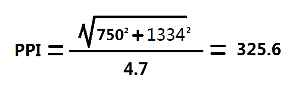
PPI:英文Pixels Per Inch的缩写,意为每英寸所占用的像素数目,主要用于荧幕,如:手机、IPad,一英寸相当于2.54厘米。如iPhone 6的PPI是
DPI:是英文Dots Per Inch的缩写,意为每英寸占用的点数目,主要用于印刷,手机设备上不说DPI
设备逻辑像素和物理像素获取
在iPhone 6设备上通过window.screen.width和document.documentElement.clientWidth获取的宽度都是逻辑像素375
而我们经常说的1倍图、2倍图、3倍图,就是是通过 设备的 物理像素 / 逻辑像素 计算得来,如iPhone 6(750 / 375 = 2)。也可以直接通过window.devicePixelRatio获取设备的像素比
注意
在js代码中是无法直接获取到设备的物理像素的,需要通过document.documentElement.clientWidth * window.devicePixelRatio来间接的获取
各个设备尺寸图
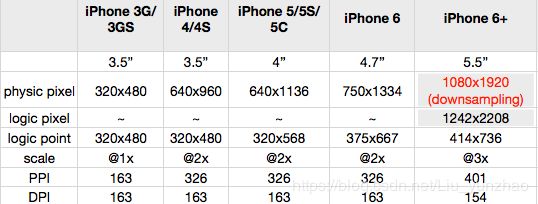
physic pixel:物理像素
logic pixel:设计像素(iPhone+独有的,比较特殊)
logic point:设备独立像素
scale:设备像素比(DPR)
PPI:每英寸所占用的像素数目
DPI:每英寸占用的点数目
在上图中我们发现iPhone 6+ 下面多了(downsampling 1242 * 2208),细心的我们其实也发现了,逻辑像素414 * 736 放大3倍就是1242 * 2208,而这里iPhone 6+的物理像素怎么会是1080 * 1920呢?
这个downsample(降低采样)技术就是将1242 * 2208个像素塞到1080 * 1920个实际物理像素点里来渲染,这个过程是系统自动完成的,我们不需要管,
所以我们在做适配时,可直接把1242 * 2208视为iPhone 6+ 的物理像素,设计也是以1242 * 2208为标准,因此通常把1242 * 2208称为iPhone 6+的 设计像素
iPhone 6+为什么这样设计?
其实,当初苹果公司在确定iPhone 6Plus的设备像素比时,想过如果选2,同样的字号在iPhone 6Plus上看起来比6还小,不好;如果选3,字又显得太大,导致一屏展示的内容还没有6多;最合适视觉的设备像素比值是2.46,但是这样一个数字能把设计师和程序员逼疯,最后就想出了引入“设计像素”这样一个两全其美的方案。
移动端1px边框解决方案
通过上边的概念,我们知道在代码中写的1px反应到手机设备上会根据设备像素比显示成1px、2px、3px等,比如在2倍屏750*1334设备上显示的就是2px。这也就是为什么我们会在手机上看的边框有时候会比想象中的粗。
解决方案:伪元素 + transform 实现
**原理:**通过把伪元素绝对定位到某个位置,再根据设备像素比,通过transform的scale对伪元素进行缩放来达到真正的1px边框。
比如实现底部1px边框
.border-bottom-1px {
  position: relative;
}

.border-bottom-1px::after {
  content: ' ';
  width: 100%;
  height: 0;
  position: absolute;
  left: 0;
  bottom: 0;
  overflow: hidden;
  border-bottom: 1px black solid;
  transform-origin: left bottom;
}
@media only screen and (-webkit-min-device-pixel-ratio: 1.5), only screen and (min-device-pixel-ratio: 1.5) {
  .border-bottom-1px::after {
    -webkit-transform: scaleY(.7);
    transform: scaleY(.7);
  }
}

@media only screen and (-webkit-min-device-pixel-ratio: 2), only screen and (min-device-pixel-ratio: 2) {
  .border-bottom-1px::after {
    -webkit-transform: scaleY(.5);
    transform: scaleY(.5);
  }
}

@media only screen and (-webkit-min-device-pixel-ratio: 3), only screen and (min-device-pixel-ratio: 3) {
  .border-bottom-1px ::after {
    -webkit-transform: scaleY(.33);
    transform: scaleY(.33);
  }
}
先把伪元素定位到底部,再根据设备的像素比,通过transform对伪元素的Y轴进行缩放来到达真正的1px边框
比如实现上下左右1px边框
.border {
  position: relative;
}

.border::before {
  content: ' ';
  position: absolute;
  left: 0;
  top: 0;
  overflow: hidden;
  border: 1px black solid;
  transform-origin: left top;
}
@media only screen and (-webkit-min-device-pixel-ratio: 1.5), only screen and (min-device-pixel-ratio: 1.5) {
  .border::before {
    width: 150%;
    height: 150%;
    transform: scale(.7);
  }
}

@media only screen and (-webkit-min-device-pixel-ratio: 2), only screen and (min-device-pixel-ratio: 2) {
  .border::before {
    width: 200%;
    height: 200%;
    transform: scale(.5);
  }
}

@media only screen and (-webkit-min-device-pixel-ratio: 3), only screen and (min-device-pixel-ratio: 3) {
  .border::before {
    width: 300%;
    height: 300%;
    transform: scale(.33);
  }
}
四个边都有边框稍微复杂一点,首先也是通过伪元素设置border,再根据设备的像素比,先给伪元素设置宽高,并对宽高进行放大,然后再通过transform对伪元素的X、Y轴进行缩放来到达真正的1px边框。
这里有一份从网上找的封装好的样式,各种组合的边框样式都有
Border样式下载