python matplotlib各种绘图类型完整总结
文章目录
- 1. Matplotlib图像基础
- 1.1 __基本绘图实例:sin、cos函数图__
- 1.2 plot()函数详解
- 1.3 __matplotlib中绘图的默认配置__
- 1.4 __设置图的横纵坐标的上下界:__
- 1.5 __设置横纵坐标上的记号__
- 1.6 __调整图像的脊柱__
- 1.7 添加图例
- 1.8 给一些特殊点加注释
- 1.9 子图
- 2. 函数间区域填充函数 fill_between()和fill()
- 3. 散点图
- 4. 直方图
- 5. 条形图
- 5.1 一个数据样本的条形图
- 5.2 多个数据样本进行对比的直方图
- 5.3 水平条形图
- 5.4 绘制不同数据样本进行对比的水平条形图
- 5.5 堆叠条形图
- 6. 等高线图
- 7. 雷达图
- 7.1 圆形雷达图
- 7.2 多边形雷达图
- 8. 极坐标图
- 9. 折线图
- 10. 灰度图
- 11. 热力图
- 11.1 自定义colormap
- 12. 箱线图
- 13. 饼图
- 14. 学会使用```help()```函数
1. Matplotlib图像基础
1.1 基本绘图实例:sin、cos函数图
from pylab import *
import numpy as np
import matplotlib.pyplot as plt

x = np.linspace(-np.pi, np.pi, 256, endpoint=True)
c, s = np.cos(x), np.sin(x)

plt.plot(x, c)
plt.plot(x, s)

show()

1.2 plot()函数详解
调用形式一般为:
plot([x], y, [fmt], data=None, **kwargs)
plot([x], y, [fmt], [x2], y2, [fmt2], …, **kwargs)
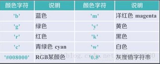
其中可选参数[fmt]是一个字符串,用于定义图的基本属性:颜色(color)、点型(marker)、线型(linestyle)
具体形式为:fmt = [color][marker][linestyle],注意这里的三个属性只能是每个属性的单个字母缩写,若属性用的是全名则不能用[fmt]参数来组合赋值
**kwargs参数:
- x: x轴数据
- y: y轴数据
- linewidth: 线宽
- color:线条颜色
- marker: 标记风格

- linestyle: 线条样式

- markerfacecolor 标记颜色
- markersize 标记大小
from pylab import *
import numpy as np
import matplotlib.pyplot as plt

x = np.linspace(-np.pi, np.pi, 256, endpoint=True)
c, s = np.cos(x), np.sin(x)

plt.plot(x, c, 'b|-')
plt.plot(x, s)

show()

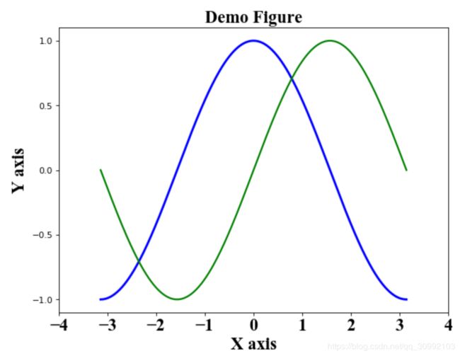
1.3 matplotlib中绘图的默认配置
from pylab import *
import numpy as np
import matplotlib.pylab as plt

# 创建一个8*6点(point)的图,并设置分辨率为80
figure(figsize=(8, 6), dpi=80)

# 创建一个新的1*1的子图,接下来的图样绘制在其中的第一块中
subplot(1, 1, 1)

# 得到坐标点(x,y)坐标
X = np.linspace(-np.pi, np.pi, 256, endpoint=True)
C, S = np.cos(X), np.sin(X)

# 绘制余弦曲线,使用蓝色的、连续的、宽度为1的线条
plot(X, C, color='blue', linewidth=2.5, linestyle='-')

# 绘制正弦曲线,使用绿色的、连续的、宽度为1的线条
plot(X, S, color='green', linewidth=2.0, linestyle='-')

# 设置横轴的上下限
xlim(-4.0, 4.0)

# 设置横轴记号
xticks(np.linspace(-4, 4, 9, endpoint=True), fontproperties='Times New Roman', size=20)

# 设置纵轴记号
yticks(np.linspace(-1, 1, 5, endpoint=True))

#设置横纵坐标的名称以及对应字体格式
font = {'family' : 'Times New Roman',
'weight' : 'normal',
'size'   : 20,
}

# 设置横轴标签
plt.xlabel('X axis', font)

# 设置纵轴标签
plt.ylabel('Y axis', font)

# 设置图像标题
plt.title('Demo Figure', font)

# 以分辨率72来保存图片
savefig('demo.png', dpi=72)

# 在屏幕上显示
show()
1.4 设置图的横纵坐标的上下界:
xlim(), ylim()
from pylab import *
import numpy as np

# 得到坐标点(x,y)坐标
X = np.linspace(-np.pi, np.pi, 256, endpoint=True)
C, S = np.cos(X), np.sin(X)

x_min, x_max = X.min(), X.max()
c_min, c_max = C.min(), C.max()
s_min, s_max = S.min(), C.max()
y_min, y_max = min(c_min, s_min), max(c_max, s_max)

# 设置横纵坐标上下界的偏移量,这样能够完整的显示图像且最美观
dx = (x_max - x_min) * 0.2
dy = (y_max - y_min) * 0.2

# 设置上下限
xlim(x_min - dx, x_max + dx)
ylim(y_min - dy, y_max + dy)

# 绘制余弦曲线,使用蓝色的、连续的、宽度为1的线条
plot(X, C, color='blue', linewidth=2.5, linestyle='-')

# 绘制正弦曲线,使用绿色的、连续的、宽度为1的线条
plot(X, S, color='green', linewidth=2.0, linestyle='-')

show()

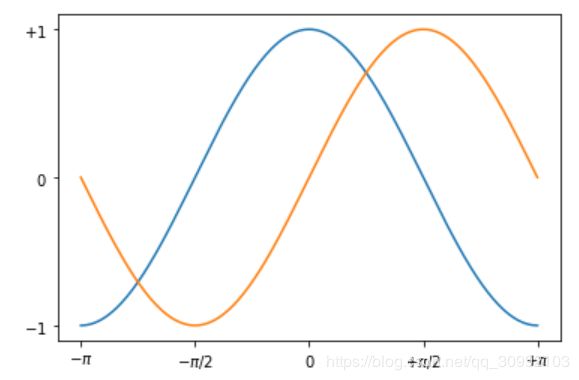
1.5 设置横纵坐标上的记号
xticks(), yticks()
这两个函数的用处在于指明横纵轴需要显示的内容和显示内容的位置,
参数的值可以有两种情况:
- 当横纵坐标的值为普通的数字时:参数为一个list,list中的元素为数字,此时两个函数的参数只需要这一个list
- 当横纵坐标的值为公式(使用的latex中的公式表示,如’ p i pi pi’)或其他和当前的坐标值不同的值时:参数为两个list,第一个list为普通数字对应的是纵坐标值,第二个list为第一个list中纵坐标位置对应要显示的值,可以是公式也可以是其他和当前纵坐标值不同的表示
from pylab import *
import numpy as np
import matplotlib.pyplot as plt

x = np.linspace(-np.pi, np.pi, 256, endpoint=True)
c, s = np.cos(x), np.sin(x)

xticks([-np.pi, -np.pi/2, 0, np.pi/2, np.pi],
       [r'$-\pi$', r'$-\pi/2$', r'$0$', r'$+\pi/2$', r'$+\pi$'])

yticks([-1, 0, +1],
       [r'$-1$', r'$0$', r'$+1$'])

plt.plot(x, c)
plt.plot(x, s)

show()
1.6 调整图像的脊柱
坐标轴和上面的记号连在一起就形成了脊柱(Spines,一条线段上又一系列凸起,是不是很像脊柱),它记录了数据区域的范围,它们可以放在任意位置,不过默认是放在图的四边。
实际上每幅图都有四条脊柱(上下左右),为了将脊柱放在图的中间,我们必须将其中的两条(上和右)设置为无色,然后调整剩下的两条到合适的位置——数据空间的0点
from pylab import *
import numpy as np
import matplotlib.pyplot as plt

x = np.linspace(-np.pi, np.pi, 256, endpoint=True)
c, s = np.cos(x), np.sin(x)

plt.plot(x, c)
plt.plot(x, s)

# 设置坐标轴gca(),获取坐标轴信息
ax = gca()

'''
使用ax.spines[]选定边框,使用set_color()将选定的边框的颜色设为 none
'''
ax.spines['right'].set_color('none')
ax.spines['top'].set_color('none')

'''
移动坐标轴,将bottom即x坐标轴移动到y=0的位置
ax.xaixs为x轴,set_ticks_position()用于从上下左右(top/bottom/left/right)四条脊柱中选择一个作为x轴
使用set_position()设置边框位置:y=0的位置。位置的所有属性包括:outward、axes、data
'''
ax.xaxis.set_ticks_position('bottom')
ax.spines['bottom'].set_position(('data', 0))

'''
将left 即y坐标轴设置到x=0的位置
'''
ax.yaxis.set_ticks_position('left')  # 选定y轴
ax.spines['left'].set_position(('data', 0))

plt.show()

1.7 添加图例
在plot()函数中增加一个参数label,再通过legend()函数显示图例
from pylab import *
import numpy as np
import matplotlib.pyplot as plt

x = np.linspace(-np.pi, np.pi, 256, endpoint=True)
c, s = np.cos(x), np.sin(x)

plt.plot(x, c, label='cosine')
plt.plot(x, s, label='sine')

legend(loc='upper left')

show()

1.8 给一些特殊点加注释
scatter(x, y, s=None, c=None, marker=None, cmap=None, norm=None, vmin=None, vmax=None, alpha=None, linewidths=None, verts=None, edgecolors=None, hold=None, data=None, **kwargs)
函数用于在图像中绘制散点
参数:
- x/y:都是向量形式,且维度相同,分别对应坐标点的横纵坐标
- scalar: 标记大小,以平方磅为单位的标记面积,可以有一下形式:
- 数值标量 : 以相同的大小绘制所有标记。
- 行或列向量 : 使每个标记具有不同的大小。x、y 和 sz 中的相应元素确定每个标记的位置和面积。sz 的长度必须等于 x 和 y 的长度。
- [] : 使用 36 平方磅的默认面积。
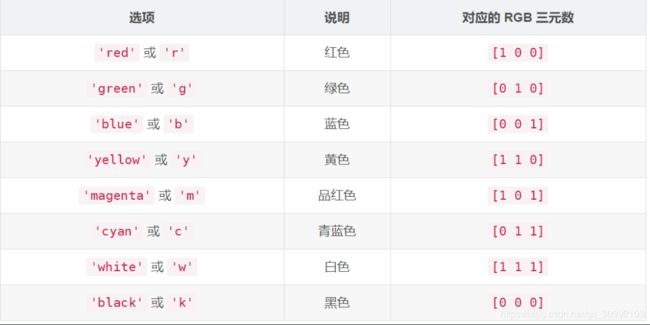
- color: 标记的颜色,有下列不同的赋值方式:
- RGB 三元数或颜色名称 - 使用相同的颜色绘制所有标记。
- 由 RGB 三元数组成的三列矩阵 - 对每个标记使用不同的颜色。矩阵的每行为对应标记指定一种 RGB 三元数颜色。行数必须等于 x 和 y 的长度
- 向量 - 对每个标记使用不同的颜色,并以线性方式将 c 中的值映射到当前颜色图中的颜色。c 的长度必须等于 x 和 y 的长度。要更改坐标区的颜色图,请使用 colormap 函数。如果散点图中有三个点,并且您希望这些颜色成为颜色图的索引,请以三元素列向量的形式指定 c。
- marker: 标记样式

- edgecolors: 轮廓颜色,参数形式和color类似
- alpha: 透明度,值在[0, 1]范围内,1表示不透明,0表示透明
- linewidths: 线宽,表示标记边缘的宽度,默认是"face"
- cmap: 自定义色彩盘,实际上就是一个三列的矩阵,shape为 [ N , 3 ] [N, 3] [N,3],一个实例可以参考matplotlib使用自己想要的color map
```annotate(s, xy, *args, **kwargs)```
函数用于在图形上给数据点添加文本注解,而且支持带箭头的划线工具,方便我们在合适的位置添加描述信息。具体的内容可以参考Matplotlib中的annotate用法
参数:
- s: 注释文本中的内容
- color: 注释文本的颜色
- xy: 被注释的坐标点,二维元组形式(x, y)
- xytext: 注释文本的坐标点,也是二维元组(x, y)形式
- xycoords: 被注释的坐标系属性,允许输入的值如下图

- textcoords: 注释文本的坐标系属性,默认与xycoords属性值相同,除了允许输入xycoords的属性值,还允许输入以下两种:

- arrowprops: 用于标注的箭头的样式,这个参数是一个dict类型的数据。如果该属性为空,则会在注释文本和被注释点之间画一个箭头。箭头的样式可以通过
arrowstyle关键字来指定默认的可选类型,arrowstyle关键字包含的默认类型包括以下:
如果没有arrowstyle关键字,则箭头的样式可以由以下关键字指定(注意arrowstyle和以下关键字不能同时存在)

箭头、坐标点和注释文本之间的关系属性包括如下图。其中connectionstyle属性用于控制注释点和注释文本之间的连接线的属性,比如弧度,角度之类的信息,这里还不是太清楚。

from pylab import *
import numpy as np
import matplotlib.pyplot as plt

x = np.linspace(-np.pi, np.pi, 256, endpoint=True)
c, s = np.cos(x), np.sin(x)

plt.plot(x, c)
plt.plot(x, s)

# 调整图像的脊柱
ax = gca()
ax.spines['right'].set_color('none')
ax.spines['top'].set_color('none')
ax.xaxis.set_ticks_position('bottom')
ax.spines['bottom'].set_position(('data', 0))
ax.yaxis.set_ticks_position('left')  # 选定y轴
ax.spines['left'].set_position(('data', 0))

# 在2*np.pi/3的位置给两条函数曲线加上一个注释
t = 2 * np.pi / 3
plt.plot([t, t], [0, np.cos(t)], color='blue', linewidth=2.5,linestyle='--')
scatter([t, ], [np.cos(t), ], 50, color='blue')
annotate(r'$\sin(\frac{2\pi}{3})=\frac{\sqrt{3}}{2}$',
         xy=(t, np.sin(t)), xycoords='data',
         xytext=(+10, +30), textcoords='offset points', fontsize=16,
         arrowprops=dict(arrowstyle="->", connectionstyle="arc3,rad=.2"))

plot([t,t],[0,np.sin(t)], color ='red', linewidth=2.5, linestyle="--")
scatter([t,],[np.sin(t),], 50, color ='red')
annotate(r'$\cos(\frac{2\pi}{3})=-\frac{1}{2}$',color='green',
         xy=(t, np.cos(t)), xycoords='data',
         xytext=(-90, -50), textcoords='offset points', fontsize=16,
         arrowprops=dict(arrowstyle="->", connectionstyle="arc3,rad=.2"))  # arc, angle, armA, rad

show()

1.9 子图
图像的属性包括以下几个:

from pylab import *

'''
subplot()函数的参数中,除最后一维的其他维表示子图的大小,最后一维表示当前子图在图像中的位置,如下实例,在2*2的网格里,第四个子图为(2, 2, 4)

创建横跨多个位置的子图用gridspec实现

'''
"""
    添加多个固定大小的子图:
fig = plt.figure(figsize=(10, 10), dpi=80, facecolor='red')
ax1 = fig.add_subplot(2, 2, 1)
ax2 = fig.add_subplot(2, 2, 4)
ax1.plot() ...
ax2.plot() ...

"""

subplot(2,2,1)
xticks([]), yticks([])
text(0.5,0.5, 'subplot(2,2,1)',ha='center',va='center',size=20,alpha=.5)

subplot(2,2,2)
xticks([]), yticks([])
text(0.5,0.5, 'subplot(2,2,2)',ha='center',va='center',size=20,alpha=.5)

subplot(2,2,3)
xticks([]), yticks([])
text(0.5,0.5, 'subplot(2,2,3)',ha='center',va='center',size=20,alpha=.5)

subplot(2,2,4)
xticks([]), yticks([])
text(0.5,0.5, 'subplot(2,2,4)',ha='center',va='center',size=20,alpha=.5)

# savefig('../figures/subplot-grid.png', dpi=64)
show()

from pylab import *
import matplotlib.gridspec as gridspec
# gridspec的用法,可以使图像横跨多个坐标
G = gridspec.GridSpec(3, 3)

axes_1 = subplot(G[0, :])
xticks([]), yticks([])
text(0.5,0.5, 'Axes 1',ha='center',va='center',size=24,alpha=.5)

axes_2 = subplot(G[1,:-1])
xticks([]), yticks([])
text(0.5,0.5, 'Axes 2',ha='center',va='center',size=24,alpha=.5)

axes_3 = subplot(G[1:, -1])
# 确定了这个子图的位置之后,就可以直接在上面画图,直到创建了下个新的子图
x = np.linspace(-np.pi, np.pi, 256, endpoint=True)
c, s = np.cos(x), np.sin(x)
plt.plot(x, c)
plt.plot(x, s)
#xticks([]), yticks([])
#text(0.5,0.5, 'Axes 3',ha='center',va='center',size=24,alpha=.5)

axes_4 = subplot(G[-1,0])
xticks([]), yticks([])

'''
    text()函数用于在图像上的特定位置加上一些文本,用于注释

'''

text(0.5,0.5, 'Axes 4',ha='center',va='center',size=24,alpha=.5)

axes_5 = subplot(G[-1,-2])
xticks([]), yticks([])
text(0.5,0.5, 'Axes 5',ha='center',va='center',size=24,alpha=.5)

#plt.savefig('../figures/gridspec.png', dpi=64)
show()

from pylab import *

'''
    使用axes()函数来确定当前子图的位置和大小,参数为一个list[x, y, width, height],
        x,y为当前子图的左下角坐标位置,width为子图的宽度,height为子图的高度

'''
axes([0.1,0.1,0.8,0.8])
xticks([]), yticks([])
text(0.6,0.6, 'axes([0.1,0.1,.8,.8])',ha='center',va='center',size=20,alpha=.5)

axes([0.2,0.2,.3,.3])
x = np.linspace(-np.pi, np.pi, 256, endpoint=True)
c, s = np.cos(x), np.sin(x)
plt.plot(x, c)
plt.plot(x, s)
# xticks([]), yticks([])
# text(0.5,0.5, 'axes([0.2,0.2,.3,.3])',ha='center',va='center',size=16,alpha=.5)

# plt.savefig("../figures/axes.png",dpi=64)
show()

from pylab import *

axes([0.1,0.1,.5,.5])
xticks([]), yticks([])
text(0.1,0.1, 'axes([0.1,0.1,.5,.5])',ha='left',va='center',size=16,alpha=.5)

axes([0.2,0.2,.5,.5])
xticks([]), yticks([])
text(0.1,0.1, 'axes([0.2,0.2,.5,.5])',ha='left',va='center',size=16,alpha=.5)

axes([0.3,0.3,.5,.5])
x = np.linspace(-np.pi, np.pi, 256, endpoint=True)
c, s = np.cos(x), np.sin(x)
plt.plot(x, c)
plt.plot(x, s)
# xticks([]), yticks([])
# text(0.1,0.1, 'axes([0.3,0.3,.5,.5])',ha='left',va='center',size=16,alpha=.5)

axes([0.4,0.4,.5,.5])
xticks([]), yticks([])
text(0.1,0.1, 'axes([0.4,0.4,.5,.5])',ha='left',va='center',size=16,alpha=.5)

# plt.savefig("../figures/axes-2.png",dpi=64)
show()
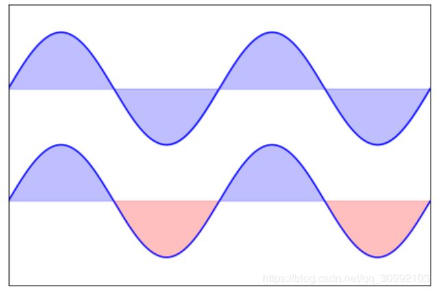
2. 函数间区域填充函数 fill_between()和fill()
plt.fill_between(x, y1, y2, where, color, alpha)
参数:
- x: x轴坐标值,为一个list
- y1: 第一条曲线对应的函数值,为x对应的函数值list
- y2: 第二条曲线对应的函数值,为x对应的函数值list
- where: 条件表达式,用于判断某个区间内是否进行填充,如果判断为True,则进行填充,否则不填充
- color: 填充区域的颜色
- alpha: 填充区域的透明度,1表示不透明,0表示完全透明
一些实例可以参考基于matplotlib的数据可视化(图形填充函数fill和fill_between)
import numpy as np
import matplotlib.pyplot as plt

n = 256
X = np.linspace(-np.pi,np.pi,n,endpoint=True)
Y = np.sin(2*X)

plt.axes([0.025,0.025,0.95,0.95])

plt.plot (X, Y+1, color='blue', alpha=1.00)
plt.fill_between(X, 1, Y+1, color='blue', alpha=.25)

plt.plot (X, Y-1, color='blue', alpha=1.00)
plt.fill_between(X, -1, Y-1, (Y-1) > -1, color='blue', alpha=.25)
plt.fill_between(X, -1, Y-1, (Y-1) < -1, color='red',  alpha=.25)

plt.xlim(-np.pi,np.pi), plt.xticks([])
plt.ylim(-2.5,2.5), plt.yticks([])
# savefig('../figures/plot_ex.png',dpi=48)
plt.show()
3. 散点图
scatter()
前面已经详细讲过,这里不再赘述。
import numpy as np
import matplotlib.pyplot as plt

n = 1024
X = np.random.normal(0,1,n)
Y = np.random.normal(0,1,n)
T = np.arctan2(Y,X)  # T中包含了数据点的颜色到当前colormap的映射值
# print(T.shape)
plt.axes([0.025,0.025,0.95,0.95])
plt.scatter(X,Y, s=75, c=T, alpha=.5)

plt.xlim(-1.5,1.5), plt.xticks([])
plt.ylim(-1.5,1.5), plt.yticks([])
# savefig('../figures/scatter_ex.png',dpi=48)
plt.show()

4. 直方图
直方图和条形图外观上看上去差不多,但概念和实现上完全不同,需要加以区分:
- 条形图: 每个条形表示一个类别,条形的高度表示类别的频数。
- 直方图: 用长条形的面积表示频数,宽度表示数据范围,高度为 频 数 宽 度 \frac{频数}{宽度} 宽度频数。
| 区别 | 频数分布直方图 | 条形图 |
|---|---|---|
| 横轴上的数据 | 连续的,是一个范围 | 孤立的,代表一个类别 |
| 长条形之间 | 没有空隙 | 有空隙 |
| 频数的表示 | 一般用面积表示;当宽度相同时,用长度表示 | 长条形的高度 |
import matplotlib.pyplot as plt
import numpy as np
import matplotlib

# 设置matplotlib正常显示中文和负号
matplotlib.rcParams['font.sans-serif']=['SimHei']   # 用黑体显示中文
matplotlib.rcParams['axes.unicode_minus']=False     # 正常显示负号
# 随机生成(10000,)服从正态分布的数据
data = np.random.randn(10000)
"""
绘制直方图
data:必选参数,绘图数据
bins:直方图的长条形数目,可选项,默认为10
normed:是否将得到的直方图向量归一化,可选项,默认为0,代表不归一化,显示频数。normed=1,表示归一化,显示频率。
facecolor:长条形的颜色
edgecolor:长条形边框的颜色
alpha:透明度
"""
plt.hist(data, bins=40, normed=0, facecolor="blue", edgecolor="black", alpha=0.7)
# 显示横轴标签
plt.xlabel("区间")
# 显示纵轴标签
plt.ylabel("频数/频率")
# 显示图标题
plt.title("频数/频率分布直方图")
plt.show()

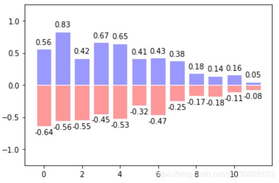
5. 条形图
5.1 一个数据样本的条形图
bar()
参数:
- x: 长条形中的横坐标点list
- left: 长条形左边沿x轴坐标list
- height: 长条形对应每个横坐标的高度值
- width: 长条形的宽度,默认值为0.8
- label: 每个数据样本对应的label,后面调用legend()函数可以显示图例
- alpha: 透明度
from pylab import *


n = 12
X = np.arange(n)
Y1 = (1-X/float(n)) * np.random.uniform(0.5,1.0,n)
Y2 = (1-X/float(n)) * np.random.uniform(0.5,1.0,n)

bar(X, +Y1, facecolor='#9999ff', edgecolor='white')
bar(X, -Y2, facecolor='#ff9999', edgecolor='white')
#xticks(X)
for x,y in zip(X,Y1):
    text(x, y+0.05, '%.2f' % y, ha='center', va= 'bottom')
for x, y in zip(X, -Y2):
    text(x, y-0.15, '%.2f'% y, ha='center', va='bottom')

ylim(-1.25,+1.25)
show()
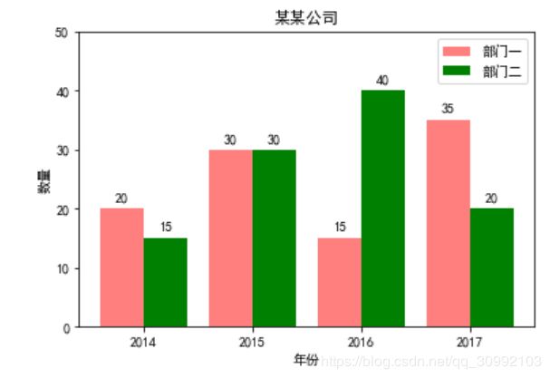
5.2 多个数据样本进行对比的直方图
import matplotlib.pyplot as plt
import matplotlib

"""
   多个数据样本进行对比时,要注意每个数据样本对应的颜色,对每个条形的注释文本设置和横纵坐标的设置

"""


# 设置中文字体和负号正常显示
matplotlib.rcParams['font.sans-serif'] = ['SimHei']
matplotlib.rcParams['axes.unicode_minus'] = False

label_list = ['2014', '2015', '2016', '2017']  # 横坐标刻度显示值
num_list1 = [20, 30, 15, 35]  # 纵坐标值1
num_list2 = [15, 30, 40, 20]  # 纵坐标值2
x = range(len(num_list1))

# 绘制条形图
rects1 = plt.bar(x, height=num_list1, width=0.4, alpha=0.5, color='red', label='部门一')
rects2 = plt.bar([i+0.4 for i in x], height=num_list2, width=0.4, color='green', label='部门二')

# 设置y轴属性
plt.ylim(0, 50)
plt.ylabel('数量')

# 设置x轴属性
plt.xticks([index+0.2 for index in x], label_list)
plt.xlabel("年份")
plt.title('某某公司')
plt.legend()

# 显示文本
for rect in rects1:
    height = rect.get_height()
    plt.text(rect.get_x() + rect.get_width() / 2, height + 1, str(height), ha='center', va='bottom')
for rect in rects2:
    height = rect.get_height()
    plt.text(rect.get_x() + rect.get_width() / 2, height + 1, str(height), ha='center', va='bottom')

plt.show()
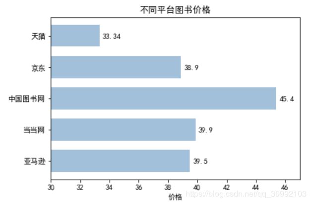
5.3 水平条形图
bar(y, width, height, left, *, align='center', **kwargs)
参数:
- y: y轴坐标值list
- left: 条形的左边沿对应的横坐标,即从这个点开始计算条形的宽度
- width: 每个y轴坐标值对应的条形的宽度list
- height: 条形的高度,在水平条形图中,条形的高度都是固定的。
- align: center或者edge,如果是center,则坐标点在条形的中间,如果是edge,则坐标点对应条形的底部
- color: 填充色
- edgecolor: 条形的边缘线条颜色
- linewidth: 条形的边缘线条线宽
import matplotlib.pyplot as plt
import matplotlib

matplotlib.rcParams['font.sans-serif'] = ['SimHei']
matplotlib.rcParams['axes.unicode_minus'] = False

price = [39.5, 39.9, 45.4, 38.9, 33.34]

# 绘制水平条形图
plt.barh(range(5), price, height=0.7, color='steelblue', alpha=0.5)
plt.yticks(range(5), ['亚马逊', '当当网', '中国图书网', '京东', '天猫'])
plt.xlim(30, 47)
plt.xlabel('价格')
plt.title('不同平台图书价格')
for x, y in enumerate(price):
    plt.text(y+0.2, x-0.1, '%s'%y)

plt.show()
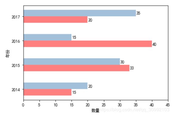
5.4 绘制不同数据样本进行对比的水平条形图
import matplotlib.pyplot as plt
import matplotlib

# 设置中文字体和负号正常显示
matplotlib.rcParams['font.sans-serif'] = ['SimHei']
matplotlib.rcParams['axes.unicode_minus'] = False

label_list = ['2014', '2015', '2016', '2017']
num_list1 = [20, 30, 15, 35]
num_list2 = [15, 33, 40, 20]
y = range(1, len(num_list1)+1)
y = [index*1.5 for index in y]


plt.barh(y, num_list1, height=0.4, color='steelblue', alpha=0.5)
plt.barh([index-0.4 for index in y], num_list2, height=0.4, color='red', alpha=0.5)
plt.yticks([index-0.2 for index in y], label_list)
plt.ylabel('年份')
plt.xlim(0, 45)
plt.xlabel('数量')

for x, y1 in zip(num_list1, y):
    plt.text(x+0.8, y1-0.1, str(x), ha='center', va='bottom')
for x, y2 in zip(num_list2, y):
    plt.text(x+0.8, y2-0.5, str(x), ha='center', va='bottom')


plt.show()
5.5 堆叠条形图
import matplotlib.pyplot as plt

x = [52, 69, 58, 12, 39, 75]
y = [56, 15, 84, 65, 45, 48]
index = np.arange(len(x))
width = 0.3

plt.bar(index, height=x, width=width, color='blue', label=u'x', alpha=0.5)
plt.bar(index, height=y, width=width, color='gold', label=u'y') # 第二个图不能设置alpha值,不然透明的两个条形会出现重叠
plt.xlabel('index')
plt.ylabel('x/y')
plt.title('barplot stack', fontsize=20, color='gray')
plt.legend(loc='best')

plt.show()

6. 等高线图
X, Y = np.meshgrid(X, Y)
假设X为m维向量,Y为n维向量:
- 将X作为一行,对这一行复制n次,得到m*n维的矩阵
- 先将Y转秩,再将转秩后的Y作为一列,对这一列复制m次,得到m*n维的矩阵
这样做可以使得X和Y中的每两个值互相都可以组成一个坐标点 ( x i , y j ) (x_{i}, y_{j}) (xi,yj),在将这些坐标点作为输入,通过一个
映射函数 f ( x ) f(x) f(x)求值,就可以得到一个三维图形。
例如: X = [ 1 , 2 , 3 ] , Y = [ 4 , 5 , 6 , 7 ] X = [1,2,3], Y=[4, 5, 6, 7] X=[1,2,3],Y=[4,5,6,7], 则 X , Y = n p . m e s h g r i d ( X , Y ) X,Y=np.meshgrid(X, Y) X,Y=np.meshgrid(X,Y)得到的结果为:
X = [ [ 1 , 2 , 3 ] , [ 1 , 2 , 3 ] , [ 1 , 2 , 3 ] , [ 1 , 2 , 3 ] ] X = [[1, 2, 3], [1, 2, 3], [1, 2, 3], [1, 2, 3]] X=[[1,2,3],[1,2,3],[1,2,3],[1,2,3]]
Y = [ [ 4 , 4 , 4 ] , [ 5 , 5 , 5 ] , [ 6 , 6 , 6 ] , [ 7 , 7 , 7 ] ] Y = [[4, 4, 4], [5, 5, 5], [6, 6, 6], [7, 7, 7]] Y=[[4,4,4],[5,5,5],[6,6,6],[7,7,7]]
plt.contour()
这个函数用于绘制等高线图
import matplotlib.pyplot as plt

def f(x,y): return (1-x/2+x**5+y**3)*np.exp(-x**2-y**2)

n = 256
x = np.linspace(-3,3,n)
y = np.linspace(-3,3,n)
X,Y = np.meshgrid(x,y)
#print(X,'----', Y)
plt.contourf(X, Y, f(X,Y), 8, alpha=.75, cmap='jet')
C = plt.contour(X, Y, f(X,Y), 8, colors='black')
show()

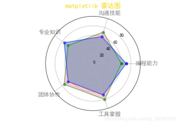
7. 雷达图
7.1 圆形雷达图
import matplotlib.pyplot as plt
import numpy as np

p1={"编程能力":60,"沟通技能":70,"专业知识":65,"团体协作":75,"工具掌握":80} #创建第一个人的数据
p2={"编程能力":70,"沟通技能":60,"专业知识":75,"团体协作":65,"工具掌握":70} #创建第二个人的数据

# 分别提取两个人的信息和对应的标签
data1=np.array([i for i in p1.values()]).astype(int) #提取第一个人的信息
data2=np.array([i for i in p2.values()]).astype(int) #提取第二个人的信息
label=np.array([j for j in p1.keys()]) #提取标签

angle = np.linspace(0, 2*np.pi, len(data1), endpoint=False) #data里有几个数据,就把整圆360°分成几份
# 闭合的目的是在绘图时能够生成闭合的环
angles = np.concatenate((angle, [angle[0]])) #增加第一个angle到所有angle里,以实现闭合
data1 = np.concatenate((data1, [data1[0]])) #增加第一个人的第一个data到第一个人所有的data里,以实现闭合
data2 = np.concatenate((data2, [data2[0]])) #增加第二个人的第一个data到第二个人所有的data里,以实现闭合

fig = plt.figure()
ax = fig.add_subplot(111, polar=True)  # 设置坐标轴为极坐标
# 绘制两个数据样本的闭合环
ax.plot(angles, data1, 'bo-', linewidth=2, color='green', alpha=0.5)
ax.fill(angles, data1, facecolor='red', alpha=0.2)
ax.plot(angles, data2, 'bo-', linewidth=2, color='blue', alpha=0.5)  #
ax.fill(angles, data2, facecolor='steelblue', alpha=0.5)
# 设置圆周每一维上显示的样本
ax.set_thetagrids(angles * 180/np.pi, label, fontproperties='SimHei', color='gray', fontsize=13)
# 设置在半径方向上要显示的文本和显示文本的角度
ax.set_rgrids(np.arange(0, 81, 20),angle=45)
ax.set_rlim(0, 100)
ax.set_title('matplotlib 雷达图', va='bottom', fontproperties='SimHei', color='gold', fontsize=15)
#help(ax.set_thetagrids)
7.2 多边形雷达图
import numpy as np
import matplotlib.pyplot as plt


def plot_radar(data):

    criterion = [1, 1, 1, 1, 1, 1] # 基准雷达图
    angles = np.linspace(0, 2 * np.pi, 5, endpoint=False)
    angles = np.concatenate((angles, [angles[0]]))
    #print(criterion)
    #print(angles)
    fig = plt.figure(facecolor='#87CEEB') # 创建画板并填充颜色
    ax = fig.add_subplot(111, polar=True,)  # 设置坐标为极坐标
    # 绘制三个五边形
    floor = 0
    ceil = 2
    labels = np.array(['x1', 'x2', 'x3', 'x4', 'x5'])
    # 绘制五边形的循环
    for i in np.arange(floor, ceil + 0.5 ,0.5):
        ax.plot(angles, [i] * (6), '-', lw= 0.5, color='black')
    for i in range(5):
        ax.plot([angles[i], angles[i]], [floor, ceil], '-',lw=0.5, color='black')
     # 绘制雷达图
    ax.plot(angles, criterion, 'b-', lw=2, alpha=0.4)
    ax.fill(angles, criterion, facecolor='b', alpha=0.3) #填充
    ax.plot(angles, data, 'b-', lw=2, alpha=0.35)
    ax.fill(angles, data, facecolor='b', alpha=0.25)

    ax.set_thetagrids(angles * 180 / np.pi, labels)
    ax.spines['polar'].set_visible(False)#不显示极坐标最外的圆形
    ax.set_theta_zero_location('N')#设置极坐标的起点(即0度)在正上方向
    ax.grid(False)# 不显示分隔线
    ax.set_yticks([]) # 不显示坐标间隔
    ax.set_title('xxxxxxxxxxxx', va='bottom', fontproperties='SimHei')
    ax.set_facecolor('#87ceeb') # 填充绘图区域的颜色
    # 保存文png图片
    plt.subplots_adjust(left=0.09, right=1, wspace=0.25, hspace=0.25, bottom=0.13, top=0.91)
    plt.savefig('a_1.png')
    plt.show()
data = [0.8, 0.9, 1.2, 1.0, 1.5, 0.8]
plot_radar(data)

8. 极坐标图
import matplotlib.pyplot as plt
import numpy as np

N=20
theta=np.linspace(0,2*np.pi,N,endpoint=False)#均分角度
radii=10*np.random.rand(N)#随机角度
width=np.pi/4*np.random.rand(N)#随机宽度

ax=plt.subplot(111,projection='polar')#极坐标图绘制
bars=ax.bar(theta,radii,width=width,bottom=0.0)#哪个角度画,长度,扇形角度,从距离圆心0的地方开始画

for r,bar in zip(radii,bars):
    bar.set_facecolor(plt.cm.viridis(r/10.0))
    bar.set_alpha(0.5)    #添加颜色


plt.title('polar')
plt.show()

9. 折线图
import matplotlib.pyplot as plt

x = [5, 10, 15, 20, 25, 30, 35, 40]
y = [17, 24, 29, 36, 38, 47, 59, 80]

plt.plot(x, y, 'rs-', markersize=10)

10. 灰度图
灰度图和热力图的区别其实在于colormap的不同,灰度图采用的灰度map,而热力图一般采用的是多个颜色组成的彩色的map。
import numpy as np
import matplotlib.pyplot as plt

def f(x,y):
    return (1-x/2+x**5+y**3)*np.exp(-x**2-y**2)

n = 10
x = np.linspace(-3,3,3.5*n)
y = np.linspace(-3,3,3.0*n)
X,Y = np.meshgrid(x,y)
Z = f(X,Y)

plt.axes([0.025,0.025,0.95,0.95])
plt.imshow(Z, interpolation='bicubic', cmap='bone', origin='lower')
plt.colorbar(shrink=0.92)

plt.xticks([]), plt.yticks([])
# savefig('../figures/imshow_ex.png', dpi=48)
plt.show()

11. 热力图
import matplotlib.pyplot as plt
import matplotlib.colors as col
import matplotlib.cm as cm
import numpy as np

points = np.arange(-5, 5, 0.01)
# print(points)
xs, ys = np.meshgrid(points, points)

z = np.sqrt(xs**2 + ys**2)
# print(z)
# 自定义colormap
start_color = 'red'
end_color = 'blue'

cmap_1 = col.LinearSegmentedColormap.from_list('cmap1', [start_color, end_color])


plt.imshow(z, cmap=cmap_1, alpha=0.3)

plt.show()

11.1 自定义colormap
以下为自定义的colormap实例。
import matplotlib.pyplot as plt

points = np.arange(-5, 5, 1)
# print(points)
xs, ys = np.meshgrid(points, points)

z = np.sqrt(xs**2 + ys**2)

# 列表中包含的颜色数目并不固定,可以选多个
color = ['red', 'green', 'blue']

cmap_1 = col.LinearSegmentedColormap.from_list('cmap1', [start_color, end_color])
plt.imshow(z, cmap=cmap_1, alpha=1)
plt.colorbar(shrink=0.92)

plt.show()

12. 箱线图
箱线图是一种用作显示一组数据分散情况的统计图

箱线图有五个参数,分别为:
- 下边缘(Q1),表示最小值;
- 下四分位数(Q2),又称“第一四分位数”,等于该样本中所有数值由小到大排列后第25%的数字;
- 中位数(Q3),又称“第二四分位数”等于该样本中所有数值由小到大排列后第50%的数字;
- 上四分位数(Q4),又称“第三四分位数”等于该样本中所有数值由小到大排列后第75%的数字;
- 上边缘(Q5),表述最大值。
箱线图各参数和正态分布之间的对比如下图:

import matplotlib.pyplot as plt
import pandas as pd
import seaborn as sns
import numpy as np

# 0、导入数据集
df = pd.read_excel('boxplot_data.xlsx', 'Sheet1')

fig = plt.figure()
ax = fig.add_subplot(111)
ax.boxplot(df['Age'])
plt.show()

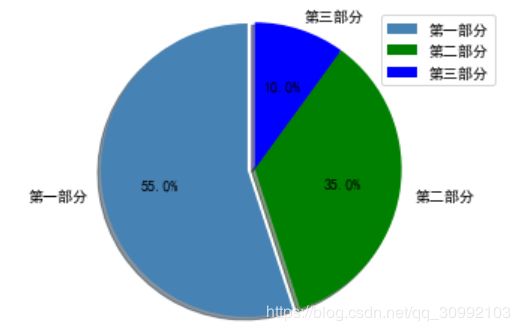
13. 饼图
import matplotlib.pyplot as plt
import matplotlib

matplotlib.rcParams['font.sans-serif'] = ['SimHei']
matplotlib.rcParams['axes.unicode_minus'] = False

label_list = ["第一部分", "第二部分", "第三部分"]    # 各部分标签
size = [55, 35, 10]    # 各部分大小
color = ["steelblue", "green", "blue"]     # 各部分颜色
explode = [0.05, 0, 0]   # 各部分突出值
"""
绘制饼图
explode:设置各部分突出
label:设置各部分标签,
labeldistance:设置标签文本距圆心位置,1.1表示1.1倍半径
autopct:设置圆里面文本
shadow:设置是否有阴影
startangle:起始角度,默认从0开始逆时针转
pctdistance:设置圆内文本距圆心距离
返回值
l_text:圆内部文本,matplotlib.text.Text object
p_text:圆外部文本
"""
patches, l_text, p_text = plt.pie(size, explode=explode, colors=color, labels=label_list,
                                  labeldistance=1.1, autopct="%1.1f%%", shadow=True, startangle=90, pctdistance=0.6)
plt.axis("equal")    # 设置横轴和纵轴大小相等,这样饼才是圆的
plt.legend()
plt.show()
14. 学会使用help()函数
像matplotlib这样的包在python中是非常多的,里面涉及大量的函数接口及其参数定义,想同时都记住是不可能也没有必要的,网上讲解各种函数的参数含义和使用的博客之类的资源很多,但大部分都不全,所以最靠谱的全面学习这些函数接口的方法应该是通过使用官方提供的help()函数,当然官方文档是英文的,会对英语有一定要求,大家可以结合者官方文档和网上的博客来学习。下面举一个简单的例子,来说明一下help()函数的用法。
import matplotlib.pyplot as plt


help(plt.figure)
Help on function figure in module matplotlib.pyplot:

figure(num=None, figsize=None, dpi=None, facecolor=None, edgecolor=None, frameon=True, FigureClass=, clear=False, **kwargs)
    Create a new figure.

    Parameters
    ----------
    num : integer or string, optional, default: None
        If not provided, a new figure will be created, and the figure number
        will be incremented. The figure objects holds this number in a `number`
        attribute.
        If num is provided, and a figure with this id already exists, make
        it active, and returns a reference to it. If this figure does not
        exists, create it and returns it.
        If num is a string, the window title will be set to this figure's
        `num`.

    figsize : (float, float), optional, default: None
        width, height in inches. If not provided, defaults to
        :rc:`figure.figsize` = ``[6.4, 4.8]``.

    dpi : integer, optional, default: None
        resolution of the figure. If not provided, defaults to
        :rc:`figure.dpi` = ``100``.

    facecolor : color spec
        the background color. If not provided, defaults to
        :rc:`figure.facecolor` = ``'w'``.

    edgecolor : color spec
        the border color. If not provided, defaults to
        :rc:`figure.edgecolor` = ``'w'``.

    frameon : bool, optional, default: True
        If False, suppress drawing the figure frame.

    FigureClass : subclass of `~matplotlib.figure.Figure`
        Optionally use a custom `.Figure` instance.

    clear : bool, optional, default: False
        If True and the figure already exists, then it is cleared.

    Returns
    -------
    figure : `~matplotlib.figure.Figure`
        The `.Figure` instance returned will also be passed to
        new_figure_manager in the backends, which allows to hook custom
        `.Figure` classes into the pyplot interface. Additional kwargs will be
        passed to the `.Figure` init function.

    Notes
    -----
    If you are creating many figures, make sure you explicitly call
    :func:`.pyplot.close` on the figures you are not using, because this will
    enable pyplot to properly clean up the memory.

    `~matplotlib.rcParams` defines the default values, which can be modified
    in the matplotlibrc file.