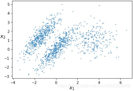
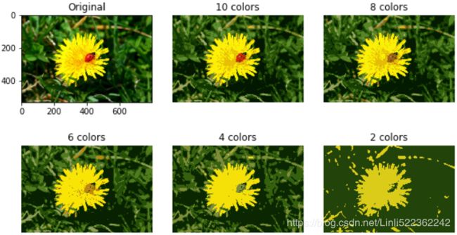
08_Dimensionality Reduction_02_Gaussian mixture_kmeans++_extent_tick_params_silhouette_image segment
cp5_Compressing Data via Dimensionality Reduction_feature extraction_PCA_LDA_convergence_kernel PCA:
https://blog.csdn.net/Linli522362242/article/details/105196037
08_Dimensionality Reduction_svd_Kernel_pca_make_swiss_roll_subplot2grid_IncrementalPCA_memmap_LLE
https://blog.csdn.net/Linli522362242/article/details/105139547
Exercises
- What are the main motivations for reducing a dataset’s dimensionality? What are the main drawbacks?
Motivations and drawbacks:
The main motivations for dimensionality reduction are:
To speed up a subsequent training algorithm (in some cases it may even remove noise and redundant features, making the training algorithm perform better).
To visualize the data and gain insights on the most important features.
Simply to save space (compression).
The main drawbacks are:
Some information is lost, possibly degrading the performance of subsequent training algorithms.
It can be computationally intensive大量.
It adds some complexity to your Machine Learning pipelines.
Transformed features are often hard to interpret.
- What is the curse of dimensionality?
The curse of dimensionality refers to the fact that many problems that do not exist in low dimensional space arise in high-dimensional space. In Machine Learning, one common manifestation表现 is the fact that randomly sampled high-dimensional vectors are generally very sparse, increasing the risk of overfitting and making it very difficult to identify patterns in the data without having plenty of
training data.
- Once a dataset’s dimensionality has been reduced, is it possible to reverse the operation? If so, how? If not, why?
Once a dataset’s dimensionality has been reduced using one of the algorithms we discussed, it is almost always impossible to perfectly reverse the operation, because some information gets lost during dimensionality reduction. Moreover, while some algorithms (such as PCA) have a simple reverse transformation procedure that can reconstruct a dataset relatively similar to the original, other algorithms (such as T-SNE) do not.
- Can PCA be used to reduce the dimensionality of a highly nonlinear dataset?
PCA can be used to significantly reduce the dimensionality of most datasets, even if they are highly nonlinear, because it can at least get rid of useless dimensions. However, if there are no useless dimensions — for example, the Swiss roll — then reducing dimensionality with PCA will lose too much information. You want to unroll the Swiss roll, not squash it.
- Suppose you perform PCA on a 1,000-dimensional dataset, setting the explained variance ratio to 95%. How many dimensions will the resulting dataset have?
That’s a trick question: it depends on the dataset. Let’s look at two extreme examples. First, suppose the dataset is composed of points that are almost perfectly aligned. In this case, PCA can reduce the dataset down to just one dimension while still preserving 95% of the variance. Now imagine that the dataset is composed of perfectly random points, scattered all around the 1,000 dimensions. In this
case roughly 950 dimensions are required to preserve 95% of the variance. So the answer is, it depends on the dataset, and it could be any number between 1 and 950. Plotting the explained variance as a function of the number of dimensions is one way to get a rough idea of the dataset’s intrinsic固有 dimensionality.
- In what cases would you use vanilla PCA, Incremental PCA, Randomized PCA, or Kernel PCA?
Regular PCA is the default, but it works only if the dataset fits in memory. Incremental PCA is useful for large datasets that don’t fit in memory, but it is slower than regular PCA, so if the dataset fits in memory you should prefer regular PCA. Incremental PCA is also useful for online tasks, when you need to apply PCA on the fly, every time a new instance arrives. Randomized PCA is useful when you want to considerably reduce dimensionality and the dataset fits in memory; in this case, it is much faster than regular PCA. Finally, Kernel PCA is useful for nonlinear datasets.
- How can you evaluate the performance of a dimensionality reduction algorithm on your dataset?
Intuitively, a dimensionality reduction algorithm performs well if it eliminates a lot of dimensions from the dataset without losing too much information. One way to measure this is to apply the reverse transformation and measure the reconstruction error. However, not all dimensionality reduction algorithms provide a reverse transformation. Alternatively, if you are using dimensionality reduction as a preprocessing step before another Machine Learning algorithm (e.g., a Random Forest classifier), then you can simply measure the performance of that second algorithm; if dimensionality reduction did not lose too much information, then the algorithm should perform just as well as when using the original dataset.
- Does it make any sense to chain two different dimensionality reduction algorithms?
It can absolutely make sense to chain two different dimensionality reduction algorithms. A common example is using PCA to quickly get rid of a large number of useless dimensions, then applying another much slower dimensionality reduction algorithm, such as LLE. This two-step approach will likely yield the same performance as using LLE only, but in a fraction of the time. - Load the MNIST dataset (introduced in Chapter 3) and split it into a training set and a test set (take the first 60,000 instances for training, and the remaining 10,000 for testing).
from sklearn.datasets import fetch_openml

mnist = fetch_openml('mnist_784', version=1)
X_train = mnist['data'][:60000]
y_train = mnist['target'][:60000]

X_test = mnist['data'][60000:]
y_test = mnist['target'][60000:]
X_test.shape
The MNIST dataset was loaded earlier.y_test.shape
Train a Random Forest classifier on the dataset and time how long it takes, then evaluate the resulting model on the test set. -
from sklearn.ensemble import RandomForestClassifier
import time

rnd_clf = RandomForestClassifier( n_estimators=100, random_state=42 )
t0 = time.time()
rnd_clf.fit( X_train, y_train )
t1 = time.time()
print( "Training took {:.2f}s".format(t1-t0) )
from sklearn.metrics import accuracy_score

y_pred = rnd_clf.predict( X_test )
accuracy_score( y_test, y_pred )
Next, use PCA to reduce the dataset’s dimensionality, with an explained variance ratio of 95%.
Train a new Random Forest classifier on the reduced dataset and see how long it takes. Was training much faster?from sklearn.decomposition import PCA pca = PCA(n_components=0.95 ) X_train_reduced = pca.fit_transform(X_train)rnd_clf_reduced = RandomForestClassifier(n_estimators=100, random_state=42) t0 = time.time() rnd_clf_reduced.fit(X_train_reduced, y_train) t1 = time.time() print("Train took {:.2f}s".format(t1-t0))
Oh no! Training is actually more than twice slower now! How can that be? Well, as we saw in this chapter, dimensionality reduction does not always lead to faster training time: it depends on the dataset, the model and the training algorithm. See figure 8-6 (themanifold_decision_boundary_plot*plots above). If you try a softmax classifier(the Softmax Regression classifier predicts the class with the highest estimated probability https://blog.csdn.net/Linli522362242/article/details/104124771) instead of a random forest classifier, you will find that training time is reduced by a factor of 3 when using PCA. Actually, we will do this in a second, but first let's check the precision of the new random forest classifier.
Next evaluate the classifier on the test set: how does it compare to the previous classifier?X_test_reduced = pca.transform(X_test) y_pred = rnd_clf_reduced.predict(X_test_reduced) accuracy_score(y_test,y_pred)
It is common for performance to drop slightly when reducing dimensionality, because we do lose some useful signal in the process. However, the performance drop is rather severe in this case. So PCA really did not help: it slowed down training and reduced performance.
Let's see if it helps when using softmax regression:
https://blog.csdn.net/Linli522362242/article/details/104124771
the Softmax Regression classifier predicts the class with the highest estimated probability
# use Softmax Regression to classify the iris flowers into all three classes
# 12. Implement Batch Gradient Descent with early stopping for Softmax Regression (without using Scikit-Learn).
classsklearn.linear_model.LogisticRegression
uses the cross-entropy loss if the ‘multi_class’ option is set to ‘multinomial’. (Currently the ‘multinomial’ option is supported only by the ‘lbfgs’, ‘sag’, ‘saga’ and ‘newton-cg’ solvers.)
C: float, default=1.0
Inverse of regularization strength; must be a positive float. Like in support vector machines, smaller values specify stronger regularization.
from sklearn.linear_model import LogisticRegression

log_clf = LogisticRegression(multi_class="multinomial", solver="lbfgs", random_state=42)
t0 = time.time()
log_clf.fit(X_train, y_train)
t1 = time.time()
print("Train took {:.2f}s".format(t1-t0))![]()
y_pred = log_clf.predict(X_test)
accuracy_score(y_test, y_pred)![]()
Okay, so softmax regression takes much longer to train on this dataset than the random forest classifier, plus it performs worse on the test set. But that's not what we are interested in right now, we want to see how much PCA can help softmax regression.
Let's train the softmax regression model using the reduced dataset:
log_clf_reduced = LogisticRegression(multi_class="multinomial", solver="lbfgs", random_state=42)
t0 = time.time()
log_clf_reduced.fit(X_train_reduced, y_train)
t1 = time.time()
print("Training took {:.2f}s".format(t1-t0))![]()
Nice! Reducing dimensionality led to a 3× speedup. :)
Let's check the model's accuracy:
y_pred = log_clf_reduced.predict(X_test_reduced)
accuracy_score(y_test, y_pred)![]()
A very slight drop in performance, which might be a reasonable price to pay for a 3× speedup, depending on the application.
So there you have it: PCA can give you a formidable speedup... but not always!
10. Use t-SNE to reduce the MNIST dataset down to two dimensions and plot the result using Matplotlib. You can use a scatterplot using 10 different colors to represent each image’s target class.
The MNIST dataset was loaded above.
Dimensionality reduction on the full 60,000 images takes a very long time, so let's only do this on a random subset of 10,000 images:
from sklearn.datasets import fetch_openml
import numpy as np

mnist = fetch_openml('mnist_784', version=1)
np.random.seed(42)

m=10000
idx = np.random.permutation(60000)[:m] # a random subset of 10,000 images

X = mnist['data'][idx]   # a random subset of 10,000 images
y = mnist['target'][idx] # a random subset of 10,000 images
Now let's use t-SNE to reduce dimensionality down to 2D so we can plot the dataset:
from sklearn.manifold import TSNE

tsne = TSNE( n_components=2, random_state=42 )
X_reduced_tsne = tsne.fit_transform(X)
Now let's use Matplotlib's scatter() function to plot a scatterplot, using a different color for each digit:
y=y.astype('int') # since y is an object
y![]()
plt.figure( figsize=(13,10) )
plt.scatter( X_reduced_tsne[:, 0], X_reduced_tsne[:, 1], c=y, cmap="jet")
plt.axis("off")
plt.colorbar()
plt.show()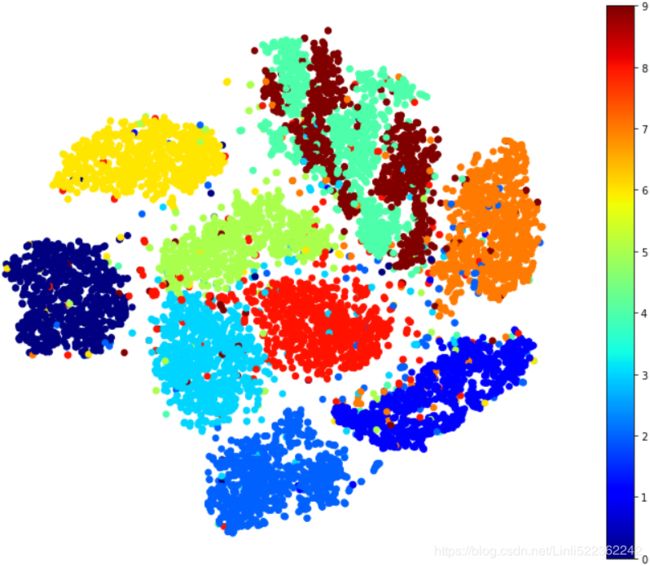
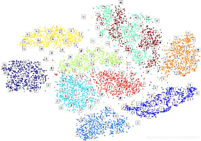
Isn't this just beautiful? :) This plot tells us which numbers are easily distinguishable from the others (e.g., 0s, 6s, and most 8s are rather well separated clusters), and it also tells us which numbers are often hard to distinguish (e.g., 4s and 9s, 5s and 3s, and so on).
Let's focus on digits 3 and 5, which seem to overlap a lot.
plt.figure( figsize=(9,9) )
cmap = mpl.cm.get_cmap("jet") # the interval ``[0.0, 1.0]``
for digit in (2,3,5):
    plt.scatter( X_reduced_tsne[y==digit, 0], X_reduced_tsne[y==digit, 1], c=[cmap(digit/9)])
plt.axis('off')
plt.show()
Let's see if we can produce a nicer image by running t-SNE on these 3 digits:
idx = (y==2) | (y==3) | (y==5)
X_subset = X[idx]
y_subset = y[idx]

tsne_subset = TSNE( n_components=2, random_state=42 )
X_subset_reduced_tsne = tsne_subset.fit_transform( X_subset )
plt.figure( figsize=(9,9) )
for digit in (2,3,5):
plt.scatter( X_subset_reduced_tsne[y_subset == digit, 0],
X_subset_reduced_tsne[y_subset == digit, 1], c=[cmap(digit/9)]
)
plt.axis('off')
plt.show()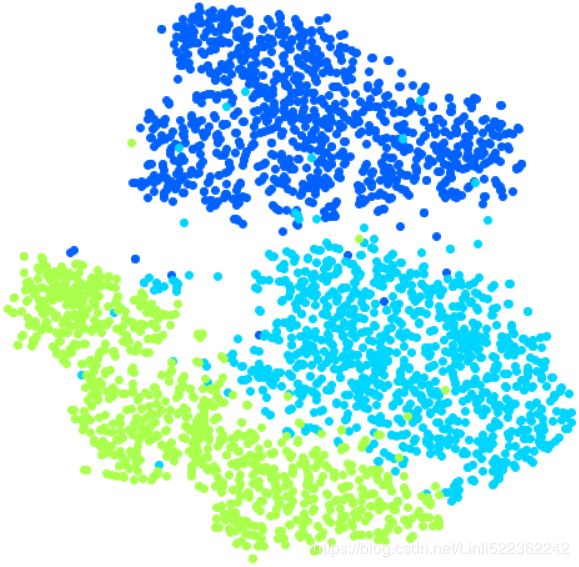
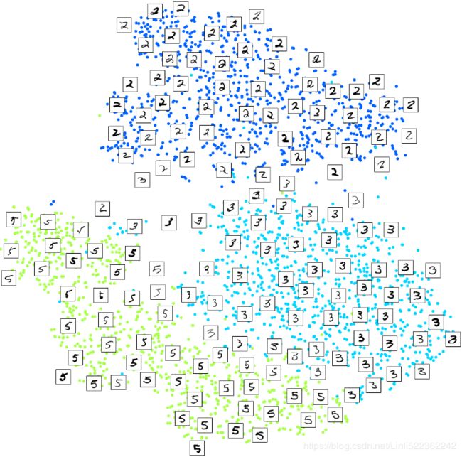
Much better, now the clusters have far less overlap. But some 3s are all over the place但是到处都是3. Plus, there are two distinct clusters of 2s, and also two distinct clusters of 5s. It would be nice if we could visualize a few digits from each cluster, to understand why this is the case. Let's do that now.
Alternatively, you can write colored digits at the location of each instance, or even plot scaled-down versions of the digit images themselves (if you plot all digits, the visualization will be too cluttered, so you should either draw a random sample or plot an instance only if no other instance has already been plotted at a close distance). You should get a nice visualization with well-separated clusters of digits.
Let's create a plot_digits() function that will draw a scatterplot (similar to the above scatterplots) plus write colored digits, with a minimum distance guaranteed between these digits. If the digit images are provided, they are plotted instead. This implementation was inspired from one of Scikit-Learn's excellent examples (plot_lle_digits, based on a different digit dataset).
from sklearn.preprocessing import MinMaxScaler
from matplotlib.offsetbox import AnnotationBbox, OffsetImage

def plot_digits( X,y, min_distance=0.05, images=None, figsize=(13,10) ):
    # Let's scale the input features so that they range from 0 to 1
    X_normalized = MinMaxScaler().fit_transform(X)

    # Now we create the list of coordinates of the digits plotted so far.
    # We pretend that one([ [10., 10.] ]) is already plotted far away at the start, to
    # avoid `if` statements in the loop below
    neighbors = np.array([ [10., 10.] ])

    # The rest should be self-explanatory
    plt.figure( figsize=figsize )
    cmap = mpl.cm.get_cmap('jet')
    digits = np.unique(y)
    for digit in digits:
        plt.scatter( X_normalized[y==digit, 0], X_normalized[y==digit, 1], c=[cmap(digit/9)] )
    #plt.axis("off")      # gcf==get current figure # gca==get current axes in gcf
    ax = plt.gcf().gca() # get current axes in current figure

    # plot an instance only if no other instance has already been plotted at a close distance
    for index, image_coord in enumerate( X_normalized ):
        #get the closest_distance between neightbors(points array) and image_coord(array)
        closest_distance = np.linalg.norm( neighbors - image_coord, axis=1).min() #l2
        if closest_distance > min_distance: # plot only one annotation at image_coord
            neighbors = np.r_[ neighbors,  # [10., 10.]
                              [image_coord] #[0~1, 0~1],...,[0~1, 0~1]
                             ] # record the used image_coord and avoid redraw at same image_coord
            if images is None:
                plt.text( image_coord[0], image_coord[1], str(y[index]),
                          color = cmap(y[index]/9), fontdict={'weight':'bold', 'size':16}
                        )
            else:
                image = images[index].reshape(28,28)
                # class matplotlib.offsetbox.AnnotationBbox(offsetbox, xy, xybox=None, xycoords='data',
                # boxcoords=None, frameon=True, pad=0.4, annotation_clip=None, box_alignment=(0.5, 0.5),
                # bboxprops=None, arrowprops=None, fontsize=None, **kwargs)

                # class matplotlib.offsetbox.OffsetImage: Bases: matplotlib.offsetbox.OffsetBox
                # The OffsetBox is a simple container artist.
                # The child artist are meant to be drawn at a relative position to its parent.
                # AnnotationBbox是一个标注框,其中可以放置任何Artist对象,我们在其中放置一个OffsetImage对象,它能按照指定的比例显示图像,缺省比例为1。
                imagebox = AnnotationBbox( OffsetImage(image, cmap="binary"), image_coord)
                ax.add_artist(imagebox) # Add any Artist to the container box
Let's try it! First let's just write colored digits:
#plot an instance only if no other instance has already been plotted at a close distance
plot_digits(X_reduced_tsne, y) #images is None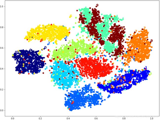
# Well that's okay, but not that beautiful. Let's try with the digit images:
# plot scaled-down versions of the digit images themselves
# plot an instance only if no other instance has already been plotted at a close distance
plot_digits( X_reduced_tsne, y, images=X, figsize=(35,25) )# idx = (y==2) | (y==3) | (y==5)
# X_subset = X[idx]
# y_subset = y[idx]
# tsne_subset = TSNE( n_components=2, random_state=42 )
# X_subset_reduced_tsne = tsne_subset.fit_transform( X_subset )
plot_digits(X_subset_reduced_tsne, y_subset, images=X_subset, figsize=(22,22))Exercise: Try using other dimensionality reduction algorithms such as PCA, LLE, or MDS and compare the resulting visualizations.
Let's start with PCA. We will also time how long it takes:
from sklearn.decomposition import PCA
import time

t0 = time.time()
X_pca_reduced = PCA( n_components=2, random_state=42 ).fit_transform(X)
t1 = time.time()

print( "PCA took {:.1f}s".format(t1-t0) )
plot_digits(X_pca_reduced, y)
plt.show()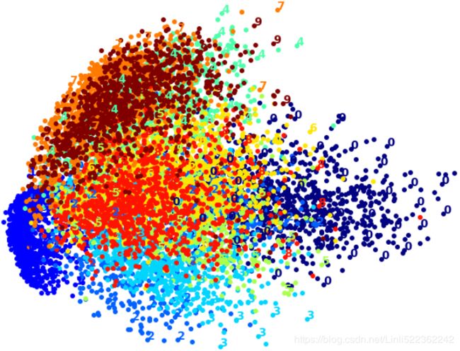
Wow, PCA is blazingly fast! But although we do see a few clusters, there's way too much overlap.
Let's try LLE:
from sklearn.manifold import LocallyLinearEmbedding

t0 = time.time()
X_lle_reduced = LocallyLinearEmbedding( n_components=2, random_state=42 ).fit_transform(X)
t1 = time.time()
print("LLE took {:.1f}s".format(t1-t0))
plot_digits(X_lle_reduced, y)
plt.show()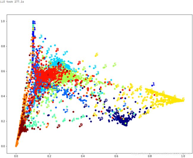
That took a while, and the result does not look too good.
Let's see what happens if we apply PCA first, preserving 95% of the variance:
from sklearn.pipeline import Pipeline

pca_lle = Pipeline([
    ("pca", PCA(n_components=0.95, random_state=42)),
    ("lle", LocallyLinearEmbedding(n_components=2, random_state=42))
])

t0 = time.time()
X_pca_lle_reduced = pca_lle.fit_transform(X)
t1 = time.time()
print("PCA+LLE took {:.1f}s".format(t1-t0))
plot_digits(X_pca_lle_reduced, y)
plt.show()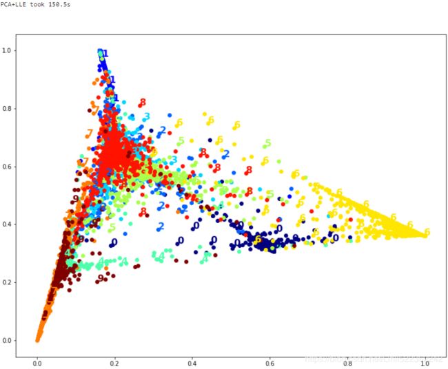
The result is more or less the same, but this time it was almost 2× faster.
Let's try MDS. It's much too long if we run it on 10,000 instances, so let's just try 2,000 for now:
from sklearn.manifold import MDS

m=2000
t0 = time.time()
X_mds_reduced = MDS( n_components=2, random_state=42).fit_transform(X[:m])
t1 = time.time()
print("MDS took {:.1f}s (on just 2,000 MNIST images instead of 10,000).".format(t1-t0))
plot_digits(X_mds_reduced, y[:m])
plt.show()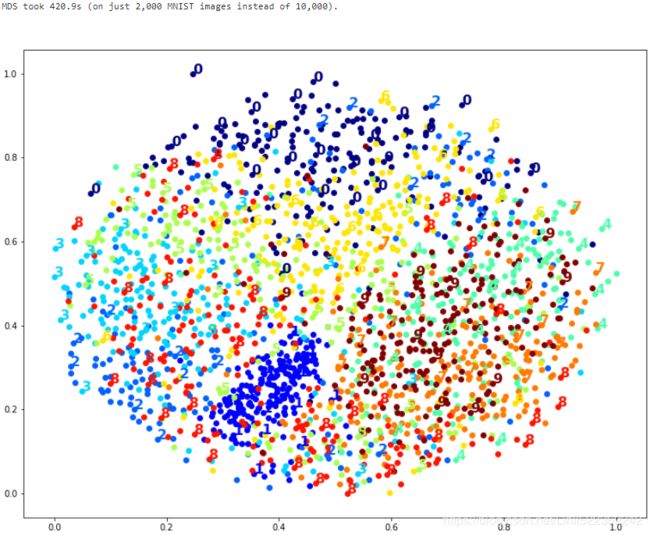
Meh. This does not look great, all clusters overlap too much.
Let's try with PCA first, perhaps it will be faster?
from sklearn.pipeline import Pipeline

pca_mds = Pipeline([
    ("pca", PCA(n_components=0.95, random_state=42)),
    ("mds", MDS(n_components=2, random_state=42)),
])

t0 = time.time()
X_pca_mds_reduced = pca_mds.fit_transform(X[:2000])
t1 = time.time()
print("PCA+MDS took {:.1f}s (on 2,000 MNIST images).".format(t1-t0))
plot_digits(X_pca_mds_reduced, y[:2000])
plt.show()![]()
Same result, and no speedup: PCA did not help (or hurt).
Let's try LDA:
from sklearn.discriminant_analysis import LinearDiscriminantAnalysis

t0 = time.time()
X_lda_reduced = LinearDiscriminantAnalysis(n_components=2).fit_transform(X,y)
t1 = time.time()
print("LDA took {:.1f}s.".format(t1-t0))
plot_digits(X_lda_reduced, y, figsize=(12,12))
plt.show()
This one is very fast, and it looks nice at first, until you realize that several clusters overlap severely.
Well, it's pretty clear that t-SNE won this little competition, wouldn't you agree?
We did not time it, so let's do that now:
from sklearn.manifold import TSNE

t0 = time.time()
X_tsne_reduced = TSNE(n_components=2, random_state=42).fit_transform(X)
t1 =time.time()
print("t-SNE took {:.1f}s.".format(t1-t0))
plot_digits(X_tsne_reduced,y)
plt.show()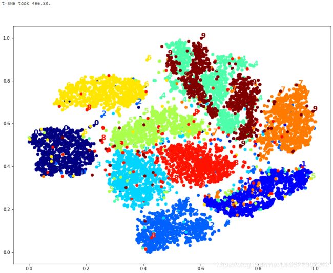
It's twice slower than LLE(took 277.1s), but still much faster than MDS(took 420.9s (on just 2,000 MNIST images instead of 10,000)), and the result looks great.
Let's see if a bit of PCA can speed it up:
pca_tsne = Pipeline([
    ("pca", PCA(n_components=0.95, random_state=42)),
    ("tsne", TSNE(n_components=2, random_state=42)),
])

t0 = time.time()
X_pca_tsne_reduced = pca_tsne.fit_transform(X)
t1 = time.time()
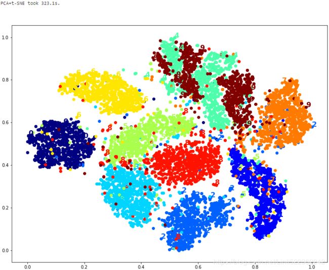
print("PCA+t-SNE took {:.1f}s.".format(t1-t0))
plot_digits(X_pca_tsne_reduced, y)
plt.show()
Yes, PCA roughly gave us a 25% speedup, without damaging the result. We have a winner!
Extra Material – Clustering
Introduction – Classification vs Clustering
from sklearn.datasets import load_iris

data = load_iris()
dataX = data.data
y = data.target
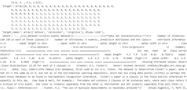
data.target_names![]()
import matplotlib.pyplot as plt

plt.figure( figsize=(14, 5) )

plt.subplot(121)
        #petal length(cm) #petal width(cm)
plt.plot( X[y==0, 2], X[y==0, 3], "yo", label="Iris-Setosa")
plt.plot( X[y==1, 2], X[y==1, 3], "bs", label="Iris-Versicolor")
plt.plot( X[y==2, 2], X[y==2, 3], "g^", label="Iris-Virginica")
plt.xlabel( "Petal length", fontsize=14)
plt.ylabel( "Petal width", fontsize=14 )
plt.legend(fontsize=12)

plt.subplot(122)
plt.scatter(X[:,2], X[:,3], c="k", marker=".")
plt.xlabel("Petal length", fontsize=14)
plt.tick_params(labelleft=False)

plt.show()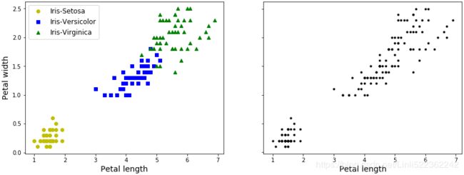
##########################################################
单高斯模型(Gaussian single model, GSM)
最常见的单高斯模型(或者叫单高斯分布)就是钟形曲线,只不过钟形曲线只是一维下的高斯分布。高斯分布(Gaussian distribution)又叫正态分布(Normal distribution),是一个在数学、物理及工程等领域都非常重要的概率分布,在统计学的许多方面有着重大的影响力。因其曲线呈钟形,因此人们又经常称之为钟形曲线。如下图为标准正态分布图: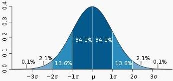
它的基本定义是:若随机变量X(the random variable X)服从一个数学期望为μ、方差为σ^2的高斯分布,则记为N(μ,σ^2)。数学期望μ指的是均值(算术平均值, 均值对应正态分布的中间位置),σ为方标准差(方差开平方后得到标准差, 标准差衡量了数据围绕均值分散的程度)。X~N(μ,σ^2)
高斯分布的概率密度函数pdf为:
where μ and σ are parameters satisfying −∞ < μ < ∞ and 0 < σ < ∞, and also where exp[v] means ![]() Briefly, we say that X is
Briefly, we say that X is ![]() .
.
上面的公式是概率密度函数pdf,也就是在已知参数的情况下,输入变量指x,可以获得相对应的概率密度。还要注意一件事,就是在实际使用前,概率分布要先进行归一化,也就是说曲线下面的面积之和需要为1,这样才能确保返回的概率密度在允许的取值范围内。
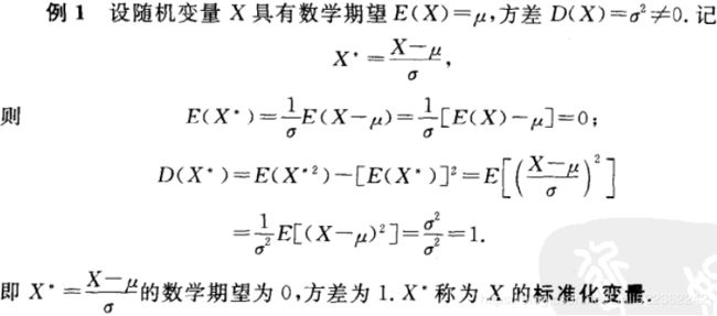
如果需要计算指定区间内的分布概率,则可以计算在区间首尾两个取值之间的面积的大小。另外除了直接计算面积,还可以用更简便的方法来获得同样的结果,就是减去区间x对应的累积密度函数(cumulative density function,CDF)。因为CDF表示的是数值小于等于x的分布概率。
高斯混合模型(Gaussian mixture model, GMM)
高斯混合模型是对高斯模型进行简单的扩展,GMM使用多个高斯分布的组合来刻画数据分布。
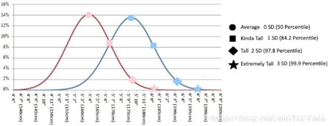
想象下现在咱们不再考察全部用户的身高,而是要在模型中同时考虑男性和女性的身高。假定之前的样本里男女都有,那么之前所画的高斯分布其实是两个高斯分布的结果。相比只使用一个高斯来建模,现在我们可以用两个(或多个)高斯分布
#################################################
多维变量![]() OR
OR  的联合概率密度函数(多维高斯分布模型下概率密度函数pdf如下):
 ,
, ![]() OR
OR 
其中, ![]() 为数据均值(期望),
为数据均值(期望), ![]() 为协方差(Covariance),D 为数据维度(==n)。
为协方差(Covariance),D 为数据维度(==n)。
Σ:协方差矩阵,描述各维变量之间的相关度covariance。对于二维高斯分布,有:
For example, the covariance between two features ![]() and
and ![]() on the population level can be calculated via the following equation:
on the population level can be calculated via the following equation:
Here, ![]() and
and ![]() are the sample means of feature j and k , respectively. Note that the sample means are zero if we standardize the dataset. A positive covariance between two features indicates that the features increase or decrease together, whereas a negative covariance indicates that the features vary in opposite directions. For example, a covariance matrix of three features can then be written as (note that
are the sample means of feature j and k , respectively. Note that the sample means are zero if we standardize the dataset. A positive covariance between two features indicates that the features increase or decrease together, whereas a negative covariance indicates that the features vary in opposite directions. For example, a covariance matrix of three features can then be written as (note that ![]() stands for the Greek uppercase letter sigma, which is not to be confused with the sum symbol):
stands for the Greek uppercase letter sigma, which is not to be confused with the sum symbol):
上述公式中,X是维度为D(==n)的列向量(![]() ),
),![]() 是模型期望,
是模型期望,![]() 是模型方差。在实际应用中u通常用样本均值来代替,Σ通常用样本方差来代替。很容易判断一个样本x是否属于类别C。因为每个类别都有自己的u和Σ,把样本x代入公式中,当概率大于一定阈值时我们就认为x属于C类。
是模型方差。在实际应用中u通常用样本均值来代替,Σ通常用样本方差来代替。很容易判断一个样本x是否属于类别C。因为每个类别都有自己的u和Σ,把样本x代入公式中,当概率大于一定阈值时我们就认为x属于C类。
从几何形状上讲,单高斯分布模型在二维空间应该近似于椭圆,在三维空间上近似于椭球。但单高斯分布模型的问题是在很多分类问题中,属于同一类别的样本点并不满足“椭圆”分布的特性。因此,就需要引入高斯混合模型来解决这个问题。
#################################################
https://blog.csdn.net/lin_limin/article/details/81048411
此例中:
d:变量维度。对于二维高斯分布,有d=2;
对于二维高斯分布,有:
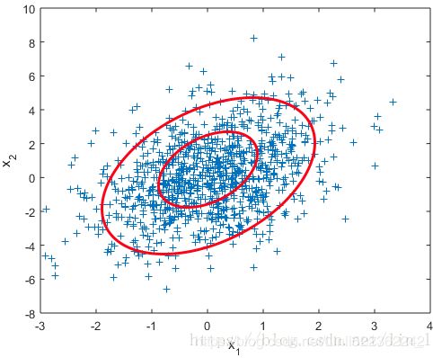
图2 二维高斯数据分布 
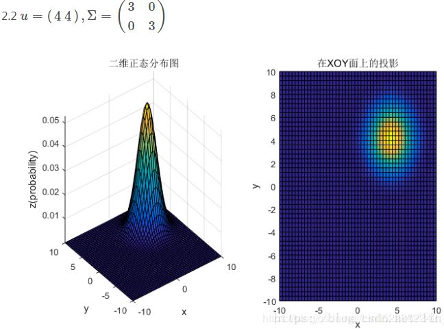
均值和协方差矩阵对二维高斯分布的影响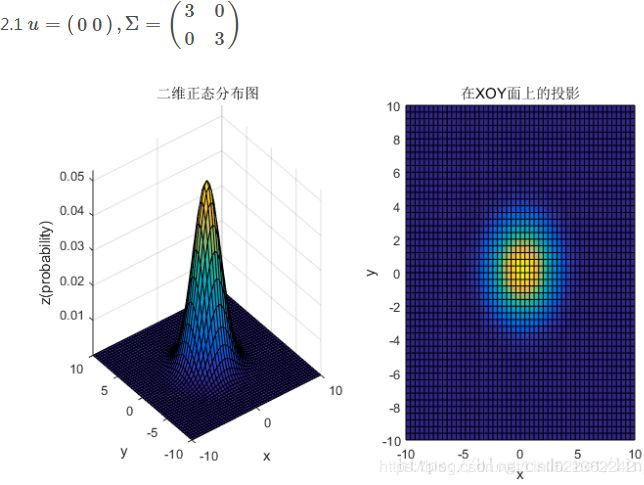
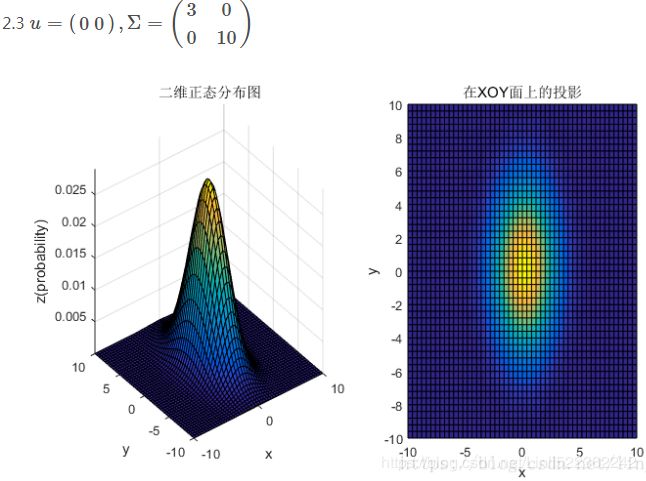
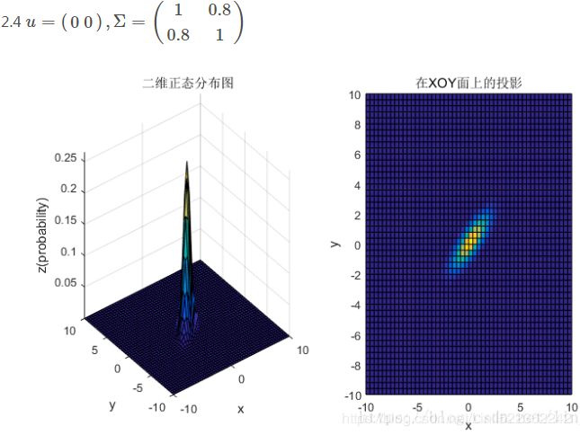
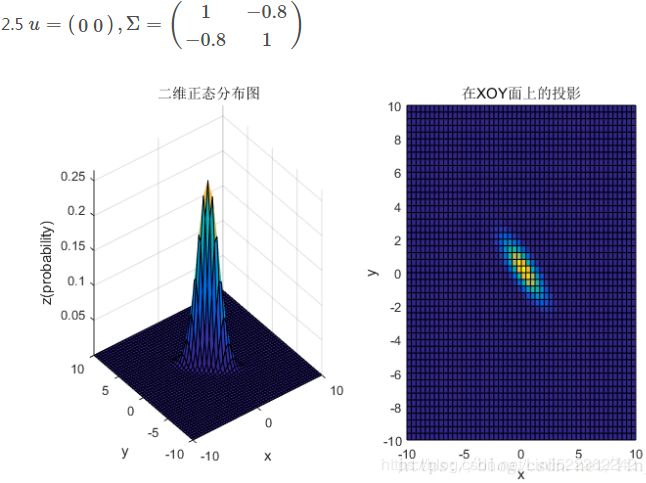
3、总结
①均值表征的是各维变量的中心,其对二维高斯曲面的影响较好理解,它使得整个二维高斯曲面在xoy平面上移动;
②对于协方差矩阵,对角线上的两个元素,即![]() 和
和![]() 表征的是 该变量的维度x(feature x)和维度y(feature y)的方差,决定了整个高斯曲面在某一维度上的“跨度”(如果是圆形,那就相当于直径),方差越大,“跨度”越大;
表征的是 该变量的维度x(feature x)和维度y(feature y)的方差,决定了整个高斯曲面在某一维度上的“跨度”(如果是圆形,那就相当于直径),方差越大,“跨度”越大;
③协方差矩阵的斜对角线上面的两个元素,即![]() 和
和![]() (
(![]() )表征的是各维变量之间的相关性:
)表征的是各维变量之间的相关性:![]() >0说明x与y呈正相关(x越大,y越大),其值越大,正相关程度越大;
>0说明x与y呈正相关(x越大,y越大),其值越大,正相关程度越大;![]() <0呈负相关;否则
<0呈负相关;否则![]() =0不相关。
=0不相关。
2.1 为什么要有混合高斯模型
先来看一组数据。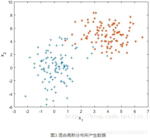
如果我们假设这组数据是由某个高斯分布产生的,利用极大似然估计(后文还会提及)对这个高斯分布做参数估计,得到一个最佳的高斯分布模型如下。
有什么问题吗?一般来讲越靠近椭圆的中心样本出现的概率越大,这是由概率密度函数决定的,但是这个高斯分布的椭圆中心的样本量却极少。显然样本服从单高斯分布的假设并不合理。单高斯模型无法产生这样的样本。
实际上,这是用两个不同的高斯分布模型产生的数据。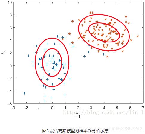
混合高斯模型。它通过求解两个高斯模型,并通过一定的权重将两个高斯模型融合成一个模型,即最终的混合高斯模型。这个混合高斯模型可以产生这样的样本。
更一般化的描述为:假设混合高斯模型由K个高斯模型组成(即数据包含K个类),则GMM的概率密度函数如下 OR
OR 
其中,![]() 是第k个高斯模型的概率密度函数,可以看成选定第k个模型后,该模型产生x的概率;
是第k个高斯模型的概率密度函数,可以看成选定第k个模型后,该模型产生x的概率;![]() 是第k个高斯模型的权重,称作选择第k个模型的先验概率,且满足
是第k个高斯模型的权重,称作选择第k个模型的先验概率,且满足 所以,混合高斯模型并不是什么新奇的东西,它的本质就是融合几个单高斯模型,来使得模型更加复杂,从而产生更复杂的样本。理论上,如果某个混合高斯模型融合的高斯模型个数足够多,它们之间的权重设定得足够合理,这个混合模型可以拟合任意分布的样本。
2.2 直观上理解混合高斯模型
下面通过几张图片来帮助理解混合高斯模型。
首先从简单的一维混合高斯模型说起。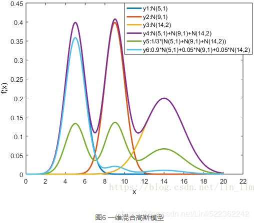
在图6中,y1,y2和y3分别表示三个一维高斯模型,他们的参数设定如图所示。y4表示将三个模型的概率密度函数直接相加,注意的是这并不是一个混合高斯模型,因为不满足 的条件。而y5和y6分别是由三个相同的高斯模型融合生成的不同混合模型。由此可见,调整权重将极大影响混合模型的概率密度函数曲线。另一方面也可以直观地理解混合高斯模型可以更好地拟合样本的原因:它有更复杂更多变的概率密度函数曲线。理论上,混合高斯模型的概率密度函数曲线可以是任意形状的非线性函数。
下面再给出一个二维空间3个高斯模型混合的例子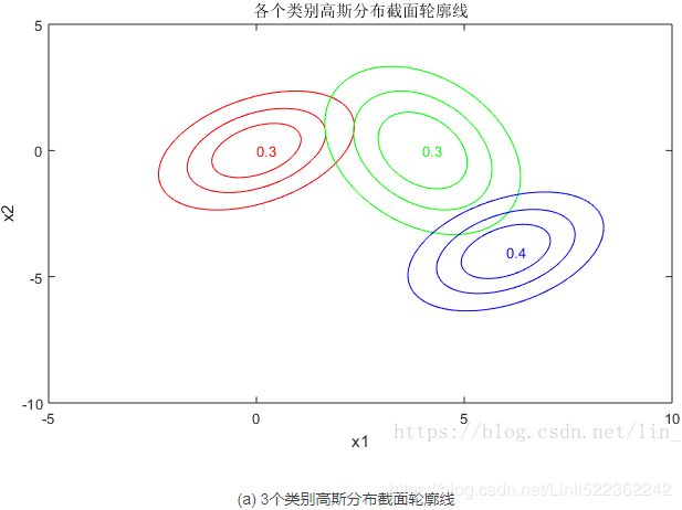
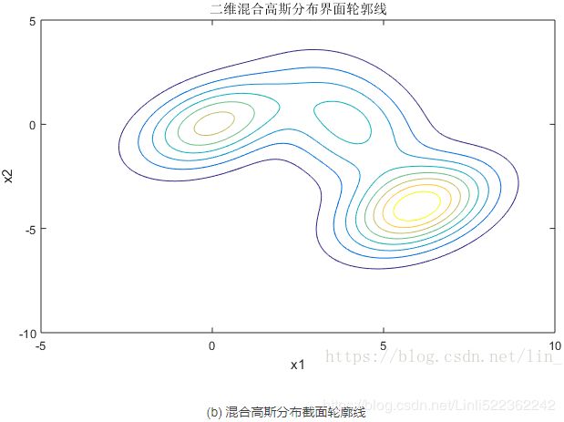
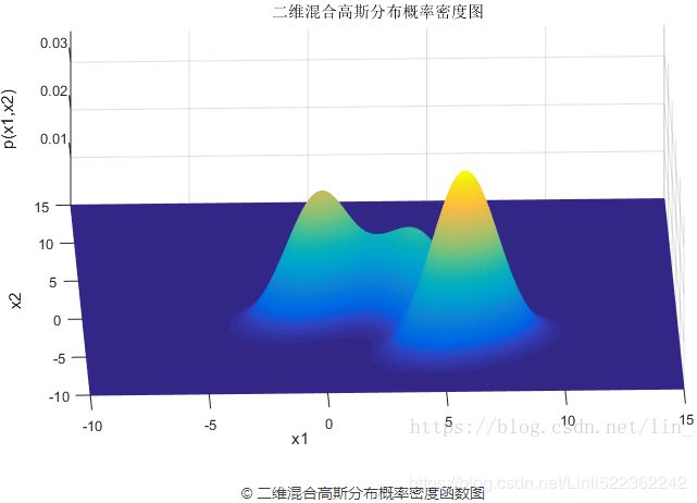
(a) 图表示的是3个高斯模型的截面轮廓图,3个模型的权重系数已在图中注明,由截面轮廓图可知3个模型之间存在很多重叠区域。其实这也正是混合高斯模型所希望的。因为如果它们之间的重叠区域较少,那么生成的混合高斯模型一般较为简单,难以生成较为复杂的样本。
设定好了3个高斯模型和它们之间的权重系数之后,就可以确定二维混合高斯分布的概率密度函数曲面,如图©所示。图(b)是对于图©概率密度曲面的截面轮廓线。从图©也可以看出,整个混合高斯分布曲面相对比于单高斯分布曲面已经异常复杂。实际上,通过调整混合高斯分布的系数![]() ,可以使得图©的概率密度曲面去拟合任意的三维曲面,从而采样生成所需要的数据样本。
,可以使得图©的概率密度曲面去拟合任意的三维曲面,从而采样生成所需要的数据样本。
##########################################################
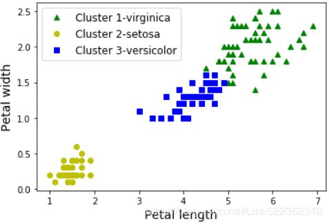
A Gaussian mixture model (explained below) can actually separate these clusters pretty well (using all 4 features(d=4): petal length & width, and sepal length & width).
from sklearn.mixture import GaussianMixture

y_pred = GaussianMixture( n_components=3, random_state=42 ).fit(X).predict(X)
y_prednp.sum(y_pred==y)![]()
![]()
![]()
![]()
np.sum(y_pred==y) / len(y_pred)![]()
![]()
![]()
![]()
len(y) 
# shifting to right
          # np.unique( y_pred ):array([0, 1, 2]) ==> targetName:['setosa', 'versicolor', 'virginica']
mapping = np.array([2,0,1])

#[0,1,2]:['setosa','versicolor','virginica']==move Right=>[2,0,1]:['virginica','setosa', 'versicolor']
y_pred = np.array( [mapping[cluster_id] for cluster_id in y_pred] )
#[2,0,1]:['virginica','setosa', 'versicolor']==move Right=>[1,2,0]:['versicolor','virginica','setosa']
y_pred = np.array( [mapping[cluster_id] for cluster_id in y_pred] )
y_pred # [0, 1, 2]:['virginica','setosa', 'versicolor']
plt.plot( X[y_pred==0,2], X[y_pred==0,3], "yo", label="Cluster 1-setosa" )
plt.plot( X[y_pred==1,2], X[y_pred==1,3], "bs", label="Cluster 2-versicolor" )
plt.plot( X[y_pred==2,2], X[y_pred==2,3], "g^", label="Cluster 3-virginica" )
plt.xlabel("Petal length", fontsize=14)
plt.ylabel("Petal width", fontsize=14)
plt.legend(loc="upper left", fontsize=12)
plt.show()np.sum(y_pred==y)![]()
![]()
np.sum(y_pred==y) / len(y_pred)![]()
![]()
K-Means
cp11_Working with Unlabeled Data_Clustering Analysis_Kmeans_hierarchical_dendrogram_heat map_DBSCAN
https://blog.csdn.net/Linli522362242/article/details/105813977
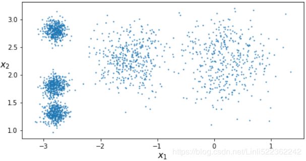
Let's start by generating some blobs:
from sklearn.datasets import make_blobs

blob_centers = np.array([
    [0.2, 2.3],
    [-1.5, 2.3],
    [-2.8, 1.8],
    [-2.8, 2.8],
    [-2.8, 1.3]
])
blob_std = np.array([0.4, 0.3, 0.1, 0.1, 0.1])

#制作团点                                               #cluster_std--skip distance--diameter
X, y = make_blobs(n_samples=2000, centers=blob_centers, cluster_std=blob_std, random_state=7)
Now let's plot them:
def plot_clusters(X, y=None):
    plt.scatter(X[:,0], X[:,1], c=y, s=1)
    plt.xlabel("$x_1$", fontsize=14)
    plt.ylabel("$x_2$", fontsize=14, rotation=0)

plt.figure(figsize=(8,4))
plot_clusters(X)

plt.show()
Fit and Predict (prediction==>cluster centroids label== kmeans.labels_)
Let's train a K-Means clusterer on this dataset. It will try to find each blob's center and assign each instance to the closest blob:
from sklearn.cluster import KMeans

y_pred = kmeans.fit_predict(X)

# Each instance was assigned to one of the 5 clusters:
# y_pred # array([4, 1, 0, ..., 3, 0, 1])
# kmeans.labels_ # array([4, 1, 0, ..., 3, 0, 1])
y_pred is kmeans.labels_ # True![]()
And the following 5 centroids (i.e., cluster centers) were estimated:
kmeans.cluster_centers_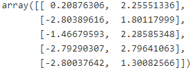
Note that the KMeans instance preserves the labels of the instances it was trained on. Somewhat confusingly, in this context, the label of an instance is the index of the cluster that instance gets assigned to:
kmeans.labels_ # Note that the KMeans instance preserves the labels of the instances it was trained on![]()
print(kmeans.labels_.shape[0], X.shape[0])![]()
Of course, we can predict the labels of new instances:
X_new = np.array([ [0,2], [3,2], [-3,3], [-3,2.5] ])
kmeans.predict( X_new )![]()
Decision Boundaries
Let's plot the model's decision boundaries. This gives us a Voronoi泰森多边形法 diagram:
def plot_data(X):
    plt.plot( X[:,0], X[:,1], 'k.', markersize=2 )

def plot_centroids( centroids, weights=None, circle_color='w', cross_color='b' ):
    if weights is not None:
        centroids = centroids[ weights>weights.max()/10 ]

    plt.scatter( centroids[:,0], centroids[:,1], marker='o', s=30, linewidths=8, color=circle_color,
                 zorder=10, alpha=0.9 ) #zorder大的图像在上层,zorder小的图像在下层
    plt.scatter( centroids[:,0], centroids[:,1], marker='x', s=50, linewidths=50, color=cross_color,
                 zorder=11, alpha=1 )

def plot_decision_boundaries( clusterer, X, resolution=1000, show_centroids=True,
                              show_xlabels=True, show_ylabels=True):
    mins = X.min(axis=0) - 0.1 #1x2 dimensions  # [-3.25343627  0.85843384]
    maxs = X.max(axis=0) + 0.1 #1x2 dimensions  # [1.44442688 3.29903802]
    xx, yy = np.meshgrid( np.linspace(mins[0], maxs[0], resolution),
                          np.linspace(mins[1], maxs[1], resolution) )

    Z = clusterer.predict( np.c_[ xx.ravel(), yy.ravel() ])
    Z = Z.reshape(xx.shape)

    # plt.show()不支持用x轴和y轴数据来设置网格,
    # 而是必须通过extent参数设置图形的坐标范围[xmin, xmax, ymin, ymax]
                                  #x1               #x2
    plt.contourf(Z, extent=(mins[0],maxs[0], mins[1],maxs[1]), cmap='Pastel2')
    plt.contour(Z, extent=(mins[0],maxs[0], mins[1],maxs[1]), linewidths=1, colors='k')

    plot_data(X)
    if show_centroids:
        plot_centroids( clusterer.cluster_centers_ )

    if show_xlabels:
        plt.xlabel( "$x_1$", fontsize=14 )
    else:
        plt.tick_params( labelbottom=False )

    if show_ylabels:
        plt.ylabel( "$x_2$", fontsize=14, rotation=0 )
    else:
        plt.tick_params( labelleft=False )


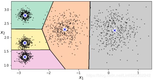
plt.figure( figsize=(8,4) )
plot_decision_boundaries(kmeans, X)

plt.show()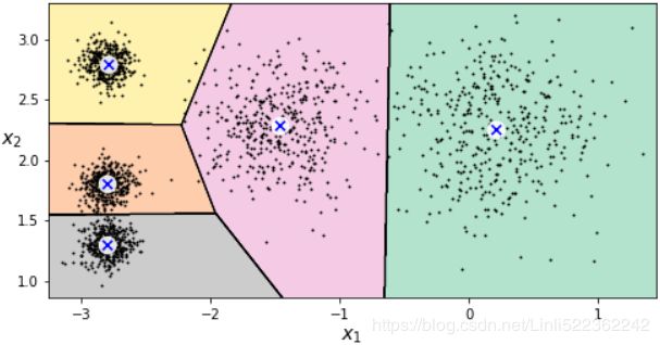
Not bad! Some of the instances near the edges were probably assigned to the wrong cluster, but overall it looks pretty good.
Hard Clustering vs Soft Clustering
Rather than arbitrarily choosing the closest cluster for each instance, which is called hard clustering(Hard clustering describes a family of algorithms where each sample in a dataset is assigned to exactly one cluster), it might be better measure the distance of each instance to all 5 centroids (of 5 clusters).
This is what the transform() method does:
# X_new = np.array([ [0,2], [3,2], [-3,3], [-3,2.5] ])
# kmeans.predict( X_new ) # array([0, 0, 3, 3])

kmeans.transform(X_new)
array([[0.32995317, 2.81093633, 1.49439034, 2.9042344 , 2.88633901],
[2.80290755, 5.80730058, 4.4759332 , 5.84739223, 5.84236351],
[3.29399768, 1.21475352, 1.69136631, 0.29040966, 1.71086031],
[3.21806371, 0.72581411, 1.54808703, 0.36159148, 1.21567622]])
You can verify that this is indeed the Euclidian distance between each instance and each centroid:
np.tile(X_new, (1,k)) #"1": keep rows, 2 columns-->2xk columns(repeats)# "-1" ~group: keep the number of instances arbitrarily, which is corresponding to Z-axis,
# "k" ~ repeats: the number of clusters which is corresponding to X-axis,
# "2": the number of features in each instance which is corresponding to y-axis
#keep rows(Z), then reshape kx2
np.tile(X_new, (1,k)).reshape(-1, k, 2) #3D(Z,x,y)
 Note that, in the preceding equation, the index j refers to the jth dimension (feature column) of the sample points x and y
np.linalg.norm( np.tile(X_new, (1,k)).reshape(-1,k,2)
               - kmeans.cluster_centers_,
               ord=2, #default
               axis=2, #If `axis` is an integer, it specifies the axis of `x` along which
                       #to compute the vector norms, note(Z_group,x_row,y_column)~(0,1,2)
               keepdims=False, #default
              )
# kmeans.predict( X_new ) # array([0, 0, 3, 3]) # label ~ centroid index
K-Means Algorithm(https://blog.csdn.net/Linli522362242/article/details/105813977)
The K-Means algorithm is one of the fastest clustering algorithms, but also one of the simplest:
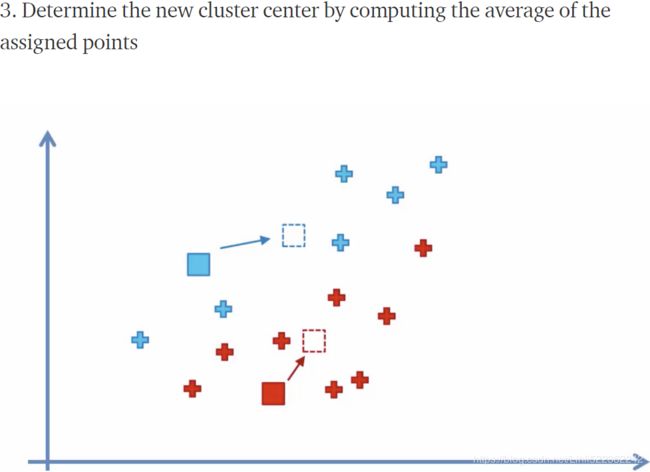
- First initialize k centroids randomly: distinct instances are chosen randomly from the dataset and the centroids are placed at their locations. (
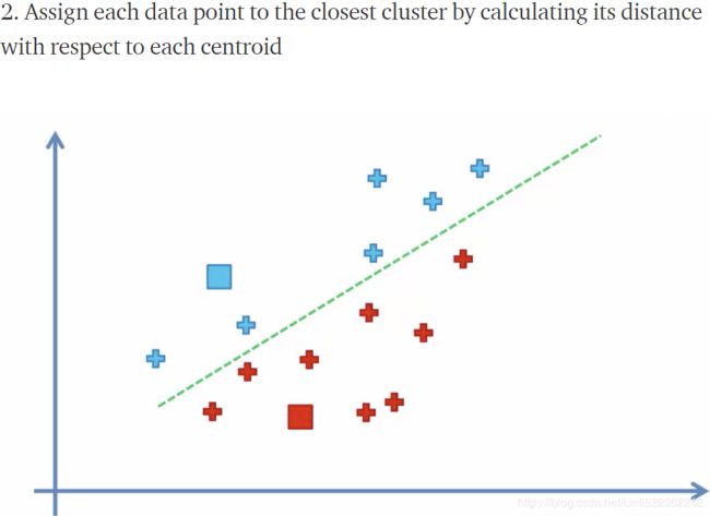
init="random")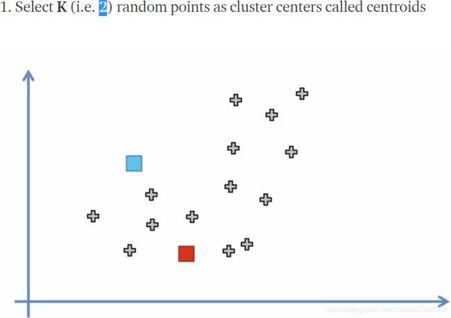
- Repeat until convergence (i.e., until the centroids stop moving):(until the cluster assignments do not change or a user-defined tolerance or a maximum number of iterations is reached)
The KMeans class applies an optimized algorithm by default. To get the original K-Means algorithm (for educational purposes only), you must set init="random", n_init=1 and algorithm="full". These hyperparameters will be explained below.
We set n_init=1 to run the k-means clustering algorithms 1 times independently with different random centroids to choose the final model as the one with the lowest SSE.  Here,
Here, ![]() is the representative point (centroid) for cluster j, and
is the representative point (centroid) for cluster j, and ![]() =1 if the sample
=1 if the sample ![]() is in cluster j;
is in cluster j; ![]() = 0 otherwise.
= 0 otherwise.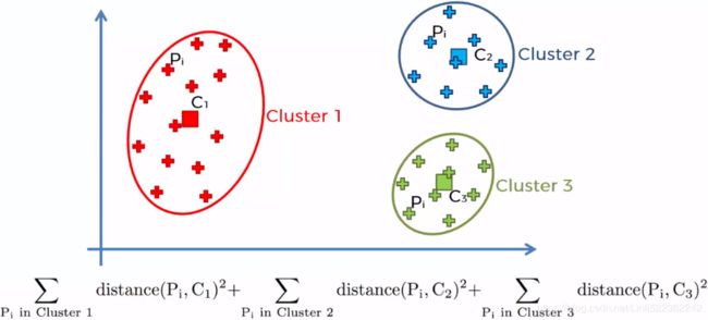
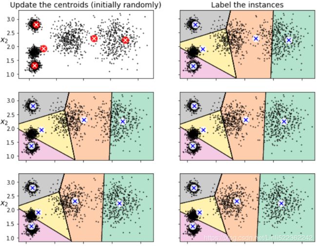
Let's run the K-Means algorithm for 1, 2 and 3 iterations, to see how the centroids move around:
from sklearn.cluster import KMeans

# We set n_init=1 to run the k-means clustering algorithms 1 times independently with
# different random centroids to choose the final model as the one with the lowest SSE.
kmeans_iter1 = KMeans(n_clusters=5, init="random", n_init=1,
                      algorithm="full", # default # applies an optimized algorithm by default
                      max_iter=1, ######
                      random_state=1
                     )
kmeans_iter2 = KMeans(n_clusters=5, init="random", n_init=1,
                      algorithm="full",
                      max_iter=2, ######
                      random_state=1
                     )
kmeans_iter3 = KMeans(n_clusters=5, init="random", n_init=1,
                      algorithm="full",
                      max_iter=3, ######
                      random_state=1
                     )
kmeans_iter1.fit(X)
kmeans_iter2.fit(X)
kmeans_iter3.fit(X)def plot_data(X):
plt.plot(X[:,0], X[:,1], "k.", markersize=2)
def plot_centroids( centroids, weights=None, circle_color='w', cross_color='b'):
if weights is not None:
centroids = centroids[ weights>weights.max()/10 ]
plt.scatter( centroids[:,0], centroids[:,1], marker='o', s=30, linewidths=8, color=circle_color,
zorder=10, alpha=0.9) # #zorder大的图像在上层,zorder小的图像在下层
plt.scatter( centroids[:,0], centroids[:,1], marker='x', s=50, linewidths=50, color=cross_color,
zorder=11, alpha=1)
def plot_decision_boundaries( clusterer, X, resolution=1000, show_centroids=True,
show_xlabels=True, show_ylabels=True):
mins = X.min(axis=0) - 0.1
maxs = X.max(axis=0) + 0.1
xx, yy = np.meshgrid( np.linspace(mins[0], maxs[0], resolution),
np.linspace(mins[1], maxs[1], resolution)
)
Z=clusterer.predict( np.c_[ xx.ravel(), yy.ravel() ])
Z=Z.reshape(xx.shape)
# plt.show()不支持用x轴和y轴数据来设置网格,
# 而是必须通过extent参数设置图形的坐标范围[xmin, xmax, ymin, ymax]
#x1 #x2
plt.contourf(Z, extent=(mins[0],maxs[0], mins[1],maxs[1]), cmap='Pastel2')
plt.contour(Z, extent=(mins[0],maxs[0], mins[1],maxs[1]), linewidths=1, colors='k')#boundaries
plot_data(X)
if show_centroids:
plot_centroids( clusterer.cluster_centers_ )
if show_xlabels:
plt.xlabel( "$x_1$", fontsize=14 )
else:
plt.tick_params( labelbottom=False )# do not display bottom x-axis label
if show_ylabels:
plt.ylabel( "$x_2$", fontsize=14, rotation=0 )
else:
plt.tick_params( labelleft=False )plt.figure( figsize=(10,8) )
# First initialize k centroids randomly
plt.subplot(321)
plot_data(X)
plot_centroids(kmeans_iter1.cluster_centers_, circle_color='r', cross_color='w')
plt.ylabel('$x_2$', fontsize=14, rotation=0)
plt.tick_params(labelbottom=False) # do not display bottom x-axis label
plt.title("Update the centroids (initially randomly)", fontsize=14)
# Assign each instance to the closest centroid
plt.subplot(322)
plot_decision_boundaries(kmeans_iter1, X, show_centroids=True, show_xlabels=False, show_ylabels=False)
plt.title("Label the instances", fontsize=14)
# Update the centroids to be the mean of the instances that are assigned to them(current centroids).
plt.subplot(323)
plot_decision_boundaries(kmeans_iter1, X, show_centroids=False, show_xlabels=False, show_ylabels=True)
plot_centroids(kmeans_iter2.cluster_centers_) #new centroids
# Assign each instance to the closest centroid(new centroids)
plt.subplot(324)
plot_decision_boundaries(kmeans_iter2, X, show_centroids=True, show_xlabels=False, show_ylabels=False)
# Update the centroids to be the mean of the instances that are assigned to them(current centroids).
plt.subplot(325)
plot_decision_boundaries(kmeans_iter2, X, show_centroids=False, show_xlabels=False, show_ylabels=True)
plot_centroids(kmeans_iter3.cluster_centers_) #new centroids
plt.subplot(326)
plot_decision_boundaries(kmeans_iter3, X, show_centroids=True, show_xlabels=False, show_ylabels=False)First initialize k centroids randomly(first figure)
and the rest of left figures are related to update the centroids to be the mean (#for each cluster, compute the mean distances between the instances with their centroids) of the instances that are assigned to them(current centroids) ,the action of updating the centroids looks likes move centroids;
the right figures are related to assign each instance to the closest centroid(new centroid), usually change current separating regions.
K-Means Variability
In the original K-Means algorithm, the centroids are just initialized randomly, and the algorithm simply runs a single iteration to gradually improve the centroids, as we saw above.
However, one major problem with this approach is that if you run K-Means multiple times (or with different random seeds), it can converge to very different solutions, as you can see below:
def plot_clusterer_comparison( clusterer1, clusterer2, X, title1=None, title2=None):
    clusterer1.fit(X)
    clusterer2.fit(X)

    plt.figure(figsize=(10, 3.2))

    plt.subplot(121)
    plot_decision_boundaries(clusterer1, X)
    if title1:
        plt.title(title1, fontsize=14)

    plt.subplot(122)
    plot_decision_boundaries(clusterer2, X, show_ylabels=False)
    if title2:
        plt.title(title2, fontsize=14)


kmeans_rnd_init1 = KMeans( n_clusters=5, init="random", n_init=1, algorithm="full", random_state=11 )
kmeans_rnd_init2 = KMeans( n_clusters=5, init="random", n_init=1, algorithm="full", random_state=123 )

plot_clusterer_comparison(kmeans_rnd_init1, kmeans_rnd_init2, X,
                          "Solution 1", "Solution 2 (with a diffrent random init)"
                         )

plt.show()
Inertia
To select the best model, we will need a way to evaluate a K-Mean model's performance. Unfortunately, clustering is an unsupervised task, so we do not have the targets. But at least we can measure the distance between each instance and its centroid. This is the idea behind the inertia metric:
# k = 5 # given
# kmeans = KMeans( n_clusters=k, random_state=42 )
# y_pred = kmeans.fit_predict(X)
kmeans.inertia_![]()
As you can easily verify, inertia is the sum of the squared distances between each training instance and its closest centroid:
X_dist = kmeans.transform(X) #the distance between each instance and all centroids
# X_dist.shape == (X.shape[0],5)
                # 0~1999                 #clusters label or centroids
np.sum( X_dist[ np.arange( len(X_dist) ), kmeans.labels_ ]**2, axis=0 )![]()
The score() method returns the negative inertia. Why negative? Well, it is because a predictor's score() method must always respect the "great is better" rule.
kmeans.score(X)![]()
Multiple Initializations
So one approach to solve the variability issue is to simply run the K-Means algorithm multiple times with different random initializations, and select the solution that minimizes the inertia( OR SSE).
For example, here are the inertias of the two "bad" models shown in the previous figure:
kmeans_rnd_init1.inertia_![]() # if you get SSE==
# if you get SSE==![]() , then this model is better than SSE=
, then this model is better than SSE=![]()
kmeans_rnd_init2.inertia_![]()
As you can see, they have a higher inertia than the first "good" model we trained(SSE==![]() ), which means they are probably worse.
), which means they are probably worse.
When you set the n_init hyperparameter, Scikit-Learn runs the original algorithm n_init times, and selects the solution that minimizes the inertia. By default, Scikit-Learn sets n_init=10.
kmeans_rnd_10_inits = KMeans(n_clusters=5, init="random", n_init=10, algorithm="full", random_state=11)
kmeans_rnd_10_inits.fit(X)
As you can see, we end up with the initial model, which is certainly the optimal K-Means solution (at least in terms of inertia, and assuming k=5).
plt.figure( figsize=(8,4))
plot_decision_boundaries(kmeans_rnd_10_inits, X)

plt.show()
K-Means++
Instead of initializing the centroids entirely randomly, it is preferable to initialize them using the following algorithm, proposed in a 2006 paper by David Arthur and Sergei Vassilvitskii:
Initialize an empty set M to store the k centroids being selected
- Take one centroid
 , chosen uniformly at random from the dataset.
 - Take a new center
 , choosing an instance
  with probability:
  where
where  is the minimum squared distance between the instance
  and the closest centroid that was already chosen. This probability distribution ensures that instances that are further away from already chosen centroids are much more likely be selected as centroids.
 - Repeat the previous step until all k centroids have been chosen.
M: good_init = np.array([ [-3,3], [-3,2], [-3,1], [-1,2], [0,2] ])
The rest of the K-Means++ algorithm is just regular K-Means. With this initialization, the K-Means algorithm is much less likely to converge to a suboptimal solution, so it is possible to reduce n_init considerably. Most of the time, this largely compensates for the additional complexity of the initialization process.
To set the initialization to K-Means++, simply set init="k-means++" (this is actually the default):
KMeans()good_init = np.array([ [-3,3], [-3,2], [-3,1], [-1,2], [0,2] ])
kmeans = KMeans( n_clusters=5, init=good_init, n_init=1, random_state=42 )
kmeans.fit(X)
# inertia is the sum of the squared distances between each training instance and its closest centroid
kmeans.inertia_![]()
Accelerated K-Means
The K-Means algorithm can be significantly accelerated by avoiding many unnecessary distance calculations: this is achieved by exploiting the triangle inequality (given three points A, B and C, the distance AC is always such that AC ≤ AB + BC) and by keeping track of lower and upper bounds for distances between instances and centroids (see this 2003 paper(https://www.aaai.org/Papers/ICML/2003/ICML03-022.pdf) by Charles Elkan for more details).
To use Elkan's variant of K-Means, just set algorithm="elkan". Note that it does not support sparse data, so by default, Scikit-Learn uses "elkan" for dense data, and "full" (the regular K-Means algorithm) for sparse data.
timeit
Command line usage:
python timeit.py [-n N] [-r N] [-s S] [-t] [-c] [-p] [-h] [--] [statement]
Options:
-n/--number N: how many times to execute 'statement' (default: see below)
-r/--repeat N: how many times to repeat the timer (default 3)
-s/--setup S: statement to be executed once initially (default 'pass').
Execution time of this setup statement is NOT timed.
-p/--process: use time.process_time() (default is time.perf_counter())
-t/--time: use time.time() (deprecated)
-c/--clock: use time.clock() (deprecated)
-v/--verbose: print raw timing results; repeat for more digits precision
-u/--unit: set the output time unit (usec, msec, or sec)
-h/--help: print this usage message and exit
--: separate options from statement, use when statement starts with -
statement: statement to be timed (default 'pass')
https://blog.csdn.net/tylitianrui/article/details/83009188?utm_medium=distribute.pc_relevant.none-task-blog-BlogCommendFromBaidu-4&depth_1-utm_source=distribute.pc_relevant.none-task-blog-BlogCommendFromBaidu-4
#-n/--number N: how many times to execute 'statement' (default: see below)
%timeit -n 50 KMeans(algorithm="elkan").fit(X)![]()
%timeit -n 50 KMeans(algorithm="full").fit(X)![]()
Mini-Batch K-Means
Scikit-Learn also implements a variant of the K-Means algorithm that supports mini-batches (see this paper http://www.eecs.tufts.edu/~dsculley/papers/fastkmeans.pdf):
from sklearn.cluster import MiniBatchKMeans

minibatch_kmeans = MiniBatchKMeans( n_clusters=5, random_state=42 )
minibatch_kmeans.fit(X)minibatch_kmeans.inertia_![]()
If the dataset does not fit in memory, the simplest option is to use the memmap class, just like we did for incremental PCA:
#########################
NumPy’s memmap class, which allows you to manipulate a large array stored in a binary file on disk as if it were entirely in memory; the class loads only the data it needs in memory, when it needs it.
#########################
# filename = "my_mnist.data"
# m,n = X_train.shape

# X_mm = np.memmap( filename, dtype="float32", mode="write", shape=(m,n) )
# X_mm[:] = X_train #copy the MNIST data into it

# Now deleting the memmap() object will trigger its Python finalizer,
# which ensures that the data is saved to disk.
# del X_mm

filename = "my_mnist.data"
m,n = 50000, 28*28
X_mm = np.memmap( filename, dtype="float32", mode="readonly", shape=(m,n) )

#50000 instances/5000 batches==10 instances/batch
minibatch_kmeans = MiniBatchKMeans( n_clusters=10, batch_size=10, random_state=42 )
minibatch_kmeans.fit( X_mm )
If your data is so large that you cannot use memmap, things get more complicated. Let's start by writing a function to load the next batch (in real life, you would load the data from disk):
def load_next_batch( batch_size ):
    return X[np.random.choice(len(X), batch_size, replace=False) ]
Now we can train the model by feeding it one batch at a time. We also need to implement multiple initializations and keep the model with the lowest inertia:
http://lijiancheng0614.github.io/scikit-learn/modules/generated/sklearn.cluster.MiniBatchKMeans.html
MiniBatchKMeans( n_clusters=k, init_size=init_size ):
init_size : int, optional, default: 3 * batch_size
Number of samples to randomly sample for speeding up the initialization (sometimes at the expense of accuracy牺牲准确性): the only algorithm is initialized by running a batch KMeans on a random subset of the data. This needs to be larger than n_clusters.
np.random.seed(42)MiniBatchKMeans( n_clusters=5, init_size=500 )k = 5
n_init = 10
n_iterations = 100
batch_size=100
init_size = 500 # more data for K-Means++ initialization
evaluate_on_last_n_iters = 10 # last 10 iterations for validation
best_kmeans=None
#n_init=10 to run the Mini_k-means clustering algorithms 10 times to find final best solution(minimize SSE)
for init in range( n_init ):
# initialization
minibatch_kmeans = MiniBatchKMeans( n_clusters=k, init_size=init_size ) #default init='k-means++'
X_init = load_next_batch( init_size )
minibatch_kmeans.partial_fit( X_init )
minibatch_kmeans.sum_inertia_=0
for iteration in range(n_iterations): #Repeat until a maximum number of iterations is reached
X_batch = load_next_batch(batch_size)
minibatch_kmeans.partial_fit(X_batch)
if iteration >= n_iterations - evaluate_on_last_n_iters:#hold last 10 iterations for validation
# inertia is the sum of the squared distances between each training instance
# and its closest centroid #SSE
minibatch_kmeans.sum_inertia_ += minibatch_kmeans.inertia_
if (best_kmeans is None) or (minibatch_kmeans.sum_inertia_ < best_kmeans.sum_inertia_) :
best_kmeans = minibatch_kmeans #with the lowest sse(positive value)best_kmeans.score(X) #returns the negative inertia ![]() # based on evaluate _on_last_n_iters # use New data.
# based on evaluate _on_last_n_iters # use New data.
best_kmeans.sum_inertia_![]() ==(
==(![]() +...+) #accumulation
+...+) #accumulation
best_kmeans.inertia_![]()
Mini-batch K-Means is much faster than regular K-Means:
%timeit KMeans(n_clusters=5).fit(X)![]()
%timeit MiniBatchKMeans(n_clusters=5).fit(X)![]()
That's much faster! However, its performance is often lower (higher inertia![]() of Mini-batch K-Means >
of Mini-batch K-Means > ![]() of regular K-Means), and it keeps degrading as k(the number of clusters) increases.
of regular K-Means), and it keeps degrading as k(the number of clusters) increases.
Let's plot the inertia ratio and the training time ratio between Mini-batch K-Means and regular K-Means:
from timeit import timeit
#https://docs.python.org/3/library/timeit.htmlhelp(timeit)Help on function timeit in module timeit:
timeit(stmt='pass', setup='pass', timer=, number=1000000, globals=None)
Convenience function to create Timer object and call timeit method.
times = np.empty( (100,2) )
inertias = np.empty( (100,2) )

for k in range(1,101):
    kmeans = KMeans( n_clusters=k, random_state=42 )
    minibatch_kmeans = MiniBatchKMeans(n_clusters=k, random_state=42)
    print("\r{}/{}".format(k,100), end="")
    #stmt:statement #number:run times  #The optional globals argument specifies a namespace in which to execute the code.
    times[k-1,0] = timeit( "kmeans.fit(X)", number=10, globals=globals() )
    times[k-1,1] = timeit("minibatch_kmeans.fit(X)", number=10, globals=globals())

    inertias[k-1,0] = kmeans.inertia_
    inertias[k-1,1] = minibatch_kmeans.inertia_
100/100
plt.figure(figsize=(10,4))

plt.subplot(121)
plt.plot( range(1,101), inertias[:,0], "r--", label="K-Means")
plt.plot( range(1,101), inertias[:,1], "b.-", label="Mini-batch K-Means")
plt.xlabel("$k$ clusters", fontsize=16)
plt.title("Inertia", fontsize=14)
plt.legend(fontsize=14, loc="best")
plt.axis([1,100, 0,100])

plt.subplot(122)
plt.plot( range(1,101), times[:,0], "r--", label="K-Means")
plt.plot( range(1,101), times[:,1], "b.-", label="Mini-batch K-Means")
plt.xlabel("$k$ clusters", fontsize=16)
plt.title("Training time(seconds)")
plt.axis([1,100, 0,30])

plt.show()
Finding the optimal number of clusters
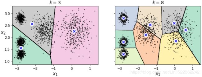
What if the number of clusters was set to a lower or greater value than 5?
kmeans_k3 = KMeans( n_clusters=3, random_state=42 )
kmeans_k8 = KMeans( n_clusters=8, random_state=42 )

plot_clusterer_comparison( kmeans_k3, kmeans_k8, X, "$k=3$", "$k=8$" )
plt.show()
Ouch, these two models don't look great. What about their inertias?
kmeans_k3.inertia_![]()
kmeans_k8.inertia_![]()
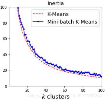
No, we cannot simply take the value of k that minimizes the inertia, since it keeps getting lower as we increase k. Indeed, the more clusters there are, the closer each instance will be to its closest centroid, and therefore the lower the inertia will be.
However, we can plot the inertia as a function of k and analyze the resulting curve:
kmeans_per_k = [ KMeans(n_clusters=k, random_state=42).fit(X) for k in range(1,10) ]
inertias = [ model.inertia_ for model in kmeans_per_k ]


plt.figure( figsize=(8,3.5) )

plt.plot( range(1,10), inertias, 'bo-' )

plt.xlabel("$k$", fontsize=14)
plt.ylabel("Inertia", fontsize=14)
plt.annotate('Elbow', xy=(4, inertias[3]),
             xytext=(0.55, 0.55), textcoords="figure fraction", fontsize=16,
             arrowprops=dict(facecolor="black", shrink=0.1)
            )
plt.axis([1,10, 0,1300])
plt.title('inertia_vs_k_diagram')

plt.show()
As you can see, there is an elbow at k=4, which means that less clusters than that would be bad, and more clusters would not help much and might cut clusters in half. So k=4 is a pretty good choice. Of course in this example it is not perfect since it means that the two blobs斑点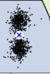 in the lower left will be considered as just a single cluster, but it's a pretty good clustering nonetheless.
plot_decision_boundaries(kmeans_per_k[4-1], X) #k=4
plt.show()
Another approach is to look at the silhouette score, which is the mean silhouette coefficient over all the instances, which is equivalent to numpy.mean(silhouette_samples(…)).. An instance's silhouette coefficient is equal to (b-a)/max(a,b) where a is the mean distance to the other instances in the same cluster (it is the mean intra-cluster distance), and b is the mean nearest-cluster distance, that is the mean distance (of An instance) to the instances of the next closest cluster (defined as the one that minimizes , excluding the instance's own cluster). The silhouette coefficient can vary between -1 and +1: a coefficient close to +1 means that the instance is well inside its own cluster and far from other clusters, while a coefficient close to 0 means that it is close to a cluster boundary, and finally a coefficient close to -1 means that the instance may have been assigned to the wrong cluster.
Let's plot the silhouette score(the mean silhouette coefficient over all the instances) as a function of k:
from sklearn.metrics import silhouette_score

# for k in range(1,101):
#     kmeans = KMeans( n_clusters=k, random_state=42 ) #finally, n_clusters=k=100,
# kmeans
# KMeans(algorithm='auto', copy_x=True, init='k-means++', max_iter=300,
#        n_clusters=100, n_init=10, n_jobs=None, precompute_distances='auto',
#        random_state=42, tol=0.0001, verbose=0)
silhouette_score(X, kmeans.labels_)![]()
# kmeans_per_k = [ KMeans(n_clusters=k, random_state=42).fit(X) for k in range(1,10) ]
                                             #predictions
silhouette_scoreList = [ silhouette_score(X, model.labels_) for model in kmeans_per_k[1:] ]
# [1:] since the silhouette coefficient = (b-a)/max(a,b), the number of clusters >=2


plt.figure( figsize=(8,3) )
plt.plot( range(2,10), silhouette_scoreList, 'bo-' )
plt.xlabel( "$k$ clusters", fontsize=14 )
plt.ylabel( "Silhouette Score", fontsize=14)
plt.axis([1.8, 9.5, 0.55, 0.7])
plt.title("silhouette_score_vs_k_diagram")

plt.show()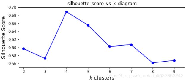
As you can see, this visualization is much richer than the previous one: in particular, although it confirms that k=4 is a very good choice, but it also underlines the fact that k=5 is quite good as well.
An even more informative visualization is given when you plot every instance's silhouette coefficient, sorted by the cluster they are assigned to and by the value of the coefficient. This is called a silhouette diagram:
from sklearn.metrics import silhouette_samples
from matplotlib.ticker import FixedLocator, FixedFormatter
import matplotlib as mpl

plt.figure( figsize=(11,9) )

for k in (3,4,5,6):
    plt.subplot(2,2,k-2)

    y_pred = kmeans_per_k[k-1].labels_
    silhouette_coefficients = silhouette_samples(X, y_pred) #default metric='euclidean'

    padding = len(X) //30
    pos = padding
    ticks= []  #each cluster index as a tick
    for i in range(k):
        coeffs = silhouette_coefficients[ y_pred==i ] # for the same cluster
        coeffs.sort() # ascending
        #cm.jet(X): For floats, X should be in the interval ``[0.0, 1.0]`` to
        #return the RGBA values ``X*100`` percent along the Colormap line.
        #color = mpl.cm.jet( float(i)/k)
        color = mpl.cm.Spectral( float(i)/k )
                         #padding
#         plt.barh( range(pos, pos+len(coeffs)), coeffs, height=1.0, edgecolor='none',
#               color=color)
                           #y: variable
        plt.fill_betweenx( np.arange(pos, pos+len(coeffs)),
                          0,      #x1~f(y), its curve is the y-axis when x1=0,
                          coeffs, # x2~f(y)
                          facecolor=color, edgecolor=color, alpha=0.7 )
        ticks.append( pos+len(coeffs)//2 ) #each cluster index as a tick
        pos += len(coeffs) + padding #The starting position of the next cluster silhouette
    #end inner for loop
    plt.gca().yaxis.set_major_locator( FixedLocator(ticks) )
    plt.gca().yaxis.set_major_formatter( FixedFormatter(range(k)) )

    if k in (3,5):
        plt.ylabel("Cluster")
    if k in (5,6):
        plt.gca().set_xticks([-0.1, 0, 0.2, 0.4, 0.6, 0.8, 1])
        plt.xlabel("Silhouette Coefficient")
    else:
        plt.tick_params(labelbottom=False)
    #silhouette_scoreList[] for clusters=[2,3,4,...]=index[0,1,2]
    plt.axvline(x=silhouette_scoreList[k-2], color='red', linestyle="--")
    plt.title("$k={}$".format(k), fontsize=16)

plt.show()
Through a visual inspection of the silhouette plot, we can quickly scrutinize 仔细或彻底检查 the sizes of the different clusters( len(c_silhouette_vals) ) and identify clusters that contain outliers![]() ; ##I believe k=5 may be the best clustering.
; ##I believe k=5 may be the best clustering.
Limits of K-Means
X1, y1 = make_blobs( n_samples=1000, centers=( (4,-4), (0,0) ), random_state=42 )
# X1
# array([[ 1.02406253,  0.59252695],
#        [ 1.66125921, -0.45709626],
#        [ 2.39251677, -3.81536614],
#        ...,
#        [ 3.9623653 , -2.89669812],
#        [-0.97165673, -1.37961816],
#        [ 5.57957215, -4.52286003]])
# np.unique(y1) # array([0, 1]) #since centers=( (4,-4), (0,0) ) #positions' tuple
X1 = X1.dot( np.array([[0.374, 0.95],
                       [0.732, 0.598]
                      ])
           )
# X1.shape      #(1000, 2)

X2, y2 = make_blobs( n_samples=250, centers=1, random_state=42 )
X2 = X2 + [6,-8]
# X2.shape # (250, 2)
# np.unique(y2) # array([0]) # since centers=1 # number of cluster

X = np.r_[X1, X2] # X.shape # (1250, 2)
y = np.r_[y1, y2] # y.shape # (1250,)


def plot_clusters(X, y=None):
    plt.scatter(X[:,0], X[:,1], c=y, s=1)
    plt.xlabel("$x_1$", fontsize=14)
    plt.ylabel("$x_2$", fontsize=14, rotation=0)

plot_clusters(X)kmeans_good = KMeans( n_clusters=3, init=np.array([ [-1.5, 2.5], [0.5, 0], [4, 0] ]), #centroids
n_init=1, random_state=42 )
kmeans_bad = KMeans( n_clusters=3,
init="k-means++", #default #selects initial cluster centers for k-mean clustering in a smart way to speed up convergence
n_init=10, #default
max_iter=300, #default
algorithm="auto", #default
tol=0.0001, #default
random_state=42)
kmeans_good.fit(X)
kmeans_bad.fit(X)
plt.figure( figsize=(14,3.2) )

plt.subplot(121)
plot_decision_boundaries(kmeans_good, X)
plt.title( "Inertia = {:.1f}".format( kmeans_good.inertia_), fontsize=14 )

plt.subplot(122)
plot_decision_boundaries(kmeans_bad, X, show_ylabels=False)
plt.title( "Inertia = {:.1f}".format( kmeans_bad.inertia_), fontsize=14 )

plt.show()
variability issue(inconformity)
Using clustering for image segmentation
image directory:
Current directory:
os.path.abspath(os.path.pardir+"\images")![]()
os.getcwd() ![]()
from matplotlib.image import imread
import os

image = imread( os.path.join(os.path.abspath(os.path.pardir+"\images"),
                                             "unsupervised_learning", "ladybug.png")
              ) #Blue Green Red=BGR,
# if you want the input image format RGB: imag[..., ::-1]

# OR
# import cv2
# Change color to RGB (from BGR)
# image = cv2.cvtColor(image, cv2.COLOR_BGR2RGB)

image.shape![]() # 3-->BGR; Height x Length = 533 x 800
# 3-->BGR; Height x Length = 533 x 800
X = image.reshape(-1,3) # Reshape image into a 2D array of pixels and 3 color values (BGR)
kmeans = KMeans( n_clusters=8, random_state=42 ).fit(X)
# np.unique(kmeans.labels_) # array([0, 1, 2, 3, 4, 5, 6, 7])
# kmeans.labels_            # array([3, 3, 3, ..., 7, 7, 3])
# kmeans.cluster_centers_
# array([[0.20698585, 0.37355077, 0.0522274 ],
#        [0.984066  , 0.9406676 , 0.02602943],
#        [0.34464604, 0.5229904 , 0.15256725],
#        [0.02093545, 0.10603908, 0.00559799],
#        [0.60578346, 0.6335118 , 0.39201766],
#        [0.9010906 , 0.7415247 , 0.03171456],
#        [0.6244905 , 0.38521746, 0.08882673],
#        [0.09142023, 0.24330519, 0.01521175]], dtype=float32)

segmented_img = kmeans.cluster_centers_[ kmeans.labels_ ]
# array([[0.02093545, 0.10603908, 0.00559799],
#        [0.02093545, 0.10603908, 0.00559799],
#        [0.02093545, 0.10603908, 0.00559799],
#        ...,
#        [0.09142023, 0.24330519, 0.01521175],
#        [0.09142023, 0.24330519, 0.01521175],
#        [0.02093545, 0.10603908, 0.00559799]], dtype=float32)
# segmented_img.shape # (426400, 3) # 426400=533*800
segmented_img = segmented_img.reshape( image.shape )
# a 2D array of (pixels and 3 color values (BGR)) convert to a 3D array of (height, width and 3 color values(BGR)
segmented_img.shape # (533, 800, 3) ![]() # 3-->BGR; Height x Length = 533 x 800
# 3-->BGR; Height x Length = 533 x 800
#X = image.reshape(-1,3) # 3D(533, 800, 3) convert to 2D(426400, 3)
segmented_imgs = [] #for saving 3D image
n_colors = (10,8,6,4,2)
for n_clusters in n_colors:
    kmeans = KMeans( n_clusters=n_clusters, random_state=42 ).fit(X)
    segmented_img = kmeans.cluster_centers_[ kmeans.labels_ ]
    segmented_imgs.append( segmented_img.reshape(image.shape) )


plt.figure( figsize=(10,5) )
plt.subplots_adjust(wspace=0.05, hspace=0.5)

plt.subplot(231)
plt.imshow(image)
plt.title("Original")
# plt.axis('off')

for idx, n_clusters in enumerate(n_colors):
    plt.subplot(232 + idx)
    plt.imshow( segmented_imgs[idx] )
    plt.title( "{} colors".format(n_clusters) )
    plt.axis('off')

plt.show()
Using Clustering for Preprocessing
https://blog.csdn.net/Linli522362242/article/details/105973507


