CSS 小结笔记之变形、过渡与动画的示例
1、过渡 transition
过渡属性用法: transition :ransition-property transition-duration transition-timing-function transition-delay
可以一起指定也可以分别单独指定
transition-property: 是要过渡的属性(如width,height),all是所有都改变。
transition-duration:花费的时间,单位为s或ms
transition-timing-function:是指定动画类型(运动区曲线),运动曲线有以下几种
ease=>逐渐慢下来(默认值) linear=>匀速 ease-in=>加速 ease-out=>减速 ease-in-out=>先加速在减速
transition-delay 延迟时间,单位为s或ms
|
1
2
3
4
5
6
7
8
9
10
11
12
13
14
15
16
17
18
19
20
21
22
23
24
25
26
27
28
|
<
html
lang
=
"en"
>
<
head
>
<
meta
charset
=
"UTF-8"
>
<
meta
name
=
"viewport"
content
=
"width=device-width, initial-scale=1.0"
>
<
meta
http-equiv
=
"X-UA-Compatible"
content
=
"ie=edge"
>
<
title
>Document
<
             style
             >
div {
width: 100px;
height: 200px;
background-color: aqua;
transition: width 2s ease-in-out 0.5s;
}
div:hover {
width: 500px;
}
<
body
>
<
div
>
|
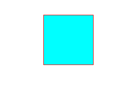
结果如下,当鼠标上上去后变化不再是瞬间完成,而是过渡完成。
2、变形 transform
(1)、2D变形
(a)移动 translate(x,y)
移动可以指定像素值也可以指定百分比, 注意:指定百分比是自身大小的百分比,因此可以用于设置盒子定位时的居中对齐(在设置left:50%后再移动自身的-50%即可)。
|
1
2
3
4
5
6
7
8
9
10
11
12
13
14
15
16
17
18
19
20
21
22
23
24
25
26
27
|
<
html
lang
=
"en"
>
<
             head
             >
<
meta
charset
=
"UTF-8"
>
<
meta
name
=
"viewport"
content
=
"width=, initial-scale=1.0"
>
<
meta
http-equiv
=
"X-UA-Compatible"
content
=
"ie=edge"
>
<
title
>Document
<
style
>
div {
width: 100px;
height: 100px;
background-color: aqua;
transition: all 2s;
}
div:active {
transform: translate(200px, 200px);
}
<
             body
             >
<
div
>
|
点击之后盒子进行了移动。用于让定位的盒子居中的代码入下
|
1
2
3
4
5
6
7
8
9
10
11
12
13
14
15
16
17
18
19
20
21
22
23
24
25
26
27
28
29
30
31
32
33
34
35
36
37
38
|
<
html
lang
=
"en"
>
<
head
>
<
meta
charset
=
"UTF-8"
>
<
meta
name
=
"viewport"
content
=
"width=device-width, initial-scale=1.0"
>
<
meta
http-equiv
=
"X-UA-Compatible"
content
=
"ie=edge"
>
<
title
>Document
<
             style
             >
.fa {
width: 300px;
height: 300px;
background-color: aqua;
transition: all 0.5s;
position: relative;
}
.son {
background-color: red;
position: absolute;
left: 50%;
top: 50%;
width: 100px;
height: 100px;
transform: translate(-50%, -50%);
}
<
body
>
<
div
class
=
"fa"
>
<
div
class
=
"son"
>
|
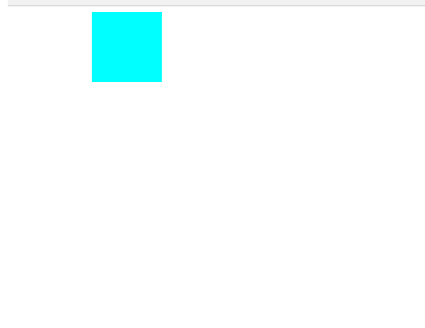
结果为

(b)缩放 scale(x,y)
x,y设置大于1 是放大,小于1 是缩小。
|
1
2
3
4
5
6
7
8
9
10
11
12
13
14
15
16
17
18
19
20
21
22
23
24
25
26
27
28
29
30
|
<
html
lang
=
"en"
>
<
             head
             >
<
meta
charset
=
"UTF-8"
>
<
meta
name
=
"viewport"
content
=
"width=device-width, initial-scale=1.0"
>
<
meta
http-equiv
=
"X-UA-Compatible"
content
=
"ie=edge"
>
<
title
>Document
<
style
>
div {
width: 100px;
height: 100px;
background-color: aqua;
margin: 200px auto;
transition: all 2s;
}
div:hover {
transform: scale(0.5, 2);
}
<
             body
             >
<
div
>
|
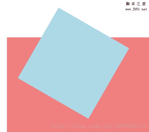
(c)旋转 rotate(x deg)
x指定度数值,正数是顺时针旋转,负数是逆时针旋转。
旋转可以使用 transform-origin 指定旋转中心点,transform-origin 给left top right bottom 也可以指定具体的像素值。
|
1
2
3
4
5
6
7
8
9
10
11
12
13
14
15
16
17
18
19
20
21
22
23
24
25
26
27
28
29
|
<
html
lang
=
"en"
>
<
head
>
<
meta
charset
=
"UTF-8"
>
<
meta
name
=
"viewport"
content
=
"width=device-width, initial-scale=1.0"
>
<
meta
http-equiv
=
"X-UA-Compatible"
content
=
"ie=edge"
>
<
title
>Document
<
             style
             >
div {
width: 200px;
height: 100px;
background-color: aqua;
margin: 200px auto;
transition: all 2s;
transform-origin: bottom left;
}
div:hover {
transform: rotate(120deg);
}
<
body
>
<
div
>
|
(d)倾斜 skew(x deg ,y deg)
x,y分别指定倾斜在x,y方向上的角度,可以为负数。y值不写默认为0。
|
1
2
3
4
5
6
7
8
9
10
11
12
13
14
15
16
17
18
19
20
21
22
23
24
25
26
27
28
29
|
<
html
lang
=
"en"
>
<
             head
             >
<
meta
charset
=
"UTF-8"
>
<
meta
name
=
"viewport"
content
=
"width=device-width, initial-scale=1.0"
>
<
meta
http-equiv
=
"X-UA-Compatible"
content
=
"ie=edge"
>
<
title
>Document
<
style
>
div {
width: 100px;
height: 100px;
background-color: aqua;
border: 1px solid red;
transition: all 1s;
margin: 200px auto;
}
div:hover {
transform: skew(30deg, 20deg);
}
<
body
>
<
             div
             >
|
(2)3D变形
(a)旋转(rotateX,rotateY,rotateZ)
3D旋转与2D类似,只不过一个是基于二位坐标一个是基于三维坐标。三个值可以同时指定也可以单独指定。
|
1
2
3
4
5
6
7
8
9
10
11
12
13
14
15
16
17
18
19
20
21
22
23
24
25
26
27
28
29
30
31
|
<
html
lang
=
"en"
>
<
head
>
<
meta
charset
=
"UTF-8"
>
<
meta
name
=
"viewport"
content
=
"width=device-width, initial-scale=1.0"
>
<
meta
http-equiv
=
"X-UA-Compatible"
content
=
"ie=edge"
>
<
title
>Document
<
style
>
div {
width: 200px;
height: 100px;
background-color: aqua;
margin: 200px auto;
transition: all 2s;
transform-origin: bottom left;
}
div:hover {
transform: rotateX(120deg);
/* transform: rotateY(120deg); */
/* transform: rotateZ(120deg); */
}
<
             body
             >
<
div
>
|

(b)移动(translateX,translateY,translateZ)
3D移动对于xy方向上的移动与2d移动一致。只有z方向上的移动不一样。Z方向上的移动在现实生活中是距离变远,距离变近。因此在网页中显示结果是变近则变大,变远则变小。
要使Z放线上移动生效首先要设置perspective(眼睛距离屏幕的距离);
|
1
2
3
4
5
6
7
8
9
10
11
12
13
14
15
16
17
18
19
20
21
22
23
24
25
26
27
28
29
30
31
32
33
34
35
|
<
html
lang
=
"en"
>
<
head
>
<
meta
charset
=
"UTF-8"
>
<
meta
name
=
"viewport"
content
=
"width=device-width, initial-scale=1.0"
>
<
meta
http-equiv
=
"X-UA-Compatible"
content
=
"ie=edge"
>
<
title
>Document
<
             style
             >
body {
perspective: 1000px;
/* 数值越小说明眼睛离的越近 */
}
div {
width: 200px;
height: 200px;
background-color: aqua;
transition: all 0.5s;
margin: 200px auto;
}
div:hover {
transform: translate3d(0, 0, 200px);
}
<
body
>
<
div
>
|

3、动画 animation
(1)、 animation: animation- name || animation- duration|| animation- timing-function || animation- delay || animation- iteration-count|| animation- direction|| animation- fill-mode;
animation-name:动画名称(自己使用@keyframes 定义的动画)
animation-duration:持续时间
animation-timing-function:运动曲线,与过渡的运动曲线类似。
animation-delay:延迟时间
animation-iteration-count:循环次数 (infinite 是无限循环)
animation-direction:是否反向(动画是否是由结尾倒开是倒着放的)
animation-fill-mode:设置在动画播放之外的状态(结束时的状态)none | forwards(设为结束时的状态)| backwards(设为开始时的状态)|both(设为开始或结束时的状态)
animation-play-state:设置动画状态 running 开始|paused 暂停
(2)、@keyframes 自定义动画
格式如下
|
1
2
3
4
|
@keyframes 动画名称 {
from{ 开始}
0%
to{ 结束 }
100%
}
|
可以用 from...to 来指定动画过程,也可以用0%~100%指定动画过程。
|
1
2
3
4
5
6
7
8
9
10
11
12
13
14
15
16
17
18
19
20
21
22
23
24
25
26
27
28
29
30
31
32
33
34
35
36
37
38
39
40
41
42
|
<
html
lang
=
"en"
>
<
             head
             >
<
meta
charset
=
"UTF-8"
>
<
meta
name
=
"viewport"
content
=
"width=device-width, initial-scale=1.0"
>
<
meta
http-equiv
=
"X-UA-Compatible"
content
=
"ie=edge"
>
<
title
>Document
<
style
>
div {
width: 100px;
height: 100px;
background-color: aqua;
/* animation: 动画名称 动画时间 运动曲线 何时开始 播放次数 是否反方向 */
animation: move 5s linear 3;
}
@keyframes move {
0% {
transform: translate3d(0, 0, 0);
}
25% {
transform: translate3d(400px, 0, 0);
}
50% {
transform: translate3d(400px, 300px, 0);
}
75% {
transform: translate3d(0, 300px, 0);
}
100% {
transform: translate3d(0, 0, 0);
}
}
<
body
>
<
             div
             >
|
以上就是本文的全部内容,希望对大家的学习有所帮助,也希望大家多多支持脚本之家。
如您对本文有所疑义或者对本文内容提供补充建议,请联系小编 ,本站会保留修改者版权

微信公众号搜索 “ 脚本之家 ” ,选择关注
程序猿的那些事、送书等活动等着你

最新评论