Screen and UI Performance
Chapter 4. Screen and UI Performance
The user interface of your app is likely influenced by designers, developers, usability studies, and testing—just about anyone is happy to add input/feedback to how your app looks. As the UI of your app is your connection to your customers, it defines your brand and it requires careful planning. However simple (or complicated) the UI of your app is, it’s important that your UI design is built to be performant.
As a developer, your task is to work with the UI/UX team and build an app that follows its design parameters on every Android device. We’ve already (briefly) discussed the pitfalls of the many screen sizes in the Android ecosystem and the challenges that exist there. But how about UI performance? How does the UI that your designers designed (and you built) run? Do the pages load quickly? Do they respond in a fast and smooth way? In this chapter, we’ll discuss how to optimize your UI for fast rendering and scrolling/animations, and the tools you can use to profile your screen and UI performance.
UI Performance Benchmarks
Like all performance goals, it is important to understand the performance goals associated with UI. Saying “my app needs to load faster” is great, but what are the expectations of the end user, and are there concrete numbers you can apply to those expectations? In general, we can fall back on studies of the psychology of human interactions. These studies have shown that users perceive delays of 0 – 100 ms as instantaneous and delays of 100 – 300 ms as sluggish; delays between 300 – 1,000 ms indicate to users that “the machine is working,” whereas delays of 1,000+ ms lead users to feel a context switch.
As this is basic human psychology, it seems to be a good metric to start with for page/view/app loading times. Ilya Grigorik has a great presentation about building mobile websites to take just “1,000 ms to Glass.” If your web page can load in 1 second, you win the human perception battle, and now you must wow your customers with great content. Additional research has shown that >50% of users begin abandoning websites if no content has loaded in 3–4 s. Applying the same argument to apps tells us that the faster you can get your app to start, the better. In this chapter, we’ll focus just on the UI loading. There may be tasks that must run in the background, files to be downloaded from the Internet, and so on, we’ll cover optimizing these tasks (or ways to keep these tasks from blocking the rendering) in future chapters.
Jank
In addition to getting content on the screen as quickly as possible, it has to render in a smooth way. The Android team refers to jerky, unsmooth motion as jank, and this is caused by missing a screen frame refresh. Most Android devices refresh the screen 60 times a second (there are undoubtedly exceptions—earlier Android devices were sometimes in the 50 or less fps range). Because the screen is refreshed every 16 ms (1 s/60 fps = 16 ms per frame), it is crucial to ensure that all of your rendering can occur in less than 16 ms. If a frame is skipped, users experience a jump or skip in the animation, which can be jarring. In order to keep your animations smooth, we’ll look at ways to ensure the entire screen renders in 16 ms. In this chapter, we’ll diagnose common issues and illustrate how to remove jank from your UI.
UI and Rendering Performance Updates in Android
One of the major complaints of early Android releases was that the UI—especially touch interactions and animations—were laggy. As a result, as Android has matured, the developers have invested a great deal of time and effort to make the user interaction as fast and seamless as possible. Let’s walk through a few of the improvements that have been added in various releases of Android to improve the user interaction:
-
On devices running Gingerbread or earlier, the screen was drawn completely in software (there was no GPU requirement). However, device screens were getting larger and pixel density was increasing, placing strain on the ability of the software to render the screen in a timely manner.
-
Honeycomb added tablets, further increasing screen sizes. To account for this, GPU chips were added, and apps had the option to run the rendering using full GPU hardware acceleration.
-
For apps targeting Ice Cream Sandwich and higher, GPU hardware acceleration is on by default; pushing most rendering out of the software and onto dedicated hardware sped up rendering significantly.
-
Jelly Bean 4.1 (and 4.2) “Project Butter” made further improvements to avoid jank and jitter, in order to make your apps “buttery smooth.” By improving timing with VSYNC (better scheduling frame creation) and adding additional frame buffering, Jelly Bean devices skip frames less often. When building these improvements, the Android team built a number of great tools to measure screen drawing, the new VSYNC buffering and jank, and released these tools to developers.
We’ll review all of these changes, the tools introduced, and what they mean to the average Android developer. As you might imagine, the goals from these updates were as follows:
-
Lower the latency of screen draws
-
Create fast, consistent frame rates to avoid jank
When the Android team was working on all of the improvements to screen rendering and UI performance, they needed tools to quantify the improvements that they made to the OS. To their credit, they have included these tools in the Android SDK so that developers can test their apps for rendering performance issues. As we walk through the different ways to improve app performance, we’ll use these tools with example apps to explain how they work.
With that said, let’s get started!
Building Views
I assume that you are familiar with the XML layout builder in Android Studio, and how to build views with the different tools in Android Studio (Eclipse) to look at those views. In Figure 4-1, you can see a simple app with a series of nested views. When building your views, it is important to look at the Component Tree in the upper-right of the screen. The more nested your views become, the more complicated the View Tree becomes, and the longer it will take to render.
For each view in your app, Android goes through three steps to render on the screen: measure, layout, and draw. If you imagine your XML layout hierarchy in your app, the measure starts at the top node and walks the render tree of the layout: measuring the dimensions of each view to be displayed on the screen (in Figure 4-1: LinearLayout; RelativeLayout; LinearLayout; then branching for textView0 and the LinearLayout Row1—which has three further children). Each view will provide dimensions to the parent for positioning. If a parent view discovers an issue in the measurements of its dimensions (or that of its children), it can force every child (grandchild, great-grandchild, etc.) to remeasure in order to resolve the issue (potentially doubling or tripling the measurement time). This is the reason a flat (less nested) view tree is valuable. The deeper the nodes for the tree, the more nested the measurement, and the calculation times are lengthened (especially on remeasurements). We’ll examine some examples of how remeasurement can really hurt rendering as we look through the views.
Remeasuring Views
There does not have to be an error for a remeasure to occur.RelativeLayouts often have to measure their children twice to ensure that all child views are laid out properly. LinearLayouts that have children with layout weights also have to measure twice to get the exact dimensions for the children. If there are nested LinearLayouts or RelativeLayouts, the measure time can grow in an exponential fashion (four remeasures with two nested views, eight remeasures with three nested views, etc.). We’ll see a dramatic example of remeasurement in Figure 4-9.
Once the views are measured, each view will layout its children, and pass the view up to its parent—all the way back up to the root view. Once the layout is completed, each view will be drawn on the screen. Note that all views are drawn, not just the ones that are seen by your customers. We’ll talk about that issue in “Overdrawing the Screen”. The more views your app has, the more time it will take to measure, layout, and draw. To minimize the time this takes, it is important to keep the render tree as flat as possible, and remove all views that not essential to rendering. Removing layers of the layout tree will go a long way in speeding up the painting of your screen. Ideally the total measure, layout, and draw should be well below the 16 ms threshold—ensuring smooth scrolling of your UI on the screen.
While it is possible to look at the node view of your layout as XML (like in Figure 4-1), it can be difficult to find redundant views. In order to find these redundant views (and views that add delay to screen rendering), the Hierarchy Viewer tool in Android Studio Monitor can greatly help you visualize the views in your Android app to resolve these issues (Monitor is a standalone app that is downloaded as a part of Android Studio).
Hierarchy Viewer
The Hierarchy Viewer is a handy way to visualize the nesting behavior of your various views on a screen. The Hierarchy Viewer is a great tool to investigate the construction of your view XML. It is available in Android Studio Monitor, and requires a device with a developer build of Android on it. See “Rooted Devices/Engineering/Developer Builds” for details on what this entails. There is also a class from Googler Romain Guythat allows you to test a debug version of your app. All of the views and screenshots using the Hierarchy View in the subsequent sections are taken from a Samsung Note II running 4.1.2 Jelly Bean. By testing screen rendering on an older device (with a slower processor), you can be sure that if you meet rendering thresholds on this device, you app will likely render well on all Android devices.
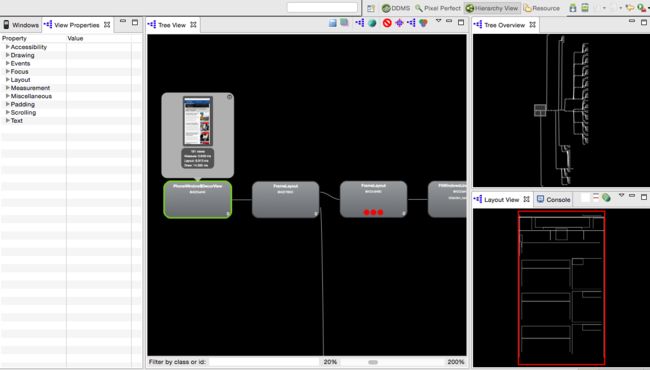
As shown in Figure 4-2, when you open Hierarchy View, there are a number of windows: on the left, there is a Windows tab that lists the Android devices connected to your computer, with a list of all running processes. The active process is displayed in bold. The second tab gives details about a selected build (more on this later). The center section shows a zoomed view of your app’s Tree View. Clicking on a view (in this case, the leftmost view) shows you the view as it appears on the device and additional data. To the right are two views: Tree Overview and Layout View. The Tree Overview shows the entire view hierarchy, with a box showing where the zoomed center section is in relation to the entire tree. The Layout View highlights in dark red the area that is painted by the selected view (and light red displays the parent view).
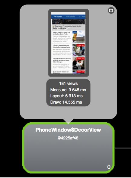
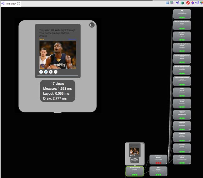
Inside the central close-up view, you can click on an individual view to get a representation of the view on an Android screen. By clicking the green, red, and purple “Venn diagram” icon under the Tree View, this pop-up view will also provide the child view count, and the timing for view measure, layout, and draw. This will calculate the measure, layout, and draw times for every view down the tree from the selection (in Figure 4-3, I chose the top view to obtain the timing to create the entire view).
The topmost view for the article list uses 181 views, measures in 3.6 ms, layout in 7 ms and draws in 14.5 ms (~25 ms total). In order to reduce the time to render these views, it makes sense to look at the Tree Overview of the app, to see how the views fit together as a whole. The tree overview shows that while there are a lot of views in this screen, the render tree is relatively flat. A flat render tree is good, as the “depth” of your view XML can have detrimental effects to rendering time. Even with the flat XML, there is still a 26 ms draw time, there may be times where this view is janky, and that optimizations should be considered.
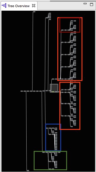
Examining the Tree Overview of a news app’s list of articles (Figure 4-4), there are three major regions: the header (in the blue box at the bottom of the views), story lists (there are two orange boxes with views for two different tabs of articles). The views for a single story are highlighted in red. There are nine repeats of this internal headline structure, five in the top orange box, and four in the second). Finally, the views for the side pull-out navigation bar can be found at the bottom (in the green box). The header uses 22 views, the two story lists use 67 and 44, respectively (each headline uses 13 views), and the navigation drawer uses 20. For those of you keeping score, this leaves 18 views unaccounted for. There is a swipe animation, and some interim views that complete the total. As you can see, the number of views can really add up. Being as efficient as possible is crucial to ensuring a jank free experience for your users (see Figure 4-5).
Figure 4-5. Examining a View Tree
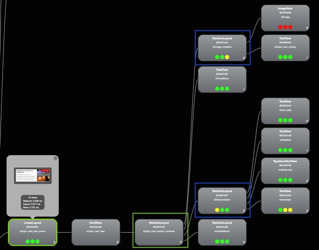
Looking closer at a headline, we can look at the 13 views that make up one headline in the list. Each headline has five levels of hierarchy (seen as vertical columns), and it takes .456 ms to measure, 0.077s to layout, and 2.737 to draw. The fifth layer of hierarchy is fed by two RelativeLayouts in the fourth level (highlighted in blue). These are drawn by a third RelativeLayout in the third column (highlighted in green). If the layout described in these two could be described in their parents (in the third level), an entire layer of rendering could be removed. Further, as I explained in Remeasuring Views, each RelativeLayout is measured twice, so having nested RelativeLayouts can quickly lead to increases in measure time.
By now, you may have noticed the red, yellow, and green circles in each view. These denote the relative speed of measure, layout, and draw (from left to right) for that view in that vertical layer of views. Green means fastest 50%, yellow means slowest 50% and red denotes the slowest view in that level of the tree. Obviously, the red views are good places to look for optimizations.
In the tree for the article headline, the slowest view is the ImageView in the upper-right corner. Walking the view back the article parent, it is fed through two RelativeLayouts (increasing the measure time), and then three views with no children (across the bottom). These three views could also be aggregated into a single view—removing two layers of hierarchy.
Let’s look at how another news app worked to reduce the number of views per headline. The Figure 4-6 view shows a similar hierarchy to what we saw in Figure 4-5.
In fact, the headline view (shown in Figure 4-6) has the same issue with RelativeLayouts (in blue), and this results in a measure of 1.275 ms, layout of 0.066 ms and draw of 3.24 ms (a total of 4.6 ms per headline). Upon seeing these times, the developers went back to the drawing board, and built a prettier UI, with a larger image and share buttons—but a flatter hierarchy (Figure 4-7).
Now the headline (with just three columns of hierarchy) takes a total of just 4.2 ms to render—a savings of 400 ms even with the larger UI!
To better explore aspects of performance, I will use examples from a sample app, “Is it a goat?” This simple app is a list of several images with checkmarks next to pictures of goats. This sample app has several different layouts built into it, from unoptimized and slow to an optimized fast XML layout. By examining the views, and how they evolve, we can quantify how the optimizations improve the rendering of the app. We’ll walk through several steps of optimization in this app, and each change in view layout can be viewed in Hierarchy View by changing the view in the settings. Upon choosing a layout type, the view is refreshed with a more (or less) optimized XML view structure. We’ll start with the “Slow XML” as the unoptimized starting point. A quick look at the Hierarchy View at the unoptimized version of this app reveals a few things, as shown in Figure 4-8.
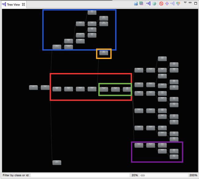
There are 59 views in this simple app. However, unlike the news app in Figure 4-4, the view tree has more horizontal depth. The more views that are fed on top of one another, the longer the app will take to draw. By removing layers of depth, this app will render each frame on the screen faster.
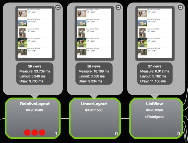
The blue box frames out the views for the Android Action Bar. The orange box is the text box at the top of the screen, and the purple box marks one row of goat information (there are six identical views above the purple view indicated). The red box shows seven views in a row that only add depth to the app, and do not build any additional display. Taking a closer look at just three of these sequential views (in the green box) shows an interesting remeasurement issue (Figure 4-9).
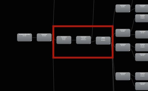
As the device measures views, it starts from the right (child view) and moves to the left (to the parent views). The ListView on the right takes the measurements from the six rows of goat data (37 total views), and takes 0.012 ms to measure. This feeds into the center LinearLayout (38 views). Interestingly, the measure timing balloons out due to a remeasurement loop. The measure time jumps three orders of magnitude to 18.109 ms. The RelativeLayout to the left of the LinearLayout redoubles the measurement time to 33.739 ms. By the time the measurement cascades through the additional parent views (those additional views in the red box in Figure 4-8), the total measurement time is over 68 ms. By simply removing this one LinearLayout, the entire view tree measurement drops to under 1 ms! (You can verify this by comparing the “Remove Overdraw” layout in the app to the “Remove LL+OD” layout. The only difference is removing that one view.) We can remove several more layers of depth by applying the “Optimized Layout” setting. From the seven excess views shown in Figure 4-10, the app now has just three layers (Figure 4-11).
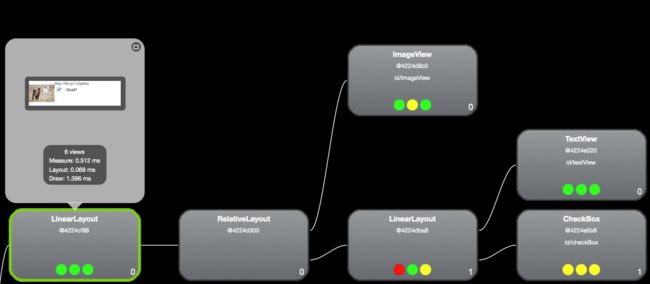
A further optimization to remove view depth can be done by looking at the rows of goat data. Each line of goat information has six views, and there are six rows of data visible on the screen (one such row is highlighted in a purple box at the bottom right of Figure 4-8.) Using the Hierarchy View tool to look at how the views are built for one row of the Goat app (Figure 4-11), we see that the two left-most views (a LinearLayout and RelativeLayout) add only depth to the views (“Slow XMl” view). The initial LinearLayout feeds directly into a RelativeLayout, but adds nothing to the display.
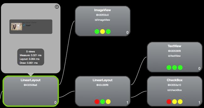
Because RelativeLayouts remeasure twice (and we are trying to reduce measurement time), I first attempted to remove the RelativeLayout (“Optimized Layout” setting in the app; see Figure 4-12). When I did this, the depth was reduced from 4 to 3, and the display rendering is faster.
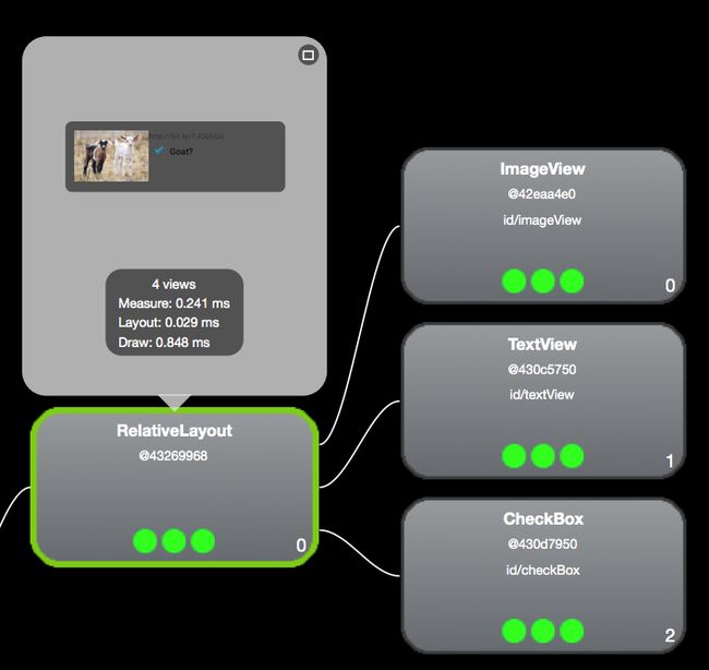
However, this is not the fastest optimization. By removing the LinearLayout and reorganizing the RelativeLayout to handle the entire row of information (as shown in Figure 4-13), the view depth is reduced to 2. The layout is 0.1 ms faster to render. It just goes to show that there is more than one way to optimize your layouts, and it does not hurt to test different options (see Table 4-1).
| Version | View Count | View Depth | Measure | Layout | Draw | Total |
|---|---|---|---|---|---|---|
| Unoptimized |
6 |
4 |
0.570 |
0.068 |
1.477 |
2.115 ms |
| Remove RelativeLayout |
5 |
3 |
0.321 |
0.064 |
0.851 |
1.236 ms |
| Remove LinearLayouts |
4 |
2 |
0.241 |
0.029 |
0.848 |
1.118 ms |
By removing ~1 ms of rendering from each row of information, we can pull about 6 ms from the entire render time (assuming six rows of data on the screen). If your app has jank, or your tests show that you are close to the 16 ms border of jank, saving 6 ms will definitely pull you further from the edge.
Reusing Views
Like a good object-oriented programmer, you likely have views that you call and reuse (rather than recode over and over). In my “Is it a goat?” app, the goatrow layout is reused for every row of data. If the view wrapping your sublayout is only used to create the XML file, it may be creating an extra layer of depth in your app. If this is the case, you can remove that outer view wrapper and enclose the elements in
As an exercise, download the “Is it a goat?” app on GitHub and observe the view times in the Hierarchy View tool. You can modify the view XML files used by changing the radio buttons in the settings menu, and use the Hierarchy View tool to view the changes in depth of the app, and how these changes affect the rendering speed of your app.
Hierarchy Viewer (Beyond the Tree)
The Hierarchy Viewer has a couple of additional neat functions that can be helpful to better understand overdraw. Following the options in the tree view from left to right, you have the ability to do a number of useful things like:
-
Save any view from the tree as a PNG (icon is a stylized diskette).
-
Photoshop export (described in “Overdrawing the Screen”).
-
Reload the view (second purple tree icon).
-
Open large view in another window (the globe icon); this has an option to change the background color so that it’s easier to determine whether there is overdraw.
-
Invalidate the view (red line with bar through it).
-
Request view to layout.
-
Request view to output the draw commands to the LogCat (yes, the third use of the purple tree icon); this is a great way to read the actual OpenGL commands for each action being taken. For Open GL experts: this will be helpful for in-depth optimizations.
It is clear that the Hierarchy Viewer is a must-have analysis tool to optimize the View tree of your app—potentially shaving tens of ms from the render time of your Android app.
Asset Reduction
Once your app is flattened and the number of views are reduced, you can also reduce the number of objects used in each view. In 2014, Instagram reduced the number of assets in its title bar from 29 to 8 objects. They quantified the performance increase to be 10%–20% of the startup time (depending on device). They managed this reduction through asset tinting, where they load just one object, and modify its color using a ColorFilter at runtime. For example, by sending your drawable and desired color through the following method:
public Drawable colorDrawable(Resources res,
  @DrawableRes int drawableResId, @ColorRes int colorResId) {
    Drawable drawable = res.getDrawable(drawableResId);
    int color = res.getColor(colorResId);
    drawable.setColorFilter(color, PorterDuff.Mode.SRC_IN);
    return drawable;
}
One file can be used to represent several different object states (starred versus unstarred, online versus offline, etc.).
Overdrawing the Screen
Every few years, there is a story about how a museum has X-rayed a priceless painting and discovered that the artist had reused the canvas, and that there was an undiscovered new painting underneath the original masterwork. In some cases, they are even able to use advanced imaging techniques to discover what the original work on the canvas looked like. Android views are drawn in a similar manner. When Android draws the screen, it draws the parent first, and then the children/grandchildren/etc. views on top of the parent views. This can result in entire views being drawn on the screen, and then—much like the artist and his canvas—these views are entirely covered up by subsequent views.
During the Renaissance, our master artist had to wait for the paint to dry before he could reuse his canvas. On our high-tech touch screens, the speed of redrawing the screen is several orders of magnitude faster, but the act of painting the screen multiple times does add latency, and potentially can add jank to your layout. The act of repainting the screen is called overdraw, and we’ll look at how to diagnose overdraw in the next section.
An additional problem with overdraw is that anytime a view is invalidated (which happens whenever there is an update to the view), the pixels for that view need to be redrawn. Because Android does not know which view is visible, it must redraw every view that is associated with those pixels. In the painting analogy, our artist would have to scratch out all the paint back to the canvas, repaint the “hidden masterwork” and then repaint his current work. If your app has multiple layers or views being drawn for that pixel, each must be redrawn. If we are not careful, all of this heavy lifting to draw (and redraw) the screen can cause performance issues.
Testing Overdraw
There are a number of great tools offered from Android to test overdraw. In Jelly Bean 4.2, the Debug GPU Overdraw tool was added in the Developer Options menu. If you are using a Jelly Bean 4.3 or KitKat device, there is a version of the Overdraw counter that gives you a weighted average of total screen overdraw in the bottom left of the view. I find that this tool is a very useful way to quickly look at apps for overdraw issues. However, it does appear to overestimate apps that have more than 6–7x overdraw (yes, it happens more than we’d like to admit).
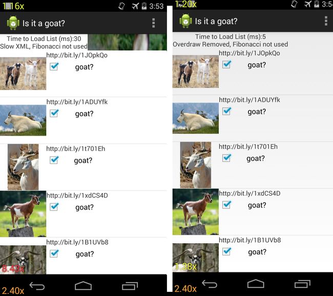
The screenshots shown in Figure 4-14 are again from the “Is it a goat?” app. The overdraw counters can be seen in the lower left. There are three overdraw counters on the screen, but the one we can control as a developer appears in the main window. The overdraw counter appears in the bottom left. The unoptimized app on the left has an overdraw of 8.43, and our optimization steps will reduce this to 1.38. We can also see that the nav bars have overdraws of 1.2 (and the menu buttons 2.4), meaning that the text and icons overdraw this section by an extra 20% (140%). While the overdraw counter is a quick way to compare overdraw between apps without impacting the user experience too much, it does not help you understand where the overdraw issues lie.
Another way to visualize the overdraw is to use the “Show Overdraw areas” selection in the Debug GPU overdraw menu. This tool makes places an overlay of color over your app, showing you the total amount of overdraw in each region of the app (for those developers who are colorblind, the KitKat release offers a colorblind-friendly setting). By comparing the colors on the screen, you can quickly determine the issues at hand:
- White
-
No overdraw
- Blue
-
1x overdraw (screen is painted twice)
- Green
-
2x overdraw (screen is painted twice)
- Light red
-
3x overdraw
- Dark red
-
4x or more overdraw
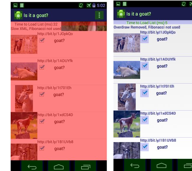
In Figure 4-15, you can see the overdraw areas rendering of the “Is it a goat?” app before and after optimization. The menu bar of the app is not colored (no overdraw) in either screenshot, but the Android icon and the settings menu icon are green (2x overdraw). The list of goat images is dark red before optimization (indicating at least 4x overdraw). After the app views were optimized, there is now only blue (1x) overdraw over the checkbox and the images—indicating that at least three layers of drawing were removed! There is now no overdraw around the text and in the blank space.
By reducing the number of views (or at least the way these views over paint one another) the app will render faster. Comparing the parent view in the Hierarchy Viewer for the view with excess overdraw and the optimized version (“Slow XML” versus “Remove Overdraw”) shows a 50% drop in the draw time from 13.5 ms to 6.8 ms.
Overdraw in Hierarchy Viewer
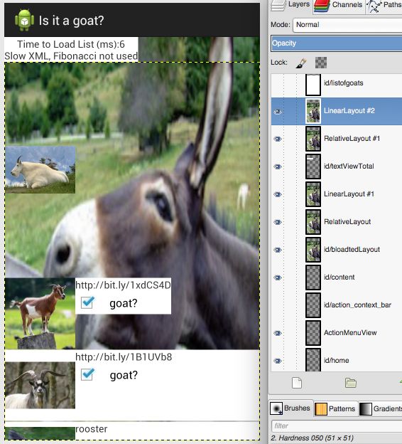
Another way to visualize the overdraw in an app is to save the view hierarchy as a Photoshop document (the second option on the Tree View) in Hierarchy Viewer. If you do not have Photoshop, there are a number of free tools available that will allow you to open this document (the subsequent screenshots are from GIMP for Mac). When opening these views, you can really see the overdraw present in different layers. In most production apps, it is typically drawing a white background on top of another white background. This does not sound terrible, but it is two steps of painting, and should be avoided. To better visualize this in the “Is it a goat?” app, all overdrawn regions utilize an image of a donkey instead of a white background. If you look at the images in previous pages, there are no images of a donkey visible, because they were overdrawn with a white view on top of them. By removing the visible view layers, we’ll be able to see the layers of donkey below, and quickly determine where overdraw occurs, and then remove it. In GIMP, views that are visible in your app have a small eye icon next to the layer. In Figure 4-16, you can see that I have begun to peel back the views at the top of the “Is it a goat?” app (revealing a large donkey). In the layout view list to the right, you can see there are a number of full screen layouts that are visible (and they all are showing the same donkey image).
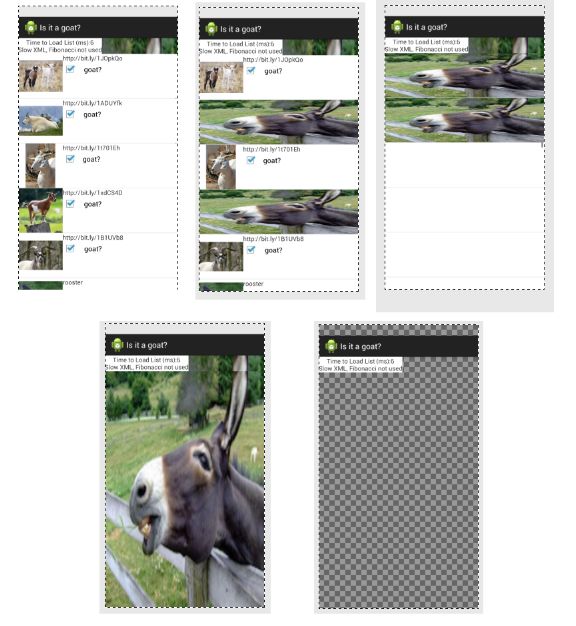
Another way to visualize the “peeling back of the views” is shown in Figure 4-17. We start at the top left with the full screen view of the app, as seen on the device. Moving to the center top screenshot, we have removed two rows of goat pictures and layout, revealing that under each row of goat data there is a stretched picture of a donkey. Below the six or seven stretched small donkey images, there is a white backdrop (seen in the rightmost image on the top row with two of the small donkey pictures). Removing that white layer reveals a large donkey, as seen at the bottom left. Below the donkey pictures, there is a final full screen of white until we reach the bottom of the view tree (seen at the bottom right).
Overdraw and KitKat (Overdraw Avoidance)
In KitKat and newer devices, the effects of overdraw have been dramatically reduced.Called Overdraw Avoidance, the system can remove simple cases of overdraw (such as views that are completely covered by other views) automatically (this likely means that the effects of the full screen donkeys in my “Is it a goat?” app will not be felt by KitKat and newer users). This will improve the draw rate for apps with overdraw, but it still makes sense to clean up as many examples of overdraw as possible (for better code, and for your customers on Jelly Bean and lower).
Overdraw Avoidance and Developer Tools
When you use the Overdraw tools described earlier, KitKat’s Overdraw Avoidance is disabled, so you can see what your layout really looks like, but not how the device actually sees it.
Analyzing For Jank (Profiling GPU Render)
After the view hierarchy and overdraw have been optimized, you may still be suffering from lost frames or choppy scrolling: your app still suffers from a case of jank. You may not experience jank on your high-end Android device, but it might be there on the devices with less computing power. To get an overall view of the jank in your app, Android has added Profile GPU Rendering as a Developer Option in Jelly Bean and newer devices. This measures how long it takes each frame to draw onto the screen. You can either save the data into a logfile (adb shell dumpsys gfxinfo), or you can display the GPU rendering as a screen overlay in real time on the device (available on Android 4.2+).
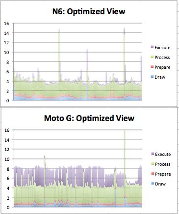
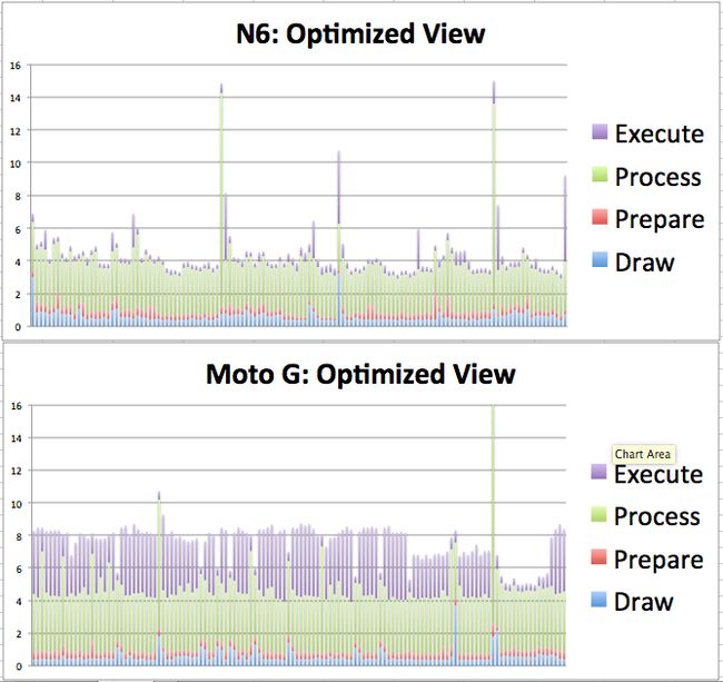
For a quick analysis of what is going on, I really like displaying the GPU rendering on the screen to get a holistic view of what is happening, (but the raw data from the log is great for offline graphing or reporting). Again, this is good to attempt on multiple devices. In Figure 4-18, you can see the GPU rendering profile on a Nexus 6 running Lollipop (left) and the Moto G on KitKat (right) for the “Is it a goat?” app. The bars appear at the bottom of the screen. The most important feature in this GPU profile graph is the horizontal green bar. This frame denotes the 16 ms time the device uses to render a frame. Each frame that is rendered is a horizontal bar. If you have a lot of frames that go over the 16 ms line, you have a jank problem. In the figures below, there are a few instances of Jank on the Nexus 6. This occurred when the scrolling hit the end of the page, and the device did a bounce animation. The end-user experience was not terribly affected. Each screen draw (vertical line) is broken down into four additional measurements collected (on Lollipop) by color: draw (blue), prepare (purple), process (red), and execute (yellow). In KitKat and earlier, the prepare data is not broken out, and is included in the other metrics (hence only three colors appear in the KitKat GPU profile screenshots).
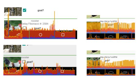
Figure 4-18. GPU Profiling Lollipop (left) and KitKat (right) of the unoptimized “Is it a goat?” app (top), optimized (bottom)
Comparing the GPU data from the Nexus 6 to the Moto G brings us back to the topic of device testing. The unoptimized “Is it a goat?” app (top row) in Figure 4-18qualitatively shows that the Moto G takes twice as long as the Nexus 6 (by comparing vertical heights of the GPU profile to the green line, scales are the same). This can be quantified by collecting the data (adb shell dumpsys gfxinfo) and graphing. In the next example, the optimized view takes almost twice as long on the Moto G. For both devices, the draw, prepare, and process steps all take about the same amount of time (less than 4 ms total). The difference occurs in the execute phase (purple) of the frame draw, where the Moto G often takes ~4 ms longer than the Nexus 6. This goes to show that testing GPU rendering is best done on your lower-powered devices, as they are more likely to have issues rendering your views without jank.
At a high level, the GPU profiler lets you know you might have a problem. In the “Is it a goat?” app, if I turn on the Fibonacci delay (where a heavy recursive calculation is done during view creation), the GPU profiler does not show any jank because the calculation takes place on the UI thread and completely blocks rendering (on slower devices this setting results in an app not responding message).
Fibonacci Calculation Algorithms
The Fibonacci sequence is a series of numbers where each value is the sum of the two preceding values: 0, 1, 1, 2, 3, 5, 8, and so on. It is commonly used to describe recursion in programming, and in this case, I am using the most inefficient code to generate the Fibonacci value:
publicclassfibonacci{//recursive Fibonaccipublicstaticintfib(intn){if(n<=0)return0;if(n==1)return1;returnfib(n-1)+fib(n-2);}
The number of calculations required to generate each value grows exponentially. The goal here is to put so much work on the CPU during rendering that the views are delayed and cannot render quickly. Calculating n=40 really slows down the app (and causes it to crash on lower-end devices). While perhaps a slightly contrived example of what might block your views from rendering, the techniques we used to identify the Fibonacci code in our traces will help you find code that is slowing down your app.
GPU Rendering in Android Marshmallow
In Android Marshmallow, adb shell dumpsys gfxinfo
** Graphics info for pid 2612 [appname] **

Stats since: 1914100487809ns
Total frames rendered: 26400
Janky frames: 5125 (19.41%)
90th percentile: 20ms
95th percentile: 32ms
99th percentile: 36ms
Number Missed Vsync: 142
Number High input latency: 11
Number Slow UI thread: 2196
Number Slow bitmap uploads: 439
Number Slow draw: 3744
From the time the app was started, now you can see how many frames were rendered, and how many are 90th percentile and the timings for the slowest frames (90th, 95th, and 99th percentile). The last five lines list reasons that the frame did not render in 16 ms. Note that there are more issues than janky frames, indicating that some frames were impacted by more than one issue.
Another great addition to Android Marshmallow to the gfxinfo library of test tools is adb shell dumpsys gfxinfo framestats. This outputs a large comma-separated table with specific timings of events in each frame. The columns in the export are not labeled, but are described at the Android developer site. To determine the time each step of the rendering pathway takes on your device, you must calculate the differences between the framestats reported values. To simplify these calculations, I have created a spreadsheet that computes the values of interest. When you paste in the raw CSV data, columns P-X become populated with useful data about each frame render (all results are in ms):
-
VSYNC-Intended_VSYC (tells you if a frame render was missed—jank!)
-
Input event time (processing time for input events—should be < 2 ms))
-
Animation evaluation (should be < 2 ms)
-
Layout and measure
-
view.draw() time
-
Sync phase time (if > 0.4 ms, indicates many new bitmaps being sent to GPU)
-
GPU work time (overdraw draw time will appear here)
-
Total frame time
There are two tabs in the worksheet with sample data, both from the “Is it a goat?” app: goat-optim and goat-slowXML. Looking at the data from the goat-slowXML sheet (shown in Figure 4-20), we can see a few frames (in purple) where the total frame draw exceeded 16.6 ms. Fortunately, due to the presence of frames in the VSYNC buffer, no frames were dropped (as indicated by the 0s in the first column). For devices with a smaller buffer (or for apps where the buffer does not have time to repopulate), this could result in a janky user experience. The chart also implies that slow input events (orange) and evaluate animator events (red) add GPU work, and lengthen the total frame rendering time.
Beyond Jank (Skipped Frames)
There are times that the GPU profiler does not show a jank event crossing the 16 ms threshold, but you can tell that there was a skip or jump in the UI rendering. This can occur during a skipped frame, where rendering is completely blocked by the CPU doing something else. In Monitor or Android Studio, you can watch the logfiles in the DDMS view. It is easier follow logs from your app if you filter on the process you are testing. If you think this might be the case in your app, look in the logfiles for a warning like the one shown in Figure 4-21.
Figure 4-21. Log error showing skipped frames
We’ll look at how skipped frames are caused by the CPU in Chapter 5.
Systrace
If you are still experiencing jank after optimizing all of your views, all is not lost. The Systrace tool is another way to measure the performance of your app, and it can also help you diagnose where the issue might lay. Introduced as a part of “Project Butter” with the Jelly Bean release, it allows quick scans into how your app is behaving at core levels of your Android device. There are many types of Systrace parameters that can be run, and we will cover other traces later in the book. Here we will focus on how the UI is rendered, and debug issues associated with jank using Systrace. All of the traces shown in this chapter are available in in the High Performance Android Apps GitHub repository.
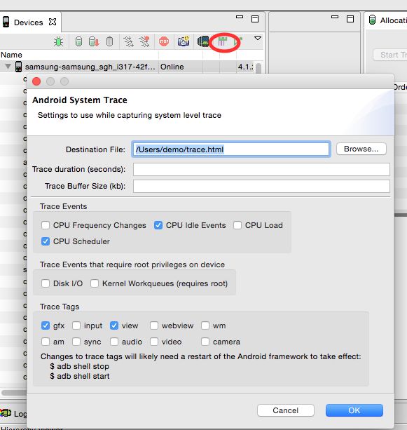
Systrace differs from the previous tools in this chapter in that it records data for the entire Android system; it is not app specific. For this reason, it is best run on a device that has few additional processes running at the same time, so that the other processes do not interfere with your debugging. In the examples here, we Run Systrace from Android Monitor (but it can also be run from Android Studio or the command line). The Systrace icon is a stylized green and pink graph icon (marked by a red oval in Figure 4-22), and when you press it, it opens a window with a number of options.
The trace is recorded into an HTML file that can be opened in your browser. To study the interactions on the screen, we’ll just collect the CPU, graphics and view data (as shown in the dialog box in Figure 4-22). We’ll leave the duration field blank (default to 5 seconds). When you press OK, the Systrace will immediately begin to record the parameters you selected on the device (so you’d better be ready to start right away). Because the trace is extremely detailed (and measures all features to the sub-millisecond timeframe), it should be used to diagnose one issue at a time rather than to get a holistic view of your app’s performance.
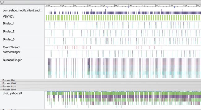
Much like in “Battery Historian” in Chapter 3, the output from these traces is overwhelming (and we only picked four of the options available!). Scrolling can be performed with the mouse, and the WASD keys are used to zoom in/out (W, S) and scroll left/right (A,D). At the top of the trace just run, you’ll see details about the CPUs. Below the CPU data are collapsible sections describing each process that was active. Each color bar indicates a different action by the OS, and the length of the color indicates the duration (and if we zoom in, we’d see even more lines). Selecting a bar provides details about that item in the window at the bottom of the screen. Like Battery Historian and other tools, the high-level view (shown in Figure 4-23) is intimidating at first glance. Let’s take our first look, and then dig into the information provided so that you can become an expert at reading these files.
Systrace Evolution
Like the Android ecosystem itself, Systrace has a slightly different interface, display, and set of results depending on the version of the OS you are testing:
-
On Jelly Bean devices, there is a setting in Developer Options to enable tracing. You must enable the trace collection on both the computer and the device.
-
The output from each release of Android becomes more detailed and has slightly different layouts.
-
It is still worthwhile to look at Systraces from Jelly Bean and compare to Lollipop, as you can glean different information from the devices, but they will look different.
At Google I/O 2015, a new version of Systrace was launched, and some of the new features are discussed in “Systrace Update—I/O 2015”.
As we scroll down through the Systrace results, every process that ran during the test can be seen. For the study of jank, we are primarily looking at the way the app in question draws, and the when the screen refreshes. As long as these two partners are in sync, the dance of the screen rendering will be smooth. However, should either take a misstep, there will be the opportunity for there to be a jitter or jank in the rendering of the page.
Systrace Screen Painting
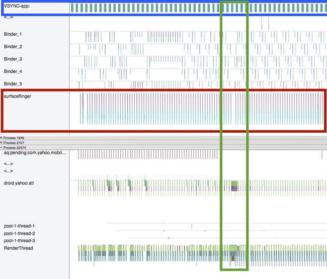
Let’s walk through the steps of screen painting, using Figure 4-24 as an example. The top row of the trace (highlighted in blue) is the VSYNC, consisting of wide, evenly spaced teal bars. VSYNC is the signal to the OS that it is time to update the screen. Each bar denotes 16 ms (as does the whitespace between the bars). When a VSYNC event occurs (at either end of the teal bar), the surfaceflinger (highlighted with a red box and consisting of several colors of bars from purple-orange and teal) to grab a view from the view buffer (not shown) and displays the image on the screen. Ideally, surfaceflinger events will be 16 ms apart (no jank), so gaps indicate times where the surfaceflinger missed a VSYNC update—the screen did not update in time (and where to look for causes of jank). You can see such a gap about 2/3 of the way through the trace (highlighted in a green box).
The bottom section of Figure 4-24 shows details about the app. The second line of data (green and purple lines) are the app building views, and then the bottom row (green, blue, and some purple bars) is the RenderThread, where the views are rendered and sent to the buffer (not shown in this screenshot). Note that these bars get thicker at the same location as the potential jank in the surfaceflinger (about one-third of the way through the trace), indicating that something in the app may have been the cause of the jank. Each app is different, and will have a different cause, but these are the sort of symptoms we are looking for.
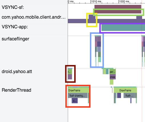
This high-level view is a great way to look for jank, but to investigate we must zoom in to get a better look. To understand what is happening in the Systrace, it is best to figure out what Systrace measures, and how things work when everything is working well. Once you figure out the way things should work, it makes finding the issues easier. In Figure 4-25, I have edited together the pertinent lines from a Systrace where things were running smoothly (taking out a lot of whitespace for space considerations). We start at the left side of the screen with droid.yahoo.com. Note that my description will have you bouncing up and down in the trace to different lines (from the app to the OS) as the rendering occurs:
-
Red box: droid.yahoo.com is finishing up a measure of the views for the screen. These are passed to the RenderThread.
-
Orange box: RenderThread. Here the app:
-
Draws the frame (light green).
-
Flushes the Drawing buffer (gray).
-
Dequeue the buffer (in purple).
-
Sends this to a buffered list of views.
-
-
Yellow box: com.yahoo.mobile.client.andr…
This is the list of views in a buffer. The height of the line demotes how many views are buffered. At the start, there is one, and when the view is passed to the buffer, the height doubles to two.
-
Green box: VSYNC-sf alerts the surface flinger that it has 16 ms to render a screen. The brown bar on this line is 16 ms long.
-
Blue box: surfaceflinger grabs a view from the queue (note in the yellow box that the buffer queue drops from 2 to 1). Upon completion, this view is sent off to the GPU and the screen is drawn.
-
Purple box: VSYNC-app now tells the app to render another view (and shows a 16 ms timer).
-
As soon as the VSYNC begins, the process repeats itself with droid.yahoo.att, measuring the views, passing to the RenderThread, and so on. And the cycle continues.
On reflection, it is pretty amazing all of the steps that our devices do to just render a screen so smoothly in such a short period of time. Now that we know what things look like when running smoothly, let’s debug a moment of jank.
In Figure 4-26, we are looking at a close-up of the OS layer. To highlight the issue, I have added arrows indicating 16 ms intervals, and a red box at the location of a missing surfaceflinger.
Why does this happen? The row above the arrows is the view buffer, and the height of this row indicates how many screen frames are saved in the buffer. At the start of this trace, the buffer is alternating between one and two views. As the surfaceflinger grabs one view (the buffer count drops), but the buffer is quickly repopulated from the app. However, after the third SurfaceFlinger action, the buffer queue empties and is not repopulated by the app in time. So, let’s see what was happening at the app level.
In Figure 4-27, we initially see the RenderThread passing a view to the buffer (red box). The orange box shows the app creating a second view, rendering it, and passing it to the buffer (droid.yahoo.att measures and lays out the views, and RenderThread draws). Unfortunately, the app gets hung up before building another view (inside the yellow boxes). During the building of the next screen, the droid.yahoo.att app must first run (light green) “obtainView” for 7 ms, (teal) “setupListItem” for 8.7 ms, before the dark green “performTraversals” (3 ms). The app then passes the data to the RenderThread, which is also significantly slower (12 ms). Creating this frame took the app nearly 31 ms (versus ~6 ms for the previous view). When the process to build this frame began, there was one view stored in the buffer, but the device required two views during this time period. As the process had not fed the buffer, a jank occurred in the screen render.
It is interesting to note that the app catches up quickly. After the delayed yellow box view is created and passed to the buffer, two additional frames are created in quick succession (green and blue boxes). By quickly refilling the buffer queue, the app survives with just one skipped frame. This trace was taken on a Nexus 6 (with a fast processor that allowed it to catch up quickly). Repeating this same study on a Samsung S4 Mini running Jelly Bean 4.2.2 resulted in the trace shown in Figure 4-28.
It is immediately clear from the high-level view that many more frames are skipped (see the many gaps in the surfaceflinger at the start of the trace). Also good to notice is that the top row (the view buffer) often has zero views in its buffer (which we just saw leads to jank), and rarely has two views in the buffer. On a device with a slower GPU processor, the app does not have as many opportunities to “catch up” and refill the buffer like the Nexus 6 did.
TIP
You can exceed the 16.6 ms time to render a frame occasionally, as there are often one or two buffered frames ready to go. However, if you have two or three slow frame renders in a row, your customers will experience jank.
Because this trace was taken on a handset running Jelly Bean, the RenderThread data is included with the droid.yahoo.att row (the measure, draw, and layout are reported together until Lollipop). Combining these rows makes each step appear thicker. The small amount of whitespace between each call shows that this device has very little extra time between frame draws. The app on this device is only able to run slightly ahead of the surfaceflinger to keep the buffer queue full. If this app were able to reduce the complexity of each view—thus speeding up the rendering of the views—there would be more empty space between draws, the buffers would have more opportunity to fill, and likely would add a little “breathing room” in its view drawing on lower-end devices.
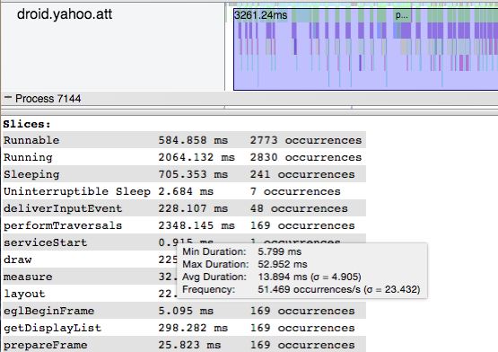
By highlighting a region, Systrace will count up all of the slices seen, and give basic statistical analyses by mousing over any of the values. In Figure 4-29, we see the performTraversals (the parent draw command) averages 13.8 ms, with a standard deviation of 5 ms. Because the 16 ms jank threshold lies within one standard deviation of the mean, we can guess that there is a jank problem on this device.
Zooming into this section shows this in detail (Figure 4-30). Each vertical red line indicates 16 ms. There are five or six instances here where the SurfaceFlinger misses the 16 ms mark. The length of the green “performtraversals” lines are all nearly 16 ms long (and because they must occur between each frame build, jank). There are also two blue-green deliverInputEvents (that take well over 16 ms each) block the app from drawing the screen.

Figure 4-30. Systrace detail on a slower device (running Jelly Bean); note how the frame creation takes longer than 16 ms (red vertical lines), causing jank
So, what is causing those deliverInputEvents that are causing so much trouble? This is the user touching the screen, and forcing the ListView to build all of the views. This is blocking at the CPU level. Let’s briefly cover what CPU blocking looks like (and cover it in more detail in Chapter 5).
Systrace and CPU Usage Blocking Render
If you see excessive jank, and are unable to see any significant differences in the rendering or surfaceflinger, you can investigate what processes are running on the CPU at the top of the Systrace. If you can isolate a certain feature or process that could be preventing your app from drawing, then you can look to remove that code from blocking the draw process (usually by removing it from the main thread). In the “Is it a goat?” app there is an option to enable a Fibonacci delay. When you turn this option on, the app calculates a very large Fibonacci number (recursively) for each row of goat data. As you might imagine, this is very slow and CPU intensive. Because the calculation is being done in a way that blocks the rendering of the views, it causes dropped frames when creating the view, and the scrolling is very janky. This is the example used in Figure 4-21 to show how the log reports skipped frames. Let’s now dig deeper into Systrace to find the process calculating the Fibonacci numbers.
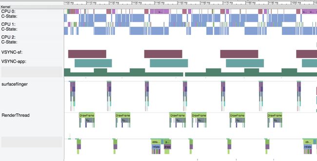
Let’s start again with looking at a trace that runs properly. Figure 4-31 shows the “Is it a goat?” app on an N6 using the unoptimized layout.
This view is modified, cutting out many lines between the CPU and surfaceflinger. In this trace, there is no jank, we see regular surfaceflingers every 16 ms (no jank). The RenderThread and Goat Process rows are creating all of the views and feeding them to the view buffer appropriately. Comparing these two rows to the CPU reveals a neat pattern. When the RenderThread is drawing the layouts, CPU1 is running a blue activity (note that we are looking at the narrower CPU1, not CPU1:C-State). When the views are being measured by the Goat Process row, CPU0 has a corresponding purple process. They layouts are being built and drawn across two CPUs. Note that the major clicks on the X-axis are 10 ms each, and none of these processes take longer than 2–4 ms.
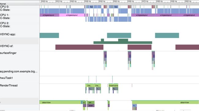
When we add the computationally intensive Fibonacci calculation into the draw, the Systrace takes a very different view (Figure 4-32).
This Systrace shows a lot of jank. In the same 100ms timeframe, only three surfaceflinger views are drawn (versus seven in non-delayed app). We can see the RenderThread is still drawing the views quickly (and you can see that in this trace, the blue RenderThread is running on CPU0). However, when measuring the views, the large recursive Fibonacci calculation is causing issues. The Goat Process row is spending most of its time in the obtainView state, rather than measuring. You can also see on CPU1 that the purple bands corresponding to Goat app processes are no longer 2–4 ms, but now range 2–17 ms long. The large Fibonacci calculations are taking 13–17 ms each, and this is really slowing down the app’s ability to draw smoothly. We’ll look at how to diagnose CPU performance (and its effect on rendering) in Chapter 5.
Systrace Update—I/O 2015
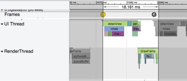
At Google I/O 2015, a new version of systrace was released that makes a lot of the analysis covered above a lot easier. In Figure 4-27, I highlighted each frame as it was updated. In the new version of systrace (shown in Figure 4-33), each frame is indicated by a dot with an “F” in it. Frames that render as expected have green dots, while slower (and very slow) frames are yellow or red. Selecting a dot and pressing m highlights the one frame for easier analysis.
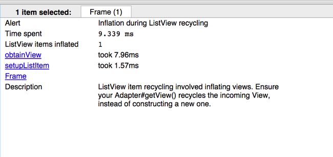
The new Systrace also has a lot better descriptions as to what is happening. In Figure 4-33 the frame render time is 18.181 ms, and is colored yellow—as many frames in a row over 16 ms could lead to jank. In the description panel below the trace (shown in Figure 4-34), it warns that my app is recycling a ListView item, rather than creating a new one, and this is slowing down the view inflation.
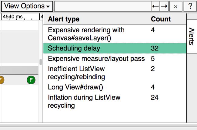
Alerts like these are shown as similar bubbles or dots inside Systrace, and also are listed in the alerts panel on the right side of the screen (shown in Figure 4-35).
These new additions to Systrace make discovering issues slowing your UI even easier to diagnose.
Vendor-Specific Tools
Each of the major chip manufacturers have GPU profiling tools that can help you discover even more information about potential bottlenecks in rendering. These tools promise more detail into how your app runs on a specific chipset, allowing better tuning for these different GPU chips. This does go deeper than the scope of this book, but should the need arise, utilize these tools for even more powerful GPU debugging. Qualcomm, NVIDIA and Intel all offer special development tools to test your apps GPU performance on their processors.
Perceived Performance
In the previous sections, we discussed how to make your UI fast through testing, discovering issues, and optimizing layouts. But there is another possible way to make your Android UI faster: make it appear faster. Of course, it is crucial that you work to optimize all of the code, views, overdraw, and other issues that might affect your UI first to really make your app as fast as possible. However, once you have done that, there are still a few ways to make your app appear faster to your customers.
The human mind behaves in interesting ways, and by changing the perception of waiting, you can make the delay seem shorter to your users. This is exactly why grocery stores put trashy magazines in the checkout aisle, as having something to look at makes the delay seem shorter. If you can deliver content in a way to make the delivery appear seamless, more power to you. It may seem like a sleight of hand trick to make users feel like things are happening faster, but at the end it is the perception of how fast your app loads that matters. This is tricky to implement well, as some perceived performance optimizations have backfired, so always A/B test to ensure that these help your customers feel the speed of your app.
Spinners: The Good and the Bad
Spinners, progress bars, hourglass icons, and other tools to indicate a pause have been around for years. They have also been used to make apps and transitions feel faster. When loading an app with a progress bar, consider using a progress bar with an animation that moves in the opposite direction of loading complete. Research has shown that users are 12% more accommodating of the time with an animated scrollbar. Spinners that pulse faster generally make the wait time appear to be faster than a slowly moving spinner.
However, if you have a delay, adding a spinner is not always a good idea. The developers of the iOS app Polar noticed that there was a bit of delay in their app while rendering views on a page. Following conventional wisdom, they added a spinner to the page to show its users that something was happening while the page was rendering, but the responses were unexpected. Feedback and reviews began to arrive about how the app was slower, and there was a lot of waiting for pages to load (note that the only change made was to add the spinner, the app was not actually any slower). The addition of a waiting indication allowed the customers to cue in that they were waiting. Removing that visual queue, the perception was that the app had sped up (again no code other than the spinner was changed). By changing the perception of the wait, the app became faster. Facebook found similar data: using a custom spinner in their iOS app made their load time appear longer than when they used a standard spinner.
Addition of a spinner should be accompanied by user testing to ensure that the results are expected. In general, spinners are acceptable when a delay is expected: opening a new page or downloading an image over the network. But if the delay will be short (say less than one second), you should consider omitting the spinner. In these cases, the addition of the spinner implies a delay that is not really there.
Animations to Mask Load Times
Clicking and seeing a blank screen gives your customers the perception of waiting. It is exactly for this reason that browsers keep the old page visible when you click a link. In mobile apps, you may not want to keep the old page visible, but a quick sweep animation might provide enough delay to get the next view ready for display. Observe this while using your favorite Android apps, and how many sweep in updated views from the bottom or from the side.
The White Lie of Instant Updates
If your customers make an update on the page, immediately change the data on the page, even if the data has not yet hit the server (of course, you need to ensure that these updates 100% do eventually get updated on the server). For example, when you “like” a photo on Instagram, the mobile view immediately updates the like status, even before a connection is established to the server and the backend is updated. They call this an “optimistic action,” in that the update will appear on the website and be visible to friends within a few seconds (or minutes if in a tunnel, or area with low coverage), but the update will occur, and there is no need to wait for the server to update to update the UI. The mobile user does not feel obligated to wait to “make sure it worked.”
An added advantage to instantly updating the UI without requiring the update to post on the server is that your app appears to function when coverage is intermittent (like when your train enters a tunnel on the commute home). Flipboard, in Offline Network Queue has presented its queueing architecture, which is used to upload changes made while offline, and this could easily be used to immediately change the UI, and update the backend a moment or two later.
Another performance trick (that is essentially the opposite of upload later) is to upload ahead of time. For apps like Instagram where large uploads of photos can add delay updates to the main UI, you can begin uploading these large files early. Instagram realized that the slowest step in post creation was data entry. While the user adds text around the image post, Instagram uploads the photo to the server before the post is made public. Once the customer hits the post button, only the text and the post command needs to be uploaded, and the perception is that the upload happened in no time. To think of it another way, Instagram was able to answer the question “should we add a spinner?” by architecting its app to never need a spinner.
Tips to Improve Perceived Performance
When the speed of your app is improved by optimizing the code or views, you can measure the difference with a stopwatch. Some of the perceived performance gains (like Instagram’s) can be measured with s stopwatch, but others (like the spinner examples) cannot. Because typical analytics or measurement tools cannot be used, these improvements will need to be put in front of users in order to identify if customers perceive the difference. Usability testing of some sort, whether with a wider team, A/B testing, or usability testing, will let you know if your changes please or further frustrate your users.
Conclusion
The user experience of your Android app is directly tied to the way it appears on the screen. If your app is slow to load or if the scrolling is not fast and smooth, your customers will be left with a negative perception of your app. In this chapter, we’ve covered examples of view hierarchy, and profiled how flattening and simplifying views speed rendering. We’ve considered overdrawing the screen, and the tools used to identify overdraw issues. For issues that require deeper digging (into CPU issues), Systrace is great at debugging and determining the issues causing jank. Finally, there are tricks that make your appear faster and more responsive through tricks in rendering, and moving CPU/network tasks out of the critical path of rendering. In the next chapter, we’ll look at how optimizing and reducing the CPU usage of your app will improve the performance.

