Matplotlib可视化--有序条形图(笔记)
该例子来自于机器学习网站MachineLearning Plus上的博文:Python可视化50图
import numpy as np
import pandas as pd
import matplotlib.patches as patches
import matplotlib.pyplot as plt
准备数据
df_raw = pd.read_csv('https://github.com/selva86/datasets/raw/master/mpg_ggplot2.csv')
df_raw
| manufacturer | model | displ | year | cyl | trans | drv | cty | hwy | fl | class | |
|---|---|---|---|---|---|---|---|---|---|---|---|
| 0 | audi | a4 | 1.8 | 1999 | 4 | auto(l5) | f | 18 | 29 | p | compact |
| 1 | audi | a4 | 1.8 | 1999 | 4 | manual(m5) | f | 21 | 29 | p | compact |
| 2 | audi | a4 | 2.0 | 2008 | 4 | manual(m6) | f | 20 | 31 | p | compact |
| 3 | audi | a4 | 2.0 | 2008 | 4 | auto(av) | f | 21 | 30 | p | compact |
| 4 | audi | a4 | 2.8 | 1999 | 6 | auto(l5) | f | 16 | 26 | p | compact |
| ... | ... | ... | ... | ... | ... | ... | ... | ... | ... | ... | ... |
| 229 | volkswagen | passat | 2.0 | 2008 | 4 | auto(s6) | f | 19 | 28 | p | midsize |
| 230 | volkswagen | passat | 2.0 | 2008 | 4 | manual(m6) | f | 21 | 29 | p | midsize |
| 231 | volkswagen | passat | 2.8 | 1999 | 6 | auto(l5) | f | 16 | 26 | p | midsize |
| 232 | volkswagen | passat | 2.8 | 1999 | 6 | manual(m5) | f | 18 | 26 | p | midsize |
| 233 | volkswagen | passat | 3.6 | 2008 | 6 | auto(s6) | f | 17 | 26 | p | midsize |
234 rows × 11 columns
name = ["汽车制造商","型号名称","发动机排量(L)","制造年份","气缸数量","手动/自动"
              ,"驱动类型","城市里程/加仑","公路里程/加仑","汽油种类","车辆种类"]
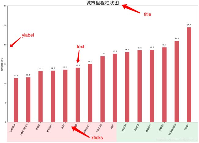
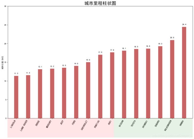
条形图中x轴是汽车的型号,y轴是manufacturer(型号名称)的平均cty(城市里程/加仑),x轴和y轴的取值过程如下:
df = df_raw[['cty','manufacturer']].groupby('manufacturer').mean()
df.head()
| manufacturer | cty |
|---|---|
| audi | 17.611111 |
| chevrolet | 15.000000 |
| dodge | 13.135135 |
| ford | 14.000000 |
| honda | 24.444444 |
df.sort_values('cty', inplace=True) # 如果为True,则就地执行操作
df.head()
| manufacturer | cty |
|---|---|
| lincoln | 11.333333 |
| land rover | 11.500000 |
| dodge | 13.135135 |
| mercury | 13.250000 |
| jeep | 13.500000 |
df.reset_index(inplace=True)
df.head()
| manufacturer | cty | |
|---|---|---|
| 0 | lincoln | 11.333333 |
| 1 | land rover | 11.500000 |
| 2 | dodge | 13.135135 |
| 3 | mercury | 13.250000 |
| 4 | jeep | 13.500000 |
画图
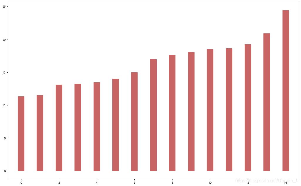
fig, ax = plt.subplots(figsize=(16,10), facecolor='white', dpi=80)
ax.vlines(x=df.index, ymin=0, ymax=df.cty, color='firebrick', alpha=0.7, linewidth=20);
源码整合
# Draw plot
import matplotlib.patches as patches

fig, ax = plt.subplots(figsize=(16,10), facecolor='white', dpi= 80)
ax.vlines(x=df.index, ymin=0, ymax=df.cty, color='firebrick', alpha=0.7, linewidth=20)
'''
画条形图
x:           横坐标
ymin:        纵坐标的起点
ymax:        纵坐标的终点
color:       颜色
alpha:       饱和度
linewidth:   图的宽度
'''

# Annotate Text 文本注释
for i, cty in enumerate(df.cty):
    ax.text(i, cty+0.5, round(cty, 1), horizontalalignment='center')

# Title, Label, Ticks and Ylim
ax.set_title('城市里程柱状图', fontdict={'size':22})
ax.set(ylabel='城市公里/加仑', ylim=(0, 30))
plt.xticks(df.index, df.manufacturer.str.upper(), rotation=60, horizontalalignment='right', fontsize=12)

# Add patches to color the X axis labels 添加补丁以使X轴标签着色
p1 = patches.Rectangle((.57, -0.005), width=.33, height=.13, alpha=.1, facecolor='green', transform=fig.transFigure)
p2 = patches.Rectangle((.124, -0.005), width=.446, height=.13, alpha=.1, facecolor='red', transform=fig.transFigure)
'''
matplotlib.patches.Rectangle(xy, width, height, angle=0.0, **kwargs)
xy: 2元组 矩形左下角xy坐标
width:矩形的宽度
height:矩形的高度
angle: float, 可选,矩形相对于x轴逆时针旋转角度,默认0
fill: bool, 可选,是否填充矩形
transform=fig.transFigure #确保矩形显示在图像最上方,如果我们对fig作画,不会被ax挡住
'''

fig.add_artist(p1)
fig.add_artist(p2)
plt.show()
代码中ylable、xticks、text、title对应条形图中的部分如图: