python seaborn.heatmap实例
热力图的应用场景
热力图可用来观察数据的分布情况,也可以非常直观的呈现一些原本不易理解或表达的数据,比如密度、频数、温度等,改用区域和颜色这种更容易被人理解的方式来呈现。
seaborn.heatmap参数介绍
seaborn.heatmap(data, vmin=None, vmax=None, cmap=None, center=None, robust=False, annot=None, fmt=’.2g’, annotkws=None, linewidths=0, linecolor=‘white’, cbar=True, cbarkws=None, cbar_ax=None, square=False, ax=None, xticklabels=True, yticklabels=True, mask=None, **kwargs)
data:矩阵数据集
2D dataset that can be coerced into an ndarray. If a Pandas DataFrame is provided, the index/column information will be used to label the columns and rows.
vmin、vmax:图例中最大值和最小值的显示值
Values to anchor the colormap, otherwise they are inferred from the data and other keyword arguments.
annot:在每个单元格写入数据值
If True, write the data value in each cell. If an array-like with the same shape as data, then use this to annotate the heatmap instead of the raw data.
fmt:字符串格式
String formatting code to use when adding annotations.
实例分析
数据集:https://www.kaggle.com/gregorut/videogamesales
python数据处理包:numpy、pandas、matplotlib、seaborn
此数据集包含超过1000000份的视频游戏列表,其中字段包括:
Rank - 销售排名
Name - 游戏名称
Platform - 游戏发布平台
Year - 游戏发布年分
Genre - 游戏类型
Publisher - 游戏发行商
NA_Sales - 北美销售量
EU_Sales - 欧洲销售量
JP_Sales - 日本销售量
Other_Sales - 其他地区销售量
Global_Sales - 全球销售量
# coding: utf-8
import pandas  as pd
import numpy as np
import matplotlib.pyplot as plt
import seaborn as sns

df = pd.read_csv("vgsales.csv") #导入数据

#平台和游戏类型的关系
plat_genre = pd.crosstab(df.Platform,df.Genre)#频数表
# print plat_genre
plat_genre_total = plat_genre.sum(axis=1).sort_values(ascending=False)#axis =1表示按行进行汇总(axis=0/1),ascending=False表示按照降序排列
#print plat_genre_total
plt.figure(figsize=(8,6))#figsize:指定figure的宽和高,单位为英寸
sns.barplot(y = plat_genre_total.index,x = plat_genre_total.values,orient='h')#orient 柱状图方向是水平
plt.ylabel = "platform"
plt.xlabel = "number of games"
plt.show()
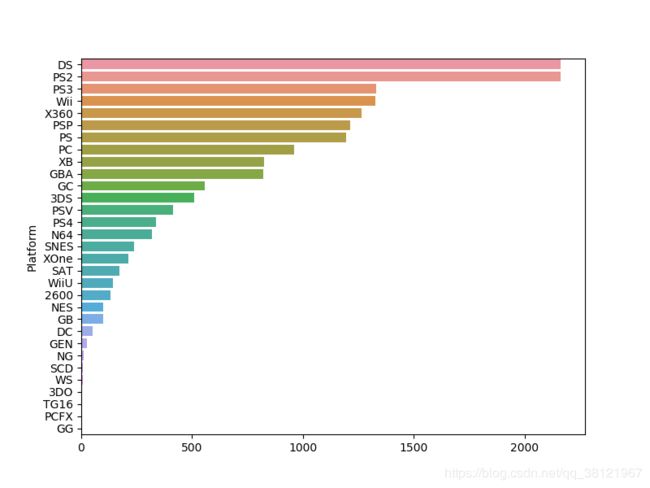
我们可以看到,DS和PS2平台上拥有最多的游戏类型,超过1000个游戏。
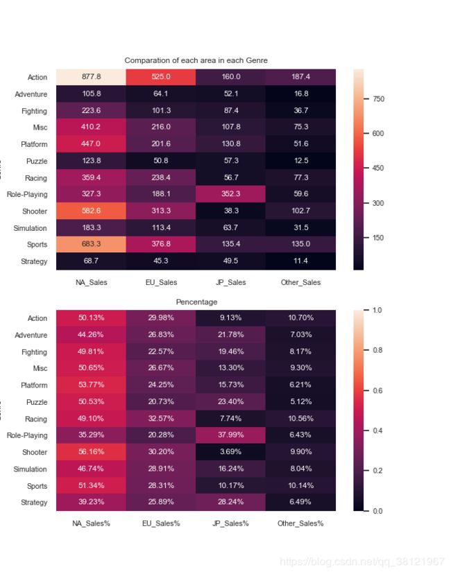
#每个地区每种类型的销售量和销售所占百分比
genre_group = df.groupby(['Genre']).sum().loc[:,'NA_Sales':'Global_Sales']# 取数所有行,列为'NA_Sales'到'Global_Sales'的数据
print genre_group
将数据集按照游戏类型分组汇总如下图所示:

genre_group['NA_Sales%'] = genre_group['NA_Sales']/genre_group['Global_Sales']
genre_group['EU_Sales%'] = genre_group['EU_Sales']/genre_group['Global_Sales']
genre_group['JP_Sales%'] = genre_group['JP_Sales']/genre_group['Global_Sales']
genre_group['Other_Sales%'] = genre_group['Other_Sales']/genre_group['Global_Sales']
#统计数热图,数据是矩阵
plt.figure(figsize=(8,10))
sns.set(font_scale=0.7)
plt.subplot(211) #绘制多个子图
sns.heatmap(genre_group.loc[:,'NA_Sales':'Other_Sales'],annot=True,fmt='.1f')#fmt = .1f 保留一位小数
plt.title('Comparation of each area in each Genre')
#百分比热图
plt.subplot(212)
sns.heatmap(genre_group.loc[:,'NA_Sales%':'Other_Sales%'],vmax=1,vmin=0,annot=True,fmt=".2%")
plt.title("Pencentage")
plt.show()
绘制各地区各类型的销售量和销售所占百分比热力图如下所示: