Python中matplotlib库的简单使用
matplotlib是Python中一个数学绘图库
- 绘制简单的折线图
import matplotlib.pyplot as plt  #模块pyplot包含很多用于生成图表的函数

input_values=[1,2,3,4,5]
squares = [1, 4, 9, 16, 25]
plt.plot(input_values,squares,linewidth=5)#尝试根据这些数字绘制出有意义的图形,linewidth表示线条粗细

#设置图表标题,并给坐标轴加上标签,fontsize表示图表中文字大小
plt.title("Squares Numbers",fontsize=24)
plt.xlabel("Value",fontsize=14)
plt.ylabel("Square of Value",fontsize=14)

#设置刻度标记的大小,axis='both'表示x轴和y轴同时设置labelsize用于设置刻度线标签的字体大小
plt.tick_params(axis='both',labelsize=14)

plt.show() # 打开matplotlib查看器,并显示绘制的图形
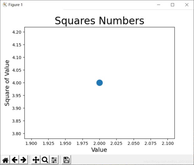
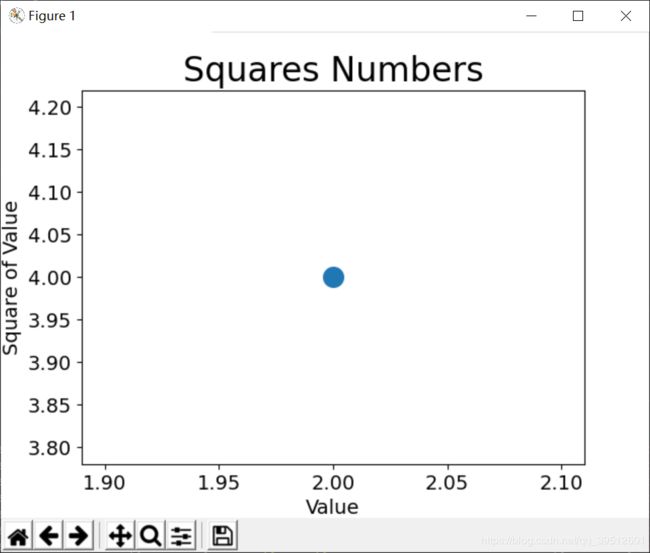
2.绘制散点图
- 绘制单个点,可使用函数 scatter() ,并向它传递一对x和y坐标,它将在指定位置绘制一个点
import matplotlib.pyplot as plt

#s=200指明了点的尺寸
plt.scatter(2,4,s=200)

#设置图表标题,并给坐标轴加上标签,fontsize表示图表中文字大小
plt.title("Squares Numbers",fontsize=24)
plt.xlabel("Value",fontsize=14)
plt.ylabel("Square of Value",fontsize=14)
#默认是major表示主刻度
plt.tick_params(axis='both',which='major',labelsize=14)
plt.show()
官方文档关于which参数的解释
which{'major', 'minor', 'both'}
Default is 'major'; apply arguments to which ticks.
网上找了很多,就找到了下面这个解释:
默认是major表示主刻度答,后面分布为次刻度及主次刻度都显示(其实我没看太懂这个意思)
于是自己试验了以下,下面三张图分别是参数对应major,minor,both的结果,我觉得当为major是正常情况,minor的时候会显示更精确的刻度,而both我还不知道是什么意思,如果有小伙伴知道可以解释下。

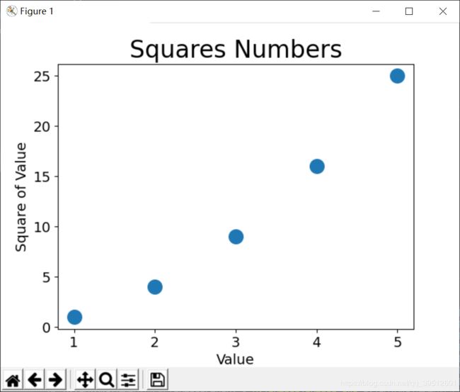
- 绘制一系列点
要绘制一系列的点,可向 scatter() 传递两个分别包含x值和y值的列表
import matplotlib.pyplot as plt

x_values=[1,2,3,4,5]
y_values=[1,4,9,16,25]
#s=200指明了点的尺寸
plt.scatter(x_values,y_values,s=200)

#设置图表标题,并给坐标轴加上标签,fontsize表示图表中文字大小
plt.title("Squares Numbers",fontsize=24)
plt.xlabel("Value",fontsize=14)
plt.ylabel("Square of Value",fontsize=14)
#默认是major表示主刻度
plt.tick_params(axis='both',which='major',labelsize=14)
plt.show()
- 自动计算数据,绘图的数据不是一个个列出
import matplotlib.pyplot as plt

x_values=list(range(1,1001))
y_values=[x**2 for x in x_values]
plt.scatter(x_values,y_values,s=40)

#设置图表标题,并给坐标轴加上标签,fontsize表示图表中文字大小
plt.title("Squares Numbers",fontsize=24)
plt.xlabel("Value",fontsize=14)
plt.ylabel("Square of Value",fontsize=14)

#设置每个坐标轴取值范围
plt.axis([0,1100,0,1000000])

plt.show()
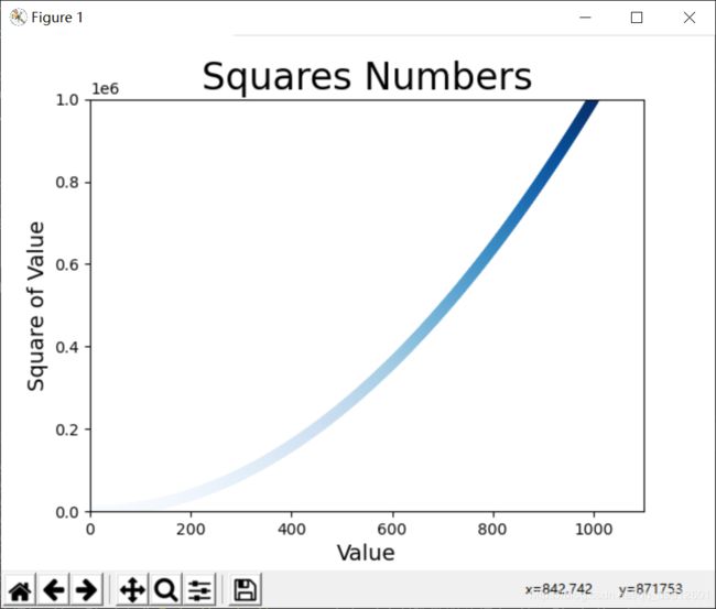
- 使用颜色映射
颜色映射(colormap)是一系列颜色,它们从起始颜色渐变到结束颜色。在可视化中,颜色映射用于突出数据的规律,例如,你可能用较浅的颜色来显示较小的值,并使用较深的颜色来显示较大的值。
import matplotlib.pyplot as plt

x_values=list(range(1,1001))
y_values=[x**2 for x in x_values]
plt.scatter(x_values,y_values,c=y_values,cmap=plt.cm.Blues,s=40)

#设置图表标题,并给坐标轴加上标签,fontsize表示图表中文字大小
plt.title("Squares Numbers",fontsize=24)
plt.xlabel("Value",fontsize=14)
plt.ylabel("Square of Value",fontsize=14)

#设置每个坐标轴取值范围
plt.axis([0,1100,0,1000000])

plt.show()
将参数 c 设置成了一个y值列表,表示颜色根据y值来变化,并使用参数 cmap 告诉 pyplot 使用哪个颜色映射。这些代码将y值较小的点显示为浅蓝色,并将y值较大的点显示为深蓝色。
3.绘制随机漫步图
随机漫步是这样行走得到的路径:每次行走都完全是随机的,没有明确的方向,结果是由一系列随机决策决定的。
创建一个RandomWalk类,其中属性包含要创建的点个数,点的x,y坐标,使用fill_walk生成随机漫步的点的x和y坐标,再创建这个类的实例。
from random import choice
import matplotlib.pyplot as plt

class RandomWalk():
    #生成一个随机漫步的类
    def __init__(self,num_points=5000):
        self.num_points=num_points

        #所有随机漫步数都始于0,0
        self.x_values=[0]
        self.y_values=[0]

    def fill_walk(self):
        #计算随机漫步包含的所有点

        #不断漫步,直到列表到达指定的长度
        while len(self.x_values)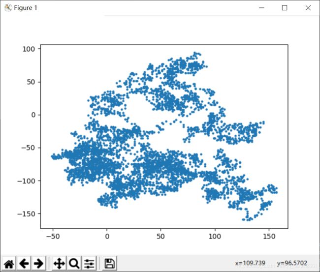
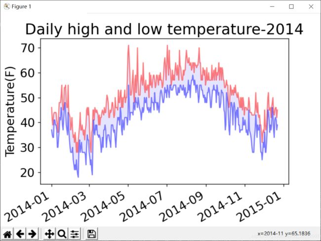
4.绘制csv文件绘图
import csv
import matplotlib.pyplot as plt
from datetime import datetime

filename='sitka_weather_2014.csv'
with open(filename) as f:
    #创建一个与该文件相关联的阅读器对象
    reader=csv.reader(f)
    #next将返回文件中的下一行
    reader_row=next(reader)

    dates,highs,lows=[],[],[]
    #遍历文件中余下各行
    for row in reader:
        current_date=datetime.strptime(row[0],'%Y-%m-%d')
        dates.append(current_date)
        highs.append(int(row[1]))
        lows.append(int(row[3]))

    print(highs)

#根据数据绘制图形,alpha指定颜色透明度
fig=plt.figure(dpi=128,figsize=(6,4))
plt.plot(dates,highs,c='red',alpha=0.5)
plt.plot(dates,lows,c='blue',alpha=0.5)

#填充两个参数之间的区域,facecolor绘制颜色
plt.fill_between(dates,highs,lows,facecolor='blue',alpha=0.1)
#设置图形格式
plt.title("Daily high and low temperature-2014",fontsize=20)
plt.xlabel('',fontsize=16)
#设置图表上日期显示为斜的
fig.autofmt_xdate()
plt.ylabel('Temperature(F)',fontsize=16)
plt.tick_params(axis='both',which='major',labelsize=16)

plt.show()