大屏 1920 布局: 响应式&自适应 vw+ rem + %
需求:
1. 全屏, 设计图 1920 x 1080 ; min: 1200 x 768
2. 响应式&自适应
方法:
| 元素 | 单位 |
|---|---|
| html | font-size: 单位 vw |
| 页面宽度、字体 | 单位 rem |
| 页面高度 | 单位 % + rem, (不直接使用 vh, 因为无法直接实现 min-height 限制) |
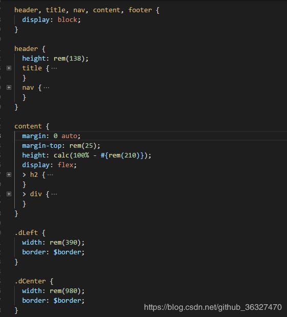
一、 scss 编译,
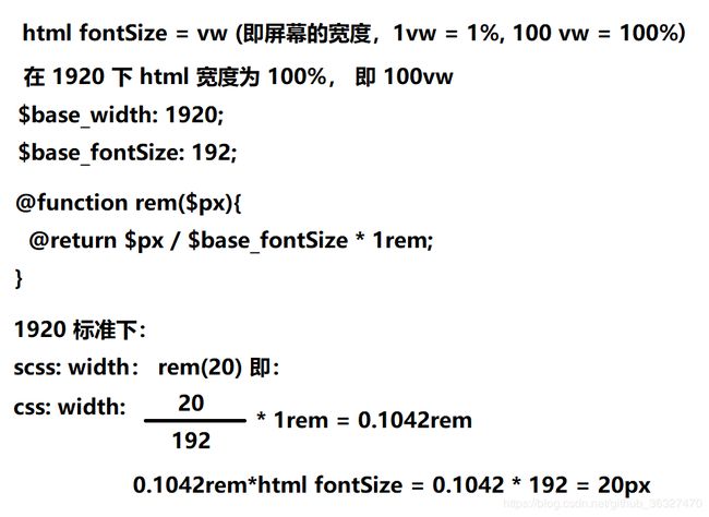
函数 rem($px) 可实现 1920 设计图上的宽度和字体, 不用计算,
1920 分辨率下 即 100 px 即 rem(100)
// 1920 字体 19.2px 即  1rem === 192px

$base_width: 1920;
$base_fontSize: 192;

@function rem($px){
  @return $px / $base_fontSize * 1rem;
}

html {
  font-size: ( $base_width / $base_fontSize) * 1vw;
  @media screen and (max-width: 1200px) {
    font-size: 120px;
  }
  width: 100%;
  height: 100%;
  min-width: 1200px;
  min-height: 768px;
  background-color: #0b1b41;
  background: url("../img/bg.png") center center no-repeat;
  background-size: 100% 100%;
}
二、具体用法