纯CSS制作圆形旋转菜单效果
我们理念中的菜单都是矩形的,不是横向排列就是纵向排列,这里我们打破了常规的思维,把菜单做成圆形的。
在这里我们不得不克服几个问题:
- 如何定义html
- 如何悬停定位菜单元素
下面就让我们开始今天的教程吧
第一步:构建HTML
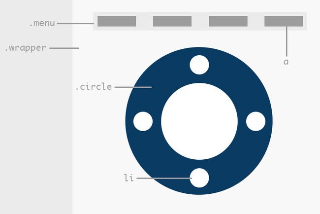
在编写HTML之前,必须先了解将要构建的结构是怎么样的,下图表示要构建的结构:

每个顶部的矩形框都与下面大圆中的一个小圆相联系,当把鼠标悬停在矩形框上时,对应的小圆旋转到菜单的顶部。而实现这个功能的难点就是怎样实现悬停在一个元素上从而影响另一个元素的表现状态。
为解决这个问题,让我们看看下面的HTML:
|
1
2
3
4
5
6
7
|
target
|
我们希望通过鼠标悬停在anchor上来改变target段落的颜色,如果你对hover的远程操作有一个基本的概念,你可能会先写出下面的css代码:
|
1
2
3
|
a:hover p
{
color
:
blue
;
}
|
这段代码不能达到我们的预期效果,观察上面HTML代码,我们要改变颜色的元素和鼠标悬停的元素分别在不同的div中,这无形中增加了我们实现的难度,所以需要改变HTML结构如下,把两个元素分别放在同一个div下:
|
1
2
3
4
|
target
|
把两个元素分别放在同一个div下,anchor和target作为同级元素可以进行以下操作
|
1
2
3
|
a:hover + p
{
color
:
blue
;
}
|
以上就实现了鼠标悬停在a上面,并且使紧临它的同级元素改变颜色。
具体应用:
运用上面的知识到本教程案例中,我们可以想出一个可行的结构,首先创建3个嵌套div,分别命名class为wrapper, menu和circle.
|
1
2
3
4
5
6
|
|
在menu div里面设置4个锚点,分别有不同的class,在circle div里面是一个包含4个数字的ul li元素
|
1
2
3
4
5
6
7
8
9
10
11
12
13
14
15
16
17
18
|
1
2
3
4
|
让我们用一张图片来更清晰的理解上面所描述的结构
第二步:wrapper div的css
上面的HTML代码自此就书写完毕,下面主要的是css的问题,首先我们定义一些基本的样式:
|
1
2
3
4
5
6
7
8
9
10
11
12
|
*
{
margin
:
0
;
padding
:
0
;
-webkit-backface-visibility
:
hidden
;
}
/*WRAPPER*/
.wrapper
{
position
:
relative
;
margin
:
20px
auto
;
width
:
3670px
;
}
|
第三步:circle div的css
这一步我们将定义一个大圆,用css制作圆是很简单的我们只需要把元素的宽度和高度设置成相等,然后把border的宽度设置成50%就行了。更多关于利用border来创建图形的教程可以参看我的《创建三角形的几种不同的方式》这篇文章。
|
1
2
3
4
5
6
7
8
9
10
11
|
/*MAIN CIRCLE*/
.circle
{
position
:
relative
;
margin-top
:
30px
;
margin-bottom
:
20px
;
margin-left
:
25px
;
width
:
300px
;
height
:
300px
;
border-radius
:
50%
;
background
:
#093b62
;
}
|
为了让圆看起来更好看,更具有立体感,我们为其添加阴影效果transition,它将会在circle旋转时用到。
|
1
2
3
4
5
6
7
8
9
10
11
12
13
14
15
16
17
18
19
20
|
/*MAIN CIRCLE*/
.circle
{
position
:
relative
;
margin-top
:
30px
;
margin-bottom
:
20px
;
margin-left
:
25px
;
width
:
300px
;
height
:
300px
;
border-radius
:
50%
;
background
:
#093b62
;
box-shadow
:
inset
0px
0px
30px
rgba
(
0,0,0,0.3
)
;
-webkit-box-shadow
:
inset
0px
0px
30px
rgba
(
0,0,0,0.3
)
;
-webkit-transition
:
all
0.5s
ease
;
-moz-transition
:
all
0.5s
ease
;
-ms-transition
:
all
0.5s
ease
;
-o-transition
:
all
0.5s
ease
;
transition
:
all
0.5s
ease
;
}
|
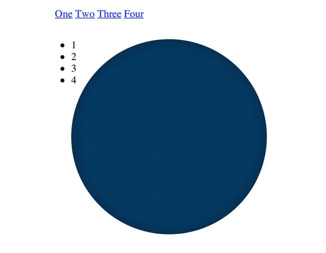
如果我们看一看实时预览,我们应该有一个漂亮的大圆和一些其他各种分散的元素,接下来将会对这些分散的元素进行处理。
第四步:menu div的css
下面是对锚点(也就是这里的元素),做一些样式设置和悬停效果:
|
1
2
3
4
5
6
7
8
9
10
11
12
|
.menu a
{
margin-right
:
-4px
;
padding
:
10px
30px
;
width
:
50px
;
color
:
#333
;
text-decoration
:
none
;
font
:
15px/25px
Helvetica,
Arial,
sans-serif
;
}
.menu a:hover
{
background
:
#eee
;
}
|
在启用预览看一些,将会比上面好看的多,并且悬停会出现设置的效果,但是ul li还是是很乱的表现,接下来将解决这个问题:

第五步:小圆的css
首先我们这里是用ul li来制作小圆,所以要先清除它的固有样式用list-style:none;来清除,然后制作小圆,类似与制作大圆,宽高相等,border宽度50%,然后设置背景颜色和字体:
|
1
2
3
4
5
6
7
8
9
10
11
|
/*LITTLE CIRCLES*/
.circle li
{
position
:
absolute
;
width
:
50px
;
height
:
50px
;
border-radius
:
50%
;
background
:
white
;
list-style
:
none
;
text-align
:
center
;
font
:
20px/50px
Helvetica,
Arial,
sans-serif
;
}
|
下面是最困难的部分,为小圆定位,这里用绝对定位方式,首先我们用nth-child找到子元素,然后分别用top、left属性来定位,并使用CSS的transform属性来旋转小圆,以便于大圆旋转时对应的小圆中的数字处于正向。
|
1
2
3
4
5
6
7
8
9
10
11
12
13
14
15
16
17
18
19
20
21
22
23
24
25
26
27
28
29
30
31
32
33
34
|
.circle li:nth-child(1)
{
top
:
15px
;
left
:
125px
;
}
.circle li:nth-child(2)
{
top
:
125px
;
left
:
235px
;
-webkit-transform
:
rotate
(
90deg
)
;
-moz-transform
:
rotate
(
90deg
)
;
-ms-transform
:
rotate
(
90deg
)
;
-o-transform
:
rotate
(
90deg
)
;
transform
:
rotate
(
90deg
)
;
}
.circle li:nth-child(3)
{
top
:
235px
;
left
:
125px
;
-webkit-transform
:
rotate
(
180deg
)
;
-moz-transform
:
rotate
(
180deg
)
;
-ms-transform
:
rotate
(
180deg
)
;
-o-transform
:
rotate
(
180deg
)
;
transform
:
rotate
(
180deg
)
;
}
.circle li:nth-child(4)
{
top
:
125px
;
left
:
15px
;
-webkit-transform
:
rotate
(
270deg
)
;
-moz-transform
:
rotate
(
270deg
)
;
-ms-transform
:
rotate
(
270deg
)
;
-o-transform
:
rotate
(
270deg
)
;
transform
:
rotate
(
270deg
)
;
}
|
下面在看一下预览,是不是看起来要好很多了:

第六步:内部圆的css
在DEMO中我们还看见中间有一个白色的带“DS”文字的圆,这里使用伪元素“:before”来完成,并对齐进行绝对定位,它不会随大圆的旋转而旋转。
|
1
2
3
4
5
6
7
8
9
10
11
12
13
14
15
16
17
18
|
/*INNER CIRCLE*/
.wrapper:before
{
content
:
"DS"
;
text-align
:
center
;
font
:
70px/135px
Georgia,
Times,
serif
;
color
:
#efefef
;
position
:
absolute
;
top
:
140px
;
left
:
110px
;
z-index
:
10
;
width
:
130px
;
height
:
130px
;
border-radius
:
50%
;
background
:
#fff
;
-webkit-box-shadow
:
3px
3px
10px
rgba
(
0,0,0,0.3
)
;
box-shadow
:
3px
3px
10px
rgba
(
0,0,0,0.3
)
;
}
|
自此css样式全部定义完成,剩下的就是文章开头讲到的远程控制元素行为:

第七步:圆的”:hover”伪元素设置
要使菜单旋转,必须结合文章开头的远程控制教程,当鼠标悬停在锚点上时,下面的圆旋转到对应的顶部位置。HTML中锚点和circle div是同级元素,这里我们需要搞定的是选择器的问题,也是本文最难的部分。所以选择器部分,第一个不用旋转,所以我们从第二个开始如下:
|
1
2
|
.menu > .two:hover ~ .circle
{
}
|
2所处的位置需要逆时针旋转90°才能到达预期位置所以:
|
1
2
3
4
5
6
7
|
.menu > .two:hover ~ .circle
{
-webkit-transform
:
rotate
(
-90deg
)
;
-moz-transform
:
rotate
(
-90deg
)
;
-ms-transform
:
rotate
(
-90deg
)
;
-o-transform
:
rotate
(
-90deg
)
;
transform
:
rotate
(
-90deg
)
;
}
|
类似的我们有.one 0° .two-90°, .three -180° ,.four -270°.
|
1
2
3
4
5
6
7
8
9
10
11
12
13
14
15
16
17
18
19
20
21
22
23
24
25
26
27
28
29
30
31
32
|
/*HOVER STATES*/
.menu > .one:hover ~ .circle
{
-webkit-transform
:
rotate
(
0deg
)
;
-moz-transform
:
rotate
(
0deg
)
;
-ms-transform
:
rotate
(
0deg
)
;
-o-transform
:
rotate
(
0deg
)
;
transform
:
rotate
(
0deg
)
;
}
.menu > .two:hover ~ .circle
{
-webkit-transform
:
rotate
(
-90deg
)
;
-moz-transform
:
rotate
(
-90deg
)
;
-ms-transform
:
rotate
(
-90deg
)
;
-o-transform
:
rotate
(
-90deg
)
;
transform
:
rotate
(
-90deg
)
;
}
.menu > .three:hover ~ .circle
{
-webkit-transform
:
rotate
(
-180deg
)
;
-moz-transform
:
rotate
(
-180deg
)
;
-ms-transform
:
rotate
(
-180deg
)
;
-o-transform
:
rotate
(
-180deg
)
;
transform
:
rotate
(
-180deg
)
;
}
.menu > .four:hover ~ .circle
{
-webkit-transform
:
rotate
(
-270deg
)
;
-moz-transform
:
rotate
(
-270deg
)
;
-ms-transform
:
rotate
(
-270deg
)
;
-o-transform
:
rotate
(
-270deg
)
;
transform
:
rotate
(
-270deg
)
;
}
|
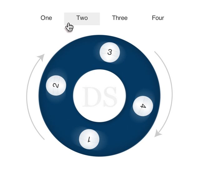
最终效果:
原文地址:http://www.itlanguageexpress.info/827.html