python绘图之matlibplot
前言
Matplotlib 是一个在 python 下实现的类 matlab 的纯 python 的三方库,旨在用 python实现 matlab 的功能,是python 下最出色的绘图库,功能很完善,其风格跟 matlab 很相似,同时也继承了 python 的简单明了的风格,其可以很方便地设计和输出二维以及三维的数据, 其提供了常规的笛卡尔坐标, 极坐标, 球坐标, 三维坐标等。事实上Python中很多可视化库都是基于matplotlib开发的。Matplotlib 是一个 Python 的 2D绘图库,它以各种硬拷贝格式和跨平台的交互式环境生成出版质量级别的图形。它也是 Python 的绘图库。 它可与 NumPy 一起使用,提供了一种有效的 MatLab 开源替代方案。 它也可以和图形工具包一起使用,如 PyQt 和 wxPython。
绘图基本了解
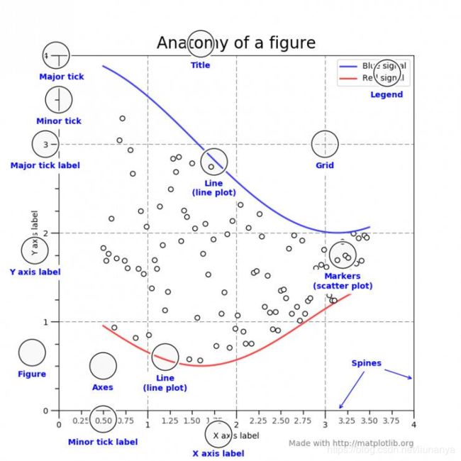
Title为标题。Axis为坐标轴,Label为坐标轴标注。Tick为刻度线,Tick Label为刻度注释。
绘图
- 折线图
import matplotlib.pyplot as plt
year = [2011,2012,2013,2014]
pop = [1.2,3.4,4.5,6.5]
#折线图绘制函数
plt.plot(year,pop)
plt.show()
- 散点图
import matplotlib.pyplot as plt
year = [2011,2012,2013,2014]
pop = [1.2,3.4,4.5,6.5]
#散点图绘制函数
plt.scatter(year,pop)
plt.show()
- 直方图
import matplotlib.pyplot as plt
values = [0,1,2,3,4,1,2,3,4,4,5,2,4,1]
#直方图绘制函数,bins为直方图间隔份数
plt.hist(values,bins=10)
plt.show()
- 修饰图
title(’图形名称’) (都放在单引号内)
xlabel(’x轴说明’)
ylabel(’y轴说明’)
text(x,y,’图形说明’)
legend(’图例1’,’图例2’,…)
import matplotlib.pyplot as plt

year = [1950,1970,1990,2010]
pop = [2.3,3.4,5.8,6.5]

#折线图,实体填充
plt.fill_between(year,pop,0,color='green')

#轴的标签
plt.xlabel('Year')
plt.ylabel('Population')

#轴的标题
plt.title('World Population')

#轴的y刻度
plt.yticks([0,2,4,6,8,10],['0B','2B','4B','6B','8B','10B'])
plt.show()
- 多子图绘制
import matplotlib.pyplot as plt
import numpy as np

def f(t):
    return np.exp(-t) * np.cos(2 * np.pi * t)

t1 = np.arange(0, 5, 0.1)
t2 = np.arange(0, 5, 0.02)

plt.figure(12)
plt.subplot(221)
plt.plot(t1, f(t1), 'bo', t2, f(t2), 'r--')

plt.subplot(222)
plt.plot(t2, np.cos(2 * np.pi * t2), 'r--')

plt.subplot(212)
plt.plot([1, 2, 3, 4], [1, 4, 9, 16])

plt.show()
figure了解:https://blog.csdn.net/weixin_41500849/article/details/80352338
plot命令了解: https://blog.csdn.net/xiaotao_1/article/details/79100163
subplot了解:https://blog.csdn.net/jagbiam1000/article/details/79600679
子图添加:https://blog.csdn.net/m0_37362454/article/details/81511427
- 三维图形
import matplotlib.pyplot as plt
from mpl_toolkits.mplot3d import Axes3D
fig = plt.figure()
ax = fig.add_subplot(111, projection='3d')
X = [1, 1, 2, 2]
Y = [3, 4, 4, 3]
Z = [1, 2, 1, 1]
ax.plot_trisurf(X, Y, Z)
plt.show()
- plt.axes()
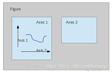
我们先来看什么是Figure和Axes对象。在matplotlib中,整个图像为一个Figure对象。在Figure对象中可以包含一个,或者多个Axes对象。每个Axes对象都是一个拥有自己坐标系统的绘图区域。其逻辑关系如下:
import matplotlib.pyplot as plt
import numpy as np

# create some data to use for the plot
dt = 0.001
t = np.arange(0.0, 10.0, dt)
r = np.exp(-t[:1000] / 0.05)  # impulse response
x = np.random.randn(len(t))
s = np.convolve(x, r)[:len(x)] * dt  # colored noise

# the main axes is subplot(111) by default
plt.plot(t, s)
plt.axis([0, 1, 1.1 * np.amin(s), 2 * np.amax(s)])
plt.xlabel('time (s)')
plt.ylabel('current (nA)')
plt.title('Gaussian colored noise')

# this is an inset axes over the main axes
a = plt.axes([.65, .6, .2, .2], axisbg='y')
n, bins, patches = plt.hist(s, 400, normed=1)
plt.title('Probability')
plt.xticks([])
plt.yticks([])

# this is another inset axes over the main axes
a = plt.axes([0.2, 0.6, .2, .2], axisbg='y')
plt.plot(t[:len(r)], r)
plt.title('Impulse response')
plt.xlim(0, 0.2)
plt.xticks([])
plt.yticks([])

plt.show()
多曲线绘制:https://blog.csdn.net/Touch_Dream/article/details/79402477
https://blog.csdn.net/Touch_Dream/article/details/79402477
更多精美matlibplot绘图:https://yq.aliyun.com/articles/682843
https://www.leiphone.com/news/201805/9ZrBlCe5uLr3o9tL.html
参考网址: https://blog.csdn.net/ztchun/article/details/64774072