Flutter 按钮
Material组件库中的按钮
Material 组件库中提供了多种按钮组件如RaisedButton、FlatButton、OutlineButton等。它们都是直接或间接对RawMaterialButton组件的包装定制。所以他们大多数属性都和RawMaterialButton一样。
所有Material 库中的按钮都有如下相同点:
- 按下时都会有“水波动画”(又称“涟漪动画”,就是点击时按钮上会出现水波荡漾的动画)
- 有一个onPressed属性来设置点击回调,当按钮按下时会执行该回调,如果不提供该回调则按钮会处于禁用状态,禁用状态不响应用户点击。
RaisedButton
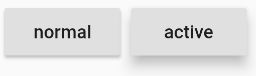
RaisedButton 即"漂浮"按钮,它默认带有阴影和灰色背景。按下后,阴影会变大
const RaisedButton({
    Key key,
    @required VoidCallback onPressed,
    ValueChanged<bool> onHighlightChanged,
    ButtonTextTheme textTheme,
    Color textColor,
    Color disabledTextColor,
    Color color,
    Color disabledColor,
    Color highlightColor,
    Color splashColor,
    Brightness colorBrightness,
    double elevation,
    double highlightElevation,
    double disabledElevation,
    EdgeInsetsGeometry padding,
    ShapeBorder shape,
    Clip clipBehavior = Clip.none,
    MaterialTapTargetSize materialTapTargetSize,
    Duration animationDuration,
    Widget child,
  })
属性:
| 名称 | 类型 | 说明 |
|---|---|---|
| onHighlightChanged | ValueChanged | 水波纹高亮变化回调,按下返回true,抬起返回false |
| textTheme | ButtonTextTheme | 按钮的主题 |
| textColor | Color | 文字的颜色 |
| disabledTextColor | Color | 按钮禁用时候文字的颜色 |
| color | Color | 按钮的背景颜色 |
| disabledColor | Color | 按钮被禁用的时候显示的背景颜色 |
| highlightColor | Color | 点击或者toch控件高亮的时候显示在控件上面,水波纹下面的颜色 |
| splashColor | Color | 水波纹的颜色 |
| colorBrightness | Brightness | 按钮主题高亮 |
| elevation | double | 按钮下面的阴影 |
| highlightElevation | double | 高亮时候的阴影 |
| disabledElevation | double | 按下的时候的阴影 |
| padding | EdgeInsetsGeometry | 内边距 |
| shape | ShapeBorder | 设置形状 |
| clipBehavior | Clip | 裁剪小部件内容 |
| materialTapTargetSize | MaterialTapTargetSize | 点击目标的最小尺寸 |
| animationDuration | Duration | 动画持续的时间 |
| child | Widget | 子Widget |
FlatButton

FlatButton即扁平按钮,默认背景透明并不带阴影。按下后,会有背景色
 const FlatButton({
    Key key,
    @required VoidCallback onPressed,
    ValueChanged<bool> onHighlightChanged,
    ButtonTextTheme textTheme,
    Color textColor,
    Color disabledTextColor,
    Color color,
    Color disabledColor,
    Color highlightColor,
    Color splashColor,
    Brightness colorBrightness,
    EdgeInsetsGeometry padding,
    ShapeBorder shape,
    Clip clipBehavior = Clip.none,
    MaterialTapTargetSize materialTapTargetSize,
    @required Widget child,
  })
属性参见RaisedButton
OutlineButton
OutlineButton默认有一个边框,不带阴影且背景透明。按下后,边框颜色会变亮、同时出现背景和阴影(较弱)

 const OutlineButton({
    Key key,
    @required VoidCallback onPressed,
    ButtonTextTheme textTheme,
    Color textColor,
    Color disabledTextColor,
    Color color,
    Color highlightColor,
    Color splashColor,
    double highlightElevation,
    this.borderSide,
    this.disabledBorderColor,
    this.highlightedBorderColor,
    EdgeInsetsGeometry padding,
    ShapeBorder shape,
    Clip clipBehavior = Clip.none,
    Widget child,
  })
属性:(其他属性见上表)
| 名称 | 类型 | 说明 |
|---|---|---|
| borderSide | BorderSide | 边框大小 |
| disabledBorderColor | Color | 禁用时边框颜色 |
| highlightedBorderColor | Color | 可用时按下边框颜色 |
IconButton
IconButton是一个可点击的Icon,不包括文字,默认没有背景,点击后会出现背景

例子:
IconButton(
  icon: Icon(Icons.thumb_up),
  onPressed: () {},
)
带图标的按钮
RaisedButton、FlatButton、OutlineButton都有一个icon 构造函数,通过它可以轻松创建带图标的按钮

例子:
RaisedButton.icon(
  icon: Icon(Icons.send),
  label: Text("发送"),
  onPressed: _onPressed,
),
OutlineButton.icon(
  icon: Icon(Icons.add),
  label: Text("添加"),
  onPressed: _onPressed,
),
FlatButton.icon(
  icon: Icon(Icons.info),
  label: Text("详情"),
  onPressed: _onPressed,
),