flutter-实现Tabs吸顶的PageView效果
文章目录
- 1. 效果预览
- 2. 结构分析
- 3. 完整代码
- 4. 总结
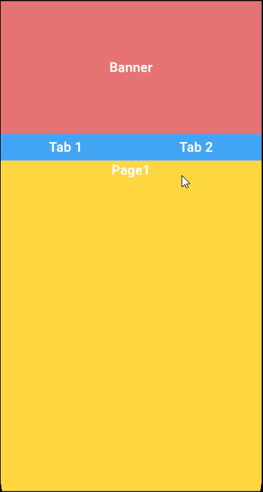
1. 效果预览
在 Flutter 开发中,创建具有吸顶 Tabs 的 PageView 效果可以极大地提升用户界面的交互性和用户体验。今天,我们就通过一段具体的代码来深入了解如何实现这一功能。效果预览如下:
2. 结构分析
我们从整体上看这段代码,它定义了一个名为CeilingTabsPageView的有状态组件。这个组件的作用就是构建出一个带有吸顶 Tabs 的页面,用户可以通过滑动 PageView 在不同的页面内容间切换。
- 引入必要的库
import 'package:extended_nested_scroll_view/extended_nested_scroll_view.dart';
import 'package:flutter/material.dart';
代码开头引入了两个重要的库。
-
package:flutter/material.dart:Flutter 的核心 UI库,它提供了各种构建用户界面的基本组件和工具,比如我们后续会用到的Container、Row、Text等。
-
package:extended_nested_scroll_view/extended_nested_scroll_view.dart:为我们实现吸顶效果提供了关键支持,ExtendedNestedScrollView这个特殊的组件就来自于它。
- 定义CeilingTabsPageView组件
class CeilingTabsPageView extends StatefulWidget {
const CeilingTabsPageView({Key? key}) : super(key: key);
State<CeilingTabsPageView> createState() => CeilingTabsPageViewState();
}
这里定义了CeilingTabsPageView组件,它是一个有状态的组件。有状态组件意味着它在运行过程中可以根据用户操作或者其他事件改变自身状态。而createState方法返回了CeilingTabsPageViewState实例,这个实例负责管理组件的状态和构建具体的 UI。
- CeilingTabsPageViewState类的详细解析
class CeilingTabsPageViewState extends State<CeilingTabsPageView> {
/// 控制器
late PageController _pageController;
int pageIndex = 0;
/// 字体样式
TextStyle myTextStyle = const TextStyle(
color: Colors.white, fontWeight: FontWeight.w600, fontSize: 20);
/// 生命周期
void initState() {
super.initState();
_pageController = PageController(initialPage: pageIndex);
}
/// 页面滑动回调
void handlePageChange(int index) {
setState(() {
pageIndex = index;
});
}
/// Tabs点击
void handleTabClick(int index) {
setState(() {
pageIndex = index;
_pageController.jumpToPage(index); // 直接跳转至指定页面
});
}
- 生命周期方法:initState方法在组件首次插入到 Widget 树时调用,在这里我们只是简单地调用了父类的initState方法,暂时没有额外的初始化操作,但它为我们后续可能需要的初始化工作提供了位置。
- 状态变量:pageIndex用于记录当前 PageView 显示的页面索引,初始值为 0,表示默认显示第一个页面。
- 控制器:_pageController是PageView的控制器
- 字体样式定义:myTextStyle定义了一种字体样式,包括白色字体颜色、中等加粗的字重和 20 的字体大小,后续在多个文本组件中会使用到这个样式。
- 页面滑动回调函数:当 PageView 发生滑动时,handlePageChange函数会被调用。它通过setState方法来更新pageIndex的值,setState方法会触发组件的重新构建,从而确保 UI 能够反映出页面索引的变化。
- Tabs点击:点击Tabs的回调函数
- 构建 UI 的核心方法
Widget build(BuildContext context) {
/// 最大宽度
double maxW = MediaQuery.of(context).size.width;
/// 最大高度
double maxH = MediaQuery.of(context).size.height;
return SizedBox(
width: maxW,
height: maxH,
child: ExtendedNestedScrollView(
headerSliverBuilder: (BuildContext context, bool innerBoxIsScrolled) {
return [
SliverToBoxAdapter(
child: Column(
crossAxisAlignment: CrossAxisAlignment.center,
children: [bannerWidget(maxW), tabsWidget(maxW)]))
];
},
// 需要固定吸顶的高度
pinnedHeaderSliverHeightBuilder: () {
return 40;
},
onlyOneScrollInBody: true,
body: SizedBox(
width: maxW,
height: maxH,
child: pageViewWidget(maxW, maxH),
)),
);
}
- 获取屏幕尺寸:通过MediaQuery.of(context).size.width和MediaQuery.of(context).size.height获取当前设备屏幕的宽度maxW和高度maxH,这两个值对于构建适配不同屏幕尺寸的 UI 非常重要。
- 使用ExtendedNestedScrollView:这是实现吸顶效果的关键组件。
- headerSliverBuilder:这个回调函数用于构建顶部的内容。它返回一个包含SliverToBoxAdapter的列表,SliverToBoxAdapter又包含了一个Column,Column中依次排列着bannerWidget和tabsWidget。这就定义了顶部的布局结构,先显示一个 Banner,再显示 Tabs。
- pinnedHeaderSliverHeightBuilder:这个回调函数指定了需要固定吸顶的高度为 40。也就是说,tabsWidget部分会在用户滚动页面时固定在顶部,不会随着页面内容一起滚动。
- onlyOneScrollInBody:设置为true表示在页面主体部分只允许一个滚动行为,避免了滚动冲突。
body:这里设置页面的主体内容为pageViewWidget,也就是我们的 PageView 部分。
- 各个部件的构建方法
bannerWidget
Widget bannerWidget(double maxW) {
  return Container(
      width: maxW,
      height: 200,
      alignment: Alignment.center,
      color: Colors.red.shade300,
      child: Text('Banner', style: myTextStyle));
}
这个方法构建了一个Container作为 Banner。它的宽度为屏幕宽度maxW,高度为 200,背景颜色为浅红色(Colors.red.shade300),并且在容器中心显示了 “Banner” 字样,使用之前定义好的myTextStyle字体样式。
tabsWidget
Widget tabsWidget(double maxW) {
  return Container(
    width: maxW,
    height: 40,
    color: Colors.blue.shade400,
    child: Row(
      children: [
        Expanded(
            child: GestureDetector(
              onTap: () {
                handleTabClick(0);
              },
              child: Container(
                alignment: Alignment.center,
                child: Text('Tab 1', style: myTextStyle),
              ),
            ),
          ),
          Expanded(
            child: GestureDetector(
              onTap: () {
                handleTabClick(1);
              },
              child: Container(
                alignment: Alignment.center,
                child: Text('Tab 2', style: myTextStyle),
              ),
            ),
          )
      ],
    ),
  );
}
tabsWidget构建了 Tabs 部分。同样是一个宽度为屏幕宽度maxW、高度为 40 的Container,背景颜色为浅蓝色(Colors.blue.shade400)。在这个容器内部,通过Row布局将空间分为两部分,每部分都包含一个Expanded包裹的Container,分别显示 “Tab 1” 和 “Tab 2”,同样使用myTextStyle字体样式。Expanded组件的作用是让两个 Tab 平分容器的宽度。并且添加了GestureDetector来处理点击事件。
pageViewWidget
Widget pageViewWidget(double maxW, double maxH) {
  return SingleChildScrollView(
      primary: true,
      physics: const BouncingScrollPhysics(),
      child: SizedBox(
        width: maxW,
        height: maxH,
        child: PageView(
        controller: _pageController,
            onPageChanged: (index) {
              setState(() {
                pageIndex = index;
              });
            },
          children: [
            Container(
                width: maxW,
                height: 1000,
                color: Colors.amberAccent,
                alignment: Alignment.topCenter,
                child: Text('Page1', style: myTextStyle)),
            Container(
                width: maxW,
                height: 1000,
                color: Colors.deepPurpleAccent,
                alignment: Alignment.topCenter,
                child: Text('Page2', style: myTextStyle))
          ],
        ),
      ));
}
pageViewWidget构建了 PageView。它被包裹在SingleChildScrollView中,设置primary为true表示这是主要的滚动视图,physics设置为BouncingScrollPhysics以实现类似于 iOS 的弹性滚动效果。在SizedBox内部是一个PageView,包含两个页面,每个页面都是一个宽度为屏幕宽度maxW、高度为 1000 的Container,分别显示 “Page1” 和 “Page2”,背景颜色也各不相同,同样使用myTextStyle字体样式。并且把控制器绑定上,添加了onPageChanged回调事件。
3. 完整代码
- main.dart
const CeilingTabsPageView()
- ceilingTabsPageView.dart
import 'package:extended_nested_scroll_view/extended_nested_scroll_view.dart';
import 'package:flutter/material.dart';
/// 吸顶Tabs的PageView
class CeilingTabsPageView extends StatefulWidget {
const CeilingTabsPageView({Key? key}) : super(key: key);
State<CeilingTabsPageView> createState() => CeilingTabsPageViewState();
}
class CeilingTabsPageViewState extends State<CeilingTabsPageView> {
late PageController _pageController;
int pageIndex = 0;
/// 字体样式
TextStyle myTextStyle = const TextStyle(
color: Colors.white, fontWeight: FontWeight.w600, fontSize: 20);
/// 生命周期
void initState() {
super.initState();
_pageController = PageController(initialPage: pageIndex);
}
/// 页面滑动回调
void handlePageChange(int index) {
setState(() {
pageIndex = index;
});
}
/// Tabs点击
void handleTabClick(int index) {
setState(() {
pageIndex = index;
_pageController.jumpToPage(index); // 直接跳转至指定页面
});
}
/// 构建UI
Widget build(BuildContext context) {
/// 最大宽度
double maxW = MediaQuery.of(context).size.width;
/// 最大高度
double maxH = MediaQuery.of(context).size.height;
return SizedBox(
width: maxW,
height: maxH,
child: ExtendedNestedScrollView(
headerSliverBuilder: (BuildContext context, bool innerBoxIsScrolled) {
return [
SliverToBoxAdapter(
child: Column(
crossAxisAlignment: CrossAxisAlignment.center,
children: [bannerWidget(maxW), tabsWidget(maxW)]))
];
},
// 需要固定吸顶的高度
pinnedHeaderSliverHeightBuilder: () {
return 40;
},
onlyOneScrollInBody: true,
body: SizedBox(
width: maxW,
height: maxH,
child: pageViewWidget(maxW, maxH),
)),
);
}
/// Banner部件
Widget bannerWidget(double maxW) {
return Container(
width: maxW,
height: 200,
alignment: Alignment.center,
color: Colors.red.shade300,
child: Text('Banner', style: myTextStyle));
}
/// Tabs部件
Widget tabsWidget(double maxW) {
return Container(
width: maxW,
height: 40,
color: Colors.blue.shade400,
child: Row(
children: [
Expanded(
child: GestureDetector(
onTap: () {
handleTabClick(0);
},
child: Container(
alignment: Alignment.center,
child: Text('Tab 1', style: myTextStyle),
),
),
),
Expanded(
child: GestureDetector(
onTap: () {
handleTabClick(1);
},
child: Container(
alignment: Alignment.center,
child: Text('Tab 2', style: myTextStyle),
),
),
)
],
),
);
}
/// pageView部件
Widget pageViewWidget(double maxW, double maxH) {
return SingleChildScrollView(
primary: true,
physics: const BouncingScrollPhysics(),
child: SizedBox(
width: maxW,
height: maxH,
child: PageView(
controller: _pageController,
onPageChanged: (index) {
setState(() {
pageIndex = index;
});
},
children: [
Container(
width: maxW,
height: 1000,
color: Colors.amberAccent,
alignment: Alignment.topCenter,
child: Text('Page1', style: myTextStyle)),
Container(
width: maxW,
height: 1000,
color: Colors.deepPurpleAccent,
alignment: Alignment.topCenter,
child: Text('Page2', style: myTextStyle))
],
),
));
}
}
4. 总结
通过这段代码,我们成功地在 Flutter 中实现了一个具有吸顶 Tabs 的 PageView 效果。从引入必要的库,到定义组件和管理状态,再到构建具体的 UI 部件,每一步都紧密配合。ExtendedNestedScrollView组件的使用是实现吸顶效果的核心,而各个部件的合理布局和样式设置则让整个页面看起来更加美观和易于交互。希望这篇文章能帮助你理解并在自己的 Flutter 项目中运用类似的功能。
本次分享就到这儿啦,我是鹏多多,如果您看了觉得有帮助,欢迎评论,关注,点赞,转发,我们下次见~
往期文章
- flutter-使用extended_image操作图片的加载和状态处理以及缓存和下载
- flutter-制作可缩放底部弹出抽屉评论区效果
- flutter学习-day12-可滚动组件和监听
- Vue2全家桶+Element搭建的PC端在线音乐网站
- vue3+element-plus配置cdn
- 助你上手Vue3全家桶之Vue3教程
- 助你上手Vue3全家桶之VueX4教程
- 助你上手Vue3全家桶之Vue-Router4教程
- 超详细!Vue的九种通信方式
- 超详细!Vuex手把手教程
- 使用nvm管理node.js版本以及更换npm淘宝镜像源
- vue中利用.env文件存储全局环境变量,以及配置vue启动和打包命令
个人主页
- CSDN
- GitHub
- 简书
- 博客园
- 掘金