css3字体弹跳动画_使用CSS3动画创建弹跳页面加载器
css3字体弹跳动画
Side projects are not only fun but they bring a whole lot of learning experience for you. While hunting for a pre-built page loader for a website I ended up coding one for myself.
附带项目不仅很有趣,而且还为您带来了很多学习经验。 在寻找网站的预制页面加载器时,我最终为自己编写了一个。
Initially, I had a view that implementing CSS3 animations are quite a cumbersome task so, I looked for an online service for creating simple animations. However, I didn't find a reasonable page loading CSS animations which met my project's requirements. I wanted something neat and simple.
最初,我认为实现CSS3动画是一项繁琐的任务,因此,我寻找了一种用于创建简单动画的在线服务。 但是,我找不到适合我项目要求的合理页面来加载CSS动画。 我想要简单整洁的东西。
After toying around with the code in less than an hour I managed to build a simple implementation of a bouncing page loading experience with CSS3 animation keyframes which I am super excited to share with you.
在不到一个小时的时间里弄乱了代码,我设法用CSS3动画关键帧构建了一个弹跳页面加载体验的简单实现,非常高兴与您分享。
项目研究 ( Project Research )
I didn't jump to CSS @keyframes at-rule right away. It took me some time and research to figure out an effective way to code a page loading experience. Initially, I started playing with the CSS Transitions which help you change CSS property values, over a range of time. But I wanted to keep the process as simple as it can get and the @keyframes at-rule served me best.
我没有立刻就跳到CSS @keyframes规则。 我花了一些时间和研究来找到一种有效的方式来编写页面加载体验的代码。 最初,我开始使用CSS Transitions来帮助您在一段时间内更改CSS属性值。 但是我想使过程尽可能地简单,而@keyframes规则最适合我。
项目设置 ( Project Setup )
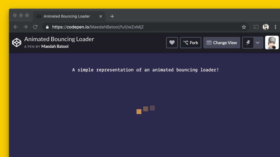
Here's what we’ll be making by the end of this tutorial:
在本教程结束时,我们将要做的是:
HTML ( HTML )
First, let's write the basic HTML for this project.
首先,让我们为该项目编写基本HTML。
< p > A simple representation of an animated bouncing loader!

< div class = " loader " >
  < span >
  < span >
  < span >
I added a div with the class called loader. This div is responsible for creating all the page loader elements. Inside this div, I added three consecutive span elements each representing a page loader circle.
我添加了一个名为loader的class的div 。 该div负责创建所有页面加载器元素。 在此div ,我添加了三个连续的span元素,每个元素代表一个页面加载器圈子。
CSS样式 ( CSS Styles )
Let's first style our basic elements.
首先让我们设计基本元素。
/*_ OPTIONAL: Styles for the demo. *_/
body  {
  background : #2C294F ;
  padding : 2 rem ;
}

p  {
  font : 1 rem/ 1.45 "Operator Mono" ;
  color : #A599E9 ;
  text-align : center ;
}
The above code block defines the optional CSS styles for the p tag and the body.
上面的代码块为p标签和body定义了可选CSS样式。
样式化.loader类 (Styling .loader Class)
Next, I styled my page loader with the following properties:
接下来,我使用以下属性设置了页面加载器的样式:
/_ CSS for animated bouncing loader. _/
.loader  {
  display : flex ;
  justify-content : center ;
  align-items : center ;
}
I used the Flexbox i.e., display: flex; property to place the bouncing page loader in the middle of the page both horizontally and vertically.
我使用了Flexbox,即display: flex; 属性,将弹跳页面加载程序水平和垂直放置在页面中间。
/_ Loader circles _/
.loader > span  {
  background : #FAD000 ;
  border-radius : 50% ;
  margin : 5 rem 0.5 rem ;
  animation : bouncingLoader 0.6 s infinite alternate ;
}

.loader > span :nth-child(2)  {
  animation-delay : 0.2 s ;
}

.loader > span :nth-child(3)  {
  animation-delay : 0.4 s ;
}
Each loader circle has width: 1rem; and height:1rem; with #FFB651 color. By default, the shape of my page loader in square. To give it a circular shape I set the border-radius to 50%. Just uploading a GIF to show how the loader looks like without the border-radius property.
每个装载机圈的width: 1rem; height:1rem; #FFB651颜色。 默认情况下,页面加载器的形状为正方形。 为了使其呈圆形,我将border-radius设置为50%。 只需上传一个GIF即可显示没有border-radius属性的加载程序的外观。
I also added bit of a margin between the circles but the most interesting part here is the animation property. We are using an animation keyframe called bouncingLoader that runs once in 0.6s and repeats itself inifintely. Let's talk more on that and the animation delay properties below.
我还在圆之间添加了一点边距,但是这里最有趣的部分是animation属性。 我们正在使用一个称为bouncingLoader的动画关键帧,该关键帧在0.6s内运行一次,并自动重复。 让我们在下面进一步讨论动画延迟属性。
border-radius property.
 因此,这里有个快速提示,即,如果您希望装载机为方形,请不要使用
border-radius属性。
创建动画关键帧 ( Creating Animation Keyframe )
Keyframes are used to define the animation behavior and give us complete control of one cycle of a CSS animation. We define it as @keyframes at-rule followed by the name of the animation which is bouncingLoader in this case.
关键帧用于定义动画行为,并使我们可以完全控制CSS动画的一个周期。 我们将其定义为@keyframes ,然后加上动画名称(在这种情况下为bouncingLoader 。
Inside a @keyframe rule, you use the keywords from and to in order to specify a starting and ending point for your animation. Equivalently, you can also use 0% *for from which depicts the starting point and *100% for to depicting the ending point of your animation.
在@keyframe规则中,您可以使用from和to关键字来指定动画的起点和终点 。 同样地,你也可以使用0%* 为from描绘为出发点和* 100% to描绘动画的终点 。
Moreover, if you want several animation transitions, you can define a range of percentages each containing a list of styling selectors. These percentages can be listed in any order and with any difference between them. A simple representation of these percentages is shown below:
此外,如果要进行多个动画过渡,则可以定义一个百分比范围,每个百分比包含样式选择器列表。 这些百分比可以以任何顺序列出,并且它们之间可以有任何差异。 这些百分比的简单表示如下所示:
@keyframes animationNameHere {
  0%  { opacity : 1 ; }
  30%  { opacity : 0.75 ; }
  50%  { opacity : 0.5 ; }
  100%  { opacity : 0.25 ; }
}
Let's now write the code for the keyframe which I wrote to create my bouncing page loader:
现在,让我们编写用于创建弹跳页面加载器的关键帧的代码:
/_ Define the animation called bouncingLoader . _/
@keyframes bouncingLoader {
  from  {
    width : 0.1 rem ;
    height : 0.1 rem ;
    opacity : 1 ;
    transform : translate 3 d ( 0 ) ;
  }
  to  {
    width : 1 rem ;
    height : 1 rem ;
    opacity : 0.1 ;
    transform : translate 3 d ( 0 , - 1 rem, 0 ) ;
  }
}
I am using the keywords from and to which define the basic styling properties of width, height, and opacity of the circles. Other than that, to create the bouncing effect, I used the CSS transform property to change the coordinates of a given element hence transforming the location of each circle.
我使用关键字from和to定义了圆形的width , height和opacity的基本样式属性。 除此之外,为了创建弹跳效果,我使用CSS transform属性来更改给定元素的坐标,从而转换每个圆的位置。
With this transform property, I've used the translate3D() function which takes three inputs explaining the change in (x, y, z) coordinates. Since I wanted my loader to run in a wave motion, I need to translate primarily along the y-axis keeping the x and z-axis constant. Thus, my ending point value is (0, -1rem, 0).
通过此transform属性,我使用了translate3D()函数,该函数接受三个 输入来解释(x, y, z)坐标的变化。 由于我希望装载机以波动运行,因此我需要主要沿y 轴平移,同时保持x 轴 和z 轴恒定 。 因此,我的终点值为(0, -1rem, 0) 。
Let me show you a little demo how to play with this property. If I set my ending point value as transform: translate3d(1rem, 0rem, 1rem);. It'll mean that I am transforming it along the x and z-axis while keeping my y-axis constant. Now my animation will look something like this:
让我向您展示一些演示如何使用此属性。 如果我将终点值设置为transform: translate3d(1rem, 0rem, 1rem); 。 这意味着我要在保持y轴不变的同时沿x和z轴对其进行变换。 现在,我的动画将如下所示:

在关键帧上使用动画延迟 (Using Animation Delay with Keyframe)
Now begins the final part. Since I have written the code for my @keyframe, it’s time to set it up and running. The kind of animation which you are viewing in the GIFs above was made possible with the following few lines of code:
现在开始最后一部分。 由于我已经为@keyframe编写了代码,是时候设置并运行它了。 您可以通过以下几行代码在上面的GIF中查看这种动画:
/_ Loader circles _/
.loader > span  {
  background : #FAD000 ;
  border-radius : 50% ;
  margin : 5 rem 0.5 rem ;
  animation : bouncingLoader 0.6 s infinite alternate ;
}

.loader > span :nth-child(2)  {
  animation-delay : 0.2 s ;
}

.loader > span :nth-child(3)  {
  animation-delay : 0.4 s ;
}
You style the element you want to animate with the animation property and/or its sub-properties. Using this property you can control the timing, duration, and other details of your animation.
您可以使用animation属性和/或其子属性为要设置动画的元素设置样式。 使用此属性,您可以控制动画的timing , duration和其他细节。
Here I have used the following animation sub-properties:
在这里,我使用了以下动画子属性:
animation : animation-name, animation-duration, animation-iteration-count, animation-direction ;animation-name: Defines the name of your animation which isloaderin my case.animation-name:定义animation-name的名称 ,在我的情况下为loader。animation-duration: Configures the length of time which your animation will take to complete one cycle.animation-duration:配置动画完成一个周期所需的时间。animation-iteration-count: Tells how many times you want your animation cycle to play before it stops.animation-iteration-count:告诉您希望动画循环播放多少次才能停止。animation-direction: Defines that in which direction is your animation going to play.animation-direction:定义动画将朝哪个方向播放。
Apart from these there are several other sub-properties as well. You can browse them from here.
除了这些以外,还有其他几个子属性。 您可以从这里浏览它们。
Based on these I have defined my animation as follows:
基于这些,我将动画定义如下:
animation : bouncingLoader 0.6 s infinite alternate ;This line of code does the following three things:
此行代码执行以下三件事:
☑️ Tells the
loaderelement to use our keyframebouncingLoader.☑️告诉
loader元素使用我们的关键帧bouncingLoader。☑️ It also sets the length of the animation to 0.6 seconds.
☑️它还将动画的长度设置为0.6秒。
☑️ It runs the animation an infinite number of times.
☑️它可以无限次地运行动画。
☑️ Upon completion of one single cycle, the animation direction
alternatesi.e., it reverses.☑️在完成一个单一周期后,动画方向
alternates即相反。
I have defined these properties for the first circle of my bouncing loader. To target the second (2) and the third (3) circle, I've used the nth-child(n) selector which allows you to select and target one or more elements which are the nth-child of its parent. Moreover, for the remaining span elements, I have just defined the animation-delay, so that each element does not start to animate at the same time.
我已经为弹跳加载程序的第一个圆定义了这些属性。 为了定位第二个 (2)和第三个 (3)圆,我使用了nth-child(n)选择器,该选择器允许您选择和定位一个或多个作为其父级的nth-child元素的元素。 此外,对于其余的span元素,我刚刚定义了animation-delay ,以便每个元素不会同时开始进行动画处理。
最终产品 ( The Final Product )
Here's the complete code of this animated bouncing page loader:
这是此动画弹跳页面加载器的完整代码:
HTML代码 (HTML Code)
< p > A simple representation of an animated bouncing page loader!

< div class = " loader " >
  < span >
  < span >
  < span >
CSS代码 (CSS Code)
/_ CSS for animated bouncing loader. _/
.loader  {
  display : flex ;
  justify-content : center ;
    align-items : center ;
}

/_ Loader circles _/
.loader > span  {
  background : #FAD000 ;
  border-radius : 50% ;
  margin : 5 rem 0.5 rem ;
  animation : bouncingLoader 0.6 s infinite alternate ;
}

.loader > span :nth-child(2)  {
  animation-delay : 0.2 s ;
}

.loader > span :nth-child(3)  {
  animation-delay : 0.4 s ;
}

/_ Define the animation called bouncingLoader . _/
@keyframes bouncingLoader {
  from  {
    width : 0.1 rem ;
    height : 0.1 rem ;
    opacity : 1 ;
    transform : translate 3 d ( 0 ) ;
  }
  to  {
    width : 1 rem ;
    height : 1 rem ;
    opacity : 0.1 ;
    transform : translate 3 d ( 0 , - 1 rem, 0 ) ;
  }
}

/_ OPTIONAL: Styles for the demo. _/
body  {
  background : #2C294F ;
  padding : 2 rem ;
}

p  {
  font : 1 rem/ 1.45 "Operator Mono" ;
  color : #A599E9 ;
  text-align : center ;
}
Here's a working demo with CodePen for this. You can fork this pen and go crazy with it.
这是CodePen的工作演示 。 您可以叉这支笔,然后疯狂起来。
轮到你 ( Your turn )
After developing this animation, I have realized that CSS is amazingly powerful. There are several ways of creating animations like this. I'd love you hear your suggestions and the way you create CSS animations.
开发了此动画之后,我意识到CSS非常强大。 有几种创建动画的方法。 我希望您能听到您的建议以及创建CSS动画的方式。
Thanks for reading! If this tutorial was helpful and has piqued your interest, try it out yourself and share your feedback in the comments section below.
谢谢阅读! 如果本教程对您有所帮助,并且引起了您的兴趣,请尝试一下并在下面的评论部分中分享您的反馈。
翻译自: https://scotch.io/tutorials/create-a-bouncing-page-loader-with-css3-animations
css3字体弹跳动画