Python学习笔记:5.1.5 网页前端练习
本文是学习陆老师的《python全栈工程师 - web开发前端基础》课程的笔记,欢迎学习交流。同时感谢陆老师的精彩传授!
一、课程目标
- 练习要求
- 练习项目
二、详情解读
2.1、练习要求
1.预先看完录播视频,并跟着视频演练了其中所有代码
2.练习不应当求快,求快没有任何意义,今天所省的每一点努力,将来都你是就业的阻力,应当专注于弄懂,弄明白各属性取值含义
1.练习有两种,第一种,提供了演示代码。这种练习参照演示代码,第一遍照着写,第二遍尝试自己写,第三遍尝试优化一下
2.第二种,没有参考代码,只有要求的作业。这种应当独立完成,碰到问题先思考,看看是不是自己哪里没掌握好,如果百思不得其解,就可以求助。
2.2、练习项目介绍
1.标签练习,通过练习增加对标签的熟悉
2.定位练习,通过练习提升对定位的理解
3.布局练习,通过练习提升对网页标签与网页定位的综合动用能力
三、前端基础练习
3.1、标签练习
3.1.1、基本标签_我的第一个页面
<html>
<head>
<meta charset="utf-8" />
<title>我的第一个页面title>
head>
<body>
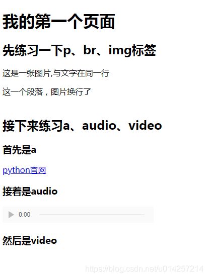
<h1>我的第一个页面h1>
<h2>先练习一下p、br、img标签h2>
<p>这是一张图片,与文字在同一行
<img src="timgbg.jpeg" width=100 height=100 alt="" />
p>
<p>这一个段落,图片换行了<br>
<img src="timgbg.jpeg" width=100 height=100 alt="" />
p>
<h2>接下来练习a、audio、videoh2>
<h3>首先是ah3>
<p><a href="http://python.org">python官网a>p>
<h3>接着是audioh3>
<p>
<audio src="../../02_css3/img/mo.mp3" autoplay="autoplay" controls="">
当前浏览器不支持audio
audio>
p>
<h3>然后是videoh3>
<p>
<video width="800" height="" controls="controls">
<source src="../../03_js基础/a.mp4" type="video/mp4">source>
<source src="myvideo.ogv" type="video/ogg">source>
<source src="myvideo.webm" type="video/webm">source>
<object width="" height="" type="application/x-shockwave-flash" data="myvideo.swf">
<param name="movie" value="myvideo.swf" />
<param name="flashvars" value="autostart=true&file=myvideo.swf" />
object>
当前浏览器不支持 video直接播放,点击这里下载视频: <a href="myvideo.webm">下载视频a>
video>
p>
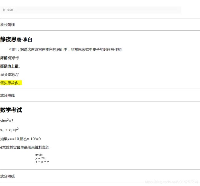
<hr >
<p>放分隔线p>
<hr >
<h2>静夜思<small>唐-李白small>h2>
<blockquote>
引用:据说这首诗写在李白独居山中,非常思念家中妻子的时候写作的
blockquote>
<p><b>床前b><i>明月光i>p>
<p><strong>疑是地上霜strong>。p>
<p><em>举头望明月em>p>
<p><mark>低头思故乡。mark>p>
<hr >
<p>放分隔线p>
<hr >
<h2>数学考试h2>
<p>sinx<sup>2sup>=?p>
<p>x<sub>1sub> + x<sub>2sub>=y<sup>2sup>p>
<p>如果<del>x==10del>,那么x-10!=0p>
<p><ins>e常数其实最早是用来算利息的ins>p>
<pre>
x=10;
y = 20;
z = x + y
pre>
<hr >
<p>放分隔线p>
<hr >
<h2>练习任务h2>
<ol>
<li>熟悉所讲的标签含义li>
<li>参照该网页书写一遍,注意字体变化li>
ol>
<h3>练习完后可以选择下列行为h3>
<ul>
<li>吃饭li>
<li>睡觉li>
<li>唱歌li>
ul>
body>
html>
运行结果:

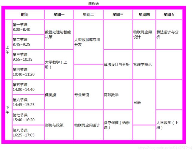
3.1.2、基本标签_课程表
<html>
	<head>
		<meta charset="utf-8" />
		<title>title>
	head>

	<body>
		<table id="table" border="15" cellspacing="1" bordercolor="#f0f" width="800" height="600">

			<caption id="caption">课程表caption>


			<tr class="tr1">
				<th colspan="2">时间th>
				<th>星期一th>
				<th>星期二th>
				<th>星期三th>
				<th>星期四th>
				<th>星期五th>
			tr>
			<tr>
				<td rowspan="4" class="td1">上午td>
				<td class="td2">第一节课 8:00~8:40td>
				<td rowspan="2" id="a" >数据处理与智能决策td>
				<td rowspan="3" id="b" >大型数据库应用开发td>
				<td rowspan="2">td>
				<td rowspan="2" id="c" >物联网应用设计td>
				<td rowspan="2" id="d" >算法设计与分析td>
			tr>
			<tr>
				<td class="td2">第二节课 8:45~9:25td>
			tr>
			<tr>
				<td class="td2">第三节课9:55~10:35td>
				<td rowspan="2" id="e" >大学数学(上册)td>
				<td rowspan="2" id="f" >算法设计与分析td>
				<td rowspan="2" id="g">管理学概论td>
				<td rowspan="2">td>
			tr>
			<tr>
				<td class="td2">第四节课10:40~11:20td>
				<td>td>
			tr>
			<tr>
				<td rowspan="4" class="td1">下午td>
				<td class="td2">第五节课14:00~14:40td>
				<td rowspan="2" id="h" onclick="h()">健美操td>
				<td rowspan="2" id="i" onclick="i()">专业英语td>
				<td rowspan="2" id="j" onclick="j()">离散数学td>
				<td rowspan="3" id="k" onclick="k()">日语td>
				<td rowspan="2">td>
			tr>
			<tr>
				<td class="td2">第六节课14:45~15:25td>
			tr>
			<tr>
				<td class="td2">第七节课15:40~16:20td>
				<td rowspan="2" id="l" onclick="l()">形势与政策td>
				<td rowspan="2" id="m" onclick="m()">物联网应用设计td>
				<td rowspan="2" id="n" onclick="n()">食疗保健(选修课)td>
				<td rowspan="2" id="o" onclick="o()">大学数学(上册)td>
			tr>
			<tr>
				<td class="td2">第八节课16:25~17:05td>
				<td>td>
			tr>
		table>
	body>

html>
运行结果:
3.1.3、基本标签_练习表单
<html>
	<head>
		<meta charset="UTF-8">
		<title>title>
	head>
	<body>
	<h1>欢迎注册有缘相见网h1>
	<table border="" cellspacing="" cellpadding="">
		<tr><th>姓名th><td><input type="" name="" id="" value=""  />td>tr>
		<tr><th>出生年月日th><td><select name="">
			<option value="2000-10-1">2000-10-1option>
			<option value="2000-10-2">2000-10-1option>
		select>td>tr>
		<tr><th>性别th><td>
			<label>男label>
			<input name="radio" type="radio" checked>
				<label>女label>
				<input name="radio" type="radio" checked>
		td>tr>
		<tr><th>上传照片th><td><input type="file" name="" id="" value="" />td>tr>
	<tr><th>出生年月日th><td><select name="">
		<option value="2000-10-1">2000-10-1option>
		<option value="2000-10-2">2000-10-1option>
	select>td>tr>
	<tr><th>爱好th><td>唱歌<input type="checkbox" name="" id="" value=""  />睡觉<input type="checkbox" name="" id="" value=""  />td>tr>
	<tr><th>手机号th><td><input type="" name="" id="" value=""  />td>tr>
	<tr><th>登陆密码th><td><input type="password" name="" id="" value=""  />td>tr>
	<tr><th>确认密码th><td><input type="password" name="" id="" value=""  />td>tr>
	<tr><td colspan="2"><input type="submit" name="" id="" value="--------立即注册------"  />td>tr>
	table>
	body>
html>
运行结果:

3.2、网页练习
3.2.1、定位练习
<html>
	<head>
		<meta charset="UTF-8">
		<title>title>
		<style type="text/css">
			.container{
				border: 2px solid red;
				width: 340px;
				height: 340px;
				position: relative;
				margin: 0 auto;
			}
			.container>div{
				width: 100px;
				height: 100px;
				background-color: red;
				text-align: center;
				line-height: 100px;
				color: white;
				position: absolute;
			}
			.link1{
				left: 20px;
				top: 20px;
			}
			.link2{
				right: 20px;
				top: 20px;
			}
			.container > .link3{
				background-color: blue;
				color: yellow;
				top: 120px;
				left: 120px;
			}
			.link4{
				bottom: 20px;
				left: 20px;
			}
			.link5{
				right: 20px;
				bottom: 20px;
			}
		style>
	head>
	<body>
		<div class="container">
			<div class="link1">box1div>
			<div class="link2">box2div>
			<div class="link3">box3div>
			<div class="link4">box4div>
			<div class="link5">box5div>
		div>
	body>
html>
运行结果:

3.2.2、CSS菜单练习
<head>
	<meta http-equiv="Content-Type" content="text/html; charset=utf-8" />
	<title>纯CSS多级菜单title>
	<link rel="stylesheet" type="text/css" href="css/step1.css"/>
	<link rel="stylesheet" type="text/css" href="css/step2.css"/>
	<style>
		/* 二级及以上菜单 */
		#nav>li>ul li{
			position: relative;
			padding: 10px;
			background: #efefef;
		}
		#nav>li>ul li ul{
			position: absolute;
			left: -1000px;
			top: -1000px;
			margin: 0;
			padding: 0;
			z-index: 100;
			list-style: none;
		}
		#nav>li>ul li:hover>ul{
			left: 100%;
			top: 0px;
			display: block;
		}
		#nav>li>ul li:hover{
			background: #779e25;
		}
	style>
head>
<body>
	<ul id="nav">
		<li><a href="#">首页a>li>
		<li><a href="#">菜单一a>
			<ul>
				<li><a href="#">菜单一|一级一a>li>
				<li><a href="#">菜单一|一级二a>li>
				<li><a href="#">菜单一|一级三a>li>
			ul>
		li>
		<li><a href="#">菜单二»a>
			<ul>
				<li><a href="#">菜单二|一级一 »a>
					<ul>
						<li><a href="#">菜单二|一级一|二级一a>li>
						<li><a href="#">菜单二|一级一|二级二a>li>
						<li><a href="#">菜单二|一级一|二级三a>li>
					ul>
				li>
				<li>
					<a href="#">菜单二|一级二 »a>
					<ul>
						<li><a href="#">菜单二|一级二|二级一a>li>
						<li><a href="#">菜单二|一级二|二级二a>li>
						<li><a href="#">菜单二|一级二|二级三a>li>
					ul>
				li>
				<li>
					<a href="#">菜单二|一级三  »a>
					<ul>
						<li><a href="#">菜单二|一级三|二级一 »a>
							<ul>
								<li><a href="#">菜单二|一级三|三级一 a>li>
								<li><a href="#">菜单二|一级三|三级二 a>li>
								<li><a href="#">菜单二|一级三|三级三 a>li>
							ul>
						li>
						<li><a href="#">菜单二|一级三|二级二 »a>
							<ul>
								<li><a href="#">菜单二|一级三|二级二 |三级一a>li>
								<li><a href="#">菜单二|一级三|二级二 |三级二 »a>
									<ul>
										<li><a href="#">菜单二|一级三|二级二 |三级二 |四级一 »a>
											<ul>
												<li><a href="#">菜单二|一级三|二级二 |三级二 |四级一|五级一a>li>
												<li><a href="#">菜单二|一级三|二级二 |三级二 |四级一|五级二a>li>
												<li><a href="#">菜单二|一级三|二级二 |三级二 |四级一|五级三a>/li>
											ul>
										li>
										<li><a href="#">菜单二|一级三|二级二|三级二 |四级二a>li>
										<li><a href="#">菜单二|一级三|二级二 |三级二 |四级三 »a>
											<ul>
												<li><a href="#">菜单二|一级三|二级二 |三级二 |四级三 |五级一a>li>
												<li><a href="#">菜单二|一级三|二级二 |三级二 |四级三 |五级二a>li>
												<li><a href="#">菜单二|一级三|二级二 |三级二 |四级三 |五级三a>li>
											ul>
										li>
										<li><a href="#">菜单二|一级三|二级二 |三级二 |四级四a>li>
										<li><a href="#">菜单二|一级三|二级二 |三级二 |四级五a>li>
									ul>
								li>
								<li><a href="#">菜单二|一级三|二级二 |三级三a>li>
								<li><a href="#">菜单二|一级三|二级二 |三级四a>li>
							ul>
						li>
						<li><a href="#">菜单二|一级三|二级三 »a>
							<ul>
								<li><a href="#">菜单二|一级三|二级三|三级一a>li>
								<li><a href="#">菜单二|一级三|二级三|三级二a>li>
								<li><a href="#">菜单二|一级三|二级三|三级三a>li>
								<li><a href="#">菜单二|一级三|二级三|三级四a>li>
								<li><a href="#">菜单二|一级三|二级三|三级五a>li>
							ul>
						li>
					ul>
				li>
				<li><a href="#">菜单二|一级三 a>li>
				<li><a href="#">菜单二|一级四 a>li>
			ul>
		li>
		<li><a href="#">菜单三»a>
			<ul>
				<li><a href="#">菜单三|一级一 a>li>
				<li><a href="#">菜单三|一级一 a>li>
				<li><a href="#">菜单三|一级一 a>li>
			ul>
		li>
		<li><a href="#">菜单四»a>
			<ul>
				<li><a href="#">菜单四|一级一 a>li>
				<li><a href="#">菜单四|一级二 a>li>
			ul>
		li>
		<li><a href="#">菜单五a>li>
	ul>
body>
html>
/*step1.css文件内容*/
/* 主菜单样式 */
a {
	text-decoration: none;
	font-family: 微软雅黑;
	white-space: nowrap;
}
#nav {
	position: relative;
	margin: 0;
	padding: 0;
	z-index: 100;
	background: #528e34;
	font-size: 12px;
	width: 740px;
	height: 30px;
	list-style: none;
}
#nav>li {
	position: relative;
	margin:0 15px 0 15px;
	background: #039AE3;
	float: left;
}
#nav>li>a{
	display: block;
	margin: 0 10px 0 10px;
	white-space: nowrap;
	height: 30px;
	line-height: 30px;
	color: #fff;
	font-size: 14px;
	font-weight: bold;
}
#nav>li:hover{
	background: #0F91F5;
}
/*step2.css文件内容*/
/* 第一级下拉菜单样式 */
/* 第一级子菜单在主菜单下方 */
#nav>li>ul{
	position: absolute;
	left: 0px;
	top:  0px;
	margin: 0;
	padding: 0;
	z-index: 100;
	list-style: none;
	display: none;

}
#nav>li:hover>ul{
	top: 30px;
	display:block;
}
#nav>li>ul>li{
	padding:10px;
	background: #efefef;
}
#nav>li>ul>li:hover{
	background: #779e25;
}
#nav>li>a{
	display: block;
	margin: 0 10px 0 10px;
	white-space: nowrap;
	height: 30px;
	line-height: 30px;
	color: #fff;
	font-size: 14px;
	font-weight: bold;
}
运行结果:

3.2.3、新闻列表练习
<html>
	<head>
		<meta http-equiv="Content-Type" content="text/html; charset=UTF-8" />
		<title>title>
		<style type="text/css">
			h3, ul, li,p{
			    margin:0;
			    padding:0;
			}
			a{
			    text-decoration: none;
			}
			a:link{
			    color:#000;
			}
			a:visited{
			    color: #333;
			}
			a:hover{
			    color: #666;
			}
			.all{
			    width: 800px;
			}
			.tab a{
			    display:inline-block;
			    height: 40px;
			    width: 60px;
			    line-height: 40px;
			    text-align: center;
			    border: 0px solid #000000;
			    background: #e0e0e0;
			    color: #666;
			}
			.tab a:hover{
			    background: #efefef;
			    color: #333;
			}
	        #news_pic{
				margin-top: 15px;
			    width: 500px;
			    float:left;
			}
			#news_pic li{
				list-style: none;
				width: 100%;
			}
			.pic_left{
				float:left;
				width: 150px;
			}
			.pic_right{
				padding-left:20px;
				float:left;
				width: 60%;
			}
			.pic_right p {
				height: 48px;
				line-height: 24px;
				overflow: hidden;
			}
			.media{
			    float:left;
			    font-size:12px;
			}
			.date{
			    float:right;
			    font-size:10px;
			}
			#tips{
			    font-size: 11px;
			    color: #969696;
			    width: 100%;
			    text-align: center;
			}
			#news{

			}
			#news{
				margin-top: 15px;
				width: 150px;
				float: left;
			    border-left: 3px solid #efefef;
			    font-family: "微软雅黑";
			    padding: 10px;
			}
			#news li{
			    list-style: none;
			}
		style>
	head>
	<body>
	  <div class="all">

	    <div class="tab">
	    	<a href="">选项1a>
	    	<a href="">选项2a>
	    	<a href="">选项3a>
	    div>
	    <div id="news_pic">
	    	  <ul>
	    	  	<li>
	    	  	    <img  class="pic_left" src="../img/1.jpeg"/>
	    	  	       <div class="pic_right">
	    	  	       <h3><a href="">图文新闻列表标题a>h3>
	    	  	       <p>asynchat是asyncore的高级封装模块,可以简化类似http这样的请求/响应简单的网络模式开发
	    	  	      p>
					  <p><span class="media">新华社span>
	    	  	           <em class="date">2018-09-12em>p>
	    	  	       div>
	    	  	li>
	    	  	<li>
                    <img  class="pic_left" src="../img/1.jpeg"/>
                       <div class="pic_right">
                       <h3><a href="">图文新闻列表标题a>h3>
                       <p>asynchat是asyncore的高级封装模块,可以简化类似http这样的请求/响应简单的网络模式开发
                       p>
					   <p>
                           <span class="media">新华社span>
                           <em class="date">2018-09-12em>
                      p>
                       div>
                li>
                <li>
                    <img  class="pic_left" src="../img/1.jpeg"/>
                       <div class="pic_right">
                       <h3><a href="">图文新闻列表标题a>h3>
                       <p>asynchat是asyncore的高级封装模块,可以简化类似http这样的请求/响应简单的网络模式开发
                       p>
					   <p>
                           <span class="media">新华社span>
                           <em class="date">2018-09-12em>
                      p>
                       div>
                li>
	    	  ul>
	    div>
        <div id="news">
        	   <h3>新闻列表h3>
        	   <ul>
        	   	   <li><a href="">标题1a>li>
        	   	   <li><a href="">标题1a>li>
        	   	   <li><a href="">标题1a>li>
        	   	   <li><a href="">标题1a>li>
        	   	   <li><a href="">标题1a>li>
        	   ul>
        div>
     div>
	body>
html>
运行结果:

3.3、动画练习
3.3.1、太阳的东升西落
<html>
	<head>
		<meta charset="UTF-8">
		<title>title>
		<style>
			.container{
				width: 800px;
				height: 800px;
				border: 1px solid black;
				margin: 0 auto;
				position: relative;
			}
			.sky{
				width: 800px;
				height: 500px;
				background-color: #262626;
				animation: sky 10s linear 1 forwards;
			}
			@-webkit-keyframes sky{
				0%{
					background-color: #262626;
				}
				50%{
					background-color: #2E4171;
				}
				70%{
					background-color: #2E4171;
				}
				100%{
					background-color: #262626;
				}
			}
			.ground{
				width: 800px;
				height: 300px;
				background-color: #ccc;
				position: absolute;
				left: 0;
				top: 500px;
				z-index: 1;
				animation: ground 10s linear infinite forwards;
			}
			@-webkit-keyframes ground{
				0%{
					background-color: #ccc;
				}
				50%{
					background-color: #174A0B;
				}
				70%{
					background-color: #174A0B;
				}
				100%{
					background-color: #ccc;
				}
			}
			.sun{
				width: 200px;
				height: 200px;
				background-color: red;
				border-radius: 100px;
				position: absolute;
				left: 590px;
				top: 600px;
				animation: sun 10s ease 1 forwards;
			}
			@-webkit-keyframes sun{
				0%{
					left: 590px;
					top: 600px;
					background-color: red;
				}
				33%{
					left: 590px;
					top: 20px;
					background-color: yellow;
				}
				66%{
					left: 10px;
					top: 20px;
					background-color: yellow;
				}
				100%{
					left: 10px;
					top: 590px;
					background-color: red;
				}
			}
			.clouds{
				position: absolute;
				top: 200px;
				left: 300px;
				animation: clouds 10s ease 1 forwards;
			}
			@-webkit-keyframes clouds{
				0%{
					top: 130px;
					left: -150px;
				}
				33%{
					top: 130px;
					left: 300px;
				}
				66%{
					top: 130px;
					left: 350px;
				}
				100%{
					top: 130px;
					left: 810px;
				}
			}
			.cloud1,.cloud2,.cloud3{
				width: 100px;
				height: 50px;
				border-radius: 50px/25px;
				background-color: white;
				position: absolute;
				left: 0;
				top: 0;
			}
			.cloud2{
				top: -10px;
				left: 30px;
			}
			.cloud3{
				top: 5px;
				left: 50px;
			}
			.moon{
				position: absolute;
				right: 170px;
				top: 20px;
				opacity: 0;
				animation: moon 3s linear 11s 1 forwards;
			}
			@-webkit-keyframes moon{
				from{
					opacity: 0;
				}
				to{
					opacity: 1;
				}
			}
			.y{
				width: 150px;
				height: 150px;
				background-color: yellow;
				border-radius: 75px;
				position: absolute;
				left: 0;
				top: 0;
			}
			.d{
				width: 150px;
				height: 150px;
				background-color: #262626;
				border-radius: 75px;
				position: absolute;
				left: -50px;
			}
		style>
	head>
	<body>
		<div class="container">
			<div class="sky">div>
			<div class="ground">div>
			<div class="sun">div>
			<div class="clouds">
				<div class="cloud1">div>
				<div class="cloud2">div>
				<div class="cloud3">div>
			div>
			<div class="moon">
				<div class="y">div>
				<div class="d">div>
			div>
		div>
	body>
html>
运行结果:

3.3.2、太阳的东升西落
<html>
	<head>
		<meta charset="UTF-8">
		<title>title>
	head>
	<style type="text/css">
	    .stage>img{
                position: absolute;
                left:0;
                top:0;
				width: 200px;
				height: 200px;
            }
	    .stage{
	            position: absolute;
                left: 200px;
                top: 200px;
                width:200px;
                height:200px;
                transform-style: preserve-3d;
                transform: rotateX(10deg) rotateY(0deg);
                animation: img_roate 5s linear infinite;
            }

            @-webkit-keyframes img_roate{
                from{
                    transform: rotateX(-30deg) rotateY(10deg);
                }
                to{
                    transform: rotateX(-30deg) rotateY(1090deg);
                }
            }
            /*img{display: none;}*/
	   img{
			opacity: 0.5;
			/* box-shadow: 1px 1px 10px greenyellow; */
		}

		img:nth-child(1){
		    transform:translateZ(100px);
		}

		img:nth-child(2){
		    transform: rotateY(180deg) translateZ(100px);
		}

		img:nth-child(3){
			transform: rotateY(90deg) translateZ(100px);
		}

		img:nth-child(4){
			transform: rotateY(-90deg) translateZ(100px);
		}

		img:nth-child(5){
			transform: rotateX(90deg) translateZ(100px);
		}

		img:nth-child(6){
			transform: rotateX(-90deg) translateZ(100px);
		}
	style>
	<body>
	    <div class="stage">
	        <img src="img/6-1.jpg" />
	        <img src="img/6-2.jpg" />
	        <img src="img/6-3.jpg"/>
	        <img src="img/6-4.jpg"/>
	        <img src="img/6-5.jpg"/>
	        <img src="img/6-6.jpg"/>

	    div>
	body>
html>
运行结果:
3.3.2、骰子
<html>
	<head>
		<meta charset="UTF-8">
		<title>title>
	head>
	<style type="text/css">
	    .box{
	        position: relative;
	        left: 100px;
	        top: 100px;
	        width: 300px;
	        height:300px;
	        transform-style: preserve-3d;
	        transform: rotateX(-10deg);
	        animation: round 3s linear infinite;

	    }

	    @-webkit-keyframes round{
	    	from{transform: rotateX(-10deg) rotateY(0deg) rotateZ(0deg);}
	    	to{transform: rotateX(-10deg) rotateY(360deg) rotateZ(360deg);}
	    }
		.face{
		    position: absolute;
		    left: 0;
		    top: 0;
		    margin: auto;
		    width: 300px;
		    height: 300px;
		    border: 1px solid #000;
		    border-radius: 30px;
		}

		.point{
		    margin: auto;
		    background: #FF0000;
			border-radius: 50% ;
		}

		.face1{

		    transform: translateZ(150px);
		}
		/* 定义了1点的大小,1点比其他的点要大 */
		.point1{
		    margin:-webkit-calc(50% - 40px);
		    width: 80px;
		    height: 80px;

		}

		/* 2点面的样式 */
		.face2{
		    transform: rotateX(180deg) translateZ(150px);
		}

		.face2>div:first-child{
		    margin-top: -webkit-calc(50% - 60px);
		}

		/* 2点, 3点,4点一样大 */
		.point2,.point3,.point4{
		    width: 60px;
		    height: 60px;

		}

		/* 第三面定义 */
		.face3{
            transform: rotateX(90deg) translateZ(150px);
        }
		/* 3点面中第一个点的位置 */
		.point3:first-child{
		    margin-top: -webkit-calc(50% );
		    margin-left: -webkit-calc(50% - 100px);
		}
		/* 其余两个点的位置 */
		.face3 .point3,.point4{
		    float: left;
		    margin-top: -webkit-calc(50% - 60px);
		}

		/* 第四个面的定义 */
		.face4{
            transform: rotateX(-90deg) translateZ(150px);
        }

		/* 使用li排列4个点 */
		.face4 ul{
		    margin: -webkit-calc(50% - 60px);
		    padding: 0;
		    width: 130px;
		    height:130px;
		    border: 1px solid #f00;
		}

		.face4>ul>li{
		    float:left;
		    list-style: none;
		    width: 60px;
		    height: 60px;
		    border-radius: 30px;
		    background: #f00;
		    border: 1px solid #f00;
		}

		/* 5,6面的点的排列方式是一样的 */
        .face5{
            transform: rotateY(90deg) translateZ(150px);
        }
        .face6{
            transform: rotateY(-90deg) translateZ(150px);
        }
        .face5 ul,.face6 ul{
            margin: -webkit-calc(50% - 70px);
            padding: 0;
            width: 130px;
            height:130px;
            border: 1px solid #f00;
        }
		.face5>ul>li,.face6>ul>li{
		    float:left;
		    list-style: none;
		    width: 60px;
		    height: 60px;
		    border-radius: 30px;
		    background: #f00;
		    border: 1px solid #f00;
		}
	style>
	<body>

	<div class="box">


     <div class="face face1">
            <div class="point point1">

            div>

        div>
     <div class="face face2">
        	   <div class="point point2">

        	   div>
        	   <div class="point point2">

           div>

        div>
       <div class="face face3">
        	   <div class="point point3">

        	   div>
        	   <div class="point point3">

           div>
           <div class="point point3">

            div>
        div>
       <div class="face face4">
            <ul>
                <li>li>
                <li>li>
                <li>li>
                <li>li>
            ul>
        div>
        <div class="face face5">
            <ul>
                <li>li>
                <li>li>
                <li>li>
                <li>li>
                 <li>li>
            ul>
        div>
        <div class="face face6">
            <ul>
                <li>li>
                <li>li>
                <li>li>
                <li>li>
                <li>li>
                <li>li>
            ul>
        div>
    div>

	body>
html>
运行效果:
3.3.3、css动态菜单.1
<html>
	<head>
		<meta charset="UTF-8">
		<title>title>
	head>
	<style type="text/css">
	    .nav{
	        width: 900px;
	        height: 50px;
	        background: #333;
			color: #fff;
	    }
	    .nav>ul{
	        margin: 0;
	        height: 50px;
	    }
	    .nav>ul>li{
	        float:left;
	        list-style: none;
	        width: 100px;
	        height: 50px;
	        line-height: 50px;
	    }
		.nav>ul>li>ul{
		    /* display: none; */
			margin: 0;
			padding:0;
			opacity: 0;
		    color: #0F91F5;
		    height: 0px;
		    transition:1s;
			overflow: hidden;
		}
	    .nav>ul>li:hover>ul{
	        /* display: block; */
			opacity: 1;
	        height: 100px;
	    }
	    .sub-nav>li{
	        height:25px;
	        line-height: 25px;;
	    }
	style>
	<body>
	    <div class="nav">
	    	      <ul>
	    	      	<li>导航1
	    	      	    <ul class="sub-nav">
	    	      	    	  <li>子导航1li>
	    	      	    	  <li>子导航2li>
	    	      	    	  <li>子导航3li>
	    	      	    ul>
	    	      	li>
	    	      	<li>导航2li>
	    	      	<li>导航3li>
	    	      	<li>导航4li>
	    	      ul>
	    div>
	body>
html>
运行结果:

3.3.4、css动态菜单.2
<html>
	<head>
		<meta charset="UTF-8">
		<title>title>
	head>
	<style type="text/css">
		.nav li{
		    width: 200px;
		    height: 30px;
		    overflow: hidden;
		    transition-duration: 1s;
		}
		.nav li>ul{
		    position: relative;
		    left: 200px;
		    transition-duration: 2s;

		}
		.nav li:hover{
		    height: 100px;
		}
		.nav li:hover>ul{
		    left: 0;
		    background: #0000FF;
		}
	style>
	<body>
	    <ul class="nav">
        	    	<li>链接1
        	    	     <ul class="submenu">
        	    	         <li>子链接1li>
        	    	         <li>子链接2li>
        	    	         <li>子链接3li>
        	    	         <li>子链接4li>
        	    	         <li>子链接5li>
        	    	     ul>
        	    	li>
        	    	<li>链接2li>
        	    	<li>链接3li>
        	    	<li>链接4li>
        	    	<li>链接5li>
	    ul>
	body>
html>
运行结果:

3.3.5、css动态菜单.3
<html>
	<head>
		<meta charset="UTF-8">
		<title>title>
	head>
	<style type="text/css">

		.dock a{
		    display: inline-block;
		    float: left;
		    width: 80px;
		    height: 80px;
		    line-height: 80px;
		    text-align: center;
		    border: 3px solid #ff0;
		    border-radius: 41px;
		    background: #d0a0c0;
		    transition-duration: 1s;
		    transition-timing-function: ease-in-out;
		}
		.dock a:hover{
		    transform: scale(0.5);
		}
	style>
	<body>
	    <div class="dock">
	        <a href="">日历a>
	        <a href="">keynotea>
	        <a href="">numbera>
	    div>
	    <div style="clear:both">div>
	body>
html>
运行结果:

四、作业
4.1、实现如下图的效果–盒子模型效果

4.2、实现如下图的效果–我的简历

4.3、实现如下图的效果–饿了么首页

4.4、实现如下图的效果–信用卡弹性布局
