Android 2-5 RadioButton&CheckBox
RadioButton&CheckBox
文章目录
- RadioButton&CheckBox
- RadioButton
- 样式
- 事件
- CheckBox
- 样式
- 事件
RadioButton
- 常用属性
- 自定义样式
- 监听事件
单选按钮(android.wiget.RadioButton)是具有两种状态(选中/未选中)的按钮。当单选按钮未被选中时,用于可以按压或者点击它来选中。与复选框不同,单选框一经选择便无法取消。
单选按钮通常与单选组(android.widget.RadioGroup)搭配使用。当几个单选按钮共同组合在同一个单选组中时,选中其中任意一个单选按钮将会使其他的按钮被取消。
RadioGroup继承自LinearLayout,可以设置排列方向android:orientation。
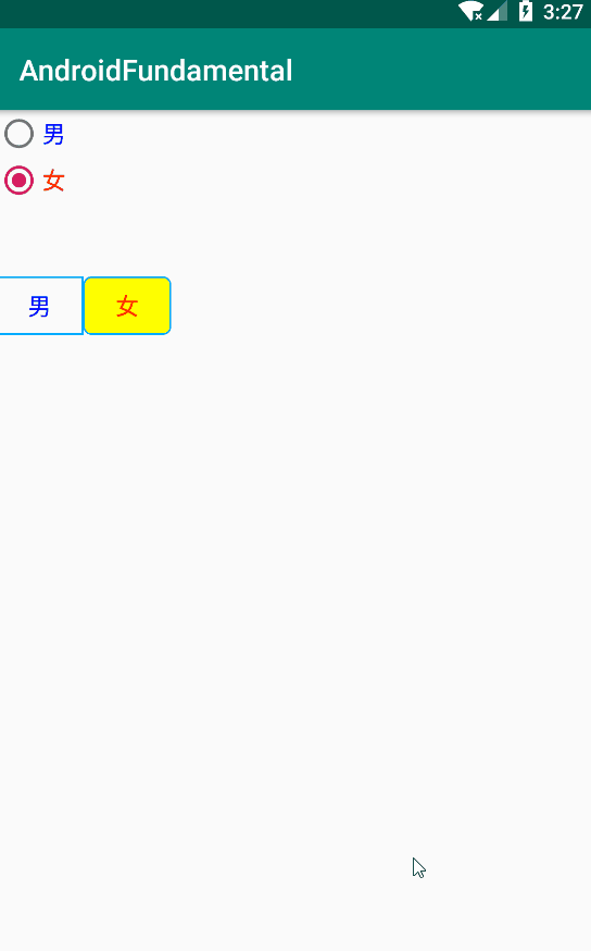
样式
        <ButtonGroup
        android:id="@+id/rg_2"
        android:layout_width="wrap_content"
        android:layout_height="wrap_content"
        android:orientation="horizontal"
        android:layout_below="@id/rg_1"
        android:layout_marginTop="50dp"
        >
        <RadioButton
            android:id="@+id/rb_3"
            android:layout_width="60dp"
            android:layout_height="40dp"
            android:text="男"
            android:textSize="16sp"
            android:textColor="#0000ff"
            android:checked="true"
            android:button="@null"
            android:background="@drawable/select_button_bg"
            android:gravity="center"
            />
        <RadioButton
            android:id="@+id/rb_4"
            android:layout_width="60dp"
            android:layout_height="40dp"
            android:text="女"
            android:gravity="center"
            android:textSize="16sp"
            android:textColor="#ff0000"
            android:button="@null"
            android:background="@drawable/select_button_bg"
            />
    RadioGroup>
这里对RadioButton使用Gravity属性使得内部文字居中显示
自定义了drawable资源文件,控制单选选择时的背景
@drawable/select_button_bg.xml
<selector xmlns:android="http://schemas.android.com/apk/res/android">
    <item android:state_checked="true">
        <shape>
            <stroke android:width="1dp" android:color="#00AAFF" />
            <solid android:color="#ffff00" />
            <corners android:radius="5dp" />
        shape>
    item>
    <item android:state_checked="false">
        <shape>
            <stroke android:width="1dp" android:color="#00AAFF" />
        shape>
    item>
selector>
事件
对于单选按钮的操作主要通过监听单选按钮组的选取实现,
在对应的Activity中编写方法,实现RadioButton的选中监听方法,java将会传入checkId作为传入单选按钮的id,可以根据此查找到对应的单选控件,然后再取出文本中的内容用Toast输出:
public class RadioButtonActivity extends AppCompatActivity {
	private RadioGroup mRg1;
	@Override
	protected void onCreate(Bundle savedInstanceState) {
		super.onCreate(savedInstanceState);
		setContentView(R.layout.activity_radio_button);
		mRg1 = findViewById(R.id.rg_2);
		mRg1.setOnCheckedChangeListener(new RadioGroup.OnCheckedChangeListener() {
			@Override
			public void onCheckedChanged(RadioGroup group, int checkedId) {
				//获得当前选中的id
				RadioButton radioButton = group.findViewById(checkedId);
				Toast.makeText(getApplicationContext(), radioButton.getText(), Toast.LENGTH_SHORT).show();
			}
		});
	}
}
实现效果:
CheckBox
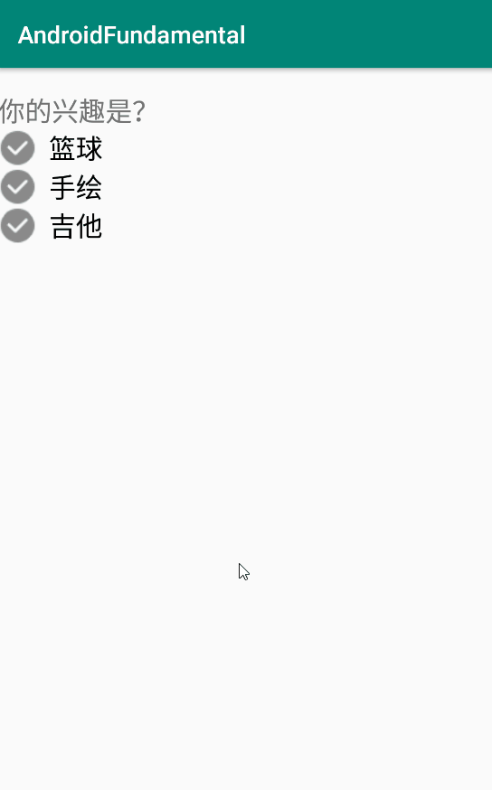
复选框允许使用者从一个集合中选取一个或者多个选项,推荐在垂直区域内放置这些选项
样式
要使用复选框,应该使用CheckBox标签,
 <LinearLayout
        android:layout_width="match_parent"
        android:layout_height="wrap_content"
        android:layout_marginTop="20dp"
        android:orientation="vertical">

        <TextView
            style="@style/FontMiddle"
            android:layout_width="wrap_content"
            android:layout_height="wrap_content"
            android:text="你的兴趣是?" />
        <CheckBox
            android:id="@+id/cb_5"
            style="@style/FontMiddle"
            android:layout_width="wrap_content"
            android:layout_height="wrap_content"
            android:layout_below="@id/tv_1_cb"
           android:button="@drawable/checkbox_bg1"
            android:paddingStart="10dp"
            android:text="篮球"
            />
        <CheckBox
            android:id="@+id/cb_6"
            style="@style/FontMiddle"
            android:layout_width="wrap_content"
            android:layout_height="wrap_content"
            android:layout_below="@id/tv_1_cb"
            android:button="@drawable/checkbox_bg1"
            android:paddingStart="10dp"
            android:text="手绘"
            />
        <CheckBox
            android:id="@+id/cb_7"
            style="@style/FontMiddle"
            android:layout_width="wrap_content"
            android:layout_height="wrap_content"
            android:layout_below="@id/tv_1_cb"
            android:button="@drawable/checkbox_bg1"
            android:paddingStart="10dp"
            android:text="吉他"
            />
    LinearLayout>

自定义了可绘制资源,名为checkbox_bg1,控制选中或者未被选中时背景图的区分:
<selector
xmlns:android="http://schemas.android.com/apk/res/android">    <item android:state_checked="false"
android:drawable="@drawable/icon_checkbox32">item>    <item android:state_checked="true"
android:drawable="@drawable/icon_checkbox32_checked">item>selector>
在这里使用Style自定义了样式,统一控制字体大小,参考
https://blog.csdn.net/oudetu/article/details/78568436
事件
设置XML文件CheckBox标签的OnClick属性并在内置的Activity类中实现对应的方法,或者与RadioButton类似,在绑定Activity中监听CheckBox控件的选中监听事件来实现控制选中行为。我们这里使用后一种方法实现:
如果按钮被选中,提示XX被选中,反之提示XX未被选中。
public class CheckBoxActivity extends AppCompatActivity {

	private CheckBox mCb5,mCb6, mCb7;
	@Override
	protected void onCreate(Bundle savedInstanceState) {
		super.onCreate(savedInstanceState);
		setContentView(R.layout.activity_check_box);
		mCb5 = findViewById(R.id.cb_5);
		mCb6 = findViewById(R.id.cb_6);
		mCb7 = findViewById(R.id.cb_7);

		mCb5.setOnCheckedChangeListener(new CompoundButton.OnCheckedChangeListener() {
			@Override
			public void onCheckedChanged(CompoundButton buttonView, boolean isChecked) {
				Toast.makeText(CheckBoxActivity.this, isChecked?"选中篮球":"未选中篮球", Toast.LENGTH_SHORT).show();
			}
		});

		mCb6.setOnCheckedChangeListener(new CompoundButton.OnCheckedChangeListener() {
			@Override
			public void onCheckedChanged(CompoundButton buttonView, boolean isChecked) {
				Toast.makeText(CheckBoxActivity.this, isChecked?"选中收回":"未选中手绘", Toast.LENGTH_SHORT).show();
			}
		});

		mCb7.setOnCheckedChangeListener(new CompoundButton.OnCheckedChangeListener() {
			@Override
			public void onCheckedChanged(CompoundButton buttonView, boolean isChecked) {
				Toast.makeText(CheckBoxActivity.this, isChecked?"选中吉他":"未选中吉他", Toast.LENGTH_SHORT).show();
			}
		});
	}
}
效果: