We use the standard convention for referencing the matplotlib API:
In [1]: import matplotlib.pyplot as plt
We provide the basics in pandas to easily create decent looking plots. See the ecosystem section for visualization libraries that go beyond the basics documented here.
Note
All calls to np.random are seeded with 123456.
Basic Plotting: plot
We will demonstrate the basics, see the cookbook for some advanced strategies.
The plot method on Series and DataFrame is just a simple wrapper around plt.plot():
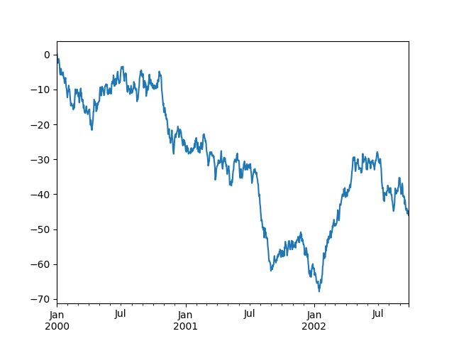
In [2]: ts = pd.Series(np.random.randn(1000), index=pd.date_range('1/1/2000', periods=1000))

In [3]: ts = ts.cumsum()

In [4]: ts.plot()
Out[4]:
If the index consists of dates, it calls gcf().autofmt_xdate() to try to format the x-axis nicely as per above.
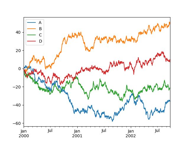
On DataFrame, plot() is a convenience to plot all of the columns with labels:
In [5]: df = pd.DataFrame(np.random.randn(1000, 4), index=ts.index, columns=list('ABCD'))

In [6]: df = df.cumsum()

In [7]: plt.figure(); df.plot();
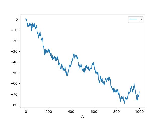
You can plot one column versus another using the x and y keywords in plot():
In [8]: df3 = pd.DataFrame(np.random.randn(1000, 2), columns=['B', 'C']).cumsum()

In [9]: df3['A'] = pd.Series(list(range(len(df))))

In [10]: df3.plot(x='A', y='B')
Out[10]:
Note
For more formatting and styling options, see formatting below.
Other Plots
Plotting methods allow for a handful of plot styles other than the default line plot. These methods can be provided as the kind keyword argument to plot(), and include:
‘bar’ or ‘barh’ for bar plots
‘hist’ for histogram
‘box’ for boxplot
‘kde’ or ‘density’ for density plots
‘area’ for area plots
‘scatter’ for scatter plots
‘hexbin’ for hexagonal bin plots
‘pie’ for pie plots
For example, a bar plot can be created the following way:
In [11]: plt.figure();

In [12]: df.iloc[5].plot(kind='bar');
You can also create these other plots using the methods DataFrame.plot. instead of providing the kind keyword argument. This makes it easier to discover plot methods and the specific arguments they use:
In [13]: df = pd.DataFrame()

In [14]: df.plot.
df.plot.area     df.plot.barh     df.plot.density  df.plot.hist     df.plot.line     df.plot.scatter
df.plot.bar      df.plot.box      df.plot.hexbin   df.plot.kde      df.plot.pie
In addition to these kind s, there are the DataFrame.hist(), and DataFrame.boxplot() methods, which use a separate interface.
Finally, there are several plotting functions in pandas.plotting that take a Series or DataFrame as an argument. These include:
Scatter Matrix
Andrews Curves
Parallel Coordinates
Lag Plot
Autocorrelation Plot
Bootstrap Plot
RadViz
Plots may also be adorned with errorbars or tables.
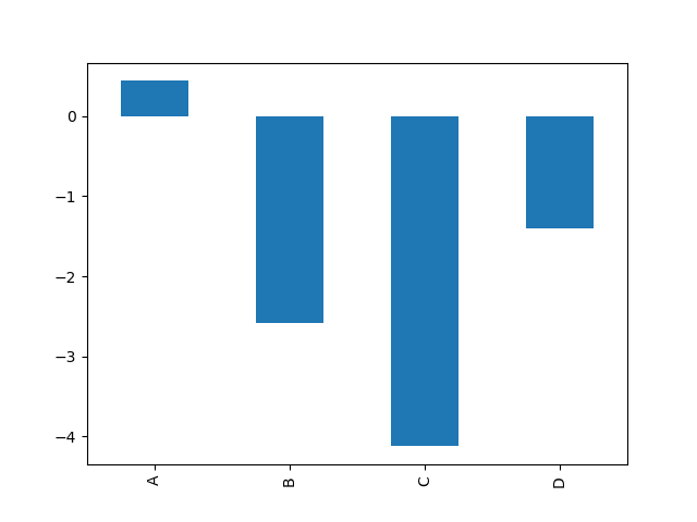
Bar plots
For labeled, non-time series data, you may wish to produce a bar plot:
In [15]: plt.figure();

In [16]: df.iloc[5].plot.bar(); plt.axhline(0, color='k')
Out[16]:
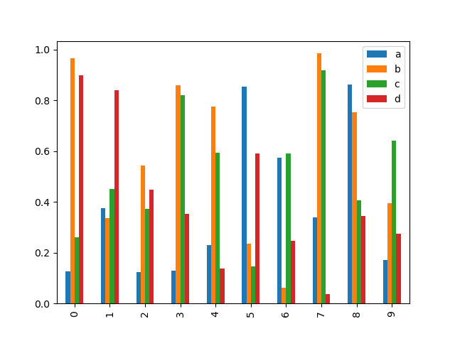
Calling a DataFrame’s plot.bar() method produces a multiple bar plot:
In [17]: df2 = pd.DataFrame(np.random.rand(10, 4), columns=['a', 'b', 'c', 'd'])

In [18]: df2.plot.bar();
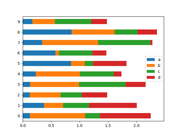
To produce a stacked bar plot, pass stacked=True:
In [19]: df2.plot.bar(stacked=True);
To get horizontal bar plots, use the barh method:
In [20]: df2.plot.barh(stacked=True);
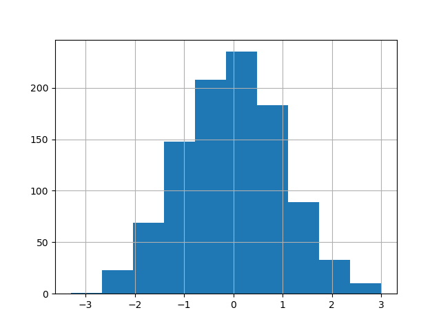
Histograms
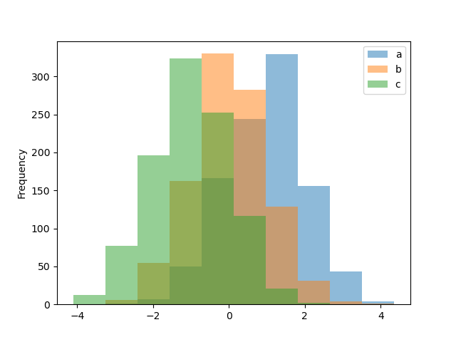
Histograms can be drawn by using the DataFrame.plot.hist() and Series.plot.hist() methods.
In [21]: df4 = pd.DataFrame({'a': np.random.randn(1000) + 1, 'b': np.random.randn(1000),
   ....:                     'c': np.random.randn(1000) - 1}, columns=['a', 'b', 'c'])
   ....:

In [22]: plt.figure();

In [23]: df4.plot.hist(alpha=0.5)
Out[23]:
A histogram can be stacked using stacked=True. Bin size can be changed using the bins keyword.
In [24]: plt.figure();

In [25]: df4.plot.hist(stacked=True, bins=20)
Out[25]:
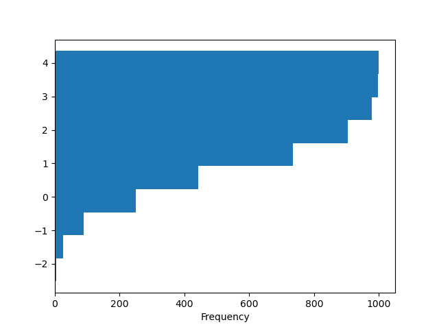
You can pass other keywords supported by matplotlib hist. For example, horizontal and cumulative histograms can be drawn by orientation='horizontal' and cumulative=True.
In [26]: plt.figure();

In [27]: df4['a'].plot.hist(orientation='horizontal', cumulative=True)
Out[27]:
See the hist method and the matplotlib hist documentation for more.
The existing interface DataFrame.hist to plot histogram still can be used.
In [28]: plt.figure();

In [29]: df['A'].diff().hist()
Out[29]:
DataFrame.hist() plots the histograms of the columns on multiple subplots:
In [30]: plt.figure()
Out[30]:

In [31]: df.diff().hist(color='k', alpha=0.5, bins=50)
Out[31]:
array([[,
        ],
       [,
        ]], dtype=object)
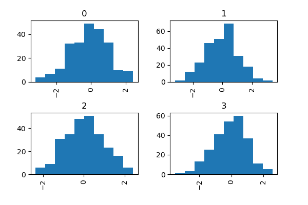
The by keyword can be specified to plot grouped histograms:
In [32]: data = pd.Series(np.random.randn(1000))

In [33]: data.hist(by=np.random.randint(0, 4, 1000), figsize=(6, 4))
Out[33]:
array([[,
        ],
       [,
        ]], dtype=object)
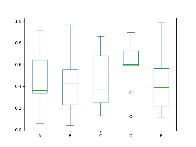
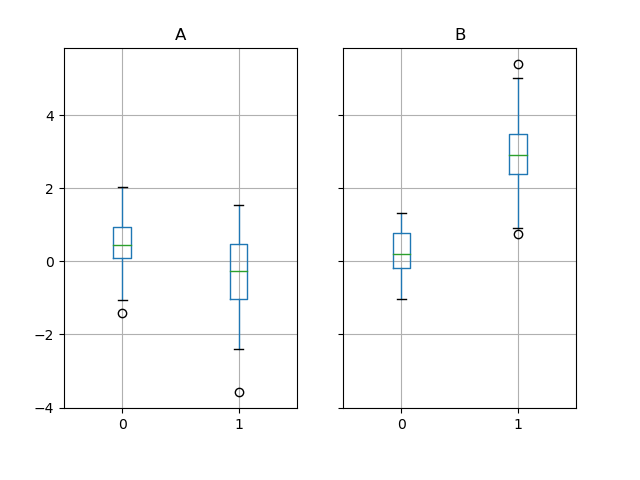
Box Plots
Boxplot can be drawn calling Series.plot.box() and DataFrame.plot.box(), or DataFrame.boxplot() to visualize the distribution of values within each column.
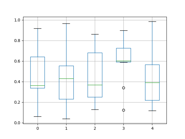
For instance, here is a boxplot representing five trials of 10 observations of a uniform random variable on [0,1).
In [34]: df = pd.DataFrame(np.random.rand(10, 5), columns=['A', 'B', 'C', 'D', 'E'])

In [35]: df.plot.box()
Out[35]:
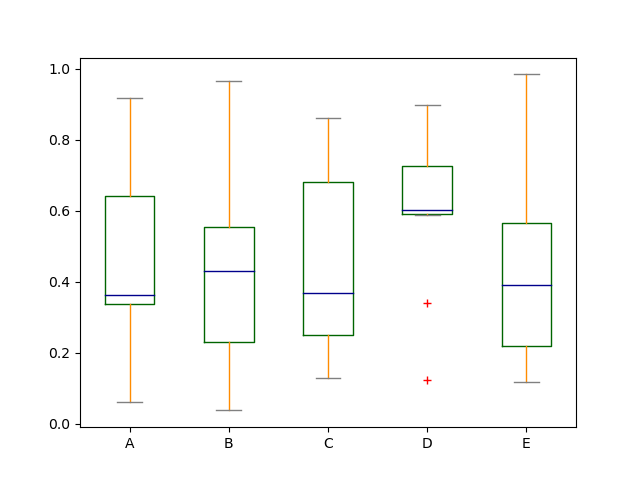
Boxplot can be colorized by passing color keyword. You can pass a dict whose keys are boxes, whiskers, medians and caps. If some keys are missing in the dict, default colors are used for the corresponding artists. Also, boxplot has symkeyword to specify fliers style.
When you pass other type of arguments via color keyword, it will be directly passed to matplotlib for all the boxes, whiskers, medians and caps colorization.
The colors are applied to every boxes to be drawn. If you want more complicated colorization, you can get each drawn artists by passing return_type.
In [36]: color = dict(boxes='DarkGreen', whiskers='DarkOrange',
   ....:              medians='DarkBlue', caps='Gray')
   ....:

In [37]: df.plot.box(color=color, sym='r+')
Out[37]:
Also, you can pass other keywords supported by matplotlib boxplot. For example, horizontal and custom-positioned boxplot can be drawn by vert=False and positions keywords.
In [38]: df.plot.box(vert=False, positions=[1, 4, 5, 6, 8])
Out[38]:
See the boxplot method and the matplotlib boxplot documentation for more.
The existing interface DataFrame.boxplot to plot boxplot still can be used.
In [39]: df = pd.DataFrame(np.random.rand(10,5))

In [40]: plt.figure();

In [41]: bp = df.boxplot()
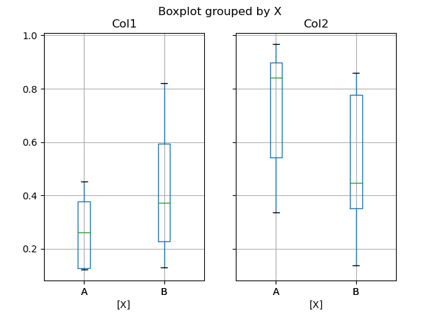
You can create a stratified boxplot using the by keyword argument to create groupings. For instance,
In [42]: df = pd.DataFrame(np.random.rand(10,2), columns=['Col1', 'Col2'] )

In [43]: df['X'] = pd.Series(['A','A','A','A','A','B','B','B','B','B'])

In [44]: plt.figure();

In [45]: bp = df.boxplot(by='X')
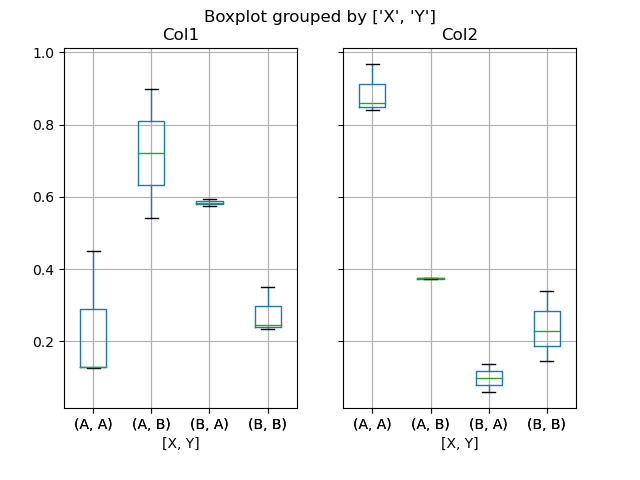
You can also pass a subset of columns to plot, as well as group by multiple columns:
In [46]: df = pd.DataFrame(np.random.rand(10,3), columns=['Col1', 'Col2', 'Col3'])

In [47]: df['X'] = pd.Series(['A','A','A','A','A','B','B','B','B','B'])

In [48]: df['Y'] = pd.Series(['A','B','A','B','A','B','A','B','A','B'])

In [49]: plt.figure();

In [50]: bp = df.boxplot(column=['Col1','Col2'], by=['X','Y'])
Warning
The default changed from 'dict' to 'axes' in version 0.19.0.
In boxplot, the return type can be controlled by the return_type, keyword. The valid choices are {"axes", "dict", "both",None}. Faceting, created by DataFrame.boxplot with the by keyword, will affect the output type as well:
return_type=
Faceted
Output type
None
No
axes
None
Yes
2-D ndarray of axes
'axes'
No
axes
'axes'
Yes
Series of axes
'dict'
No
dict of artists
'dict'
Yes
Series of dicts of artists
'both'
No
namedtuple
'both'
Yes
Series of namedtuples
Groupby.boxplot always returns a Series of return_type.
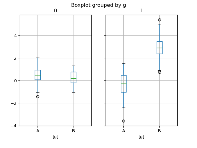
In [51]: np.random.seed(1234)

In [52]: df_box = pd.DataFrame(np.random.randn(50, 2))

In [53]: df_box['g'] = np.random.choice(['A', 'B'], size=50)

In [54]: df_box.loc[df_box['g'] == 'B', 1] += 3

In [55]: bp = df_box.boxplot(by='g')
The subplots above are split by the numeric columns first, then the value of the g column. Below the subplots are first split by the value of g, then by the numeric columns.
In [56]: bp = df_box.groupby('g').boxplot()
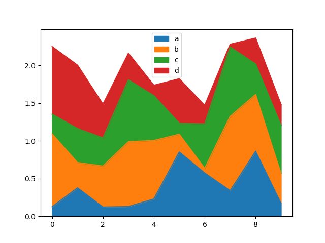
Area Plot
You can create area plots with Series.plot.area() and DataFrame.plot.area(). Area plots are stacked by default. To produce stacked area plot, each column must be either all positive or all negative values.
When input data contains NaN, it will be automatically filled by 0. If you want to drop or fill by different values, use dataframe.dropna() or dataframe.fillna() before calling plot.
In [57]: df = pd.DataFrame(np.random.rand(10, 4), columns=['a', 'b', 'c', 'd'])

In [58]: df.plot.area();
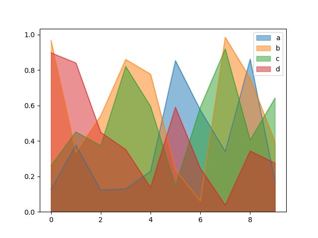
To produce an unstacked plot, pass stacked=False. Alpha value is set to 0.5 unless otherwise specified:
In [59]: df.plot.area(stacked=False);
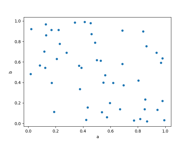
Scatter Plot
Scatter plot can be drawn by using the DataFrame.plot.scatter() method. Scatter plot requires numeric columns for the x and y axes. These can be specified by the x and y keywords.
In [60]: df = pd.DataFrame(np.random.rand(50, 4), columns=['a', 'b', 'c', 'd'])

In [61]: df.plot.scatter(x='a', y='b');
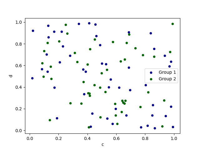
To plot multiple column groups in a single axes, repeat plot method specifying target ax. It is recommended to specify color and label keywords to distinguish each groups.
In [62]: ax = df.plot.scatter(x='a', y='b', color='DarkBlue', label='Group 1');

In [63]: df.plot.scatter(x='c', y='d', color='DarkGreen', label='Group 2', ax=ax);
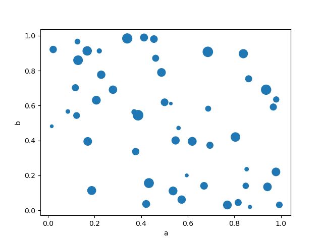
The keyword c may be given as the name of a column to provide colors for each point:
In [64]: df.plot.scatter(x='a', y='b', c='c', s=50);
You can pass other keywords supported by matplotlib scatter. The example below shows a bubble chart using a column of the DataFrame as the bubble size.
In [65]: df.plot.scatter(x='a', y='b', s=df['c']*200);
See the scatter method and the matplotlib scatter documentation for more.
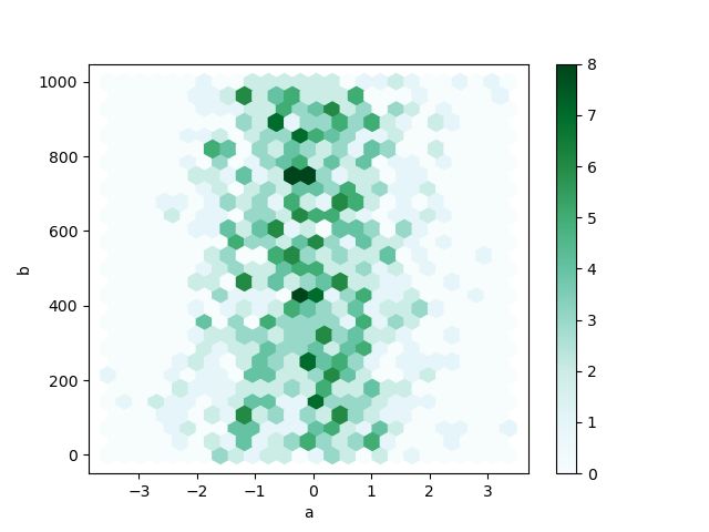
Hexagonal Bin Plot
You can create hexagonal bin plots with DataFrame.plot.hexbin(). Hexbin plots can be a useful alternative to scatter plots if your data are too dense to plot each point individually.
In [66]: df = pd.DataFrame(np.random.randn(1000, 2), columns=['a', 'b'])

In [67]: df['b'] = df['b'] + np.arange(1000)

In [68]: df.plot.hexbin(x='a', y='b', gridsize=25)
Out[68]:
A useful keyword argument is gridsize; it controls the number of hexagons in the x-direction, and defaults to 100. A larger gridsize means more, smaller bins.
By default, a histogram of the counts around each (x, y) point is computed. You can specify alternative aggregations by passing values to the C and reduce_C_function arguments. C specifies the value at each (x, y) point and reduce_C_function is a function of one argument that reduces all the values in a bin to a single number (e.g. mean, max, sum, std). In this example the positions are given by columns a and b, while the value is given by column z. The bins are aggregated with NumPy’s max function.
In [69]: df = pd.DataFrame(np.random.randn(1000, 2), columns=['a', 'b'])

In [70]: df['b'] = df['b'] = df['b'] + np.arange(1000)

In [71]: df['z'] = np.random.uniform(0, 3, 1000)

In [72]: df.plot.hexbin(x='a', y='b', C='z', reduce_C_function=np.max,
   ....:         gridsize=25)
   ....:
Out[72]:
See the hexbin method and the matplotlib hexbin documentation for more.
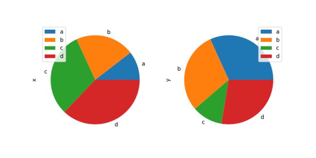
Pie plot
You can create a pie plot with DataFrame.plot.pie() or Series.plot.pie(). If your data includes any NaN, they will be automatically filled with 0. A ValueError will be raised if there are any negative values in your data.
In [73]: series = pd.Series(3 * np.random.rand(4), index=['a', 'b', 'c', 'd'], name='series')

In [74]: series.plot.pie(figsize=(6, 6))
Out[74]:
For pie plots it’s best to use square figures, i.e. a figure aspect ratio 1. You can create the figure with equal width and height, or force the aspect ratio to be equal after plotting by calling ax.set_aspect('equal') on the returned axes object.
Note that pie plot with DataFrame requires that you either specify a target column by the y argument or subplots=True. When y is specified, pie plot of selected column will be drawn. If subplots=True is specified, pie plots for each column are drawn as subplots. A legend will be drawn in each pie plots by default; specify legend=False to hide it.
You can use the labels and colors keywords to specify the labels and colors of each wedge.
Warning
Most pandas plots use the label and color arguments (note the lack of “s” on those). To be consistent with matplotlib.pyplot.pie() you must use labels and colors.
If you want to hide wedge labels, specify labels=None. If fontsize is specified, the value will be applied to wedge labels. Also, other keywords supported by matplotlib.pyplot.pie() can be used.
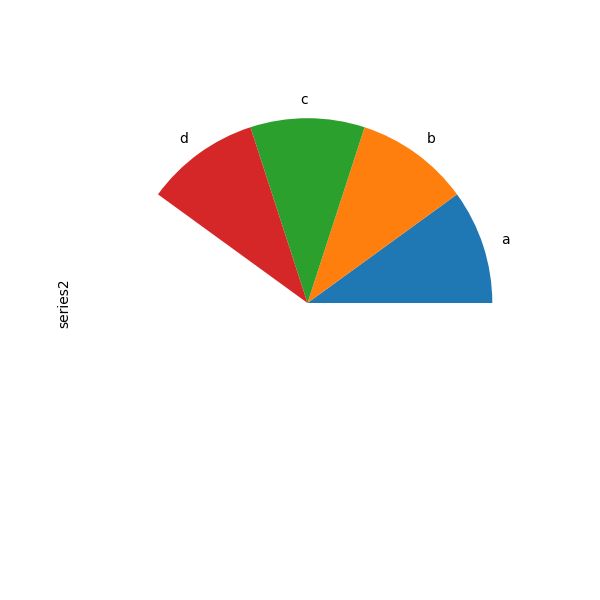
If you pass values whose sum total is less than 1.0, matplotlib draws a semicircle.
In [78]: series = pd.Series([0.1] * 4, index=['a', 'b', 'c', 'd'], name='series2')

In [79]: series.plot.pie(figsize=(6, 6))
Out[79]:
See the matplotlib pie documentation for more.
Plotting with Missing Data
Pandas tries to be pragmatic about plotting DataFrames or Series that contain missing data. Missing values are dropped, left out, or filled depending on the plot type.
Plot Type
NaN Handling
Line
Leave gaps at NaNs
Line (stacked)
Fill 0’s
Bar
Fill 0’s
Scatter
Drop NaNs
Histogram
Drop NaNs (column-wise)
Box
Drop NaNs (column-wise)
Area
Fill 0’s
KDE
Drop NaNs (column-wise)
Hexbin
Drop NaNs
Pie
Fill 0’s
If any of these defaults are not what you want, or if you want to be explicit about how missing values are handled, consider using fillna() or dropna() before plotting.
Plotting Tools
These functions can be imported from pandas.plotting and take a Series or DataFrame as an argument.
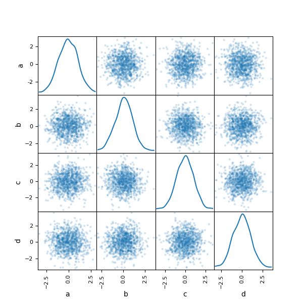
Scatter Matrix Plot
You can create a scatter plot matrix using the scatter_matrix method in pandas.plotting:
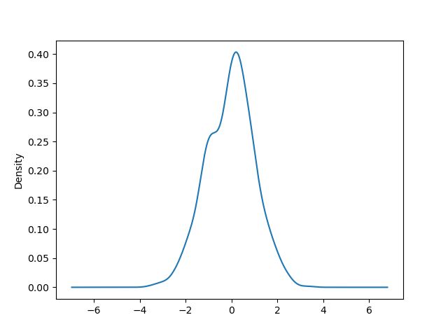
You can create density plots using the Series.plot.kde() and DataFrame.plot.kde() methods.
In [83]: ser = pd.Series(np.random.randn(1000))

In [84]: ser.plot.kde()
Out[84]:
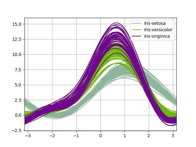
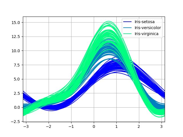
Andrews Curves
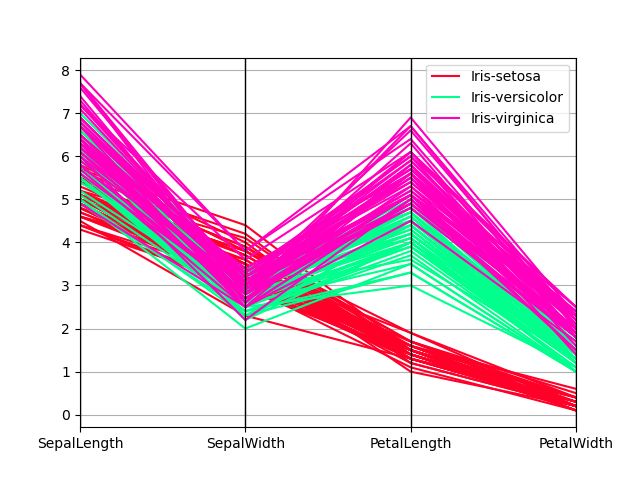
Andrews curves allow one to plot multivariate data as a large number of curves that are created using the attributes of samples as coefficients for Fourier series, see the Wikipedia entry for more information. By coloring these curves differently for each class it is possible to visualize data clustering. Curves belonging to samples of the same class will usually be closer together and form larger structures.
Note: The “Iris” dataset is available here.
In [85]: from pandas.plotting import andrews_curves

In [86]: data = pd.read_csv('data/iris.data')

In [87]: plt.figure()
Out[87]:

In [88]: andrews_curves(data, 'Name')
Out[88]:
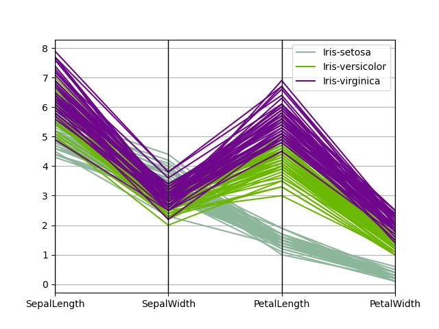
Parallel Coordinates
Parallel coordinates is a plotting technique for plotting multivariate data, see the Wikipedia entry for an introduction. Parallel coordinates allows one to see clusters in data and to estimate other statistics visually. Using parallel coordinates points are represented as connected line segments. Each vertical line represents one attribute. One set of connected line segments represents one data point. Points that tend to cluster will appear closer together.
In [89]: from pandas.plotting import parallel_coordinates

In [90]: data = pd.read_csv('data/iris.data')

In [91]: plt.figure()
Out[91]:

In [92]: parallel_coordinates(data, 'Name')
Out[92]:
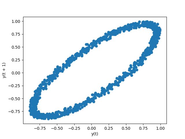
Lag Plot
Lag plots are used to check if a data set or time series is random. Random data should not exhibit any structure in the lag plot. Non-random structure implies that the underlying data are not random. The lag argument may be passed, and when lag=1 the plot is essentially data[:-1] vs. data[1:].
In [93]: from pandas.plotting import lag_plot

In [94]: plt.figure()
Out[94]:

In [95]: data = pd.Series(0.1 * np.random.rand(1000) +
   ....:     0.9 * np.sin(np.linspace(-99 * np.pi, 99 * np.pi, num=1000)))
   ....:

In [96]: lag_plot(data)
Out[96]:
Autocorrelation Plot
Autocorrelation plots are often used for checking randomness in time series. This is done by computing autocorrelations for data values at varying time lags. If time series is random, such autocorrelations should be near zero for any and all time-lag separations. If time series is non-random then one or more of the autocorrelations will be significantly non-zero. The horizontal lines displayed in the plot correspond to 95% and 99% confidence bands. The dashed line is 99% confidence band. See the Wikipedia entry for more about autocorrelation plots.
In [97]: from pandas.plotting import autocorrelation_plot

In [98]: plt.figure()
Out[98]:

In [99]: data = pd.Series(0.7 * np.random.rand(1000) +
   ....:    0.3 * np.sin(np.linspace(-9 * np.pi, 9 * np.pi, num=1000)))
   ....:

In [100]: autocorrelation_plot(data)
Out[100]:
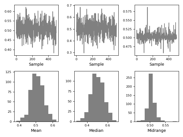
Bootstrap Plot
Bootstrap plots are used to visually assess the uncertainty of a statistic, such as mean, median, midrange, etc. A random subset of a specified size is selected from a data set, the statistic in question is computed for this subset and the process is repeated a specified number of times. Resulting plots and histograms are what constitutes the bootstrap plot.
In [101]: from pandas.plotting import bootstrap_plot

In [102]: data = pd.Series(np.random.rand(1000))

In [103]: bootstrap_plot(data, size=50, samples=500, color='grey')
Out[103]:
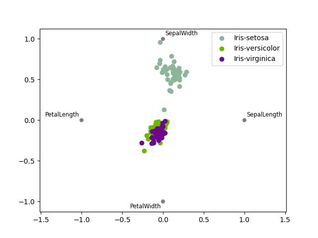
RadViz
RadViz is a way of visualizing multi-variate data. It is based on a simple spring tension minimization algorithm. Basically you set up a bunch of points in a plane. In our case they are equally spaced on a unit circle. Each point represents a single attribute. You then pretend that each sample in the data set is attached to each of these points by a spring, the stiffness of which is proportional to the numerical value of that attribute (they are normalized to unit interval). The point in the plane, where our sample settles to (where the forces acting on our sample are at an equilibrium) is where a dot representing our sample will be drawn. Depending on which class that sample belongs it will be colored differently. See the R package Radviz for more information.
Note: The “Iris” dataset is available here.
In [104]: from pandas.plotting import radviz

In [105]: data = pd.read_csv('data/iris.data')

In [106]: plt.figure()
Out[106]:

In [107]: radviz(data, 'Name')
Out[107]:
Plot Formatting
Setting the plot style
From version 1.5 and up, matplotlib offers a range of preconfigured plotting styles. Setting the style can be used to easily give plots the general look that you want. Setting the style is as easy as calling matplotlib.style.use(my_plot_style) before creating your plot. For example you could write matplotlib.style.use('ggplot')for ggplot-style plots.
You can see the various available style names at matplotlib.style.available and it’s very easy to try them out.
General plot style arguments
Most plotting methods have a set of keyword arguments that control the layout and formatting of the returned plot:
In [108]: plt.figure(); ts.plot(style='k--', label='Series');
For each kind of plot (e.g. line, bar, scatter) any additional arguments keywords are passed along to the corresponding matplotlib function (ax.plot(), ax.bar(), ax.scatter()). These can be used to control additional styling, beyond what pandas provides.
Controlling the Legend
You may set the legend argument to False to hide the legend, which is shown by default.
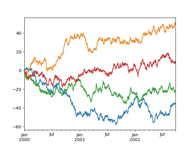
In [109]: df = pd.DataFrame(np.random.randn(1000, 4), index=ts.index, columns=list('ABCD'))

In [110]: df = df.cumsum()

In [111]: df.plot(legend=False)
Out[111]:
Scales
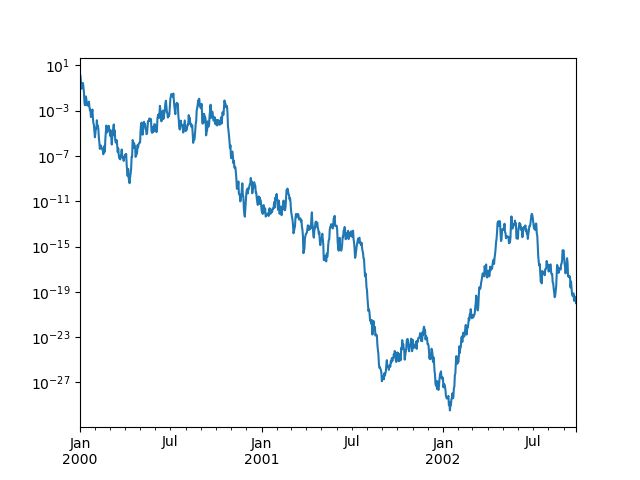
You may pass logy to get a log-scale Y axis.
In [112]: ts = pd.Series(np.random.randn(1000), index=pd.date_range('1/1/2000', periods=1000))

In [113]: ts = np.exp(ts.cumsum())

In [114]: ts.plot(logy=True)
Out[114]:
See also the logx and loglog keyword arguments.
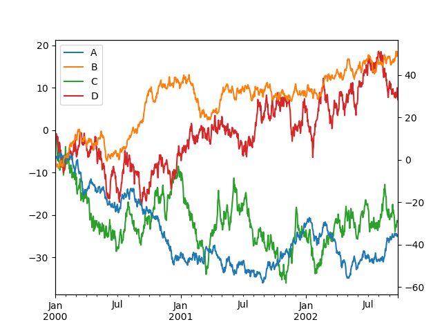
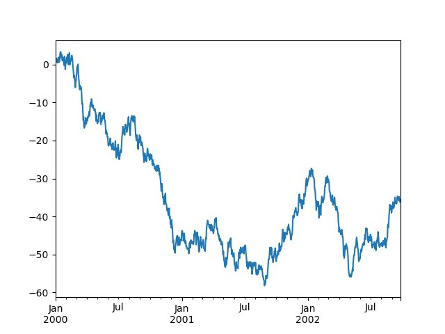
Plotting on a Secondary Y-axis
To plot data on a secondary y-axis, use the secondary_y keyword:
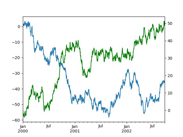
In [115]: df.A.plot()
Out[115]:

In [116]: df.B.plot(secondary_y=True, style='g')
Out[116]:
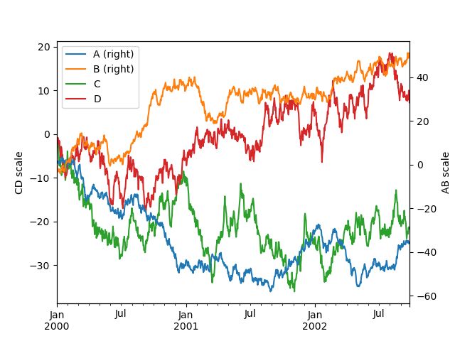
To plot some columns in a DataFrame, give the column names to the secondary_y keyword:
In [117]: plt.figure()
Out[117]:

In [118]: ax = df.plot(secondary_y=['A', 'B'])

In [119]: ax.set_ylabel('CD scale')
Out[119]: Text(0,0.5,'CD scale')

In [120]: ax.right_ax.set_ylabel('AB scale')
Out[120]: Text(0,0.5,'AB scale')
Note that the columns plotted on the secondary y-axis is automatically marked with “(right)” in the legend. To turn off the automatic marking, use the mark_right=False keyword:
In [121]: plt.figure()
Out[121]:

In [122]: df.plot(secondary_y=['A', 'B'], mark_right=False)
Out[122]:
Suppressing Tick Resolution Adjustment
pandas includes automatic tick resolution adjustment for regular frequency time-series data. For limited cases where pandas cannot infer the frequency information (e.g., in an externally created twinx), you can choose to suppress this behavior for alignment purposes.
Here is the default behavior, notice how the x-axis tick labeling is performed:
In [123]: plt.figure()
Out[123]:

In [124]: df.A.plot()
Out[124]:
Using the x_compat parameter, you can suppress this behavior:
In [125]: plt.figure()
Out[125]:

In [126]: df.A.plot(x_compat=True)
Out[126]:
If you have more than one plot that needs to be suppressed, the use method in pandas.plotting.plot_params can be used in a with statement:
In [127]: plt.figure()
Out[127]:

In [128]: with pd.plotting.plot_params.use('x_compat', True):
   .....:     df.A.plot(color='r')
   .....:     df.B.plot(color='g')
   .....:     df.C.plot(color='b')
   .....:
Automatic Date Tick Adjustment
New in version 0.20.0.
TimedeltaIndex now uses the native matplotlib tick locator methods, it is useful to call the automatic date tick adjustment from matplotlib for figures whose ticklabels overlap.
See the autofmt_xdate method and the matplotlib documentation for more.
Subplots
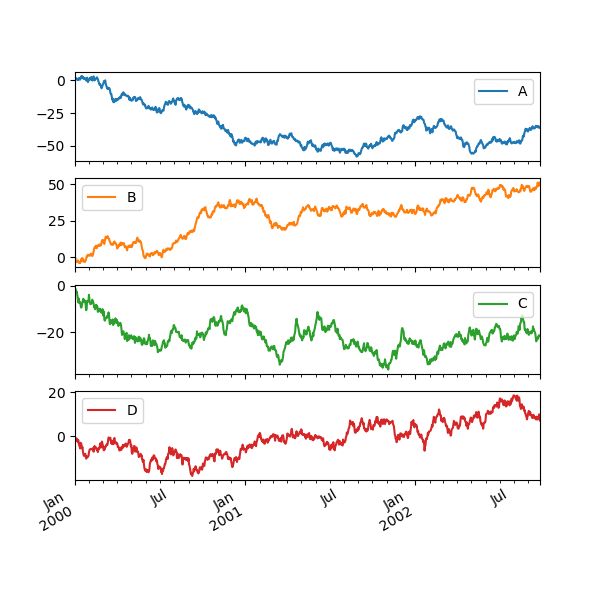
Each Series in a DataFrame can be plotted on a different axis with the subplots keyword:
In [129]: df.plot(subplots=True, figsize=(6, 6));
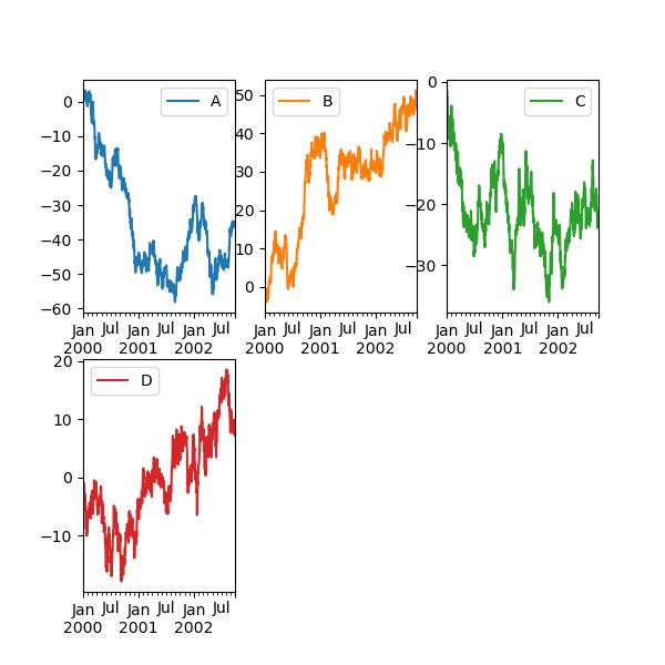
Using Layout and Targeting Multiple Axes
The layout of subplots can be specified by the layout keyword. It can accept (rows, columns). The layout keyword can be used in hist and boxplot also. If the input is invalid, a ValueError will be raised.
The number of axes which can be contained by rows x columns specified by layout must be larger than the number of required subplots. If layout can contain more axes than required, blank axes are not drawn. Similar to a NumPy array’s reshape method, you can use -1 for one dimension to automatically calculate the number of rows or columns needed, given the other.
In [130]: df.plot(subplots=True, layout=(2, 3), figsize=(6, 6), sharex=False);
The above example is identical to using:
In [131]: df.plot(subplots=True, layout=(2, -1), figsize=(6, 6), sharex=False);
The required number of columns (3) is inferred from the number of series to plot and the given number of rows (2).
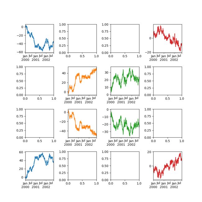
You can pass multiple axes created beforehand as list-like via ax keyword. This allows more complicated layouts. The passed axes must be the same number as the subplots being drawn.
When multiple axes are passed via the ax keyword, layout, sharex and sharey keywords don’t affect to the output. You should explicitly pass sharex=False and sharey=False, otherwise you will see a warning.
In [132]: fig, axes = plt.subplots(4, 4, figsize=(6, 6));

In [133]: plt.subplots_adjust(wspace=0.5, hspace=0.5);

In [134]: target1 = [axes[0][0], axes[1][1], axes[2][2], axes[3][3]]

In [135]: target2 = [axes[3][0], axes[2][1], axes[1][2], axes[0][3]]

In [136]: df.plot(subplots=True, ax=target1, legend=False, sharex=False, sharey=False);

In [137]: (-df).plot(subplots=True, ax=target2, legend=False, sharex=False, sharey=False);
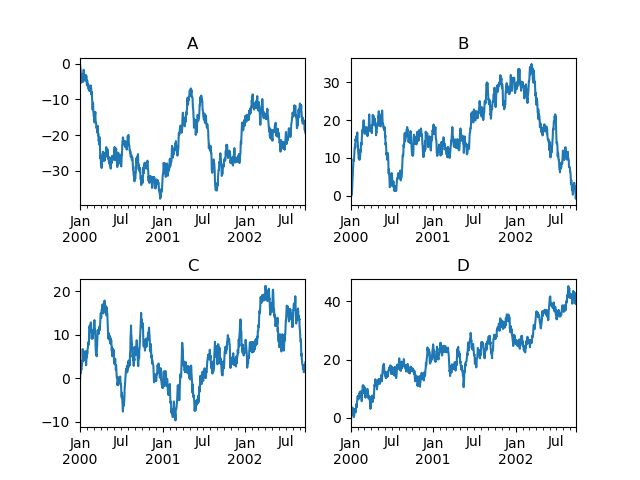
Another option is passing an ax argument to Series.plot() to plot on a particular axis:
In [138]: fig, axes = plt.subplots(nrows=2, ncols=2)

In [139]: df['A'].plot(ax=axes[0,0]); axes[0,0].set_title('A');

In [140]: df['B'].plot(ax=axes[0,1]); axes[0,1].set_title('B');

In [141]: df['C'].plot(ax=axes[1,0]); axes[1,0].set_title('C');

In [142]: df['D'].plot(ax=axes[1,1]); axes[1,1].set_title('D');
Plotting With Error Bars
Plotting with error bars is supported in DataFrame.plot() and Series.plot().
Horizontal and vertical error bars can be supplied to the xerr and yerr keyword arguments to plot(). The error values can be specified using a variety of formats:
As a DataFrame or dict of errors with column names matching the columns attribute of the plotting DataFrame or matching the name attribute of the Series.
As a str indicating which of the columns of plotting DataFrame contain the error values.
As raw values (list, tuple, or np.ndarray). Must be the same length as the plotting DataFrame/Series.
Asymmetrical error bars are also supported, however raw error values must be provided in this case. For a M length Series, a Mx2 array should be provided indicating lower and upper (or left and right) errors. For a MxNDataFrame, asymmetrical errors should be in a Mx2xN array.
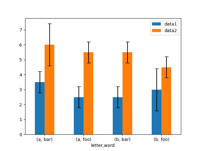
Here is an example of one way to easily plot group means with standard deviations from the raw data.
# Generate the data
In [143]: ix3 = pd.MultiIndex.from_arrays([['a', 'a', 'a', 'a', 'b', 'b', 'b', 'b'], ['foo', 'foo', 'bar', 'bar', 'foo', 'foo', 'bar', 'bar']], names=['letter', 'word'])

In [144]: df3 = pd.DataFrame({'data1': [3, 2, 4, 3, 2, 4, 3, 2], 'data2': [6, 5, 7, 5, 4, 5, 6, 5]}, index=ix3)

# Group by index labels and take the means and standard deviations for each group
In [145]: gp3 = df3.groupby(level=('letter', 'word'))

In [146]: means = gp3.mean()

In [147]: errors = gp3.std()

In [148]: means
Out[148]:
             data1  data2
letter word
a      bar     3.5    6.0
       foo     2.5    5.5
b      bar     2.5    5.5
       foo     3.0    4.5

In [149]: errors
Out[149]:
                data1     data2
letter word
a      bar   0.707107  1.414214
       foo   0.707107  0.707107
b      bar   0.707107  0.707107
       foo   1.414214  0.707107

# Plot
In [150]: fig, ax = plt.subplots()

In [151]: means.plot.bar(yerr=errors, ax=ax)
Out[151]:
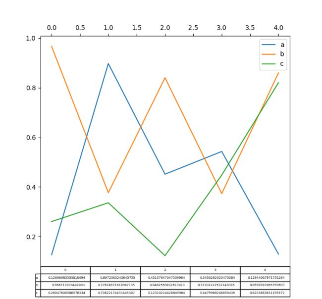
Plotting Tables
Plotting with matplotlib table is now supported in DataFrame.plot() and Series.plot() with a table keyword. The tablekeyword can accept bool, DataFrame or Series. The simple way to draw a table is to specify table=True. Data will be transposed to meet matplotlib’s default layout.
In [152]: fig, ax = plt.subplots(1, 1)

In [153]: df = pd.DataFrame(np.random.rand(5, 3), columns=['a', 'b', 'c'])

In [154]: ax.get_xaxis().set_visible(False)   # Hide Ticks

In [155]: df.plot(table=True, ax=ax)
Out[155]:
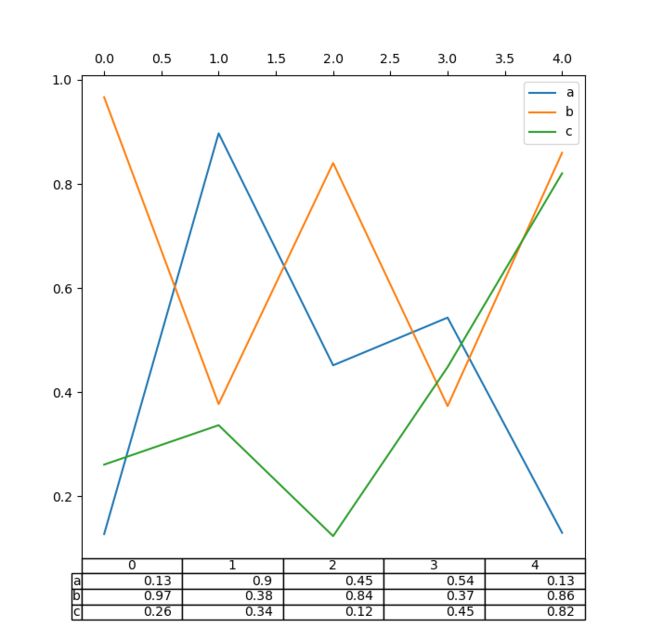
Also, you can pass a different DataFrame or Series to the table keyword. The data will be drawn as displayed in print method (not transposed automatically). If required, it should be transposed manually as seen in the example below.
In [156]: fig, ax = plt.subplots(1, 1)

In [157]: ax.get_xaxis().set_visible(False)   # Hide Ticks

In [158]: df.plot(table=np.round(df.T, 2), ax=ax)
Out[158]:
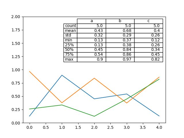
There also exists a helper function pandas.plotting.table, which creates a table from DataFrame or Series, and adds it to an matplotlib.Axes instance. This function can accept keywords which the matplotlib table has.
In [159]: from pandas.plotting import table

In [160]: fig, ax = plt.subplots(1, 1)

In [161]: table(ax, np.round(df.describe(), 2),
   .....:       loc='upper right', colWidths=[0.2, 0.2, 0.2])
   .....:
Out[161]:

In [162]: df.plot(ax=ax, ylim=(0, 2), legend=None)
Out[162]:
Note: You can get table instances on the axes using axes.tables property for further decorations. See the matplotlib table documentation for more.
Colormaps
A potential issue when plotting a large number of columns is that it can be difficult to distinguish some series due to repetition in the default colors. To remedy this, DataFrame plotting supports the use of the colormap argument, which accepts either a Matplotlib colormap or a string that is a name of a colormap registered with Matplotlib. A visualization of the default matplotlib colormaps is available here.
As matplotlib does not directly support colormaps for line-based plots, the colors are selected based on an even spacing determined by the number of columns in the DataFrame. There is no consideration made for background color, so some colormaps will produce lines that are not easily visible.
To use the cubehelix colormap, we can pass colormap='cubehelix'.
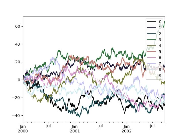
In [163]: df = pd.DataFrame(np.random.randn(1000, 10), index=ts.index)

In [164]: df = df.cumsum()

In [165]: plt.figure()
Out[165]:

In [166]: df.plot(colormap='cubehelix')
Out[166]:
Alternatively, we can pass the colormap itself:
In [167]: from matplotlib import cm

In [168]: plt.figure()
Out[168]:

In [169]: df.plot(colormap=cm.cubehelix)
Out[169]:
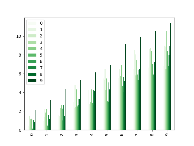
Colormaps can also be used other plot types, like bar charts:
In [170]: dd = pd.DataFrame(np.random.randn(10, 10)).applymap(abs)

In [171]: dd = dd.cumsum()

In [172]: plt.figure()
Out[172]:

In [173]: dd.plot.bar(colormap='Greens')
Out[173]:
Parallel coordinates charts:
In [174]: plt.figure()
Out[174]:

In [175]: parallel_coordinates(data, 'Name', colormap='gist_rainbow')
Out[175]:
Andrews curves charts:
In [176]: plt.figure()
Out[176]:

In [177]: andrews_curves(data, 'Name', colormap='winter')
Out[177]:
Plotting directly with matplotlib
In some situations it may still be preferable or necessary to prepare plots directly with matplotlib, for instance when a certain type of plot or customization is not (yet) supported by pandas. Series and DataFrame objects behave like arrays and can therefore be passed directly to matplotlib functions without explicit casts.
pandas also automatically registers formatters and locators that recognize date indices, thereby extending date and time support to practically all plot types available in matplotlib. Although this formatting does not provide the same level of refinement you would get when plotting via pandas, it can be faster when plotting a large number of points.
In [178]: price = pd.Series(np.random.randn(150).cumsum(),
   .....:                   index=pd.date_range('2000-1-1', periods=150, freq='B'))
   .....:

In [179]: ma = price.rolling(20).mean()

In [180]: mstd = price.rolling(20).std()

In [181]: plt.figure()
Out[181]:

In [182]: plt.plot(price.index, price, 'k')
Out[182]: []

In [183]: plt.plot(ma.index, ma, 'b')
Out[183]: []

In [184]: plt.fill_between(mstd.index, ma-2*mstd, ma+2*mstd, color='b', alpha=0.2)
Out[184]:
Trellis plotting interface
Warning
The rplot trellis plotting interface has been removed. Please use external packages like seaborn for similar but more refined functionality and refer to our 0.18.1 documentation here for how to convert to using it.
参考:http://blog.csdn.net/qingfeilee/article/details/7052736
org.hibernate.NonUniqueResultException: query did not return a unique result: 2
在项目中出现了org.hiber
由Oracle通信技术部门主导的演示项目并没有在本月较早前法国南斯举行的行业集团TM论坛大会中获得嘉奖。但是,Oracle通信官员解雇致力于打造一个支持零干预分配和编制功能的网络即服务(NaaS)平台,帮助企业以更灵活和更适合云的方式实现通信服务提供商(CSP)的连接产品。这个Oracle主导的项目属于TM Forum Live!活动上展示的Catalyst计划的19个项目之一。Catalyst计
Spring MVC提供了非常方便的文件上传功能。
1,配置Spring支持文件上传:
DispatcherServlet本身并不知道如何处理multipart的表单数据,需要一个multipart解析器把POST请求的multipart数据中抽取出来,这样DispatcherServlet就能将其传递给我们的控制器了。为了在Spring中注册multipart解析器,需要声明一个实现了Mul
the CollabNet user information center http://help.collab.net/
How do I create a new Wiki page?
A CollabNet TeamForge project can have any number of Wiki pages. All Wiki pages are linked, and
package beautyOfCoding;
import java.util.Arrays;
import java.util.Random;
public class MaxSubArraySum2 {
/**
* 编程之美 子数组之和的最大值(二维)
*/
private static final int ROW = 5;
private stat
示例程序,swap_1和swap_2都是错误的,推理从1开始推到2,2没完成,推到3就完成了
# include <stdio.h>
void swap_1(int, int);
void swap_2(int *, int *);
void swap_3(int *, int *);
int main(void)
{
int a = 3;
int b =
同步工具类包括信号量(Semaphore)、栅栏(barrier)、闭锁(CountDownLatch)
闭锁(CountDownLatch)
public class RunMain {
public long timeTasks(int nThreads, final Runnable task) throws InterruptedException {
fin
不止一次,看到很多讲技术的文章里面出现过这个词语。今天终于弄懂了——通过朋友给的浏览软件,上了wiki。
我再一次感到,没有辞典能像WiKi一样,给出这样体贴人心、一清二楚的解释了。为了表达我对WiKi的喜爱,只好在此一一中英对照,给大家上次课。
In computer science, bleeding edge is a term that