seaborn可视化之heatmap & time series & regression
之前尝试了用seaborn去做category和distribution可视化。时间序列的数据也是数据分析&挖掘的常客,这次选取了1965-2016全球重大地震数据做一些可视化及分析。主要研究下seaborn中heatmap,time series 以及regression function的使用。
seaborn中的plot function:
* heatmap: 用颜色矩阵去显示数据在两个维度下的度量值
* tsplot: 用时间维度序列去展现数据的不确定性
* regplot: 用线性回归模型对数据做拟合
* residplot: 展示线性回归模型拟合后各点对应的残值.
ls ../input/earthquake/
earthquake@ earthquake.csv*
cd ../input/earthquake/
/kesci/data/earthquake
import pandas as pd
import numpy as np
data = pd.read_csv('earthquake.csv')
data.head()
| Date | Time | Latitude | Longitude | Type | Depth | Depth Error | Depth Seismic Stations | Magnitude | Magnitude Type | ... | Magnitude Seismic Stations | Azimuthal Gap | Horizontal Distance | Horizontal Error | Root Mean Square | ID | Source | Location Source | Magnitude Source | Status | |
|---|---|---|---|---|---|---|---|---|---|---|---|---|---|---|---|---|---|---|---|---|---|
| 0 | 01/02/1965 | 13:44:18 | 19.246 | 145.616 | Earthquake | 131.6 | NaN | NaN | 6.0 | MW | ... | NaN | NaN | NaN | NaN | NaN | ISCGEM860706 | ISCGEM | ISCGEM | ISCGEM | Automatic |
| 1 | 01/04/1965 | 11:29:49 | 1.863 | 127.352 | Earthquake | 80.0 | NaN | NaN | 5.8 | MW | ... | NaN | NaN | NaN | NaN | NaN | ISCGEM860737 | ISCGEM | ISCGEM | ISCGEM | Automatic |
| 2 | 01/05/1965 | 18:05:58 | -20.579 | -173.972 | Earthquake | 20.0 | NaN | NaN | 6.2 | MW | ... | NaN | NaN | NaN | NaN | NaN | ISCGEM860762 | ISCGEM | ISCGEM | ISCGEM | Automatic |
| 3 | 01/08/1965 | 18:49:43 | -59.076 | -23.557 | Earthquake | 15.0 | NaN | NaN | 5.8 | MW | ... | NaN | NaN | NaN | NaN | NaN | ISCGEM860856 | ISCGEM | ISCGEM | ISCGEM | Automatic |
| 4 | 01/09/1965 | 13:32:50 | 11.938 | 126.427 | Earthquake | 15.0 | NaN | NaN | 5.8 | MW | ... | NaN | NaN | NaN | NaN | NaN | ISCGEM860890 | ISCGEM | ISCGEM | ISCGEM | Automatic |
5 rows × 21 columns
data['Date'] = pd.to_datetime(data['Date'])
data['Year'] = data['Date'].dt.year
data['Month'] = data['Date'].dt.month
data = data[data['Type'] == 'Earthquake']
先尝试用countplot作图,看看到底每年有多少地震发生
import warnings
warnings.filterwarnings("ignore")
import seaborn as sns
import matplotlib.pyplot as plt
%matplotlib inline
plt.figure(1,figsize=(12,6))
Year = [i for i in range(1965,2017,5)]
idx = [i for i in range(0,52,5)]
sns.countplot(data['Year'])
plt.setp(plt.xticks(idx,Year)[1],rotation=45)
plt.title('Earthquake counts in history from year 1965 to year 2016')
plt.show()

作热力图heatmap去看看近十年来的地震记录
热力图的特点就在于定义两个具有意义的dimension,然后看数据在这两个dimension下的统计情况,完成对比分析。比如在下图中,我们将近十年来的地震记录数按照年份和月份做热力图。
test = data.groupby([data['Year'],data['Month']],as_index=False).count()
new = test[['Year','Month','ID']]
temp = new.iloc[-120:,:]
temp = temp.pivot('Year','Month','ID')
sns.heatmap(temp)
plt.title('Earthquake happened in recent 10 years')
plt.show()

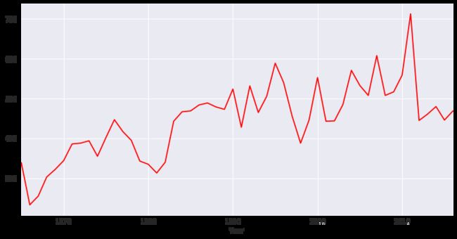
做时间序列图去探究以年为单位,地震记录的趋势
temp = data.groupby('Year',as_index=False).count()
temp = temp.loc[:,['Year','ID']]
plt.figure(1,figsize=(12,6))
sns.tsplot(temp.ID,temp.Year,color="r")
plt.show()
对以年为单位的地震记录作线性回归拟合
plt.figure(figsize=(12,6))
plt.subplot(121)
sns.regplot(x="Year", y="ID", data=temp,order=1) # default by 1
plt.ylabel(' ')
plt.title('Regression fit of earthquake records by year,order = 1')

plt.subplot(122)
sns.residplot(x="Year", y="ID", data=temp)
plt.ylabel(' ')
plt.title('Residual plot when using a simplt regression model,order=1')
plt.show()

上方分别是对地震记录以年为单位统计之后的一阶线性回归拟合以及拟合后残值分布的情况。同样的思路,可以尝试高阶拟合,如下图的二阶拟合。
plt.figure(figsize=(12,6))
plt.subplot(121)
sns.regplot(x="Year", y="ID", data=temp,order=2) # default by 1
plt.ylabel(' ')
plt.title('Regression fit of earthquake records by year,order = 2')

plt.subplot(122)
sns.residplot(x="Year", y="ID", data=temp,order=2)
plt.ylabel(' ')
plt.title('Residual plot when using a simplt regression model,order=2')

plt.show()

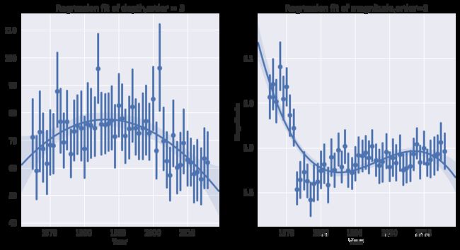
同样的尝试,我们可以对地震记录中的深度Depth和强度Magnitude做线性拟合。
plt.figure(figsize=(12,6))
plt.subplot(121)
sns.regplot(x="Year", y="Depth", data=data,x_jitter=.05, x_estimator=np.mean,order=3)
  # x_estimator是一个参数,相当于对每年地震记录中参数取平均值,探究平均值的趋势
plt.ylabel(' ')
plt.title('Regression fit of depth,order = 3')

plt.subplot(122)
sns.regplot(x="Year", y="Magnitude", data=data,x_jitter=.05, x_estimator=np.mean,order=3)
    # x_estimator是一个参数,相当于对每年地震记录中参数取平均值,探究平均值的趋势
plt.title('Regression fit of magnitude,order=3')
plt.show()