R语言中的高级绘图
1、散点图
attach(mtcars)
plot(wt, mpg,
main="Basic Scatterplot of MPG vs. Weight",
xlab="Car Weight (lbs/1000)",
ylab="Miles Per Gallon ", pch=19)
abline(lm(mpg ~ wt), col="red", lwd=2, lty=1)
lines(lowess(wt, mpg), col="blue", lwd=2, lty=2)
abline()函数用来添加最佳拟合的线性直线,
lowess()函数则用来添加一条平滑曲线。该平滑曲线拟合是一种基于局部加权多项式回归的非参数方法

library(car)
scatterplot(mpg ~ wt | cyl, data=mtcars, lwd=2,
main="Scatter Plot of MPG vs. Weight by # Cylinders",
xlab="Weight of Car (lbs/1000)",
ylab="Miles Per Gallon", id.method="identify",
legend.plot=TRUE, labels=row.names(mtcars),
boxplots="xy")

2、散点图矩阵
(1)library(car)
scatterplotMatrix(~ mpg + disp + drat + wt, data=mtcars, spread=FALSE,
lty.smooth=2, main="Scatterplot Matrix via car package")
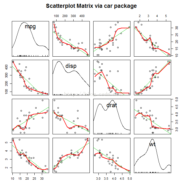
scatterplotMatrix(~ mpg + disp + drat + wt | cyl, data=mtcars, spread=FALSE,
main="Scatterplot Matrix via car package", diagonal="histogram")
以不同的气缸进行分组

cor(mtcars[c("mpg", "wt", "disp", "drat")])
mpg wt disp drat
mpg 1.0000000 -0.8676594 -0.8475514 0.6811719
wt -0.8676594 1.0000000 0.8879799 -0.7124406
disp -0.8475514 0.8879799 1.0000000 -0.7102139
drat 0.6811719 -0.7124406 -0.7102139 1.0000000
使用gclus包绘制散点图矩阵
library(gclus)
mydata <- mtcars[c(1,3,5,6)]
mydata.corr <- abs(cor(mydata))
mycolors <- dmat.color(mydata.corr)
myorder <- order.single(mydata.corr)
cpairs(mydata,
myorder,
panel.colors=mycolors,
gap=.5,
main="Variables Ordered and Colored by Correlation"
)

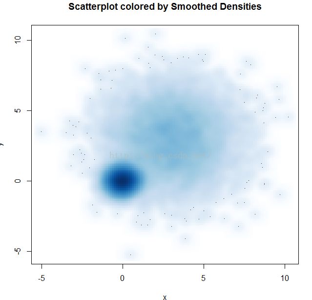
3、高密度散点图
当数据点重叠很严重时,用散点图来观察变量关系就显得“力不从心”了。下面是一个人为设计的例子,其中10 000个观测点分布在两个重叠的数据群中:
创建10000个观测数据
set.seed(1234)
n <- 10000
c1 <- matrix(rnorm(n, mean=0, sd=.5), ncol=2)
c2 <- matrix(rnorm(n, mean=3, sd=2), ncol=2)
mydata <- rbind(c1, c2)
mydata <- as.data.frame(mydata)
names(mydata) <- c("x", "y")
(1)
with(mydata,
plot(x, y, pch=19, main="Scatter Plot with 10000 Observations"))

2、with(mydata,
smoothScatter(x, y, main="Scatterplot colored by Smoothed Densities"))
3、
library(hexbin)
with(mydata, {
bin <- hexbin(x, y, xbins=50)
plot(bin, main="Hexagonal Binning with 10,000 Observations")
})

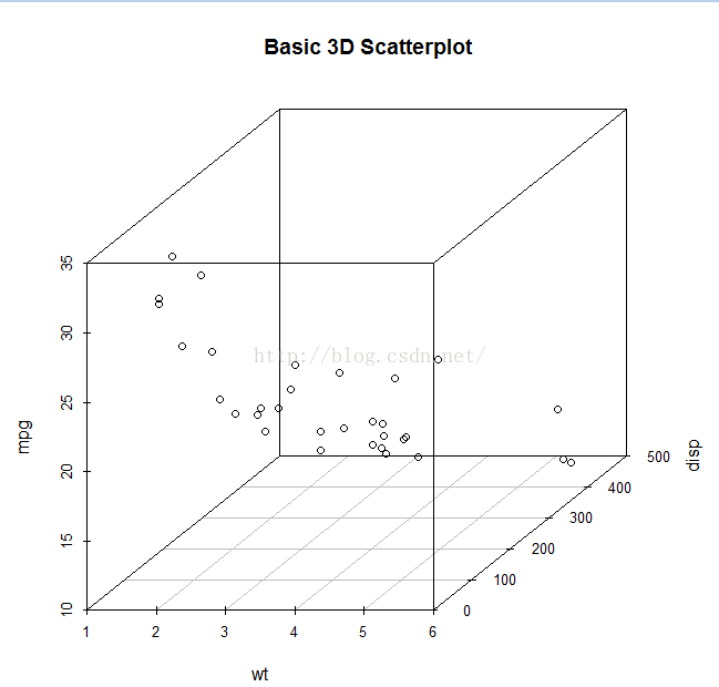
4、三维散点图
library(scatterplot3d)
attach(mtcars)
scatterplot3d(wt, disp, mpg,
main="Basic 3D Scatterplot")
s3d <-scatterplot3d(wt, disp, mpg,
+ pch=16,
+ highlight.3d=TRUE,
+ type="h",
+ main="3D Scatter Plot with Verical Lines and Regression Plane")
> fit <- lm(mpg ~ wt+disp)
> s3d$plane3d(fit)
> detach(mtcars)

这个三维图可以旋转
library(rgl)
attach(mtcars)
plot3d(wt, disp, mpg, col="red", size=5)

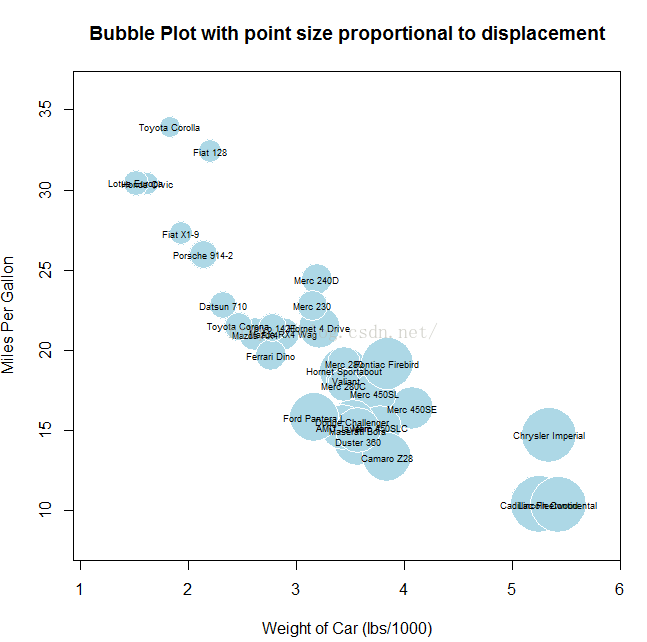
4、气泡图
我们通过三维散点图来展示三个定量变量间的关系。现在介绍另外一种思路:先创建一个二维散点图,然后用点的大小来代表第三个变量的值。这便是气泡图(bubble plot)
attach(mtcars)
r <- sqrt(disp/pi)
symbols(wt, mpg, r, inches=0.30, fg="white", bg="lightblue",
main="Bubble Plot with point size proportional to displacement",
ylab="Miles Per Gallon",
xlab="Weight of Car (lbs/1000)")
text(wt, mpg, rownames(mtcars), cex=0.6)
detach(mtcars)
par(opar)
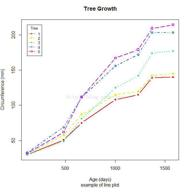
5、折线图
par(mfrow=c(1,2))
t1 <- subset(Orange, Tree==1)
plot(t1$age, t1$circumference,
xlab="Age (days)",
ylab="Circumference (mm)",
main="Orange Tree 1 Growth")
plot(t1$age, t1$circumference,
xlab="Age (days)",
ylab="Circumference (mm)",
main="Orange Tree 1 Growth",
type="b")
par(opar)


Orange$Tree <- as.numeric(Orange$Tree)
ntrees <- max(Orange$Tree)
xrange <- range(Orange$age)
yrange <- range(Orange$circumference)
plot(xrange, yrange,
type="n",
xlab="Age (days)",
ylab="Circumference (mm)"
)
colors <- rainbow(ntrees)
linetype <- c(1:ntrees)
plotchar <- seq(18, 18+ntrees, 1)
for (i in 1:ntrees) {
tree <- subset(Orange, Tree==i)
lines(tree$age, tree$circumference,
type="b",
lwd=2,
lty=linetype[i],
col=colors[i],
pch=plotchar[i]
)
}
title("Tree Growth", "example of line plot")
legend(xrange[1], yrange[2],
1:ntrees,
cex=0.8,
col=colors,
pch=plotchar,
lty=linetype,
title="Tree"
)