Python可视化交互库——dash

本文项目代码
文章目录
- 简介
- 安装
- 初试
- 应用构成
- 设置CSS
- 热更新
- 插入HTML
- 可重用组件
- 更多可视化
- Markdown
- 核心组件
- 回调函数
- 滑块更新图表
- 多个输入
- 多个输出
- 链式回调
- 状态
- 基本数据交互
- 悬停时更新图形
- 通用交叉过滤
- 回调函数共享数据
- 踩过的坑
- 参考文献
简介
Dash 是一款构建web应用的Python框架,建立在 Plotly.js, React 和 Flask 之上,将现代UI元素(如下拉框、滑块和图形)直接与Python代码绑定。
| App | Description |
|---|---|
 |
将下拉菜单绑定到D3.js的绘图 |
 |
Dash代码是声明式和响应式的,更容易构建复杂交互程序 |
| Dash使用 Plotly.js 绘图,支持超过 35 种类型,包括地图 | |
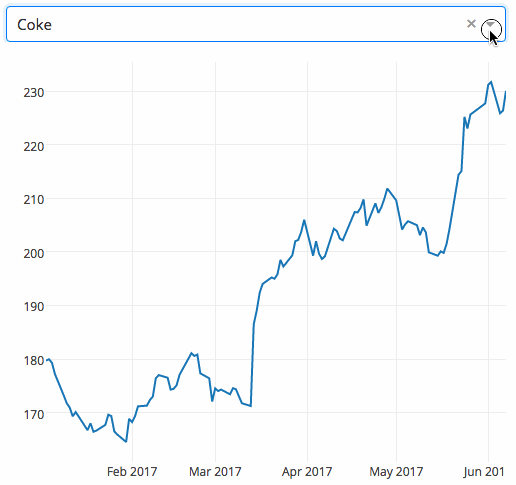
| Dash不只是仪表盘,可以完全控制应用的外观。如图是一种PDF风格的Dash应用 |
安装
pip install dash
初试
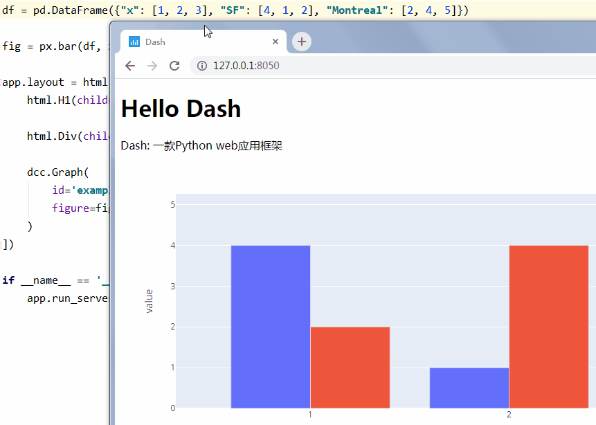
import dash
import pandas as pd
import plotly.express as px
import dash_core_components as dcc
import dash_html_components as html

app = dash.Dash()

df = pd.DataFrame({'x': [1, 2, 3], 'SF': [4, 1, 2], 'Montreal': [2, 4, 5]})

fig = px.bar(df, x='x', y=['SF', 'Montreal'], barmode='group')

app.layout = html.Div(children=[
    html.H1(children='Hello Dash'),

    html.Div(children='Dash: 一款Python web应用框架'),

    dcc.Graph(
        id='example-graph',
        figure=fig
    )
])

if __name__ == '__main__':
    app.run_server(debug=True)

应用构成
Dash应用由两部分组成:
- layout,外观
- callback,交互
import dash
import dash_core_components as dcc
import dash_html_components as html
from dash.dependencies import Input, Output

app = dash.Dash()

app.layout = html.Div([
    html.H1('智能聊天机器人'),
    dcc.Input(id='my-id', value='在吗?', type='text'),
    html.Div(id='my-div')
])


@app.callback(
    Output(component_id='my-div', component_property='children'),  # 输出给id为my-div的children
    [Input(component_id='my-id', component_property='value')]  # 输入来自id为my-id的value
)
def update_output_div(input_value):
    '''AI核心代码,估值1个亿'''
    return input_value.replace('吗', '').replace('?', '!').replace('?', '!')


if __name__ == '__main__':
    app.run_server(debug=True)

设置CSS
声明参数external_stylesheets
external_stylesheets = ['https://codepen.io/chriddyp/pen/bWLwgP.css']

app = dash.Dash(__name__, external_stylesheets=external_stylesheets)
热更新
app.run_server(debug=True) 默认激活Dash的热更新,一旦修改代码,Dash会自动刷新浏览器
取消热更新:app.run_server(dev_tools_hot_reload=False)
插入HTML
dash_html_components 模块包含HTML组件及关键字参数
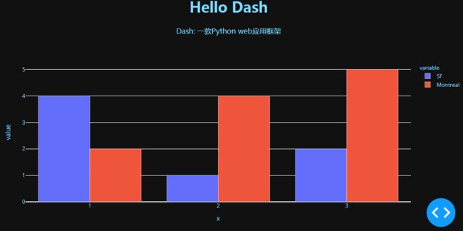
import dash
import pandas as pd
import plotly.express as px
import dash_core_components as dcc
import dash_html_components as html

app = dash.Dash()

colors = {
    'background': '#111111',
    'text': '#7FDBFF'
}

df = pd.DataFrame({'x': [1, 2, 3], 'SF': [4, 1, 2], 'Montreal': [2, 4, 5]})

fig = px.bar(df, x='x', y=['SF', 'Montreal'], barmode='group')

fig.update_layout(plot_bgcolor=colors['background'], paper_bgcolor=colors['background'], font_color=colors['text'])

app.layout = html.Div(
    style={'backgroundColor': colors['background']},
    children=[
        html.H1(
            children='Hello Dash',
            style={
                'textAlign': 'center',
                'color': colors['text']
            }
        ),

        html.Div(
            children='Dash: 一款Python web应用框架',
            style={
                'textAlign': 'center',
                'color': colors['text']
            }
        ),

        dcc.Graph(
            id='example-graph-2',
            figure=fig
        )
    ])

if __name__ == '__main__':
    app.run_server(debug=True)
可重用组件
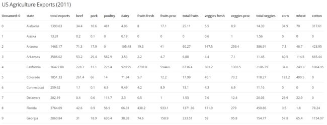
部分美国农业出口数据.csv
,state,total exports,beef,pork,poultry,dairy,fruits fresh,fruits proc,total fruits,veggies fresh,veggies proc,total veggies,corn,wheat,cotton
0,Alabama,1390.63,34.4,10.6,481.0,4.06,8.0,17.1,25.11,5.5,8.9,14.33,34.9,70.0,317.61
1,Alaska,13.31,0.2,0.1,0.0,0.19,0.0,0.0,0.0,0.6,1.0,1.56,0.0,0.0,0.0
2,Arizona,1463.17,71.3,17.9,0.0,105.48,19.3,41.0,60.27,147.5,239.4,386.91,7.3,48.7,423.95
3,Arkansas,3586.02,53.2,29.4,562.9,3.53,2.2,4.7,6.88,4.4,7.1,11.45,69.5,114.5,665.44
4, California,16472.88,228.7,11.1,225.4,929.95,2791.8,5944.6,8736.4,803.2,1303.5,2106.79,34.6,249.3,1064.95
5,Colorado,1851.33,261.4,66.0,14.0,71.94,5.7,12.2,17.99,45.1,73.2,118.27,183.2,400.5,0.0
6,Connecticut,259.62,1.1,0.1,6.9,9.49,4.2,8.9,13.1,4.3,6.9,11.16,0.0,0.0,0.0
7,Delaware,282.19,0.4,0.6,114.7,2.3,0.5,1.0,1.53,7.6,12.4,20.03,26.9,22.9,0.0
8,Florida,3764.09,42.6,0.9,56.9,66.31,438.2,933.1,1371.36,171.9,279.0,450.86,3.5,1.8,78.24
9,Georgia,2860.84,31.0,18.9,630.4,38.38,74.6,158.9,233.51,59.0,95.8,154.77,57.8,65.4,1154.07
用Python编写HTML标记可创建复杂的可重用组件,而无需切换上下文
import dash
import pandas as pd
import dash_html_components as html

df = pd.read_csv('美国农业出口数据.csv')


def generate_table(dataframe, max_rows=10):
    '''生成表格'''
    return html.Table([
        html.Thead(
            html.Tr([html.Th(col) for col in dataframe.columns])
        ),
        html.Tbody([
            html.Tr([
                html.Td(dataframe.iloc[i][col]) for col in dataframe.columns
            ]) for i in range(min(len(dataframe), max_rows))
        ])
    ])


app = dash.Dash()

app.layout = html.Div(
    children=[
        html.H4(
            children='US Agriculture Exports (2011)'
        ),
        generate_table(df)
    ])

if __name__ == '__main__':
    app.run_server(debug=True)
更多可视化
dash_core_components 模块的 Graph 使用开源JavaScript库 plotly.js,支持超过35种图表类型,并以矢量SVG和高性能WebGL呈现。
GDP与人均寿命.csv
import dash
import pandas as pd
import plotly.express as px
import dash_core_components as dcc
import dash_html_components as html

app = dash.Dash()

df = pd.read_csv('GDP与人均寿命.csv')

fig = px.scatter(df, x='gdp per capita', y='life expectancy',
                 size='population', color='continent', hover_name='country',
                 log_x=True, size_max=60)

app.layout = html.Div([
    dcc.Graph(
        id='life-exp-vs-gdp',
        figure=fig
    )
])

if __name__ == '__main__':
    app.run_server(debug=True)

图具有交互性和响应性:
- 悬停:看值
- 单击:跟踪
- 双击:复原
- Shift+拖动:放大
Markdown
dash_core_components 模块的 Markdown
import dash
import dash_core_components as dcc
import dash_html_components as html

app = dash.Dash()

markdown_text = '''
# 你的Markdown代码
'''

app.layout = html.Div([
    dcc.Markdown(children=markdown_text)
])

if __name__ == '__main__':
    app.run_server(debug=True)

Dash使用Markdown通用标记规范,渲染效果可对比 Cmd Markdown
本人测试不通过:
- 注脚
- LaTeX 数学公式
- 流程图、序列图、甘特图
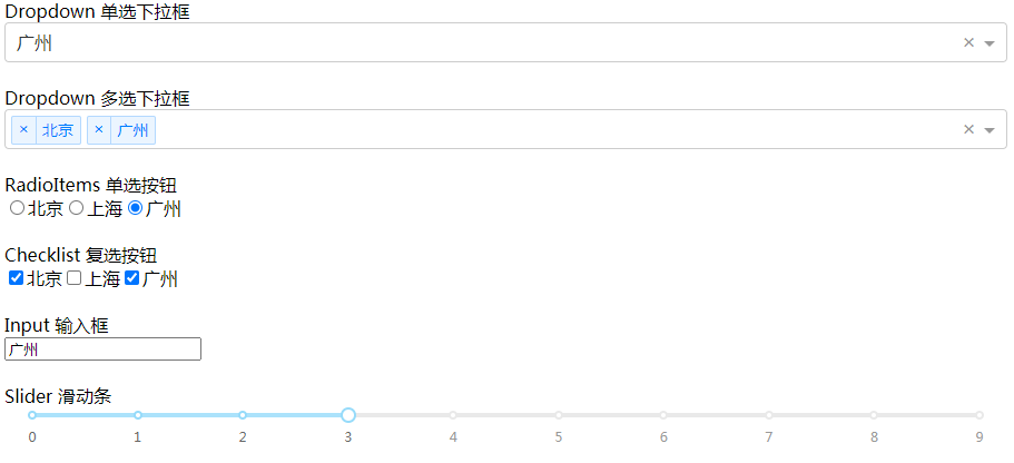
核心组件
dash_core_components 模块提供了一系列高级组件,如下拉菜单、图表、Markdown块等,所有组件均可声明式描述
查看所有可用组件:Dash Core Components
import dash
import dash_core_components as dcc
import dash_html_components as html

app = dash.Dash()

app.layout = html.Div([
    html.Label('Dropdown 单选下拉框'),
    dcc.Dropdown(
        options=[
            {'label': '北京', 'value': 'BJ'},
            {'label': '上海', 'value': 'SH'},
            {'label': '广州', 'value': 'GZ'}
        ],
        value='GZ'  # 默认值
    ),
    html.Br(),  # 换行

    html.Label('Dropdown 多选下拉框'),
    dcc.Dropdown(
        options=[
            {'label': '北京', 'value': 'BJ'},
            {'label': '上海', 'value': 'SH'},
            {'label': '广州', 'value': 'GZ'}
        ],
        value=['BJ', 'GZ'],
        multi=True  # 多选
    ),
    html.Br(),

    html.Label('RadioItems 单选按钮'),
    dcc.RadioItems(
        options=[
            {'label': '北京', 'value': 'BJ'},
            {'label': '上海', 'value': 'SH'},
            {'label': '广州', 'value': 'GZ'}
        ],
        value='GZ'
    ),
    html.Br(),

    html.Label('Checklist 复选按钮'),
    dcc.Checklist(
        options=[
            {'label': '北京', 'value': 'BJ'},
            {'label': '上海', 'value': 'SH'},
            {'label': '广州', 'value': 'GZ'}
        ],
        value=['BJ', 'GZ']
    ),
    html.Br(),

    html.Label('Input 输入框'),
    html.Br(),
    dcc.Input(value='广州', type='text'),
    html.Br(),
    html.Br(),

    html.Label('Slider 滑动条'),
    dcc.Slider(
        min=0,
        max=9,
        marks={i: str(i) for i in range(10)},  # 传入字典作为标记显示
        value=3,
    ),
    html.Br(),
])

if __name__ == '__main__':
    app.run_server(debug=True)
回调函数
通过修饰器 app.callback 定义 Input 和 Output
import dash
import dash_core_components as dcc
import dash_html_components as html
from dash.dependencies import Input, Output

app = dash.Dash()

app.layout = html.Div([
    html.H1('智能聊天机器人'),
    dcc.Input(id='my-id', value='在吗?', type='text'),
    html.Div(id='my-div')
])


@app.callback(
    Output(component_id='my-div', component_property='children'),  # 输出给id为my-div的children
    [Input(component_id='my-id', component_property='value')]  # 输入来自id为my-id的value
)
def update_output_div(input_value):
    '''AI核心代码,估值1个亿'''
    return input_value.replace('吗', '').replace('?', '!').replace('?', '!')


if __name__ == '__main__':
    app.run_server(debug=True)
滑块更新图表
每五年GDP与人均寿命.csv
import dash
import pandas as pd
import plotly.express as px
import dash_core_components as dcc
import dash_html_components as html
from dash.dependencies import Input, Output

df = pd.read_csv('每五年GDP与人均寿命.csv')

app = dash.Dash()

app.layout = html.Div([
    dcc.Graph(id='graph-with-slider'),
    dcc.Slider(
        id='year-slider',
        min=df['year'].min(),
        max=df['year'].max(),
        value=df['year'].min(),
        marks={str(year): str(year) for year in df['year'].unique()},
        step=None
    )
])


@app.callback(
    Output('graph-with-slider', 'figure'),
    [Input('year-slider', 'value')]
)
def update_figure(selected_year):
    filtered_df = df[df.year == selected_year]
    fig = px.scatter(filtered_df, x='gdpPercap', y='lifeExp',
                     size='pop', color='continent', hover_name='country',
                     log_x=True, size_max=60)
    fig.update_layout(transition_duration=500)  # 过渡时间
    return fig


if __name__ == '__main__':
    app.run_server(debug=True)
1952年中国人均GDP只有400,平均寿命44岁。50年后,人均GDP就飙升到3119,平均寿命达到72岁。
多个输入
国家及其指标.csv
import dash
import pandas as pd
import plotly.express as px
import dash_core_components as dcc
import dash_html_components as html
from dash.dependencies import Input, Output

app = dash.Dash()

df = pd.read_csv('国家及其指标.csv')

available_indicators = df['Indicator Name'].unique()  # 各种指标

app.layout = html.Div([
    html.Div([
        html.Div([
            dcc.Dropdown(
                id='xaxis-column',
                options=[{'label': i, 'value': i} for i in available_indicators],
                value='Fertility rate, total (births per woman)'
            ),
            dcc.RadioItems(
                id='xaxis-type',
                options=[{'label': i, 'value': i} for i in ['Linear', 'Log']],
                value='Linear',
                labelStyle={'display': 'inline-block'}
            )
        ],
            style={'width': '48%', 'display': 'inline-block'}),

        html.Div([
            dcc.Dropdown(
                id='yaxis-column',
                options=[{'label': i, 'value': i} for i in available_indicators],
                value='Life expectancy at birth, total (years)'
            ),
            dcc.RadioItems(
                id='yaxis-type',
                options=[{'label': i, 'value': i} for i in ['Linear', 'Log']],
                value='Linear',
                labelStyle={'display': 'inline-block'}
            )
        ], style={'width': '48%', 'float': 'right', 'display': 'inline-block'})
    ]),

    dcc.Graph(id='indicator-graphic'),

    dcc.Slider(
        id='year--slider',
        min=df['Year'].min(),
        max=df['Year'].max(),
        value=df['Year'].max(),
        marks={str(year): str(year) for year in df['Year'].unique()},
        step=None
    )
])


@app.callback(
    Output('indicator-graphic', 'figure'),
    [Input('xaxis-column', 'value'),
     Input('yaxis-column', 'value'),
     Input('xaxis-type', 'value'),
     Input('yaxis-type', 'value'),
     Input('year--slider', 'value')])
def update_graph(xaxis_column_name, yaxis_column_name, xaxis_type, yaxis_type, year_value):
    dff = df[df['Year'] == year_value]

    fig = px.scatter(x=dff[dff['Indicator Name'] == xaxis_column_name]['Value'],
                     y=dff[dff['Indicator Name'] == yaxis_column_name]['Value'],
                     hover_name=dff[dff['Indicator Name'] == yaxis_column_name]['Country Name'])

    fig.update_layout(margin={'l': 40, 'b': 40, 't': 10, 'r': 0}, hovermode='closest')

    fig.update_xaxes(title=xaxis_column_name, type='linear' if xaxis_type == 'Linear' else 'log')

    fig.update_yaxes(title=yaxis_column_name, type='linear' if yaxis_type == 'Linear' else 'log')

    return fig


if __name__ == '__main__':
    app.run_server(debug=True)
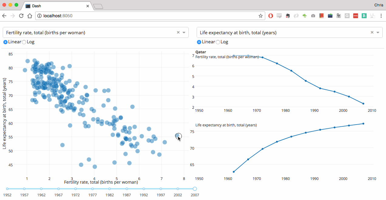
查看各国不同指标间的关系
每个女人生育几个孩子和平均寿命间的关系
1962年香港每个女人平均生5个孩子,平均寿命68岁 → 2007年平均生1个孩子,平均寿命82岁
多个输出
import dash
import dash_core_components as dcc
import dash_html_components as html
from dash.dependencies import Input, Output

app = dash.Dash()

app.layout = html.Div([
    dcc.Input(
        id='num-multi',
        type='number',
        value=5
    ),
    html.Table([
        html.Tr([html.Td(['x', html.Sup(2)]), html.Td(id='square')]),
        html.Tr([html.Td(['x', html.Sup(3)]), html.Td(id='cube')]),
        html.Tr([html.Td(['x', html.Sup('x')]), html.Td(id='x^x')]),
    ]),
])


@app.callback(
    [Output('square', 'children'),
     Output('cube', 'children'),
     Output('x^x', 'children')],
    [Input('num-multi', 'value')])
def callback_a(x):
    return x ** 2, x ** 3, x ** x


if __name__ == '__main__':
    app.run_server(debug=True)

注意:最好分开多个写
链式回调
一个回调函数的输出是另一个回调函数的输入
import dash
import dash_core_components as dcc
import dash_html_components as html
from dash.dependencies import Input, Output

app = dash.Dash()

all_options = {
    '中国': ['北京', '上海', '广州'],
    '美国': ['纽约', '旧金山']
}
app.layout = html.Div([
    dcc.RadioItems(
        id='countries-radio',
        options=[{'label': k, 'value': k} for k in all_options.keys()],
        value='中国'
    ),

    html.Hr(),

    dcc.RadioItems(id='cities-radio'),

    html.Hr(),

    html.Div(id='display-selected-values')
])


@app.callback(
    Output('cities-radio', 'options'),
    [Input('countries-radio', 'value')])
def set_cities_options(selected_country):
    return [{'label': i, 'value': i} for i in all_options[selected_country]]


@app.callback(
    Output('cities-radio', 'value'),
    [Input('cities-radio', 'options')])
def set_cities_value(available_options):
    return available_options[0]['value']


@app.callback(
    Output('display-selected-values', 'children'),
    [Input('countries-radio', 'value'),
     Input('cities-radio', 'value')])
def set_display_children(selected_country, selected_city):
    return '{} 是 {} 的城市'.format(selected_city, selected_country)


if __name__ == '__main__':
    app.run_server(debug=True)

状态
当用户输入完成后才回调
修饰器 app.callback 定义的 Input 改为 State
import dash
import dash_core_components as dcc
import dash_html_components as html
from dash.dependencies import Input, Output, State

app = dash.Dash()

app.layout = html.Div([
    dcc.Input(id='input-1-state', type='text', value='初始值1'),
    dcc.Input(id='input-2-state', type='text', value='初始值2'),
    html.Button(id='submit-button-state', n_clicks=0, children='Submit'),
    html.Div(id='output-state')
])


@app.callback(Output('output-state', 'children'),
              [Input('submit-button-state', 'n_clicks')],
              [State('input-1-state', 'value'),
               State('input-2-state', 'value')])
def update_output(n_clicks, input1, input2):
    return '点击了 {} 次:{}, {}'.format(n_clicks, input1, input2)


if __name__ == '__main__':
    app.run_server(debug=True)

基本数据交互
修饰器 app.callback 定义的 Input 添加参数:
- hoverData:悬停
- clickData:点击
- selectedData:选择
- relayoutData:重新布局
import json
import dash
import pandas as pd
import plotly.express as px
import dash_core_components as dcc
import dash_html_components as html
from dash.dependencies import Input, Output

app = dash.Dash()

styles = {
    'pre': {
        'border': 'thin lightgrey solid',
        'overflowX': 'scroll'
    }
}

df = pd.DataFrame({
    'x': [1, 2, 1, 2],
    'y': [1, 2, 3, 4],
    'customdata': [1, 2, 3, 4],
    'fruit': ['apple', 'apple', 'orange', 'orange']
})

fig = px.scatter(df, x='x', y='y', color='fruit', custom_data=['customdata'])

fig.update_layout(clickmode='event+select')

fig.update_traces(marker_size=20)

app.layout = html.Div([
    dcc.Graph(
        id='basic-interactions',
        figure=fig
    ),

    html.Div(className='row', children=[
        html.Div([
            dcc.Markdown('**悬停 hoverData**'),
            html.Pre(id='hover-data', style=styles['pre'])
        ], className='three columns'),

        html.Div([
            dcc.Markdown('**点击 clickData**'),
            html.Pre(id='click-data', style=styles['pre']),
        ], className='three columns'),

        html.Div([
            dcc.Markdown('**选择 selectedData**'),
            html.Pre(id='selected-data', style=styles['pre']),
        ], className='three columns'),

        html.Div([
            dcc.Markdown('**重布局 relayoutData**'),
            html.Pre(id='relayout-data', style=styles['pre']),
        ], className='three columns')
    ])
])


@app.callback(
    Output('hover-data', 'children'),
    [Input('basic-interactions', 'hoverData')])
def display_hover_data(hoverData):
    return json.dumps(hoverData, indent=2)


@app.callback(
    Output('click-data', 'children'),
    [Input('basic-interactions', 'clickData')])
def display_click_data(clickData):
    return json.dumps(clickData, indent=2)


@app.callback(
    Output('selected-data', 'children'),
    [Input('basic-interactions', 'selectedData')])
def display_selected_data(selectedData):
    return json.dumps(selectedData, indent=2)


@app.callback(
    Output('relayout-data', 'children'),
    [Input('basic-interactions', 'relayoutData')])
def display_relayout_data(relayoutData):
    return json.dumps(relayoutData, indent=2)


if __name__ == '__main__':
    app.run_server(debug=True)
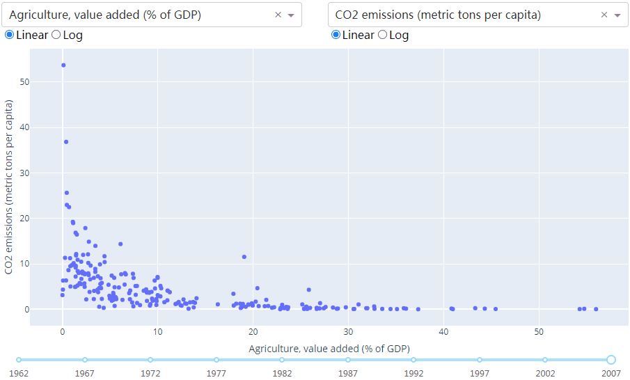
悬停时更新图形
国家及其指标.csv
import dash
import pandas as pd
import plotly.express as px
import dash_core_components as dcc
import dash_html_components as html
from dash.dependencies import Input, Output

app = dash.Dash()

df = pd.read_csv('国家及其指标.csv')

available_indicators = df['Indicator Name'].unique()

app.layout = html.Div([
    html.Div([
        html.Div([
            dcc.Dropdown(
                id='crossfilter-xaxis-column',
                options=[{'label': i, 'value': i} for i in available_indicators],
                value='Fertility rate, total (births per woman)'
            ),
            dcc.RadioItems(
                id='crossfilter-xaxis-type',
                options=[{'label': i, 'value': i} for i in ['Linear', 'Log']],
                value='Linear',
                labelStyle={'display': 'inline-block'}
            )
        ], style={'width': '49%', 'display': 'inline-block'}),

        html.Div([
            dcc.Dropdown(
                id='crossfilter-yaxis-column',
                options=[{'label': i, 'value': i} for i in available_indicators],
                value='Life expectancy at birth, total (years)'
            ),
            dcc.RadioItems(
                id='crossfilter-yaxis-type',
                options=[{'label': i, 'value': i} for i in ['Linear', 'Log']],
                value='Linear',
                labelStyle={'display': 'inline-block'}
            )
        ], style={'width': '49%', 'float': 'right', 'display': 'inline-block'})
    ], style={
        'borderBottom': 'thin lightgrey solid',
        'backgroundColor': 'rgb(250, 250, 250)',
        'padding': '10px 5px'
    }),

    html.Div([
        dcc.Graph(
            id='crossfilter-indicator-scatter',
            hoverData={'points': [{'customdata': 'Japan'}]}
        )
    ], style={'width': '49%', 'display': 'inline-block', 'padding': '0 20'}),

    html.Div([
        dcc.Graph(id='x-time-series'),
        dcc.Graph(id='y-time-series'),
    ], style={'display': 'inline-block', 'width': '49%'}),

    html.Div([
        dcc.Slider(
            id='crossfilter-year--slider',
            min=df['Year'].min(),
            max=df['Year'].max(),
            value=df['Year'].max(),
            marks={str(year): str(year) for year in df['Year'].unique()},
            step=None
        )], style={'width': '49%', 'padding': '0px 20px 20px 20px'})
])


@app.callback(
    Output('crossfilter-indicator-scatter', 'figure'),
    [Input('crossfilter-xaxis-column', 'value'),
     Input('crossfilter-yaxis-column', 'value'),
     Input('crossfilter-xaxis-type', 'value'),
     Input('crossfilter-yaxis-type', 'value'),
     Input('crossfilter-year--slider', 'value')])
def update_graph(xaxis_column_name, yaxis_column_name, xaxis_type, yaxis_type, year_value):
    '''一旦改变下拉框、单选按钮或年份则更新图表'''
    dff = df[df['Year'] == year_value]
    fig = px.scatter(
        x=dff[dff['Indicator Name'] == xaxis_column_name]['Value'],
        y=dff[dff['Indicator Name'] == yaxis_column_name]['Value'],
        hover_name=dff[dff['Indicator Name'] == yaxis_column_name]['Country Name']
    )
    fig.update_traces(customdata=dff[dff['Indicator Name'] == yaxis_column_name]['Country Name'])
    fig.update_xaxes(title=xaxis_column_name, type='linear' if xaxis_type == 'Linear' else 'log')
    fig.update_yaxes(title=yaxis_column_name, type='linear' if yaxis_type == 'Linear' else 'log')
    fig.update_layout(margin={'l': 40, 'b': 40, 't': 10, 'r': 0}, hovermode='closest')
    return fig


def create_time_series(dff, axis_type, title):
    '''更新右边图表'''
    fig = px.scatter(dff, x='Year', y='Value')
    fig.update_traces(mode='lines+markers')
    fig.update_xaxes(showgrid=False)
    fig.update_yaxes(type='linear' if axis_type == 'Linear' else 'log')
    fig.add_annotation(
        x=0, y=0.85, xanchor='left', yanchor='bottom',
        xref='paper', yref='paper', showarrow=False, align='left',
        bgcolor='rgba(255, 255, 255, 0.5)', text=title
    )
    fig.update_layout(height=225, margin={'l': 20, 'b': 30, 'r': 10, 't': 10})
    return fig


@app.callback(
    Output('x-time-series', 'figure'),
    [Input('crossfilter-indicator-scatter', 'hoverData'),
     Input('crossfilter-xaxis-column', 'value'),
     Input('crossfilter-xaxis-type', 'value')])
def update_y_timeseries(hoverData, xaxis_column_name, axis_type):
    '''更新右上角图表'''
    country_name = hoverData['points'][0]['customdata']
    dff = df[df['Country Name'] == country_name]
    dff = dff[dff['Indicator Name'] == xaxis_column_name]
    title = '{}
{}'.format(country_name, xaxis_column_name)
    return create_time_series(dff, axis_type, title)


@app.callback(
    Output('y-time-series', 'figure'),
    [Input('crossfilter-indicator-scatter', 'hoverData'),
     Input('crossfilter-yaxis-column', 'value'),
     Input('crossfilter-yaxis-type', 'value')])
def update_x_timeseries(hoverData, yaxis_column_name, axis_type):
    '''更右下角图表'''
    dff = df[df['Country Name'] == hoverData['points'][0]['customdata']]
    dff = dff[dff['Indicator Name'] == yaxis_column_name]
    return create_time_series(dff, axis_type, yaxis_column_name)


if __name__ == '__main__':
    app.run_server(debug=True)
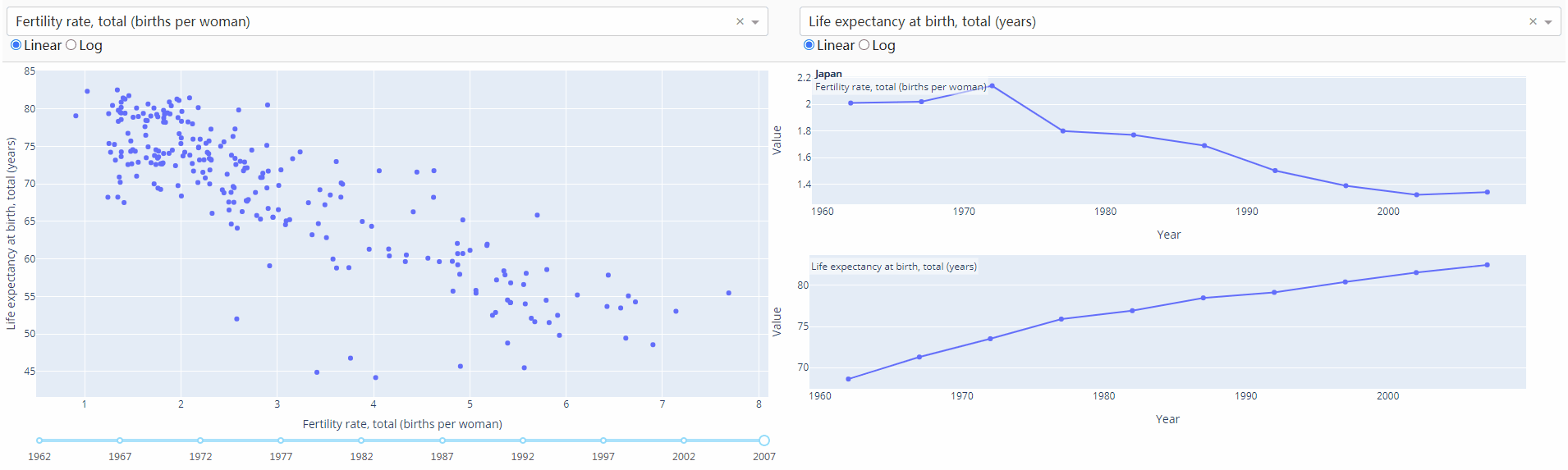
我国出口商品占GDP比重和GDP的增长速度呈正比,说明了改革开放的重要性。
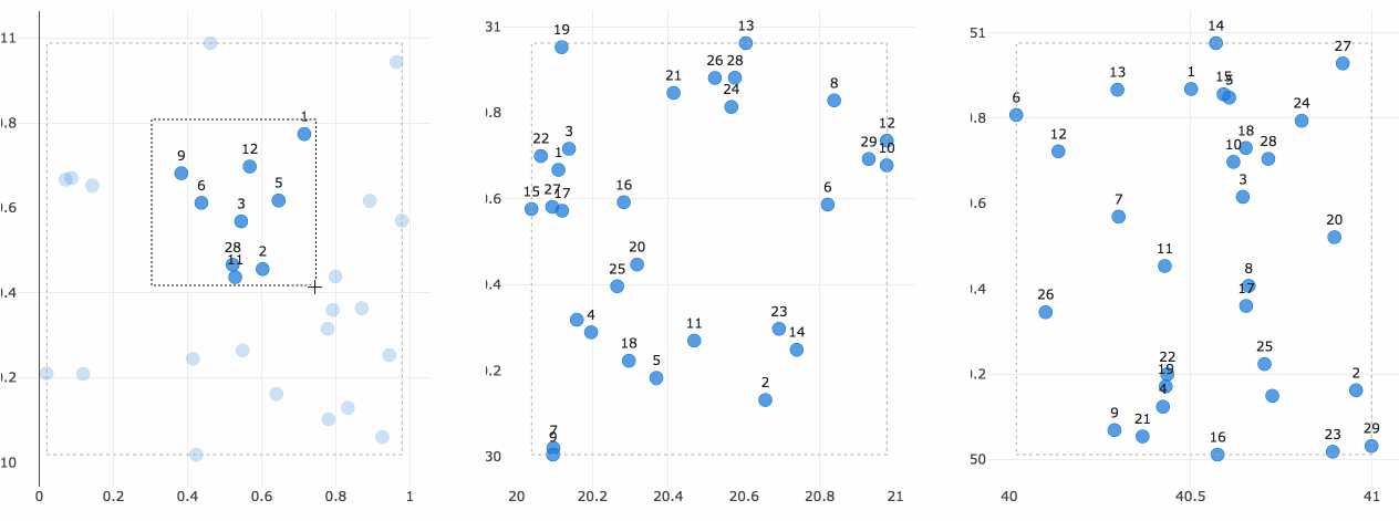
通用交叉过滤
对每个散点图的选择过滤底层数据
import dash
import numpy as np
import pandas as pd
import plotly.express as px
import dash_core_components as dcc
import dash_html_components as html
from dash.dependencies import Input, Output

np.random.seed(0)
df = pd.DataFrame({"Col " + str(i + 1): np.random.rand(30) for i in range(6)})  # 随机生成6组30以内的数(3组x,y轴数据)

app = dash.Dash()

app.layout = html.Div([
    html.Div(
        dcc.Graph(id='g1', config={'displayModeBar': False}),
        className='four columns'
    ),
    html.Div(
        dcc.Graph(id='g2', config={'displayModeBar': False}),
        className='four columns'
    ),
    html.Div(
        dcc.Graph(id='g3', config={'displayModeBar': False}),
        className='four columns'
    )
], className='row')


def get_figure(df, x_col, y_col, selectedpoints, selectedpoints_local):
    if selectedpoints_local and selectedpoints_local['range']:
        ranges = selectedpoints_local['range']
        selection_bounds = {'x0': ranges['x'][0], 'x1': ranges['x'][1],
                            'y0': ranges['y'][0], 'y1': ranges['y'][1]}
    else:
        selection_bounds = {'x0': np.min(df[x_col]), 'x1': np.max(df[x_col]),
                            'y0': np.min(df[y_col]), 'y1': np.max(df[y_col])}

    fig = px.scatter(df, x=df[x_col], y=df[y_col], text=df.index)

    fig.update_traces(selectedpoints=selectedpoints,
                      customdata=df.index,
                      mode='markers+text', marker={'color': 'rgba(0, 116, 217, 0.7)', 'size': 20},
                      unselected={'marker': {'opacity': 0.3}, 'textfont': {'color': 'rgba(0, 0, 0, 0)'}})

    fig.update_layout(margin={'l': 20, 'r': 0, 'b': 15, 't': 5}, dragmode='select', hovermode=False)

    fig.add_shape(dict({'type': 'rect', 'line': {'width': 1, 'dash': 'dot', 'color': 'darkgrey'}}, **selection_bounds))

    return fig


@app.callback(
    [Output('g1', 'figure'),
     Output('g2', 'figure'),
     Output('g3', 'figure')],
    [Input('g1', 'selectedData'),
     Input('g2', 'selectedData'),
     Input('g3', 'selectedData')]
)
def callback(selection1, selection2, selection3):
    selectedpoints = df.index
    for selected_data in [selection1, selection2, selection3]:
        if selected_data and selected_data['points']:
            selectedpoints = np.intersect1d(
                selectedpoints,
                [p['customdata'] for p in selected_data['points']]
            )

    return [get_figure(df, "Col 1", "Col 2", selectedpoints, selection1),
            get_figure(df, "Col 3", "Col 4", selectedpoints, selection2),
            get_figure(df, "Col 5", "Col 6", selectedpoints, selection3)]


if __name__ == '__main__':
    app.run_server(debug=True)
点击或选择一个区域来过滤,选中的点会高亮
回调函数共享数据
为什么需要共享状态?
某些回调做数据处理,如SQL查询或下载数据,代价很大。与其让多个回调运行相同的任务,不如将结果共享给其余的回调。
可选方案:
- 多个output:对数据作一次小处理再查数据库代价仍太大
- global:数据会影响到用户之间
为了跨多个Python进程安全地共享数据,需要将数据存储在每个进程都可以访问的地方。主要方案有:
- 用户的浏览器会话
- 磁盘,如文件或新数据库
- 共享内存空间,如Redis
具体方案查看回调函数共享数据
踩过的坑
- 报错:
ValueError: All arguments should have the same length. The length of argument y is 2, whereas the length of previous arguments ['x'] is 3
更新plotly即可:pip install plotly --upgrade
参考文献
- Dash Documentation & User Guide | Plotly
- dash: Analytical Web Apps for Python, R, Julia, and Jupyter. No JavaScript Required.