简介:
没错!这是一个小作业而已。简单记一下笔记。
最后效果图
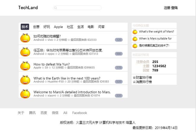
最后效果图
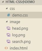
目录结构:
遇到的俩个小问题:
1.不换行,因为胡乱打的,是一个长单词
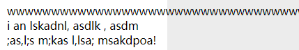
不换行,因为胡乱打的,是一个长单词
解决:
word-wrap:break-word;/*加上长单词也换行*/ 具体请参考下面代码。
2.同样的俩个div浮动后,写着写着发现怎么高度不一致了。
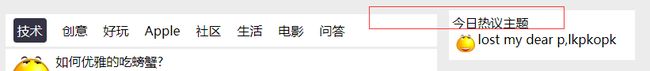
高度不一致
问题原因:因为我去掉了父left的背景色,后来在子div中加上的颜色。而父right有背景色,背景色默认也是会填充padding区域。解决加上
background-clip: content-box;这里我也是去掉父right的背景色,在里面子div中加上颜色。主要记住
背景色默认也是会填充padding区域!
    /* background-color: white;此处的背景色也会填充padding区域 */
    /* background-clip: content-box; */
    /*
    background-clip的属性还有:
    content-box: 背景被裁剪到内容框的位置
    border-box: 背景被裁剪到边距框的位置
    */
上代码
- html
Html+css小demo
 如何优雅的吃螃蟹?
Android ⚝ vivo ⚝ 2 分钟前 ⚝ 最后回复来自 ID2333
任正非:华为对向苹果等出售5G芯片持开放态度.
Android ⚝ oppo ⚝ 2 分钟前 ⚝ 最后回复来自 ID7313
How to defeat Ma Yun?
Apple ⚝ S9 ⚝ 12 分钟前 ⚝ 最后回复来自 ID99655
What is the Earth like in the next 100 years?
Android ⚝ HuaWei-P30 ⚝ 20 分钟前 ⚝ 最后回复来自 ID9383
Welcome to Mars!A detailed introduction to Mars.
Android ⚝ xiaomi ⚝ 2 分钟前 ⚝ 最后回复来自 ID1874
今日热议主题
What's the weight of Mars?
When is Mars suitable for human habitation?
是时候展现真正的技术了!
社区运行状况
注册会员
255
主题
1234562
回复
789
♕财富排行榜
♔消费排行榜
如何优雅的吃螃蟹?
Android ⚝ vivo ⚝ 2 分钟前 ⚝ 最后回复来自 ID2333
任正非:华为对向苹果等出售5G芯片持开放态度.
Android ⚝ oppo ⚝ 2 分钟前 ⚝ 最后回复来自 ID7313
How to defeat Ma Yun?
Apple ⚝ S9 ⚝ 12 分钟前 ⚝ 最后回复来自 ID99655
What is the Earth like in the next 100 years?
Android ⚝ HuaWei-P30 ⚝ 20 分钟前 ⚝ 最后回复来自 ID9383
Welcome to Mars!A detailed introduction to Mars.
Android ⚝ xiaomi ⚝ 2 分钟前 ⚝ 最后回复来自 ID1874
今日热议主题
What's the weight of Mars?
When is Mars suitable for human habitation?
是时候展现真正的技术了!
社区运行状况
注册会员
255
主题
1234562
回复
789
♕财富排行榜
♔消费排行榜

- demo.css
html body {
    margin: 0;
    padding: 0;
    background-color: #ececec;
}
/*********************header************************/
#header{
    background-color: white;
}
#header-content{
    margin: 0 auto;/*水平居中*/
    height: 80px;
    width: 800px;
}
#logo {
    float: left;
}
#search{
    float: left;
    margin-left: 70px;
}
#double-link{
    float: right;
    font-weight: bolder;
}
input{
    background-image: url(../image/search.png);/*注意这里是css文件目录下,所以需要上一层*/
    /*这里图片的信息是231*24 所以input的高度是24*/
    padding: 0;/*消去自带的padding*/
    height: 25px;
    width: 210px;/*宽度需要减去padding-lef和padding-right*/
    padding-left: 25px;/*让文字显示在放大镜符号右边*/
    padding-right: 10px;/*让长文字不至于抵达右边距*/
    border: none;/*去掉文本框的边框*/
    outline: none;/*去掉在一些浏览器中input高亮边框*/
}
/*********************content************************/
#content{
    margin: 30px auto;
    width: 800px;
    word-wrap:break-word;/*加上长单词也换行*/
}
/***********content-left************/
#content-left{
    width: 545px;
    margin-right: 10px;
    padding: 5px;
    float: left;
}
/*********nav********/
#nav{
    background-color: white;
    overflow: hidden;
    /*在不加overflow:Hidden;的时候,#nav ul{margin-top}这个属性是认不到边的,也就是失效。所以不会有白色背景。
    但是ie浏览器解决了这个问题,火狐、谷歌之类的就会出现失效*/
}
#nav ul{
    list-style: none;
    padding: 0;
    margin: 10px;
}
#nav li{
    float: left;
    margin-right: 20px;
}
/*********post********/
#post{
    margin-top: 3px;
    background-color: white;
    height: 64px;
}
#post-head{
    width: 64px;
    height: 64px;
    float: left;
}
#post-head img{
    width: 50px;
    height: 50px;
    margin: 7px;
}
#post-title{
    width: 461px;
    float: left;
    height: 50px;
    margin: 10px;
}
#post-title-text{
    width: 440px;
    height: 22px;
    overflow: hidden;/*标题保持一行 多余hidden*/
    line-height: 28px;
}
#post-info-text{
    float: left;
    font-size: smaller;
    color: #808080;
}
#reply-count{
    float: right;
    margin-right: 15px;
    height: 19px;
    background-color: #aab0c6;
    padding: 0 8px;
    border-radius: 12px;
    font-size: smaller;
    color: #808080;
}
/***********content-right************/
#content-right{
    width: 225px;
    padding: 5px;
    float: left;
    /* background-color: white;此处的背景色也会填充padding区域 */
    /* background-clip: content-box; */
    /*
    background-clip的属性还有:
    content-box: 背景被裁剪到内容框的位置
    border-box: 背景被裁剪到边距框的位置
    */
}
/*********hot-post********/
#hot-module-title{
    background-color: white;
    margin-bottom: 3px;
    padding: 5px;
    color: #e2dcd9;
    font-size: smaller;
}

#hot-post{
    background-color: white;
    margin-bottom: 3px;
}
#hot-post-head{
    width: 32px;
    height: 32px;
    float: left;
}
#hot-post-head img{
    width: 24px;
    height: 24px;
    margin: 4px;
}
#hot-post-title{
    float: left;
    width: 183px;
    height: 15px;
    overflow: hidden;
    padding: 5px;
    font-size: smaller;
}
/**********running-status*********/
#running-status{
    border-radius: 20px;
    margin-top: 15px;
}
#running-module-title{
    background-color: white;
    color: #e2dcd9;
    margin-bottom: 3px;
    font-size: smaller;
    padding: 5px;
}
#statistic{
    background-color: white;
    padding: 8px;
}
#statistic-name{
    float: left;
    color: #c4b4a6;
    width: 80px;
    text-align: right;
}
#statistic-value{
    float: left;
    font-weight: bolder;
    margin-left: 15px;
}
#scoreboard{
    background-color: white;
    margin-top: 3px;
    padding: 5px;
}
/*********************footer************************/
#footer{
    background-color: white;
}
#footer-content{
    width: 800px;
    height: 120px;
    margin: 0 auto;
    position: relative;
    /* overflow: hidden; */
/*css特性:
if父元素设置了margin,则第一个子元素的margin-top会和父元素的top合并
最后一个子元素的margin-bottom会和父元素的margin-bottom合并
所以
方法1.给父元素加上overflow: hidden;
方法2.如这里所作:
父:{
    position: relative;
}
子:{
    position: absolute;
    top:xx;
    bottom:xx;
}
*/
}
#footer-links ul{
    list-style: none;
    padding: 0;
    margin: 0;/*ul会有自带的margin属性*/
    position: absolute;
    top:10%;
}
#footer-links li{
    float: left;
    margin-right: 25px;
}
#footer-links a{
    color: #808080;
}
#nav .current-active{
    background-color: #333344;
    color: white;
    padding: 5px;
    border-radius: 4px;
}
#updata{
    position: absolute;
    bottom: 10%;
    right: 0;
}

/*********************辅助样式************************/
/* 清除浮动 */
.clearfix{
    *zoom: 1;
}
.clearfix::after{
    content:".";
    clear: both;
    display: block;
    height: 0;
    visibility: hidden;
}
/* 垂直居中 */
.v-center{
    position: relative;
    top: 50%;
    transform: translateY(-50%);/*y值移动负50%即向上移动自身宽度的50%*/
}
/* 水平居中 */
.h-center{
    position: absolute;
    left: 50%;
    transform: translateX(-50%);
}
a{
    text-decoration: none;
    color: black;
}