Flutter自定义背景色渐变 按钮 组件
这是笔者写的第一个 Flutter 自定义组件,在这里和大家分享一下,可能稍微有点粗糙,就当学习使用。
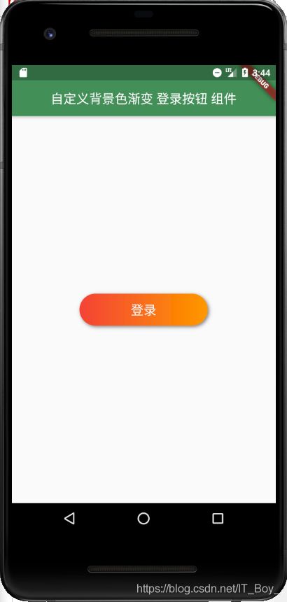
首先我们先来看一下效果图:
代码:
import 'package:flutter/material.dart';

void main() => runApp(MyApp());

class MyApp extends StatelessWidget {
  @override
  Widget build(BuildContext context) {
    return Container(
      child: MaterialApp(
        debugShowCheckedModeBanner: true,
        theme: ThemeData(
          primaryColor: Color.fromRGBO(67, 144, 87, 1.0),
        ),
        home: Scaffold(
          appBar: AppBar(
            centerTitle: true,
            title: Text("自定义背景色渐变 登录按钮 组件"),
          ),
          body: Center(
            // 组件使用
            child: LinearGradientButton(
              height: 50.0,
              width: 200.0,
              text: "登录",
              textSize: 20.0,
              textColor: Colors.white,
              leftGradientColor: Colors.red,
              rightGradientColor: Colors.orange,
              paddingTop: 0.0,
              paddingBottom: 0.0,
            ),
          ),
        ),
      ),
    );
  }
}
组件:
import 'package:flutter/material.dart';

class LinearGradientButton extends StatefulWidget {
  final double height; // 宽高
  final double width;
  final String text; // 按钮文字
  final double marginLeft; // 左右外边框
  final double marginRight;
  final Color leftGradientColor; // 左右渐变的颜色
  final Color rightGradientColor;
  final double borderRadius; // 边框圆角
  final Color shadowColor; // 阴影颜色
  final double offsetX; // x、y轴阴影大小
  final double offsetY;
  final double blurRadius; // 阴影的虚化效果大小
  final double paddingLeft; // 上下左右的内边框
  final double paddingTop;
  final double paddingRight;
  final double paddingBottom;
  final Color textColor; // 按钮文字颜色
  final double textSize; // 按钮文字大小

  LinearGradientButton({
    // 默认值
    this.height = 50.0,
    this.width = 100.0,
    this.text = "登录",
    this.marginLeft = 20.0,
    this.marginRight = 20.0,
    this.leftGradientColor = const Color.fromRGBO(73, 72, 255, 1.0),
    this.rightGradientColor = const Color.fromRGBO(67, 150, 200, 1.0),
    this.borderRadius = 90.0,
    this.shadowColor = const Color.fromRGBO(128, 128, 128, 1.0),
    this.offsetX = 2.0,
    this.offsetY = 2.0,
    this.blurRadius = 4.0,
    this.paddingLeft = 0.0,
    this.paddingTop = 13.0,
    this.paddingRight = 0.0,
    this.paddingBottom = 13.0,
    this.textColor = const Color.fromRGBO(255, 255, 255, 1.0),
    this.textSize = 16.0,
  });

  @override
  _LinearGradientButtonState createState() => _LinearGradientButtonState();
}

class _LinearGradientButtonState extends State {
  @override
  Widget build(BuildContext context) {
    return Container(
      height: widget.height,
      width: widget.width,
      // 两端的间隔 marginLeft、marginRight
      margin:
          EdgeInsets.fromLTRB(widget.marginLeft, 0.0, widget.marginRight, 0.0),
      child: DecoratedBox(
        decoration: BoxDecoration(
          gradient: LinearGradient(
            colors: [
              // 渐变颜色 leftGradientColor、rightGradientColor
              widget.leftGradientColor,
              widget.rightGradientColor
            ],
          ), // 背景渐变
          // borderRadius 圆角的大小
          borderRadius: BorderRadius.circular(widget.borderRadius), // 90.0像素圆角
          boxShadow: [
            // 阴影
            BoxShadow(
              // 阴影颜色 shadowColor
              color: widget.shadowColor,
              // 阴影的大小 offsetX、offsetY
              offset: Offset(widget.offsetX, widget.offsetY),
              // 阴影的虚化效果大小
              blurRadius: widget.blurRadius,
            ),
          ],
        ),
        child: Padding(
          // paddingTop、paddingBottom、paddingLeft、paddingRight
          padding: EdgeInsets.fromLTRB(
            widget.paddingLeft,
            widget.paddingTop,
            widget.paddingRight,
            widget.paddingBottom,
          ),
          child: Center(
            child: Text(
              // 字体内容 text
              widget.text,
              style: TextStyle(
                // 字体颜色 textColor
                color: widget.textColor,
                // 字体大小 textSize
                fontSize: widget.textSize,
              ),
            ),
          ),
        ),
      ),
    );
  }
}