Android控件:ProgressBar使用详解
1、环形进度条
ProgressBar 默认style 为 style="?android:attr/progressBarStyle" ,为一个环形进度条。
<ProgressBar
    style="?android:attr/progressBarStyle"
    android:layout_width="50dp"
    android:layout_height="50dp"
    android:layout_margin="8dp"
    android:indeterminate="true"
    android:indeterminateDrawable="@drawable/bg_gradient_rotate" />

<ProgressBar
    style="?android:attr/progressBarStyle"
    android:layout_width="50dp"
    android:layout_height="50dp"
    android:layout_margin="8dp"
    android:indeterminateDrawable="@drawable/bg_gradient_animated_rotate"/>
查找源码:
themes.xml
<item name="progressBarStyle">@style/Widget.ProgressBaritem>
styles.xml
<style name="Widget.ProgressBar">
- "indeterminateOnly"
>true
- "indeterminateDrawable">@drawable/progress_medium_white
- "indeterminateBehavior">repeat
- "indeterminateDuration">3500
- "minWidth">48dip
- "maxWidth">48dip
- "minHeight">48dip
- "maxHeight">48dip
- "mirrorForRtl">false
style>
通过styles.xml源码可以看出 indeterminateOnly 为 true, 环形进度条都是非精确的, indeterminate, progress, progressDrawable 属性的设置均为无效的。只能通过android:indeterminateDrawable 指代非精确进度条对应的Drawable 。 这个Drawable 的 最顶层标签可以为 或 ,animated-rotate 的帧数帧率在源码看是可调的,但我们自己写无法调整,所以看起来会很卡。
bg_gradient_rotate.xml
<rotate xmlns:android="http://schemas.android.com/apk/res/android"
    android:drawable="@drawable/bg_ring_with_gradient"
    android:fromDegrees="0"
    android:pivotX="50%"
    android:pivotY="50%"
    android:toDegrees="1080.0">
rotate>
bg_gradient_animated_rotate.xml
<animated-rotate
    xmlns:android="http://schemas.android.com/apk/res/android"
    android:drawable="@drawable/bg_ring_with_gradient"
    android:pivotX="50%"
    android:pivotY="50%"
    android:framesCount="12"
    android:frameDuration="100">
animated-rotate>
bg_ring_with_gradient.xml
<shape xmlns:android="http://schemas.android.com/apk/res/android"
    android:innerRadiusRatio="3"
    android:shape="ring"
    android:thicknessRatio="9"
    android:useLevel="false">
    <gradient
        android:endColor="#1FBDFF"
        android:startColor="#FFFFFF"
        android:type="sweep" />
shape>
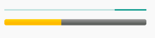
运行截图:

2、横向进度条
横向进度条对应的style为style="?android:attr/progressBarStyleHorizontal",此style 默认的 android:indeterminate 为 false 即进度是确定的。
<ProgressBar
    style="?android:attr/progressBarStyleHorizontal"
    android:layout_width="match_parent"
    android:layout_height="wrap_content"
    android:layout_margin="8dp"
    android:indeterminate="true"/>

<ProgressBar
    style="?android:attr/progressBarStyleHorizontal"
    android:layout_width="match_parent"
    android:layout_height="wrap_content"
    android:layout_margin="8dp"
    android:indeterminate="false"
    android:progress="40"
    android:progressDrawable="@drawable/progress_horizontal" />
查找源码:
themes.xml
<item name="progressBarStyleHorizontal">@style/Widget.ProgressBar.Horizontalitem>
styles.xml
<style name="Widget.ProgressBar.Horizontal">
- "indeterminateOnly"
>false
- "progressDrawable">@drawable/progress_horizontal
- "indeterminateDrawable">@drawable/progress_indeterminate_horizontal
- "minHeight">20dip
- "maxHeight">20dip
- "mirrorForRtl">true
style>
通过styles.xml源码可以看出 indeterminateOnly 为 false, 所以 indeterminate, progress, progressDrawable 属性都是可以自由设置的,当不设置时使用styles.xml中设定的默认资源
当android:indeterminate 为false时 ,此时 andorid:progress 及 android:progressDrawable 的属性设置生效
当android:indeterminate 为true时,此时 android:indeterminateDrawable 属性生效
android:progressDrawable 对应的Drawable 资源一般使用layer-list , 三个item: background, secondaryProgress, progress 分别对应 背景,第二进度和进度,可以不全部设置
<layer-list xmlns:android="http://schemas.android.com/apk/res/android">

    <item android:id="@android:id/background">
        <shape>
            <corners android:radius="5dip" />
            <gradient
                    android:startColor="#ff9d9e9d"
                    android:centerColor="#ff5a5d5a"
                    android:centerY="0.75"
                    android:endColor="#ff747674"
                    android:angle="270"
            />
        shape>
    item>

    <item android:id="@android:id/secondaryProgress">
        <clip>
            <shape>
                <corners android:radius="5dip" />
                <gradient
                        android:startColor="#80ffd300"
                        android:centerColor="#80ffb600"
                        android:centerY="0.75"
                        android:endColor="#a0ffcb00"
                        android:angle="270"
                />
            shape>
        clip>
    item>

    <item android:id="@android:id/progress">
        <clip>
            <shape>
                <corners android:radius="5dip" />
                <gradient
                        android:startColor="#ffffd300"
                        android:centerColor="#ffffb600"
                        android:centerY="0.75"
                        android:endColor="#ffffcb00"
                        android:angle="270"
                />
            shape>
        clip>
    item>

layer-list>
运行截图: