SpinKit 是一套网页动画效果,包含8种基于 CSS3 实现的很炫的加载动画。借助 CSS3 Animation 的强大功能来创建平滑,易于定制的动画。SpinKit 的目标不是提供一个每个浏览器都兼容的解决方案,而是给现代浏览器提供更优的技术实现方案和更佳的使用体验。(为保证最佳的效果,请在 Chrome、Firefox 和 Safari 等现代浏览器中浏览)
您可能感兴趣的相关文章
- 你想不到的!CSS 实现的各种球体效果
- 精心挑选的在线 CSS3 代码生成工具
- 14个支持响应式设计的流行前端开发框架
- 推荐10个特别方便的 CSS3 开发工具
- 推荐收集的40款优秀的免费 CSS 工具
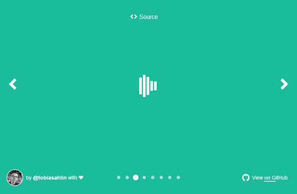
Loading 动画效果一
HTML 代码:
|
1
2
3
4
5
6
7
|
|
CSS 代码:
|
1
2
3
4
5
6
7
8
9
10
11
12
13
14
15
16
17
18
19
20
21
22
23
24
25
26
27
28
29
30
31
32
33
34
35
36
37
38
39
40
41
42
43
44
45
46
47
48
49
50
51
52
|
.spinner {
margin
:
100px
auto
;
width
:
50px
;
height
:
60px
;
text-align
:
center
;
font-size
:
10px
;
}
.spinner > div {
background-color
:
#67CF22
;
height
:
100%
;
width
:
6px
;
display
: inline-
block
;
-webkit-animation: stretchdelay
1.2
s infinite ease-in-out;
animation: stretchdelay
1.2
s infinite ease-in-out;
}
.spinner .rect
2
{
-webkit-animation-delay:
-1.1
s;
animation-delay:
-1.1
s;
}
.spinner .rect
3
{
-webkit-animation-delay:
-1.0
s;
animation-delay:
-1.0
s;
}
.spinner .rect
4
{
-webkit-animation-delay:
-0.9
s;
animation-delay:
-0.9
s;
}
.spinner .rect
5
{
-webkit-animation-delay:
-0.8
s;
animation-delay:
-0.8
s;
}
@-webkit-keyframes stretchdelay {
0%
,
40%
,
100%
{ -webkit-transform: scaleY(
0.4
) }
20%
{ -webkit-transform: scaleY(
1.0
) }
}
@keyframes stretchdelay {
0%
,
40%
,
100%
{
transform: scaleY(
0.4
);
-webkit-transform: scaleY(
0.4
);
}
20%
{
transform: scaleY(
1.0
);
-webkit-transform: scaleY(
1.0
);
}
}
|
Loading 动画效果二
HTML 代码:
|
1
|
|
CSS 代码:
|
1
2
3
4
5
6
7
8
9
10
11
12
13
14
15
16
17
18
19
20
21
22
23
24
25
26
27
28
|
.spinner {
width
:
60px
;
height
:
60px
;
background-color
:
#67CF22
;
margin
:
100px
auto
;
-webkit-animation: rotateplane
1.2
s infinite ease-in-out;
animation: rotateplane
1.2
s infinite ease-in-out;
}
@-webkit-keyframes rotateplane {
0%
{ -webkit-transform: perspective(
120px
) }
50%
{ -webkit-transform: perspective(
120px
) rotateY(
180
deg) }
100%
{ -webkit-transform: perspective(
120px
) rotateY(
180
deg) rotateX(
180
deg) }
}
@keyframes rotateplane {
0%
{
transform: perspective(
120px
) rotateX(
0
deg) rotateY(
0
deg);
-webkit-transform: perspective(
120px
) rotateX(
0
deg) rotateY(
0
deg)
}
50%
{
transform: perspective(
120px
) rotateX(
-180.1
deg) rotateY(
0
deg);
-webkit-transform: perspective(
120px
) rotateX(
-180.1
deg) rotateY(
0
deg)
}
100%
{
transform: perspective(
120px
) rotateX(
-180
deg) rotateY(
-179.9
deg);
-webkit-transform: perspective(
120px
) rotateX(
-180
deg) rotateY(
-179.9
deg);
}
}
|
Loading 动画效果三
HTML 代码:
|
1
2
3
4
|
|
CSS 代码:
|
1
2
3
4
5
6
7
8
9
10
11
12
13
14
15
16
17
18
19
20
21
22
23
24
25
26
27
28
29
30
31
32
33
34
35
36
37
38
39
40
41
|
.spinner {
width
:
60px
;
height
:
60px
;
position
:
relative
;
margin
:
100px
auto
;
}
.double-bounce
1
, .double-bounce
2
{
width
:
100%
;
height
:
100%
;
border-radius:
50%
;
background-color
:
#67CF22
;
opacity:
0.6
;
position
:
absolute
;
top
:
0
;
left
:
0
;
-webkit-animation: bounce
2.0
s infinite ease-in-out;
animation: bounce
2.0
s infinite ease-in-out;
}
.double-bounce
2
{
-webkit-animation-delay:
-1.0
s;
animation-delay:
-1.0
s;
}
@-webkit-keyframes bounce {
0%
,
100%
{ -webkit-transform: scale(
0.0
) }
50%
{ -webkit-transform: scale(
1.0
) }
}
@keyframes bounce {
0%
,
100%
{
transform: scale(
0.0
);
-webkit-transform: scale(
0.0
);
}
50%
{
transform: scale(
1.0
);
-webkit-transform: scale(
1.0
);
}
}
|
Loading 动画效果四
HTML 代码:
CSS 代码:
Loading 动画效果五
HTML 代码:
CSS 代码:
Loading 动画效果六
HTML 代码:
CSS 代码:
Loading 动画效果七
HTML 代码:
CSS 代码:
Loading 动画效果八
HTML 代码:
CSS 代码: