界面开发的推荐色值, dip,px,pt,sp 的区别
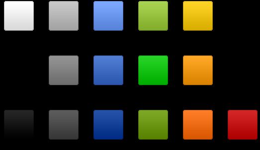
下图是帮助文档中的关于界面开发的推荐色值,大家可以参考一下:
dip: device independent pixels(设备独立像素). 不同设备有不同的显示效果,这个和设备硬件有关,一般我们为了支持WVGA、HVGA和QVGA 推荐使用这个,不依赖像素。
px: pixels(像素). 不同设备显示效果相同,一般我们HVGA代表320x480像素,这个用的比较多。
pt: point,是一个标准的长度单位,1pt=1/72英寸,用于印刷业,非常简单易用;
sp: scaled pixels(放大像素). 主要用于字体显示best for textsize。由此,根据 google 的建议,TextView 的字号最好使用 sp 做单位,而且查看TextView的源码可知 Android 默认使用 sp 作为字号单位。
在 Android 中, 1pt 大概等于 2.22sp
以上供参考,如果 UI 能够以 sp 为单位提供设计是最好的,如果设计中没有 sp的概念,则开发人员也可以通过适当的换算取近似值。
过去,程序员通常以像素为单位设计计算机用户界面。例如,定义一个宽度为300像素的表单字段,列之间的间距为5个像素,图标大小为16×16像素 等。这样处理的问题在于,如果在一个每英寸点数(dpi)更高的新显示器上运行该程序,则用户界面会显得很小。在有些情况下,用户界面可能会小到难以看清 内容。
与分辨率无关的度量单位可以解决这一问题。Android支持下列所有单位。
px(像素):屏幕上的点。
in(英寸):长度单位。
mm(毫米):长度单位。
pt(磅):1/72英寸。
dp(与密度无关的像素):一种基于屏幕密度的抽象单位。在每英寸160点的显示器上,1dp = 1px。
dip:与dp相同,多用于android/ophone示例中。
sp(与刻度无关的像素):与dp类似,但是可以根据用户的字体大小首选项进行缩放。
为了使用户界面能够在现在和将来的显示器类型上正常显示,建议大家始终使用sp作为文字大小的单位,将dip作为其他元素的单位。当然,也可以考虑使用矢量图形,而不是用位图。
1.使用include标签实现包含共享UI设计
(1)创建新的布局文件 title_layout.xml,里面包含共享内容的布局
(2)layout属性:其对应抽取出来的共享的布局内容
       <

       LinearLayout xmlns:android

       =

       "

       http://schemas.android.com/apk/res/android

       "


 android:orientation

       =

       "

       vertical

       "


 android:background

       =

       "

       @drawable/share_background

       "


 android:layout_width

       =

       "

       fill_parent

       "


 android:layout_height

       =

       "

       fill_parent

       "

       >


       <include layout="@layout/title_layout"></include>


       </

       LinearLayout

       >
2.使用shapes实现渐变效果
(1)创建新的drawable的xml文件
       <

       shape xmlns:android

       =

       "

       http://schemas.android.com/apk/res/android

       "

        android:shape

       ="rectangle"

       >


       <

       gradient android:startColor

       =

       "

       #FFFF0000

       "

        android:endColor

       =

       "

       #80FF00FF

       "


 android:angle

       =

       "

       270

       "

       />


       <

       padding android:left

       =

       "

       50dp

       "

        android:top

       =

       "

       20dp

       "


 android:right

       =

       "

       7dp

       "

        android:bottom

       =

       "

       7dp

       "


       />


       <

       corners android:radius

       =

       "

       8dp

       "


       />


       </

       shape

       >
android:shape="rectangle" 默认的也是长方形
corners表示是有半径
(还有很多其它参数)
(2)设置android:background属性
       android:background

       =

       "

       @drawable/share_background

       "
3.灵活使用styles.xml
(1)在res/values目录下新建一个style.xml,增加<resource>根节点
       <?

       xml version

       =

       "

       1.0

       "

        encoding

       =

       "

       utf-8

       "

       ?>


       <

       resources

       >


       <

       style name="SpecialText"

        parent

       =

       "

       @style/Text

       "

       >


       <

       item name

       =

       "

       android:textSize

       "

       >

       18sp

       </

       item

       >


       <

       item name

       =

       "

       android:textColor

       "

       >

       #

       008

       </

       item

       >


       </

       style

       >


       <

       style name="button_style"

       >


       <

       item name

       =

       "

       android:textStyle

       "

       >

       bold

       </

       item

       >


       <

       item name

       =

       "

       android:textColor

       "

       >

       #FFFFFFFF

       </

       item

       >


       <

       item name

       =

       "

       android:layout_width

       "

       >

       100

       .0dip

       </

       item

       >


        </style>


       </

       resources

       >
(2)设置style属性
       <

       EditText id

       =

       "

       @+id/text1

       "


 style

       =

       "

       @style/SpecialText

       "


 android:layout_width

       =

       "

       fill_parent

       "


 android:layout_height

       =

       "

       wrap_content

       "


 android:text

       =

       "

       Hello, World!

       "


       />
|
现在这个EditText组件的所表现出来的风格就为我们在上边的XML文件中所定义的那样。
|
4.自定义按钮显示效果
(1)在drawable中创建新的xml文件--mybutton.xml文件。
       <

       item android:state_window_focused

       =

       "

       false

       "

        android:drawable

       =

       "

       @color/transparent

       "


       />


       <!--

        Even though these two point to the same resource, have two states so the drawable will invalidate itself when coming out of pressed state. 注意这句话

       -->


       <

       item android:state_focused

       =

       "

       true

       "

        android:state_enabled

       =

       "

       false

       "


 android:state_pressed

       =

       "

       true

       "


 android:drawable

       =

       "

       @drawable/selector_background_disabled

       "


       />


       <

       item android:state_focused

       =

       "

       true

       "

        android:state_enabled

       =

       "

       false

       "


 android:drawable

       =

       "

       @drawable/lselector_background_disabled

       "


       />


       <

       item android:state_focused

       =

       "

       true

       "

        android:state_pressed

       =

       "

       true

       "


 android:drawable

       =

       "

       @drawable/selector_background_transition

       "


       />


       <

       item android:state_focused

       =

       "

       false

       "

        android:state_pressed

       =

       "

       true

       "


 android:drawable

       =

       "

       @drawable/selector_background_transition

       "


       />


       <

       item android:state_focused

       =

       "

       true

       "


 android:drawable

       =

       "

       @drawable/selector_background_focus

       "


       />


       </

       selector

       >
(2)在构造的layout中引用这个xml
       <

       ImageButton
android:id

       =

       "

       @+id/ImageButton01

       "


android:layout_width

       =

       "

       wrap_content

       "


android:layout_height

       =

       "

       wrap_content

       "


android:background

       ="@drawable/mybutton"

       >


       </

       ImageButton

       >
5.实现无失真图片拉伸(NinePatch图片处理)
使用draw9patch.bat工具创建 .9.png图片