自定义Silverlight DataGrid行列:Defining Columns for a Silverlight DataGrid
| This post has been updated to work with the RTW version of the Silverlight 2 DataGrid. The code examples are not guaranteed to work with previous Beta versions of the DataGrid. Read more about the features that the Silverlight 2 DataGrid has to offer... |
If you read my last post, you might have noticed how easy it is to get a Silverlight DataGrid up and running with the AutoGenerateColumns feature. Something else you might have noticed is that if you don't like the default column choices it is sort of hard to change them. Not to fear however since there are two ways to get more control. One way is to use the AutoGeneratingColumn event (we'll talk about this in a different post) but the easiest way, and the topic of our discussion today, is by using the Columns collection.
The Columns Collection and You
The Columns Collection is your ticket to controlling the DataGrid's column order, appearance, and even what controls they use to represent data in their cells. It enables you to have a concrete instance for each column that you define unlike auto generation that simply fills the column collection for you.
Before we dive into using the Columns collection though, it is useful to know what you can put in it.
DataGrid Column Types
- DataGridTextColumn - When you think of a standard column in a DataGrid, you probably picture something that looks a lot like a DataGridTextColumn. This column is the default and uses a TextBlock to display its data, and a TextBox to allow editing of its data.
- DataGridCheckBoxColumn - The DataGridCheckBoxColumn is the first out of box custom column type. It provides a read-only CheckBox for displaying a boolean or nullable boolean value, and a normal CheckBox to allow editing of that value. This column derives from DataGridBoundColumn and serves as a sample for building your own column types. We'll walk through the process of building your own column types in a future post.
- DataGridTemplateColumn - If the DataGrid was a movie, the DataGridTemplateColumn would be the star. It is the most versatile column but, like most prima donnas, takes the most work to get up and going. Once it is going though there is pretty much no limit to what it can do.
Using the Columns Collection
First we need to get our project back to where we ended last time. Go ahead and follow the steps 1 and 2here.
If you followed steps 1 & 2 from the previous post, your DataGrid should look something like this:
<data:DataGrid x:Name="dg"></data:DataGrid>
(If yours looks different because you did step 3, don't worry since it won't affect this walk through. The one exception is that you need to change IsReadOnly back to False.)
Also, in the code behind file for Page.xaml you should be setting the source to a List<Data> where Data is the custom business object you created.
Now that we are all on the same page lets start playing with the Column collection.
Since auto generation is no longer needed, go ahead and set AutoGenerateColumns to False.
<data:DataGrid x:Name="dg" AutoGenerateColumns="False"></data:DataGrid>
Now add the Columns collection, and add a Text column in it bound to the "FirstName" property.
<data:DataGrid x:Name="dg" AutoGenerateColumns="False">
    <data:DataGrid.Columns>
        <data:DataGridTextColumn Header="First Name"
                Binding="{Binding FirstName}" />
    </data:DataGrid.Columns>
</data:DataGrid>
The code above is doing a few things:
- It creates the Columns collection using the <data:DataGrid.Columns> tag.
- Inside that collection it creates a new DataGridTextColumn
- The content that you see in the column header is set to "First Name" using the Header property
- The column is data bound to the FirstName property using the Binding property. Notice that since the DataContext of the DataGrid is its ItemsSource collection a Source does not need to be specified.
Side Note: Some of you might be wondering why we use Binding here instead of a string like DisplayMemberPath. The thinking behind this decision was that a binding gives you a lot more control of what ends up being shown. It allows the use of converters, and leaves the door open for the addition of validation, and formatters.
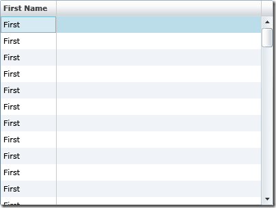
If you run this you should see something like this:
In addition to the Header and Binding properties, you can also customize the column through properties such as:
Column Properties:
- CanUserResize - Determines if this column can be resized. In regards to its relationship with the DataGrid property CanUserResizeColumns, false always wins.
- CanUserReorder - Determines if this column can be reordered with other columns. In regards to its relationship with the DataGrid property CanUserReorderColumns, false always wins.
- CanUserSort - Determines if this column can be sorted. In regards to its relationship with the DataGrid property CanUserSortColumns, false always wins.
- IsReadOnly - Determines if this column can be edited. In regards to its relationship with the DataGrid property IsReadOnly, true always wins.
- Width - Sets the width of the column. Setting this value overrides the DataGrid ColumnWidth property.
- MinWidth - Sets the minimum width for this column.
- Visibility - Hides or shows this column
- ElementStyle - The property used to style the display element for a column. (In the case of the TextBox Column the display element is the TextBlock)
- EditingElementStyle - The property used to style the editing element for a column. (In the case of the TextBox Column the display element is the TextBox)
TextBox Column Specific Properties:
- FontFamily - Sets the FontFamily property on both the TextBlock and TextBox.
- FontSize - Sets the FontSize property on both the TextBlock and TextBox.
- FontStyle - Sets the FontStyle property on both the TextBlock and TextBox.
- FontWeight - Sets the FontWeight property on both the TextBlock and TextBox.
- Foreground - Sets the Foreground property on both the TextBlock and TextBox.
CheckBox Column Specific Properties:
- IsThreeState - Sets the IsThreeState property on the CheckBoxes
Lets now finish off the columns that we used to have by adding two more DataGridTextBoxColumns and a DataGridCheckBoxColumn bound to "LastName", "Age", and "Available".
<data:DataGrid x:Name="dg" AutoGenerateColumns="False" >
    <data:DataGrid.Columns>
        <data:DataGridTextColumn Header="First Name"
                Binding="{Binding FirstName}" />
        <data:DataGridTextColumn Header="Last Name"
                Binding="{Binding LastName}" />
        <data:DataGridTextColumn Header="Age" Width="50"
                Binding="{Binding Age}" />
        <data:DataGridCheckBoxColumn Header="Available"
                Binding="{Binding Available}" />
    </data:DataGrid.Columns>
</data:DataGrid>
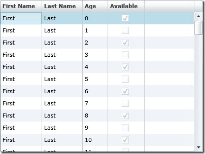
Now when you run the application you have the same output as the auto generation, except now you control the order, what the header says, and you can set properties. For instance in the code above the width of the Age column is set to 50 instead of the usual Auto.
Unleashing the Template Column
Now that we have recreated the auto generated DataGrid from before let's add some new functionality, specifically a column that can be bound to a DateTime. To do this we can either create a new column type, or just use a template column. Since we only plan on using this column once, let's use a template column.
First let's add something for this column to bind to. Going back to your Data class, add the following property:
C#
public DateTime Birthday{ get; set; }
VB
Private _birthday As DateTime

Property Birthday() As DateTime
    Get
        Return _birthday
    End Get
    Set(ByVal value As DateTime)
        _birthday = value
    End Set
End Property
Also we need to update the Page.xaml code behind to initialize the new property:
C#
public Page()
{
    InitializeComponent();

    List<Data> source = new List<Data>();
    int itemsCount = 100;

    for (int i = 0; i < itemsCount; i++)
    {
        source.Add(new Data()
        {
            FirstName = "First",
            LastName = "Last",
            Age = i,
            Available = i % 2 == 0,
            Birthday = DateTime.Today.AddYears(-i)
        });
    }

    dg.ItemsSource = source;
}
VB
Public Sub New()
    InitializeComponent()

    Dim Source As List(Of Data) = New List(Of Data)
    Dim ItemsCount As Integer = 100

    For index As Integer = 1 To ItemsCount
        Source.Add(New Data() With _
        { _
            .FirstName = "First", _
            .LastName = "Last", _
            .Age = index, _
            .Available = (index Mod 2 = 0), _
            .Birthday = DateTime.Today.AddYears(-index) _
        })
    Next

    dg.ItemsSource = Source
End Sub
Now that the data is there we can bind to it. Going back to the Page.xaml file add a DataGridTemplateColumn to the Columns collection right after the "Available" column.
xmlns:basics="clr-namespace:System.Windows.Controls;
assembly=System.Windows.Controls"
<data:DataGrid x:Name="dg" AutoGenerateColumns="False" >
    <data:DataGrid.Columns>
        <data:DataGridTextColumn Header="First Name"
                Binding="{Binding FirstName}" />
        <data:DataGridTextColumn Header="Last Name"
                Binding="{Binding LastName}" />
        <data:DataGridTextColumn Header="Age" Width="50"
                Binding="{Binding Age}" />
        <data:DataGridCheckBoxColumn Header="Available"
                Binding="{Binding Available}" />

        <data:DataGridTemplateColumn Header="Birthday">
            <data:DataGridTemplateColumn.CellTemplate>
                <DataTemplate>
                    <TextBlock Text="{Binding Birthday}" Margin="4"/>
                </DataTemplate>
            </data:DataGridTemplateColumn.CellTemplate>
            <data:DataGridTemplateColumn.CellEditingTemplate>
                <DataTemplate>
                    <basics:DatePicker
                        SelectedDate="{Binding Birthday, Mode=TwoWay}" />
                </DataTemplate>
            </data:DataGridTemplateColumn.CellEditingTemplate>
        </data:DataGridTemplateColumn>

    </data:DataGrid.Columns>
</data:DataGrid>
Warning: Be sure to add the DatePicker from the ToolBox so the basics namespace and associated reference to System.Windows.Controls is added for you.
What's going on in the code above:
- A DataGridTemplateColumn is being added to the Columns collection with its header being set to "Birthday".
- The CellTemplate property, which takes a DataTemplate, is being used to define the UI that cells in the column will use to display the data.
- In this instance, the content of that DataTemplate is a TextBlock that has its Text property bound to the "Birthday" property on the Data Item. Once again notice that no binding source is necessary since the default DataContext of a Template column's contents is the data item that it will be representing.
- In addition to the CellTemplate the DataGridTemplateColumn's CellEditingTemplate property is also being set. This property is also a DataTemplate and defines the UI that cells in the column will display during edit mode.
- In this instance, the content of the CellEditingTemplate's DataTemplate is a DatePicker control that has its SelectedDate property also bound to the "Birthday" property.
- Notice that its binding has the Mode property set to TwoWay. This is crucial to make sure that any changes made to this property at runtime will be pushed back into the data source. Note that you do not need to set the Mode when you are using the DisplayMemberBinding property in column types other than DataGridTemplateColumn because the columns themselves take care of this.
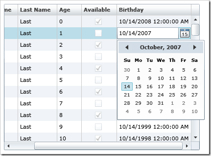
When you run this you should see a new column in your DataGrid that uses a TextBlock to display a date, and then switches to a DatePicker during edit mode to provide a richer input experience.
(If your DataGrid still has all of the properties set from Step 3 of the last post you need to set IsReadOnly back to False if you want to be able to see the DatePicker in edit mode)
Using Value Converters
This column is pretty much exactly what we want, but there is a finishing touch missing. If you look at the text, it has an annoying 12:00:00 AM after each date. Since we only care about the date itself and not the time, let's reformat this string to the short date format that matches what is shown in the DatePicker.
Add a new class to your Silverlight project and name it "DateTimeConverter". Then add:
C#
using System.Windows.Data;
using System.Globalization;
public class DateTimeConverter: IValueConverter
{
    public object Convert(object value,
                       Type targetType,
                       object parameter,
                       CultureInfo culture)
    {
        DateTime date = (DateTime)value;
        return date.ToShortDateString();
    }

    public object ConvertBack(object value,
                              Type targetType,
                              object parameter,
                              CultureInfo culture)
    {
        string strValue = value.ToString();
        DateTime resultDateTime;
        if (DateTime.TryParse(strValue, out resultDateTime))
        {
            return resultDateTime;
        }
        return value;
    }
}
VB
Imports System.Windows.Data

Public Class DateTimeConverter
    Implements IValueConverter

    Public Function Convert(ByVal value As Object, _
                ByVal targetType As System.Type, _
                ByVal parameter As Object, _
                ByVal culture As System.Globalization.CultureInfo) _
                As Object _
                Implements System.Windows.Data.IValueConverter.Convert

        Dim DateValue As DateTime = value
        Return DateValue.ToShortDateString()

    End Function

    Public Function ConvertBack(ByVal value As Object, _
                ByVal targetType As System.Type, _
                ByVal parameter As Object, _
                ByVal culture As System.Globalization.CultureInfo) _
                As Object _
                Implements System.Windows.Data.IValueConverter.ConvertBack

        Dim StrValue As String = value.ToString()
        Dim ResultDateTime As DateTime

        If DateTime.TryParse(StrValue, ResultDateTime) Then
            Return ResultDateTime
        End If

        Return value

    End Function
End Class
If you look at the code, a converter is a class that implements IValueConverter and as part of that provides two methods: Convert and ConvertBack. These two methods are where you can perform your custom logic, in this case parsing a DateTime to and from a short date string format.
Now that you have your reusable converter class you can use it in data binding.
Back in your Page.xaml add a local xmlns. To do this add the following in the UserControl tag next to the other xmlns declarations:
xmlns:local="clr-namespace:_____________"
Where the _________ is the name of your Application. IntelliSense should provide the correct syntax as an option in the dropdown. Next add the converter to your UserControl as a static resource.
<UserControl.Resources>
    <local:DateTimeConverter x:Key="DateConverter" />
</UserControl.Resources>
Finally use the converter in the TextBox's binding in the DataGridTemplateColumn.
<TextBlock
    Text="{Binding Birthday, Converter={StaticResource DateConverter}}"
    Margin="4"/>
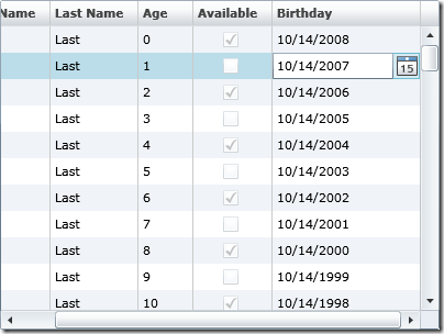
Now when you run the application, the text will be formatted in the manner that the converter specified.


