https://github.com/reiinakano/scikit-plot


TP:预测类别是P(正例),真实类别也是P
FP:预测类别是P,真实类别是N(反例)
TN:预测类别是N,真实类别也是N
FN:预测类别是N,真实类别是P
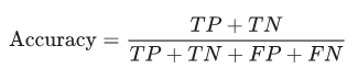
1.准确率(accuracy)
所有预测正确的样本/总的样本 = (TP+TN)/总
from sklearn.metrics import accuracy
accuracy = accuracy_score(y_test, y_predict)
2.查准率(precision)
精确率是针对我们预测结果而言的,它表示的是预测为正的样本中有多少是真正的正样本。那么预测为正就有两种可能了,一种就是把正类预测为正类(TP),另一种就是把负类预测为正类(FP),也就是
from sklearn.metrics import precision_score
precision = precision_score(y_test, y_predict)
3.查全率/召回率(recall)
召回率是针对我们原来的样本而言的,它表示的是样本中的正例有多少被预测正确了。那也有两种可能,一种是把原来的正类预测成正类(TP),另一种就是把原来的正类预测为负类(FN):
from sklearn.metrics import recall_score
recall = recall_score(y_test, y_predict)
#recall得到的是一个list,是每一类的召回率
4.F1
是精确率和召回率的调和平均
from sklearn.metrics import f1_score
f1_score(y_test, y_predict)
5.PR曲线
PR曲线是准确率和召回率的点连成的线。
PR曲线展示的是Precision vs Recall的曲线,PR曲线与ROC曲线的相同点是都采用了TPR (Recall),都可以用AUC来衡量分类器的效果。不同点是ROC曲线使用了FPR,而PR曲线使用了Precision,因此PR曲线的两个指标都聚焦于正例。类别不平衡问题中由于主要关心正例,所以在此情况下PR曲线被广泛认为优于ROC曲线。
6.ROC曲线
ROC的含义为概率曲线,AUC的含义为正负类可正确分类的程度。它告诉模型能够在多大程度上区分类,AUC越高,模型越能预测0为0和1为1。类比疾病诊断模型,若AUC越高,模型对有疾病和无疾病的区分就越好。
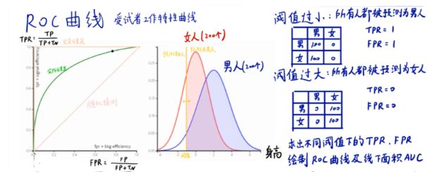
截断点thresholds
机器学习算法对test样本进行预测后,可以输出各test样本对某个类别的相似度概率。比如t1是P类别的概率为0.3,一般我们认为概率低于0.5,t1就属于类别N。这里的0.5,就是”截断点”。
TPR FPR
样本中的真实正例类别总数即TP+FN
TPR即True Positive Rate,TPR = TP/(TP+FN)。
TPR:真实的正例中,被预测为正例的比例
样本中的真实反例类别总数为FP+TN
FPR即False Positive Rate,FPR=FP/(TN+FP)。
FPR:真实的反例中,被预测为正例的比例
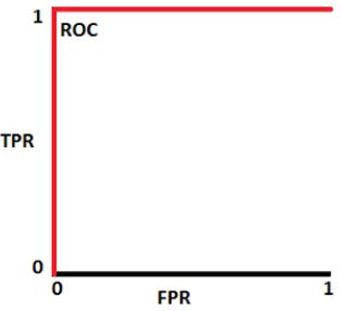
理想分类器TPR=1,FPR=0
ROC曲线越接近左上角,代表模型越好,即ACU接近1
7.AUC
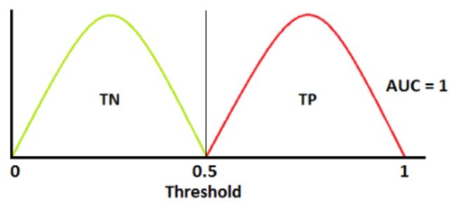
如上图为正类和负类的分布,我们根据ROC曲线的定义,以阈值为1向0移动,得到相应的TPR和FPR,因此我们根据上图可画出ROC曲线,ROC曲线下的面积等于1,即AUC=1。
同理,我们根据下图的正负类分布画出ROC曲线,AUC = 0.7
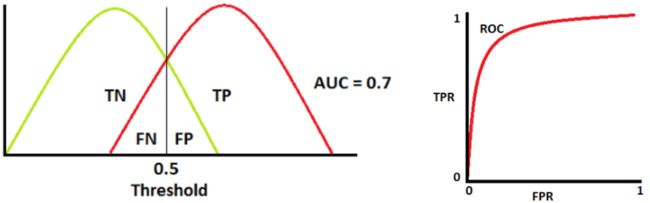
AUC值为ROC曲线所覆盖的区域面积,显然,AUC越大,分类器分类效果越好。
AUC = 1,是完美分类器,采用这个预测模型时,不管设定什么阈值都能得出完美预测。绝大多数预测的场合,不存在完美分类器。
0.5 < AUC < 1,优于随机猜测。这个分类器(模型)妥善设定阈值的话,能有预测价值。
AUC = 0.5,跟随机猜测一样(例:丢铜板),模型没有预测价值。
AUC < 0.5,比随机猜测还差;但只要总是反预测而行,就优于随机猜测。
Binary-class classification
import numpy as np
np.random.seed(10)
import matplotlib.pyplot as plt
from sklearn.datasets import make_classification
from sklearn.preprocessing import label_binarize
from sklearn.ensemble import RandomForestClassifier
from sklearn.model_selection import train_test_split
from sklearn.metrics import roc_curve

X, y = make_classification(n_samples=80000)
# print(X[0], y[0])
# (80000, 20) (80000,)

X_train, X_test, y_train, y_test = train_test_split(X, y, test_size=0.5)

X_train, X_train_lr, y_train, y_train_lr = train_test_split(X_train,                                                            y_train,                                                       test_size=0.5)

from keras.models import Sequential
from keras.layers import Dense
from sklearn.metrics import auc

model = Sequential()
model.add(Dense(20, input_dim=20, activation='relu'))
model.add(Dense(40, activation='relu'))
model.add(Dense(1, activation='sigmoid'))
model.compile(loss='binary_crossentropy', optimizer='adam', metrics=['accuracy'])
model.fit(X_train, y_train, epochs=5, batch_size=100, verbose=1)

y_pred = model.predict(X_test).ravel()
print(y_pred.shape)

fpr, tpr, thresholds = roc_curve(y_test, y_pred)

roc_auc = auc(fpr, tpr)


plt.figure(1)
plt.plot([0, 1], [0, 1], 'k--')
plt.plot(fpr, tpr, label='Keras (area = {:.3f})'.format(roc_auc))
plt.xlabel('False positive rate')
plt.ylabel('True positive rate')
plt.title('ROC curve')
plt.legend(loc='best')
plt.show()
# Zoom in view of the upper left corner.
plt.figure(2)
plt.xlim(0, 0.2)
plt.ylim(0.8, 1)
plt.plot([0, 1], [0, 1], 'k--')
plt.plot(fpr, tpr, label='Keras (area = {:.3f})'.format(roc_auc))
plt.xlabel('False positive rate')
plt.ylabel('True positive rate')
plt.title('ROC curve (zoomed in at top left)')
plt.legend(loc='best')
plt.show()


# (Optional) Prediction probability density function(PDF)

import numpy as np
from scipy.interpolate import UnivariateSpline
from matplotlib import pyplot as plt

def plot_pdf(y_pred, y_test, name=None, smooth=500):
    positives = y_pred[y_test == 1]
    negatives = y_pred[y_test == 0]
    N = positives.shape[0]
    n = N//smooth
    s = positives
    p, x = np.histogram(s, bins=n) # bin it into n = N//10 bins
    x = x[:-1] + (x[1] - x[0])/2   # convert bin edges to centers
    f = UnivariateSpline(x, p, s=n)
    plt.plot(x, f(x))

    N = negatives.shape[0]
    n = N//smooth
    s = negatives
    p, x = np.histogram(s, bins=n) # bin it into n = N//10 bins
    x = x[:-1] + (x[1] - x[0])/2   # convert bin edges to centers
    f = UnivariateSpline(x, p, s=n)
    plt.plot(x, f(x))
    plt.xlim([0.0, 1.0])
    plt.xlabel('density')
    plt.ylabel('density')
    plt.title('PDF-{}'.format(name))
    plt.show()
plot_pdf(y_pred, y_test, 'Keras')

Multi-class classification
from sklearn.datasets import make_classification
from sklearn.preprocessing import label_binarize
from keras.models import Sequential
from keras.layers import Dense
import numpy as np
from scipy import interp
import matplotlib.pyplot as plt
from itertools import cycle
from sklearn.model_selection import train_test_split
from sklearn.metrics import roc_curve, auc

# 标签共三类
n_classes = 3

X, y = make_classification(n_samples=80000, n_features=20, n_informative=3, n_redundant=0, n_classes=n_classes,
    n_clusters_per_class=2)
# print(X.shape, y.shape)
# print(X[0], y[0])
# (80000, 20) (80000,)
# [-1.90920853 -1.30052757 -0.76903467 -3.2546519  -0.02947816  0.14105006
#   0.43556031 -0.81300607 -0.94553296 -0.92774495  1.49041451 -0.4443121
#  -1.16342165 -0.32997815 -1.02907045 -0.39950447 -0.711287    0.51382424
#   2.88822258 -2.0935274 ]
# 1

# Binarize the output相当于one_hot
y = label_binarize(y, classes=[0, 1, 2])
# print(y.shape, y[0])
# (80000, 3) [0 1 0]

X_train, X_test, y_train, y_test = train_test_split(X, y, test_size=0.5)
model = Sequential()
model.add(Dense(20, input_dim=20, activation='relu'))
model.add(Dense(40, activation='relu'))
model.add(Dense(3, activation='softmax'))
model.compile(loss='categorical_crossentropy', optimizer='adam', metrics=['accuracy'])
model.fit(X_train, y_train, epochs=1, batch_size=100, verbose=1)

y_pred = model.predict(X_test)
# print(y_pred.shape)
# (40000, 3)

# Compute ROC curve and ROC area for each class
fpr = dict()
tpr = dict()
roc_auc = dict()
for i in range(n_classes):
    # scores = np.array([0.1, 0.4, 0.35, 0.8])
    # fpr, tpr, thresholds = metrics.roc_curve(y, scores, pos_label=2)
    # y 就是标准值,scores 是每个预测值对应的阳性概率,比如0.1就是指第一个数预测为阳性的概率为0.1,很显然,
    # y 和 socres应该有相同多的元素,都等于样本数。pos_label=2 是指在y中标签为2的是标准阳性标签,其余值是阴性。
    # 接下来选取一个阈值计算TPR/FPR,阈值的选取规则是在scores值中从大到小的以此选取,于是第一个选取的阈值是0.8
    # label=[1,1,2,2] scores=[0.1,0.4,0.35,0.8] thresholds=[0.8,0.4,0.35,0.1] 以threshold为0.8为例,将0.8与
    # scores 中所有值比较大小得到预测值,[0,0,0,1].对于label中两个1,其概率分别为0.1,0.4,小于阈值0.8,判定为
    # 负样本,而他们的label是1,说明他们确实是负样本,判断正确,是两个TN;两个2,对应概率为0.35,0.8,0.35小于
    # 0.8,判定为负样本,但是label是2,应该是个正样本,所以这是个FN;最后0.8>=0.8,这是个TP,所以最后的结果是
    # :1个TP,2个TN,1个FN,0个FP
    fpr[i], tpr[i], thresholds = roc_curve(y_test[:, i], y_pred[:, i])  # (40000,)
    # print(fpr[i].shape)# (5491,)# (6562,)# (4271,)
    roc_auc[i] = auc(fpr[i], tpr[i])


# 计算microROC曲线和ROC面积
# .ravel()将多维数组转换为一维数组
fpr["micro"], tpr["micro"]  , thresholds = roc_curve(y_test.ravel(), y_pred.ravel())  #  (120000,)
roc_auc["micro"] = auc(fpr["micro"], tpr["micro"])

# 计算macroROC曲线和ROC面积
# 首先,汇总所有的假阳性率
# np.unique() 该函数是去除数组中的重复数字,并进行排序之后输出。
# print(np.concatenate([fpr[i] for i in range(n_classes)]).shape) (16324,)
all_fpr = np.unique(np.concatenate([fpr[i] for i in range(n_classes)]))  # (7901,)
# 然后插值所有的ROC曲线在这一点
# np.zeros_like() 这个函数的意思就是生成一个和你所给数组a相同shape的全0数组。
mean_tpr = np.zeros_like(all_fpr)
for i in range(n_classes):
    mean_tpr += interp(all_fpr, fpr[i], tpr[i])

# 最后求平均值并计算AUC
mean_tpr /= n_classes
fpr["macro"] = all_fpr
tpr["macro"] = mean_tpr
roc_auc["macro"] = auc(fpr["macro"], tpr["macro"])

# Plot all ROC curves
plt.figure(1)
plt.plot(fpr["micro"], tpr["micro"], color='deeppink', linestyle=':', linewidth=4,
         label='micro-average ROC curve (area = {0:0.2f})'.format(roc_auc["micro"]))

plt.plot(fpr["macro"], tpr["macro"],color='navy', linestyle=':', linewidth=4,
         label='macro-average ROC curve (area = {0:0.2f})'.format(roc_auc["macro"]))

colors = cycle(['aqua', 'darkorange', 'cornflowerblue'])
for i, color in zip(range(n_classes), colors):
    plt.plot(fpr[i], tpr[i], color=color, linewidth=2,
             label='ROC curve of class {0} (area = {1:0.2f})'.format(i, roc_auc[i]))

plt.plot([0, 1], [0, 1], 'k--', linewidth=2)
plt.xlim([0.0, 1.0])
plt.ylim([0.0, 1.05])
plt.xlabel('False Positive Rate')
plt.ylabel('True Positive Rate')
plt.title('Some extension of Receiver Operating Characteristic to multi-class')
plt.legend(loc='best')
plt.show()


# Zoom in view of the upper left corner.
plt.figure(2)
plt.xlim(0, 0.2)
plt.ylim(0.8, 1)
plt.plot(fpr["micro"], tpr["micro"],color='deeppink', linestyle=':', linewidth=4,
         label='micro-average ROC curve (area = {0:0.2f})'.format(roc_auc["micro"]))

plt.plot(fpr["macro"], tpr["macro"],color='navy', linestyle=':', linewidth=4,
         label='macro-average ROC curve (area = {0:0.2f})'.format(roc_auc["macro"]))

colors = cycle(['aqua', 'darkorange', 'cornflowerblue'])
for i, color in zip(range(n_classes), colors):
    plt.plot(fpr[i], tpr[i], color=color, linewidth=2,
             label='ROC curve of class {0} (area = {1:0.2f})'.format(i, roc_auc[i]))

plt.plot([0, 1], [0, 1], 'k--', linewidth=2)
plt.xlabel('False Positive Rate')
plt.ylabel('True Positive Rate')
plt.title('ROC curve (zoomed in at top left)')
plt.legend(loc='best')
plt.show()
8.混淆矩阵confusion matrix:
def plot_confusion_matrix(title, y_true, y_pred, labels):
    import matplotlib.pyplot as plt
    from sklearn.metrics import confusion_matrix

    cm = confusion_matrix(y_true, y_pred)

    # np.newaxis的作用就是在这一位置增加一个一维,这一位置指的是np.newaxis所在的位置,比较抽象,需要配合例子理解。
    # x1 = np.array([1, 2, 3, 4, 5])
    # the shape of x1 is (5,)
    # x1_new = x1[:, np.newaxis]
# now, the shape of x1_new is (5, 1)


    cm_normalized = cm.astype('float') / cm.sum(axis=1)[:, np.newaxis]
    # print (cm, '\n\n', cm_normalized)
    # [[1 0 0 0 0]
    #  [0 1 0 0 0]
    #  [0 0 1 0 0]
    #  [0 0 0 1 0]
    #  [0 0 0 0 1]]

    #  [[1. 0. 0. 0. 0.]
    #  [0. 1. 0. 0. 0.]
    #  [0. 0. 1. 0. 0.]
    #  [0. 0. 0. 1. 0.]
    #  [0. 0. 0. 0. 1.]]
    tick_marks = np.array(range(len(labels))) + 0.5
    #  [0.5 1.5 2.5 3.5 4.5 5.5]
    np.set_printoptions(precision=2)

    plt.figure(figsize=(10, 8), dpi=120)
    ind_array = np.arange(len(labels))
    x, y = np.meshgrid(ind_array, ind_array)
    # print(ind_array, '\n\n', x, '\n\n', y)
    # [0 1 2 3 4 5]

    #  [[0 1 2 3 4 5]
    #  [0 1 2 3 4 5]
    #  [0 1 2 3 4 5]
    #  [0 1 2 3 4 5]
    #  [0 1 2 3 4 5]
    #  [0 1 2 3 4 5]]

    #  [[0 0 0 0 0 0]
    #  [1 1 1 1 1 1]
    #  [2 2 2 2 2 2]
    #  [3 3 3 3 3 3]
    #  [4 4 4 4 4 4]
    #  [5 5 5 5 5 5]]
    intFlag = 0 # 标记在图片中对文字是整数型还是浮点型
    for x_val, y_val in zip(x.flatten(), y.flatten()):
        # plt.text()函数用于设置文字说明。

        if (intFlag):
            c = cm[y_val][x_val]
            plt.text(x_val, y_val, "%d" % (c,), color='red', fontsize=8, va='center', ha='center')

        else:
            c = cm_normalized[y_val][x_val]
            if (c > 0.01):
                plt.text(x_val, y_val, "%0.2f" % (c,), color='red', fontsize=7, va='center', ha='center')
            else:
                plt.text(x_val, y_val, "%d" % (0,), color='red', fontsize=7, va='center', ha='center')
    cmap = plt.cm.binary
    if(intFlag):
        plt.imshow(cm, interpolation='nearest', cmap=cmap)
    else:
        plt.imshow(cm_normalized, interpolation='nearest', cmap=cmap)
    plt.gca().set_xticks(tick_marks, minor=True)
    plt.gca().set_yticks(tick_marks, minor=True)
    plt.gca().xaxis.set_ticks_position('none')
    plt.gca().yaxis.set_ticks_position('none')
    plt.grid(True, which='minor', linestyle='-')
    plt.gcf().subplots_adjust(bottom=0.15)
    plt.title(title)
    plt.colorbar()
    xlocations = np.array(range(len(labels)))
    plt.xticks(xlocations, labels, rotation=90)
    plt.yticks(xlocations, labels)
    plt.ylabel('Index of True Classes')
    plt.xlabel('Index of Predict Classes')
    plt.savefig('confusion_matrix.jpg', dpi=300)
    plt.show()
title='Confusion Matrix'
labels = ['A', 'B', 'C', 'F', 'G']
y_true = [1, 2, 3, 4, 5]# np.loadtxt(r'/home/dingtom/a.txt')
y_pred = [1, 2, 3, 4, 5]# np.loadtxt(r'/home/dingtom/b.txt')
plot_confusion_matrix(title, y_true,y_pred, labels)
参考:
https://github.com/Tony607/ROC-Keras/blob/master/ROC-Keras.ipynb
混淆矩阵
混淆矩阵是一张表,这张表通过对比已知分类结果的测试数据的预测值和真实值表来描述衡量分类器的性能。在二分类的情况下,混淆矩阵是展示预测值和真实值四种不同结果组合的表。

假正例&假负例
假正例和假负例用来衡量模型预测的分类效果。假正例是指模型错误地将负例预测为正例。假负例是指模型错误地将正例预测为负例。主对角线的值越大(主对角线为真正例和真负例),模型就越好;副对角线给出模型的最差预测结果。假正例下面给出一个假正例的例子。比如:模型将一封邮件分类为垃圾邮件(正例),但这封邮件实际并不是垃圾邮件。这就像一个警示,错误如果能被修正就更好,但是与假负例相比,它并不是一个严重的问题。作者注:个人观点,这个例子举的不太好,对垃圾邮件来说,相比于错误地将垃圾邮件分类为正常邮件(假负例),将正常邮件错误地分类为垃圾邮件(假正例)是更严重的问题。假正例(I型错误)——原假设正确而拒绝原假设。

假负例假负例的一个例子。例如,该模型预测一封邮件不是垃圾邮件(负例),但实际上这封邮件是垃圾邮件。这就像一个危险的信号,错误应该被及早纠正,因为它比假正例更严重。假负例(II型错误)——原假设错误而接受原假设
上图能够很容易地说明上述指标。左图男士的测试结果是假正例因为男性不能怀孕;右图女士是假负例因为很明显她怀孕了。从混淆矩阵,我们能计算出准确率、精度、召回率和F-1值。准确率准确率是模型预测正确的部分。

当数据集不平衡,也就是正样本和负样本的数量存在显著差异时,单独依靠准确率不能评价模型的性能。精度和召回率是衡量不平衡数据集的更好的指标。**精度**精度是指在所有预测为正例的分类中,预测正确的程度为正例的效果。
精度越高越好。召回率召回率是指在所有预测为正例(被正确预测为真的和没被正确预测但为真的)的分类样本中,召回率是指预测正确的程度。它,也被称为敏感度或真正率(TPR)。

召回率越高越好。F-1值通常实用的做法是将精度和召回率合成一个指标F-1值更好用,特别是当你需要一种简单的方法来衡量两个分类器性能时。F-1值是精度和召回率的调和平均值。
普通的通常均值将所有的值平等对待,而调和平均值给予较低的值更高的权重,从而能够更多地惩罚极端值。所以,如果精度和召回率都很高,则分类器将得到很高的F-1值。
接受者操作曲线(ROC)和曲线下的面积(AUC)
ROC曲线是衡量分类器性能的一个很重要指标,它代表模型准确预测的程度。ROC曲线通过绘制真正率和假正率的关系来衡量分类器的敏感度。如果分类器性能优越,则真正率将增加,曲线下的面积会接近于1.如果分类器类似于随机猜测,真正率将随假正率线性增加。AUC值越大,模型效果越好。
累积精度曲线
CAP代表一个模型沿y轴为真正率的累积百分比与沿x轴的该分类样本累积百分比。CAP不同于接受者操作曲线(ROC,绘制的是真正率与假正率的关系)。与ROC曲线相比,CAP曲线很少使用。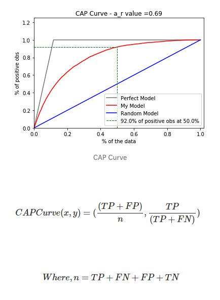
以考虑一个预测客户是否会购买产品的模型为例,如果随机选择客户,他有50%的概率会购买产品。客户购买产品的累积数量会线性地增长到对应客户总量的最大值,这个曲线称为CAP随机曲线,为上图中的蓝色线。而一个完美的预测,准确地确定预测了哪些客户会购买产品,这样,在所有样本中只需选择最少的客户就能达到最大购买量。这在CAP曲线上产生了一条开始陡峭一旦达到最大值就会维持在1的折线,称为CAP的完美曲线,也被称为理想曲线,为上图中灰色的线。最后,一个真实的模型应该能尽可能最大化地正确预测,接近于理想模型曲线。参考链接:
http://www.semspirit.com/artificial-intelligence/machine-learning/classification/classifier-evaluation/classifier-evaluation-with-cap-curve-in-python/" "_blank"
分类器的代码见:
https://github.com/BadreeshShetty/Supervised-ML-Classification" "_blank"Github Repo