移动端布局之less+rem+媒体查询
rem与em
rem相对单位,取决于html字体大小。 而em也是相对单位,取决于父元素的字体大小
Document
媒体查询
媒体查询(Media Query)是CSS3新语法。
作用:针对不同的屏幕 设置不同的样式
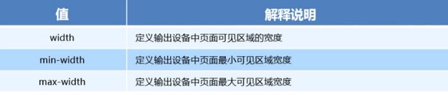
媒体查询语法规范
- 用 @media开头 注意@符号
- mediatype:媒体类型
- 关键字 and not only
- media feature 媒体特性必须有小括号
语法
@media mediatype and|not|only (media feature) {
    CSS-Code;
}
媒体类型
将不同的终端设备划分成不同的类型,被称为媒体类型。

关键字
关键字将媒体类型与媒体特性连接起来作为媒体查询的条件
- and:可以将多个媒体特性连接到一起,相当于“且”的意思。
- not:排除某个媒体类型,相当于“非”的意思,可以省略。
- only:指定某个特定的媒体类型,可以省略。
媒体特性
每种媒体类型具有不同的特性
Document
媒体查询之案例

Document
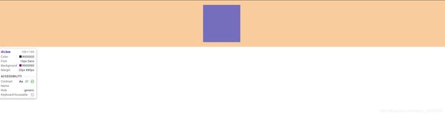
媒体查询+rem实现元素的动态变化
Document
header
媒体查询之引入资源
书写多个不同屏幕尺寸下的样式,针对于不同的屏幕尺寸,调用不同的样式
style320
div {
    width: 100%;
    height: 50px;
}

div:nth-of-type(1) {
    background-color: red;
}

div:nth-of-type(2) {
    background-color: blue;
}
style640
div {
    float: left;
    width: 50%;
    height: 25px;
}

div:nth-of-type(1) {
    background-color: red;
}

div:nth-of-type(2) {
    background-color: purple;
}
index
引入资源
媒体查询总结
- 媒体查询是按照从小到大的顺序来写
- 媒体查询是由媒体类型 关键字 媒体特性组成
- 媒体特性要加小括号
css的缺点
- 书写大量无逻辑的代码,css冗余度是比较高的。
- 处理起来比较艰难
- 没有计算的能力
less
less是css的预处理语言 它拓展css动态特性 它在css语法基础上扩展一些功能,引进变量 函数 使css有计算能力
如何安装less
①安装nodejs,可选择版本(14.7.0),网址:nodejs.cn/download/
②检查是否安装成功,使用cmd命令(win10是window+r 打开运行输入cmd) —输入“node –v”查看版本即可
③基于nodejs在线安装Less,使用cmd命令“npm install -g less”即可
④检查是否安装成功,使用cmd命令“ lessc -v ”查看版本即可
注意:vscode想要编译less 必须要使用Easy LESS插件 只要保存一下Less文件,会自动生成CSS文件。
注意:vscode想要编译less 必须要使用Easy LESS插件 只要保存一下Less文件,会自动生成CSS文件。
less变量
@变量名:值;
注意事项
- 必须@为前缀
- 不能包含特殊字符
- 不能以数字开头
- 大小写敏感
less文件
@color:purple;
@font:20px;
@baseline:50px;
html {
    font-size: @baseline;
}
.box {
    color: @color;
    font-size: @font;
    background-color: red;
    text-align: center;
    height: 1rem;
    line-height: 1rem;
}
编译后的css文件
html {
  font-size: 50px;
}
.box {
  color: purple;
  font-size: 20px;
  background-color: red;
  text-align: center;
  height: 1rem;
  line-height: 1rem;
}
html文件
    Document


        hello word

less嵌套
- 子元素的样式直接写在父元素上即可
- 如果有链接伪类选择器 交集选择器 伪元素选择器使用&进行连接
less文件
// 后代选择器

.box {
    width: 400px;
    height: 400px;
    margin: 20px auto;
    background-color: red;
    p {
        width: 200px;
        height: 200px;
        background-color: rebeccapurple;

    }

}

// 伪类选择器
a {
    display: block;
    width: 200px;
    height: 200px;
    text-align: center;
    line-height: 200px;
    background-color: yellow;
    text-decoration: none;
    &:hover {
        background-color: red;
    }
}
编译好的css文件
.box {
  width: 400px;
  height: 400px;
  margin: 20px auto;
  background-color: red;
}
.box p {
  width: 200px;
  height: 200px;
  background-color: rebeccapurple;
}
a {
  display: block;
  width: 200px;
  height: 200px;
  text-align: center;
  line-height: 200px;
  background-color: yellow;
  text-decoration: none;
}
a:hover {
  background-color: red;
}
html文件
    Document


    百度

less运算
- 乘号(*)除号(/)的写法
- 运算符中间左右有个空格隔开
- 对于两个不同的单位的值之间的运算,运算结果的值取第一个值的单位
- 如果两个值之间只有一个值有单位,则运算结果就取该单位
less文件
@baseline:50px;
@border:5px + 1;
html {
    font-size: @baseline;
}

.box {
    width: 80rem/@baseline;
    height:80rem/@baseline;
    border:@border solid red
}
css文件
html {
  font-size: 50px;
}
.box {
  width: 1.6rem;
  height: 1.6rem;
  border: 6px solid red;
}
html文件
Document

技术方案
1.less+rem+媒体查询
2.flexible.js+rem
适配的目标
让一些不能等比自适应的元素,当设备尺寸发生改变的时候,等比例适配当前设备。
设计稿常见尺寸

rem适配方案
①假设设计稿是750px
②假设我们把整个屏幕划分为15等份(划分标准不一可以是20份也可以是10等份)
③每一份作为html字体大小,这里就是50px
④那么在320px设备的时候,字体大小为320/15就是 21.33px
⑤用我们页面元素的大小除以不同的 html字体大小会发现他们比例还是相同的
⑥比如我们以750为标准设计稿
⑦一个100_100像素的页面元素在 750屏幕下, 就是 100/ 50 转换为rem 是 2rem_2rem 比例是1比1
⑧320屏幕下, html字体大小为21.33 则 2rem= 42.66px 此时宽和高都是 42.66 但是宽和高的比例还是 1比1
⑨但是已经能实现不同屏幕下 页面元素盒子等比例缩放的效果
总结
页面元素的rem值 = 页面元素值(px) / html font-size 字体大小
Document
