html爱心表白代码(最全)
文中所有表白代码都在我的资源里面html表白代码(全)需要的就进链接下载吧。
对象生日祝福代码地址(也可以表白):html生日快乐代码
本文共有9个表白效果,少部分有全部代码。(没特殊说明的就是完整代码,可以在桌面新建一个文本文档,把代码复制进去,保存后把后缀改为html,双击即可打开页面。)
创建完html文件后可以直接QQ或者微信发送html文件,选择浏览器打开就可以了。(有些效果没显示就需要把css和js写入html文件里面;图片不显示则需要更改图片绝对地址为图片链接,不知道怎么生成图片链接可以先发一个仅自己可见的图片说说,然后就可以得到图片链接地址了。)
代码1:
<html lang="en">
<head>
    <meta charset="UTF-8">
    <title>跳动爱心title>
    <style>
        *{

            padding: 0;
            margin: 0;
        }
        body{

            background-color: pink;
        }
        #frame{

            position: relative;
            width: 400px;
            height: 300px;
            margin: 250px auto;
        }
        .left,.right{

            top: 0;
            width: 200px;
            height: 200px;
            border-radius: 50%;
        }
        .left{

            left: 35px;

        }
        .right{

            right: 35px;
            z-index: -1;
        }
        .bottom{

            bottom: 36px;
            left: 100px;
            width: 200px;
            height: 200px;
            transform: rotate(45deg);
            z-index: -1;

        }
        .heart{

            position: absolute;
            box-shadow:0 0 40px #d5093c;
            animation: beat .8s ease infinite normal;
            background: linear-gradient(-90deg, #F50A45 0%, #d5093c 40%);
        }
        @keyframes beat {

            0%{

                transform: scale(1) rotate(225deg);
                box-shadow:0 0 40px #d5093c;
            }
            50%{

                transform: scale(1.1) rotate(225deg);
                box-shadow: 0 0 70px #d5093c;
            }
            100%{

                transform: scale(1) rotate(225deg);
                box-shadow: 0 0 40px #d5093c;;
            }
        }
    style>
head>
<body>
    <div id="frame">
        <div class="heart left">div>
        <div class="heart right">div>
        <div class="heart bottom">div>
    div>
body>
html>
效果1:
代码2:
<html>
<head>
<meta charset="utf-8">
<title>动态爱心title>

<style>
html, body {

  height: 100%;
  padding: 0;
  margin: 0;
  background: #000;
}
canvas {

  position: absolute;
  width: 100%;
  height: 100%;
}style>
head>
<body>
<canvas id="pinkboard">canvas>
<script>
...
script>
body>
html>
代码2补充说明:
代码过长,这里不贴出来了,可以去我的资源下载所有源码。
效果2:

代码3:
<html lang="en">
<head>
    <meta charset="UTF-8">
    <title>爱心title>
    <style type="text/css">
        *{

            margin: 0px;
            border: 0px;
        }
        body{

			overflow: hidden;
            background-color: #000000;
        }
        .container{

            position: relative;
            left: 0;
            top: 0;
            bottom: 0;
            right: 0;
            margin: auto;
            height: 260px;
            width: 200px;
            transform-origin: 50% 130%;
            transform-style: preserve-3d;
            animation: 8s rotate linear infinite;
        }
        @keyframes rotate{

            from{

                transform:rotateX(0deg) rotateY(0deg);
            }
            to{

                transform: rotateX(360deg) rotateY(360deg);
            }
        }
        .square{

            position: relative;
            width: 100px;
            height: 100px;
            transform:translateX(50px) translateY(300px) translateZ(50px);
            transform-style: preserve-3d;
        }
        .square div{

            position: absolute;
            top: 0;
            left: 0;
            width: 100px;
            height: 100px;
        }
        .square div:nth-child(1){

            top: 100px;
            transform-origin: top;
            transform:rotateX(-90deg);
        }
        .square div:nth-child(2){

            left: 100px;
            transform-origin: left;
            transform:rotateY(90deg);
        }
        .square div:nth-child(3){

            left: -100px;
            transform-origin: right;
            transform:rotateY(-90deg);
        }
        .square div:nth-child(4){

            top: -100px;
            transform-origin: bottom;
            transform:rotateX(90deg);
        }
        .square div:nth-child(6){

            top:0;
            transform:translateZ(-100px);
        }
        .square div:nth-child(5){


        }
        .heart{

            position: absolute;
            top:0;
            left:0;
            height: 260px;
            width: 200px;
            border: 2px solid red;
            margin: 200px auto;
            border-radius: 50% 50% 0%/50% 50% 0%;
            border-bottom: 0;
            border-left: 0;
        }
        img{

            width: 100px;
            height:100px;
        }
    style>
head>
<body>
    <div class="container">
        <div class="square">
            <div><img src="https://timgsa.baidu.com/timg?image&quality=80&size=b9999_10000&sec=1608466964941&di=d3504467c477c4e01a6f0260cb98190e&imgtype=0&src=http%3A%2F%2Fpan.iqiyi.com%2Fext%2Fpaopao%2F%3Ftoken%3DeJxjYGBgmM78W4UBDMS2AAATNwKE.jpg">div>
            <div><img src="https://timgsa.baidu.com/timg?image&quality=80&size=b9999_10000&sec=1608466964941&di=e775cea9b00cb11b6896c4da10add95e&imgtype=0&src=http%3A%2F%2Fhbimg.b0.upaiyun.com%2F7e2797aa748ecdac67ffe1f1d3beddbe623a363743d10-gz1KTO_fw658">div>
            <div><img src="https://timgsa.baidu.com/timg?image&quality=80&size=b9999_10000&sec=1608466964941&di=79097818e33bb2b7cf01d4911db7be02&imgtype=0&src=http%3A%2F%2Fc-ssl.duitang.com%2Fuploads%2Fitem%2F201909%2F26%2F20190926135456_L4NeB.thumb.400_0.jpeg">div>
            <div><img src="https://timgsa.baidu.com/timg?image&quality=80&size=b9999_10000&sec=1608466964941&di=1f5ee0885c6b3b5568240a581256abe6&imgtype=0&src=http%3A%2F%2Fb-ssl.duitang.com%2Fuploads%2Fitem%2F201806%2F24%2F20180624082734_otodl.jpg">div>
            <div><img src="https://timgsa.baidu.com/timg?image&quality=80&size=b9999_10000&sec=1608466964941&di=5e4f0bb44403c4980e8f914d234edfdd&imgtype=0&src=http%3A%2F%2Finews.gtimg.com%2Fnewsapp_bt%2F0%2F7834060435%2F1000.jpg">div>
            <div><img src="https://timgsa.baidu.com/timg?image&quality=80&size=b9999_10000&sec=1608466964941&di=86ccf8b49b111bbf178b95d054ac8f72&imgtype=0&src=http%3A%2F%2Fb-ssl.duitang.com%2Fuploads%2Fitem%2F201811%2F20%2F20181120104318_rtrct.jpg">div>
        div>
    div>
body>
html>
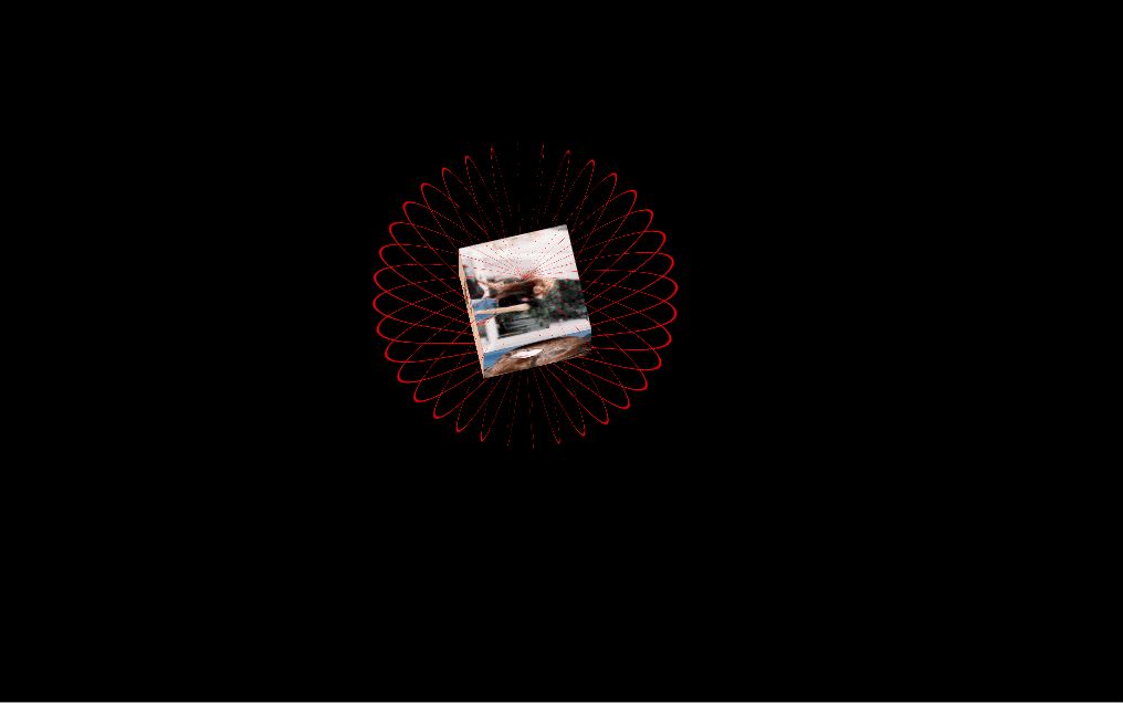
代码3补充说明:
代码太长没有全部贴出,里面的图片地址是百度图片的地址,你也可以换成本地图片的地址。(比如女朋友的照片哈哈哈)
效果3:
代码4:
<html>
<head>
<meta charset="utf-8">
<title>爱在心中title>

<style>
body {
  background: #000;
  height: 100vh;
  overflow: hidden;
}

#ui .love {
  position: absolute;
  top: 50%;
  left: 50%;
  margin: -225px 0 0 -225px;
}
#ui .love:last-child .love_word {
  color: red;
  font-size: 3.5rem;
  text-shadow: 0 0 10px red;
}
#ui .love_word {
  color: #fff;
  font-size: 1.4rem;
  transform: translateY(-100%) rotateZ(-30deg);
  font-family: 'Dosis', sans-serif;
  text-shadow: 0 0 10px #ffc800;
  letter-spacing: 2px;
}
#ui .love_horizontal {
  animation: horizontal 10000ms infinite alternate ease-in-out;
}
#ui .love_vertical {
  animation: vertical 20000ms infinite linear;
}

#ui .love:nth-child(70) .love_vertical {
  animation-delay: -21000ms;
}
...
...
  <div class="love">
    <div class="love_horizontal">
      <div class="love_vertical">
        <div class="love_word">么么哒div>
      div>
    div>
  div>
  <div class="love">
    <div class="love_horizontal">
      <div class="love_vertical">
        <div class="love_word">Lovediv>
      div>
    div>
  div>
div>
body>
html>
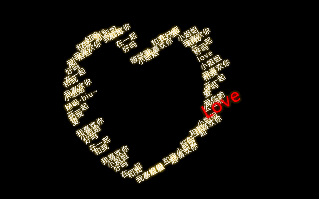
代码4说明:
代码太长,想要的可以去我的资源下载。
效果4:
代码5:
<html>
<head>
<title>Hearttitle>
<meta charset="UTF-8">
head>
<body>
	<canvas id="c">canvas>
	<script>
   		var b = document.body;
    	var c = document.getElementsByTagName('canvas')[0];
    	var a = c.getContext('2d');
	script>
    <script>
	eval('var M=Math,n=M.pow,i,E=2,F="rgba(233,61,109,",d=M.cos,z=M.sin,L=1,u=30,W=window,w=c.width=W.innerWidth,h=c.height=W.innerHeight,r=_1){return M.random()*2-1},y="px Arial",v="爱你",q="♥",X=w/2,Y=h/2,T=4,p=_1){var e=this;e.g=_1){e.x=X;e.y=Y;e.k=0;e.l=0;e.t=M.random()*19000;e.c=e.t};e.d=_1){a.fillStyle=F+(e.c/e.t)+")";a.fillText(q,e.x,e.y);e.c-=50;e.x+=e.k;e.y+=e.l;e.k=e.k+r();e.l=e.l+r();if(e.c<0||e.x>w||e.x<0||e.y>h||e.y<0){e.g()}};e.g()},A,B;a.textAlign="center";a.strokeStyle="#000";a.lineWidth=2;for(i=0;i<350;i++){M[i]=new p()}setInterval(_1){a.clearRect(0,0,w,h);a.font=u+y;X=(w/6*n(z(T),3)+w/2);Y=0.8*(-h/40*(13*d(T)-5*d(2*T)-2*d(3*T)-d(4*T))+h/2.3);T+=(z(T)+3)/99;for(i=0;i<350;i++){with(M[i]){A=(x/w-0.5)*2,B=-(y/h-0.5);if(L&&(A*A+2*n((B-0.5*n(M.abs(A),0.5)),2))>0.11){k=l=0}d()}}a.font=120+y;if(E>0.1){if(E<1){a.fillStyle=F+E+")";a.fillText("Click",w/2,h/2)}E-=0.02}a.fillStyle="#E93D6D";a.fillText(v,X,Y+u);a.strokeText(v,X,Y+u)},50);b.bgColor="#FFEFF2";c.οnmοuseup=_1){L=(L)?0:1}'.replace(/(_1)/g,'function('))
    script>
body>
html>
效果5:

代码6:
<html lang="en">
<head>
<meta charset="UTF-8">
<meta content="width=device-width,initial-scale=1.0,maximum-scale=1.0,user-scalable=no" name="viewport">
<title>我喜欢你title>
head>
<script src="js/lib/jquery.min.js" type="text/javascript">script>
<script src="js/lib/jquery.fireworks.js" type="text/javascript">script>
<style type="text/css">
*{
-webkit-tap-highlight-color:rgba(0,0,0,0); -webkit-box-sizing: border-box; box-sizing: border-box; }
html{
width: 100%; height: 100%; }
body{
max-width: 600px; margin: 0 auto; background: #0b3443; color: #f0f0f0;}
.share_img{
width: 0; height: 0; overflow: hidden; opacity: 0; }
.content{
padding: 80px 20px;}
.text_wrapper{
display: -webkit-box; display: flex; }
.text_wrapper .text{
padding-top: 20px; padding-left: 20px; }
.hide{
display: none !important; }
p{
margin: 0; }
.btn-groups{
padding-right: 20px; text-align: center; }
.heart-btn{
display: inline-block; animation: breath 0.8s linear 0s infinite both; -webkit-animation: breath 0.8s linear 0s infinite both; }
.btn{
position: relative; display: inline-block; width: 60px; height: 60px; margin: 0 30px; transform: rotate(45deg); -webkit-transform: rotate(45deg);}
.btn span{
display: block; width: 100%; height: 100%; line-height: 60px; margin-top: -10px; margin-left: -10px; text-align: center; transform: rotate(-45deg); -webkit-transform: rotate(-45deg); }
.btn-a{
background: #d26ae5; }
.btn-b{
background: #c9c9c9; }
.btn-a:before{
content: ''; position: absolute; display: block; width: 30px; height: 60px; background: #d26ae5; left: -29px; top: 0; border-top-left-radius: 60px; border-bottom-left-radius: 60px; }
.btn-a:after{
content: ''; position: absolute; display: block; width: 60px; height: 30px; background: #d26ae5; left: 0; top: -29px; border-top-left-radius: 60px; border-top-right-radius: 60px;}
.btn-b:before{
content: ''; position: absolute; display: block; width: 30px; height: 60px; background: #c9c9c9; left: -29px; top: 0; border-top-left-radius: 60px; border-bottom-left-radius: 60px; }
.btn-b:after{
content: ''; position: absolute; display: block; width: 60px; height: 30px; background: #c9c9c9; left: 0; top: -29px; border-top-left-radius: 60px; border-top-right-radius: 60px;}
.container{
}
.container .mask{
position: absolute; top: 0; left: 0; right: 0; bottom: 0; background: rgba(0,0,0,0.3); }
.container .modal{
width: 80%; height: 160px; position: absolute; top: 50%; left: 50%; padding: 20px 15px; border-radius: 5px; transform: translate(-50%, -70%); -webkit-transform: translate(-50%,-70%); background: #f3f3f3;}
.container .modal p{
margin-top: 20px; margin-bottom: 20px; font-size: 16px; color: #353535; text-align: center;}
.confirm{
display: block; width: 120px; height: 40px; margin: 0 auto; border: none; font-size: 16px; border-radius: 5px; color: #ffffff; background: #f45cae; }
.type_words{
padding: 12px 20px; }
@keyframes breath {
0% {
transform: scale3d(1,1,1);
-webkit-transform: scale3d(1,1,1);
transform-origin: 50% 50%;
}
50%{
transform: scale3d(1.02,1.02,1.02);
-webkit-transform: scale3d(1.02,1.02,1.02);
transform-origin: 50% 50%;
}
100%{
transform: scale3d(1,1,1);
-webkit-transform: scale3d(1,1,1);
transform-origin: 50% 50%;
}
}
style>
<script type="text/javascript">
$(function() {
$('#yes').click(function(event) {
modal('我就知道小姐姐您一定会愿意的。(^_^)', function() {
$('.page_one').addClass('hide');
$('.page_two').removeClass('hide');
// typeWrite();
fireworks();
});
});
$('#no').click(function(event) {
modal('明人不说暗话!', A);
});
});
function A() {
modal('我喜欢你!', B);
}
function B() {
modal('我知道你在等我这一句话', C);
}
function C() {
modal('请您不要拒绝我', D);
}
function D() {
modal('拒绝我,不存在的', E);
}
function E() {
modal('这辈子都不可能让你离开我', F);
}
function F() {
modal('跟我走吧', G);
}
function G() {
modal('房产证上写你名', H);
}
function H() {
modal('我会做饭', I);
}
function I() {
modal('爱你。么么哒!', J)
}
function J() {
modal('行,我们去民政局登记吧', function() {
fireworks();
});
}
function fireworks() {
$('.page_one').addClass('hide');
$('.page_two').removeClass('hide');
$('.page_two').fireworks({
sound: false,
opacity: 0.9,
width: '100%',
height: '100%'
});
}
function modal(content, callback) {
var tpl = ''+
''+
''+
''
+ content +''+
''+
''+
'';
$('body').append(tpl);
$(document).on('click', '.confirm', function() {
$('.container').remove();
callback();
});
}
var myWords = '有人说,人的一生会遇到2920万人,而两个人相爱的概率只有0.000049。在这茫茫人海中,两个人能相遇就值得感激,能相爱更是一种难得。所以,我很庆幸上天让我遇见了你。我希望有个如你一般的人,能看完我写过的所有状态,读完我所有的日志,看完我从小到大的照片,试着听我喜欢的歌。如果可以,甚至陪我去我喜欢的地方,只想弥补错过你的青春。';
var x = 0;
var speed = 150;
var current = 0;
function typeWrite(){
$('.type_words').html(myWords.substring(0, x++)+'_');
var timer = setTimeout("typeWrite()", speed);
if (x == myWords.length) {
x = myWords.length;
clearTimeout(timer)
}
}
script>
<body>
<div class="share_img"><img src="images/a8b.png" alt="">div>
<div class="page_one">
<div class="content">
<div class="text_wrapper">
<img src="images/a8.png" alt="">
<div class="text">
小姐姐,我好喜欢你,你愿意做我女朋友吗?
div>
div>
div>
<div class="btn-groups">
<div class="heart-btn">
<div id="yes" class="btn btn-a"><span>愿意span>div>
div>
<div id="no" class="btn btn-b"><span>不愿意span>div>
div>
div>
<div class="page_two hide">
<div class="type_words">div>
div>
body>
html>
代码6补充说明:
css文件和js文件全部在我的资源里面。
效果6:
效果7:
附带音乐(可修改)。
效果8:

效果9:
附带音频(可以自己修改音频,比如你的录音等等)。
文中所有表白代码都在我的资源里面html表白代码(全)需要的就进链接下载吧。
对象生日祝福代码地址(也可以表白):html生日快乐代码