转载自 作者:悦光阴 出处:http://www.cnblogs.com/ljhdo/
使用geom_bar()函数绘制条形图,条形图的高度通常表示两种情况之一:每组中的数据的个数,或数据框中列的值,高度表示的含义是由geom_bar()函数的参数stat决定的,stat在geom_bar()函数中有两个有效值:count和identity。默认情况下,stat="count",这意味着每个条的高度等于每组中的数据的个数,并且,它与映射到y的图形属性不相容,所以,当设置stat="count"时,不能设置映射函数aes()中的y参数。如果设置stat="identity",这意味着条形的高度表示数据数据的值,而数据的值是由aes()函数的y参数决定的,就是说,把值映射到y,所以,当设置stat="identity"时,必须设置映射函数中的y参数,把它映射到数值变量。
geom_bar()函数的定义是:
geom_bar(mapping = NULL, data = NULL, stat = "count", width=0.9, position="stack")
参数注释:
stat:设置统计方法,有效值是count(默认值) 和 identity,其中,count表示条形的高度是变量的数量,identity表示条形的高度是变量的值;
position:位置调整,有效值是stack、dodge和fill,默认值是stack(堆叠),是指两个条形图堆叠摆放,dodge是指两个条形图并行摆放,fill是指按照比例来堆叠条形图,每个条形图的高度都相等,但是高度表示的数量是不尽相同的。 position参数也可以由两个函数来控制,参数vjust和widht是相对值:
position_stack(vjust =1, reverse = FALSE)
position_dodge(width = NULL)
position_fill(vjust =1, reverse = FALSE)
width:条形图的宽度,是个比值,默认值是0.9
color:条形图的线条颜色
fill:条形图的填充色
本文使用vcd包中的Arthritis数据集来演示如何创建条形图。
一,绘制基本的条形图
使用geom_bar()函数绘制条形图,
ggplot(data=ToothGrowth, mapping=aes(x=dose))+ geom_bar(stat="count")
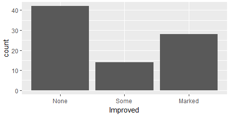
当然,我们也可以先对数据进行处理,得到按照Improved进行分类的频数分布表,然后使用geom_bar()绘制条形图:
mytable <- with(Arthritis,table(Improved))
df <-as.data.frame(mytable)
ggplot(data=df, mapping=aes(x=Improved,y=Freq))+ geom_bar(stat="identity")
绘制的条形图是相同的,如下图所示:
二,修改条形图的图形属性
条形图的图形属性包括条形图的宽度,条形图的颜色,条形图的标签,分组和修改图例的位置等。
1,修改条形图的宽度和颜色
把条形图的相对宽度设置为0.5,线条颜色设置为red,填充色设置为steelblue
ggplot(data=Arthritis, mapping=aes(x=Improved))+ geom_bar(stat="count",width=0.5, color='red',fill='steelblue')

2,设置条形图的文本
使用geom_text()为条形图添加文本,显示条形图的高度,并调整文本的位置和大小。
当stat="count"时,设置文本的标签需要使用一个特殊的变量 aes(label=..count..), 表示的是变量值的数量。
ggplot(data=Arthritis, mapping=aes(x=Improved))+ geom_bar(stat="count",width=0.5, color='red',fill='steelblue')+ geom_text(stat='count',aes(label=..count..), vjust=1.6, color="white", size=3.5)+ theme_minimal()
当stat="identity"时,设置文本的标签需要设置y轴的值,aes(lable=Freq),表示的变量的值。
mytable <- with(Arthritis,table(Improved))
df <- as.data.frame(mytable)
ggplot(data=df, mapping=aes(x=Improved,y=Freq))+
geom_bar(stat="identity",width=0.5, color='red',fill='steelblue')+
geom_text(aes(label=Freq), vjust=1.6, color="white", size=3.5)+
theme_minimal()

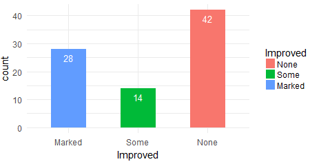
3,按照分组修改条形图的图形属性
把条形图按照Improved变量进行分组,设置每个分组的填充色,这通过aes(fill=Improved)来实现,每个分组的填充色依次是scale_color_manual()定义的颜色:
ggplot(data=Arthritis, mapping=aes(x=Improved,fill=Improved))+ geom_bar(stat="count",width=0.5)+ scale_color_manual(values=c("#999999","#E69F00","#56B4E9"))+ geom_text(stat='count',aes(label=..count..), vjust=1.6, color="white", size=3.5)+ theme_minimal()

4,修改图例的位置
修改图例的位置,通过theme(legend.position=) 来实现,默认的位置是right,有效值是right、top、bottom、left和none,其中none是指移除图例。
p <- ggplot(data=Arthritis, mapping=aes(x=Improved,fill=Improved))+
geom_bar(stat="count",width=0.5)+
scale_color_manual(values=c("#999999", "#E69F00", "#56B4E9"))+
geom_text(stat='count',aes(label=..count..), vjust=1.6, color="white", size=3.5)+
theme_minimal()
p + theme(legend.position="top")
p + theme(legend.position="bottom")
# Remove legend
p + theme(legend.position="none")
5,修改条形图的顺序
通过scale_x_discrete()函数修改标度的顺序:
p <- ggplot(data=Arthritis, mapping=aes(x=Improved,fill=Improved))+
geom_bar(stat="count",width=0.5)+
scale_color_manual(values=c("#999999", "#E69F00", "#56B4E9"))+
geom_text(stat='count',aes(label=..count..), vjust=1.6, color="white", size=3.5)+
theme_minimal()
p + scale_x_discrete(limits=c("Marked","Some", "None"))
三,包含分组的条形图
分组的条形图如何摆放,是由geom_bar()函数的position参数确定的,默认值是stack,表示堆叠摆放、dodge表示并行摆放、fill表示按照比例来堆叠条形图。
1,堆叠摆放
设置geom_bar()的position参数为"stack",在向条形图添加文本时,使用position=position_stack(0.5),调整文本的相对位置。
ggplot(data=Arthritis, mapping=aes(x=Improved,fill=Sex))+ geom_bar(stat="count",width=0.5,position='stack')+ scale_fill_manual(values=c('#999999','#E69F00'))+ geom_text(stat='count',aes(label=..count..), color="white", size=3.5,position=position_stack(0.5))+ theme_minimal()

2,并行摆放
调整y轴的最大值,使用position=position_dodge(0.5),vjust=-0.5 来调整文本的位置
y_max <- max(aggregate(ID~Improved+Sex,data=Arthritis,length)$ID)
ggplot(data=Arthritis, mapping=aes(x=Improved,fill=Sex))+
geom_bar(stat="count",width=0.5,position='dodge')+
scale_fill_manual(values=c('#999999','#E69F00'))+
ylim(0,y_max+5)+
geom_text(stat='count',aes(label=..count..), color="black", size=3.5,position=position_dodge(0.5),vjust=-0.5)+
theme_minimal()

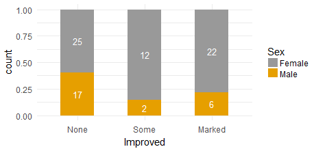
3,按照比例堆叠条形图
需要设置geom_bar(position="fill"),并使用geom_text(position=position_fill(0.5))来调整文本的位置,如果geom_text(aes(lable=..count..)),那么表示文本显示的值是变量的数量:
ggplot(data=Arthritis, mapping=aes(x=Improved,fill=Sex))+ geom_bar(stat="count",width=0.5,position='fill')+ scale_fill_manual(values=c('#999999','#E69F00'))+ geom_text(stat='count',aes(label=..count..), color="white", size=3.5,position=position_fill(0.5))+ theme_minimal()
ggplot(data=Arthritis, mapping=aes(x=Improved,fill=Sex))+
geom_bar(stat="count",width=0.5,position='fill')+
scale_fill_manual(values=c('#999999','#E69F00'))+
geom_text(stat='count',aes(label=scales::percent(..count../sum(..count..)))
, color="white", size=3.5,position=position_fill(0.5))+
theme_minimal()
