“The simple graph has brought more information to the data analyst’s mind than any other device.” — John Tukey
1.从ggplot开始
R has several systems for making graphs, but ggplot2 is one of the most elegant and most versatile.ggplot2 implements the grammar of graphics, a coherent system for describing and building graphs. With ggplot2, you can do more faster by learning one system and applying it in many places.
2.装载tidyverse
tidyverse 包含了 ggplot2, readr, dplyr, tibble, purrr 等工具包,可以一站式完成数据读写、数据处理和数据可视化的任务。
# 安装tidyverse包
install.packages('tidyverse')

# 加载tidyverse包
library(tidyverse)
You only need to install a package once, but you need to reload it every time you start a new session.
If we need to be explicit about where a function (or dataset) comes from, we’ll use the special form package::function(). For example, ggplot2::ggplot() tells you explicitly that we’re using the ggplot() function from the ggplot2 package.
案例式学习
在开始前,先介绍这部分用到的案例信息:
Do cars with big engines use more fuel than cars with small engines? You probably already have an answer, but try to make your answer precise. What does the relationship between engine size and fuel efficiency look like? Is it positive? Negative? Linear? Nonlinear?
3.初识数据
mpg是ggplot2包内置的数据集:
# 查看数据基本信息
glimpse(mpg)

# 查看数据格式
str(mpg)

# 查看数据集
View(mpg)

# 编辑数据
edit(mpg)
> glimpse(mpg)
Observations: 234
Variables: 11
$ manufacturer  "audi", "audi", "audi", "audi", "audi", "audi", "audi", "audi", "audi", "audi", "audi", "audi", "au...
$ model         "a4", "a4", "a4", "a4", "a4", "a4", "a4", "a4 quattro", "a4 quattro", "a4 quattro", "a4 quattro", "...
$ displ         1.8, 1.8, 2.0, 2.0, 2.8, 2.8, 3.1, 1.8, 1.8, 2.0, 2.0, 2.8, 2.8, 3.1, 3.1, 2.8, 3.1, 4.2, 5.3, 5.3,...
$ year          1999, 1999, 2008, 2008, 1999, 1999, 2008, 1999, 1999, 2008, 2008, 1999, 1999, 2008, 2008, 1999, 200...
$ cyl           4, 4, 4, 4, 6, 6, 6, 4, 4, 4, 4, 6, 6, 6, 6, 6, 6, 8, 8, 8, 8, 8, 8, 8, 8, 8, 8, 8, 8, 8, 8, 8, 4, ...
$ trans         "auto(l5)", "manual(m5)", "manual(m6)", "auto(av)", "auto(l5)", "manual(m5)", "auto(av)", "manual(m...
$ drv           "f", "f", "f", "f", "f", "f", "f", "4", "4", "4", "4", "4", "4", "4", "4", "4", "4", "4", "r", "r",...
$ cty           18, 21, 20, 21, 16, 18, 18, 18, 16, 20, 19, 15, 17, 17, 15, 15, 17, 16, 14, 11, 14, 13, 12, 16, 15,...
$ hwy           29, 29, 31, 30, 26, 26, 27, 26, 25, 28, 27, 25, 25, 25, 25, 24, 25, 23, 20, 15, 20, 17, 17, 26, 23,...
$ fl            "p", "p", "p", "p", "p", "p", "p", "p", "p", "p", "p", "p", "p", "p", "p", "p", "p", "p", "r", "e",...
$ class         "compact", "compact", "compact", "compact", "compact", "compact", "compact", "compact", "compact", ...
其中,int 整型,dbl 双精度,chr 字符型,
以上变量的含义:
- manufacturer 制造商
- model 车型
- displ 排量
- year 生产年份
- cyl 气缸数
- trans 传输类型
- drv 驱动形式
- cty 每加仑城市里程
- hwy 每加仑高速里程
- fl 燃料类型
- class 汽车品牌
4.初识ggplot2
Wilkinson(2005)提出语法规则→Wickham(2009)编写ggplot2
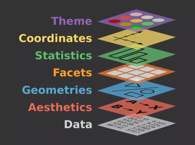
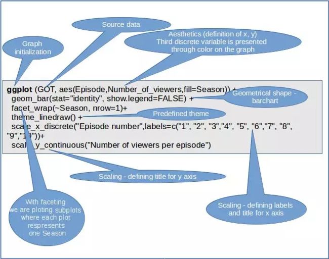
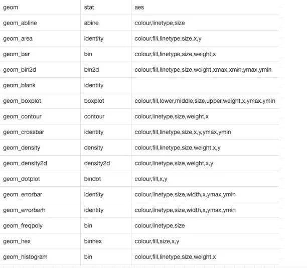
Wilkinson在2005年提出一套用来描述所有统计图形深层特性的语法规则:一张统计图形就是从数据到几何对象(geometric object,缩写为geom,如点、线、条形等)的图形属性(aesthetic attributes,缩写为aes,如颜色、形状、大小等)的一个映射,此外,图形中还可能包含数据的统计变换(statistical system,缩写为stats),最后绘制在某个特定的坐标系(coordinate system,缩写为coord)中,而分面(facet,指将绘图窗口划分为若干个子窗口)则可以用来生成数据不同子集的图形(毛里里求斯)。
ggplot2包由Hadley Wickham(2009a)编写,提供了一种基于Wilkinson(2005)所述图形语法的图形系统,Wickham(2009b)还对该语法进行了扩展。ggplot2包的目标是提供一个全面的、基于语法的、连贯一致的图形生成系统,允许用户创建新颖的、有创新性的数据可视化图形。该方法的力量已经使得ggplot2成为使用R进行数据可视化的重要工具(攀董)。
ggplot2有以下特点(黄宝臣):
- ggplot2的核心理念是将绘图与数据分离,数据相关的绘图与数据无关的绘图分离
- ggplot2是按图层作图
- ggplot2保有命令式作图的调整函数,使其更具灵活性
- ggplot2将常见的统计变换融入到了绘图中
以下是ggplot2图层函数的示意图:
5.练中学
基础的命令:
ggplot(data = ) +
    (mapping = aes())

 数据
 几何对象,如point,line...
 数据和图形的映射关系
汽车排量和每加仑高速里程
# 汽车排量和每加仑高速里程
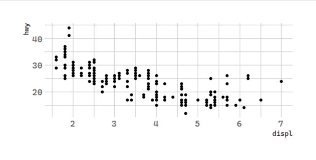
ggplot(data = mpg) +
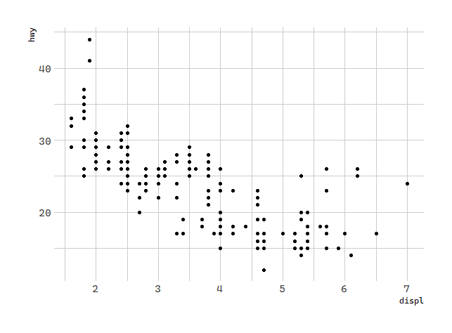
  geom_point(mapping = aes(x = displ, y = hwy))
The plot shows a negative relationship between engine size (
displ) and fuel efficiency (
hwy). In other words, cars with big engines use more fuel.
With ggplot2, you begin a plot with the function ggplot(). ggplot()creates a coordinate system that you can add layers to. The first argument of ggplot() is the dataset to use in the graph. So ggplot(data = mpg) creates an empty graph.
You complete your graph by adding one or more layers to ggplot(). The function geom_point() adds a layer of points to your plot, which creates a scatterplot. ggplot2 comes with many geom functions that each add a different type of layer to a plot.
Each geom function in ggplot2 takes a mapping argument. This defines how variables in your dataset are mapped to visual properties. The mapping argument is always paired with aes(), and the x and y arguments of aes() specify which variables to map to the x and y axes. ggplot2 looks for the mapped variables in the data argument, in this case, mpg.
接下来我们从
“The greatest value of a picture is when it forces us to notice what we never expected to see.” — John Tukey
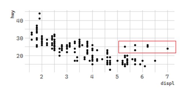
很容易看出刚刚绘制的图形中有一些异常值,如何来分析呢?
5.1 图形属性映射
Let’s hypothesize that the cars are hybrids. One way to test this hypothesis is to look at the class value for each car.The class variable of the mpg dataset classifies cars into groups such as compact, midsize, and SUV. If the outlying points are hybrids, they should be classified as compact cars or, perhaps, subcompact cars (keep in mind that this data was collected before hybrid trucks and SUVs became popular).
You can add a third variable, like class, to a two dimensional scatterplot by mapping it to an aesthetic.An aesthetic is a visual property of the objects in your plot. Aesthetics include things like the size, the shape, or the color of your points.You can display a point (like the one below) in different ways by changing the values of its aesthetic properties. Since we already use the word “value” to describe data, let’s use the word “level” to describe aesthetic properties. Here we change the levels of a point’s size, shape, and color to make the point small, triangular, or blue:
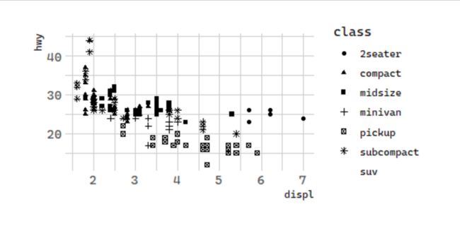
按形状
# 按形状:汽车排量和每加仑高速里程
ggplot(data = mpg) +
  geom_point(mapping = aes(x = displ, y = hwy,
      shape = class))
注意:The shape palette can deal with a maximum of 6 discrete values because more than 6 becomes difficult to discriminate; you have 7. Consider specifying shapes manually if you must have them.
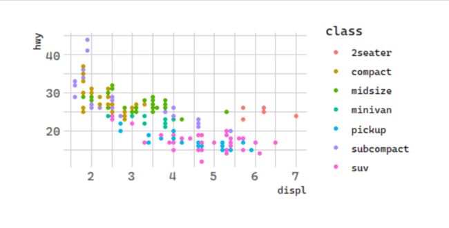
按颜色
You can convey information about your data by mapping the aesthetics in your plot to the variables in your dataset. For example, you can map the colors of your points to the class variable to reveal the class of each car.
# 按颜色:汽车排量和每加仑高速里程
ggplot(data = mpg) +
  geom_point(mapping = aes(x = displ, y = hwy,
      color = class))
To map an aesthetic to a variable, associate the name of the aesthetic to the name of the variable inside aes(). ggplot2 will automatically assign a unique level of the aesthetic (here a unique color) to each unique value of the variable, a process known as scaling.ggplot2 will also add a legend that explains which levels correspond to which values.
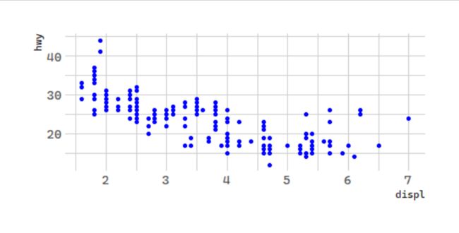
注意:如果在mapping外部设置color时,只是改变了所有点的颜色,并没有做映射。
# 颜色:汽车排量和每加仑高速里程
ggplot(data = mpg) +
  geom_point(mapping = aes(x = displ, y = hwy),
             color = "blue")
为什么会是两座车?
The colors reveal that many of the unusual points are two-seater cars. These cars don’t seem like hybrids, and are, in fact, sports cars!Sports cars have large engines like SUVs and pickup trucks, but small bodies like midsize and compact cars, which improves their gas mileage. In hindsight, these cars were unlikely to be hybrids since they have large engines.
按大小
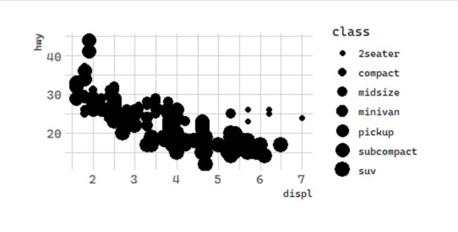
In the above example, we mapped class to the color aesthetic, but we could have mapped class to the size aesthetic in the same way. In this case, the exact size of each point would reveal its class affiliation. We get a warning here, because mapping an unordered variable (class) to an ordered aesthetic (size) is not a good idea.
# 按大小:汽车排量和每加仑高速里程
ggplot(data = mpg) +
  geom_point(mapping = aes(x = displ, y = hwy,
      size = class))

Warning message:
Using size for a discrete variable is not advised.
除了按颜色、形状等分类外,我们还可以有如下的操作:
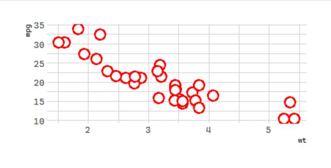
What does the stroke aesthetic do? What shapes does it work with? (Hint: use ?geom_point)
# 改变形状的边界厚度
# 数据集更换为mtcars
ggplot(mtcars, aes(wt, mpg)) +
  geom_point(shape = 21, color = "red", fill = "white",
             size = 5, stroke = 2)
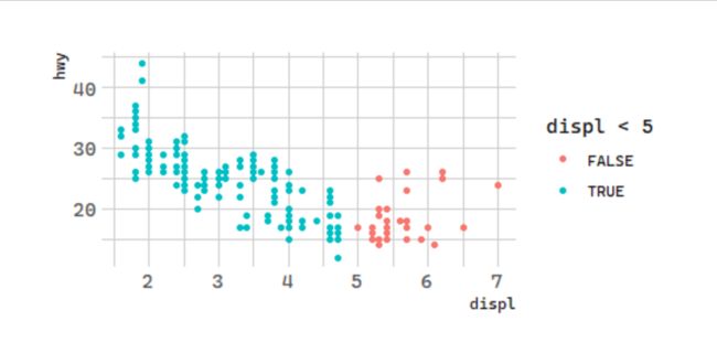
What happens if you map an aesthetic to something other than a variable name, like aes(colour = displ < 5)? Note, you’ll also need to specify x and y.
# 分区间:汽车排量和每加仑高速里程
ggplot(data = mpg) +
  geom_point(mapping = aes(x = displ, y = hwy,
            color = displ < 5))
5.2分面
One way to add additional variables is with aesthetics. Another way, particularly useful for categorical variables, is to split your plot into facets, subplots that each display one subset of the data.
To facet your plot by a single variable, use facet_wrap(). The first argument of facet_wrap() should be a formula, which you create with ~ followed by a variable name (here “formula” is the name of a data structure in R, not a synonym for “equation”). The variable that you pass to facet_wrap() should be discrete.
# 分面:汽车排量和每加仑高速里程
ggplot(data = mpg) +
  geom_point(mapping = aes(x = displ, y = hwy)) +
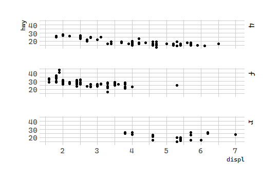
  facet_wrap(~class, nrow = 2)
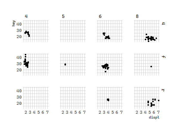
To facet your plot on the combination of two variables, add facet_grid() to your plot call. The first argument of facet_grid() is also a formula. This time the formula should contain two variable names separated by a ~.
# 分面:汽车排量和每加仑高速里程
ggplot(data = mpg) +
  geom_point(mapping = aes(x = displ, y = hwy)) +
  facet_grid(drv ~ cyl)
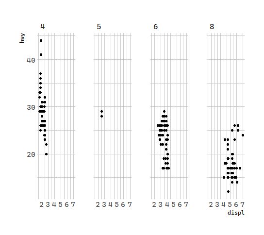
If you prefer to not facet in the rows or columns dimension, use a .instead of a variable name.
# 分面:汽车排量和每加仑高速里程
ggplot(data = mpg) +
  geom_point(mapping = aes(x = displ, y = hwy)) +
  facet_grid(.~ cyl)
# 分面:汽车排量和每加仑高速里程
ggplot(data = mpg) +
  geom_point(mapping = aes(x = displ, y = hwy)) +
  facet_grid(drv ~. )
分面有什么好处
What are the advantages to using faceting instead of the colour aesthetic? What are the disadvantages? How might the balance change if you had a larger dataset?
当变量较多的时候,图形属性颜色区分度不高,不能很好区分各个样本点,而分面可以,但是分面后不同面上的点之间不好比较,所以变量少容易区分时可以用图形属性映射,多的时候颜色大小等不容易区分可以考虑分面(TidyFridy笔记本)。
单变量和双变量的分面
Read ·?facet_wrap·. What does nrow do? What does ncol do? What other options control the layout of the individual panels? Why doesn’t ·facet_grid()· have nrow and ncol arguments?
nrow 和 ncol 控制分面子图的排版,facet_grid() 对应 x 方向和 y 方向的分面图个数是确定的,所有不用设置。
5.3几何对象
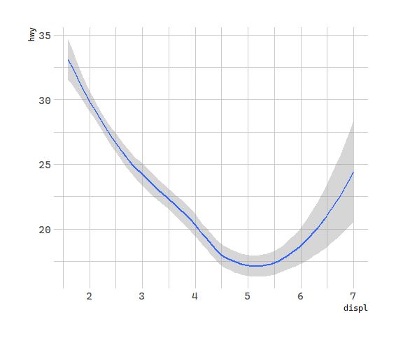
A geom is the geometrical object that a plot uses to represent data. People often describe plots by the type of geom that the plot uses. For example, bar charts use bar geoms, line charts use line geoms, boxplots use boxplot geoms, and so on. Scatterplots break the trend; they use the point geom.
To change the geom in your plot, change the geom function that you add to ggplot(). For instance, to make the plots above, you can use this code:
# 几何对象:汽车排量和每加仑高速里程
ggplot(data = mpg) +
  geom_point(mapping = aes(x = displ, y = hwy))
# 几何对象:汽车排量和每加仑高速里程
ggplot(data = mpg) +
  geom_smooth(mapping = aes(x = displ, y = hwy))
调整线段形式
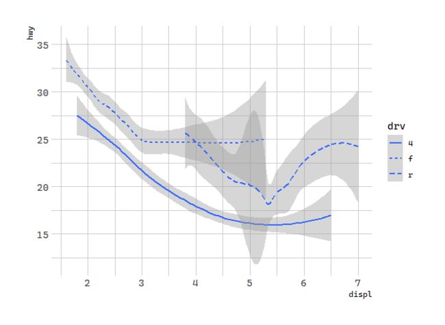
Every geom function in ggplot2 takes a mapping argument. However, not every aesthetic works with every geom. You could set the shape of a point, but you couldn’t set the “shape” of a line. On the other hand, you could set the linetype of a line.geom_smooth()will draw a different line, with a different linetype, for each unique value of the variable that you map to linetype.
# 几何对象:汽车排量和每加仑高速里程
ggplot(data = mpg) +
  geom_smooth(mapping = aes(x = displ, y = hwy, linetype = drv))
Here geom_smooth() separates the cars into three lines based on their drv value, which describes a car’s drivetrain. One line describes all of the points with a 4 value, one line describes all of the points with an f value, and one line describes all of the points with an r value. Here, 4 stands for four-wheel drive, f for front-wheel drive, and r for rear-wheel drive.
对比group和color
Many geoms, like geom_smooth(), use a single geometric object to display multiple rows of data. For these geoms, you can set the group aesthetic to a categorical variable to draw multiple objects. ggplot2 will draw a separate object for each unique value of the grouping variable. In practice, ggplot2 will automatically group the data for these geoms whenever you map an aesthetic to a discrete variable (as in the linetype example). It is convenient to rely on this feature because the group aesthetic by itself does not add a legend or distinguishing features to the geoms.
# 几何对象:汽车排量和每加仑高速里程
p1 <- ggplot(data = mpg) +
  geom_smooth(mapping = aes(x = displ, y = hwy))

p2 <- ggplot(data = mpg) +
  geom_smooth(mapping = aes(x = displ, y = hwy, group = drv))

p3 <- ggplot(data = mpg) +
  geom_smooth(
    mapping = aes(x = displ, y = hwy, color = drv),
    show.legend = FALSE
  )
p <- cowplot::plot_grid(p1, p2, p3, nrow = 1, labels = LETTERS[1:3])

p
多几何对象
To display multiple geoms in the same plot, add multiple geom functions to ggplot():
# 几何对象:汽车排量和每加仑高速里程
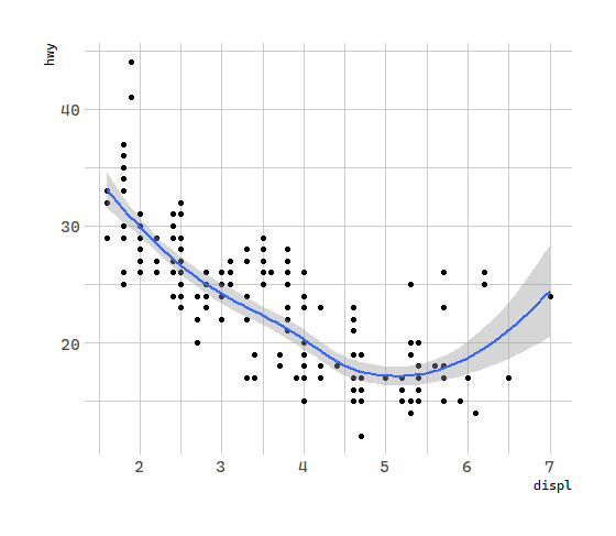
ggplot(data = mpg) +
  geom_point(mapping = aes(x = displ, y = hwy)) +
  geom_smooth(mapping = aes(x = displ, y = hwy))
全局映射
This, however, introduces some duplication in our code. Imagine if you wanted to change the y-axis to display cty instead of hwy. You’d need to change the variable in two places, and you might forget to update one. You can avoid this type of repetition by passing a set of mappings to ggplot(). ggplot2 will treat these mappings as global mappings that apply to each geom in the graph. In other words, this code will produce the same plot as the previous code:
# 几何对象:汽车排量和每加仑高速里程
ggplot(data = mpg, mapping = aes(x = displ, y = hwy)) +
  geom_point() +
  geom_smooth()
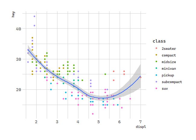
If you place mappings in a geom function, ggplot2 will treat them as local mappings for the layer. It will use these mappings to extend or overwrite the global mappings for that layer only. This makes it possible to display different aesthetics in different layers.
# 几何对象:汽车排量和每加仑高速里程
ggplot(data = mpg, mapping = aes(x = displ, y = hwy)) +
  geom_point(mapping = aes(color = class)) +
  geom_smooth()
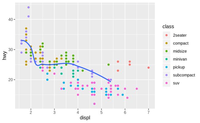
You can use the same idea to specify different data for each layer. Here, our smooth line displays just a subset of the mpg dataset, the subcompact cars. The local data argument in geom_smooth() overrides the global data argument in ggplot() for that layer only.
# 几何对象:汽车排量和每加仑高速里程
ggplot(data = mpg, mapping = aes(x = displ, y = hwy)) +
  geom_point(mapping = aes(color = class)) +
  geom_smooth(data = filter(mpg, class == "subcompact"), se = FALSE)
se 代表是否在图形中显示标准差
filter(mpg, class == "subcompact") 只选择车型为subcompact的汽车
5.4统计变换
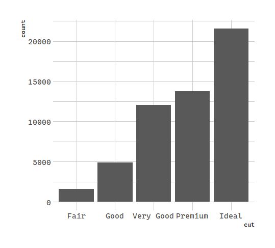
Next, let’s take a look at a bar chart. Bar charts seem simple, but they are interesting because they reveal something subtle about plots. Consider a basic bar chart, as drawn with geom_bar(). The following chart displays the total number of diamonds in the diamonds dataset, grouped by cut. The diamonds dataset comes in ggplot2 and contains information about ~54,000 diamonds, including the price, carat, color, clarity, and cut of each diamond. The chart shows that more diamonds are available with high quality cuts than with low quality cuts.
# 统计变换:钻石
ggplot(data = diamonds) +
  geom_bar(mapping = aes(x = cut))
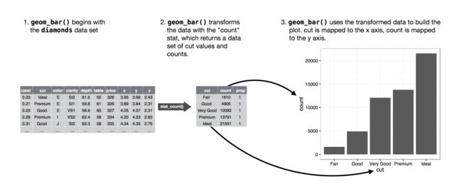
On the x-axis, the chart displays cut, a variable from diamonds. On the y-axis, it displays count, but count is not a variable in diamonds! Where does count come from? Many graphs, like scatterplots, plot the raw values of your dataset. Other graphs, like bar charts, calculate new values to plot:
- bar charts, histograms, and frequency polygons bin your data and then plot bin counts, the number of points that fall in each bin.
- smoothers fit a model to your data and then plot predictions from the model.
- boxplots compute a robust summary of the distribution and then display a specially formatted box.
The algorithm used to calculate new values for a graph is called a stat, short for statistical transformation. The figure below describes how this process works with geom_bar().
默认属性
You can learn which stat a geom uses by inspecting the default value for the stat argument. For example, ?geom_bar shows that the default value for stat is “count”, which means that geom_bar()uses stat_count(). stat_count() is documented on the same page as geom_bar(), and if you scroll down you can find a section called “Computed variables”. That describes how it computes two new variables: count and prop.
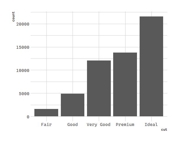
You can generally use geoms and stats interchangeably. For example, you can recreate the previous plot using stat_count() instead of geom_bar():
# 统计变换:钻石
ggplot(data = diamonds) +
  stat_count(mapping = aes(x = cut))
This works because every geom has a default stat; and every stat has a default geom. This means that you can typically use geoms without worrying about the underlying statistical transformation. There are three reasons you might need to use a stat explicitly:
- You might want to override the default stat. In the code below, I change the stat of
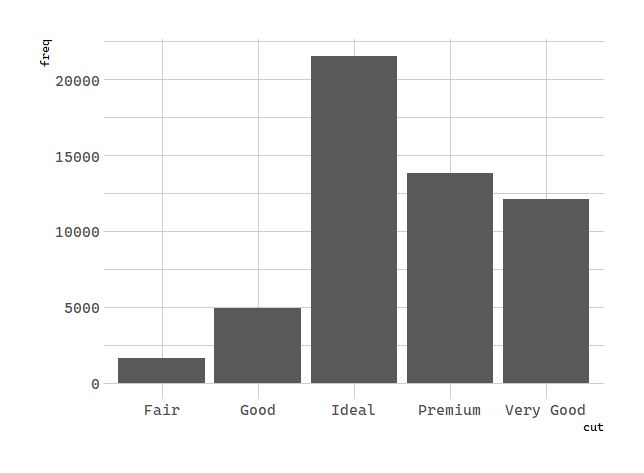
geom_bar()from count (the default) to identity. **This lets me map the height of the bars to the raw values of a y variable. **Unfortunately when people talk about bar charts casually, they might be referring to this type of bar chart, where the height of the bar is already present in the data, or the previous bar chart where the height of the bar is generated by counting rows.
# 统计变换:钻石
demo <- tribble(
  ~cut,         ~freq,
  "Fair",       1610,
  "Good",       4906,
  "Very Good",  12082,
  "Premium",    13791,
  "Ideal",      21551
)

ggplot(data = demo) +
  geom_bar(mapping = aes(x = cut, y = freq), stat = "identity")
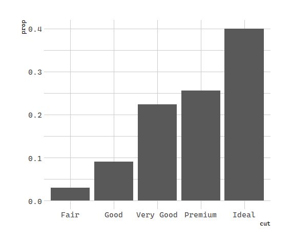
- You might want to override the default mapping from transformed variables to aesthetics. For example, you might want to display a bar chart of proportion, rather than count:
# 统计变换:钻石
ggplot(data = diamonds) +
  geom_bar(mapping = aes(x = cut, y = stat(prop),group = 1))
注:group = 1 将所有的数据看作一组,如果不设置,所有的 bar 将是等高的
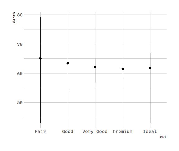
- You might want to draw greater attention to the statistical transformation in your code. For example, you might use stat_summary(), which summarises the y values for each unique x value, to draw attention to the summary that you’re computing:
# 统计变换:钻石
ggplot(data = diamonds) +
  stat_summary(
    mapping = aes(x = cut, y = depth),
    fun.ymin = min,
    fun.ymax = max,
    fun.y = median
  )
ggplot2 provides over 20 stats for you to use. Each stat is a function, so you can get help in the usual way, e.g. ?stat_bin. To see a complete list of stats, try the ggplot2 cheatsheet.
5.5位置调整
单变量:边缘和填充
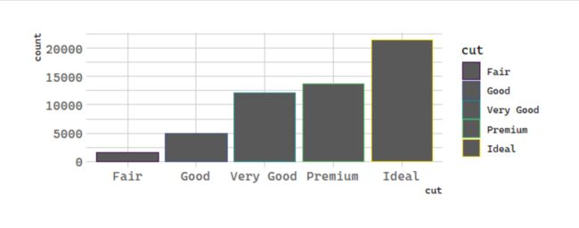
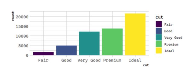
There’s one more piece of magic associated with bar charts. You can colour a bar chart using either the colour aesthetic, or, more usefully, fill:
# 位置调整:钻石
ggplot(data = diamonds) +
  geom_bar(mapping = aes(x = cut, colour = cut))
**多变量混合**
# 位置调整:钻石
ggplot(data = diamonds) +
  geom_bar(mapping = aes(x = cut, fill = cut))
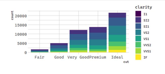
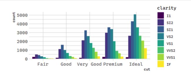
Note what happens if you map the fill aesthetic to another variable, like
clarity: the bars are automatically stacked. Each colored rectangle represents a
combination of
cut and
clarity.
# 统计变换:钻石
ggplot(data = diamonds) +
  geom_bar(mapping = aes(x = cut, fill = clarity))
The stacking is performed automatically by the position adjustment specified by the position argument. If you don’t want a stacked bar chart, you can use one of three other options: "identity", "dodge" or "fill".
以上是自动调整,接下来以条形图为例来看刊 ggplot 支持的几种位置调整方式。
1. position = 'identity'
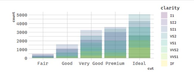
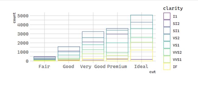
position = "identity" will place each object exactly where it falls in the context of the graph. This is not very useful for bars, because it overlaps them. To see that overlapping we either need to make the bars slightly transparent by setting alpha to a small value, or completely transparent by setting fill = NA.
# 统计变换:钻石
ggplot(data = diamonds, mapping = aes(x = cut, fill = clarity)) +
  geom_bar(alpha = 1/5, position = "identity")
# 统计变换:钻石
ggplot(data = diamonds, mapping = aes(x = cut, color = clarity)) +
  geom_bar(fill = NA, position = "identity")
The identity position adjustment is more useful for 2d geoms, like points, where it is the default.
2. position = "fill"
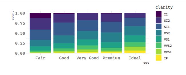
position = "fill" works like stacking, but makes each set of stacked bars the same height. This makes it easier to compare proportions across groups.
# 统计变换:钻石
ggplot(data = diamonds) +
  geom_bar(mapping = aes(x = cut, fill = clarity), position = "fill")
3. position = "dodge"
position = "dodge" places overlapping objects directly beside one another. This makes it easier to compare individual values.
# 统计变换:钻石
ggplot(data = diamonds) +
  geom_bar(mapping = aes(x = cut, fill = clarity), position = "dodge")
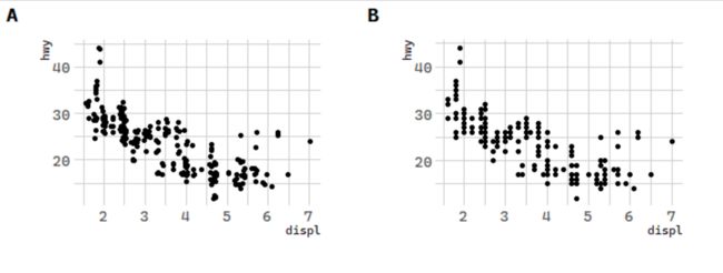
**There’s one other type of adjustment that’s not useful for bar charts, but it can be very useful for scatterplots. **Recall our first scatterplot. Did you notice that the plot displays only 126 points, even though there are 234 observations in the dataset?
原因是有些点被覆盖了,可以用geom_point(position = 'jitter')来缓解
# 位置调整:汽车数据
p1 <- ggplot(data = mpg) +
  geom_point(mapping = aes(x = displ, y = hwy), position = "jitter")
p2 <- ggplot(data = mpg) +
  geom_point(mapping = aes(x = displ, y = hwy))
p <- cowplot::plot_grid(p1, p2, nrow = 1, labels = LETTERS[1:2])
p
5.6坐标系
Coordinate systems are probably the **most complicated part of ggplot2. **The default coordinate system is the Cartesian coordinate system where the x and y positions act independently to determine the location of each point. There are a number of other coordinate systems that are occasionally helpful.
参考资料:
R for Data Science
每天 5 分钟,轻轻松松上手 R 语言(一)
如何使用 ggplot2 ?
R-可视化 | ggplot2框架与主要函数
ggplot2 专题分析
