一 容器组件
容器组件Container 自身包含一个Widget 其自身属性有Key,aligment ,padding margin color decoration foregroundDecoration width height constraints transfotm child 。
基础的大家都认识,就不多介绍了,
Container 构造方法
Container({
Key key,
this.alignment,
this.padding,
Color color,
Decoration decoration,
this.foregroundDecoration,
double width,
double height,
BoxConstraints constraints,
this.margin,
this.transform,
this.child,
})
其中 key 类型是Key, 是container的唯一标识符,用于查找更新,
aligment 控制child 的对齐方式 ,其类型是AlignmentGeometry 是一个抽象类,有多种对其方式 ,这是几种对其方式
/// The top left corner.
static const Alignment topLeft = Alignment(-1.0, -1.0);
/// The center point along the top edge.
static const Alignment topCenter = Alignment(0.0, -1.0);
/// The top right corner.
static const Alignment topRight = Alignment(1.0, -1.0);
/// The center point along the left edge.
static const Alignment centerLeft = Alignment(-1.0, 0.0);
/// The center point, both horizontally and vertically.
static const Alignment center = Alignment(0.0, 0.0);
/// The center point along the right edge.
static const Alignment centerRight = Alignment(1.0, 0.0);
/// The bottom left corner.
static const Alignment bottomLeft = Alignment(-1.0, 1.0);
/// The center point along the bottom edge.
static const Alignment bottomCenter = Alignment(0.0, 1.0);
二 图片组件
有从网络获取 assets获取,可以看到有四个
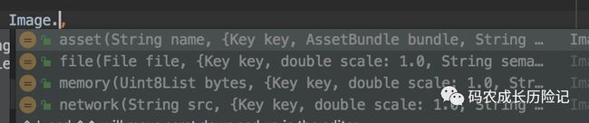
Image.network(
String src, {
Key key,
double scale =1.0,
this.semanticLabel,
this.excludeFromSemantics =false,
this.width,
this.height,
this.color,
this.colorBlendMode, // 对图片进行手动处理,如改动图片颜色
this.fit, // 图片填充模式 BoxFit 与Android的ImageView的ScanType类似
this.alignment = Alignment.center, // 控制图片摆放位置
this.repeat = ImageRepeat.noRepeat, // 设置图片充足模式。,默认不重复
this.centerSlice,
this.matchTextDirection =false, // 是否是从左到右
this.gaplessPlayback =false, // 当ImageProvider发生变化后,重新加载图片,
// 原图片是否保留
this.filterQuality = FilterQuality.low,// 加载图片质量
Map headers,
})
BoxFit 这里有具体的图片显示效果
enum BoxFit {
/// Fill the target box by distorting the source's aspect ratio.
///
/// 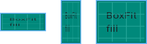
fill,
/// As large as possible while still containing the source entirely within the
/// target box.
///
/// 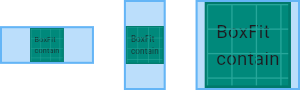
contain,
/// As small as possible while still covering the entire target box.
///
/// 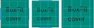
cover,
/// Make sure the full width of the source is shown, regardless of
/// whether this means the source overflows the target box vertically.
///
/// 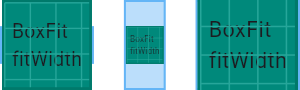
fitWidth,
/// Make sure the full height of the source is shown, regardless of
/// whether this means the source overflows the target box horizontally.
///
/// 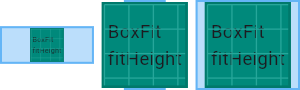
fitHeight,
/// Align the source within the target box (by default, centering) and discard
/// any portions of the source that lie outside the box.
///
/// The source image is not resized.
///
/// 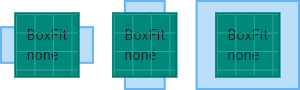
none,
/// Align the source within the target box (by default, centering) and, if
/// necessary, scale the source down to ensure that the source fits within the
/// box.
///
/// This is the same as `contain` if that would shrink the image, otherwise it
/// is the same as `none`.
///
/// 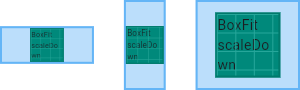
scaleDown,
}
Image.asset(
String name, {
Key key,
AssetBundle bundle,
this.semanticLabel,
this.excludeFromSemantics =false,
double scale,
this.width,
this.height,
this.color,
this.colorBlendMode,
this.fit,
this.alignment = Alignment.center,
this.repeat = ImageRepeat.noRepeat,
this.centerSlice,
this.matchTextDirection =false,
this.gaplessPlayback =false,
String package,
this.filterQuality = FilterQuality.low,
})
三 文本组件
属性如下,常用属性
const Text(
this.data,// String 显示的文本
{
Key key,
this.style, // 文本样式
this.strutStyle,// StrutStyle
this.textAlign, //文本对齐方式
this.textDirection, // 文本排列方式
this.locale, // 在相同的字符情况下,根据区域,设置不同的字体
this.softWrap,// 文本在软换行出换行
this.overflow,// 如何处理溢出的文本 TextOverFlow
this.textScaleFactor,//double
this.maxLines,
this.semanticsLabel,
})
四 图标组件
图标组件Icon,Icon不可以交互,IconButton可以
Icons 框架自有的icon资源
IconTheme
ImageIcon AssetImages 或者其他图片显示icon
IconButton 如果 onPressed 是null 则这个图标不可点击
const IconButton({
Key key,
this.iconSize =24.0,
this.padding =const EdgeInsets.all(8.0),
this.alignment = Alignment.center,// 定义icon的对其方式
@required this.icon,
this.color,
this.highlightColor,
this.splashColor,
this.disabledColor,//禁用时的颜色,
@required this.onPressed,
this.tooltip,//按钮按下时的提示语
})
RaisedButton 一个凸起的矩形按钮,按下时会有一个触摸效果
const RaisedButton({
Key key,
@required VoidCallback onPressed,
ValueChanged onHighlightChanged,
ButtonTextTheme textTheme,
Color textColor,
Color disabledTextColor,
Color color,
Color disabledColor,
Color highlightColor,
Color splashColor,
Brightness colorBrightness,
double elevation,
double highlightElevation,// 高亮时的阴影
double disabledElevation,
EdgeInsetsGeometry padding,
ShapeBorder shape,
Clip clipBehavior = Clip.none,
MaterialTapTargetSize materialTapTargetSize,
Duration animationDuration,
Widget child,
}
五 列表组件
ListView 常用的列表组件,可以支持水平和垂直
list item 数量较少 可以使用
ListView({
Key key,
Axis scrollDirection = Axis.vertical,// 控制列表的排列方向
bool reverse =false,// 组件排列反向
ScrollController controller,
bool primary,
ScrollPhysics physics,
bool shrinkWrap =false,
EdgeInsetsGeometry padding,
this.itemExtent,
bool addAutomaticKeepAlives =true,
bool addRepaintBoundaries =true,
bool addSemanticIndexes =true,
double cacheExtent,
List children =const [],//列表元素
int semanticChildCount,
DragStartBehavior dragStartBehavior = DragStartBehavior.start,
})
如果数量较多 基础组件也是listview 但还需要添加一个itemBuilder
六 网格布局,GridView
GridView({
Key key,
Axis scrollDirection = Axis.vertical,
bool reverse =false,// 默认是从左上开始滚动
ScrollController controller,//控制child滚动时候的位置
bool primary,
ScrollPhysics physics,
bool shrinkWrap =false,
EdgeInsetsGeometry padding,
@required this.gridDelegate,
bool addAutomaticKeepAlives =true,
bool addRepaintBoundaries =true,
bool addSemanticIndexes =true,
double cacheExtent,
List children =const [],
int semanticChildCount,
})
具体使用后续会有介绍,目前先有个大概的轮廓
项目地址:
https://github.com/liuhang1234/flutter_base_widget