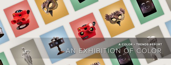
2021 色彩+设计 流行趋势
揭开Dunn-Edwards2021
色彩+设计趋势
2020年10月20日,美国Dunn-Edwards在洛杉矶发布了“2021年度color+design trend色彩+设计流行趋势”(英文版)。
今天,我们在中国发布(中文版)“2021年度color+design trend色彩+设计流行趋势”。
由于COVID-19疫情的影响,流行趋势变得变换莫测,导致我们需要更多地时间去研究趋势的发展,因此,本次发布比往年延迟了几个月。
美国邓恩每年投入巨资研究发布的色彩+设计流行趋势,希望色彩和设计人员在此获得灵感。
在迈入新的十年的过程中,我们面临着全球大流行COVID-19和混乱的影响。在这些事件中出现了一段反思和彻底变化的时期。我们学到了什么?我们将改变什么?我们可以治愈吗?一场思想、身体和灵魂的革命正在我们身上展开,我们在寻找一种新常态,挑战过时的生活和设计观念,用新的魔法和神秘滋养我们的创造力。我们与自然的关系变得更加谦卑,因为我们将目光转向遗产和工艺,寻求一种新的怀旧之情。 当我们谈论可持续性时,创造力常常被遗忘。然而,我们看到了可持续发展美学的真正演变。对意义的追求和具体行动的欲望激发了我们对材料的兴趣,在情感上调和我们自己与这些想法,并关注于对生态负责的创造过程和由此产生的良性美学。
在2021流行趋势里,我们提及的最多的就是人与自然的和谐,这是值得注意的细节。
2021 色彩+设计流行趋势包含五个主题:
Querencia 乡愁
Querencia: a place from which one’s strength is drawn, where one feels at home; the place where you are your most authentic self.
奎伦西亚:力量的源泉,温暖如家;在这里,你回归真实的自我。
In Querencia, we discover a renewed fascination for artisan crafts. When we talk about sustainability, creativity is often forgotten. However, we see a real evolution in the "aesthetics of sustainability." The quest for meaning and a desire to act concretely motivate us to take an interest in materials, reconcile ourselves emotionally with these ideas, and focus on eco-responsible creative processes and the virtuous aesthetics that result.
在奎伦西亚,我们发现一种手工技艺的新魅力。
当我们谈论发展可持续性时,创造力常常被遗忘。
然而,我们看到了“可持续性美学”的真正演化。
对意义的追求和对具体行动的愿望激励我们对材料产生兴趣,在情感上与这些想法调和,专注于对生态负责的创造过程和由此产生的良性美学。
Like a remedy to anxiety, we prefer immersive vegetation decoration and take inspiration from the flamboyant colors and incredible textures of the plant and animal world. Aesthetics linked to climate change are adorned with a resolutely poetic veil of nostalgia.
如同对焦虑的一种补救,我们更爱身临其境的植物装饰,并从动物和植物世界里艳丽的色彩和难以置信的纹理中获得灵感。
与气候变化关联的美学,被如诗的怀旧面纱所装点。
Rooted in the charm of regional traditions and history, establishing local foundations and rediscovering emotions. We look to simple joys filled with gratitude and generosity. Leaning into connections, we cherish family, especially the elderly, as well as first responders who selflessly come to our aid in times of crisis.
根植于区域性传统与历史的魅力,建立当地的基础,重新发现情感。
我们探究那充满了感恩和慷慨情怀的简单快乐。
我们珍惜家庭,尤其爱护长辈,以及在危难时刻无私地帮助我们的急救人员。
As we seek goodness in life, we treasure simple joys and days filled with gratitude, generosity and kindness. Amid the current crisis and staying away from friends and family for safety’s sake, we crave intimacy and connection.
当我们在寻找生活之美时,我们珍惜简单的快乐和充满感激、慷慨和良善的日子。
在当前的危机之中,为了安全而远离朋友和家人,我们渴望亲密和联系。
The chase for perfection has comes under fire, and there is now a backlash to the never-ending cycle of unattainable lifestyles. We learn to trust our inner voices and find comforts in the home are where we are meant to be.
对完美的追求招致抨击,那水中花一般不可求的生活方式的无休止循环也带来了社会的强烈反应。
我们学会相信自我的心声,在家中找到舒适,这才是我们的归宿。
inspiration灵感
Think local and rediscover the know-how and vitality of regional richness, redesigned through the filter of modern times. There is a decadence in the uncomplicated tasks of daily life, while disconnecting from technology and resetting daily life.
吸取本地元素,重新发现知识和区域性活力,由过滤现代而重新设计。
鉴于日常生活中简单的任务可滋生颓废,我们必须脱离技术,重新设定常规活动。
We connect to emotions based on authenticity. There is a focus on the south Mediterranean, a region rich with a tradition, and rediscovering the pleasures of good products created with established, local know-how. As a result of the touch crisis, we seek tactility and comfort in these authentic products.
我们依据真实性来连接情感。
我们聚焦南地中海-一个传统丰富之地,发现了以当地成熟的技术制造的好产品。
由于新冠接触危机,我们在这些产品中寻求触感与舒适感。
New immersive spaces, modeled on old-fashioned specialist stores, celebrate an authentic part of living with a contemporary take, based on regional gastronomy and everyday functionality.
新式拟真空间,仿旧专业商店,基于区域性美食和日常功能,以当代风格喜庆一个真实的生活。
Design设计
Through the design lens, we crave innocence and whimsy and delight in homespun, small-town delights filled with humor and nostalgia. Retro styles of the 1950s — ’60s era highlight a return to the golden age of design. And, as we tire of the cheap fast-fashion, we yearn for simple classics that are updated to modern times. Home offices are key jumping-off points, as many of us will continue to work remotely for the foreseeable future.
穿过设计的透镜,我们渴望天真和奇想,钟爱那充满幽默和怀旧的土布小镇。
20世纪50 - 60年代的复古风格凸显了设计黄金时代的回归。
而且,当廉价的快闪时尚已经带来了观赏疲劳,我们渴望那更新到现代的简单经典。
家庭办公室是关键的起点,因为在可预见的未来,许多人将继续远程工作。
There is a design revival in learning new skills to turn the ordinary and outdated into a new, timeless and whimsical aesthetic. Interior design take shape through themes of playfulness and whimsy, to the simple elegance and a focus on the core essentials.
学习新技能,化平淡和过时的设计为新颖、永恒和奇幻的美学。
室内设计通过嬉耍与奇异的主题已逐步成型,到达简单的优雅和对核心要素的关注。
Color颜色
Subtle, delicate and graceful, the palette starts with soft, chalky and watercolor tones with infusions of light and patina effects. There is a soft warmth to the range of hues balanced by toned-down cooler shades. Pops of tangy pastels add a cheerful, fresh mood, while ’70s sunset gradients punch up the retro vibes.
用色風格
微妙、精致、优雅,以柔和、白垩和水色灰色调开始,注入光线和古铜色效果。
在颜色的范围内有柔和的暖色,这种色调被调低的冷黑色调所平衡。
浓烈的粉彩增添了欢快清新的气氛,而70年代的日落渐变则增添了复古的氛围。
Rethink the red, white and blue flag colors and classic tricolors, as the importance of joyfulness highlights delightful quirkiness. Transparent filtered colors are sentimental, while graphic tones, tempered by gradated half-tones applied on summer stripes, as well as mini geometrics from the archives, showcase a softened retro, summery vibe.
重新考虑一下红、白、蓝三色的美国国旗颜色和经典的三色,因为快乐的重要性突出了愉悦的奇异风格。透明的过滤色是感性的,而图形灰色调,用渐变的半色调调和夏季条纹以及迷你几何,展示了软化的复古、夏季氛围。
材料和纹理
There is a light-heartedness and focus on comfort in materials and surfaces. Soothing and organic, heirloom-quality and artisan. Here are distinctive concepts to consider when designing with Querencia in mind:
这里有一种轻松的氛围,注重材料和表面的舒适。
舒缓、有机,传家宝质量和工匠。在使用Querencia进行设计时,心怀如下独特的概念:
Regional heritage — hand-crafted braiding, straw and cane work, and traditional weaving. Workmanship from another era is revived and reinterpreted in artisan-designer collaborations. Add to this a fondness for Mid-century modern revivals: snake-channel tufting, soft curved lines and ergonomic chairs in poppy hues.
区域性传统-手工编织,稻草和藤条工作,和传统的编织。来自另一个时代的工艺在工匠与设计师的合作中得到复兴和重新诠释。
除此之外,还有对中世纪现代复兴的喜爱:蛇形槽簇绒、柔和的曲线条和符合人体工学的罂粟色椅子。
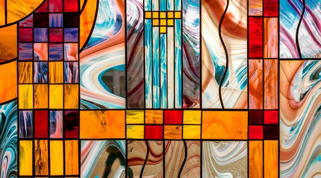
Stained glass revival — colored neo-stained glass transparency and cloisonné enamel, in addition to metal outlines or satin patchwork, precious ornamental and geometric textures.
染色玻璃复兴-金属轮廓或缎质拼缝品,贵装饰品和几何纹理, 外加彩色新染色玻璃的透明和景泰蓝珐琅。
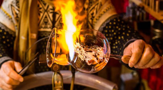
Barware revival — glassblowing is a fascinating art form that has recently regained traction and — along with that — a renewed interest in artisan glassware and barware. As we continue to practice social distancing, home bars are in-demand design elements.
酒吧器皿的复兴-最近重获吸引力的玻璃吹制术是一种迷人的艺术形式,同时,人们对手工玻璃器皿和酒吧器皿的兴趣也重新燃起。
随着我们继续保持社交距离,家庭酒吧成为了炙手可热的设计元素。
Modern chatelaine — medieval references — such as chains, precious historical ornamentation in jacquard, and resin-coated feathers and vintage ceramics, and couture scarves recycled as cushions highlight a new decorative industry.
现代腰链——中世纪参照物——如链条、花布织物上珍贵的历史装饰、树脂覆盖的羽毛和古董陶瓷,以及回收作垫子的昂贵时装围巾,均为新兴装饰工业的亮点。
Childhood charms — childlike, simplistic forms and fonts highlight positivity and energy to Querencia. Voluminous constructions and malleable forms permeate the brighter range of colors within the palette.
童年的魅力——童真、简约的形式和字体,突出Querencia的积极性与活力。
大容量的建筑和可延展性的外形渗透在调色板明亮的颜色范围内
Kitsch florals and country calico — overdyed checks, blocky contrasted color, rural mini-geometrics, trompe l’oeil embroidery, country florals or naïve gouaches. Fresh decorations combined or working in positive-negative treatments.
俗气的花卉和乡村印花布-染色过格,块状对比的颜色,乡村迷你几何图形,错视绣,乡村花卉或天真的水粉画。新鲜的装饰结合或工作在正负处理。
Re-enchanted nostalgia — turned wood and painted paneling, stained-glass windows from yesteryear, azulejos or cement tiles reawaken the charm and emotion of a family home. Combine precious details and folk accessories to tell a new story of the place and live there in the present. Modernized tailoring in silk, linen and wool muslin with updated pinstripes, argyle and painterly surfaces exude qualities of bygone eras.
复兴怀旧风-改造旧时的木质、彩绘镶板和染色玻璃窗,上光花砖或水泥瓷砖唤醒了居家的魅力和情怀。将珍贵的细节和民间饰品结合起来,讲述一个关于这个地方的新故事,让人们活在当下。
丝绸、亚麻和羊毛细布经过现代化的剪裁,加上最新的细条纹、菱形花纹和绘画般的表面,散发出过去时代的特质。
Customized tradition — showcase the handcrafted aspect of production, highlighting quality and sense of detail, for illustrations as well as for the choice of material-media and for expressing developed expertise.
定制传统-为了达到图解说明,材料媒体的选择和表达发展的专业知识,展示产品的手工制作方面,突出质量和细节的感觉。
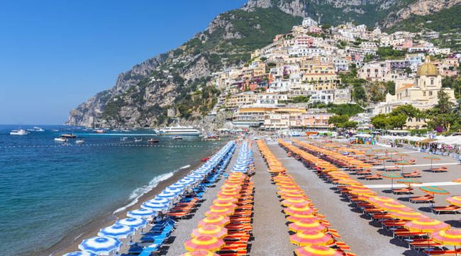
Family story — like a summer seaside memory, we romanticize regional traditions. The result is authentic, intimate and comfortable. Seaside graphics, diagonal stripes, retro geometrics and candy-colored saturated stripes and glassware are key to seaside nostalgia.
家的故事-如夏日海边的记忆,我们浪漫化了区域性的传统。其结果真实、亲密和舒适。
海边图案、斜条纹、复古的几何图形、糖果色的饱和条纹和玻璃器皿是海边怀旧的关键。
Solibre 索里部落
Solibre: literal translation "sun free." Sounds like "soy libre" — I’m free
What is the biggest challenge we face? This question was recently posed by Fernando Ausin an international entrepreneur with a passion for social justice and global sustainability, during a virtual program on trends and practices to carry us forward post-pandemic. When Ausin questioned elders in his research within Mexico’s indigenous cultural communities, rather than pointing to outside influences, their answer was fear or "chicuaqui." Described as an energetic parasite, chicuaqui feeds on our doubts, fear, anger, worry and sadness. When the fear is fed, there is a constant anxiousness.
我们面临的最大挑战是什么? 费尔南多 奥新是一位对社会正义和全球可持续性充满热情的国际企业家。他在一个关于在大流行后推动我们前进的趋势和实践的虚拟方案中提出了这个问题。
当奥辛在他的研究中询问墨西哥土著文化社区的长者时,他们的回答是恐惧或“chicuaqui”,而不是指向外界的影响。
chicuaqui被描述为一种充满活力的寄生虫,它以我们的怀疑、恐惧、愤怒、担忧和悲伤为食。
当恐惧被喂食,焦虑必将持续。
Solibre is a story of overcoming our fears and transferring these negative emotions into a new freedom of ideas for sustainable practices, self-optimization and adaptive design. A push forward to innovate on the edge of uncertain times, ideas are free to flow, liberated from fear.
Solibre是一个克服我们的恐惧,并将这些负面情绪转化为可持续实践、自我优化和适应性设计的新自由思想的故事。在不确定的时代边缘推动创新,思想自由流动,从恐惧中解放。
Solibre puts climate issues back into the heart of restorative creation, nourished by a symbiotic relationship with nature and indigenous cultures.
Solibre将气候问题重新纳入恢复性创造的核心,而恢复性创造由与自然和土著文化的共生关系滋养。
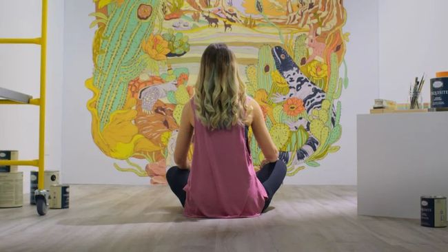
Nature under threat is a subject of reflection and fascination. There is a feeling of loss as we seek to repair connections with the land. Artists, designers and scientists are interacting with nature and coming up with restorative concepts poised between ancestral know-how and cutting-edge technological developments.
受到威胁的自然是一个令人深思和着迷的主题。当我们试图修复与大地的关联时,失落感油然而生。艺术家、设计师和科学家与大自然互动,在古老的知识和前沿技术发展之间提出修复概念。
Design 设计
How do we utilize the inspiration of Solibre to the world of design? There is a symbiotic relationship between reality and the artificial worlds as we look to innovations in digital intelligence — sensors, AI, Alexa, integrated devices, etc. — to aid in protection and preparation. Yet, innovation has moved us past fear into increased lives melding digital and reality.
我们如何将Solibre的灵感运用到设计的世界中? 数字智能的创新——传感器、人工智能、Alexa、集成设备等——可以应用于帮助保护和准备。这一可能性揭示了现实和人工世界之间存在的共生关系。然而,创新实际上已经让我们摆脱了恐惧,进入了融合数字与现实的丰富生活之中。
Technology is coming of age with real-time interactions. Virtual advancements allow us to better ourselves through science, as well as traditional healing practices. We are pushing the limits of what the human body can do, moving beyond our comfort zones. Solibre highlights that we can perceive discomfort of these scientific and technological developments as necessary for growth. Pushing boundaries is the gateway to new design frontiers.
技术正在步入实时互动的时代。虚拟的进步使我们得以通过科学和传统的治疗来改善自我。
我们正在突破人体的极限,超越我们的舒适区。Solibre 强调,我们可以感受到这些科技发展所带来的不适为成长所必需的元素。突破边界-那是通向新设计前沿之门。
Products that offer preparation and protection are key elements. Adaptive designs allow greater self-sufficiency, while expanding creative boundaries, which foster breakthroughs in technology and transformative design solutions. The new luxury is the ability to choose refuge.
提供准备和保护的产品是关键元素。适应性设计允许更大的自足性,同时扩大创造边界,以促进技术和变革性设计解决方案突破的产生。选择避难所的能力是新的奢侈。
Adaptive design inspires dynamic tools that increase convenience and preparedness for the unknown. It is streamlined, displaying only the absolute essentials, which cultivates a safe haven and bolsters our courage to discover the unknown.
适应性设计激发了动态工具,以增加便利和对未知的准备。它是简化高效型的,只显示绝对的要素,这培养了一个安全的避风港,并激励我们去探索和发现未知。
Products will continue to push the boundaries of creativity and — because there will always be matters beyond our control — design will continue to give us innovative tools for additional preparation. Immersive design experiences focus on solar energy, reconnecting with cultural heritage, and re-creating paradise in gallery form.
产品将继续推动创造力的边界,而且——因为总会有事物超乎我们掌控——设计将继续为我们提供创新的工具,以作进一步的预备。沉浸式设计体验聚焦于太阳能,与文化遗产重新连接,以画廊的形式再造天堂。
What architectural approach befits Solibre? Brutalism. That’s right: Brutalism isn’t dead. After appearing, then disappearing, brutalism is back in softer, surrealist and eco-focused forms. Balance is central to brutalism, as well as future-facing design, which is crafted for longer-term appeal. This architectural style is reminiscent of the California coastline and reborn out of fire protection — utilitarian and essential.
什么样的建筑方法适合Solibre? 野兽派。没错:野兽派并未死亡。出现之后消失,野兽主义又回到了更柔和、超现实主义和聚焦生态为的形式。平衡是野兽派的核心,也是面向未来、取胜于长久艺术魅力的设计的核心。这种建筑风格让人联想到加州的海岸线,并从防火中重生——实用且不可或缺。
Color 颜色
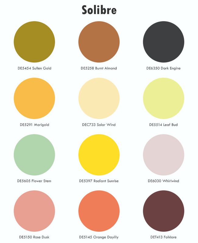
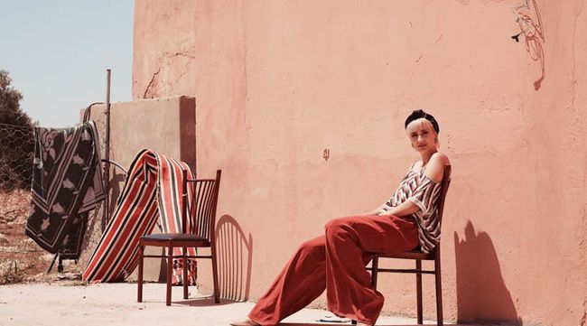
The Solibre color palette is strong and nurturing, comforting us through uncertain times. This organic palette is reminiscent of desert landscapes, real and surreal, revealing brown and red tones that echo the Earth’s hues. Creating balance, pastels whisper the promise of new life, greens protect flora and fauna, and yellows showcase the power of solar energy. Bathed in light that radiates from all surfaces in pearly glints, ambers and soft iridescence, this color scheme is invigorated by a soft Day-Glo acid yellow.
Solibre 色彩的调色板是强烈和具培育性的,在多变之秋给我们予安慰。
这种有机的调色板让人联想到沙漠景观,真实却又超现实,展现棕和红的灰色调,与地球的颜色相呼应。作为创造平衡的元素群,粉彩轻呼着新生的诺言,绿色保护着动植物,而黄色则描画出了太阳能的力量。
沐浴在所有表面放射出的珍珠光泽、琥珀色和柔和的彩虹色光线中,这个色彩方案被柔和的炫彩Day-Glo酸黄色激活。
This warm palette is influenced by raw materials, art and nature, all enhanced by yellow. Paired and gradient contrasts reinvent light and shadow, the day’s beginning and end. Botanical hues are omnipresent, greens and khakis are filtered through the sun and polished with yellow accents yet blended with shades of dark brown.
这温暖的用色风格受到原材料、艺术和自然的影响,所有这些都被黄色强化了。配对和梯度对比重新创造了光与影,一日之始与终。植物性的颜色无处不在,绿色和卡其色在阳光下被过滤并由黄强调色抛光,但它们仍然混合了深棕黑色调。
材料和纹理
"Necessity is the mother of invention," goes the well-known proverb, and it’s more relevant than ever. Necessity is pushing designers to reinvent materials for indestructible protection, in hyper-real finishes and durable fibers. Self-healing and anti-viral protective fabrics are crucial materials.
俗语言“需要是发明之母。”这句话比以往任何时候都更加贴切。必要性正在推动设计师们重新发明具有不可破坏保护功能的材料,这些材料采用超真实的饰面和耐用的纤维。自愈和抗病毒防护织物是至关重要的材料。
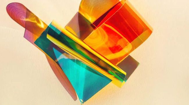
Designs are organic, utilitarian and offer an artisan approach; imagine new heirlooms for future generations. Glassware is transparent, offering unusual forms. Lighting designs are pushing boundaries of form and function with a focus on sunlight and solar-light infusions — amber colors, tinted glass, light sensors, lustrous and gradated textures, iridescent weaves and light sensors. Other featured design, materials and textures include:
设计是有机的、实用的,并提供一种工匠的方法;想象一下未来几代人的新传家宝。玻璃器皿是透明的,提供不同寻常的形态。照明设计正在推进形态和功能的边界,重点是日光和太阳能光的注入-琥珀色,染色玻璃,光泽和渐变的纹理,彩虹编织和光传感器。
其他特色设计、材料和纹理包括:
Themes of island life and exotic survival — plating, printed heather, raffia knit, openwork fishnet, as well as crafts inspired by Oceanic art, including exotic feathers, straw, leather, rattan — anything that reinvents tribal spirit.
岛屿生活和异国情调生存的主题-电镀,印刷石南,拉菲针织,镂空渔网,以及灵感来自海洋艺术的工艺品,包括奇异的羽毛,稻草,皮革,藤条-一切重新创造部落精神的事物。
· Plastic reformation — in a blend of natural and digital manifestations, upcycled and recycled products emerge with impression of diluted and shot decoration, half-floral or half-aquatic, like new camouflage. New landscapes, aqueous marbling, imaginary island flowers, and patterns that look like Rorschach tests. Mirror-polished stainless steel adds the right touch of tech.
塑料改造——在自然和数字表现的混合中,升级和回收的产品出现了稀释和拍摄装饰的印象,半花或半水,像新的迷彩。新的景观,水形大理石纹,想象中的岛花,和恍如罗夏测验的图案。镜面抛光的不锈钢增添了恰如其分的技术触觉。
· Sunlight everywhere — abundant sunshine with contemporary materials that catch or filter the light through colored glass, glossy corrugated iron, glazed textures, and interiors that open out onto nature, mixing high-tech equipment with ancestral accessories, with an exotic futuristic vibe.
日光无处不在-丰富的日照与当代材料捕捉光线,或者通过彩色玻璃、光滑的波纹铁、釉面纹理、和开放到自然的室内环境过滤光线,使祖传的配件与奇异的未来氛围与高科技设备充分混合。
· Nature’s rebirth and metamorphosis — appreciate the richness of nature’s constant transformation. Honeyed shine, hot-foil stamping, sizzling summer heat gradations, organic mutations of plant life, raw limestone, charred cork, oak, resin, coated honeycombed knit, micro textures, beeswax, and perforated metal. Nature is influenced by environmental awareness and technological advances, and new nature focuses on discovery and understanding, from original to man-made.
大自然的再生与蜕变-欣赏大自然的永恒之变。花蜜般的光泽、冲压烫金箔、炎夏热阶、植物的有机变异、原始石灰岩、烧焦的软木、橡木、树脂、镀膜的蜂窝编织、微观纹理、蜂蜡和穿孔的金属。自然受到环境意识和技术进步的影响,新自然聚焦于发现与理解,从原始到人为。
· Mutations and mysteries of nature — fantastical vegetation formations, metamorphosing flora and fruit to adapt to extremes, dehydrated shapes, botanic mimicry. There is a strange, otherworldly exoticism to decorative leaf patterns and textures and extravagant vegetation with acid accents. Add to this supernatural vision oversized botanical elements, hybrids of flora and fauna, and pearlized finishes.
突变和自然之谜——奇异的植被形成,改变植物群和水果以适应极端环境,脱水的形状,植物拟态。以超凡脱俗的奇异风格装饰叶形图案、纹理和奢华的植被。超大的植物元素、混合动植物群、和珍珠饰面被添加到超自然的视野。
In surface design, the influence of biotechnology is paramount. Patterns include speckled and gravel-coated, granular effects, along with numeric typography — rulers, bold numbers, charts and graphs. Heat-mapping graphics in bright chemical-colored prints represent escapism, as well as environmental influences. Volcanic lava spatters display the raw power of Earth, while color gradients in sunrise and sunset hues elevate design to dream states.
在表面设计中,生物技术的影响是至关重要的。图案包括斑点和砾石涂层、颗粒效果,以及数字排版-标尺,粗体数字,图表和曲线图。在明亮的化学色彩印刷品上的热绘图代表了对现实的逃避,以及环境影响。火山熔岩飞溅显示了地球的原始力量,而日出日落颜色的渐变则将设计升入梦境。
Hanabi 烟花
Hanabi: a Japanese term meaning “fireworks.” Hana = flower. Bi = fire.
Hanabi explores the codes of inclusive, optimistic and laid-back design re-creating links between the generations. Borrowing energy and inventiveness from our childhood, then turning this vivacity and creativity into a collaborative and festive playground. Finding better solutions for the challenges that lie ahead.
Hanabi:日语词汇,意为烟花。Hana=花 bi=火。
Hanabi探索了包容、乐观和悠闲的设计准则,再造了世代之间的联系。从我们的童年汲取能量和创造力,然后把它们化作协作和喜庆的游乐场。为前方的挑战找到更好的解决方案。
Design设计
Embracing childhood through spontaneity and freedom of play, designs showcase happy and wide-ranging results, more artistic in nature, that show you don’t have to take life so seriously. Design can provide cheerful and upbeat escapes from the everyday.
透过自发性和嬉耍拥抱童年,设计展示了欢快和广泛的结果,更艺术的自然,表明生活无须如此严肃。设计可以提供日常生活中积极和乐观的解脱。
Hanabi asks us to look at design through the eyes of a child — an easy-going approach in which the space is brightened by playful shapes and colors and plays-on-scale. Drawings are random and in oversized forms.
Hanabi要求我们通过孩子的眼睛来看待设计——一种轻松的方式,以顽皮的形状和颜色照亮空间。绘画是随机的, 并采取超大形式。
Color颜色
The Hanabi color palette is experimental and fresh. Early-childhood shades of marshmallow pink, mint and bleached yellow boost the playful palette, which is darkened by bright blues and greens and stimulated by radiant purple and coral.
Hanabi的调色板是实验性的和新鲜的, 由明亮的蓝色和绿色暗化,并以亮紫色和珊瑚色刺激。童年时期的棉花糖粉色、薄荷色和漂白黄色黑色调增强了它活泼的主色调。
Color can play a role in function and fun. Monochromatic coating and graphic color blocking reveal practical purposes, while highlighting the enjoyment that design can bring to commercial and residential spaces. Multicolored and childlike graphics are shown on floor trails, resulting in wayfinding fun.
颜色可以在功能和乐趣中发挥作用。单色涂料和图形色块显现实用目的,同时也突出了设计给商业和住宅空间带来的享受。多色彩的应用和天真的图形显示在地板上的小径,引来寻路乐趣。
材料和纹理
Hanabi creations are artistic, filled with freedom of movement and rediscovery of childhood dreams. The playground inspiration is brought to life through vivid, fruity color combinations, handmade textures and fun graphic decoration. A positive and spontaneous new spirit reflects our wish to prolong childhood, as well as not take oneself too seriously. Vibrant, colorful and brimming with charm, key materials and textures include:
Hanabi的创作是艺术的,充满了自由的行动和对童年梦想的重新发现。通过生动、水果的色彩组合、手工质感和趣味图形装饰,将游乐场的灵感带入生活。积极与自发的新精神体现了我们希望延展童年和无须过度严肃的姿态。生机盎然、色彩丰富、魅力四射。主要材料和纹理包括:
· Children’s drawings — rediscover the spontaneity of childhood through sketches or an artistic combination of effects with crayon drawings and clay models. Liberation can be found in creative freehand drawings as figurative or abstract patterns look as though they have been doodled with a felt-tip pen.
儿童绘画-通过素描或蜡笔绘画和粘土模型的艺术组合,重新发现童年的自发性。自由可以在创造性的徒手绘画中找到,因为具象的或抽象的图案都像毡头笔涂鸦一样。
· Creative compilations — from furniture to accessories, we envision reassembled color-collage forms using scissors or 3D printers to create new, unique designs.
创造性的汇编-从家具到配件,我们用剪刀或3D打印机预想出重新组合的彩色拼贴形式,以创造新颖独特的设计。
· Line drawings — surface patterns are inspired by simple stripes and colorful shapes in color. Serpentine tubing or dotted hatching add line interest.
线条画-表面图案的灵感来自简单的条纹和彩色的形状。蛇形管或虚线孵化增加线的兴趣。
· Volume — classics are revamped in plump and oversized shapes; fresh designs with playground vibes and glossy textures.
卷曲-经典在丰满和超大形状中翻新; 带游乐场氛围和光滑纹理的清新设计。
· Typography and graphics — comic forms are embraced through speech balloons and high-impact typography. Storytelling is rediscovered through characters on product packaging, wall art and other inspired outlets — inviting us to envision these tales through the eyes of children.
排版和图形-语音气球和高冲压排版体现了漫画的形式。通过产品包装上的人物形象、墙体艺术和其他受启发的渠道,故事被重新发现——邀请我们用孩子的目光去观看经典传奇。
Lagom 古今平衡
Lagom: a Swedish term that signifies the right amount or balanced perfection. Not too little, not too much — just right. Lagom is easygoing, unplugging, connecting with others in real life and disengaging from social media. It's about taking time for yourself, doing something with your own hands, and giving back.
Lagom:瑞典术语,指适量或平衡的完美。不少,也不多——恰好。Lagom是个随和的人,在现实生活中与他人保持联系,但脱离社交媒体。给自己
时间,做事,回馈社会。
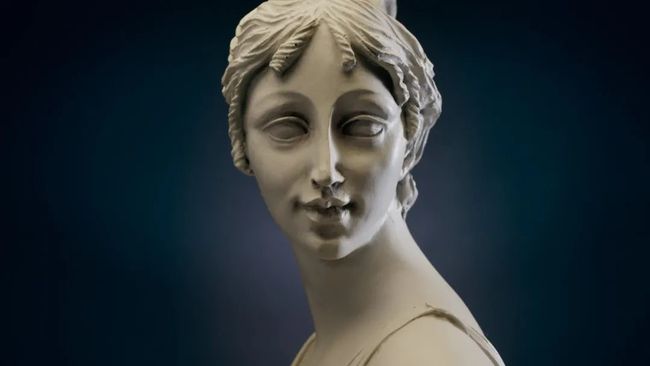
Lagom challenges the notion of classical form, while praising timeless qualities of design. Finding the ideal balance of old and new. Reaching out for ageless points of inspiration, designers and artists channel archetypal historical references to build new visions of enduring purpose. Essential design with artistic touch. Lagom speaks to the spirit of storytelling, decoding the past and reframing the future.
Lagom挑战古典形式的概念,同时赞扬设计的永恒品质。找到新与旧的理想平衡。为了寻找永恒的灵感点,设计师和艺术家们引入原型历史典故来建立目的持久的新愿景。带艺术感的基本设计。Lagom对话故事叙述的精神,解码过去,重构未来。
Design设计
The individual and collective narratives are told theatrically in an opulent aesthetic. We cultivate mystery by blurring couture, bourgeois, rock or neo-cyborg references. Important classics are revived in a glam, dressy version. The ornamental baroque style imposes itself; colors are darker, and forms are distorted.
个体和集体的叙述浸透在丰盛的美学中,以戏剧性的方式展开。我们通过模糊时装、中产阶级、摇滚或新半机械人来培养神秘感。重要的经典作品在华丽、考究的版本中复活。装饰性的巴洛克风格在自我推行;颜色趋深,形式扭曲。
Lagom seeks to rebalance the notion of old traditions, creating fresh legacies in design and art, as well as a resurrecting the beauty of craftsmanship. Rethinking past designs reveal innovative layers for today. Sharing, inclusive designs reveal a new balance. Asking oneself what heritage means in using depths of emotion to create novel and meaningful classics. Art Nouveau, Arts and Crafts, enchanted design, and architectural styles of years past come full circle, as the need for escape and timeworn beauty are everywhere.
Lagom试图重新平衡传统观念,在设计和艺术上创造新的遗产,以及复兴工艺之美。反思过往的设计揭示了今天创新的层次。分享和包容性的设计展现了新的平衡。问自己,在用情感的深度去创作新颖而有意义的经典中,传承意味着什么。新艺术、工艺美术、魔幻设计和陈年建筑风格都在循环往复,因为脱离的需求和陈旧之美无处不在。
art nouveau新藝術(以曲折有致的線條、植物和花朵的形狀為特色的藝術或裝飾風格)
Learning to rewrite history with a more inclusive approach provides opportunities to grow and re-allocate value to newer ideals of design and art, rethinking splendor and timeless aesthetics. This synthesis to the design process provides hope and meaning to products. The individual and collective narratives are told theatrically in a picturesque aesthetic.
学习更为包容地改写历史提供了成长的机会,并将价值重新分配给更新的设计和艺术理念,重新思考辉煌和永恒的美学。这种对设计过程的综合为产品提供了希望和意义。个体和集体的叙述浸透在如画的美学中,以戏剧性的方式展开。
Key highlights to Lagom include heirloom-quality designs transformed by fresh symbolism, as well as classically tweaked designs layered with refined and subtle embellishments. Melding ancient and modern techniques, perfecting the process of design is essential, taking the time to reveal what’s beneath the surface.
Lagom的关键亮点包括由新鲜的象征主义转化的传家宝质量的设计,以及与精致和微妙的装饰分层的经典微调设计。融合古代和现代的技术,对设计过程的完善必不可少,揭示表层之下的内涵。
Color颜色
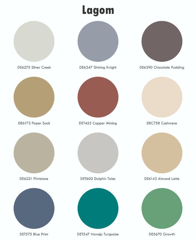
The story of neutrals through layers of time, antique hues with a touch of decadence and romance. A global archaic influence peaks through as grays are softened and touches of flesh pink and deep rust red infuse the palette with the spirit of art.
故事的中性透过时间层,颓废和浪漫的古旧颜色。灰色被软化,少许肉粉色和深铁锈红给调色板注入了艺术的精神,总体古老的影响达到顶峰。
This mineral-inspired palette layers shades of marble, granite and concrete, while overlaying a veil of sand and fragile fresco hues. Nature’s influence is displayed through modern blues and plant-based greens.
这个由矿物激发灵感的调色板把大理石、花岗岩和混凝土的黑色调分层,同时覆盖一层沙子和脆弱的壁画颜色。自然的影响通过现代蓝和植物绿表现出来。
材料和纹理
Lagom is design with purpose, and a fundamental attention to the process. Repurposed heirlooms, classical mashups and superior craftsmanship are foundations for an ideal design. Add light, decadent accents for a luxurious touch to finalize a storybook setting. Other key design details, materials and texture highlights include:
Lagom是有目的的设计,是对过程的基本关注。改换意图的传家宝,经典混搭和卓越的工艺是一个理想设计的基础。添加轻而颓废的强调色取得豪华的触感,以完成一个故事书的设置。其他主要设计细节、材料和纹理亮点包括:
· The idea of subtle movement and motion — channeling caryatids or ancient Greek pleating — supple textiles, sculptured stone with texturized folding and fluid draping, cool sensuality, a study in the anatomy of design.
微妙运动之想-引入女像柱或古希腊的褶裥-柔软的纺织品,带纹理折叠和流体悬垂的石雕,凉爽质感,研究设计解剖学。
· Artisan made — crafted vegetable-tanned hides, repurposed composite, craftsperson-made goods, resin, brass, dried floral arrangements and other Art Nouveau floral interpretations. Vibrant damask, delicate velvets and toile are finely crafted. Other materials of note include walnut wood, Italian marble, gas-fired clay, shearling wool, smooth leather, antique bronze, alabaster and colored glass.
工匠制作-精心制作的植物鞣皮,改换意图的复合材料,手工制品,树脂,黄铜,干燥的插花和其他新艺术花卉诠释。充满活力的锦缎,精致的天鹅绒和棉质印花布都是精心制作的。其他值得注意的材料包括胡桃木、意大利大理石、燃气烧制的粘土、剪羊毛、光滑皮革、古董青铜、雪花石膏和着色玻璃。
· Mythology reborn — arrows, goblets, chalices, thrones, columns. Modernized ancient references drawn from Greco-Roman epic poetry and mythology. Paying tribute to classical imagery tinged with modernity through typographical treatments in art installations with a nude color palette.
神话重生——箭、高脚杯、圣杯、宝座、圆柱。来自古希腊罗马史诗和神话的现代化的古文献参考。通过在艺术装置中使用裸色调色板的排印处理,向由现代性着色的经典意象致敬。
Surface pattern highlights include opulent textures, aggressive distressing and molded impressions, with darkly hued walls and Rococo details adding romance. Pattern and graphics commemorate ancestry, while complex geometrics and typography intensify playful, strong messaging for updated twists to tradition. Other key details include pear motifs, dainty floral-patterned wallcovering, romantic curves, hand-painted foliage, micro-tiles, carved woodwork and inlayed patterns.
表面图案的亮点包括丰富的纹理、上进的苦恼和塑造的印象、暗颜色的墙壁和添加浪漫的洛可可细节。图案和图形表达纪念先祖,而复杂的几何图形和排版强化了幽默的信息,以更新对传统的改变。其他关键细节包括梨图案、秀丽的花卉图案墙纸、浪漫的曲线、手绘树叶、微型瓷砖、雕刻的木品和镶嵌图案。
Other key design details embody the following characteristics:
其他关键设计细节体现了以下特点:
· Lines drawings — delicate graphics, networks and grids for decoration or in wiry structures, for outlining, articulating or surrounding voids
线条图-精致的图形,用于装饰或金属线结构的网络和网格,用于勾勒、连接或包围空隙。
· Revamped brutalism — as noted in our Solibre Trend story, brutalism has returned. With Lagom, the focus is on forged metal, coffered concrete, retracted enamel, and roughness that retains traces of the mold or tool. Material scarification and scoring — primal minimalism. Raw concrete and pale marble overlaid with traces of frescoes and architectural sketches feature elegant contrasts. Add comforting textiles to soften these neo-industrial spaces.
翻修的野兽主义-正如我们在Solibre趋势故事中提到的,野兽主义已经回归。Lagom的焦点是锻造的金属,格子状的混凝土,收回的珐琅,以及保留模具或工具痕迹的表面粗糙。
材料划痕和计分-原始的极简主义。未加工的混凝土和覆盖着壁画痕迹和建筑草图的苍白大理石形成了优雅的对比。添加舒适的纺织品来软化这些新工业空间。
· Ancient languages –– calligraphy and hieroglyphics gathered over the course of time add unique decoration through repeating cross-hatched geometrics, allegorical scenes, signs to decipher, and engraved or stamped designs.
古代语言——书法和象形文字——通过重复阴影线交叉的几何图案、寓意场景、有待破译的符号以及雕刻或冲压的设计,增加了独特的装饰。
Moonwake 迷蒙魔法
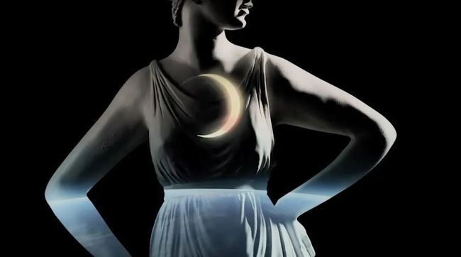
Moonwake: reflection of moonlight on a body of water
Moonwake:月光在水面上的反射
"Anytime you try something new and creative, the very next thought you experience is fear," said Elizabeth Gilbert, author and poet. Yet creativity is the cornerstone of a happy life. As you face a new design project, how do you face your fears and unmask that creative spark? Moonwake speaks to the mysteries of the creative process, letting go of fear and nourishing new ideas.
作家兼诗人伊丽莎白·吉尔伯特(Elizabeth Gilbert)说:“每当你尝试新颖并有创意的事物时,你马上就会想到恐惧。” 然而,创造力是幸福生活的基石。当你面对一个新的设计项目时,你如何面对你的恐惧,并揭开创造性的火花? Moonwake告诉我们创造过程的奥秘,脱手恐惧,滋养新思想。
We feel a need to give the future back a certain amount of mystery and magic, while continuing to nourish imaginative ideas, awaken creativity by giving it meaning, and recording this process over time.
我们感到必要给未来赋予一定的神秘感和魔力,同时继续培养富于创造的思想,通过赋予它意义来唤醒创造力,并记录这个过程。
Moonwake speaks to our collective desire to connect. Design takes on an atmosphere of romance downtown at night — a picture that is both vibrant and dark with fantastical verdant themes running throughout. The ritual of forest-bathing takes on journeys as the woodland opens up its mysteries with every step down an unknown path. There is a heightened fondness for nature and biophilic design is front and center.
Moonwake表达了我们对联系的共同渴望。设计呈现出闹市区浪漫之夜的氛围——一幅充满活力和黑暗的画面,奇幻的翠绿主题贯穿始终。森林沐浴的仪式在旅途中进行,在未知的道路上前行,森林拉开它神秘的面纱。这里有一种对自然的高度喜爱,而热爱生物的设计是前沿和中心。
Spurred by the growing popularity of fortune-tellers and psychics, along with consumers’ desire to reconnect with nature, Moonwake highlights a need for escapism with layers of intuition and magic. The mood is fabricated with nocturnal colorways, shadowy florals and organic shapes that often feel disturbed.
受算命师和灵媒越来越受欢迎的刺激,再加上消费者渴望与大自然重新接触,Moonwake凸显了人们对借助层层直觉和魔法逃避现实的需求。这种氛围是由夜间的色彩、幽暗的花朵和常使人不安的有机形状构成的。
There is a focus on cyber-reality, technological infusion, eco-sustainability and an interest in what lies beyond. The online world is a greater need than ever, as our daily functions and connectivity rely on digital apps and computers; thus, becoming a blurry reality between analogue and digital.
有一个关注聚焦在网络现实、技术注入、生态可持续性,以及对未来的兴趣。对网络世界的需求比以往任何时候都更大,因为我们的日常功能和连接都依赖于数字应用程序和电脑;
网络世界因此变成了模拟和数字之间的一个模糊的现实。
As we dive further into the electronic world, we create dramatic avatars for our virtual worlds. And the design realm is responding — with online fashion shows and fitting rooms, while furniture and décor industries are creating robust online showrooms.
随着我们深入电子世界,我们为我们的虚拟世界创造了戏剧性的化身。设计领域正在做出回应——通过在线时装秀和试衣间,同时家具和装饰行业也在创建活跃的在线展厅。
Design 设计
With this new, deeper level of cyber-integration and fantasy, a curious and playful utopia of oceanic and forest influences has emerged, drawing us into magical, immersive experiences such as secret gardens and otherworldly delights.
随着这种新的、更深层次的网络整合和幻想,一个受海洋和森林影响的好奇又好玩的乌托邦出现了,它把我们吸引到魔幻的、身临其境的体验中,比如秘密花园和另一个世界的乐趣。
Escapism is fundamental to the Moonwake aesthetic. Showcasing surreal flora and fauna in this fantasy world, it focuses on natural iridescence, overgrown proportions, liquid movement and subtle undercurrent of beautiful decay. The full lifecycle of nature is on display.
逃避主义是Moonwake美学的基础。它展示了梦幻世界超现实的动植物,聚焦于自然的彩虹色、过度生长的比例、流体运动和美丽的衰退之下微妙的潜流。大自然的完整生命周期被展示。
As we seek refuge in virtual worlds, designs concentrate on warped forms, sci-fi allure, soft dimensions and molded synthetics. Try a twist of nostalgia in clashing design eras with overtones of opulence to create surreal atmospheres.
当我们在虚拟世界中寻求庇护时,设计集中在弯曲的形态、科幻的诱惑、柔软的维度和成型的合成材料上。在充满冲突的设计时代,尝试怀旧,用丰盛的过色调来创造超现实的氛围。
Color颜色
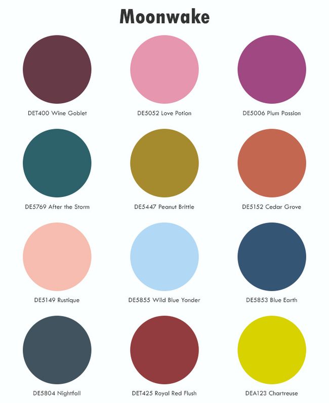
Moonwake displays a warm, romantic and decadent palette filled with nocturnal moods. This melancholy palette starts with a base of deep darks tinged with acid, luminous cloudy blues and flashy purples.
Moonwake展现了一种温暖、浪漫和颓废的用色风格,充满了夜间的情绪。这款忧郁的调色板以略带酸性的深黑色、明亮的多云蓝色和闪光的紫色开始。
Splashy accents on city-influenced dark tones, shimmering monochromatics, intense color — a story of noir fiction. Positive energies display luminous brights and intense neutrals, uplifting the spirit in this dreamy escape that sparks energy. Hyper blends of blues, greens and pinks mixed with pastels showcase these fantasy-driven colors.
在城市影响的暗灰色调上引人注目的强调色,闪烁的单色,强烈的色彩——一个黑色小说的故事。正能量显示出明亮的光和强烈的中性颜色,在这个梦幻的逃离中。梦幻的逃离飞溅起能量。蓝色亢奋的混合、绿色、粉红色与粉彩的混合,展示了这些幻想驱动的色彩。
Intense chromas are decadent ties to digital realities, while purple shades nurture the imagination. Uplifting coral and chartreuse promote the importance of mood-boosting color.
强烈的色彩是与数字现实的颓废联系,而紫的黑色调则滋养着想象力。令人振奋的珊瑚色和黄绿色促成了提升情绪色彩的重要性。
材料和纹理
Moonwake transports us to a playful, eco-fantasy utopia filled with forest and marine images. Beyond the aesthetic, we look to material, textures and surfaces that speak to this story. Commercial spaces are especially influenced by Moonwake, creating immersive experiences such as hidden sanctuaries and Alice in Wonderland-style landscapes.
Moonwake将我们带到一个充满森林和海洋图像的有趣的、生态幻想的乌托邦。除了美学,我们还关注与这个故事相关的材料、纹理和表面。商业空间尤其受到Moonwake的影响,创造出身临其境的体验,如隐藏的庇护所和爱丽丝漫游仙境式的景观。
Fairytale escapes — organic utopia, luminous glass, crisp silk, shimmering coatings, lacquered glitter, soft surfaces such as velvet and chenille — all inspired by nocturnal luxuries and Art Deco jazz lounges.
童话般的逃脱——有机乌托邦,夜光玻璃,酥脆的丝绸,闪光的涂料,涂漆的发光碎屑,柔软的表面如天鹅绒和雪奈——所有的灵感都来自夜间奢侈品和装饰艺术爵士休息室。
· Fabrics allude to the Renaissance. Iridescent lace, or lace with insect or branch motifs, and textured velvet, help create this dark fairytale aesthetic.
织物暗示着文艺复兴。色彩斑斓的蕾丝,或昆虫或树枝图案的蕾丝,以及质感的天鹅绒,有助于营造这样黑暗童话般的美学。
· Florals are bright and outlined with metallic yarns, which take on a more eroded appearance than pure metallic. Abstract jacquards for outerwear are updated with wavy lines.
花是明亮的并用金属纱勾勒,因而比纯金属显现更多的腐蚀外观。抽象的提花织物外衣新添了波浪线。
· Dark creatures on prints and tableware embrace a darker view of garden escapism.
在版画和餐具上的黑暗生物表现了对花园逃避现实主义的黑暗观点。
Otherworldy — ethereal and futuristic. What’s real anymore? Otherworldly highlights the blend of cyber and reality, creating a "new familiar" in design.
超凡脱俗-缥缈和未来主义。什么是真实? 超凡脱俗强调了网络和现实的融合,在设计上创造了 “新的熟悉”。
· Tweeds and wool suiting, too, are blurred with brushed effects. Prints are abstract forms that don’t resemble anything in real life.
粗花呢和羊毛西装,也与拉绒效果融合。版画是抽象的形式,与现实生活中的任何事物都不相似。
· A new level of coziness with "rich, full-body fabrics" and "dense products without the weight." The cocooning trend evolves with shapes that are "generously cozy" and that are "blown-up" yet ultra-light
“丰富的、全身的面料”和“没有重量的致密产品”带来了新的舒适水平。茧式生活趋势演变,带来“宽松舒适”并且 “膨大”但超轻的形状,
· Lighting is key as designers push boundaries with ethereal lighting formations.
设计师推动与缥缈光照的边界,灯光是关键。
· Lucite, resin, Murano glass, silicone, powder-coated steel and concrete materials are key material inspirations to futuristic design play.
树脂、慕拉诺玻璃、硅树脂、粉末涂层钢和混凝土材料是未来派设计的主要材料灵感来源。
Psychedelic opulence — a heightened sensorial experience through design, distorted outlines and exaggerated form push design boundaries, while kaleidoscope coloring lends a playful quality.
迷幻的丰盛-一种通过设计而提高的感官体验,扭曲的轮廓和夸张的形式推动了设计的边界,而万花筒的色彩提供了幽默的品质。
· Accessories are based in dark metallic and are enhanced with gasoline effects or "shadowy enamel."
配件以黑色金属为基础,并由汽油效应或“阴影珐琅”增强。
· Warm and cool color blends with newer techniques, tie-dye enhance, surface movement and hybrid creations.
暖色和冷色混合更新的技术、扎染增强、表面运动和混合创造。
Bio-tech fixation — the deeper, mysterious qualities of underground biodiversity emerge as novel forms of inspiration for eco-fantasy designs.
生物技术固定-地下生物多样性的深层神秘特性成为生态幻想设计的新灵感形式。
· Moss covering, mushrooms, intricate micro-views of organic matter, faux rust, warped metals, sandblasted glass, carved textures and marbled textiles all play with form and function for organic décor.
苔藓覆盖、蘑菇、有机物质的复杂微观视图、人造锈、弯曲的金属、喷砂玻璃、雕刻纹理和仿大理石纺织品都在形式和功能上为有机装饰发挥作用。
Dunn Edwards
2021年因为突如其来的疫情,人们的生活、习惯、思想都有太多的变数,这些都会影响色彩和设计的改变!导致对趋势的研究变得异常艰难,但是邓恩色研室的天才们还是克服了重重困难,终于在2020年10月20日在美国洛杉矶发布了!虽然比往年延迟了几个月,但一个更准确的流行趋势更重要。是的,准确与否是判断流行趋势成果是否权威的最重要的标尺!
美国邓恩拥有独立自有的色卡体系“perfect palette”,在世界上只有极少数企业拥有独立自有的色卡体系。因此彰显了邓恩在国际色彩界的地位。
- END -
相关推荐
01●2020年国际建筑装饰色彩流行趋势
02●2019 国际建筑装饰色彩流行趋势
03●2018色彩+设计流行趋势
04●2017建筑色彩+设计流行趋势


