0. 问题导入
之前绘图的时候,我经常会去RGB颜色对照表上手动去摘选颜色码,然后手动粘到ggplot-scale_fill/color_manual(values = c('我选的色带'))。但是呢,大家都知道的,男生嘛,对于颜色这方面,是吧......大家都懂的(手动汗颜,表示要向李佳琦好好学习)。一般绘图常态就是画图15秒,调色一小时,简直是开了无数窗口,最后还是强迫症爆炸般地觉得下一个色带一定是最好的。
BUT, HOWEVER
组会上把精心调好的图展示出来的时候,还是有时候会觉得不太好看
于是乎就有了今天这篇帖子,旨在搜罗网上比较全的颜色贴,好好滴总结一波,希望可以帮到同样是选择困难症的你。
绘图所用软件包附于文末, PS:多图预警!!图片加载可能需要画20秒左右,内容精彩,值得期待哈~
1. 示例数据
本次演示采用“全球sc-PDSI(干旱指数)1901-2018年的月尺度数据” 中的2018年12月的数据进行绘图示例。同之前,为了大家下载方便,下附百度云下载链接(如果觉得慢,也可以去数据官网进行下载):
数据下载链接
2. 数据导入与底图绘制
input_data = 'L:\\JianShu\\2019-12-07\\data\\scpdsi_1901_2018.nc'
data = stack(input_data)
data = data[[1416]] #2018-12

df = as.data.frame(data,xy = T)
colnames(df) = c('long','lat','scpdsi')
na_index = which(is.na(df$scpdsi))
df = df[-na_index,]

df$DC = cut(df$scpdsi,
                                breaks = c(-Inf,-5,-4,-3,-2,-1,Inf))

df$DC = factor(df$DC,
                                   labels = c('Exceptional Drought',
                                              'Extreme Drought',
                                              'Severe Drought',
                                              "Moderate Drought",
                                              'Abnormally Dry',
                                              'No Drought'))

# fill bar

p = ggplot()+
  geom_hline(aes(yintercept = 50),linetype = 'dashed',alpha = 0.5,lwd = 0.5,color = 'black')+

  geom_hline(aes(yintercept = 0),linetype = 'dashed',alpha = 0.5,lwd = 0.5,color = 'black')+
  geom_hline(aes(yintercept = -50),linetype = 'dashed',alpha = 0.5,lwd = 0.5,color = 'black')+
  geom_vline(aes(xintercept = 0),linetype = 'dashed',alpha = 0.5,lwd = 0.5,color = 'black')+
  geom_vline(aes(xintercept = -100),linetype = 'dashed',alpha = 0.5,lwd = 0.5,color = 'black')+
  geom_vline(aes(xintercept = 100),linetype = 'dashed',alpha = 0.5,lwd = 0.5,color = 'black')+

  geom_tile(data = df, aes(x = long,y = lat, fill = DC))+
  theme(panel.background = element_rect(fill = 'transparent',color = 'black'),
        axis.text = element_text(face='bold',colour='black',size=fontsize,hjust=.5),
        axis.title = element_text(face='bold',colour='black',size=fontsize,hjust=.5),
        legend.position=c('bottom'),
        legend.direction = c('horizontal'))+
  coord_fixed(1.3)+
  guides(fill=guide_legend(nrow=3))+
  xlab('Longitude')+
  ylab('Latitude')
3. 增加Viridis 色带
Viridis 色带包由Simon Garnier研发, 包含viridis, magma, plasma, inferno及默认共5个色带组(图1-2),对应scale_fill/color_viridis(option =" " )中的"A", "B", "C", "D","E"五个参数。

png('L:\\JianShu\\2019-12-07\\plot\\plot_viridis.png',
    height = 15,
    width = 26,
    units = 'cm',
    res = 1000)

# print(p_viridis)


p_viridis = grid.arrange(
  p + scale_fill_viridis(option = 'A',discrete = T)+labs(x="Virdis A", y=NULL),
  p + scale_fill_viridis(option = 'B',discrete = T)+labs(x="Virdis B", y=NULL),
  p + scale_fill_viridis(option = 'C',discrete = T)+labs(x="Virdis C", y=NULL),
  p + scale_fill_viridis(option = 'D',discrete = T)+labs(x="Virdis D", y=NULL),
  p + scale_fill_viridis(option = 'E',discrete = T)+labs(x="Virdis E", y=NULL),
  ncol=3, nrow=2
)

dev.off()

4. 增加 RColorBrewer 色带
RColorBrewer这个应用很广泛了,附色带图谱及应用示例(图3-6)。

4.1 RColorBrewer 色带组1
png('L:\\JianShu\\2019-12-07\\plot\\plot_rcolor_brewer.png',
    height = 26,
    width = 26,
    units = 'cm',
    res = 1000)

p_rcolor_brewer = grid.arrange(
  p+scale_fill_brewer(palette = 'YlOrRd')+labs(x="ColorBand: YlOrRd", y=NULL),
  p+scale_fill_brewer(palette = 'YlOrBr')+labs(x="ColorBand: YlOrBr", y=NULL),
  p+scale_fill_brewer(palette = 'YlGnBu')+labs(x="ColorBand: YlGnBu", y=NULL),

  p+scale_fill_brewer(palette = 'YlGn')+labs(x="ColorBand: YlGn", y=NULL),
  p+scale_fill_brewer(palette = 'Reds')+labs(x="ColorBand: Reds", y=NULL),
  p+scale_fill_brewer(palette = 'RdPu')+labs(x="ColorBand: RdPu", y=NULL),

  p+scale_fill_brewer(palette = 'Purples')+labs(x="ColorBand: Purples", y=NULL),
  p+scale_fill_brewer(palette = 'PuRd')+labs(x="ColorBand: PuRd", y=NULL),
  p+scale_fill_brewer(palette = 'PuBuGn')+labs(x="ColorBand: PuBuGn", y=NULL),

  ncol = 3
)

dev.off()

4.1 RColorBrewer 色带组2
png('L:\\JianShu\\2019-12-07\\plot\\plot_rcolor_brewer2.png',
    height = 26,
    width = 26,
    units = 'cm',
    res = 1000)

p_rcolor_brewer = grid.arrange(
  p+scale_fill_brewer(palette = 'PuBu')+labs(x="ColorBand: PuBu", y=NULL),
  p+scale_fill_brewer(palette = 'OrRd')+labs(x="ColorBand: OrRd", y=NULL),
  p+scale_fill_brewer(palette = 'Oranges')+labs(x="ColorBand: Oranges", y=NULL),

  p+scale_fill_brewer(palette = 'Greys')+labs(x="ColorBand: Greys", y=NULL),
  p+scale_fill_brewer(palette = 'Greens')+labs(x="ColorBand: Greens", y=NULL),
  p+scale_fill_brewer(palette = 'GnBu')+labs(x="ColorBand: GnBu", y=NULL),

  p+scale_fill_brewer(palette = 'BuPu')+labs(x="ColorBand: BuPu", y=NULL),
  p+scale_fill_brewer(palette = 'BuGn')+labs(x="ColorBand: BuGn", y=NULL),
  p+scale_fill_brewer(palette = 'Blues')+labs(x="ColorBand: Blues", y=NULL),
  ncol = 3
)

dev.off()

4.1 RColorBrewer 色带组3
png('L:\\JianShu\\2019-12-07\\plot\\plot_rcolor_brewer3.png',
    height = 15,
    width = 26,
    units = 'cm',
    res = 1000)

p_rcolor_brewer = grid.arrange(
  p+scale_fill_brewer(palette = 'RdYlBu')+labs(x="ColorBand: RdYlBu", y=NULL),
  p+scale_fill_brewer(palette = 'RdBu')+labs(x="ColorBand: RdBu", y=NULL),
  p+scale_fill_brewer(palette = 'PuOr')+labs(x="ColorBand: PuOr", y=NULL),

  p+scale_fill_brewer(palette = 'PRGn')+labs(x="ColorBand: PRGn", y=NULL),
  p+scale_fill_brewer(palette = 'PiYG')+labs(x="ColorBand: PiYG", y=NULL),
  p+scale_fill_brewer(palette = 'BrBG')+labs(x="ColorBand: BrBG", y=NULL),
  ncol = 3
)

dev.off()

5. 增加 GGSCI 色带(来自一些顶级期刊,如柳叶刀)
GGSCI这个色带组收集了一些主流SCI期刊中比较受欢迎与经典的色带组(图7),分别包括:
- scale_color/fill_npg(): 对应Nature Publishing Group色带
- scale_color/fill_aaas(): 对应American Association for the Advancement of Science 色带
- scale_color/fill_lancet: 对应Lancet (柳叶刀)期刊搜集的色带组
- scale_color/fill_jco: 对应Journal of Clinical Oncology 色带组
- scale_color/fill_tron: 对应Tron Legacy 色带组
png('L:\\JianShu\\2019-12-07\\plot\\plot_ggsci.png',
    height = 15,
    width = 26,
    units = 'cm',
    res = 1000)

p_rcolor_brewer = grid.arrange(
  p+scale_fill_npg()+labs(x="ColorBand: NRC", y=NULL),
  p+scale_fill_aaas()+labs(x = 'ColorBand: AAAS',y = NULL),
  p+scale_fill_lancet()+labs(x = 'ColorBand: Lancet',y = NULL),
  p+scale_fill_jco()+labs(x = 'ColorBand: JCO',y = NULL),
  p+scale_fill_tron()+labs(x = 'ColorBand: TRON',y = NULL),
  ncol = 3
)

dev.off()

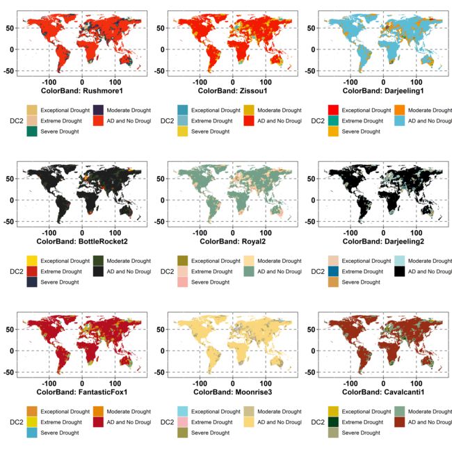
6. 增加 Wes Anderson色带(来自一些顶级期刊,如柳叶刀)
由于Wes Anderson 色带组中大多颜色带所含颜色数量为4-5个(图8-9),因此在此,我对 df 中的干旱分类组进行压缩,将Abnormal dry 与 No drought 进行合并。

df$DC2 = cut(df$scpdsi,
            breaks = c(-Inf,-5,-4,-3,-2,Inf))

df$DC2 = factor(df$DC2,
               labels = c('Exceptional Drought',
                          'Extreme Drought',
                          'Severe Drought',
                          "Moderate Drought",
                          'AD and No Drought'))

p1 = ggplot()+
  geom_hline(aes(yintercept = 50),linetype = 'dashed',alpha = 0.5,lwd = 0.5,color = 'black')+

  geom_hline(aes(yintercept = 0),linetype = 'dashed',alpha = 0.5,lwd = 0.5,color = 'black')+
  geom_hline(aes(yintercept = -50),linetype = 'dashed',alpha = 0.5,lwd = 0.5,color = 'black')+
  geom_vline(aes(xintercept = 0),linetype = 'dashed',alpha = 0.5,lwd = 0.5,color = 'black')+
  geom_vline(aes(xintercept = -100),linetype = 'dashed',alpha = 0.5,lwd = 0.5,color = 'black')+
  geom_vline(aes(xintercept = 100),linetype = 'dashed',alpha = 0.5,lwd = 0.5,color = 'black')+

  geom_tile(data = df, aes(x = long,y = lat, fill = DC2))+
  theme(panel.background = element_rect(fill = 'transparent',color = 'black'),
        axis.text = element_text(face='bold',colour='black',size=fontsize,hjust=.5),
        axis.title = element_text(face='bold',colour='black',size=fontsize,hjust=.5),
        legend.position=c('bottom'),
        legend.direction = c('horizontal'))+
  coord_fixed(1.3)+
  guides(fill=guide_legend(nrow=3))+
  xlab('Longitude')+
  ylab('Latitude')

png('L:\\JianShu\\2019-12-07\\plot\\plot_web_anderson.png',
    height = 26,
    width = 26,
    units = 'cm',
    res = 1000)

p_rcolor_brewer = grid.arrange(
  p1+scale_fill_manual(values = wes_palette('Rushmore1'))+labs(x="ColorBand: Rushmore1", y=NULL),
  p1+scale_fill_manual(values = wes_palette('Zissou1'))+labs(x="ColorBand: Zissou1", y=NULL),
  p1+scale_fill_manual(values = wes_palette('Darjeeling1'))+labs(x="ColorBand: Darjeeling1", y=NULL),

  p1+scale_fill_manual(values = wes_palette('BottleRocket2'))+labs(x="ColorBand: BottleRocket2", y=NULL),
  p1+scale_fill_manual(values = wes_palette('Royal2'))+labs(x="ColorBand: Royal2", y=NULL),
  p1+scale_fill_manual(values = wes_palette('Darjeeling2'))+labs(x="ColorBand: Darjeeling2", y=NULL),

  p1+scale_fill_manual(values = wes_palette('FantasticFox1'))+labs(x="ColorBand: FantasticFox1", y=NULL),
  p1+scale_fill_manual(values = wes_palette('Moonrise3'))+labs(x="ColorBand: Moonrise3", y=NULL),
  p1+scale_fill_manual(values = wes_palette('Cavalcanti1'))+labs(x="ColorBand: Cavalcanti1", y=NULL),

  ncol = 3
)

dev.off()
7. 本文所用软件包-木有的话,可以用install.packages('软件包名')进行安装
library(viridis)
library(RColorBrewer)
library(ggsci)
library(wesanderson)
library(ggplot2)
library(gridExtra)
8. 致谢
大家如果觉得有用,还麻烦大家关注点赞,也可以扩散到朋友圈,帮助到绘图中同样陷入颜色选择困难症的TA
大家如果在使用本文代码的过程有遇到问题的,可以留言评论,也可以私信我哈~~