为Silverlight创建自定义控件
Silverlight™ 2 有别于 Silverlight 1.0 的众多功能之一是支持控件。Silverlight 2 以丰富且强大可靠的控件模型闻名,该模型是平台中包括的控件和第三方控件包的基础。您也可以使用此控件模型构建自己的控件,但对于不熟悉 Windows® Presentation Foundation (WPF) 控件模型的开发人员来讲,第一次构建 Silverlight 自定义控件会令人生畏。撰写此专栏时,即在发布 Silverlight 2 Beta 2 之前,几乎没有文档可供参考,而在 Web 中快速搜索出的少数几篇教程为我指明了方向。虽然我正在讨论此主题,但应该提醒大家的是,我正在使用的 Beta 2 在其最终发布之前,可能会做进一步的更改。
{
public class SimpleButton : ContentControl
{
}
}
此时,您已实现了单纯的自定义控件,该控件可在 XAML 文档中通过声明进行实例化。为了说明此问题,将下列语句添加到 Page.xaml:
<custom:SimpleButton />
具体位置是<grid></grid>之间。
xmlns:custom="clr-namespace:SimpleButtonDemo; assembly=SimpleButtonDemo"
您可以看到,clr-namespace 能够识别在其中定义 SimpleButton 类的命名空间,而程序集可以识别包含此控件的程序集。在此示例中,控件程序集和应用程序程序集是同一个程序集。如果 SimpleButton 在名为 MyControls.dll 的单独程序集中实现,您需要将程序集设为与“MyControls”相同。图 2 中的代码显示了完成上述修改后的 Page.xaml 的内容。顺便说一下,您不必将 custom 作为自定义控件的前缀;只需直接使用 foo 或贵公司的名称作为前缀即可。
 图 2 Page.xaml
xmlns="http://schemas.microsoft.com/client/2007"
xmlns:x="http://schemas.microsoft.com/winfx/2006/xaml"
xmlns:custom="clr-namespace:SimpleButtonDemo;assembly=SimpleButtonDemo"
Width="400" Height="300">
<Grid x:Name="LayoutRoot" Background="White">
<custom:SimpleButton />
</Grid>
</UserControl>
 图 4 修改后的控件声明
< custom:SimpleButton.Template >
< ControlTemplate >
< Grid x:Name = " RootElement " >
< Rectangle x:Name = " BodyElement " Width = " 200 " Height = " 100 "
Fill = " Lavender " Stroke = " Purple " RadiusX = " 16 " RadiusY = " 16 " />
< TextBlock Text = " Click Me " HorizontalAlignment = " Center "
VerticalAlignment = " Center " />
</ Grid >
</ ControlTemplate >
</ custom:SimpleButton.Template >
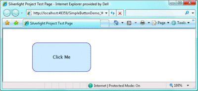 图 6 Generic.xaml
xmlns="http://schemas.microsoft.com/winfx/2006/xaml/presentation"
xmlns:x="http://schemas.microsoft.com/winfx/2006/xaml"
xmlns:custom="clr-namespace:SimpleButtonDemo;assembly=SimpleButtonDemo">
<Style TargetType="custom:SimpleButton">
<Setter Property="Template">
<Setter.Value>
<ControlTemplate TargetType="custom:SimpleButton">
<Grid x:Name="RootElement">
<Rectangle x:Name="BodyElement" Width="200" Height="100"
Fill="Lavender" Stroke="Purple" RadiusX="16" RadiusY="16" />
<TextBlock Text="Click Me" HorizontalAlignment="Center"
VerticalAlignment="Center" />
</Grid>
</ControlTemplate>
</Setter.Value>
</Setter>
</Style>
</ResourceDictionary>
this.DefaultStyleKey = typeof(SimpleButton);
然后打开 Page.xaml 并修改控件声明,使修改后的内容如下所示:
<custom:SimpleButton />
在浏览器中打开此测试页面,该控件的外观应与以前完全相同。但是这次,获取此外观将比较简单。
整个过程是先定义一个新的样式,然后在控件文件里进行绑定,则控件就会显示出样式。
<custom:SimpleButton Width="250" Height="150" />
从控件开发人员的角度而言,Silverlight 2 最重要的功能之一就是模板绑定。模板绑定允许分配给控件的属性值向下传递到控件模板,并且是使用 {TemplateBinding} 标记扩展在 XAML 中声明的。请不要使用类似下面的硬编码值定义构成 SimpleButton 主体的 Rectangle 的 Width 和 Height 属性:
Width="200" Height="100"
您应按如下方式定义上述属性:
Width="{TemplateBinding Width}" Height="{TemplateBinding Height}"
现在,分配给控件的宽度和高度即是分配给 Rectangle 的宽度和高度。
图 7 显示了 Generic.xaml 修改后的版本,它将默认值分配给从基类继承来的 Width、Height 和 Background 属性,并使用模板绑定在控件模板中引用这些属性值。
图 7 修改后的 Generic.xaml
xmlns = " http://schemas.microsoft.com/winfx/2006/xaml/presentation "
xmlns:x = " http://schemas.microsoft.com/winfx/2006/xaml "
xmlns:custom = " clr-namespace:SimpleButtonDemo;assembly=SimpleButtonDemo " >
< Style TargetType = " custom:SimpleButton " >
< Setter Property = " Width " Value = " 200 " />
< Setter Property = " Height " Value = " 100 " />
< Setter Property = " Background " Value = " Lavender " />
< Setter Property = " Template " >
< Setter.Value >
< ControlTemplate TargetType = " custom:SimpleButton " >
< Grid x:Name = " RootElement " >
< Rectangle x:Name = " BodyElement "
Width = " {TemplateBinding Width} "
Height = " {TemplateBinding Height} "
Fill = " {TemplateBinding Background} "
Stroke = " Purple " RadiusX = " 16 " RadiusY = " 16 " />
< TextBlock Text = " Click Me "
HorizontalAlignment = " Center "
VerticalAlignment = " Center " />
</ Grid >
</ ControlTemplate >
</ Setter.Value >
</ Setter >
</ Style >
</ResourceDictionary>
输出内容如图 8 所示。TemplateBindings 是正确进行操作的至关重要的步骤,因为现在 SimpleButton 的实例已支持为其分配的属性值。
 图 9 自定义 Button 控件
< custom:SimpleButton.Content >
< StackPanel Orientation = " Horizontal " HorizontalAlignment = " Center " >
< Ellipse Width = " 75 " Height = " 75 " Margin = " 10 " >
< Ellipse.Fill >
< RadialGradientBrush GradientOrigin = " 0.25,0.25 " >
< GradientStop Offset = " 0.25 " Color = " White " />
< GradientStop Offset = " 1.0 " Color = " Red " />
</ RadialGradientBrush >
</ Ellipse.Fill >
</ Ellipse >
< TextBlock Text = " Click Me " VerticalAlignment = " Center " />
</ StackPanel >
</ custom:SimpleButton.Content >
</custom:SimpleButton>
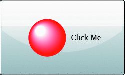
图 11 再次讨论 Generic.xaml
xmlns:x = " http://schemas.microsoft.com/winfx/2006/xaml "
xmlns:custom = " clr-namespace:SimpleButtonDemo;assembly=SimpleButtonDemo " >
< Style TargetType = " custom:SimpleButton " >
< Setter Property = " Width " Value = " 200 " />
< Setter Property = " Height " Value = " 100 " />
< Setter Property = " Background " Value = " Lavender " />
< Setter Property = " FontSize " Value = " 11 " />
< Setter Property = " Template " >
< Setter.Value >
< ControlTemplate TargetType = " custom:SimpleButton " >
< Grid x:Name = " RootElement " >
< Rectangle x:Name = " BodyElement "
Width = " {TemplateBinding Width} "
Height = " {TemplateBinding Height} "
Fill = " {TemplateBinding Background} "
Stroke = " Purple " RadiusX = " 16 " RadiusY = " 16 " />
< ContentPresenter Content = " {TemplateBinding Content} "
HorizontalAlignment = " Center " VerticalAlignment = " Center " />
</ Grid >
</ ControlTemplate >
</ Setter.Value >
</ Setter >
</ Style >
</ResourceDictionary>
图 12 包含自定义内容的 SimpleButton
< custom:SimpleButton.Content >
< StackPanel Orientation = " Horizontal " HorizontalAlignment = " Center " >
< Ellipse Width = " 75 " Height = " 75 " Margin = " 10 " >
< Ellipse.Fill >
< RadialGradientBrush GradientOrigin = " 0.25,0.25 " >
< GradientStop Offset = " 0.25 " Color = " White " />
< GradientStop Offset = " 1.0 " Color = " Red " />
</ RadialGradientBrush >
</ Ellipse.Fill >
</ Ellipse >
< TextBlock Text = " Click Me " VerticalAlignment = " Center " />
</ StackPanel >
</ custom:SimpleButton.Content >
</custom:SimpleButton>
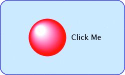 图 14 支持 Click 事件的 SimpleButton
public event RoutedEventHandler Click;//声明click
public SimpleButton()
{
this .DefaultStyleKey = typeof (SimpleButton);
this .MouseLeftButtonUp += new MouseButtonEventHandler//添加监控事件
(SimpleButton_MouseLeftButtonUp);
}
void SimpleButton_MouseLeftButtonUp( object sender,
MouseButtonEventArgs e)
{
if (Click != null )
Click( this , new RoutedEventArgs()); //激发监控事件
}
}
添加事件的思路是先在控件文件类里声明,然后添加监控函数,实现监控函数以激发事件 。
{
System.Windows.Browser.HtmlPage.Window.Alert( " Click! " );
}
步骤 8:添加可视状态
图 15 完成的 Generic.xaml
xmlns:x = " http://schemas.microsoft.com/winfx/2006/xaml "
xmlns:custom = " clr-namespace:SimpleButtonDemo;assembly=SimpleButtonDemo "
xmlns:vsm = " clr-namespace:System.Windows;assembly=System.Windows " >
< Style TargetType = " custom:SimpleButton " >
< Setter Property = " Width " Value = " 200 " />
< Setter Property = " Height " Value = " 100 " />
< Setter Property = " Background " Value = " Lavender " />
< Setter Property = " FontSize " Value = " 11 " />
< Setter Property = " Template " >
< Setter.Value >
< ControlTemplate TargetType = " custom:SimpleButton " >
< Grid >
< vsm:VisualStateManager.VisualStateGroups >
< vsm:VisualStateGroup x:Name = " CommonStates " >
< vsm:VisualStateGroup.Transitions >
< vsm:VisualTransition To = " Normal " />
< vsm:VisualTransition To = " MouseOver " />
</ vsm:VisualStateGroup.Transitions >
< vsm:VisualState x:Name = " Normal " />
< vsm:VisualState x:Name = " MouseOver " >
< Storyboard >
< ColorAnimation Storyboard.TargetName = " BodyElement "
Storyboard.TargetProperty = " (Rectangle.Fill).(SolidColorBrush.Color) "
To = " Pink " Duration = " 0 " />
</ Storyboard >
</ vsm:VisualState >
</ vsm:VisualStateGroup >
</ vsm:VisualStateManager.VisualStateGroups >
< Rectangle x:Name = " BodyElement "
Width = " {TemplateBinding Width} "
Height = " {TemplateBinding Height} "
Fill = " {TemplateBinding Background} "
Stroke = " Purple " RadiusX = " 16 " RadiusY = " 16 " />
< ContentPresenter Content = " {TemplateBinding Content} "
HorizontalAlignment = " Center " VerticalAlignment = " Center " />
</ Grid >
</ ControlTemplate >
</ Setter.Value >
</ Setter >
</ Style >
</ ResourceDictionary >
图 16 完成的 SimpleButton 类
{
public event RoutedEventHandler Click;
public SimpleButton()
{
DefaultStyleKey = typeof (SimpleButton);
this .MouseLeftButtonUp +=
new MouseButtonEventHandler(SimpleButton_MouseLeftButtonUp);
this .MouseEnter +=
new MouseEventHandler(SimpleButton_MouseEnter);
this .MouseLeave +=
new MouseEventHandler(SimpleButton_MouseLeave);
}
void SimpleButton_MouseLeftButtonUp( object sender,
MouseButtonEventArgs e)
{
if (Click != null )
Click( this , new RoutedEventArgs());
}
void SimpleButton_MouseEnter( object sender, MouseEventArgs e)
{
VisualStateManager.GoToState( this , " MouseOver " , true );
}
void SimpleButton_MouseLeave( object sender, MouseEventArgs e)
{
VisualStateManager.GoToState( this , " Normal " , true );
}
}
完成!