利用matplotlib实现颜色视觉映射的分段多色折线图(模拟ECharts Beijing AQI案例)
概述
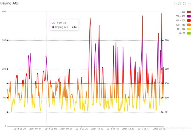
ECharts提供了大量交互组件,Beijing AQI是ECharts的一个典型的视觉映射案例,y轴的值根据不同的阈值映射为不同的颜色,matplotlib没有现成的解决方案。
matplotlib相关案例
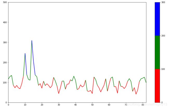
matplotlib官方案例Multicolored lines提供了类似的解决方案。
但是直接套用该案例发现,效果并不好。问题主要在于映射y轴时,如果相邻两个数据点刚好跨越不同值区间,那么这段线只能绘制一种颜色,因此,应当在值区间的转换点之间插入过渡的阈值。
import numpy as np
import pandas as pd
import matplotlib.pyplot as plt
from matplotlib.collections import LineCollection
from matplotlib.colors import ListedColormap, BoundaryNorm

with open('aqi-beijing.json') as f:
    data =pd.read_json(f,orient='columns')

x = np.arange(len(data))
y = data[1]
dydx = y
points = np.array([x, y]).T.reshape(-1, 1, 2)
segments = np.concatenate([points[:-1], points[1:]], axis=1)

fig, axs = plt.subplots(1, 1, figsize=(15,9))

cmap = ListedColormap(['r', 'g', 'b'])
norm = BoundaryNorm([0, 100, 200, 300], cmap.N)
lc = LineCollection(segments, cmap=cmap, norm=norm)
lc.set_array(dydx)
lc.set_linewidth(2)
line = axs.add_collection(lc)
fig.colorbar(line, ax=axs)

axs.set_xlim(x.min(), x.max())
axs.set_ylim(0, 500)
plt.show()
解决方案
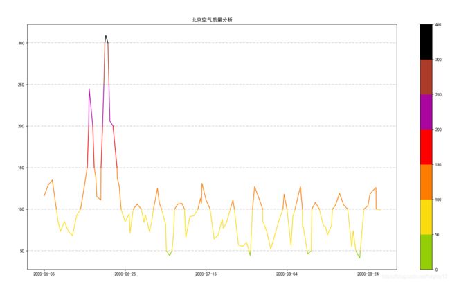
由于numpy学艺不精,不能优雅的处理插值问题,因此,采用列表、字典处理插值问题。
其他的思路包括利用numpy掩码数组处理数据过滤问题,利用plot函数分段绘制线。
from collections import Counter, defaultdict

import numpy as np
import pandas as pd
from matplotlib import pyplot as plt
import matplotlib.cm as cm
from matplotlib.colors import ListedColormap, BoundaryNorm

plt.rcParams['font.family'] = 'simhei'

plt.figure(figsize=(25, 15))

# 加载数据
with open('aqi-beijing.json') as f:
    data = pd.read_json(f, orient='columns')

# 阈值
thresholds = [50, 100, 150, 200, 250, 300]

# 转换y轴数据
d1 = data[1]
y = list(d1)
x = list(range(len(d1)))

# 构造y轴数据插值
# 确定需要插值的索引、插值、插值的策略、插值的x轴坐标
i = 0
result = defaultdict(list)
for j in thresholds:
    while i < len(y)-1:
        if (j >= y[i] and j <= y[i+1]) or (j <= y[i] and j >= y[i+1]):
            result[i+1].append((j, y[i]-y[i+1], i+abs((y[i]-y[i+1])/(y[i]-j))))
        i = i+1
    i = 0

# 插值,特别处理需要逆向插值的数据
e = 0
for index in sorted(result):
    if len(result[index]) > 1 and result[index][0][1] > 0:
        temp = list(reversed(result[index]))
    else:
        temp = result[index]
    for t in temp:
        y.insert(index+e, t[0])
        x.insert(index+e, t[2])
        e = e+1

# 构造x/y轴数据
d0 = np.array(sorted(x))
d1 = np.array(y)

# 构造颜色列表
colors = ['#93CE07', '#FBDB0F',  '#FC7D02',
          '#FD0100',  '#AA069F', '#AC3B2A', '#000']

# 构造阈值元组
control = [0]+thresholds+[400]
thresholds_spans = [i for i in zip(control, control[1:])]

# 绘制线段
for color, thresholds_span in zip(colors, thresholds_spans):
    low, high = thresholds_span
    line_data = np.ma.masked_array(d1, mask=(d1 < low) | (d1 > high))
    plt.plot(d0, line_data, color)

# 绘制参考点
# plt.plot(d0, d1, color='grey', marker='o', alpha=0.2)

# 绘制参考线
for threshold in thresholds:
    plt.axhline(threshold, linestyle='--',
                color='grey', alpha=0.3, zorder=-100)

# 绘制颜色条
cmap = ListedColormap(colors)
norm = BoundaryNorm(control, cmap.N)
plt.colorbar(cm.ScalarMappable(norm=norm, cmap=cmap))

# 绘制x轴刻度
plt.xticks([0, 20, 40, 60, 80],
           [data[0][0], data[0][20], data[0][40], data[0][60], data[0][80]])

plt.title("北京空气质量分析")
plt.show()
aqi-beijing.json:
[["2000-06-05",116],["2000-06-06",129],["2000-06-07",135],["2000-06-08",86],["2000-06-09",73],["2000-06-10",85],["2000-06-11",73],["2000-06-12",68],["2000-06-13",92],["2000-06-14",130],["2000-06-15",245],["2000-06-16",139],["2000-06-17",115],["2000-06-18",111],["2000-06-19",309],["2000-06-20",206],["2000-06-21",137],["2000-06-22",128],["2000-06-23",85],["2000-06-24",94],["2000-06-25",71],["2000-06-26",106],["2000-06-27",84],["2000-06-28",93],["2000-06-29",85],["2000-06-30",73],["2000-07-01",83],["2000-07-02",125],["2000-07-03",107],["2000-07-04",82],["2000-07-05",44],["2000-07-06",72],["2000-07-07",106],["2000-07-08",107],["2000-07-09",66],["2000-07-10",91],["2000-07-11",92],["2000-07-12",113],["2000-07-13",107],["2000-07-14",131],["2000-07-15",111],["2000-07-16",64],["2000-07-17",69],["2000-07-18",88],["2000-07-19",77],["2000-07-20",83],["2000-07-21",111],["2000-07-22",57],["2000-07-23",55],["2000-07-24",60],["2000-07-25",44],["2000-07-26",127],["2000-07-27",114],["2000-07-28",86],["2000-07-29",73],["2000-07-30",52],["2000-07-31",69],["2000-08-01",86],["2000-08-02",118],["2000-08-03",56],["2000-08-04",91],["2000-08-05",121],["2000-08-06",127],["2000-08-07",78],["2000-08-08",79],["2000-08-09",46],["2000-08-10",108],["2000-08-11",80],["2000-08-12",79],["2000-08-13",69],["2000-08-14",80],["2000-08-15",105],["2000-08-16",119],["2000-08-17",105],["2000-08-18",55],["2000-08-19",74],["2000-08-20",41],["2000-08-21",62],["2000-08-22",104],["2000-08-23",118],["2000-08-24",121],["2000-08-25",126],["2000-08-26",99]]