手把手教你做出数据可视化项目(二)可视化图表配置
数据可视化前言:https://blog.csdn.net/diviner_s/article/details/115933789
项目最终效果图:
此篇博客为自己学习pink老师的课后完成的项目的总结与记录,仅供交流参考。版权所有,转载请标注原作者!
使用echarts技术做的可视图,此外其项目包含 的技术有html、css、js、jquerry、ajax、websocket、koa等。
此章节使用的是echarts技术,详情进传送门:
echarts简介
echarts图表总结
| Echarts常用图表 | 链接 |
|---|---|
| 柱状图 | https://blog.csdn.net/diviner_s/article/details/115936504 |
| 折线图 | https://blog.csdn.net/diviner_s/article/details/115951768 |
| 散点图 | https://blog.csdn.net/diviner_s/article/details/115957974 |
| 饼状图 | https://blog.csdn.net/diviner_s/article/details/116015145 |
| 矢量地图 | https://blog.csdn.net/diviner_s/article/details/116019747 |
| 雷达图 | https://blog.csdn.net/diviner_s/article/details/116041140 |
| 仪表盘 | https://blog.csdn.net/diviner_s/article/details/116072033 |
| 直角坐标系配置 | https://blog.csdn.net/diviner_s/article/details/115961859 |
文章目录
- 可视化图表配置
-
- 0-1 echarts图表基础配置
- 0-2 echarts图表实现
- 1-1 左上角柱状图配置
- 1-2 左中角雷达图配置
- 1-3 左下角饼状图配置
- 1-4 右上角柱状图配置
- 1-5 右中角饼状图配置
- 1-6 右下折线图配置
可视化图表配置
0-1 echarts图表基础配置
需要了解的echarts图表主要配置:
seriesxAxisyAxisgridtooltiptitlelegendcolor
-
series
- 系列列表。每个系列通过
type决定自己的图表类型 - 大白话:图标数据,指定什么类型的图标,可以多个图表重叠。
- 系列列表。每个系列通过
-
xAxis:直角坐标系 grid 中的 x 轴
- boundaryGap: 坐标轴两边留白策略 true,这时候刻度只是作为分隔线,标签和数据点都会在两个刻度之间的带(band)中间。
-
yAxis:直角坐标系 grid 中的 y 轴
-
grid:直角坐标系内绘图网格。
-
title:标题组件
-
tooltip:提示框组件
-
legend:图例组件
-
color:调色盘颜色列表
0-2 echarts图表实现
-
引入echarts插件文件到html页面中
-
准备一个具备大小的DOM容器
<div id="main" style="width: 600px;height:400px;"></div> -
初始化echarts实例对象
var myChart = echarts.init(document.getElementById('main')); -
指定配置项和数据(option)
// 2. 指定配置项和数据 option = { // color设置我们线条的颜色 注意后面是个数组 color: ['pink', 'red', 'green', 'skyblue'], // 设置图表的标题 title: { text: '折线图堆叠123' }, // 图表的提示框组件 tooltip: { // 触发方式 trigger: 'axis' }, // 图例组件 legend: { // series里面有了 name值则 legend里面的data可以删掉 }, // 网格配置 grid可以控制线形图 柱状图 图表大小 grid: { left: '3%', right: '4%', bottom: '3%', // 是否显示刻度标签 如果是true 就显示 否则反之 containLabel: true }, // 工具箱组件 可以另存为图片等功能 toolbox: { feature: { saveAsImage: { } } }, // 设置x轴的相关配置 xAxis: { type: 'category', // 是否让我们的线条和坐标轴有缝隙 boundaryGap: false, data: ['星期一', '周二', '周三', '周四', '周五', '周六', '周日'] }, // 设置y轴的相关配置 yAxis: { type: 'value' }, // 系列图表配置 它决定着显示那种类型的图表 series: [ { name: '邮件营销', type: 'line', data: [120, 132, 101, 134, 90, 230, 210] }, { name: '联盟广告', type: 'line', data: [220, 182, 191, 234, 290, 330, 310] }, { name: '视频广告', type: 'line', data: [150, 232, 201, 154, 190, 330, 410] }, { name: '直接访问', type: 'line', data: [320, 332, 301, 334, 390, 330, 320] } ] }; -
将配置项设置给echarts实例对象
myChart.setOption(option);
1-1 左上角柱状图配置
实现后效果:
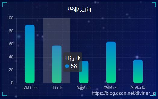
数据来源:采用Ajax的get(url,function())请求获取数据
这里需要注意的是:function是回调函数需要获取数据后存放在ret后,在done中进行数据的解析。
  // 柱状图模块1   首页左上角柱状图
  (function () {

    //--------------------------------ajax---------------------------------

    $.get("http://127.0.0.1:8888/api/text2", function (ret) {

    }).done(ret => {

      var Name2 = []
      var Value2 = []
      for (var i = 0; i < ret.length; i++) {

        var name = ret[i].name
        var value = ret[i].value
        console.log(name + " " + value)
        Name2.push(name)
        Value2.push(value)
      }
      // 1实例化对象
      var myChart1 = echarts.init(document.querySelector(".bar .chart"));
      // 2. 指定配置项和数据
      option = {

        color: new echarts.graphic.LinearGradient(0, 0, 0, 1, [{

          offset: 0,
          color: '#0184d5'
        }, {

          offset: 1,
          color: '#00d887'
        }]),
        tooltip: {

          trigger: "axis",
          axisPointer: {

            // 坐标轴指示器,坐标轴触发有效
            type: "shadow" // 默认为直线,可选为:'line' | 'shadow'
          }
        },
        // 修改图表的大小
        grid: {

          left: "0%",
          top: "10px",
          right: "0%",
          bottom: "4%",
          containLabel: true
        },
        xAxis: [
          {

            type: "category",
            data: Name2,
            axisTick: {

              alignWithLabel: true
            },
            // 修改刻度标签 相关样式
            axisLabel: {

              color: "rgba(255,255,255,.6) ",
              fontSize: "10"
            },
            // 不显示x坐标轴的样式
            axisLine: {

              show: false
            }
          }
        ],
        yAxis: [
          {

            type: "value",
            // 修改刻度标签 相关样式
            axisLabel: {

              color: "rgba(255,255,255,.6) ",
              fontSize: 10
            },
            // y轴的线条改为了 2像素
            axisLine: {

              lineStyle: {

                color: "rgba(255,255,255,.1)",
                width: 2
              }
            },
            // y轴分割线的颜色
            splitLine: {

              lineStyle: {

                color: "rgba(255,255,255,.1)"
              }
            }
          }
        ],
        series: [
          {

            name: "",
            type: "bar",
            barWidth: "35%",
            // data: [108, 6, 11, 8, 16],
            data: Value2,
            itemStyle: {

              // 修改柱子圆角
              barBorderRadius: 5
            }
          }
        ]
      };
      // 3. 把配置项给实例对象
      myChart1.setOption(option)
      // 4. 让图表跟随屏幕自动的去适应
      window.addEventListener("resize", function () {

        myChart1.resize();
      });
    });

  })();
1-2 左中角雷达图配置
 // 雷达图 左中
  (function () {


    // 1实例化对象
    var myChart = echarts.init(document.querySelector(".radar .chart"));
    // 2. 指定配置项和数据
    var lineStyle = {

      normal: {

        width: 1,
        opacity: 0.5
      }
    };
    var option = {

      legend: {

        orient: "vertical",
        top: "bottom",
        left: "right",
        textStyle: {

          color: '#fff',
          fontSize: 12
        },
        selectedMode: 'single'
      },
      grid: {

        top: ""
      },
      radar: {

        indicator: [
          {
      name: '城市', max: 100 },
          {
      name: '岗位', max: 100 },
          {
      name: '工作时间', max: 100 },
          {
      name: '兴趣', max: 100 },
          {
      name: '薪资', max: 100 },
          {
      name: '工作环境', max: 100 }
        ],
        shape: 'circle',
        splitNumber: 5,  //指示器轴的分割段数。
        name: {

          textStyle: {

            color: 'rgb(238, 197, 102)'
          }
        },
        splitLine: {

          lineStyle: {

            color: [
              'rgba(238, 197, 102, 0.1)', 'rgba(238, 197, 102, 0.2)',
              'rgba(238, 197, 102, 0.4)', 'rgba(238, 197, 102, 0.6)',
              'rgba(238, 197, 102, 0.8)', 'rgba(238, 197, 102, 1)'
            ].reverse()
          }
        },
        splitArea: {

          show: false
        },
        axisLine: {

          lineStyle: {

            color: 'rgba(238, 197, 102, 0.5)'
          }
        }
      },
      series: [
        {

          name: "16数媒01",
          type: 'radar',
          lineStyle: lineStyle,
          symbol: 'none',
          itemStyle: {

            color: '#F9713C'
          },
          areaStyle: {

            opacity: 0.1
          }
        },
        {

          name: "16数媒02",
          type: 'radar',
          lineStyle: lineStyle,
          symbol: 'none',
          itemStyle: {

            color: '#B3E4A1'
          },
          areaStyle: {

            opacity: 0.05
          }
        },
        {

          name: "16数媒03",
          type: 'radar',
          lineStyle: lineStyle,
          symbol: 'none',
          itemStyle: {

            color: 'rgb(238, 197, 102)'
          },
          areaStyle: {

            opacity: 0.05
          }
        },
        {

          name: "18数媒(升本)01",
          type: 'radar',
          lineStyle: lineStyle,
          symbol: 'none',
          itemStyle: {

            color: 'rgb(182, 87, 203)'
          },
          areaStyle: {

            opacity: 0.05  //图形透明度
          }
        }
      ]
    };
    // 3. 把配置项给实例对象
    myChart.setOption(option);

    SocketService.Instance.registerCallBack('leftcenterData', ret => {

      console.log("leftcenter:")
      console.log(ret);
      var classname = [];
      var classdata = [];
      for (var i = 0; i < ret.length; i++) {

        classname.push(ret[i].name);
        classdata.push(ret[i].student);
      }
      //数据
      myChart.setOption({

        legend: {

          data: classname,
        },
        series: [
          {

            name: "16数媒01",
            data: classdata[0]
          }
          ,
          {

            name: "16数媒02",
            data: classdata[1]
          },
          {

            name: "16数媒03",
            data: classdata[2]
          },
          {

            name: "18数媒(升本)01",
            data: classdata[3]
          }
        ]
      });
    });

    SocketService.Instance.send({

      action: 'getData',
      socketType: 'leftcenterData',
      chartName: 'leftcenter',
      value: ''
    })


    // 4. 让图表跟随屏幕自动的去适应
    window.addEventListener("resize", function () {

      myChart.resize();
    });

  })();
1-3 左下角饼状图配置
  // 饼形图1  首页左下角
  (function () {


    // 1. 实例化对象
    var myChart = echarts.init(document.querySelector(".pie .chart"));
    // 2.指定配置
    var option = {

      color: ["#FE642E", "#FE9A2E", "#F4FA58", "#01DFD7", "#8258FA"],
      tooltip: {

        trigger: "item",
        formatter: "{a}
{b}: {c} ({d}%)"
      },

      legend: {

        bottom: "0%",
        // 修改小图标的大小
        itemWidth: 10,
        itemHeight: 10,
        // 修改图例组件的文字为 12px
        textStyle: {

          color: "rgba(255,255,255,.5)",
          fontSize: "15"
        }
      },
      series: [
        {

          name: "工作地点",
          type: "pie",
          // 这个radius可以修改饼形图的大小
          // radius 第一个值是内圆的半径 第二个值是外圆的半径
          radius: ["35%", "60%"],
          center: ["50%", "45%"],
          avoidLabelOverlap: false,
          itemStyle: {

            borderRadius: 20//图形边缘弧度大小
          },
          // 图形上的文字
          label: {

            show: true
          },
          // 连接文字和图形的线是否显示
          labelLine: {

            show: true
          }
        }
      ]
    };

    // 使用刚指定的配置项显示图表。
    myChart.setOption(option);
    var dataLen = 1

    SocketService.Instance.registerCallBack('text3Data', ret => {

      console.log("text3:")
      console.log(ret);
      //数据
      myChart.setOption({

        series: [
          {

            name: "工作地点",
            data: ret,
          }
        ]
      });
      dataLen = ret.length
    });

    SocketService.Instance.send({

      action: 'getData',
      socketType: 'text3Data',
      chartName: 'text3',
      value: ''
    })

    /*******高亮显示开始**********/
    var _this2 = this
    var isSet2 = true // 为了做判断:当鼠标移动上去的时候,自动高亮就被取消
    var currentIndex2 = 0

    // 2、鼠标移动上去的时候的高亮动画
    myChart.on('mouseover', function (param) {

      isSet2 = false
      clearInterval(_this2.startCharts)
      // 取消之前高亮的图形
      myChart.dispatchAction({

        type: 'downplay',
        seriesIndex: 0,
        dataIndex: currentIndex2
      })
      // 高亮当前图形
      myChart.dispatchAction({

        type: 'highlight',
        seriesIndex: 0,
        dataIndex: param.dataIndex
      })
      // 显示 tooltip
      myChart.dispatchAction({

        type: 'showTip',
        seriesIndex: 0,
        dataIndex: param.dataIndex
      })
    })
    // 3、自动高亮展示
    chartHover = function () {

      // 取消之前高亮的图形
      myChart.dispatchAction({

        type: 'downplay',
        seriesIndex: 0,
        dataIndex: currentIndex2
      })
      currentIndex2 = (currentIndex2 + 1) % dataLen
      // 高亮当前图形
      myChart.dispatchAction({

        type: 'highlight',
        seriesIndex: 0,
        dataIndex: currentIndex2
      })
      // 显示 tooltip
      myChart.dispatchAction({

        type: 'showTip',
        seriesIndex: 0,
        dataIndex: currentIndex2
      })
    }
    _this2.startCharts = setInterval(chartHover, 1000)
    // 4、鼠标移出之后,恢复自动高亮
    myChart.on('mouseout', function (param) {

      if (!isSet2) {

        _this2.startCharts = setInterval(chartHover, 1000)
        isSet2 = true
      }
    })
    /*******高亮显示结束**********/

    // 4. 让图表跟随屏幕自动的去适应
    window.addEventListener("resize", function () {

      myChart.resize();
    });

  })();
1-4 右上角柱状图配置
  // 柱状图2  首页右上角柱状图
  (function () {


    var myColor = ["#1089E7", "#F57474", "#56D0E3", "#f8b448", "#8B78F6"];
    // 1. 实例化对象
    var myChart = echarts.init(document.querySelector(".bar2 .chart"));
    // 2. 指定配置和数据
    var option = {

      grid: {

        top: "10%",
        left: "30%",
        right: "15%",
        bottom: "10%"
        // containLabel: true
      },
      // 不显示x轴的相关信息
      xAxis: {

        show: false
      },
      yAxis: [
        {

          type: "category",
          inverse: true,
          // data: Name1,
          // 不显示y轴的线
          axisLine: {

            show: false
          },
          // 不显示刻度
          axisTick: {

            show: false
          },
          // 把刻度标签里面的文字颜色设置为白色
          axisLabel: {

            color: "#fff"
          }
        },
        {


          // data: Value1,
          data: [0, 0, 0, 0, 0],
          inverse: true,
          // 不显示y轴的线
          axisLine: {

            show: false
          },
          // 不显示刻度
          axisTick: {

            show: false
          },
          // 把刻度标签里面的文字颜色设置为白色
          axisLabel: {

            color: "#fff"
          }
        }
      ],
      series: [
        {

          name: "条",
          type: "bar",
          // data: proportion1,
          yAxisIndex: 0,
          // 修改第一组柱子的圆角
          itemStyle: {

            barBorderRadius: 20,
            // 此时的color 可以修改柱子的颜色
            color: function (params) {

              // params 传进来的是柱子对象
              // console.log(params);
              // dataIndex 是当前柱子的索引号
              return myColor[params.dataIndex];
            }
          },
          // 柱子之间的距离
          barCategoryGap: 50,
          //柱子的宽度
          barWidth: 10,
          // 显示柱子内的文字
          label: {

            show: true,
            position: "inside",
            // {c} 会自动的解析为 数据  data里面的数据
            formatter: "{c}%"
          }
        },
        {

          name: "框",
          type: "bar",
          barCategoryGap: 50,
          barWidth: 15,
          yAxisIndex: 1,
          data: [100, 100, 100, 100, 100],
          itemStyle: {

            color: "none",
            borderColor: "#00c1de",
            borderWidth: 3,
            barBorderRadius: 15
          }
        }
      ]
    };

    // 3. 把配置给实例对象
    myChart.setOption(option);


    SocketService.Instance.registerCallBack('text1Data', ret => {

      console.log("text1:")
      console.log(ret);
      var Name1 = []
      var Value1 = []
      var proportion1 = []
      for (var i = 0; i < ret.length; i++) {

        var name = ret[i].name
        var value = ret[i].value
        var proportion = ret[i].proportion
        Name1.push(name)
        Value1.push(value)
        proportion1.push(proportion)
      }
      //数据
      myChart.setOption({

        yAxis: [
          {

            data: Name1
          },
          {

            data: Value1
          }
        ],
        series: [
          {

            data: proportion1,
          },
          {


          }
        ]
      });

    });

    SocketService.Instance.send({

      action: 'getData',
      socketType: 'text1Data',
      chartName: 'text1',
      value: ''
    })


    //4.点击柱状图跳转
    myChart.on('click', function (params) {

      //获取统计数据
      document.cookie = params.dataIndex;
      window.location.href = 'nannv.html';
    });

    // 5. 让图表跟随屏幕自动的去适应
    window.addEventListener("resize", function () {

      myChart.resize();
    });

    //----------------------ajax-----------------------------
    // $.get("http://127.0.0.1:8888/api/text1", function (ret) {

    // }).done(ret => {

    //   var Name1 = []
    //   var Value1 = []
    //   var proportion1 = []
    //   for (var i = 0; i < ret.length; i++) {

    //     var name = ret[i].name
    //     var value = ret[i].value
    //     var proportion = ret[i].proportion
    //     console.log(name + " " + value)
    //     Name1.push(name)
    //     Value1.push(value)
    //     proportion1.push(proportion)
    //   }

    //   var myColor = ["#1089E7", "#F57474", "#56D0E3", "#f8b448", "#8B78F6"];
    //   // 1. 实例化对象
    //   var myChart = echarts.init(document.querySelector(".bar2 .chart"));
    //   // 2. 指定配置和数据
    //   var option = {

    //     grid: {

    //       top: "10%",
    //       left: "30%",
    //       right: "15%",
    //       bottom: "10%"
    //       // containLabel: true
    //     },
    //     // 不显示x轴的相关信息
    //     xAxis: {

    //       show: false
    //     },
    //     yAxis: [
    //       {

    //         type: "category",
    //         inverse: true,
    //         data: Name1,
    //         // 不显示y轴的线
    //         axisLine: {

    //           show: false
    //         },
    //         // 不显示刻度
    //         axisTick: {

    //           show: false
    //         },
    //         // 把刻度标签里面的文字颜色设置为白色
    //         axisLabel: {

    //           color: "#fff"
    //         }
    //       },
    //       {

    //         data: Value1,
    //         inverse: true,
    //         // 不显示y轴的线
    //         axisLine: {

    //           show: false
    //         },
    //         // 不显示刻度
    //         axisTick: {

    //           show: false
    //         },
    //         // 把刻度标签里面的文字颜色设置为白色
    //         axisLabel: {

    //           color: "#fff"
    //         }
    //       }
    //     ],
    //     series: [
    //       {

    //         name: "条",
    //         type: "bar",
    //         data: proportion1,
    //         yAxisIndex: 0,
    //         // 修改第一组柱子的圆角
    //         itemStyle: {

    //           barBorderRadius: 20,
    //           // 此时的color 可以修改柱子的颜色
    //           color: function (params) {

    //             // params 传进来的是柱子对象
    //             // console.log(params);
    //             // dataIndex 是当前柱子的索引号
    //             return myColor[params.dataIndex];
    //           }
    //         },
    //         // 柱子之间的距离
    //         barCategoryGap: 50,
    //         //柱子的宽度
    //         barWidth: 10,
    //         // 显示柱子内的文字
    //         label: {

    //           show: true,
    //           position: "inside",
    //           // {c} 会自动的解析为 数据  data里面的数据
    //           formatter: "{c}%"
    //         }
    //       },
    //       {

    //         name: "框",
    //         type: "bar",
    //         barCategoryGap: 50,
    //         barWidth: 15,
    //         yAxisIndex: 1,
    //         data: [100, 100, 100, 100, 100],
    //         itemStyle: {

    //           color: "none",
    //           borderColor: "#00c1de",
    //           borderWidth: 3,
    //           barBorderRadius: 15
    //         }
    //       }
    //     ]
    //   };

    //   // 3. 把配置给实例对象
    //   myChart.setOption(option);

    //   //4.点击柱状图跳转
    //   myChart.on('click', function (params) {

    //     //获取统计数据
    //     window.location.href = '3D.html';
    //   });

    //   // 5. 让图表跟随屏幕自动的去适应
    //   window.addEventListener("resize", function () {

    //     myChart.resize();
    //   });

    // });
  })();
1-5 右中角饼状图配置
  // 饼形图2 工作职位类别模块  首页右中
  (function () {


    var myChart = echarts.init(document.querySelector(".pie2 .chart"));
    var option = {

      color: [
        "#006cff",
        "#60cda0",
        "#ed8884",
        "#ff9f7f",
        "#0096ff",
        "#9fe6b8",
        "#32c5e9",
        "#1d9dff"
      ],
      tooltip: {

        trigger: "item",
        formatter: "{a}
{b} : {c} 元"
      },
      legend: {

        bottom: "0%",
        itemWidth: 10,
        itemHeight: 10,
        textStyle: {

          color: "rgba(255,255,255,.5)",
          fontSize: "10"
        }
      },
      series: [
        {

          name: "职业平均时薪分析",
          type: "pie",
          radius: ["10%", "65%"],
          center: ["50%", "40%"],
          roseType: "radius",
          // 图形的文字标签
          label: {

            fontSize: 10
          },
          // 链接图形和文字的线条
          labelLine: {

            // length 链接图形的线条
            length: 6,
            // length2 链接文字的线条
            length2: 8
          }
        }
      ]
    };
    myChart.setOption(option);
    // 监听浏览器缩放,图表对象调用缩放resize函数

    var dataLen = 1
    SocketService.Instance.registerCallBack('text4Data', ret => {

      console.log("text4:")
      console.log(ret);
      //数据
      myChart.setOption({

        series: [
          {

            name: "工作职位类别",
            data: ret,
          }
        ]
      });
      dataLen = ret.length
    });

    SocketService.Instance.send({

      action: 'getData',
      socketType: 'text4Data',
      chartName: 'text4',
      value: ''
    })


    /*******高亮显示开始**********/
    var _this2 = this
    var isSet2 = true // 为了做判断:当鼠标移动上去的时候,自动高亮就被取消
    var currentIndex2 = 0

    // 2、鼠标移动上去的时候的高亮动画
    myChart.on('mouseover', function (param) {

      isSet2 = false
      clearInterval(_this2.startCharts)
      // 取消之前高亮的图形
      myChart.dispatchAction({

        type: 'downplay',
        seriesIndex: 0,
        dataIndex: currentIndex2
      })
      // 高亮当前图形
      myChart.dispatchAction({

        type: 'highlight',
        seriesIndex: 0,
        dataIndex: param.dataIndex
      })
      // 显示 tooltip
      myChart.dispatchAction({

        type: 'showTip',
        seriesIndex: 0,
        dataIndex: param.dataIndex
      })
    })
    // 3、自动高亮展示
    chartHover = function () {

      // 取消之前高亮的图形
      myChart.dispatchAction({

        type: 'downplay',
        seriesIndex: 0,
        dataIndex: currentIndex2
      })
      currentIndex2 = (currentIndex2 + 1) % dataLen
      // 高亮当前图形
      myChart.dispatchAction({

        type: 'highlight',
        seriesIndex: 0,
        dataIndex: currentIndex2
      })
      // 显示 tooltip
      myChart.dispatchAction({

        type: 'showTip',
        seriesIndex: 0,
        dataIndex: currentIndex2
      })
    }
    _this2.startCharts = setInterval(chartHover, 1000)
    // 4、鼠标移出之后,恢复自动高亮
    myChart.on('mouseout', function (param) {

      if (!isSet2) {

        _this2.startCharts = setInterval(chartHover, 1000)
        isSet2 = true
      }
    })
    /*******高亮显示结束**********/
    myChart.on('click', function (params) {

      //获取统计数据
      window.location.href = '3D.html';
    });
    window.addEventListener("resize", function () {

      myChart.resize();
    });
  })();
1-6 右下折线图配置
// 折线图 右下
(function () {
var myChart = echarts.init(document.querySelector(".line .chart"));
var option = {
tooltip: {
trigger: "axis",
axisPointer: {
lineStyle: {
color: "#dddc6b"
}
}
},
legend: {
top: "0%",
textStyle: {
color: "rgba(255,255,255,.5)",
fontSize: "12"
}
},
grid: {
left: "5px",
top: "30",
right: "25px",
bottom: "10",
containLabel: true
},
xAxis: [
{
type: "category",
boundaryGap: false, //坐标轴从0开始
axisLabel: {
textStyle: {
color: "rgba(255,255,255,.6)",
fontSize: 10
}
},
axisLine: {
lineStyle: {
color: "rgba(255,255,255,.2)"
}
},
},
{
axisPointer: {
show: false },
axisLine: {
show: false },
position: "bottom",
offset: 20
}
],
yAxis: [
{
type: "value",
axisTick: {
show: false },
axisLine: {
lineStyle: {
color: "rgba(255,255,255,.1)"
}
},
axisLabel: {
textStyle: {
color: "rgba(255,255,255,.6)",
fontSize: 12
}
},
splitLine: {
lineStyle: {
color: "rgba(255,255,255,.1)"
}
}
}
],
series: [
{
name: "第一年薪资统计",
type: "line",
smooth: true,
symbol: "circle",
symbolSize: 5,
showSymbol: false,
lineStyle: {
normal: {
color: "#0184d5",
width: 2
}
},
areaStyle: {
normal: {
color: new echarts.graphic.LinearGradient(
0, 0, 0, 1,
[
{
offset: 0,
color: "rgba(1, 132, 213, 0.4)"
},
{
offset: 0.8,
color: "rgba(1, 132, 213, 0.1)"
}
],
false
),
shadowColor: "rgba(0, 0, 0, 0.1)"
}
},
itemStyle: {
normal: {
color: "#0184d5",
borderColor: "rgba(221, 220, 107, .1)",
borderWidth: 12
}
},
markArea: {
data: [
[
{
xAxis: '5000' }, {
xAxis: '6000' }
]
]
}
}
,
{
name: "第二年薪资统计",
type: "line",
smooth: true,
symbol: "circle",
symbolSize: 5,
showSymbol: false,
lineStyle: {
normal: {
color: "#00d887",
width: 2
}
},
areaStyle: {
normal: {
color: new echarts.graphic.LinearGradient(
0, 0, 0, 1,
[
{
offset: 0,
color: "rgba(0, 216, 135, 0.4)"
},
{
offset: 0.8,
color: "rgba(0, 216, 135, 0.1)"
}
],
false
),
shadowColor: "rgba(0, 0, 0, 0.1)"
}
},
itemStyle: {
normal: {
color: "#00d887",
borderColor: "rgba(221, 220, 107, .1)",
borderWidth: 12
}
},
markArea: {
data: [
[
{
xAxis: '7000' }, {
xAxis: '8000' }
]
]
}
}
]
};
// 使用刚指定的配置项显示图表。
myChart.setOption(option);
var dataLen = 1
SocketService.Instance.registerCallBack('text5Data', ret => {
console.log("text5:")
console.log(ret);
var Money = []
var Nmuber1 = []
var Nmuber2 = []
for (var i = 0; i < ret.length; i++) {
var money = ret[i].money
var number1 = ret[i].number1
var number2 = ret[i].number2
Money.push(money)
Nmuber1.push(number1)
Nmuber2.push(number2)
}
// 数据
myChart.setOption({
xAxis: [
{
data: Money
},
],
series: [
{
data: Nmuber1,
}
,
{
data: Nmuber2,
}
]
});
// var dataLen = myChart.getOption().series[0].data.length
dataLen = Nmuber1.length
});
SocketService.Instance.send({
action: 'getData',
socketType: 'text5Data',
chartName: 'text5',
value: ''
})
//------------------------Ajax-------------------------
// $.get("http://127.0.0.1:8888/api/text5", function (ret) {
// }).done(ret => {
// var Money = []
// var Nmuber1 = []
// var Nmuber2 = []
// for (var i = 0; i < ret.length; i++) {
// var money = ret[i].money
// var number1 = ret[i].number1
// var number2 = ret[i].number2
// Money.push(money)
// Nmuber1.push(number1)
// Nmuber2.push(number2)
// }
// // 基于准备好的dom,初始化echarts实例
// var myChart = echarts.init(document.querySelector(".line .chart"));
// var option = {
// tooltip: {
// trigger: "axis",
// axisPointer: {
// lineStyle: {
// color: "#dddc6b"
// }
// }
// },
// legend: {
// top: "0%",
// textStyle: {
// color: "rgba(255,255,255,.5)",
// fontSize: "12"
// }
// },
// grid: {
// left: "10",
// top: "30",
// right: "10",
// bottom: "10",
// containLabel: true
// },
// xAxis: [
// {
// type: "category",
// boundaryGap: false, //坐标轴从0开始
// axisLabel: {
// textStyle: {
// color: "rgba(255,255,255,.6)",
// fontSize: 10
// }
// },
// axisLine: {
// lineStyle: {
// color: "rgba(255,255,255,.2)"
// }
// },
// data: Money
// },
// {
// axisPointer: { show: false },
// axisLine: { show: false },
// position: "bottom",
// offset: 20
// }
// ],
// yAxis: [
// {
// type: "value",
// axisTick: { show: false },
// axisLine: {
// lineStyle: {
// color: "rgba(255,255,255,.1)"
// }
// },
// axisLabel: {
// textStyle: {
// color: "rgba(255,255,255,.6)",
// fontSize: 12
// }
// },
// splitLine: {
// lineStyle: {
// color: "rgba(255,255,255,.1)"
// }
// }
// }
// ],
// series: [
// {
// name: "第一年薪资统计",
// type: "line",
// smooth: true,
// symbol: "circle",
// symbolSize: 5,
// showSymbol: false,
// lineStyle: {
// normal: {
// color: "#0184d5",
// width: 2
// }
// },
// areaStyle: {
// normal: {
// color: new echarts.graphic.LinearGradient(
// 0, 0, 0, 1,
// [
// {
// offset: 0,
// color: "rgba(1, 132, 213, 0.4)"
// },
// {
// offset: 0.8,
// color: "rgba(1, 132, 213, 0.1)"
// }
// ],
// false
// ),
// shadowColor: "rgba(0, 0, 0, 0.1)"
// }
// },
// itemStyle: {
// normal: {
// color: "#0184d5",
// borderColor: "rgba(221, 220, 107, .1)",
// borderWidth: 12
// }
// },
// data: Nmuber1,
// markArea: {
// data: [
// [
// { xAxis: '3000' }, { xAxis: '4000' }
// ]
// ]
// }
// }
// ,
// {
// name: "第二年薪资统计",
// type: "line",
// smooth: true,
// symbol: "circle",
// symbolSize: 5,
// showSymbol: false,
// lineStyle: {
// normal: {
// color: "#00d887",
// width: 2
// }
// },
// areaStyle: {
// normal: {
// color: new echarts.graphic.LinearGradient(
// 0, 0, 0, 1,
// [
// {
// offset: 0,
// color: "rgba(0, 216, 135, 0.4)"
// },
// {
// offset: 0.8,
// color: "rgba(0, 216, 135, 0.1)"
// }
// ],
// false
// ),
// shadowColor: "rgba(0, 0, 0, 0.1)"
// }
// },
// itemStyle: {
// normal: {
// color: "#00d887",
// borderColor: "rgba(221, 220, 107, .1)",
// borderWidth: 12
// }
// },
// data: Nmuber2,
// markArea: {
// data: [
// [
// { xAxis: '5000' }, { xAxis: '6000' }
// ]
// ]
// }
// }
// ]
// };
// // 使用刚指定的配置项和数据显示图表。
// myChart.setOption(option);
/*******高亮显示开始**********/
var _this2 = this
var isSet2 = true // 为了做判断:当鼠标移动上去的时候,自动高亮就被取消
var currentIndex2 = 0
// 2、鼠标移动上去的时候的高亮动画
myChart.on('mouseover', function (param) {
isSet2 = false
clearInterval(_this2.startCharts)
// 取消之前高亮的图形
myChart.dispatchAction({
type: 'downplay',
seriesIndex: 0,
dataIndex: currentIndex2
})
// 高亮当前图形
myChart.dispatchAction({
type: 'highlight',
seriesIndex: 0,
dataIndex: param.dataIndex
})
// 显示 tooltip
myChart.dispatchAction({
type: 'showTip',
seriesIndex: 0,
dataIndex: param.dataIndex
})
})
// 3、自动高亮展示
chartHover = function () {
// 取消之前高亮的图形
myChart.dispatchAction({
type: 'downplay',
seriesIndex: 0,
dataIndex: currentIndex2
})
currentIndex2 = (currentIndex2 + 1) % dataLen
// 高亮当前图形
myChart.dispatchAction({
type: 'highlight',
seriesIndex: 0,
dataIndex: currentIndex2
})
// 显示 tooltip
myChart.dispatchAction({
type: 'showTip',
seriesIndex: 0,
dataIndex: currentIndex2
})
}
_this2.startCharts = setInterval(chartHover, 1000)
// 4、鼠标移出之后,恢复自动高亮
myChart.on('mouseout', function (param) {
if (!isSet2) {
_this2.startCharts = setInterval(chartHover, 1000)
isSet2 = true
}
})
/*******高亮显示结束**********/
window.addEventListener("resize", function () {
myChart.resize();
});
// });
})();